10,000 search results
(0.065 seconds)
- László by Just My Type,
$20.00 We count three inspirations for the László font family. The upper case was inspired by Yomar Augusto’s amazing font Unity, used on last year’s German World Cup Team jerseys; the lower case from a few letters a poster for a Bauhaus show. The name László is an homage to László Moholy-Nagy, peerless Bauhaus designer and teacher. The László type family is stripped down to the typographic core, lean, clean and definitely machined, at home in either a formal or casual setting, i.e. you can take László anywhere. Inspired by watching the World Cup and the German Team’s jerseys. Very clean, simple, Bauhaus-style design, European and highly legible. Usage recommendations Automobile ads, anywhere a European feel is desired.
 - Output Volume by Hanoded,
$15.00 I recently bought a small, portable speaker. I can now listen to music when I am making fonts! Output Volume is a name I came up with after reading the quick start guide that came with the speaker. Output Volume is a 100% handmade display font - it was based on a protest sign, but after a few glyphs it started to morph into something unique. I created 2 sets of contextual alternates (including the most used accented glyphs), that will cycle as you type. I also added some discretionary ligatures, to get an even more random effect. Output Volume comes with a vast array of accented letters, including Vietnamese.
 - Nimbusant Bresslo by DePlictis Types,
$31.00 Nimbussant Bresslo is a contemporary sans and attipic unicase were lowercase alternates with smallcaps creating an unusual look that can be used in posters, logo design and headings or small bold plain texts. This grotesque typeface supports most of the latin based languages and also kyrillic and greek alphabets. For a plus of a modern and young appeal, some of the letters have a very sharp, straight and minimalist body design but you may find also their stylistic alternates to better emulate the look you find more appropiate for your design.
 - Carolissa by Motokiwo,
$15.00 Carolissa is a script brush font with handwriting style. It's a simple and classy font that is suitable for various design project. With dynamic and spontaneous flow gestures, Carolissa will add more drama to your project. This font includes uppercase, lowercase, numeral, punctuation, ligature, and the multilingual support is also already PUA encoded. I believe in Leonardo da Vinci, that "Simplicity is the ultimate form of sophistication." If you have any issue or question, don't hesitate to drop me a message or email at motokiwodesign@gmail.com. I hope you enjoy the font!
 - FF Tarquinius by FontFont,
$68.99German type designer Norbert Reiners created this sans FontFont between 1996 and 2010. The family has 7 weights, ranging from Book to Extra Bold (including italics) and is ideally suited for book text. FF Tarquinius provides advanced typographical support with features such as ligatures, small capitals, alternate characters, case-sensitive forms, fractions, and super- and subscript characters. It comes with a complete range of figure set options – oldstyle and lining figures, each in tabular and proportional widths. As well as Latin-based languages, the typeface family also supports the Cyrillic and Greek writing systems. - Trečiokas by Rokas Cicenas,
$9.00 I present you Trečiokas typeface. This two font family is based on written letters that were sketched by using paint markers and afterwards pollished digitally. Glyphs mostly are connected, leaving some separate, as a contrast to round and soft letter shapes. It includes extended latin character set. In 2013 I made the Aerofont project, which included custom music instruments that were made based on Trečiokas Normal letter shapes. The main idea was to connect music and typography, by making sound emitting letters. You can watch the project video here.
 - Minthas Script by Amarlettering,
$15.00 Minthas Script comes with 280+ glyphs. The alternative characters were divided into several Open Type features such as Swash, Stylistic Sets, Stylistic Alternates, Contextual Alternates. The Open Type features can be accessed by using Open Type savvy programs such as Adobe Illustrator, Adobe InDesign, Adobe Photoshop Corel Draw X version, And Microsoft Word. And this Font has given PUA unicode (specially coded fonts) so that all the alternate characters can easily be accessed in full by a craftsman or designer. Note : Tail is available only for lowercase letters. Happy Designing!
 - Handy by Malindo Creative,
$10.00 Introducing,Handy Script Is a Beautiful font of retro style, Give your typography design a touch of retro style with Handy Script, Handy Script is one of hand lettering project. It was very inspired from the famous retro typography designs. Handy Script also comes with extra Extruded Font version. So you don’t need extra effort for create an extrude effect for this font. This mean it will saves your time. Handy Script Comes With 406 Glyphs and OpenType Features are also added to this font. The Features includes: Stylistic Alternates, Swashes, Ligatures, and Stylistic Set. You can pick the alternate for all style. If you have any questions, please contact me at: malindocreative@gmail.com. Feel free to contact me, I am happy to help you. Thank you for your kindness and support, it’s not hidden, what you see in preview is what it contains, Hopefully Useful, Good Luck For You, And Love You All.
 - Rolphie by Aah Yes,
$9.95 Rolphie can be your go-to sans-serif, with 16 easy-to-read weights and 10 versions for each weight, and the subtlety of choice that represents. The versions contained in each weight are: Regular; Condensed; Half-Condensed; Expanded; Small Capitals: and their italic counterparts. (At heavier weights particularly it seemed to be justified to have two Condensed versions). Plus there's 20 funky versions with the letters all shook up (that would make a good title for a song), or jumbled around, plus some Shadow, Doubled-Up, College, and other FX versions. In total there's 180 variations, giving a comprehensive selection of both standard and funky fonts, and that subtle degree of choice of weight. To make things easier, the weights are put in ascending numerical order from 01 to 16, and the FX versions have been stuck in the 80s and 90s, (like two musicians I know). There are grouped packages available for certain weights (which have 10 fonts in them) and the complete family package (180 fonts) which represent better value than the individual fonts, and there's a basic package containing the Normal and Italic versions of all 16 weights (32 fonts). A limit of 5 sub-family packages has been imposed, unfortunately, which precludes a more comprehensive selection. To let you know what's in the font that you might otherwise never know about . . . With Discretionary Ligatures on, you get special characters if you type Mc St. Rd. Bd. Ave. c/o No. (p) (P) - include the full-stop/period. With Stylistic Alternates switched on, you get plenty of extra characters - including a WiFi symbol (type Wifi or WiFi) / bullet numbers instead of ordinary numbers / that different U-dieresis / special characters for c/o No. Mc / an upside down ~ / a huge bullet, and different forms for cent, dollar, percent, per-thousand. As you'd expect, there's all the accented characters for all Western European scripts using Latin letters, and standard ligatures, plus other Open Type features including Class Kerning, Slashed-Zero, Historical Forms, Sub- and Superscript numbers, fractions for halves, thirds and quarters, Ornamental forms giving bullet numbers, etc. There's also the main mathematical operators, symbols like card-suits and male/female signs and so on, and some more obscure stuff like schwa and O-horn, U-horn - and there's lots more if you can Access All Alternates. Much will depend on what your software recognises. The Small Caps versions have (intentionally) lost the ligatures for lower case ff, fi, fj, fl, fr, fu, ffi, ffj, ffl, ffr, ffu. The names for the weights are not absolute - we had to make up some names to make them stretch out to sixteen - so rather - see them as relative to each other, being in ascending numerical order by weight.
 - Austral Slab by Antipixel,
$15.00 Austral Slab is a hand-drawn layered font designed by Antipixel, with unique textures & styles that combine giving your work a distinctive impression. This font comes in three weights, Regular, Light & Thin, with irregular outlines and uneven/crooked strokes, giving your work more personality and making it exclusive and powerful. For this same reason it can be used in a vast variety of projects, such as logos & branding, stationery, book covers, magazine design, clothing prints & tags, packaging, animated videos, and many more! Austral Slab has three sets of alphabets in uppercase and lowercase to avoid repeating the same character pattern, and giving the font a more natural handwritten feel. This is included in the Open-Type Contextual Alternates, which applies an automatic substitution of glyphs as long as the Open-Type features are activated. Also, Austral Slab offers other Open-Type features such as Stylistic Alternates, Ligatures, Discretionary Ligatures, Fractions, Superscript, Subscript, Denominator, Numerator, Scientific Inferiors & Kerning. This font has a very large glyph coverage and can be used in a wide range of languages, including English, Spanish, Italian, French, German, Polish, Czech, Vietnamese, Finnish, Icelandic, among many others. The style Maplines Thin is offered Free for commercial & personal use!
 - Heller Sans JNL by Jeff Levine,
$29.00 Heller Sans JNL is based on the main letterforms of an experimental alphabet designed by Steven Heller; noted author of over 170 books on design and visual culture. Some modifications were made in turning his design into a digital font. In his own words, here is the background to this typeface: “I recently recovered this from the junk heap. It is a yellowing photostat of my first and only typeface design (1969-70). Total folly! At the time I was smitten by Art Moderne lettering. I called it “Klaus Boobala Bold” because I liked the K and B. I’ve lost the letters S through Z, which were made. The letters were drawn with compass, Techno pen (that frequently clogged). as well as a triangle and T-square. The inline and outline made no real logical sense. I based the design, in part, on Kabel, Avant Garde and it was a product of whatever I could accomplish with those tools. The caps-only alphabet was photographed and produced as a film negative that was cut in foot-long strips and spliced to fit on a Typositor reel. Sadly, the negatives made for the font were too brittle and the splice snapped apart in the Typositor. I worked on it for well over a month and used the face only once. I realized with this attempt, like so many other times I attempted different challenges, that type design — indeed mechanical drawing — was not my strong suit.” Heller Sans JNL is available in both regular and oblique versions.
 - Ancukaseyo by Allouse Studio,
$16.00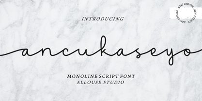 Proudly Presenting, Ancukaseyo a Monoline Script Font. Ancukaseyo come with Start Alternate Lowercase, Ligatures and Multi-Lingual Support which will fulfill your need with some exploration. We highly recommend using a program that supports OpenType features and Glyphs panels like many of Adobe apps and Corel Draw, so you can see and access all Glyph variations. Ancukaseyo is perfect for any tittle, logo, product packaging, branding project, megazine, social media, wedding, or just used to express words above the background. Enjoy the font, feel free to comment or feedback, send me PM or email. Thank You!
 - Vinyle by Lián Types,
$37.00 Bold, rounded and super cool. Those are the attributes of my latest font “Vinyle”, french for vinyl. In this epoque where all fields of Design are giving a lot of importance and attention to Typography and Lettering, I felt it was my duty to contribute with something that could really stand alone and ‘say something else’ that just words to be read. I've found that lately in the world, regarding a finished piece of design, the role of Typography (and of letters in general) went from being secondary, (like a minor player or a supporting actor) to the most important one. People are starting to understand the beauty of a well-done letter: they want their storefronts with unique scripts, they want to drink coffee surrounded by lettered blackboards, they want to buy books with astonishing covers with swashes ‘por doquier’. I'm more than happy to be alive in a present where even the most unimaginable friends of mine, (who couldn't spot differences between comic sans and helvetica before) are now conscious of the importance of a letter, or let’s say: Of the ‘voice’ of Typography. With Vinyle I tried to make a font with power. Following the nowadays trend of, let me say, “the vintage sans renaissance”. This time I put my brushes and nibs aside and experimented with something new. It wasn't easy, if you will pardon, for me to see swashes all over the place withouth the classic calligraphic ‘thick and thins’, but with after some weeks of work I started to love them. Like I already showed you in other creations (1) let me finish with the phrase: GEOMETRY IS SEXY! TIPS Vinyle has a lot of attitude, it shouts “here I am!” it really can ‘design an entire piece’ for you with just a word or two: It was designed with a 10 degree slant on purpose so the user may rotate it (like on the posters) that amount of degrees in order to see better results. Use Vinyle with the ‘fi’ standard ligatures activates for better kerning and ligatures! NOTES (1) See my font Selfie , the ‘little sister’ of Vinyle.
 - Karmaline by Mysterylab,
$9.00 Karmaline is a six-weight sans serif font family with a unique and expressive design. This font has some intriguing special features such as subtly tapered topheavy vertical strokes and selected wedge-shaped horizontal strokes. It is evocative of designs from Switzerland, Germany, and the Netherlands in the period spanning 1900 – 1930, but with thoroughly modern features like high legibility at small sizes, even inter-character weight and flow, and a high x-height. You'll find Karmaline's semi-condensed width to be useful for both strong headlines and for comfortable copyfitting in narrow column widths. This font also works very well when adding layered shadow and highlight effects, and is a great choice for logos.
 - FF Unit Rounded by FontFont,
$104.99 German type designer Erik Spiekermann and American type designer Christian Schwartz created this display and sans FontFont in 2008. The family has 6 weights, ranging from Light to Ultra and is ideally suited for advertising and packaging, editorial and publishing, logo, branding and creative industries, poster and billboards as well as wayfinding and signage. FF Unit Rounded provides advanced typographical support with features such as ligatures, small capitals, alternate characters, case-sensitive forms, fractions, and super- and subscript characters. It comes with a complete range of figure set options – oldstyle and lining figures, each in tabular and proportional widths. This FontFont is a member of the FF Unit super family, which also includes FF Unit and FF Unit Slab.
 - FF Signa Serif by FontFont,
$68.99 Danish type designer Ole Søndergaard created this serif FontFont in 2005. The family has 10 weights, ranging from Light to Black (including italics) and is ideally suited for advertising and packaging, film and tv, editorial and publishing as well as logo, branding and creative industries. FF Signa Serif provides advanced typographical support with features such as ligatures, small capitals, alternate characters, case-sensitive forms, fractions, and super- and subscript characters. It comes with a complete range of figure set options – oldstyle and lining figures, each in tabular and proportional widths. This FontFont is a member of the FF Signa super family, which also includes FF Signa, FF Signa Correspondence, FF Signa Serif Stencil, and FF Signa Stencil.
 - Sugar Melon by Supfonts,
$12.00 Sugar Melon will be perfect for wedding lettering, beautiful frame for your home, book covers, greeting cards, logos, marketing, magazines or anything that requires cute handwritten lettering :) What's inside: Multilingual support Cricut support If you have any questions, please contact me directly or in instagram @superdizigner
 - S Water Jump by Supfonts,
$10.00 Water Jump will be perfect for wedding lettering, beautiful frame for your home, book covers, greeting cards, logos, marketing, magazines or anything that requires cute handwritten lettering :) What's inside: Multilingual support Cricut support If you have any questions, please contact me directly or in instagram @superdizigner
 - Ricardo Montero by Supfonts,
$12.00 Ricardo Montero will be perfect for wedding lettering, beautiful frame for your home, book covers, greeting cards, logos, marketing, magazines or anything that requires cute handwritten lettering :) What's inside: Multilingual support Cricut support If you have any questions, please contact me directly or in instagram @superdizigner
 - Pretty Letters by Supfonts,
$14.00 Pretty Letters will be perfect for wedding lettering, beautiful frame for your home, book covers, greeting cards, logos, marketing, magazines or anything that requires cute handwritten lettering :) What's inside: Multilingual support Cricut support If you have any questions, please contact me directly or in instagram @superdizigner
 - Panoramic by Supfonts,
$9.00 Panoramic will be perfect for wedding lettering, beautiful frame for your home, book covers, greeting cards, logos, marketing, magazines or anything that requires cute handwritten lettering :) What's inside: Panoramic Script Multilingual support Cricut support If you have any questions, please contact me directly or in instagram @superdizigner
 - TT Cometus by TypeType,
$19.00 Dynamic, attractive and catchy - the new TypeType display font! Please note! If you need OTF versions of the fonts, just email us at commercial@typetype.org TT Cometus is an expressive typeface that captivates from the first time you read a text set in it. Despite its massiveness, the typeface is malleable and dynamic, like a comet piercing the space in order to achieve the only goal - to capture the attention of the viewer. TT Cometus is a slab serif whose strong serifs are serifed at the junctions with the vertical stroke to give the typeface a dynamic and modern character. Thanks to this solution, some elements of the font evoke associations with calligraphic works, while display elements remain stable thanks to massive serifs. The pointed endings of the letters c, y, e, t and noticeable inflows of arches and semi-ovals make the character of TT Cometus dynamic. The contrast between the thicknesses of the horizontal and vertical elements is small, but in the serifs, inflows, and letter endings, the contrast is pronounced. The nature of the font is balanced, and its friendliness is supported by the smoothness of shapes. Oriented towards the viewer, flowing yet massive and dynamic, TT Cometus is suitable for use in eye-catching projects. This is a display font that shows its character better in a large body size and can be used in printed materials or on the web. The font looks flawless in headlines and logos, and is suitable for use in branding. TT Cometus consists of 5 faces: 4 upright and one variable font. Each face has 568 glyphs. The font contains 18 OpenType features, including a large number of ligatures, sets of alternative characters for the ampersand and the letter g.
 - Marcel Merlina by Pixesia Studio,
$16.00 Introducing Marcel Merlina - A Lovely Chic Script Font Marcel and Marlina is now released as beautiful as romance is. This font-type gives you the vibe of an elegant and the classic-yet-so fresh kind of feeling. The curves and the flexibility of the fonts provide you the warm and familiar sense—as if you are reading letters from your beloved ones. Marcel and Marlina is meant to be endearing—portray the warmth of love. This font is designed to be used in such occasions which require high involvement of delightful emotion. This font would be best to be used in wedding invitations, love letters, and sincere greeting cards for someone so dear to you. FEATURES - Stylistic Alternates - Ligatures - PUA Encoded - Uppercase and Lowercase letters - Numbering and Punctuations - Multilingual Support - Works on PC or Mac - Simple Installation - Support Adobe Illustrator, Adobe Photoshop, Adobe InDesign, also works on Microsoft Word Hope you Like it. Thanks.
 - Rampage Monoline by Creatype Studio,
$15.00 Rampage Monoline is a beautiful, sweet, vintage monoline font with movement and grace. The script comes in a regular and rounded version. Rampage is elegant and stunning as a display which makes it perfect for branding projects, logos, wedding designs, social media posts, advertisements, product packaging, product designs, labels, photography, watermarks, invitations, stationery and any projects that need handwriting look. Rampage Monoline comes with uppercase, lowercase, numerals, punctuation and many variations on each character, including OpenType alternates and common ligatures to let you customize your designs. SANS SERIF FONT & ROUGH/STAMP EFFECT IS FOR PREVIEW PURPOSE ONLY, IT IS NOT INCLUDED IN MAIN FILE.
 - Chalk And Cheese NF by Nick's Fonts,
$10.00The name comes from a British expression about two things that couldn't be more different, and it suits this offering to a tee. The uppercase of this typeface is based on 1930s lettering by French poster artist Charles Loupot, and the lowercase is based on 1910s lettering by German plakatmeister Ludwig Hohlwein. Oddly, the two seem to play together well. Both versions of the font include the 1252 Latin and 1250 CE character sets (with localization for Romanian and Moldovan). - Batoswash by T4 Foundry,
$21.00Avantgarde fonts Batory and Batoswash are monoline sansserifs designed by Bo Berndal. The futuristic Batory (think Bladerunner and Total Recall) and the spicier relative Batoswash come in three versions: Narrow, Middle and Wide. The font family is available in Truetype and Postscript for Mac and PC. Bo Berndal, born 1924, has been designing typefaces over 56 years, for Monotype, Linotype and other foundries. "Batory is a monoline reaction to my many calligraphic fonts", says Bo Berndal. "That is also the reason I did several widths instead of weights. Batory has short stems and high x-height. Batoswash is a Batory gone wild!" The successful Batory has already been used for logotypes, vignettes in magazines and as headline type. - Batory by T4 Foundry,
$21.00Avantgarde fonts Batory and Batoswash are monoline sansserifs designed by Bo Berndal. The futuristic Batory (think Bladerunner and Total Recall) and the spicier relative Batoswash come in three versions: Narrow, Middle and Wide. The font family is available in Truetype and Postscript for Mac and PC. Bo Berndal, born 1924, has been designing typefaces over 56 years, for Monotype, Linotype and other foundries. “Batory is a monoline reaction to my many calligraphic fonts”, says Bo Berndal. "That is also the reason I did several widths instead of weights. Batory has short stems and high x-height. Batoswash is a Batory gone wild!" The successful Batory has already been used for logotypes, vignettes in magazines and as headline type. - Areon Flux by DePlictis Types,
$33.00 The future is right here, today, and Areon Flux comes to point that out. It’s a font family consisting in three weights that makes it a notable choice for designers that have to do with techy, futuristic layouts or printing materials. The lettering design appeal as sharp, powerful, distinctive and kind of modular, remembering the upcoming space exploration opportunities that are ready to enlarge our horizons in the next years. Areon Flux family is designed and published in late ‘20/ early ’21 and has an established discount for more that 30% for all the weights buyed together that makes it a versatile fresh and modern display not to be missed by edgy designers.
 - Goby by Atlantic Fonts,
$26.00 Goby has several distinct personalities, and can definitely help you make some waves. Lower case Goby is sweet, lively, easy to read, bold, and always friendly. Goby also works great in all-caps, and if you turn on discretionary ligatures, discover a huge stash of funky two and three-letter ligatures that can make ordinary words look extraordinary. The Goby font family also includes Goby Graphics, an ocean-y collection of illustrations by Amy Dietrich. If you need some artful seaweed, a head of coral, a seahorse, or maybe a smiling hermit crab, the unique images of Goby Graphics will work swimmingly.
 - Buckthorn by Hanoded,
$15.00 Buckthorn is a genus of about 110 species of shrubs and small trees, native to North America and Asia. Its uses are varied: it is used for dye, oil, printing ink and oil. That concludes the botany class for today, on with Buckthorn ‘The Font’. Buckthorn is a handmade typeface with a lot of character. It is severely eroded, giving your designs an authentic look. It comes in 4 styles, including a ‘hollow’ style, plus a dingbat font with very nifty shapes. Buckthorn is quite a pleasing font and comes with a rich harvest of diacritics.
 - Gill Display Compressed by ITC,
$29.99The successful Gill Sans® was designed by the English artist and type designer Eric Gill and issued by Monotype in 1928 to 1930. The roots of Gill Sans can be traced to the typeface that Gill's teacher, Edward Johnston, designed for the signage of the London Underground Railway in 1918. Gill´s alphabet is more classical in proportion and contains what have become known as his signature flared capital R and eyeglass lowercase g. Gill Sans is a humanist sans serif with some geometric touches in its structures. It also has a distinctly British feel. Legible and modern though sometimes cheerfully idiosyncratic, the lighter weights work for text, and the bolder weights make for compelling display typography. Gill Sans is also available as Value Pack for Macintosh, PC or as Hybrid CD with both platforms. - Gill Sans MT Greek by Monotype,
$67.99The successful Gill Sans® was designed by the English artist and type designer Eric Gill and issued by Monotype in 1928 to 1930. The roots of Gill Sans can be traced to the typeface that Gill's teacher, Edward Johnston, designed for the signage of the London Underground Railway in 1918. Gill´s alphabet is more classical in proportion and contains what have become known as his signature flared capital R and eyeglass lowercase g. Gill Sans is a humanist sans serif with some geometric touches in its structures. It also has a distinctly British feel. Legible and modern though sometimes cheerfully idiosyncratic, the lighter weights work for text, and the bolder weights make for compelling display typography. Gill Sans is also available as Value Pack for Macintosh, PC or as Hybrid CD with both platforms. - Gill Kayo Condensed by ITC,
$40.99The successful Gill Sans® was designed by the English artist and type designer Eric Gill and issued by Monotype in 1928 to 1930. The roots of Gill Sans can be traced to the typeface that Gill's teacher, Edward Johnston, designed for the signage of the London Underground Railway in 1918. Gill´s alphabet is more classical in proportion and contains what have become known as his signature flared capital R and eyeglass lowercase g. Gill Sans is a humanist sans serif with some geometric touches in its structures. It also has a distinctly British feel. Legible and modern though sometimes cheerfully idiosyncratic, the lighter weights work for text, and the bolder weights make for compelling display typography. Gill Sans is also available as Value Pack for Macintosh, PC or as Hybrid CD with both platforms. - Gill Sans MT WGL by Monotype,
$92.99The successful Gill Sans® was designed by the English artist and type designer Eric Gill and issued by Monotype in 1928 to 1930. The roots of Gill Sans can be traced to the typeface that Gill's teacher, Edward Johnston, designed for the signage of the London Underground Railway in 1918. Gill´s alphabet is more classical in proportion and contains what have become known as his signature flared capital R and eyeglass lowercase g. Gill Sans is a humanist sans serif with some geometric touches in its structures. It also has a distinctly British feel. Legible and modern though sometimes cheerfully idiosyncratic, the lighter weights work for text, and the bolder weights make for compelling display typography. Gill Sans is also available as Value Pack for Macintosh, PC or as Hybrid CD with both platforms. - Gill Sans MT Cyrillic by Monotype,
$67.99The successful Gill Sans® was designed by the English artist and type designer Eric Gill and issued by Monotype in 1928 to 1930. The roots of Gill Sans can be traced to the typeface that Gill's teacher, Edward Johnston, designed for the signage of the London Underground Railway in 1918. Gill´s alphabet is more classical in proportion and contains what have become known as his signature flared capital R and eyeglass lowercase g. Gill Sans is a humanist sans serif with some geometric touches in its structures. It also has a distinctly British feel. Legible and modern though sometimes cheerfully idiosyncratic, the lighter weights work for text, and the bolder weights make for compelling display typography. Gill Sans is also available as Value Pack for Macintosh, PC or as Hybrid CD with both platforms. - Alius by Lucas Tillian,
$18.00 Alius is something else. Experimental shapes combined with traditional ones result in an extremely legible typeface that—because of its economically spaced characters—works extraordinarily well for copy texts as well as big striking headings. Alius has been created with great attention to detail which is particularly noticeable in smaller sizes where proportions and shapes remain intact. The Typeface includes stylistic alternates that provide the designer with endless possibilities for combinations and variations. Alius contains PS-Hinting and is therefore as legible on screen as it is on paper. The typeface comes with powerful OpenType features that will satisfy even the most demanding of designers. With more than 680 Glyphs and a coverage of over 130 languages, Alius is as versatile as it is beautiful. The development of the typeface started in the summer and concluded in the fall of 2021.
 - Gill Sans MT Infant by Monotype,
$43.99The successful Gill Sans® was designed by the English artist and type designer Eric Gill and issued by Monotype in 1928 to 1930. The roots of Gill Sans can be traced to the typeface that Gill's teacher, Edward Johnston, designed for the signage of the London Underground Railway in 1918. Gill´s alphabet is more classical in proportion and contains what have become known as his signature flared capital R and eyeglass lowercase g. Gill Sans is a humanist sans serif with some geometric touches in its structures. It also has a distinctly British feel. Legible and modern though sometimes cheerfully idiosyncratic, the lighter weights work for text, and the bolder weights make for compelling display typography. Gill Sans is also available as Value Pack for Macintosh, PC or as Hybrid CD with both platforms. - Foolish Hand by Sipanji21,
$10.00 Foolish Hand is a handwritten font written in original handwriting, this font is good for various graphic designs, such as making children's drawings, coloring book covers, packaging, advertising, movie covers, posters and for any crafting. I hope this font is useful for you, have a nice day.
 - Horror Monster by Yoga Letter,
$18.00 "Horror Monster" is a scary horror font. It has a writing texture with small holes in each letter. This font is equipped with uppercase, lowercase, numerals, punctuation, and multilingual support. This font is perfect for posters, banners, stickers, Halloween, horror movie titles, action movies, and more.
 - Garoa by Just in Type,
$20.00 Inspired by the 70's design, specially on Herb Lubalin's work, the typeface Garoa is a rounded mechanical display font without optical compensations, ideal for large bodies. The medium weight has lower case for short texts, and the Bold versions have singular upper case glyphs, with some alternates (at least one alternate per letter – some with OpenType features some using caps on the keyboard). The Garoa Hacker Clube Bold version is free and contains no OpenType features, but the glyphs have the same design as on Garoa Bold.