10,000 search results
(0.057 seconds)
- Bad Situation by Intellecta Design,
$24.90 The historical source to Bad Situation comes from "EXAMPLES OF MODERN ALPHABETS, PLAIN and ORNAMENTAL; including German, Old English, Saxon, Italic, Perspective, Greek, Hebrew, Court Hand, Engrossing, Tuscan, Riband, Gothic, Rustic, and Arabesque, etc." Collected and engraved by F. Delamotte, and first published in 1864. The original alphabet was called "Example Alphabet" (plate 48), by Delamotte.
 - Planca by Vertigo,
$18.00 Planca is a sans serif typeface with medium contrast and distorted rhythm of the line. Spaced and mastered for optimal readability. All lines are of equal thickness. Its morphology is based on the study of traditional writing with a wide tip stick. It comes in 4 different weights (Light, Regular, Bold and Black) and provide multilingual support.
 - Federasyon by Yasin Yalcin,
$14.00 Federasyon was designed on the principles simplicity, legibility and functionality. The font family includes four weights and each weight has more than 240 characters on its own. Federasyon contains more than 10.000 optical arrangement data for each character to work in harmony with each other. Federasyon supports a total of 22 languages, including Western and some Central European languages.
 - Flicka by PizzaDude.dk,
$20.00 Flicka is a super funky font that oozes of fun and games. Every single letter has got it's personality of its own! And, what's even better: the Flicka font comes with ligatures for both lowercase-lowercase, uppercase-lowercase and uppercase-uppercase! 154 different ligatures in total! You will need to use OpenType supporting applications to use the autoligatures.
 - System Overload by Hanoded,
$15.00 I sometimes think that we live in strange times: a lot of good (and bad) things seems to happen all at once. System Overload font is based on the protest posters from the seventies. You can use it for your own protest posters, your restaurant signs or whatever you fancy. Comes with several interesting discretionary ligatures as well!
 - Sunny Weather by Hanoded,
$15.00 Spring is in the air! My chickens are broody and are sitting on an ever increasing pile of eggs; my fruit trees are budding and the sun is shining! Sunny Weather is a happy kind of font: it was handwritten, using a Sharpie pen. It comes with double letter ligatures and a good dose of vitamin D!
 - FS Siena for Walbusch by Fontsmith,
$80.00Siena is a luxurious type. A modern contrasted sans serif. Over 25 years in the making, FS Siena is tailor made for high-end brands. Sumptuous, elegant and eclectic, a nonconformist typeface with classical roots. It’s been a long time coming, but with its heady mix of elegance and quirky charm, FS Siena is worth the wait. - Diastema by Issam Type,
$22.00 Diastema is a modern ligature serif typeface comes with joining ligatures that give it a fancy and unique style. This font perfect for branding, logos, invitation, watermark and more. Diastema typeface comes with regular, italic, bold and bold italic font styles. Uppercase & lowercase letters, numbers, punctuation, ligatures, alternates Multilingual support. If you have any questions, please feel free to get in touch. Thank you
 - Onirom by Issam Type,
$17.00 Onirom is a Modern ligature serif font comes with joining ligatures that give it a fancy and unique style. This awesome font is perfect for branding, logos, invitation, watermark and so much more. Onirom typeface comes with regular and round font styles. Uppercase letters, numbers, punctuation, ligatures, alternates and multilingual support. If you have any questions, please feel free to get in touch. Thank you
 - Asfire by Issam Type,
$14.00 Asfire is an All Caps modern ligature serif typeface comes with joining ligatures that give it a fancy and unique style. This font perfect for branding, Headlines, logos, invitation, watermark and more. Asfire typeface comes with regular, bold and condensed font styles. Uppercase letters, numbers, punctuation, ligatures, alternates Multilingual support. If you have any questions, please feel free to get in touch. Thank you
 - Bellwood Gothic by Breauhare,
$19.99 Bellwood Gothic™ is an unorthodox but happy pairing of upper and lowercases that breaks typographic rules: its capitals evoke traditional early 20th century styling and strength. Lowercase displays a softer, more warm and friendly flavor that points to a Bauhaus aesthetic. But for some strange reason they work so well together! Therein lies the mystique of this font. Overall it isn’t strictly uniform in stroke but shows some variation of color. The sofa poster includes a cameo appearance by breauhare’s own popular Daddy’s Hand™ font. Bellwood Gothic’s nostalgic flavor of the 1960s & 1970s still conveys a modern look that lends itself to sports, fashion, lifestyle and more. The wide track of the lettering helps short words easily fill spaces. Includes stylistic alternates for the lowercase a, e, & l (L), plus 13 uppercase letters! Among OpenType features are Stylistic Alternates, Stylistic Sets, Ligatures, Fractions, & Case-sensitive forms. Extended support for Western, Central, and Eastern European languages is included. Use it for headlines, subheads, branding, editorial, packaging, and logos!
 - Modern MT for Dior CS by Monotype,
$29.99Cut by Monotype between 1900 and 1902, the Monotype Modern font family was based on Miller & Richards News 23 and 28; slightly condensed news text types of the 1890s. Monotype Modern is a lively typeface, with long, fine hairlines and well rounded letterforms, representing the best of nineteenth century modern face design. A classic text face, and typical of the moderns that were produced in the United Kingdom at that time, being less extreme in its rendering than some of the models of purer form being produced elsewhere. Monotype Modern is an excellent text face for magazines, newspapers and books, the heavier and more condensed versions are useful in headlines and display. - Gyst by phospho,
$30.00 Gyst is a neo-humanist sans-serif typeface that artfully blends the principles of Grotesque and Antiqua. With its classic uprights and the serifs in its true italics, Gyst spans the arc from a modern humanistic sans serif to a captivating calligraphic serif. Contrasting strokes and luscious, on the other hand razor-edged terminals reflect a sense of grace, thriving at the intersection of geometric precision and flourishing sophistication. Made for body text as well a s display use. In any situation, you will find the autonomous cursive posture to be a perfect playmate for the upright. Gyst comes in four upright and italic weights, all equipped with a whole lot Alternates and Ligatures.
 - Monotype Modern Display by Monotype,
$29.99Cut by Monotype between 1900 and 1902, the Monotype Modern font family was based on Miller & Richards News 23 and 28; slightly condensed news text types of the 1890s. Monotype Modern is a lively typeface, with long, fine hairlines and well rounded letterforms, representing the best of nineteenth century modern face design. A classic text face, and typical of the moderns that were produced in the United Kingdom at that time, being less extreme in its rendering than some of the models of purer form being produced elsewhere. Monotype Modern is an excellent text face for magazines, newspapers and books, the heavier and more condensed versions are useful in headlines and display. - Triump by Latinotype,
$26.00 The typeface family Triump is a simple sans serif with 6 weights from Thin, ideal for use as an epigraph, to Black for head titles of special impact. Excellent for applying in graphic design as logos, trademarks, posters, editorial and web design. Inspired by the classic types of the late twentieth century with rounded corners that give the typography a smooth appearance with rounded ends, with a horizontal stroke that exceeds the vertical in the letters A, E, F, H, J and K which gives a distinct personality. Triump comes with a Black weight in normal and italic Line both upper and lowercase letters, especially to give a vintage look to the designs.
 - Triplex by Emigre,
$39.00 Although initially designed as a rational/geometric font, Triplex developed into one of Zuzana Licko's most intuitive typeface designs at the time. Its first extensive use was in Emigre magazine #14, a special issue devoted to Swiss designers published in 1990. Triplex was intended as a friendly substitute for Helvetica. The name Triplex refers to the three versions that make up the entire family; Triplex, Triplex Serif and Triplex Italic. Each version of the typeface comes in light, bold and extra bold. The italic was designed and drawn by type designer and sign painter John Downer, and was designed to work with both the serif and sans serif versions. See also Triplex Italic OT.
 - Modern MT for Dior JP by Monotype,
$29.99Cut by Monotype between 1900 and 1902, the Monotype Modern font family was based on Miller & Richards News 23 and 28; slightly condensed news text types of the 1890s. Monotype Modern is a lively typeface, with long, fine hairlines and well rounded letterforms, representing the best of nineteenth century modern face design. A classic text face, and typical of the moderns that were produced in the United Kingdom at that time, being less extreme in its rendering than some of the models of purer form being produced elsewhere. Monotype Modern is an excellent text face for magazines, newspapers and books, the heavier and more condensed versions are useful in headlines and display. - Modern MT for Dior KO by Monotype,
$29.99Cut by Monotype between 1900 and 1902, the Monotype Modern font family was based on Miller & Richards News 23 and 28; slightly condensed news text types of the 1890s. Monotype Modern is a lively typeface, with long, fine hairlines and well rounded letterforms, representing the best of nineteenth century modern face design. A classic text face, and typical of the moderns that were produced in the United Kingdom at that time, being less extreme in its rendering than some of the models of purer form being produced elsewhere. Monotype Modern is an excellent text face for magazines, newspapers and books, the heavier and more condensed versions are useful in headlines and display. - OC Blimp by OtherwhereCollective,
$99.00The inflatable font you never knew you always wanted! With its two axes you can literally blow this variable display font up and watch it float away… Uppercase display font built on OC Format Sans Print Bd Support for 84 languages 6 preset static Inflate styles gradually inflate and stay on the baseline. 6 preset static Float styles gradually inflate and rise from the baseline. Baseline punctuation and certain symbols don’t float to provide a grounded context. Various un-inflatable symbols carry over from Format Print Bd because they might come in handy as is. With a complete alternate set and double number ligatures years and zip codes don’t look repetitive (think 1991 – 10022 that sort of thing) Double letter ligatures prevent visual repetition in words like “balloon” and “coffee”. - Benjir by Struggle Studio,
$18.00 Benjir Typeface – Display Handwritten Font look with simple, Sport, visual elegance with subtle curves and beautiful bindings, An incredibly versatile font that works both large and small. This font is suitable for a wide variety of projects such as: headlines, logos, labels, branding projects, magazines, home appliance designs, product packaging, mugs, quotes, posters and many more. This font can also be more expressive and fun, thanks to the many alternatives and ligatures that combine harmoniously in this font and make it more attractive and versatile. Try to change alternatives, fasteners and you will get many options for your project that will make it Vintage & Awesome.
 - Bushing by Hackberry Font Foundry,
$13.95 Bushing is a quick serif experiment going for open light display type. For years I have always stopped and really liked what I saw with fonts like the original Cushing from the turn of the 20th century. This time the desire for a font was stirred by Felici's article in CreativePro on fonts from the beginning of the 20th century, especially his captures of Cushing No. 2 and the version commissioned for Norwood press from ATF. I'm not interested in historically accurate reconstructions. My desire is for the general feel I get when I see a font. As a result, Bushing has little to do with Cushing (other than the last six letters). But it is a Serif font with small serifs and a huge x-height with a very open feel. I like it. I hope you do also. I made it into a limited display version of OpenType Pro. I added small caps and oldstyle figures, as I can hardly work without them. But ligatures seemed silly for this one.
 - Klaristha by Ekahermawan,
$20.00 Proudly present Klaristha is an elegant and beautiful serif family that consists of 4 weights from thin to bold. Klaristha is specially designed to make your typography design result looks more attractive with tons of ligatures characters and alternates characters. Klaristha also comes with ornaments that will support your creativity in creating design to make it look more stylish and fashionable. Klaristha is a versatile font for many designs projects such as logo design, branding, poster, magazines, labels, merchandise, invitation, presentation, advertising and so much more! If you need support or more information about this item, please contact me: ekahermawanputu@gmail.com Thank you very much.. I really hope you enjoy using it!
 - Saskya by Dear Alison,
$29.00 While I was in Boston in 2014, I visited the Museum of Fine Arts and to my good fortune there was an exhibit of etchings by Rembrandt, one of my favorite artists. As to be expected, many were simply gorgeous, but one especially caught my eye. It was an etching of a priest (Jan Cornelis Sylvius, Preacher) with an extensive amount of writing in Latin. While I'm not certain that it was Rembrandt's own hand, the script was beautiful and I was fascinated by it because it had to be written on the etching plate in reverse. I snapped a few photos using my phone and later found other editions on line. I was so taken by the script that it begged me to create a modern typeface from it. The result is Saskya, named after Rembrandt's wife Saskia. There were many ligatures and glyph variants in the print, of which I captured many of them and made them accessible via OpenType features. The complete alphabet was not present in the sample, however, I discovered some other source material to sensitively fill in those gaps, with a remaining last few that I created myself. A truly romantic hand, Saskya will work well for invitations of many sorts, and when you're looking for that 'old thyme' scripty feeling in your graphics.
 - Magic Space by Flawlessandco,
$9.00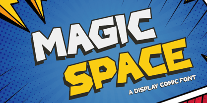 Magic Space is a Playful Comic Display Font. Embark on a whimsical journey through the cosmos with "Magic Space," a captivating comic display font that adds an enchanting touch to your designs. There's some connected letters and some alternates that suitable for any graphic designs. This font support for some multilingual. Also contains uppercase A-Z and lowercase a-z, alternate character, numbers 0-9, and some punctuation. If you need help, just write me! Thanks so much for checking out my shop!
 - Long Underwear by Comicraft,
$29.00 Boy, they're everywhere. One of your neighbors is probably one of them, Freaking super-heroes (TM, ©, ®, SM blah blah blah) are more ubiquitous in cities these days than Simon Cowell is on talent shows. Notice how that guy on the subway -- the one with the boy scout haircut? -- see how he keeps his shirt buttoned all the way up? He's not sweating either... that's 'cause he's probably from some dead planet that exploded twenty years ago. His REAL parents wrapped him in blankets and, when he turned 18, his Ma on Earth turned those same blankets into Long Underwear for her foster son. He's probably wearing his long underwear right now. That's why he's smiling at you through his horn rimmed glasses. He thinks you don't know. Thinks he's special. Thinks he's a super-hero (TM, ©, ®, SM blah blah blah). Ain't that Super?
 - Graublau Slab Pro by FDI,
$49.00 Graublau Slab is the latest addition to the popular Graublau type family designed by the Berlin-based type designer Georg Seifert. Since its release in 2008, the Graublau Sans Pro typeface has been a popular choice for corporate designs, books, magazines, websites and much more. With Graublau Slab Pro, the type family becomes even more versatile. With its contemporary and expressive design, it’s perfect for editorial design, web headlines or any other text use, that should really draw the reader’s attention. And since Graublau Slab Pro comes in the exact same 7 weights as Graublau Sans Pro, both typefaces work together perfectly.
 - Tarte Tatin by Hanoded,
$15.00 A Tarte Tatin is a French upside down apple pie. The story goes that one of the Tatin sisters (who ran Hôtel Tatin in Lamotte-Beuvron 169 km south of Paris), was baking a regular apple pie, but put the apples first and, realising her mistake, tried to rescue the dish by adding the pastry and sticking it in the oven. Tarte Tatin is a really nice all caps font. It was made with a Japanese brush pen on rough paper. Tarte Tatin comes with extensive language support and a set of alternates for the lower case letters.
 - Kaizen by Colllab Studio,
$9.00 Presenting Kaizen! A Bold Handbrush Font in 2 Versions. This font made with the perfect combination of each character. You can combine with Extra to get a unique combination. It looks original and can be used for all your project needs. Each glyph has its own uniqueness and when meeting with others will provide dynamic and pleasing proximity. This font can be used at any time and in any project. You can see in the presentation picture above, Kaizen looks unique and Japanese style on design projects. So, Kaizen can't wait to give its touch to all your design projects such as quotes, poster design, personal branding, promotional materials, website, logotype, product packaging, etc. WHAT'S INCLUDED? 1. Kaizen Version One (Solid) • The first version comes with uppercase, lowercase, ligatures, numeral, punctuation, symbols, and Standard Latin Multilingual Support (Afrikaans, Albanian, Catalan, Danish, Dutch, English, French, German, Icelandic, Indonesian, Italian, Malay, Norwegian, Portuguese, Spanisch, Swedish, Zulu, and More). 2. Kaizen Version Two (Inline texture) • The first version comes with uppercase, lowercase, ligatures, numeral, punctuation, symbols, and Standard Latin Multilingual Support (Afrikaans, Albanian, Catalan, Danish, Dutch, English, French, German, Icelandic, Indonesian, Italian, Malay, Norwegian, Portuguese, Spanisch, Swedish, Zulu, and More). 2. Extra Swashes • Included 6 Underline Swashes. You can feature all with typing c_1 until c_6 (in both versions) A Million Thanks Colllab Studio
 - De Floras by Dikas Studio,
$15.00 Hello, let me introduce my font called de Floras - 5 Fonts Family. de Floras is a lovely and beautiful script typeface that designs manually by hand and love. de Floras comes with 5 weight, light, regular, semi bold, bold and extra bold. de Floras comes with a beautiful start and end swash that made who look for the first time is falling in love. Very suitable for designing wedding cards, birthday cards, invitation, greeting, and many more.
 - Quinella by Eclectotype,
$40.00 Plumper than a misguided Z-lister's dodgy lip job, this is Quinella, named after the cheffy scoops of ice cream and the like, quinelles. It's a cute, fat script with a seventies vibe but a personality all of its own. It's non-connecting in the usual sense, but the letters overlap to make the white space as tiny as possible. Ligatures (standard and discretionary) make smoother solutions for quite a few pairs and trios, and every upper case letter has a more exuberant swash alternate. The contextual alternates feature substitutes in an alternate t for a better fit with certain letters. Fonts don't come much more voluptuous than this. The full-fat, creamy appearance makes it perfect for food packaging, but don't let it end there; it'll make memorable logos, unmissable headlines, and posters with more punch.
 - Ongunkan Old Turkic by Runic World Tamgacı,
$50.00 Orkhon inscriptions (Orkhon inscriptions, Orkhon inscriptions, Khöshöö Tsaidam monuments (also known as Khoshoo Tsaidam, Koshu-Tsaidam or Höshöö Caidam) or Kul Tigin steles (simplified Chinese: 阙特勤碑; traditional Chinese: 闕特勤碑; pinyin: Què tèqín bēi )) They are two monumental installations written by the Göktürks in the Old Turkic alphabet in the Orkhon Valley in Mongolia at the beginning of the 8th century. They were erected in honor of two Turkish princes Kül Tigin and his brother Bilge Kagan. Both Chinese and Old Turkish inscriptions describe the legendary origins of the Turks, the golden age of their history, their subjugation by the Chinese and their liberation by İlteriş Kağan. According to one source, the inscriptions contain "rhythmic and parallel passages" similar to those of epics. In the Old Turkish Alphabet, 38 letters are accepted academically and this pattern is generally used in the books. But there are more than 38 letters in this alphabet, these special letters are included in this font.
 - Galavant by Atlantic Fonts,
$32.00 Galavant will take you anywhere you want to go! Enjoy three font looks in one; a fun, chunky lower-case, a bold, animated upper-case, and in all-caps with discretionary ligatures turned on, Galavant is tightly interlocking. To explore the interlocking possibilities, turn some ligatures off and others on until you settle on the best combo. There are over 260 two, three, and four-letter ligatures available. Discover interlocking ligatures featuring lower-case "i" along the road as well. In sentence-case, turn discretionary ligatures off, except to add more handmade variation in double-letter pairs and to access a fine "ft". However you roam, Galavant aims to entertain.
 - Kaligane by ArimaType,
$18.00 Kaligane is a type family designed with passion. A geometric typeface, first designed in a muscular black weight with a high-powered dynamic typographic aesthetic used in various communications, and later developed in a lighter weight where the shape exhibits some vintage-inspired proportions. With these diverse influences, typefaces allow for the use of impressive displays and effective logo designs as well as the use of more subtle editorials in body text - with a natural inclination for effective and powerful advertising. Sports typography typically uses italics for added dynamism and impact, and Kaligane complies by offering a choice of three alternative italic shapes with different slants.
 - Glober by Fontfabric,
$39.00 The Glober font family includes 18 weights - nine uprights with nine italics. It is characterized by excellent legibility in both - web & print design areas, well-finished geometric designs, optimized kerning, excellent web-font performance and legibility etc. Inspired by the classic grotesque typefaces - Glober has his own unique style in expressed perfect softened geometric forms. The font family is most suitable for headlines of all sizes, as well as for text blocks that come in both maximum and minimum variations. Glober font styles are applicable for any type of graphic design in web, print, motion graphics etc and perfect for t-shirts and other items like posters, logos.
 - Samman by Eyad Al-Samman,
$- Samman is a Kufic simple Arabic typeface. It can be used to decorate public signs in streets, airports, hospitals, schools, malls, hotels, mosques, and other public places. My family's surname is "Samman" which stands for the person who sells fat especially the one produced by cows ("Samn" in Arabic). Consequently, "Samman" Typeface was designed for eternizing the memory of my family. The main characteristic of "Samman" Typeface is the leaf-shaped style for some of its Arabic characters such as "Dad", "Sad", "Faa", "Meem" and others. The distinguishing artistic design of its "Haa" character adds a unique feature to this typeface especially when connected with other characters. The shape of the characters' "dot", "dots", and "point" is innovative; a triangle with a semi-circle shape. "Samman" Typeface is suitable for books' covers, advertisement light boards, and titles in magazines and newspapers. Its characters' modern Kufic styles give the typeface more distinction when it is used also in posters, greeting cards, covers, exhibitions' signboards and external or internal walls of malls or metro's exits and entrances. It can also be used in titles for Arabic news and advertisements appeared in different Arabic and foreign satellite channels.
 - Linotype Typo American by Linotype,
$29.99Mark Stanczyk designed Linotype Typo American in 1999. The font is an excellent revival of American style typewriter type. As most of us can remember from our childhood years, or through old stories and movies, everyone used to type with typewriters before the invention of computers. Unlike computers, most individual typewriters only had one typestyle, or font, to chose from. To make matters worse, the letters in a typewriter font would wear down with use. Over time, text typed out on a typewriter would look more and more corroded, old, and uneven. Stanczyk has captured exactly these features in this “revival” font! Also like most older typewriter styles, Linotype Typo American’s letters are all mono-spaced, i.e., the letter i is the same width as the letter w. Typewriter letters also all tended to be cast in the same size, around 12 points or so. When using typewriter-style fonts, it is best to keep setting your text in similar sizes. (Of course, you can set really large and fun headlines with Linotype Typo American, too; if anything the unevenness of the design will come even more across in these applications.) - Charliena by Queenop Studio,
$12.00 Charliena - Signature Script Font Proudly Present The New "Charliena // Signature Script Font" Charliena is signature scripts font, this font come with beautiful ligature and lovely alternate. Charliena has a very beautiful stroke and will be very suitable if applied to wedding projects, invitations, fashion, and much more. Feature and what will you get: Uppercase and lowercase Number and punctuation Beautiful ligature Lovely alternate PUA Encoded and multilingual support I really hope you enjoy it please do let me know what you think, comments & likes are always hugely welcomed and appreciated. More importantly, please don’t hesitate to drop me a message if you have any issues or queries. Thanks & Congratulations on the Design.
 - Bristhony by Queenop Studio,
$12.00 Bristhony - Modern Calligraphy Script Font Proudly Present The New "Bristhony // Classy Calligraphy Font" Bristhony is modern classy calligraphy font, this font come with beautiful ligature and lovely alternate. Bristhony has a very beautiful stroke and will be very suitable if applied to wedding projects, invitations, fashion, and much more. Feature and what will you get: Uppercase and lowercase Number and punctuation Beautiful ligature Lovely alternate PUA Encoded and multilingual support I really hope you enjoy it – please do let me know what you think, comments & likes are always hugely welcomed and appreciated. More importantly, please don’t hesitate to drop me a message if you have any issues or queries. Thanks & Congratulations on the Design.
 - Instabread by Motokiwo,
$12.00 Instabread, a bold script font that is suitable for headline, logotype, apparel, invitation, branding, packaging, advertising etc. This typeface is comes in uppercase, lowercase, large range of punctuation, symbols & numerals, contextual alternates and ligatures, also support multilingual.
 - Aisling by VP Creative Shop,
$15.00 Introducing Aisling - Creative Display Typeface loaded with 6 fonts Aisling is long, futuristic typeface with 6 fonts loaded with ligature glyphs, alternates and multilingual support to enchant your next project. Very versatile fonts that works great in large and small sizes. Aisling is perfect for branding projects, home-ware designs, product packaging, magazine headers - or simply as a stylish text overlay to any background image. Uppercase, lowercase, numeral, punctuation & Symbol Short - Straight and Rounded Regular - Straight and Rounded Long - Straight and Rounded ligature glyphs alternates Multilingual support How to access alternate glyphs? To access alternate glyphs in Adobe InDesign or Illustrator, choose Window Type & Tables Glyphs In Photoshop, choose Window Glyphs. In the panel that opens, click the Show menu and choose Alternates for Selection. Double-click an alternate's thumbnail to swap them out. Feel free to contact me if you have any questions! Mock ups and backgrounds used are not included. Thank you! Enjoy!