10,000 search results
(0.09 seconds)
- Resotho by Glukfonts,
$10.00 Resotho is a geometric sans serif (uppercase) family. It comes in 18 weights, 9 uprights and 9 italics. Perfect for graphic design, branding, packaging design but very versatile. Language support covering Western, South, and Central Europe. The Extralight & Extralight Italic weights are free of charge.
 - Search Party by Hanoded,
$16.00 Search Party is a handwritten font, made with a Sharpie pen. It is a little wild, a little uneven, but legible and perfectly suited to be used in your designs. Comes with extensive language support and a set of alternates for the lower case letters.
 - Chorus by Soneri Type,
$23.00 Chorus is a collective effort to sing in harmony. Similarly, each letter is designed to reflect harmony when used together to form a letter, sentence or paragraph. Letters like B, D, P and R have curved stroke (instead of straight line) while joining vertical stem. Letter K, k, and R have similar disjoint point in middle and unique plus stylish curve at foot. Letter C and G has distinct horizontal cut at top as compared to other letters in typeface e.g. S. Letter like b, h, m, n, and p have consistent stroke joint style with vertical stem. Ink traps in various letters are designed such that they blend with the letter form at certain degree instead, getting emphasised. The family comes in various styles in weight and width.
 - Standard CT by CastleType,
$59.00 CastleType was commissioned in 1991 by San Francisco Focus magazine to digitize three members of the Standard family. This is a Continental lineale that was popular in Switzerland in the 1950s and later in the United States. A cousin to the classic sans serifs, Standard is an alternative that is considerably warmer and a bit more idiosyncratic. In 2008, CastleType released additional members of the Standard CT family to make it a complete typographic solution with three widths (normal, condensed, extended) of four weights each (Regular, Medium, Bold, and Extra Bold). Some of the original Standard fonts, particularly Standard Regular, appear to have been hastily designed (or perhaps too closely imitated Helvetica); these have been greatly improved in the CastleType versions with more harmonious proportions and other refinements. The three lighter weights of the Extended subfamily were designed from scratch based on the new Standard CT Regular and Standard CT Extended Extra Bold. More recently, four light weights (Light, Extra Light, Ultra Light, and Hairline) have been added to each of the three widths. The entire Standard CT family includes support for most European languages, OpenType features, arbitrary fractions, and a collection of geometrics, dingbats & fleurons.
 - AggressIan by Hackberry Font Foundry,
$13.95 AggressIan is the release of the first font I ever drew. It was done by hand with triangle and parallel rule back in the mid-1980s. I originally called it Aggressor, but I never liked it. My local type designer friend, Ian Roberts, really likes this type of drawing and told me I had to release it. So I named it after him. The small caps should work well if you need a bolder version. It has oldstyle and lining figures, plus the small cap figures. I hope you like it.
 - Santa by Typo5,
$12.95Born as a revival of an Egyptian typeface, this hand-drawn typeface is is perfect for headers and even as a body text. It manages to keep the neutrality required for a legible typeface and having slight details that makes it unique. All the details are hand drawn, and it comes in 3 versions: Santa 01 Black, with the original inked look Santa 02 Line, an sketch version of the font, Santa 03 Out, an outline version with subtle different strokes. A Santa Pack is available including all the 3 styles. - Terrified AOE by Astigmatic,
$19.00 Terrified AOE was inspired by vintage horror movie poster titling from the 1960's. It is a Capitals and smallcaps typeface, that really feels like a mix of three typefaces in one. While the Capitals and Smallcaps typesetting works to the effect of the original inspirations, each case also works well amongst itself independently, and having very different vibes. I've always been a huge fan of horror movies, and some of the lettering from vintage horror movie posters are so cool and alive, I only wish there were more of them recreated as display fonts.
 - Sada by Arabetics,
$45.00 Sada is a text font designed with hand held devices and ebooks in mind. Glyphs are designed to be larger than usual and very clear with soft visual characteristics and many traditional Arabic calligraphic transitional features incorporated to improve legibility. The word “sada” means “echo” in Arabic. Even though Sada is a cursive style font it offers clearly distinguished and visually unified letter shapes in every position of a word. Sada supports all Arabetic scripts covered by Unicode 6.1, and the latest Arabic Supplement and Extended-A Unicode blocks, including support for Quranic texts. It comes with three weights, regular, bold, and ultra-light. Each weight has normal and left-slanted “italic” styles. The script design of this font family follows the Arabetics Mutamathil Taqlidi style and utilizes varying x-heights. The Mutamathil Taqlidi type style uses one glyph per every basic Arabic Unicode character or letter, as defined by the Unicode Standards, and one additional final form glyph, for each freely-connecting letter in an Arabic text. Sada includes the required Lam-Alif ligatures in addition to all vowel diacritic ligatures. Sada’s soft-vowel diacritic marks (harakat) are only selectively positioned with most of them appearing on similar lower or upper positions to emphasize they are not part of letters. Kashida is zero width glyph.
 - ITC Magnifico by ITC,
$29.99ITC Magnifico Daytime and ITC Magnifico Nighttime are inspired by nineteenth-century decorated types and letterings. “Although they are designed as display typefaces, their use is not limited to large headings. Usually three-dimensional types are employed in gigantic headings in large posters, but I thought it would be interesting if such decorative types were used as well in small sizes, say at 12 point,” says designer Akira Kobayashi. “There were a few examples of small three-dimensional types used in cards printed in the nineteenth-century. I studied their letterforms carefully and became more and more interested in those small three-dimensional types. The outlines of ITC Magnifico are robust enough to endure use at small sizes. Sometimes the angle or the shape of the 'shadow' had to be slightly modified or even illogical, because the letterforms ought to look as simple as possible. The resulting types are fairly easy to read at small sizes, and I hope that at large sizes those occasional oddities will appear charming.” - Kidy Smile by Illushvara,
$12.00 Kidy Smile is a cute handwritten font. It embodies playfulness and authenticity and is the perfect choice for any children activity or school project. Add this chunky lettered font to your designs and notice how it makes them come alive!
 - Sungar by Twinletter,
$12.00 Introducing Sungar sans serif font. Your customers will be captivated by the unique combination of inspiration, craftsmanship, and style that comes with this new typeface. You’ll get the full power of professional design without the hard work or hefty price tag. Of course, your various design projects will be perfect and extraordinary if you use this font because this font comes with a font family, both for titles and subtitles and sentence text, start using our fonts for your extraordinary projects.
 - Mina by Resistenza,
$39.00 Go back to a time when the Mediterranean coastline was truly glamorous, when stylish women and men in wire-framed glasses listened to Domenico Modugno songs on the radio while sipping wine in sidewalk cafes. A relaxing summer’s day, a gentle sea breeze, taking the time to write a postcard to your loved ones in your best handwriting. The 1950’s may have come and gone, but the elegance and simplicity of that classic style has not, Mina keeps the feel of calligraphy, the long connections between letters is elastic, the clean, thin lines, it is a relaxed cursive ideal for logotypes, titles, and lettering. There are eleven Mina font styles and many loops to choose from to customize any letter. Bring the seaside glamour of a bygone era to your projects of today with Mina. Ranging from light to heavy, Mina Calligraphic, and Mina Shadow, this family of fonts work perfectly separately but you can also achieve beautiful results when combining them. Check out also Mina Chic We recommend to combine Mina with: PestoFresco Turquoise
 - Maestrale by Catharsis Fonts,
$25.00 Maestrale is a paradigm-breaking new take on calligraphy, built around a compact, serif-style core and outrageously long, flamboyant extenders. At large sizes, its confident, charismatic lettershapes are ideally suited for branding and decorative uses, whereas longer texts at smaller sizes naturally weave themselves into a flowing texture. The font comprises 1299 glyphs, including many stylistic alternates, ligatures, small capitals, and initial, terminal, and linking forms, and offers extensive OpenType programming to support them. The calligraphic form of Maestrale is complemented by a matching text font (Maestrale Text) with short extenders, available in three cuts (a serif-style Roman, an upright Cursive, and a tilted Italic). Maestrale is all about the lowercase; its capitals are deliberately understated so as not to steal the limelight. In fact, the font works very well when set exclusively in lowercase. Maestrale�s small capitals are fitted into the core space of the lowercase, allowing them to be freely interspersed with lowercase characters. Alternately, an OpenType feature is available to replace a and e in small-caps text with their lowercase equivalents for a fresh unicase look. Since alternates and ligatures play such an important role, Maestrale offers three different modes of use. The most straightforward approach is simply to start typing using Maestrale Pro � the extensive OpenType programming will ensure that collisions between extenders are avoided and attractive ligatures are substituted for common glyph combinations. A more interactive approach is provided by the font Maestrale Manual, which allows the user to manually select alternate forms and ligatures even in typographically unsavvy applications, such as PowerPoint (as long as standard ligatures are supported). Stylistic alternates are simply represented as ligatures of their base forms with one or more instances of the rarely-used by easily-accessed characters "~" (ASCII tilde) and "`" (spacing grave accent); linking forms are built with �_� (underscore), multi-character ligatures with "|" (pipe), and initial and terminal forms with the �less than� and �greater than� characters. For instance, the Maestrale wordmark in the posters above was simply typeset with the string (`ma`est|r_a```l```e)| in Maestrale Manual (The parentheses represent �less than� and �greater than� characters here.) Feel free to type this string into the test line below and see what happens! Make sure Standard Ligatures are enabled. An instruction sheet listing all alternate forms and their accessibility is available from the Gallery tab on this page. The third mode of usage is aimed at professional designers, who make use of sophisticated software with extensive OpenType support. These power users are advised to use the font Maestrale Pro again, where all glyphs are accessible as stylistic alternates. Maestrale Text is a less extravagant but more versatile variation on the design of Maestrale, replacing Maestrale�s swashes with efficiently compact extenders. It is intended to serve as a perfectly matching text companion to Maestrale calligraphy, but constitutes a full-fledged typeface in its own right. It is equally at home at display sizes as it is in pull quotes, titles, and high-impact blocks of text. Maestrale Text comes in three complementary faces: A serif-style Roman, an upright Cursive, and a tilted Italic. Maestrale is the Italian word for �masterful�. It is also the traditional Italian name for the northwesterly mediterranean wind, better known by its French name, Mistral. Acknowledgements: I am grateful to the helpful souls on the Typophile forums for extensive feedback and encouragement on Maestrale, and to the TypeDrawers forum for feedback on Maestrale Text. This font is dedicated to Simone.
 - Psych Handlettering by Mysterylab,
$14.00 Here's a font system distilled from the lettering styles of a thousand vintage psychedelic rock albums and posters from the swingin' sixties. All of the grooviness, but perhaps twice the legibility of some of the more "far out" examples from the genre. This family features an extensive character set and multilingual glyphs, so you can say "Trippy, Man." in many languages. The three versions allow you to harmonize letter bodies and highlight strokes with the color palette of your project Once loaded on your system, the three versions of the font show in your menu as the following three "weights": Psych Handlettering Bold, Psych Handlettering Incised, and Psych Handlettering Highlight. The 3-alphabet collection works together seamlessly to allow you to assign one color to the body of the letter, and a second color to the inset highlight lines. Just copy your text block, paste in place, reassign the font to the "highlight" version, choose a complimentary color, and off you go.
 - Just Lovely by Nicky Laatz,
$15.00 Say hello to Just Lovely!—a flirty and sleek dry-brushed font family, with a big personality and a multitude of letter variations to make your design look uniquely hand-lettered. Just Lovely comes with a stylistic set of uppercase letters, 3 sets of lowercase stylistic alternates, and realistically created standard ligatures to ensure you get the look you are after. To top it all off, Just Lovely comes with a complimentary dingbat font with a set of 62 swashes, catchwords, and doodles to bring your type designs to life! Just Lovely comes in various styles—Regular, Slanted, and Wide Slanted—each with its own unique personality to suit the style you need for your design.
 - Lota Grotesque by Los Andes,
$29.00 Lota Grotesque was designed by Daniel Hernández with the collaboration of Rodrigo Fuenzalida and Latinotype Team in digital editing. The family comes in 7 weights with matching italics and includes alternative versions that provide high versatility and functionality. The whole font family is composed of 4 subfamilies that share exactly the same number of characters and styles but with differences in programming and default characters. Lota Grotesque contains a 760-character set that supports 219 languages and includes alternative characters, discretionary ligatures, small caps, and a variety of figures and fractions—a wide range of typographic tools to meet different design needs.
 - Korolev Rough by Device,
$39.00 Korolev Rough is an inky, distressed version of Korolev , designed to mimic vintage letterpress, photocopies or hot metal on rough paper. A 20-weight sans serif family based on lettering by an anonymous Soviet graphic designer from the propaganda displays at the Communist Red Square parade in 1937, it has been named in honor of Sergey Pavlovich Korolyov, or Korolev, considered by many to be the father of practical astronomics. Every weight and style comes with an alternate double-story “a”. The complete Korolev family includes standard, italic, condensed, and compressed versions, each in five weights.
 - Thankmom by Stefani Letter,
$12.00 Thankmom is a stylish font that incredibly exudes elegance and class. Incredibly versatile, this font fits a wide pool of designs, elevating them to the highest levels. Thankmom comes with alternate, titling, swashes, and ligatures for fully customizable designs. This font is PUA encoded which means you can access all of the glyphs and swashes with ease!
 - ASTYPE Ornaments Christmas A2 by astype,
$28.00 Christmas A2 uses the following OpenType features to set up to four different color layers. - Superscript/Superior (Trees) - Subscript/Inferior (Stars) - Numerator (Candles) - Denominator (Light, Bells) Note: Due to the complexity of some parts of the font, some printers may have problems of rendering it smoothly. To avoid this problem you should always outline the font data for the final documents. On lower systems turn font antialiasing off for faster screen redrawings.
 - ASTYPE Ornaments Christmas A by astype,
$28.00 Christmas A uses the following OpenType features to set up to four different color layers. - Superscript/Superior (Trees) - Subscript/Inferior (Stars) - Numerator (Candles) - Denominator (Light, Bells) Note: Due to the complexity of some parts of the font, some printers may have problems of rendering it smoothly. To avoid this problem you should always outline the font data for the final documents. On lower systems turn font antialiasing off for faster screen redrawings.
 - FF Info Pict by FontFont,
$62.99 Erik Spiekermann, working in collaboration with Ole Schäfer, originally designed FF Info® Display for use in the context of wayfinding systems. The variants FF Info™ Text and FF Info™ Correspondence were developed later for text setting and office communication. FF Info Display The sober and clear forms of the sans serif FF Info Display have been deliberately molded to make them perfect for use on wayfinding systems. The font by Ole Schäfer and Erik Spiekermann not only takes the problem of lack of space into account - it is some 15% narrower than comparable typefaces - the characters have also been designed to ensure they remain legible even in adverse conditions for reading. As text on signs often contains words with which readers are unfamiliar and which are thus deciphered letter for letter rather than perceived as whole words, it is essential to provide for a clear differentiation between glyphs. Additional serifs on the lowercase "i" and uppercase "I" and a small arch on the terminal of the lowercase "l" ensure that it is possible to readily discriminate between these particularly problematic letters. Moreover, sharp corners on glyphs can also make it difficult to read signs with backlighting or when driving past. The rounded corners of FF Info Display counteract this effect and make sure that the character forms remain well defined.FF Info Display is available in five carefully coordinated weights, from Regular to Bold. In the corresponding italic variants, the letters appear overall more rounded while the lowercase "a" has a closed form and the "f" has a descender. Also included among the glyphs of FF Info Display are several ligatures and arrow symbols. Pictograms with different themes that complement the typeface are also available in four weights. FF Info Text Thanks to his know-how gained through designing other typefaces, Erik Spiekermann became aware that fonts created for use in problematic environments can be used in many different situations. In smaller point sizes, FF Info Display cuts a fine figure when used to set longer texts. So Spiekermann carefully reworked FF Info Display to produce FF Info Text, a font perfected for use in this context. Not only can the characters be more generously proportioned, certain features, such as additional serifs to aid with the differentiation of problematic letters, are also no longer necessary in textual surroundings. The upright styles have a double-story "g" while Spiekermann has added oldstyle figures and small caps. FF Info Correspondence FF Info Correspondence has also been designed for setting block text although it recalls the style of old typewriter characters and is specifically intended for use in office communication. The characters of this third member of the family are thus more formal, without rounded terminals but with rectangular punctuation marks. The narrower letters are provided with large serifs to give them more space although, at the same time, this reduces the differences in terms of letter width among the alphabet. In contrast with its two siblings, FF Info Correspondence has only three weights, each with corresponding italic.The three styles of the FF Info super family cover an extensive range of potential applications. If the different kerning is adjusted manually, the three styles harmonize happily with each other and can be readily used in combination to set, for example, headlines and texts and also creative display options.
 - KnewFont by Ingrimayne Type,
$9.95 KnewFont simulates neat and meticulous hand printing. Its letters slant left and come in five weights.
 - Fat Marker by Kraken,
$10.00A rough and ready typeface created from a series of doodles that comes in uppercase only. - Amazed Breath by Almarkha Type,
$29.00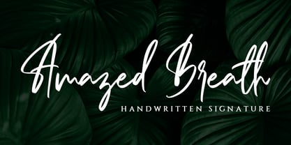 Amazed Breath is a classy script font that comes in Regular and Slant. Inspired by luxury, this font will look classy and awesome in many ways in your latest project. Amazed Breath is perfect for logos and branding, photography, invitations, watermark, advertisements, product designs, stationery, wedding designs, labels, product packaging, special events or anything that needs a handwritten taste.
 - Carouge Pro by André Simard,
$14.00 Carouge Pro is a contemporary typeface with a classical twist. This duality gives Carouge an energetic and vivid sensibility. Its subtle shapes are highly suitable for all types of documents, including corporate collateral and publicity literature. The fineness of the types provides a pure and elegant style that is highly valued in the fashion and design industry. While extremely legible in small body sizes, its personality comes into full bloom when used in large type sizes. Carouge comprises a wide range of bold fonts, from Ultra Thin to Ultra. The italic companion of the roman type has a split-line allure with a rounded personality. Carouge Pro is available in eight weights from the UltraThin to an Ultra Black. Each weight is also supported by a strong personality cursive italic. “When I designed Carouge, I wanted to create a typeface with a sober appearance and a dash of audacity. Carouge provides a fine balance between two different worlds.” — André Simard Carouge Pro is a contemporary typeface with a classical twist. This duality gives Carouge an energetic and vivid sensibility. Its subtle shapes are highly suitable for all types of documents, including corporate collateral and publicity literature. The fineness of the types provides a pure and elegant style that is highly valued in the fashion and design industry. While extremely legible in small body sizes, its personality comes into full bloom when used in large type sizes. Carouge comprises a wide range of bold fonts, from Ultra Thin to Ultra. The italic companion of the roman type has a split-line allure with a rounded personality. Carouge Pro is available in eight weights from the UltraThin to an Ultra Black. Each weight is also supported by a strong personality cursive italic. “When I designed Carouge, I wanted to create a typeface with a sober appearance and a dash of audacity. Carouge provides a fine balance between two different worlds.” — André Simard
 - ZT Yaglo by Khaiuns,
$16.00 ZT Yaglo is a dynamic and expressive display font, from the first impression you may have noticed that this font is a fishing rod-like concept, with a consistent rhythmic curve that gets sharper at the ends. The ZT Yaglo typeface is framed in a sans theme and added a serif feel to produce a bold, geometric typeface in all thicknesses. ZT Yaglo mixes a simple sans style for extra bold serif energy with the feel of calligraphic shapes. The thicker your choice of style, the more striking the flow of changes in shape becomes spiky. ZT Yaglo is a cool alternative for you to create branding projects, Logo designs, Apparel Branding, product packaging, magazine headers or just as a stylish text overlay onto any background image. ZT Yaglo has 9 Styles, 1 Free for Commercial, and one Variable font. each face has 457 glyphs. Includes Standard Ligature, and the "&" character has an alternate letter in each Weight. I hope you have fun using ZT Yaglo. Thanks for using this font ~ Khaiuns X zelowtype
 - Absentia Slab by DR Fonts,
$19.00 Conceived as a slab serif companion to the Absentia Sans family, this typeface complements its sibling with charisma and style. Built on the same geometric framework, they combine and harmonize gracefully. Yet Absentia Slab stands on its own as a novel alternative to conventional options. Anchored by blocky serifs, it presents an appearance of stability and steadiness. Its audacious design integrates unique features such as vertical terminals in glyphs ‘a’, ‘e’ and ‘6’. To make optimal use of available space, one-sided serifs (and in some cases, simple strokes without any serifs) help maintain an airy, uncluttered footprint as seen in letters ‘m’, ‘E’ and ‘N’. This forward-looking typeface is well suited for a variety of projects: understated yet spirited, technical yet welcoming. It has a modernist appeal, while reminiscent of XIXth Century woodblock lettering. Designed by Daniel Robichaud, Absentia Slab is available in ten weights with matching italics and two variable fonts.
 - Novecento Sans by Synthview,
$- This is of Novecento Sans, a font family inspired by European typographic trends between the second half of 19th century and first half of the 20th. It looks rational and geometric. However, it is optically corrected and balanced. NEWS: you can add a layered effect with Novecento Carved as top layer. This font face is designed to be used mostly for headlines, visual identities or short sentences, both in big and small sizes. Lighter faces provide a more contemporary and design look and feel, while the bolder ones definitely look retro. Novecento Sans family comes in 32 styles, speaks 76 latin based languages, has 590 glyphs and 16 stylistic opentype features for advanced typography.
 - FF Milo by FontFont,
$83.99 American type designer Michael Abbink created this sans FontFont between 2006 and 2008. The family has 9 weights, ranging from Thin to Black (including italics) and is ideally suited for advertising, packaging, book text, editorial, publishing, logo, branding, small text as well as wayfinding and signage. FF Milo provides advanced typographical support with features such as ligatures, small capitals, alternate characters, case-sensitive forms, fractions, and super- and subscript characters.It comes with a complete range of figure set options – oldstyle and lining figures, each in tabular and proportional widths. In 2011, FF Milo received the Letter.2 award. This FontFont is a member of the FF Milo super family, which also includes FF Milo Serif.
 - Glamsy by Krafted,
$10.00 Wish to give your design that vintage and classy look? Great fonts inspire emotion, and choosing the right one will push your brand in the right direction. Introducing Glamsy - A Vintage Modern Font. From merch and printed materials to websites and social media campaigns, Glamsy is ready for any project. Try it out and see the impact that a chic font can make. What you’ll get: Multilingual & Ligature Support Full sets of Punctuation and Numerals Compatible with: Adobe Suite Microsoft Office KeyNote Pages Software Requirements: The fonts that you’ll receive in the pack are widely supported by most software. In order to get the full functionality of the selection of standard ligatures (custom created letters) in the script font, any software that can read OpenType fonts will work. We hope you enjoy this font and that it makes your branding sparkle! Feel free to reach out to us if you’d like more information or if you have any concerns.
 - Luxyna by Krafted,
$10.00 Wish to add a touch of luxury to your design? A deluxe font will transform the way people see your brand. Introducing Luxyna - a Luxury Serif Font. A perfect blend of luxury and modern spirit, Luxyna will appeal to all audiences, young and old. Best of all, it works great on both the web and in print. Give it a go and see how the right font choice improves your image. What you’ll get: Multilingual & Ligature Support Full sets of Punctuation and Numerals Compatible with: Adobe Suite Microsoft Office Keynote Pages Software Requirements: The fonts that you’ll receive in the pack are widely supported by most software. In order to get the full functionality of the selection of standard ligatures (custom-created letters) in the script font, any software that can read OpenType fonts will work. We hope you enjoy this font and that it makes your branding sparkle! Feel free to reach out to us if you’d like more information or if you have any concerns.
 - Infusion by Andinistas,
$39.00 Infusion is a type family designed by CFCG & Fabio Godoy for andinistas.net. The creative process of Infusion evolved throughout a myriad of experiments supported by my font gluten This is why its expressivity comes from the addition and subtraction of its parts by mixing and combining, resulting in a great variety and new versatility of uppercase, lowercase, multiple and different numbers to be applied at the beginning, middle or end of the word. Infusion is used to write sentences in craft contexts that require organic graphic design, with meticulous imperfect look. Infusion offers typographic solutions out of the limits, or out of borders that divide the mechanics of the drawn by hand. Infusion has 6 decorative and legible fonts to write casual messages with organic, friendly and natural personality. Infusion “Script, Mix, Roman, Shadow, Extras, Dingbats” contain unconventional visually appealing ideas to work independently or in group in the design of logos, packaging, presentations, headlines or editorials.
 - Gopetter by HansCo,
$12.00 Gopetter is a casually and quickly handwritten brush script. Letters are made with procreate brush pen on ipad. Then scanned and carefully drawn into vector format. There is just a right amount of texture left so it looks good in small and big sizes. These elements gives modern, clean and elegant. Gopetter font has five sets include with swashes to give some variation for your project. Some projects that are suitable for this font include quotes, invitations, menus, taglines, flyers / posters and many others. Enjoy!
 - Girly Heart Script by Rotterlab Studio,
$10.00 Girly Heart Script: A sweet hand lettered font, casual and dynamic with a dancing baseline. Also available Platipus Sans & Ornaments to help you mix and match it to fit your creative work in harmony. All this to add an authentic touch to your designs. Girly Heart Script is perfect for Branding, Logos, Greeting Cards, Wedding Stationery, Quotes etc. It comes with a handy set of Opentype Stylistic Alternates, Ligatures and multiple language support. To enable the OpenType Stylistic alternates, you need a program that supports OpenType features such as Adobe Illustrator CS, Adobe Indesign & CorelDraw X6-X7, Microsoft Word 2010 or later versions. PUA Unicode. Mac users can use Font Book and Windows users can use Character Map to view and copy any of the extra characters to paste into your favorite text editor/app. Thanks so much for looking, I really hope you enjoy it and please don't hesitate to drop me a message if you have any issues or queries .
 - Hokuba Grabs by Afkari Studio,
$15.00 Hokuba Grabs - New Fun Display Font Hokuba Grabs is a New display font that creates with a very good concept and adjusted well to keep the legibility. Hokuba Grabs Display Font Comes with upper and lowercase Standard Characters, Punctuation, Numerals, And other Glyphs variation of the OpenType features/ Ligatures. Hokuba Grabs Display Font is suitable for logos, posters, school flyers, university banners, modern advertising design, product labels, cartoons, comics, kid books, custom mugs, pillows, t-shirts, youtube thumbnails/covers, subtitles, poster quotes, editorial design, book/cover Title, website/blog, social media post, packaging designs, and other designs. Features; - 2 Styles; Regular and Outline - Special Alternates - Uppercase, Lowercase, Number, and Punctuation - Works on PC & Mac - Simple installations - Accessible in Adobe Illustrator, Adobe Photoshop, Adobe InDesign, even work on Microsoft Word - Fully accessible without additional design software. - Mültîlíñgúãl Sùppört for; ä ö ü Ä Ö Ü ß ¿ ¡ Hope you enjoy our font and this font is useful font for your projects!
 - 99 Names of ALLAH Straight by Islamic Calligraphy75,
$12.00 We have transformed the “99 names of ALLAH” into a font. That means each key on your keyboard represents 1 of the 99 names of ALLAH Aaza Wajal. The fonts work with both the English and Arabic Keyboards. We call this Calligraphy "Straight" because of the straight like design. Everything is clear, symmetric and straight. The first "Alef" has a "fatha", this indicates to pronounce the first letter. So instead of saying "R-RAHMAAN" you say "AR-RAHMAN" (in the zip file you will find a pdf file explaining the differences in the "harakat", pronunciation and spelling according to the Holy Quran). We went for the traditional "soukoun" instead of the Quranic "soukoun" & the decorative symbols are at a minimum. Decorative letters used in this calligraphy: "Mim, Aain, Sin, HHe, He & Kaf". Purpose & use: - Writers: Highlight the names in your texts in beautiful Islamic calligraphy. - Editors: Use with kinetic typography templates (AE) & editing software. - Designers: The very small details in the names does not affect the quality. Rest assured it is flawless. The MOST IMPORTANT THING about this list is that all the names are 100% ERROR FREE, and you can USE THEM WITH YOUR EYES CLOSED. All the “Tachkilat” are 100% ERROR FREE, all the "Spelling" is 100% ERROR FREE, and they all have been written in accordance with the Holy Quran. No names are missing and no names are duplicated. The list is complete "99 names +1". The +1 is the name “ALLAH” 'Aza wajal. Another important thing is how we use the decorative letters. In every font you will see small decorative letters, these letters are used only in accordance with their respective letters to indicate pronunciation & we don't include them randomly. That means "mim" on top or below the letter "mim", "sin" on top or below the letter "sin", and so on and so forth. Included: Pdf file telling you which key is associated with which name. In that same file we have included the transliteration and explication of all 99 names. Pdf file explaining the differences in the harakat and pronunciation according to the Holy Quran. Here is a link to all the extra files you will need: https://drive.google.com/drive/folders/1Xj2Q8hhmfKD7stY6RILhKPiPfePpI9U4?usp=sharing
 - Serenus by Eurotypo,
$28.00 Serenus is a new cursive typeface whose main characteristic is the dynamism of its spontaneous and agile “ductus”, with a subtle difference in thickness that gives it elegance and presence. This font comes with a condensed version that can be used for more extensive texts. Both fonts are enriched with OpenType features, Serenus has a total of 612 characters, in OpenType format, such as Stylistics Alternatives, Swashes, Ligatures, stylistic sets. To this, we add a support of central European language to adjust your design. Enabling them makes it possible to create beautiful and elegant typographic designs. Make sure you open up the OpenType panel in Illustrator, Photoshop, and InDesign (or any OpenType compatible application) or the character map to make use of all of those features. With virtually endless ways to personalize its use, Serenus helps you to design invitations, greeting cards, logos, business cards, fashion magazines, food, packaging and menus, book covers, websites and whatever your imagination!
 - Halloween Island by Letterara,
$12.00 Halloween Island is a unique and bold lettered decorative font. This font comes with cool extras. Add it to your creative Halloween-themed ideas and notice how it makes them stand out! This font is PUA encoded which means you can access all of the glyphs.
 - Mr Palker by Letterhead Studio-YG,
$35.00 A slab serif Mr Palker and grotesque Mr Palkerson build one superfamily together. These are blank types. In a way even the display ones. Typefaces for newspapers, announcements, cheap advertising and police posters. Mr Palker and Mr Palkerson will turn every language into a fence. And due to six types of faces one can choose what material should the fence be made from — from Thin steel rods to the Black stone blocks. In their simplest appearance Mrs P&P are intended for the solid blank composition in victorian or industrial style. They are quite decent, a bit old-fashioned slab serif and grotesque with closed aperture. All my types have layers. Walker and Palkerson also do. Besides the standard set of symbols, they have 4 add-ons. 1. Alternate glyphs, including unicase ones. 2. Ligatures with A letter. 3. Extra tall small caps. 4. Two-storey ligatures. All this options are intended for the complex composition. The additional letters are rather eccentric as their main function here is to imitate the victorian oddities. Imitate, parody, just not repeat. There are lower-case As and Es in the set in height of small caps and uppercases. They can turn every writing into the unicase. The lower-case A (as well as uppercase and small caps version of it) has deliberately by my taste grown a ludicrous tail. To compensate it I’ve built all the possible ligatures - ад, ал, ая. There are 35 of this ligatures all together. Take a closer look at the Russian letters D, L, K, Ya from the main set as well as their alternates. The additional glyphs are one more comic than the other — on purpose to imitate (not to repeat!) the victorian set. This sets have lowercase numbers. And small caps numbers as well. What a modern typeface without them. They also have an У-letter with a generously curvy tail. As if before the WWI. The Latin of course has alternates as well. It has letters to make the perfect French sound more like the russian provincial version of it. The tails of Js and Ts can be made a little bit more open — or a little bit closed. My favorite feature here, an invention of a kind - extra tall small caps. It allows to compose logos with the small caped uppercases directly from the keyboard. The small caps of this typefaces are usually much taller than the customary ones. This is the kind of small caps that Palker and Palkerson have. More to that, the strokes’ weight and the letters width are corresponded to the uppercases. Just a ready set for making a logo a la 1913 style. With a unicase, one has to mind! One more trick with the tall small caps is a possibility to make them work like lower uppercases. Their height is just in between of lower- and uppercases. Isn’t it great to have an additional set of uppercase working ponies in stock for the case of emergency. And finally — the trademark of Palkers family, two-storey ligatures. They are made in the height of uppercases and turn every writing into an ornament or a puzzle of a kind, while at the same time making them much shorter. Each face has 90 of them. Mainly those are twins: CC, BB, DD and so on. ll this things are for the unhasty compositing, even for lettering. Which means that for the things which are not there you always should have Command+Option+O and some patience. Also — among the two storey ligatures one also can find some belvedere villas. All my types are glasses from the one kaleidoscope. The P&Ps family was preliminary part of the victorian set, which already has 1 Cents and Clarendorf - optionally one can add Costro, Gordoni, Handy, Guardy, Surplus, Red Ring, Red Square, Babaev to the list. And also Sklad, Odessa, Dreamland, Romb, Platinum - here, at Letterhead’s, every second one is victorian. All together our typefaces can allow one to set advertisement of any kind, even the trickiest one, and compose everything, from the coffee place’s menu to the antiquarian magazine.
 - Mr Palkerson by Letterhead Studio-YG,
$35.00 A grotesque Mr Palkerson and slab serif Mr Palker build one superfamily together. These are blank types. In a way even the display ones. Typefaces for newspapers, announcements, cheap advertising and police posters. Mr Palker and Mr Palkerson will turn every language into a fence. And due to six types of faces one can choose what material should the fence be made from — from Thin steel rods to the Black stone blocks. In their simplest appearance Mrs P&P are intended for the solid blank composition in victorian or industrial style. They are quite decent, a bit old-fashioned slab serif and grotesque with closed aperture. All my types have layers. Walker and Palkerson also do. Besides the standard set of symbols, they have 4 add-ons. 1. Alternate glyphs, including unicase ones. 2. Ligatures with A letter. 3. Extra tall small caps. 4. Two-storey ligatures. All this options are intended for the complex composition. The additional letters are rather eccentric as their main function here is to imitate the victorian oddities. Imitate, parody, just not repeat. There are lower-case As and Es in the set in height of small caps and uppercases. They can turn every writing into the unicase. The lower-case A (as well as uppercase and small caps version of it) has deliberately by my taste grown a ludicrous tail. To compensate it I’ve built all the possible ligatures - ад, ал, ая. There are 35 of this ligatures all together. Take a closer look at the Russian letters D, L, K, Ya from the main set as well as their alternates. The additional glyphs are one more comic than the other — on purpose to imitate (not to repeat!) the victorian set. This sets have lowercase numbers. And small caps numbers as well. What a modern typeface without them. They also have an У-letter with a generously curvy tail. As if before the WWI. The Latin of course has alternates as well. It has letters to make the perfect French sound more like the russian provincial version of it. The tails of Js and Ts can be made a little bit more open — or a little bit closed. My favorite feature here, an invention of a kind - extra tall small caps. It allows to compose logos with the small caped uppercases directly from the keyboard. The small caps of this typefaces are usually much taller than the customary ones. This is the kind of small caps that Palker and Palkerson have. More to that, the strokes’ weight and the letters width are corresponded to the uppercases. Just a ready set for making a logo a la 1913 style. With a unicase, one has to mind! One more trick with the tall small caps is a possibility to make them work like lower uppercases. Their height is just in between of lower- and uppercases. Isn’t it great to have an additional set of uppercase working ponies in stock for the case of emergency. And finally — the trademark of Palkerson family, two-storey ligatures. They are made in the height of uppercases and turn every writing into an ornament or a puzzle of a kind, while at the same time making them much shorter. Each face has 90 of them. Mainly those are twins: CC, BB, DD and so on. ll this things are for the unhasty compositing, even for lettering. Which means that for the things which are not there you always should have Command+Option+O and some patience. Also — among the two storey ligatures one also can find some belvedere villas. All my types are glasses from the one kaleidoscope. The P&Ps family was preliminary part of the victorian set, which already has 21 Cents and Clarendorf - optionally one can add Costro, Gordoni, Handy, Guardy, Surplus, Red Ring, Red Square, Babaev to the list. And also Sklad, Odessa, Dreamland, Romb, Platinum - here, at Letterhead’s, every second one is victorian. All together our typefaces can allow one to set advertisement of any kind, even the trickiest one, and compose everything, from the coffee place’s menu to the antiquarian magazine.