10,000 search results
(0.047 seconds)
- FF Metamorph by FontFont,
$41.99 Austrian type designer Markus Hanzer created this display FontFont in 1994. The font is ideally suited for advertising and packaging, music and nightlife as well as poster and billboards. FF Metamorph provides advanced typographical support with features such as ligatures, alternate characters, and case-sensitive forms. It comes with proportional oldstyle figures.
 - HK Brandal by HK Studio,
$25.00 HK Brandal was designed by Hendi Kusuma, comes in bold weight. They are all uppercase and lowercase, Brutalism Grunge style typeface with slab based form which were inspired by a number of historical music and subculture movement : grunge, brutalism, roughness. Art is the only place you can do what you like. That's freedom.
 - CA Spotnik by Cape Arcona Type Foundry,
$40.00 The initial inspiration for CA Spotnik was the opening title of an early Andrei Tarkovsky movie. There was this very unconventional hand drawn “s” which drew my attention. Despite its strange shape, it felt totally natural in that context. So we made a few screenshots and started to sketch some more letters in order to catch the spirit that attracted us so much. The result is a grotesque typeface with a slight contrast, the proportions are rather wide with a large x-height. The bolder the weight, the wider it gets. In case you find the swirly “s” uncomfortable, there is a standard s included as well. The general atmosphere of the typeface, which could be described as “nerdy but friendly” doesn’t depend on this detail. It’s rather the sum of details derived from the original inspiration.
 - King Tut by Canada Type,
$24.95 King Tut is a restoration and expansion of the original Egyptian Expanded, a single bold face cut in 1850 by Miller & Richard, the famous Edinburgh founders. This aesthetic, though originally issued to help drive simple print advertising of those days, is perhaps the longest lasting genre of typeface. This aesthetic flourished in the later part of the 19th century, helped by the surge of similar faces from England (such as Figgins' Antique 6 and Expanded Antique), and became the defining index of the old American wild west that continues to this very day. King Tut serves up its impact through a balance between the wide, compact letterforms and elegant curvature that manages to come through even in confined areas. The family's weight variety allows for more options in counterspace use as well as precision in the amount of curve definition and contrast needed by the typographer. The lighter weights completely oppose that 19th century boldness and expose the alphabet's skeleton in a strive for simplicity that fits modern applications. With generous language support to boot, King Tut's diverse offerings make it an essential addition to today's designer repertoire.
 - Veranda Poster SG by Spiece Graphics,
$39.00 Veranda Poster was derived from a European art supply manufacturer’s logotype done in the Vienna (Wien) Austria style. This distinctive classic style was used by artists such as Julius Klinger and Willy Willrab in the 1920s. Two new faces have been added to the original version - Veranda Poster Small Caps and Veranda Poster Alternates. Here is an extensive collection of capital and small cap alternates plus a wide selection of figures for almost any use. The contemporary alternate additions have a slightly Russian flavor. The combination of all three styles makes for striking logo and display settings. All three styles are now available in the OpenType Std format. Some additional characters have been added to this OpenType version as stylistic alternates. This advanced feature works in current versions of Adobe Creative Suite InDesign, Creative Suite Illustrator, and Quark XPress. Check for OpenType advanced feature support in other applications as it gradually becomes available with upgrades.
 - Anti by Type Firm,
$39.99 If we look up the definition of the word "grotesque", we find the following: "Odd or unnatural in shape, appearance, or character; fantastically ugly or absurd; bizarre." Following this definition, the design for Anti aims to create an un-compromised version of a grotesque sans-serif – where decorative details live in balance with brutalist shapes. The result is an alphabet with a slightly modernist feeling and an eccentric touch, that work wonders at small sizes. The typeface comes with four weights – light to bold – and features a character set supporting Central and Eastern European as well as Western European languages.
 - Noyh A by Typesketchbook,
$39.00 Noyh A is altered from the form of the original Noyh to give an addition to the Handmade type. It’s delightful being used alone or in combination with Noyh. You may find it on art publications, in fancy cafes, or even on marriage invitation card. Features include Bistro which has rough edge and the smoother edge Cafe with options of texture to add variations to the type. It also comes with Manuscript and Handdrawn designs that match to them and support caption texts. Element and Handdrawn patterns are available to complement the 17 letters of Noyh A.
 - Magazin ST by siquot'types,
$39.99 Magazin ST is powerful but delicate. What fascinated me seeing, a couple of letters, in Bob Roy Kelly's book (American Wood Type:1828-1900) were the little squares in the corners that represent a glow from lighting coming from below and from the right. Such ambiguity excited me and I thought that today with digital resources it wouldn't take long to do it. Seeing it working is excellent. Look In the posters what it is for and the effects it produces, including the sensation of relief.- L.S.
 - Padraig Nua by Tony Fahy Font Foundry,
$25.00 Padraig Nua is a font conceptualized and designed by Tony Fahy. It is a European Celtic font, contemporary to many languages, not just of Europe but of the world. It’s origin is influenced by events in Ireland in the 1960s when it was decided that the uncial letterform should not be used further in Irish schools for the Irish language—Gaelic—and that it should be replaced by the Roman letterform—the Cló Romhanach as it was called afterwards. This happened overnight without any apparent discussion. It probably had a lot to do with Ireland joining the EEC, as the EU was called then. It had a massive effect on the Irish language and culture, in that the distinguishing factor that gave the language it’s identity—the half uncial/uncial fonts that were in use in all school, government and society documentation and merchandise—were lost overnight. No one said how or why. It was just done. To this day, all documentation is bi-lingual in government and Gaelic is taught in schools and universities—and decreed so by the European Union—but the presentation for both languages is the Roman letterform. Throughout the world, there are millions of Irish Americans and Irish Canadians, Irish Europeans, Australian Irish, African Irish and many living in the Middle East and Asia—and this new font—Padraig Nua, will appeal to many of them, visually recalling their roots. No one had thought, in those days, of commissioning a design that might update the Gaelic language to a more contemporary appearance that would keep the cultural nature of it intact with a revised and updated font—at one with Europe, the US and the world. Tony Fahy designed Padraig Nua (New Patrick) to address the problem. It keeps an appearance that lends towards the Gaelic language but steers it in the direction of Roman fonts. Some characters reflect letterforms from the Irish/Gaelic manuscripts and uncial fonts.
 - Julienne by Wiescher Design,
$39.50 Cooks call thinly cut - like matchsticks - vegetables "Julienne". I found that was a fitting name for this very narrow typeface. Julienne Slim is the extreme cut of the two. Personally I do not use narrow typefaces very often, but from time to time they come in handy if there is much text to be crammed into little space. I could make a typeface that was even narrower, but I will not do it. This is as narrow as my typefaces get. Enjoy what I cut for you, Gert Wiescher.
 - Kisik by Kisla,
$19.99 Kisik is a handwritten font. I got a request to put my handwriting into a font, so I decided to take the challenge and design a whole typeface with three different weights (light, regular, bold) and 638 glyphs to cover all 104 Latin languages. This is my first time making a font. Hope you'll enjoy it. I sure did making it. Check out the listing of glyphs if you can use this font in your work. Otherwise don’t hold back writing to tanjagawish@gmail.com and I’ll create them.
 - Beta Dance - Unknown license

- Secret Memories by Flawlessandco,
$9.00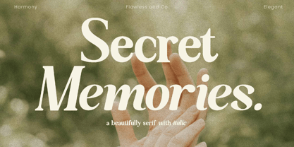 Secret Memories is a Serif Italic Font with a classy and elegant style in each character, so it's fitted for some wedding invitation display. There's some connected letters and some alternates that suitable for any graphic designs such as branding materials, t-shirt, print, business cards, logo, poster, t-shirt, photography, quotes .etc This font support for some multilingual. Also contains uppercase A-Z and lowercase a-z, alternate character, numbers 0-9, and some punctuation. If you need help, just write me! Thanks so much for checking out my shop!
 - Golden Cosmic by Flawlessandco,
$9.00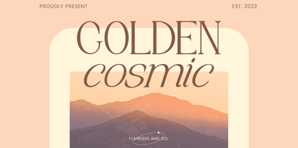 Golden Cosmic is a Serif Italic Font with a classy and elegant style in each character, so it's fitted for some wedding invitation display. There's some connected letters and some alternates that suitable for any graphic designs such as branding materials, t-shirt, print, business cards, logo, poster, t-shirt, photography, quotes .etc This font support for some multilingual. Also contains uppercase A-Z and lowercase a-z, alternate character, numbers 0-9, and some punctuation. If you need help, just write me! Thanks so much for checking out my shop!
 - Mondice by Flawlessandco,
$9.00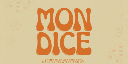 Mondice is a Groovy Retro Font that made with an additional shiny mode in each character, so it's fitted for some retro project. There's some connected letters and some alternates that suitable for any graphic designs such as branding materials, t-shirt, print, business cards, logo, poster, t-shirt, photography, quotes .etc This font support for some multilingual. Also contains uppercase A-Z and lowercase a-z, alternate character, numbers 0-9, and some punctuation. If you need help, just write me! Thanks so much for checking out my shop!
 - Dominic by Flawlessandco,
$9.00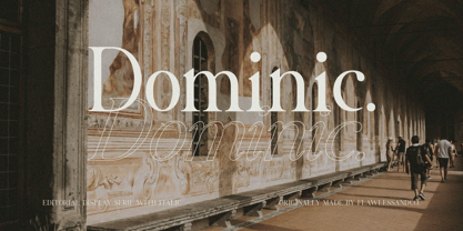 Dominic is a Serif Italic Font with a classy and elegant style in each character, so it's fitted for some wedding invitation display. There's some connected letters and some alternates that suitable for any graphic designs such as branding materials, t-shirt, print, business cards, logo, poster, t-shirt, photography, quotes .etc This font support for some multilingual. Also contains uppercase A-Z and lowercase a-z, alternate character, numbers 0-9, and some punctuation. If you need help, just write me! Thanks so much for checking out my shop!
 - Mothern by Flawlessandco,
$9.00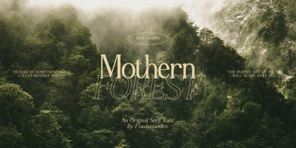 Mothern is a Serif Italic Font with a classy and elegant style in each character, so it's fitted for some wedding invitation display. There's some connected letters and some alternates that suitable for any graphic designs such as branding materials, t-shirt, print, business cards, logo, poster, t-shirt, photography, quotes .etc This font support for some multilingual. Also contains uppercase A-Z and lowercase a-z, alternate character, numbers 0-9, and some punctuation. If you need help, just write me! Thanks so much for checking out my shop!
 - Benogi by Flawlessandco,
$9.00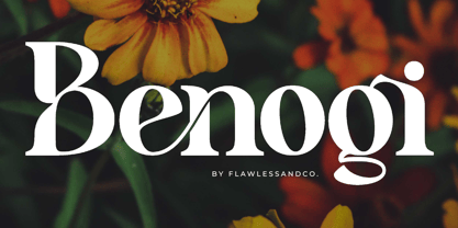 Benogi is a Modern Retro Font with a classy and unique style in each character, so it's fitted for some wedding invitation display. There's some connected letters and some alternates that suitable for any graphic designs such as branding materials, t-shirt, print, business cards, logo, poster, t-shirt, photography, quotes .etc This font support for some multilingual. Also contains uppercase A-Z and lowercase a-z, alternate character, numbers 0-9, and some punctuation. If you need help, just write me! Thanks so much for checking out my shop!
 - Nadier by Flawlessandco,
$9.00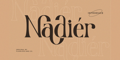 Nadier is a Modern Serif Font that made with a classic style in each character, so it's fitted for some wedding invitation display. There's some connected letters and some alternates that suitable for any graphic designs such as branding materials, t-shirt, print, business cards, logo, poster, t-shirt, photography, quotes .etc This font support for some multilingual. Also contains uppercase A-Z and lowercase a-z, alternate character, numbers 0-9, and some punctuation. If you need help, just write me! Thanks so much for checking out my shop!
 - Renaf by Flawlessandco,
$9.00 Renaf is a Groovy Retro Font that made with an additional shiny mode in each character, so it's fitted for some retro project. There's some connected letters and some alternates that suitable for any graphic designs such as branding materials, t-shirt, print, business cards, logo, poster, t-shirt, photography, quotes .etc This font support for some multilingual. Also contains uppercase A-Z and lowercase a-z, alternate character, numbers 0-9, and some punctuation. If you need help, just write me! Thanks so much for checking out my shop!
 - Frontis by Tipo Pèpel,
$24.00 Inspired by the Roman lettershapes that Asensio y Mejorada drew in 1780, Frontis is a text typeface that takes this reference just as a starting point. The delicate appearance of Neoclassical fonts becomes confidence in Frontis. The characters have a solid skeleton, and the text looks classy in the condensed half of the family. A style that shines especially at display sizes. A collection of vegetal motifs and some stylistic uppercase ligatures complete the character set. These extra shapes serve to frame and bring together all the weights and styles in the type family. The lapidary ligatures and the ornaments underline the 18th-century roots of the design. There is a connection between Frontis and those classic letters that were once engraved on stone. And yet, the design is daring enough to make it a perfect choice for contemporary use.
 - Margot by Eclectotype,
$36.00 Like a lovechild of American Typewriter and Cooper Black, typewritten in melted chocolate, this is Margot. A bold single weight display typeface in roman and italic styles, Margot is boisterous but cuddly; warm but impactful. Margot comes fully loaded with a bunch of esoteric dingbats (grouped in the ornament feature), four figure styles (proportional- and tabular- lining, and proportional- and tabular- oldstyle), a spattering of swash capitals (K, Q and R), stylistic alternates and one discretionary gi ligature in the Roman. Stylistic alternates are split into stylistic sets thus: SS01 - alternate forms for ampersand and asterisk, and # changes to an attractive numero symbol. SS02 - in the Roman, a and g change to single storey versions; in the italic, the ae digraph changes to a less ambiguous double storey version. SS03 - the lining figure 3 gets changed to its alternate form. SS04 - the lining figure 4 gets changed to its alternate form. Margot is perfect for friendly headlines, logos, T-shirts (I love New York, perhaps?), food packaging and videogame apps. Margot gets its name from my equally boisterous and cuddly cat. Enjoy!
 - Quiroga Serif Pro by TipoType,
$29.00 Quiroga Serif began in 2007 with the name Quadratta Serif. This typography was designed for continuous text, legible at medium and small sizes, with great saving of space, optimized for 6, 8, 10 and 12 points. The morphology is a mix between tradition and innovation; it has a vertical axis, thick serifs, tall x-height, light modulation and a lot of internal space between letters: key to improve legibility at small sizes. Formally, my idea was to make a serif type that had a unique color, this is visible due to the light modulation. This is also complemented with the incorporation of not common, alternative signs. Some parts of the letters that are usually curb or diagonal where made horizontal (for example: a, q, p, etc.), this makes the eye of each character to be wide and unique. The serifs (wedge type) suffered diverse variations during the process. At the begining they where thicker and ended vertically, but this caused a great deal of printing errors. And so we decided to modify them by giving them an angle to avoid visible errors in medium and small sizes. The ch, and ll ligatures where rescued because they are a part of our current spanish alphabet. The historic ligatures and stylistic alternates give different options to users who want different alternatives within a text. The accentuation signs were composed in a middle line above all signs to avoid visual shock. We also gave plenty of importance to small caps numbers, mathematical signs and currency signs so that the could interact well.
 - Gladiora by Owl king project,
$37.00 Gladiora Sans serif font family with tapered accents in some of the letters gives it a modern and bold character, even being quite prominent in thin characters. This font aims to give an elegant impression and also looks so luxurious in short wording for a letter-based title and logo. With 20 types and support for multi-languages, this font provides a wider range of exploration, which can be useful also for reading sentences and giving variety to each sentence by combining it with several sizes.
 - Vtg Stencil UK No. 76 by astype,
$34.00 The Vtg Stencil series of fonts from astype are based on real world stencils. The UK No. 76 design was derived from authentic stencil plates from Great Britain. UK No.76 comes in four flavours – the Regular style and the Alt style with alternate and shorter forms of the letters M, W and the figure eight. Since summer 2015 both styles are now available in a Rough version with an extended glyph randomizer. PDF Specimen
 - Galactica by Melonaqua,
$10.00 The universe always made me curious as to what could be found beyond earth. For the past few weeks, I’ve been staring outside my bedroom window looking at the same star. Every day at one in the morning, it shone beautifully in the cloudless night sky as I face West. That same star paved way for some inspiration to create a futuristic typeface. Every day, I watch it before it disappears into the oblivion.
 - Giraffe Skin by Scholtz Fonts,
$19.00 GiraffeSkin is an exciting, contemporary font. The popularity of the "animal skin" look in contmporary clothing and soft furnishing design make GiraffeSkin a must for designers on the cutting edge. It is best used for headings and where you intend to make a strong impact, with an African wildlife look. The font comes in two versions, one based on the popular Kassena font, the other based on Zim, one of Scholtz Fonts new designs.
 - Isbit Pro by CheapProFonts,
$10.00 Inspired by the shape of melting icecubes (“isbit” is the norwegian word for “ice cube”), this small superelliptical font family is perfect for logos and headlines. An alternate lowercase a and n is available as stylistic alternates - and a straight lowercase j (which also will be automatically substituted when the normal j would collide with the preceding glyph). ALL fonts from CheapProFonts have very extensive language support: They contain some unusual diacritic letters (some of which are contained in the Latin Extended-B Unicode block) supporting: Cornish, Filipino (Tagalog), Guarani, Luxembourgian, Malagasy, Romanian, Ulithian and Welsh. They also contain all glyphs in the Latin Extended-A Unicode block (which among others cover the Central European and Baltic areas) supporting: Afrikaans, Belarusian (Lacinka), Bosnian, Catalan, Chichewa, Croatian, Czech, Dutch, Esperanto, Greenlandic, Hungarian, Kashubian, Kurdish (Kurmanji), Latvian, Lithuanian, Maltese, Maori, Polish, Saami (Inari), Saami (North), Serbian (latin), Slovak(ian), Slovene, Sorbian (Lower), Sorbian (Upper), Turkish and Turkmen. And they of course contain all the usual “western” glyphs supporting: Albanian, Basque, Breton, Chamorro, Danish, Estonian, Faroese, Finnish, French, Frisian, Galican, German, Icelandic, Indonesian, Irish (Gaelic), Italian, Northern Sotho, Norwegian, Occitan, Portuguese, Rhaeto-Romance, Sami (Lule), Sami (South), Scots (Gaelic), Spanish, Swedish, Tswana, Walloon and Yapese.
 - Fluze by CozyFonts,
$20.00 The Fluze Fonts This is the 21st font release from CozyFonts Foundry, a California Font Foundry established in 2011 with it’s first Official Release in 2012 with the Aladdin Bold Family. Inspirations for the design of this font family, by California Graphic Designer/Illustrator/Font Designer Tom Nikosey, is based on the wacky, weird & quirky films that have graced the screen with their offbeat styles and characters. Movies that come to mind are Mary Poppins, Beetlejuice, Wizard of Oz, Edward Scissorhands, Alice in Wonderland, Little Shop of Horrors, Addams Family, Labyrinth, Ghostbusters, etc. The absurd, the sublime, the animated, the scary, and the illustrated are all descriptors to define the possibilities Of the many uses and applications of Fluze and Flute Outline as presented in a sampling of the posters here. The intentional crooked hand drawn’ glyphs and extras lend their personalities to create this effect. Whether in black, white & grays or psychedelic color combos, Fluze can be comical, frightening and Downright irreverent. This font works as main titles, end titles, branding, signage, numeric displays and even logotypes and monograms. Have fun and let your inner cartoonist inspire.
 - WL Rasteroids Monospace by Writ Large,
$5.00 Rasteroids Monospace is a typographic flashback to computing of the mid 1980s, when 9-pin dot-matrix printers were the state of the art, and most home computer displays were TVs hooked up to RF modulators. Rasteroids not only captures the dot-matrix printer look, but recreates the rasterized appearance of text on those lower-resolution monitors. Because of its fixed character width, Rasteroids Monospace is intended for use in accents or small areas of copy rather than long documents.
 - Crisis by SIAS,
$29.90 Crisis is a child of the dictatorship of economics. Since time is money the time budget of its production has been rigidly limited. Crisis was designed and generated completely on one single day. The target was to make a useful font while investing nothing more than absolutely indispensable. The component-based glyph construction scheme of another font has been utilized, further detailing work has been strictly limited. Due to those restrictions some letters have rather unusual shapes. This straightforward and contemporary sans (320 glyphs) is of compact proportions and very legible even when set in small sizes. In printing you get more text on one page and thus save up to 30% of paper.
 - Kickback by Comicraft,
$39.00 Joe Canelli is a crooked cop working in a corrupt police force. Joe is haunted by nightmares of powerlessness. When his partner is brutally murdered and he's betrayed by his colleagues, it appears that Joe's nightmares are coming true. With his back against the wall there's only one thing he can do -- turn against the criminal network that he once embraced... KICKBACK is a fast-paced, action-filled, noir-style, crime thriller from the co-creator of V FOR VENDETTA, David Lloyd. KICKBACK is also a font. This one.
 - Gingersans by Sryga,
$22.00 Introducing Gingersans, the typeface that's basically a font party in 12 different weights! Imagine a font that's not just a font but a personality chameleon, smoothly transitioning from easygoing and polite in the regular weights to downright wild and fun in the bolds. It's like having multiple distinct characters living in one seamless universe. The design? Oh, it's calligraphy meets sans serif – the rebel child of fonts. The curves are having a party of their own; they go wild on the Black, get too cute on the Hairline, and throw in some artsy politeness on the Regulars. It's a typographic adventure that keeps the vibe consistent, whether you're going Hairline, Regular or Black. And here's the best part – Gingersans is not just a font; it's a variable font too, with a weight axis to cater to your every design mood swing. Get ready to fall in love with the font that's as versatile as your ever-changing design whims! 🎉✨ #Gingersans #TypefaceMagic
 - Ongunkan Proto Bulgarian Runic by Runic World Tamgacı,
$70.00 Kъnig – the old Bulgar runes The writing kъnig emerged in the places of ancient Thraco-Bulgarian migrations in ante-deluvial times and developed in stages paralleling the other ancient writings. There have been many interactions and loanings between kъnig and these other writings. The root of the word kъnig (OBg: кънигъı) comes from the Old Chinese k'üen 'scroll' (ModCh: 纸卷 zhǐjuǎn) [57]. The word was loaned directly in the Bulgar language (*kün'ig > *küniv) restoring two individual Old Chuvash forms: 1. *k'ün'čьk > кўнчěк kind of ornament on a woman's garment; *k'ün'-gi / *k'ün'-üg > k'ün'iv book, codex, which is evidenced by the Hungarian könyv book and Mordvinian konov paper borrowings; 2. *k'ün'i- > *k'ün'i-gi > к'әn'iγь > кънигъı. This word has been preserved in Sumerian as kunuku (inscription) and kəniga (writing, knowledge). It is inherited from Bulgar to Slavic: книга (Bulgarian and Russian), књига (Serbian, Croatian and Slovenian), kniha (Czech and Slovak), książka (Polish), and non-Slavic: könyv (Hungarian) languages. Kъnig letters (kъni) have been known from archeological finds for more than 100 years already; however, until recently, no attempt has been made to decipher them, find their phonological value, or connect them to their natural successors: the Glagolitic and Cyrillic alphabets. The oldest mention on the Bulgar runes is found in the mid-9th c. AD work On the Letters by the Bulgarian writer Chernorizets Hrabъr. Being already a Christian, he wrote pejoratively about the pagan Bulgars
 - FF More by FontFont,
$72.99 Polish type designer Lukasz Dziedzic created this serif FontFont in 2010. The family has 30 weights, ranging from Light to Black in Condensed, Normal and Wide (including italics) and is ideally suited for advertising and packaging, book text, editorial and publishing, logo, branding and creative industries as well as small text. FF More provides advanced typographical support with features such as ligatures, small capitals, alternate characters, case-sensitive forms, fractions, and super- and subscript characters. It comes with a complete range of figure set options – oldstyle and lining figures, each in tabular and proportional widths. As well as Latin-based languages, the typeface family also supports the Cyrillic writing system. In 2011, FF More received the CommArts award.
 - Printers Lot JNL by Jeff Levine,
$29.00 Printers Lot JNL is another eclectic mix of cartoons, ornaments, catch words, decorations and embellishments re-drawn from vintage source material used in the days of letterpress printing. For those who like to assemble their own larger borders, a set of elements is on the 2-9 keystrokes, but it must be noted that some manual adjustment is necessary to line up all of the parts in a complete border pattern. From a Happy New Year greeting to whimsical cartoon characters; from singular ornamental design elements to beautiful brackets, this mix of subjects is a great overview of the kinds of cuts found in printers' job case drawers in years gone by.
 - Nouveau Years JNL by Jeff Levine,
$29.00 Sheet music at the beginning of the 20th Century reflects both the musical and artistic tastes of the times in often colorful ways. It seemed to be a favorite thing amongst songwriters of that era to come up with very wordy song titles. The cover of the sheet music for 1907’s “Every Little Bit Added to What You’ve Got Makes Just A Little Bit More” checks in at fourteen words, but the hand lettered title (done in an Art Nouveau style) made it worthy of transposition into a digital type face. Nouveau Years JNL is available in both regular and oblique versions.
 - vinceHand II by JOEBOB graphics,
$19.00 This is what my good friend and painter Vincent’s handwriting looks like. I have put in a couple of ligatures and I hope you like it.
 - Flirtation Walk JNL by Jeff Levine,
$29.00 Flirtation Walk JNL was inspired by the lettering on the covers of sheet music for songs taken from the 1934 Dick Powell-Ruby Keeler movie "Flirtation Walk". The typeface features some stylized characters as well as the more familiar Art Deco character designs, and is available in both regular and oblique versions.
 - Yahosch by Ingrimayne Type,
$9.00 Yahosch replicates informal hand writing. The typeface is based on egg-shaped circular elements, with the larger part of the oval on the bottom. It comes in three weights, each with an italic style. The regular is very readable even at smaller point sizes where it appears much like neat hand printing.
