10,000 search results
(0.07 seconds)
- Auster Rounded by Resistenza,
$39.00 Auster Rounded is a based on our First sans serif font Auster . The structure is based on reversed contrast, with a rounded corner. We recommend Auster Rounded, for branding, magazines, logos, ads, banner etc More About Opentype Features: https://bit.ly/opentype-rsz
 - ATC Duel by Avondale Type Co.,
$20.00 ATC Duel is a strong, extra heavy multi-width sans-serif display font with sharp edges and an extended horizontal span, inspired by the automotive industry. Font contains 500+ glyphs, full alphabet, ligatures, numberals, accents and punctuation. ATC Duel was released in 2016.
 - Dopamine by Luke Thompson,
$30.00 Dopamine is a friendly, flowing sans serif typeface. It works best for large headlines, particularly in packaging or editorial projects. Its most interesting feature is the flowing line across the top of many of the characters, creating smooth waves from one to another.
 - Losta Nova by Creativemedialab,
$20.00 Minimal and modern sans serif consists of 10 weights from hairline to black as well as variable versions. Works great for branding, fashion, modern, and casual valentine design theme. Designing a logo is made easy with lots of alternates to play with.
 - Sur by Horacio Lorente,
$20.00 Sur is a modern minimalist sans-serif typeface available in two weights (normal and bold), with a good shape for big editorial headlines and fashion publications. It was developed during 2009, trying to find a new way to express ideas in editorial projects.
 - Dance Routine by Jeff Levine,
$29.00 The hand lettered title on the cover of the 1932 sheet music for “I Wish We Could Dance Forever” was the inspiration for Dance Routine JNL. This bold Art Deco sans serif design is now available in both regular and oblique versions.
 - Basic Stencil JNL by Jeff Levine,
$29.00 Basic Stencil JNL was inspired by a lettering stencil sold by Dymo around 1968 that featured a sans serif design with rounded corners and an overall square look to the characters. This bold stencil design is available in both regular and oblique versions.
 - Merchanto by Type Juice,
$19.00 Merchanto is a condensed sans serif display typeface made up of 8 fonts in a variety of styles and weights. Included are over 500 stylized alternate glyphs for creative control and customization. 8 fonts total Over 500 Alternates Multilingual Over 2300+ glyphs
 - Superstar by ITC,
$40.99Superstar was designed by Colin Brignall, who was inspired by American sportswear graphics during the process. The font is an inline sans serif that incorporates wedge-like cutouts instead of curves. Superstar is an excellent choice for design work related to sports activities. - Sugar Sand by Ira Natasha,
$10.00 Sugar Sand is a handwritten sans serif font. A new fresh handmade font with rough edges. This font is support multi language. It will be perfect for many different project ex: quotes, logo, blog header, poster, branding, fashion, apparel, letter, invitation, stationery, etc….
 - Wavy Rounded BT by Bitstream,
$50.99Wavy Rounded is a stylized sans serif display typeface by Japanese designer Hajime Kawakami. Some of the characters possess quirky features that randomly create fun visual “waves”. There is a handful of alternate characters including an old style figure set. Catch the Wave. - Carltine by Muksal Creatives,
$10.00 Carltine is a unique and modern family of Sans serif fonts. Simply Conception has 18 families Regular and italic font, starting from the small thin to the largest black. This typeface is versatile and can be used successfully in magazines, posters, branding, websites.
 - Brooklyn Samuels by Samuelstype,
$30.00 Brooklyn Samuels is a sans-serif family of fonts designed by Hans Samuelson. Based on geometrical shapes it is primarily intended for headline use but also offers excellent legibility in small sizes. Stylistic sets offer a more text-friendly alternative for some letters.
 - LFT Etica Sheriff by TypeTogether,
$35.00 "LFT Etica, the moralist type family by Leftloft, began at the end of 2000, but its development is ongoing as it expands to fill the astute designer’s needs. The starting point was the common, cold grotesque sans typefaces — ubiquitous and often badly applied in their everyday visual environment. The challenge was to obtain the same force, versatility, and colour, but with a much warmer feel. LFT Etica resides aesthetically somewhere between a grotesque and a humanist sans serif, resulting from a design of soft strokes with open counters and terminals. LFT Etica successfully combines forcefulness and delicacy, wrapping both with sober charm. Milan-based Leftloft studio teamed up with Octavio Pardo to develop 24 additional styles for the very successful LFT Etica type family. This expansion is a direct response to type users’ requests who found in LFT Etica a de facto choice for web design. The new styles come in two series — 12 condensed widths and 12 compressed ones — and have proven versatile in applications where the ratio between information and space becomes an important challenge. Each letter was scrutinised to ensure durability throughout time and adaptability within circumstance, so LFT Etica meets the challenge of balance head-on. With its wide current range of 40 styles and many OpenType features (four sets of numerals, fractions, arrows, and dingbats, as well as stylistic alternates), LFT Etica is a versatile typeface suitable for corporate or casual use, for printed publications as well as web design. The complete LFT Etica family, along with our entire catalogue, has been optimised for today’s varied screen uses."
 - Savigny by insigne,
$22.00 Savigny began as an offshoot of Le Havre. Le Havre met my design objective of a geometric sans serif with a strong art deco touch. Le Havre’s primary inspiration came from the art deco titling of the 1930’s, and the lower case was just icing. The art of the 1930’s is of particular interest to me, and I love the art deco era and its art, and the simplicity of geometric shapes. I am mostly interested in designing display typefaces. In many ways Le Havre was the exact opposite of another popular insigne offering, Aviano Sans. Le Havre has very high ascenders, a lower case and is very condensed. Aviano Sans has no lowercase and extremely extended capitals. With the rise of webfonts I began to see Le Havre being used frequently online. It’s short x-height and very tall ascenders made it difficult to read in on screen text settings as it was intended as display type. With this observation, I felt that there is more room for a geometric sans in the insigne catalog. So I set about to design a new geometric sans using the successful skeleton of the Le Havre family. Although I planned to extend the Le Havre line, the new family is so drastically different I decided on a new name: Savigny. The face evolved and began to take on a few humanist touches. Designed from the very beginning as a webfont, the design is open and pleasing to the eye, with a tall x-height. To optimize it for onscreen settings, the spacing is generous. In addition, it includes extended and condensed members, making it insigne’s first superfamily. The family includes over 100 OpenType alternate characters. These include several style sets. Some are stemless, others are purely geometric, and in a nod to Savigny’s origins, Art Deco titling alternates. Please see the informative .pdf brochure to see these features in action. OpenType capable applications such as Quark or the Adobe suite can take full advantage of the automatically replacing ligatures and alternates. This family also includes the glyphs to support a wide range of languages. Savigny is a great choice for a professional designer who wants a well rounded typeface family that is ready for the web.
 - SF Big Whiskey SC - Unknown license

- Optima Cyrillic by Linotype,
$65.00Many typefaces are distinctive or attractive at the expense of legibility and versatility. Not so the Optima® family. Simultaneously standing out and fitting in, there are few projects or imaging environments outside of its range. Although Optima is almost always grouped with sans serif typefaces, it should be considered a serifless roman. True to its Roman heritage, Optima has wide, full-bodied characters – especially in the capitals. Only the E, F and L deviate with narrow forms. Consistent with other Zapf designs, the cap S in Optima appears slightly top-heavy with a slight tilt to the right. The M is splayed, and the N, like a serif design, has light vertical strokes. The lowercase a and g in Optima are high-legibility two-storied designs. Optima can be set within a wide choice of line spacing values – from very tight to very open. In fact, there are few limits to the amount of white space that can be added between lines of text. Optima also benefits from a wide range of letter spacing capability. It can be set quite tight, or even slightly open – especially the capitals. If there are any guidelines, Optima should be set more open than tight. It’s not that readability is affected that much when Optima is set on the snug side; it’s just that the unhurried elegance and light gray typographic color created by the face are disrupted when letters are set too tight. Optima is also about as gregarious as a typeface can be. It mixes well with virtually any serif design and a surprisingly large number of sans serif faces. The Optima family is available in six weights, from roman to extra black, each with an italic counterpart. In addition, the family is available as a suite of OpenType® Pro fonts, providing for the automatic insertion of small caps, ligatures and alternate characters, in addition to offering an extended character set supporting most Central European and many Eastern European languages. When you’re ready to find its perfect pairing, browse these fantastic matches: Monotype Century Old Style™, Dante®, Frutiger® Serif, Joanna® Nova, Malabar™, and Soho®. - Optima by Linotype,
$45.99 Many typefaces are distinctive or attractive at the expense of legibility and versatility. Not so the Optima® family. Simultaneously standing out and fitting in, there are few projects or imaging environments outside of its range. Although Optima is almost always grouped with sans serif typefaces, it should be considered a serifless roman. True to its Roman heritage, Optima has wide, full-bodied characters – especially in the capitals. Only the E, F and L deviate with narrow forms. Consistent with other Zapf designs, the cap S in Optima appears slightly top-heavy with a slight tilt to the right. The M is splayed, and the N, like a serif design, has light vertical strokes. The lowercase a and g in Optima are high-legibility two-storied designs. Optima can be set within a wide choice of line spacing values – from very tight to very open. In fact, there are few limits to the amount of white space that can be added between lines of text. Optima also benefits from a wide range of letter spacing capability. It can be set quite tight, or even slightly open – especially the capitals. If there are any guidelines, Optima should be set more open than tight. It’s not that readability is affected that much when Optima is set on the snug side; it’s just that the unhurried elegance and light gray typographic color created by the face are disrupted when letters are set too tight. Optima is also about as gregarious as a typeface can be. It mixes well with virtually any serif design and a surprisingly large number of sans serif faces. The Optima family is available in six weights, from roman to extra black, each with an italic counterpart. In addition, the family is available as a suite of OpenType® Pro fonts, providing for the automatic insertion of small caps, ligatures and alternate characters, in addition to offering an extended character set supporting most Central European and many Eastern European languages. When you’re ready to find its perfect pairing, browse these fantastic matches: Monotype Century Old Style™, Dante®, Frutiger® Serif, Joanna® Nova, Malabar™ and Soho®.
 - MPI Old Style by mpressInteractive,
$5.00 Old Style is an example of classic roman type design. It has little contrast in stroke weight, small rounded serifs, open characters, and is very easy to read. It is based on wood type of unknown origin.
 - Boffin by Evolutionfonts,
$- A simple little typeface for all things technical. A faux monospaced, semi-serif with rounded corners that you will never forget. The name comes from a British slang word that means "tech-savy person". Or simply "nerd".
 - Antique Two by Wooden Type Fonts,
$15.00A revival of one of the popular wooden type fonts of the 19th century, condensed, bold, square serifs, a very useful design for display, upper and lower case, in the antique family but with a squared design. - MPI Bodoni Ultra by mpressInteractive,
$5.00 Old Style is an example of classic roman type design. It has little contrast in stroke weight, small rounded serifs, open characters, and is very easy to read. It is based on wood type of unknown origin.
 - Seicori by Shakira Studio,
$17.00 Say hello to new serif font, Seicori! Introducing Seicori, a captivating font that takes you on a journey into the realm of psychedelia. Falling under the category of psychedelic serif display fonts, Seicori offers a mesmerizing experience that transcends traditional typography. With its regular and outline versions, Seicori invites you to explore two distinct yet interconnected dimensions. Follow my shop for upcoming updates, and for more of my work, Thank you
 - Gersy by Maulana Creative,
$13.00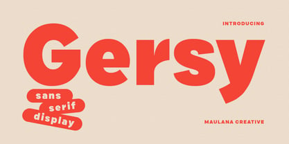 Gersy is a fancy sans serif display font. With bold stroke, fun character. To give you an extra creative work. Gersy font support multilingual more than 100+ language. This font is good for logo design, Social media, Movie Titles, Books Titles, a short text even a long text letter and good for your secondary text font with script or serif. Make a stunning work with Gersy font. Cheers, Maulana Creative
 - Bladis Night by Scoothtype,
$10.00 Bladis Night is a font duo between a serif and modern script fonts. Bladis Night is good for logo branding, wedding invitation, typography wedding, quotes text, magazine, or anything you want to do. Bladis Sans Serif includes numbers punctuation, alternates, and it also supports other languages. Bladis Night was built with OpenType features and includes ligatures, beginning and ending swashes , numbers, punctuation, and it also supports other languages. Thank you!
 - Madame by Linotype,
$40.99 The font, Madame, first appeared in a sample with similar fonts, presented by the Fonderie Typographique Française in the 19th century. The font consists of three cuts, letters, accents and numericals. The flamboyant Madame is meant for titles and headlines, emphasis in text or as initials. It combines well with both serif and sans serif fonts, but should be used sparsely to maximize the advantages of its ornate forms.
 - Indus by Linotype,
$29.99Linotype Indus is part of the Take Type Library, which features winners of Linotype’s International Digital Type Design Contest from 1994 to 1997. Designed by P.H. Hashin from India, Indus finds its historical roots in inscriptions found on ancient Indian graves. Thus Indus has a unique look and is versatile in point sizes from middle to headline. The font combines well with sans serif and slab serif typefaces. - Mondial Plus by Wiescher Design,
$49.50 MondialPlus is, as the name implies, a font meant for the whole world. MondialPlus is the newer and better version of Mondial. MondialPlus is designed to work in small sizes for bodytext. Only in bigger sizes does the font show its hidden character, it has a curved design to it, that makes it very special. Mondial is a very elegant and versatile font in the tradition of french sans typefaces.
 - Mystery Show JNL by Jeff Levine,
$29.00 Mystery Show JNL was modeled after the hand lettered titles found on various early episodes of the 1950s TV suspense program "Alfred Hitchcock Presents". The design emulates characteristics found in Frederic W. Goudy's Copperplate Gothic [a sans serif of equal stroke weights with tiny spurs added], but is considered a serif font by the addition of the spurs. Mystery Show JNL is available in both regular and oblique versions.
 - Suerte by Resistenza,
$39.00 Say hello to Suerte. This new typeface with inverted contrast and bifurcated serifs was inspired by Caslon’s Italian type and by Aldo Novarese’s Estro, published by the turinese foundry Nebiolo. Our aim was to develop a wood type typeface adding a new personality incorporating Tuscan serifs. The complete alphabet was designed with a flat long brush and Indian ink and then vectorized. Suerte contains a big set of icons and dingbats.
 - Rogy by Adam Fathony,
$14.00 Rogy, A Display Typefaces with Variable Weight and Italic. Rogy is a modern variable font. Basically this is a Sans with rigidity and squared look yet very legible with various width and italic that you can explore, combine, create and help you designing something. The Bolder the Stronger. it has define Rogy, it's Bold, Strong and the italic version of this fonts are very good for Sports design.
 - Paget by Greater Albion Typefounders,
$8.50 Paget is a modern exploration of Tuscan design. Here you'll find simple geometric outlines with an 'Arts and Craft' charm about them. Paget is beautifully clear and easy to read, but offers a distinctive charm that conventional sans serif and serif faces don't. Paget is offered in regular and oblique forms and is an ideal way to merge tradition and all that is new and fresh in your designs.
 - Levy by Lithographe,
$36.00 Good for typography, good for close paragraphs, good for titles logo, markers, use with numbers, Capitals and Cases. use Special symbols as design elements. One can be used for others. Good for closed groups. Limbos, good to go with Serif, Sans serif or old english. use it with variety and any design light or heavy. the weight is black, so it wont matter. hope you enjoy the font and use it.
 - Herzchen by Font-o-Rama,
$25.00Herzchen is a well developed sans serif font. The curving and swinging letter forms remind a little of serif fonts, on closer inspection, however, they rather remind of upright italics. Playful details give charm to the typeface and make Herzchen lively and distinctive. With four cuts the typeface is suitable for simple corporate and editorial design projects. In addition there are many ligatures in the expert-set for individual use. - Cruz Cantera BT by Bitstream,
$50.99 Cruz Cantera is a crisp and stylish yet informal sans serif typeface created by NYC type designer Ray Cruz. It is a slightly condensed design. The vertical strokes have rounded terminals, and there are some characters with serifs. Notable characters include the upper and lowercase E. There are three weights and each works equally well alone, or together for both display and text. Original design by Ramon Cruz completed in 2002.
 - Rosengarten by Typogama,
$19.00 Rosengarten is a condensed, bold typeface inspired by the work of Lucien Bernhard and the Plakatstil mouvement. With bold, rounded serifs, this typeface was created for use in headlines and larger point sizes. A complimentary sans serif style was integrated as a secondary weight with accompanying italics to allow a combination of styles to be set in layouts. This typeface includes an extended Latin and Cyrillic language support.
 - Cuanky by Kereatype,
$14.00 Cuanky is a super fun, retro-style sans serif font with subtle serifs. It possesses a recognizable flair and evokes a sense of warm nostalgia. Available in both regular and italic styles, Cuanky also features a playful hint of the future. Cuanky is perfect for headlines or food-related designs, such as pizza, burgers, and restaurant themes. Additionally, it's well-suited for creating eye-catching posters with a cool aesthetic.
 - Parsnip NF by Nick's Fonts,
$10.00Will Ransom designed the exemplar for this series for Barnhart Brothers & Spindler in the early 1900s. The typeface was originally named "Parsons", after the advertising director of a Chicago department store (evidently a very BIG customer of BB&S). Both versions of this font contain the Unicode 1252 (Latin) and Unicode 1250 (Central European) character sets, with localization for Romanian and Moldovan. - PF Cosmonut Pro by Parachute,
$69.00 Spaced out and a bit nutty. This typeface revisits the futuristic atmosphere of the 50s and 60s cartoons and is complemented with an amazing, wacky and super cool series of 50 pictograms, designed by the master designer Dimitris Foussekis. This is a very popular informal typeface which was expanded recently into a ‘Pro’ version that includes Latin, Greek and Cyrillic.
 - CRM American Horror by CRMFontCo,
$35.00 The Classic Charles Rennie Mackintosh Font has been a massive seller over the years. Its use in the Hollywood motion picture "Spider Man 2", has now been emulated by the branding of the the new Fox TV series "American Horror Story". Very unusual for the horror genre, this slightly tweaked version of the classic original mirrors how the show's producers have used it.
