7,015 search results
(0.023 seconds)
- Punavuori by Fenotype,
$14.95 Punavuori is a clean geometric unicase font. It's best for display use in magazines, books & posters. Punavuori font was originally designed in 2002. Now it's been remade with the complete character set and five different versions.
 - More Blocks by Beware of the moose,
$9.99 It is not really a font, the are more icons. Based on a grid op seven squares al 127 possibilities – filled and unfilled. Use it decorative or just for fun. There is also a dotted version.
 - British Cinema JNL by Jeff Levine,
$29.00 The hand lettered titles and credits from the 1945 British film “The Way to the Stars” were the working model for the aptly-titled British Cinema JNL, which is available in both regular and oblique versions.
 - JH Lina by JH Fonts,
$60.00 JH Lina is an Arabic Naskh typeface, including four weights; it is typical for long running text, headlines, branding , news letters, magazines, signage and electronic publishings ... The diacritic positioning is fine tuned per the publishers requirements.
 - Blood Scratch by Creaditive Design,
$12.00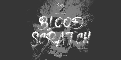 Blood Scratch is a creepy and brushed display font. It is perfectly suitable for any Halloween-related project or crafty idea, creepy film project and horror themes will be nice! The only limit is your imagination.
 - Quick Poster JNL by Jeff Levine,
$29.00 A vintage poster from the British Columbia Forest Service on the subject of forest fire prevention provided the hand lettering that was the design model for Quick Poster JNL; available in both regular and oblique versions.
 - Local News JNL by Jeff Levine,
$29.00 The hand lettered title for the 1954 film “Power of the Press” was done in a condensed sans serif type style that is now available digitally in both regular and oblique versions as Local News JNL.
 - Street Legal by LetterBalm,
$17.99 Hard core street scrawl, for tough graffiti urban hood, laid back and tough, lots of attitude and tons of muscle, for automotive, motorcycles, urban settings and back alleys. Gives your designs some serious five o'clock shadow.
 - Queen Anne Hill by Great Lakes Lettering,
$40.00 Queen Anne Hill is an modern Calligraphy style font with upright strokes and bold flourishes. Revealing the styling of fine artist and calligrapher Alissa Mazzenga, this font communicates refinement with a hint of playful artistic individualism.
 - Back Lot Stencil JNL by Jeff Levine,
$29.00 Back Lot Stencil JNL is a hand lettered slab serif stencil design based on the titles and credits from the 1954 film “Human Desire” and is available in both regular and oblique versions. Caps only Font.
 - Taranto by Antitype,
$11.90 Taranto was inspired by the typeface Domino by J. C. & M. Demarchi (published by Mecanorma in 1973). At its core, it follows the design language of Domino, but goes much further than its source of inspiration. (see fontsinuse.com for more info on Domino). The Taranto font family consists of 4 individual fonts (Thin, Regular, Black and Fill). Each font contains a glyph set of about 240 glyphs (Western European character set) and also contains alternates for some characters. Taranto Fill is designed as an underlay for the regular and thin cut. but also works fantastic as a very bold standalone.
 - Eclectic Three by Altered Ego,
$45.00STF Eclectic Three contains dingbats and a special set of glyphs which make it simple and easy to create registration and fill-in forms for print materials. Create rules with hash lines, fill-in boxes and many other variations. Also includes handicapped, recycled and arrow right/left symbols. The Eclectic family is legendary, with a cult-like following among the inititated. With over 100 characters in the complete set, you'll find yourself using Eclectic Three almost daily to add spice to your otherwise san-serif typographic existence. Available in Mac and PC formats. License it today! - Scirocco by Wiescher Design,
$39.50 Scirocco is a hot and humid wind that blows from the Sahara over to France and Italy. It crosses the mediterranean sea and carries lots of fine desert dust with it. Once it hits the coast of Provençe one can feel it grinding ones teeth and see it as fine dust covering every car. It makes people go nuts! Scirocco, the typeface has that same hot moving character and the finer hairlines giving it a kind of Arabic touch. If you use it too much, it will make you go nuts. Your pretty crazy Gert Wiescher
 - East Variable by Tarallo Design,
$73.99 East Variable is a condensed sans serif typeface. It is timeless, but with a subtle nostalgia of vintage jazz albums, film titles, newspapers, and signage. The light weight has excellent legibility at small sizes. The Extra Bold weight will capture attention. East is versatile, but would be a good choice for film titles, labels, publications, or any context where space is limited. It has variable axes of weight and slant. The OpenType features include stylistic sets, a one-story 'a', hooked letters, seriffed uppercase 'I' and '1', a slashed zero, raised colon and punctuation (Spanish), German eszett, ligatures, and vertical fractions.
 - Timber by Pelavin Fonts,
$25.00 Hand-hewn from sturdy planks with nary a splinter, Timber is a font with origins in the forests of our imagination whose genesis is displayed in its undulating grain. Using just the fill attribute it can present a diverse range of species from mellowest Maple to deepest Ebony. Additional layers of fill and stroke attributes provide the option for an endless variety of outlines and shadows, all the while preserving its luscious texture. If you’ve ever pined for a typographic solution which combines legibility with an organic character, you just might like to get on board.
 - Deco Nights JNL by Jeff Levine,
$29.00 Sheet music for the tune "Put Your Arms Around Me Honey" (from the 1937 film "Coney Island" starring Betty Grable, George Montgomery and Cesar Romero) has the song title hand lettered in a condensed Art Deco sans serif design. This became the basis for Deco Nights JNL, which is available in both regular and oblique versions. For trivia buffs, the song was written by Junie McCree and Albert Von Tilzer and was first featured in the Broadway show "Madame Sherry" in 1910 and was revived for a second time in the 1949 Judy Garland -Van Johnson film "In the Good Old Summertime".
 - No Rules by Gleb Guralnyk,
$13.00 Introducing a creative font named No rules. It's a very unique typeface with modern experimental shapes. It includes five different styles for letters and numbers. No rules font can help you to create an unexpected texture and graphical rythm. Each next letter will be automatically switched to another variation using OpenType contextual alternates feature. Using capital or lower first letters will make a different looking words. Also letters set can be changed using stylistic alternates feature. Please note: Only english alphabet and numbers have five glyphs variations. Multilingual characters have only two of them for capital and lower case letters.
 - BR Cobane by Brink,
$30.00 A modern neo-grotesque type family of 16 styles. BR Cobane is a fine balance of functionality and contemporary characteristics. Precisely drawn with a modern aesthetic in mind, Cobane has familiar qualities associated with the classic grotesques, but combines them with a stronger modern geometric flavour. BR Cobane is available in 16 finely crafted styles, with eight weights ranging from Thin to Black. The fonts also provide advanced typographic support with OpenType features such as case sensitive forms, icons, stylistic alternates, slashed zeros, and multiple figure sets. Also containing advanced language support as standard. For custom inquiries please contact: mail@brinktype.com
 - Morris Sans by Linotype,
$40.99 Morris Sans is a newly revised and extended version of a small geometric family of typefaces originally produced by Morris Fuller Benton in 1930 for ATF. His initial design consisted of an alphabet of squared capital letters with a unique twist that characterized its appearance: corners with rounded exteriors and right-angle interiors. The types were intended for use in the fine print found on business cards, banking or financial forms, and contracts. But over the ensuing decades, this design became a popular element in all sorts of design environments, and several foundries revived the typeface in digital form. Since digital fonts are bicameral, with slots for both upper and lowercase letters, new cuts of the type opted filled the lowercase slots with small caps. In 2006, Linotype commissioned its own version of the typeface-an extension for 21st century use. Under the advisement of Linotype's type director Akira Kobayashi, Dan Reynolds redrew the uppercase and added an original lowercase for the first time. Additionally, a number of extras were brought into the fonts, including six figure styles (tabular and proportional lining figures, tabular and proportional oldstyle figures, and special tabular and proportional small cap" figures). Small caps, which have become an iconic element over time, are accessible in each font as an OpenType feature. To differentiate this version from the original, Linotype's new family is named Morris Sans, in honor of Morris Fuller Benton. All fonts in the Morris Sans family are OpenType Com fonts; they include a character set capable of setting 48 European languages that employ the Roman alphabet, including all Central and Eastern Europe languages, those from the Baltics, and Turkish. This glyph coverage extends to the small caps as well. Morris Sans is a wide typeface, especially in its regular widths; the condensed faces set a more conventional line of text. The new lowercase letters are less geometric than the uppercase, except for those that share the same basic forms (e.g., c, o, and s). Instead of following this geometric trend, the new lowercase tends to strengthen the humanist elements that were present in several characters from the original type, including the uppercase D and the figures 5, 6, and 9. Morris Sans also sports a number of glyphic flares, like the stroke found on the original uppercase Q. Morris Sans is a clean, modern design best suited for headlines, advertising, posters, expressive signage (especially on storefronts), and corporate identity work."
 - Chameleon by Fontforecast,
$30.00 Chameleon consists of 16 fonts based on 3 completely different designs. Different but specially designed to complement each other. Together they form a well-balanced design kit suitable for many different projects, e.g. invites, menus, magazines, brochures, packaging, etc. Chameleon comes in three styles: 2 outline versions and a basic (solid) version. To combine Chameleon with Chameleon Fill, you will need an application that allows you to stack text frames. Once you start layering different fills, like a true chameleon, you can change colors and patterns. Simply place several layers on top of each other, choose from 7 fills to determine your pattern and assign a color to the fill. Always place one of the outline versions of Chameleon on the top layer. Chameleon Pen was added to give you the possibility to spice up your design with a personal touch. It is a charming handwritten font, which was first written out with a dip pen and ink, then scanned in and digitalized. It comes in regular and italic. And then there is Chameleon Sketch for a bit of nonchalance to add to your designs. The Outline, Hatch and Solid version can be used separately, or stacked to create a shadowy or multi-colored effect. On top of that, you'll find 102 glyphs of extra fun to play with in Chameleon Sketch Extra.
 - Norton - Unknown license

- Mike Biro Script by Johannes Krenner,
$12.50 My uncle has a real fine handwriting. Especially the long ascender and descenders are very characteristic. It is dynamic and a good legibility. Try the font in a dark blue color (C90, M15, Y0, K60) and 22pt.
 - Caster by Mans Greback,
$59.00 Caster is a thick poster script, created by Måns Grebäck during 2019. It is a high quality typeface and has energetic, drama-filled letter forms. It contains all necessary symbols and supports a wide range of languages.
 - Bandidas by Vozzy,
$5.00 Introducing a vintage look label font named "Bandidas".Typeface includes five styles plus aged version, for sample look at 4th preview. This font will good viewed on any retro design like poster, t-shirt, label, logo etc.
 - Garden Grown by Cultivated Mind,
$25.00 Garden Grown is a lovely typeface duo by Cindy Kinash. This new font family includes a caps and script. The script comes with alternates and ligatures. Try Garden Grown for book covers, stationery, marketing, magazines and film.
 - Snack Stand JNL by Jeff Levine,
$29.00 A 1940s film taken around Coney Island happened to show a sandwich vendor’s stand with its hand painted signs. The stylized Art Deco lettering inspired Snack Stand JNL, which is available in both regular and oblique versions.
 - Artica Pro by Green Type,
$46.00 Artica is an elegant sans serif typeface, offered in five weights. It was inspired by classic Roman letterforms. Artica Pro supports Latin, Cyrillic and modern Greek scripts, and includes swash initial & final forms, stylistic alternates and ligatures.
 - MISQOT by !Exclamachine,
$9.99 MISQOT, with beefy proportions and fine details is a titling font with lots of extras: lowercase, international accents and special characters. The 1.1 release features improved inter-weight metrics, additional characters and 9 newly added essential symbols.
 - Catholic School Girls Intl BB by Blambot,
$20.00This font is, like, totally inspired by the handwriting of, like, teenage girls. You’ll note that the [ ] keys are actually adorable little hearts! Totally rad! This font includes enough European characters to fill a loose leaf binder. - Formal Event JNL by Jeff Levine,
$29.00 The hand lettered actors’ credits on a title card from the 1937 film “Shall We Dance” served as the model for Formal Event JNL – an Art Deco sans serif font available in both regular and oblique versions.
 - P22 Cezanne by P22 Type Foundry,
$79.94 This font set, created for the Philadelphia Museum of Art, celebrates the work of influential French artist Paul Cézanne. P22’s Cezanne font allows you to beautify your documents with a faithful rendition of the artist’s handwriting, while Cezanne Sketches recreates a variety of imagery from the artist’s work. Cezanne Pro includes full western and central European character sets and Cyrillic for typesetting in dozens of languages. It features several types of numerals, ligatures, snap-on swashes, and word glyphs. The Pro version includes over 1,200 glyphs and “smart features” that will automatically substitute letter combination's to create an even more natural handwriting effect than was possible with Cezanne Regular.
 - Mekon by The Northern Block,
$49.50 Mekon is a modern heavyweight typeface digitised and expanded from Peter Steiners Black Body (1973). Retro style Pacman shapes are combined with small keyhole counters to create a bold and witty font ideal for apparel, books, t-shirts and posters. Mekon is now available as version 2.0 (2021); the remastered version meets higher technical standards that modern-day users demand. Included in the font are over 460 characters, four unique styles, with a free gradient option. Opentype features consist of digital numerals, lining figures, fractions and alternate a, c, e, f, i, k, m, n, r, M and S with language support covering Western, South and Central Europe.
 - MetroBots by Our House Graphics,
$- MetroBots is a fun loving, non-traditional but very functional family of 6 fonts made of big city skies, the long tropical morning shadows of ancient ziggurats and entire pueblo villages, nestled into the steep cliff-sides of sage-topped mesas in south western deserts. This is a good solid, but kind of whacky looking display type family borrowing from the heft of good old-fashioned children�s wooden building blocks and the look and feel of both modern and ancient pueblo architecture. With a bit of the not-so-subtle expressiveness of a comical robot on a WD-40 high on the side.
 - BLT Gerhard by Black Lab Type,
$12.00 Gerhard is an early 1900’s Victorian style typeface that has been carefully refined for today. It was inspired from delicately hand painted lettering on a century-old vintage piano. This typeface has an bold and elegant natural aesthetic that can work for eye-catching headlines yet work gracefully enough for wedding invitations. Small caps have been designed for sub headings and allow a visual difference. Put it to use on your next branding, signage or publication project. A number of glyphs and diacritics included make this typeface usable for a wide number of languages. Alternate letters and forms have been included to create some versatility with your design.
 - Hashtag by Agnieszka Ewa Olszewska,
$5.00 Hashtag is a type family of four types.The font contains over 360 carefully hand-crafted glyphs. Very elegant and gentle in big sizes but is very legible in smaller sizes and longer texts - in print or on screen. As an exclusively OpenType release, these fonts have an extended character set to support Central and Eastern European. Hashtag is perfect for logos, advertising, announcement, invites, thank you�s and correspondence, for packaging, and to create all yours fun and moderns designs you want. There are plenty of options to allow you to create something unique and special. I hope you like him as much as I do!
 - MFC Verre Monogram by Monogram Fonts Co.,
$69.00 The inspiration source for Verre Monogram is an unusual hand-drawn letterset from a vintage embroidery publication which comes off more as a Drop Cap or Initial lettering style than monogram. Although its original intention is uncertain, it has many possibilities. This monogram design from the early 1900’s has been updated from a Capitals only to a Caps/Smallcaps set with decorative linking ornamentation. The unique stained glass look of the letterforms allows for a lot of play with manual coloring, and the newly created linking ornaments offer interesting bracelet monogram design options. Download and view the MFC Verre Monogram Guidebook if you would like to learn a little more.
 - Sticks by Lindstrom Design,
$19.00 Sticks was originally designed as a custom logo for a sour gummy candy. It was then expanded to a full font, with numbers, symbols, foreign accents, and even a few ligatures. An all caps font, the capital letters are even more capital than the lower case capital letters. As a bold font, it's ideal for parties, flyers, greeting cards, posters, headlines, and snipes. It doesn't take itself too seriously, so it's well suited for comic, cartoony uses. The S is taller than the other letters and gives it it's unique quirky Stick-like personality. Use it with words and phrases that contain lots of S's!
 - Clarina Sans by Asritype,
$24.00 As the name, Clarina Sans is sans serif type family with two weight plus matching italics. Clarina Sans was desinged in 2018/19, influenced by geometrics typeface from handbook and newspapers in 80's during studying that have a good legibility. Clarina sans with medium to high x-heigh and geometric correction and smoothed corner has more elegant visibility, readable, and save space altogether. Its perfect for book, newspaper, web, logos, magazines, posters, and most other design. Equiped with more than 700 glyphs for eachs cut (latin plus, greek, cyrillic), ligatures, kerning, case sensitive for diacritical mark modifier, Clarina Sans has wide range languages coverage.
 - Soutumi by MYSTERIAN,
$9.00 SOUTUMI Features: 6 Ampersand options per weight Extended Latin characters 2 Pi symbols Capital and lowercase 'sharp S' Loathing the time it took me to complete the family for my personal freelance identity, Multipolar (& the first font I ever authored myself), I vowed to take the challenge of working within considerable record time. Soutumi was conceived of this challenge; it's vain purpose as such is more meaningful than the forms or any other semiotics that make up itself. Whereas Multipolar took me 9 months to complete, Soutumi was finished within the span of 3, and also sports three times more ampersand alternatives (as that theme was a running joke in Multipolar).
 - Sign and Display JNL by Jeff Levine,
$29.00 Sign and Display JNL is a long-overdue companion font to 2009’s Sign and Poster JNL. The original design models were Art Deco influenced die-cut cardboard letters and numbers manufactured by the Duro Decal Company of Chicago. Square in shape with rounded corners, the thick cardboard letters were used for making show-cards and other display signage. Subsequently, Duro used the same style of lettering to manufacture water-applied decals for boat identification and other uses. It was a set of these decals (with a black outline and yellow interior) that inspired the outline typeface Sign and Display JNL, which is available in both regular and oblique versions.
