4,856 search results
(0.054 seconds)
- Drumbeat by EdyType,
$60.00 DRUMBEAT, a brand new face from Edy Type, coming to help resolve the necessities of loose scripts in Packaging and Editorial Design. Its' very particular thicks and thins and ups and down, makes it very suitable whenever informalities is required. Used with tiny little characters, enlarged to mammoth sizes or filling a large page with it, would show it’s perfect balance and color, almost as if where hand writen. In fact, a truly different script, a graphologist would declare that is written by a person very sure of what he wants, and besides and best of all, it’s pretty.
 - Mexborough by Greater Albion Typefounders,
$11.50 Tradition meets tomorrow in Mexborough. Mexborough owes its origins to a challenge from a client of ours- they wanted a clear and easily readable typeface to use for signage in public spaces, but with enough flair and style to be suitable for use in heritage precincts. The result is a family of six Roman faces in a single weight, encompassing Regular, Text, Flamboyant, Small Capitals, Capitals and Title forms. These faces combine legibilty with traditional character, ideal for signage and poster work, where dignity and character are required. Mexborough's simple clean lines also lend themselves readily to web and online use.
 - Bhostra Lala by Ekahermawan,
$15.00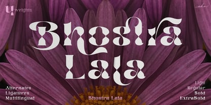 Bhostra Lala is an unique and versatile font family. Bhostra Lala comes with alternates characters (PUA Encoded) and ligatures in 4 weights that will support your creativity in creating the perfect design result for many different projects such as logo, branding, poster, magazines, labels, merchandise, invitation, presentation, advertising, quotes and so much more! FEATURES: OpenType support Playfull to use (with ligatures and alternates options) Multilingual support PUA Encoded If you need support or more information about this item please kindly contact me: ekahermawanputu@gmail.com Thank you so much I really hope you enjoy when using it!
 - Castrelon by Ekahermawan,
$15.00 Castrelon is a elegant serif family with a bunch of alternates and ligatures. Castrelon including with more than 200+ alternative characters (PUA Encoded) that give you a wide range of typographic design results. Castrelon is a versatile font for many different projects such as logo, branding, posters, magazines, label, merchandise, presentation, advertising, cards, quotes and so much more! FEATURES: OpenType support Playful to use (with ligatures options and alternates options) Multilingual support PUA Encoded If you need support or more information about this item please kindly contact me : ekahermawanputu@gmail.com Thank you so much I really hope you enjoy using it!
 - Obvia Narrow by Typefolio,
$29.00 'Obvia' appeared as a result of direct observation on typefaces classified as geometric and the plan to explore for the first time width axes Condensed, Narrow, Normal, Wide and Expanded. The idea behind 'Obvia's design was to create a distancing from geometrically pure shapes, in this case, square shapes. Then some details were added, such as subtle inktraps, concave endings of the stems and carefully drawn alternate characters, giving a 'geohumanist' tone to the font. This first family of 'Obvia' has 9 weights ranging from Thin to Black, delivering a strong typographic identity, from the paper to the pixel.
 - Hogar Slab by Latinotype,
$39.00 Hogar Slab, based on the Hogar typeface, is the result of combining a script and a slab serif into a single type system. The system has a monolinear style composed of a slab serif and a script slab serif version that share similar proportions, weight interpolations and details. Hogar Slab is basically a slab serif with script gestures and a script with slab serif shapes. In order to make the system more complete, I included an italic version, which represents a transition between both main styles. Additionally, I developed a set of patterns including some furniture designs by well-known architects.
 - Narrow Deco JNL by Jeff Levine,
$29.00 The hand lettered word ‘puzzles’ from the box cover of a 1940s set of metal “connected” puzzle pieces manufactured by the A.C. Gilbert Company was the initial typographic model, but some additions and changes were made. Instead of the right side of the ‘P’ being a semi-circle, it was changed to a more conservative ‘’squared’ look. After drawing out all of the necessary glyphs, the overall height of the characters was extended to make the letters and numbers appear taller and narrower. The end result is Narrow Deco JNL, which is available in both regular and oblique versions.
 - ArchiType by Archiness,
$10.00 With the famous and much used Eurostile and Bank Gothic in my mind I wanted to design a mono-line font as simple and legible as possible. A square with rounded corners, i.e., the letter ‘o’ as its basis. From there on back to basics, so straights remained simple straights with 90° endings, whatever the angle. Numbers are monospaced. The result seems to be a pleasantly balanced and neutral font. Excellent for display purposes and surprisingly legible in even small sizes. This perhaps typical approach by an architect led to the name of the font: ArchiType.
 - Laxory by PizzaDude.dk,
$20.00 My handwriting with a speedmarker turned into a font - well, not really, to be honest! Personally I did do all the writing of letters, but in order for the letters to fit perfectly together, I manipulated them - just a tad! But the result is a hasty set of letters! When I say I wrote all the letters, I mean it literally!!! All letters are unique, meaning all the accented characters are unique! On top of that, Laxory comes with ligatures for both double lowercase letters and numbers! You will need to use OpenType supporting applications to use the autoligatures.
 - Diskanila by Ekahermawan,
$12.00 Diskanila is a romantic swirly script font. This beautiful script including with more than 300+ alternative characters (PUA Encoded) that gives you a wide variety of romantic typography design results. Diskanila comes with bold and light swirly alternatives to make your many different projects such as logo, feminine branding, poster, magazine, label, merchandise, presentation, advertising, and invitation card more beautiful ! FEATURES: OpenType support Playful to use (with ligatures options and alternatives options) Multilingual support PUA Encoded If you need support or more information about this item please kindly contact me : ekahermawanputu@gmail.com Thank you so much I really hope you enjoy using it!
 - Double Frames by Putracetol,
$22.00 Introducing Double Frames - Display Font, a font with unique shape. there are two styles – standard and decorative. The modern and powerful display font you've been looking for. Each character is carefully crafted until the result is perfect. A lot of detail is preserved when characters are digitized, so uppercase looks fantastic up close Come with open type feature with a lot of alternates, its help you to make great lettering. best uses for wedding invitation, invitations, signature, typography lettering, branding, label, poster, logos, quotes, product packaging, header, merchandise, social media & greeting cards and many more. Double Frames is also support multi language.
 - M Comic PRC by Monotype HK,
$523.99 M Comic is a humanistic script design characterised by its modern, stiff, free and blocky construction. M Comic incorporates free and irregular characteristics of M Cute. Crossbars (橫) and stems (豎) are straight and slightly slanted. Entry and finial points of strokes are squarish and parallel without flare. Contrast of stroke is low, together with its bold stems (豎), making it suitable for large display text to catch attention. The result is a loosely coupled line of text of free, stiff and blocky glyphs. It is best for casual and humanistic display, illustrations, set upright, non-condensed.
 - Alien UFO by Gravitype,
$16.90 Alien UFO is a particular display font born from the fusion between raptor claws and an alien appearance. The standard characters have been conceived to look more aggressive, to wonderfully fit the atmosphere when tension is needed, to highlight the sense of unknown, mystery, fear. A lot of alternative glyphs are included to give you more aesthetic options and cover a wider spectrum of emotions to convey to the situation. The outline version can be mixed with the regular one to create contrast with the filled glyphs. It results particularly eye-catching after applying a mesmerizing neon effect. Multiple languages are supported.
 - Taronge by Sensatype Studio,
$15.00 Taronge - Urban Display Sans Serif that created special for Logo, Title and more stand out typography for sport and action. It's so perfect to add your style and headline overview for sport, technology, actions, and fighting theme. And specially for this font, we crafted for bold action style and modern feels so enjoy to create any project that will show your main idea out. Taronge - Urban Display Sans Seri ready with: Creative characters prepared to get best results Preview as a inspirations that you can do with Taronge font Ready with All Uppercase characters Wish you enjoy our font. :)
 - Dielust by Flawlessandco,
$9.00 Dielust is an retro font type with a fun and bold style that perfect for your retro vintage-themed projects. Try out some alternate characters for another visual result! There's some connected letters and some alternates that suitable for any graphic designs such as branding materials, t-shirt, print, business cards, logo, poster, t-shirt, photography, quotes .etc This font support for some multilingual. Also contains uppercase A-Z and lowercase a-z, alternate character, numbers 0-9, and some punctuation. If you need help, just write me! Thanks so much for checking out my shop!
 - Neutraliser Serif by HamburgerFonts,
$20.00 The Neutraliser family is a versatile collection of geometric-based fonts with 24 styles. The 6 Alternate styles are suitable for headlines and are complemented by the Sans and Serif styles suitable for small amounts text. The Caps styles allow for extra typographic variation within the family. Neutraliser is a direct result of the designers' initial exploration of typography and is uncompromising in its geometric nature. As the name suggests, the typeface celebrates the precision of the digital medium as a drawing tool in which the critical points that make up a letterform can be almost 'plotted' according to a grid-based logic.
 - Lean by Ogle Studio,
$11.00 Lean is a solid must-have for anyone's font collection. With its plump weight and dynamic poise, Lean offers an eye-catching solution for any project. Handcrafted and informal, the style adds a real statement, whether it's for a logo, video artwork, business card, or presentation. The impact of the uppercase characters, married with the gentle roundness of the lowercase strokes, present a unique result for titling, sure to get you noticed. Lean's dynamic 'lean' makes strings come alive, giving a feeling of movement and excitement. The character set contains 190 glyphs, with latin and western language support.
 - Arial Windows compatible by Monotype,A contemporary sans serif design, Arial contains more humanist characteristics than many of its predecessors and as such is more in tune with the mood of the last decades of the twentieth century. The overall treatment of curves is softer and fuller than in most industrial-style sans serif faces. Terminal strokes are cut on the diagonal which helps to give the face a less mechanical appearance. Arial is an extremely versatile family of typefaces which can be used with equal success for text setting in reports, presentations, magazines etc, and for display use in newspapers, advertising and promotions.
- Bigante by Vibrant Types,
$29.00 Bigante is a big, giant superfamily with two variants: Solid and Inline, offering six weights and seven widths. Its constructed design interprets rounded corners as three 30° angles, resulting in edged terminals and twelve-sided dots. While it sounds functional, this rounded-like semi-serif enhances the appearance, creating a friendly aesthetic. The lowercase alphabet features a high x-height. For versatile use in display and advertising, the multitude of fonts enables flexibility. Captivating with a linear structure, it associates with modern architecture, tactical sports, space travel, and futuristic technology. The character set of 780 glyphs supports 410 Latin languages.
 - Neutraliser Alternate by HamburgerFonts,
$20.00 The Neutraliser family is a versatile collection of geometric-based fonts with 24 styles. The 6 Alternate styles are suitable for headlines and are complemented by the Sans and Serif styles suitable for small amounts text. The Caps styles allow for extra typographic variation within the family. Neutraliser is a direct result of the designers' initial exploration of typography and is uncompromising in its geometric nature. As the name suggests, the typeface celebrates the precision of the digital medium as a drawing tool in which the critical points that make up a letterform can be almost 'plotted' according to a grid-based logic.
 - Lavenda by Aga Silva,
$29.99 Lavenda font is a result of my two year classic calligraphy studies, and is based on my own handwriting. The overall look is classic, which makes it a match for invitations, place cards or other paper goods where old time elegance is required. With the glyph count just under 1500 the font has many alternates and options which makes it flexible to use. Apart from swashes, alternates and ligatures - number of fancy dingbats is also included. Again, with vast number of glyphs contained should you write in other language than English - Lavenda comes as a natural choice.
 - Tibet Museum by Designpiraten,
$30.00 The Tibet Museum fonts are designed for harmonic layouts of multilingual texts, especially for the combination with asian fonts such as Tibetan or Devangari. Tibet Museum is a family of four fonts – Regular, Bold, Regular Italic and Bold Italic – that combines the shapes of Tibetan letters with a contemporary western font. The result is a unique set of characters that allows the design of multilingual applications and adds to an outstanding identity. It is perfect for branding projects as well as editorial and exhibition designs. The fonts contain a set of more than 400 glyphs to support 207 languages.
 - Styx by Canada Type,
$24.95 Philip Bouwsma makes use of his extensive calligraphy and type design experience by reaching into his vault and completing one of his unfinished projects from the mid-1990s. The result is Styx, a four-font connected-script family, with rough and smooth variations, each containing two sets of majuscules and plenty of alternates sprinkled throughout the character map. The Styx family comes in all popular font formats, and includes an extended range of language support covering Western and Central/Eastern European languages, Turkish, Baltic, Esperanto and Celtic/Welsh. The OpenType fonts contain both flat and class-based kerning.
 - Ascender Sans by Ascender,
$92.99 Ascender Sans was designed by Steve Matteson as an inventive, exhilarating sans serif design that is metrically compatible with Arial. Ascender Sans offers enhanced on-screen readability characteristics and the pan-European WGL character set and solves the needs of developers looking for width-compatible fonts to address document portability across different platforms. The Ascender Sans Narrow offers enriched on-screen readability characteristics and the pan-European WGL character set and resolve the needs of developers looking for width-compatible fonts to address document portability across platforms. Ascender Sans Narrow contains regular, italic, bold and bold italic fonts.
 - Better Kamp by Ingrimayne Type,
$6.00 BetterKamp was originally constructed in 1995-6. It was not constructed to meet any specific purpose but out of curiosity, to see what the result would be if two quite different faces were blended. KampIngriana is the offspring of BetterTypeRight, which has characteristics of a typewriter face without the monospacing, and KampFriendship, which mimics a serifed face drawn by hand. The original blending had many oddities that I did not clean up until 2020 when I also added the semi-bold weights. BetterKamp lacks polish and elegance, but it is very readable at small point sizes.
 - Ranille by Arterfak Project,
$26.00 Ranille is a modern, classy, bold serif and display font. It includes a great number of of alternates and ligatures. Ranille is inspired by retro curves style from the 50-60s era and brings it into modern design with bold weight. Ranille comes with over 200+ alternative characters (PUA Encoded) that give you a wide range of typographic design results. Ranille is a versatile font that ready to make your designs more stand out such as posters, magazines, branding, logos, label, merchandise, presentation, advertising, cards, quotes and so much more! Check out Novante which is a great pair for Ranille.
 - Letterpress by FaceType,
$18.00 Meet the Letterpress! Jakob Erbar’s Phosphor was released by the Ludwig & Mayer Foundry before 1923. The origins of Aurora date back to 1912 (Johannes Wagner Foundry). Permanent Headline was designed by Karlgeorg Hoefer, also known simply as Headline. It was fun making a mix out of the three classics – with Letterpress Bastard you will quickly get astounding results. To complete the family we added a font containing random symbols we also found in the metal type boxes. Please note that we provided loads of ligatures for double-letters to make your design look as authentic as possible.
 - JWX Memo by Janworx,
$15.00 Memo, designed by Janet Valdez of Janworx, is a digital version of her own personal penmanship, currently displayed in abundance on sticky notes all over her desk and monitor. Although its basis is in actual handwriting, it's perfectly legible, offering a casual alternative typeface for everyday correspondence or simple things, ranging from event flyers to children's birthday party invitations. Memo performs well at regularly used correspondence sizes, but at a larger size can also be manipulated in graphics software for interesting effects. The letters can be moved randomly from the baseline, overlapped, and then contoured with good results for a casual look.
 - Chromosome by Three Islands Press,
$19.00 It hit me one day that the '60s-vintage labelmaker I had lying around might make an interesting display face. I began playing with it -- clicking out letters at various pressures, scanning the results, going over the scans in a vector-graphics program. Looked pretty good. To my chagrin, however, I soon afterward got a glimpse of someone else's label-tape font. Though modeled after a more modern device, its rocketing popularity prompted me to set Chromosome aside for a year or so. Finally finished it up in late-1995. Full release has light and heavy weights, regular and reversed styles.
 - Bulby by Mircea Boboc,
$25.00 After creating an original light bulb symbol from scratch, I incorporated it in all letters and punctuation signs, ensuring a distinct rhythm and creative variation. The result is a highly recognizable font with a unique appearance, which can inspire you as a designer in many imaginative directions. This font is especially fitting for Christmas-themed projects where light installations take center stage. Similarly, if you represent a light bulb company, consider utilizing it in your indoor presentations or social media posts to showcase the playful voice of your brand. After all, everybody needs their light bulb moment.
 - Yekuana Pro by Neo Type Foundry,
$28.50 Yekuana Pro is a typeface whose design is based primarily on the study of certain geometric ethnic ancestral Venezuelan signs, visually rich and originally used in the enrichment of various utilitarian objects with high symbolic and cultural content. It’s a family that is composed of 330 glyphs y of two weights, including Inline and Outline versions, Stylistic Alternates, Fractions, Ordinals and Ligatures. The combination of their styles through the use of layers by contrasting colors application of allows to obtain new interesting results. Its use is recommended for titles or short phrases and elements of oversized visual communication.
 - Tioga by Monotype,
$29.99Tioga is a highly legible typeface designed specifically to display clearly on low-resolution displays. With superior readability even at small sizes, Tioga is an ideal typeface for developers of set-top boxes and digital televisions. Tioga is metrically compatible with Tiresias, a widely-used typeface designed for digital TV applications and adopted by the DVB and MHP standards. Tioga was fine-tuned to be more readable and aesthetically pleasing. Individual characters were adjusted for improved legibility and the letter spacing was revised to improve appearance and readability. Tioga bold was created to make the design more versatile. - Address Sans Pro by Sudtipos,
$39.00 History is always in sight; it is constantly being reconsidered and reformulated in the context of now. We see approaches to art, fashion, textiles, homewares, furnishings … not to mention music, graphics and everything else that culturally enriches our daily lives, revisited and made anew for today. Address Sans indulges in the spirit and aesthetics of mid-century Modern – Italian industrial design, sleek coffee makers, stylish cars, seductive jazz pressed on vinyl – with a charm and charisma that defies time. It evokes history but is decisively created for today. Its design, in reality, is rooted in the condensed structure and block modulation of early 1950s German lettering intended for use in street signage, but when we started to work on the various weights and widths, the result was a set of fonts in a style similar to the typographic work developed by Butti and Novarese in the 60s. The multitude of potential applications for Address Sans then became clear. In a range of 3 widths and 8 weights each, Address Sans includes little verses, true italics, small caps and numerous alternative signs for a total of 48 fonts. The result is a functional typeface that is effortlessly seductive, with geometric features and design details that ooze cool, and take it away from mere reinterpretation towards typographic forms that adapt perfectly for contemporary use.
 - Sisters by Type-Ø-Tones,
$40.00 Sisters is a lively set of stencil display typefaces designed by Type-Ø-Tones’ co-founder Laura Meseguer. The family features four fresh fonts that share foundational principles of construction yet complement each other—as sisters do—by celebrating their differences. Variations in contrast, weight, and design characteristics result in four distinct styles dubbed One through Four. This cool quartet contains no lowercase, asserting the family’s rightful place in the titling typography space. Like many Type-Ø-Tones typefaces, Sisters was conceived as a custom lettering project—in this case, the design was crafted for the identity of an art exhibition. Laura initially drew only the limited character set the show required, but from the outset, she saw great potential for a fully developed type family based on her lettering concept. The first member of Laura’s new family was, naturally, Sisters One. She later added contrast to produce Sisters Two, then equalized the weight of Sisters Two to create Sisters Three. To round out the group, Laura added a deco touch to Sisters Two, resulting in the festive but retro-elegant Sisters Four. Each Sister shares DNA with the other members of the family, just as human siblings do :). Credit for the Sisters name goes to Eider Corral and we couldn’t imagine a more fitting moniker for this little family.
 - DM Unarmed by DM Founts,
$12.50 Unarmed began life as a series of rectangles in Fireworks. The task was designing my own business card for the first time in years, and the perfect lettering couldn't be found in either free or commercial fonts. While there were some good choices, none of them really communicated who I was. Initially only the lowercase letters in my name were created, with each being designed around a 7 x 4 grid of squares. I liked the result so much that I wanted to use the same typeface in different projects - and to save time in future, I decided to create this font. In creating DM Unarmed, the intention was to avoid diagonal lines, and to keep all the lines horizontal, vertical and grid-like. This made creating some of the characters - particularly the rounded ones and the letters X and Z - challenging. Coming from both worlds, I wanted to achieve a blend of technicality and creativeness, without trying to pretend one was the other. For best results this font should be used for large and prominent text, although it works at smaller sizes up to 12pt. I've spent a lot of time trying to hint a few characters that wouldn't play ball, such as 2, 7 and 8. In case you're wondering: DM Unarmed got its name from my philosophy of facing challenges without reliance on tools and weapons.
 - Sweet Upright Script by Sweet,
$39.00Sweet Upright Script is the first release for Sweet Fonts Collection, published by MVB Fonts. It is an interpreted revival of a vintage, social engraving lettering style that was popular during the 20th Century. It is probably the first digital version of the design. With the advent of the engraving machine (a pantograph device) around 1900, commercial engraving moved from the use of hand-cut plates to the use of masterplates (lettering patterns). Lettering was traced from the masterplate using the engraving machine, letter by letter, onto a coated steel plate, that would then be etched in a chemical bath. The resulting plate was used to print engraved stationery with the raised print distinctive to the process. Many of these lettering styles were used for decades for commercial and social applications (letterheads, wedding invitations, etc.), but as they were merely traced alphabets, were not "fonts". Many remain unavailable in digital form. Over time, a number of the most popular styles were adapted to phototype, which sped up the process of plating for engraving, avoiding the need to trace each letter by hand with the engraving machine. Later, when type went digital, these phototype fonts were revived as digital fonts. As a result, the styles offered by engravers narrowed over time, as has the range of engraving styles revived in digital form. - Gothikka - Unknown license

- DIN Next Arabic by Monotype,
$155.99 DIN Next is a typeface family inspired by the classic industrial German engineering designs, DIN 1451 Engschrift and Mittelschrift. Akira Kobayashi began by revising these two faces-who names just mean ""condensed"" and ""regular"" before expanding them into a new family with seven weights (Light to Black). Each weight ships in three varieties: Regular, Italic, and Condensed, bringing the total number of fonts in the DIN Next family to 21. DIN Next is part of Linotype's Platinum Collection. Linotype has been supplying its customers with the two DIN 1451 fonts since 1980. Recently, they have become more popular than ever, with designers regularly asking for additional weights. The abbreviation ""DIN"" stands for ""Deutsches Institut für Normung e.V."", which is the German Institute for Industrial Standardization. In 1936 the German Standard Committee settled upon DIN 1451 as the standard font for the areas of technology, traffic, administration and business. The design was to be used on German street signs and house numbers. The committee wanted a sans serif, thinking it would be more legible, straightforward, and easy to reproduce. They did not intend for the design to be used for advertisements and other artistically oriented purposes. Nevertheless, because DIN 1451 was seen all over Germany on signs for town names and traffic directions, it became familiar enough to make its way onto the palettes of graphic designers and advertising art directors. The digital version of DIN 1451 would go on to be adopted and used by designers in other countries as well, solidifying its worldwide design reputation. There are many subtle differences in DIN Next's letters when compared with DIN 1451 original. These were added by Kobayashi to make the new family even more versatile in 21st-century media. For instance, although DIN 1451's corners are all pointed angles, DIN Next has rounded them all slightly. Even this softening is a nod to part of DIN 1451's past, however. Many of the signs that use DIN 1451 are cut with routers, which cannot make perfect corners; their rounded heads cut rounded corners best. Linotype's DIN 1451 Engschrift and Mittelschrift are certified by the German DIN Institute for use on official signage projects. Since DIN Next is a new design, these applications within Germany are not possible with it. However, DIN Next may be used for any other project, and it may be used for industrial signage in any other country! DIN Next has been tailored especially for graphic designers, but its industrial heritage makes it surprisingly functional in just about any application. The DIN Next family has been extended with seven Arabic weights and five Devanagari weights. The display of the Devanagari fonts on the website does not show all features of the font and therefore not all language features may be displayed correctly.
 - DIN Next Devanagari by Monotype,
$103.99DIN Next is a typeface family inspired by the classic industrial German engineering designs, DIN 1451 Engschrift and Mittelschrift. Akira Kobayashi began by revising these two faces-who names just mean ""condensed"" and ""regular"" before expanding them into a new family with seven weights (Light to Black). Each weight ships in three varieties: Regular, Italic, and Condensed, bringing the total number of fonts in the DIN Next family to 21. DIN Next is part of Linotype's Platinum Collection. Linotype has been supplying its customers with the two DIN 1451 fonts since 1980. Recently, they have become more popular than ever, with designers regularly asking for additional weights. The abbreviation ""DIN"" stands for ""Deutsches Institut für Normung e.V."", which is the German Institute for Industrial Standardization. In 1936 the German Standard Committee settled upon DIN 1451 as the standard font for the areas of technology, traffic, administration and business. The design was to be used on German street signs and house numbers. The committee wanted a sans serif, thinking it would be more legible, straightforward, and easy to reproduce. They did not intend for the design to be used for advertisements and other artistically oriented purposes. Nevertheless, because DIN 1451 was seen all over Germany on signs for town names and traffic directions, it became familiar enough to make its way onto the palettes of graphic designers and advertising art directors. The digital version of DIN 1451 would go on to be adopted and used by designers in other countries as well, solidifying its worldwide design reputation. There are many subtle differences in DIN Next's letters when compared with DIN 1451 original. These were added by Kobayashi to make the new family even more versatile in 21st-century media. For instance, although DIN 1451's corners are all pointed angles, DIN Next has rounded them all slightly. Even this softening is a nod to part of DIN 1451's past, however. Many of the signs that use DIN 1451 are cut with routers, which cannot make perfect corners; their rounded heads cut rounded corners best. Linotype's DIN 1451 Engschrift and Mittelschrift are certified by the German DIN Institute for use on official signage projects. Since DIN Next is a new design, these applications within Germany are not possible with it. However, DIN Next may be used for any other project, and it may be used for industrial signage in any other country! DIN Next has been tailored especially for graphic designers, but its industrial heritage makes it surprisingly functional in just about any application. The DIN Next family has been extended with seven Arabic weights and five Devanagari weights. The display of the Devanagari fonts on the website does not show all features of the font and therefore not all language features may be displayed correctly. - DIN Next Cyrillic by Monotype,
$65.00DIN Next is a typeface family inspired by the classic industrial German engineering designs, DIN 1451 Engschrift and Mittelschrift. Akira Kobayashi began by revising these two faces-who names just mean ""condensed"" and ""regular"" before expanding them into a new family with seven weights (Light to Black). Each weight ships in three varieties: Regular, Italic, and Condensed, bringing the total number of fonts in the DIN Next family to 21. DIN Next is part of Linotype's Platinum Collection. Linotype has been supplying its customers with the two DIN 1451 fonts since 1980. Recently, they have become more popular than ever, with designers regularly asking for additional weights. The abbreviation ""DIN"" stands for ""Deutsches Institut für Normung e.V."", which is the German Institute for Industrial Standardization. In 1936 the German Standard Committee settled upon DIN 1451 as the standard font for the areas of technology, traffic, administration and business. The design was to be used on German street signs and house numbers. The committee wanted a sans serif, thinking it would be more legible, straightforward, and easy to reproduce. They did not intend for the design to be used for advertisements and other artistically oriented purposes. Nevertheless, because DIN 1451 was seen all over Germany on signs for town names and traffic directions, it became familiar enough to make its way onto the palettes of graphic designers and advertising art directors. The digital version of DIN 1451 would go on to be adopted and used by designers in other countries as well, solidifying its worldwide design reputation. There are many subtle differences in DIN Next's letters when compared with DIN 1451 original. These were added by Kobayashi to make the new family even more versatile in 21st-century media. For instance, although DIN 1451's corners are all pointed angles, DIN Next has rounded them all slightly. Even this softening is a nod to part of DIN 1451's past, however. Many of the signs that use DIN 1451 are cut with routers, which cannot make perfect corners; their rounded heads cut rounded corners best. Linotype's DIN 1451 Engschrift and Mittelschrift are certified by the German DIN Institute for use on official signage projects. Since DIN Next is a new design, these applications within Germany are not possible with it. However, DIN Next may be used for any other project, and it may be used for industrial signage in any other country! DIN Next has been tailored especially for graphic designers, but its industrial heritage makes it surprisingly functional in just about any application. The DIN Next family has been extended with seven Arabic weights and five Devanagari weights. The display of the Devanagari fonts on the website does not show all features of the font and therefore not all language features may be displayed correctly.
