10,000 search results
(0.016 seconds)
- Fulcanelli by Illuminaut Designs,
$10.00 A clean and balanced humanist grotesque. Like many an alchemical process, this font had to be designed and redesigned from the ground up many times. Each time it blew up in the designer's face until finally the conditions and process were in perfect alignment and this new font was born.
 - Telegraph by Solotype,
$19.95Charles Beeler Jr. designed this in 1895 for Mackellar, Smiths and Jordan, which was part of the American Type Founders combine. The font had a short life because five years later ATF began an "off with the old, on with the new" program, and this font was an early victim. - Lutfey Arabic by NamelaType,
$27.00 Lutfey Arabic is new version of Lutfey with the addition of Arabic glyphs (Arabic, Urdu, Kurdish, Pegon and Farsi. It is a chunky & cute typeface, visually featuring bold, firm and gentle characters. It’s has smooth lines on each side, especially on the outside, with subtle ink-trap details at every corner.
 - Paramount by Aestherica Studio,
$12.00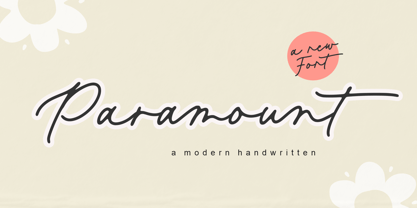 Introducing the new Fun Handwritten Font by Aestherica Studio. Proudly Present, Paramount Paramount is perfect for product packaging, branding project, megazine, social media, wedding, or just used to express words above the background. Paramount also multilingual support. Enjoy the font, feel free to comment or feedback, send me PM or email.
 - Faux Hebrew by Page Studio Graphics,
$24.00 The simulated font is based on the characteristic Hebrew calligraphy. Some of the original Hebrew characters have been given new roles, others modified to resemble modern Latin characters. The font includes an upper case alphabet, numerals, and basic faux punctuation, plus Harp of David, Menorah, and Star of David symbols.
 - Retail Shop JNL by Jeff Levine,
$29.00 Vintage New York neon signage alongside the landmark Dubrow's Cafeteria [probably circa the 1940s] of the words "retail shop" inspired the namesake digital type design. Retail Shop JNL is a bold and somewhat eccentric Art Deco font with varying widths and unusual character forms available in both regular and oblique versions.
 - Ridgewood JNL by Jeff Levine,
$29.00 While watching a movie filmed on location in New York, one scene stood out with a classic neon sign for a neighborhood restaurant. Ridgewood JNL is based on the lettering from that sign, and emulates many of the Art Deco elements that was so unique to sign work of the day.
 - Scissorgirl by Type-Ø-Tones,
$40.00 Scissorgirl by Julia Friese and Clare Keogh OpenType, 1 style Scsissorgirl is the crafty work of Ms. Julia Friese and Clare Keogh with the unselfish help of Josema Urós. Following Cortada path, this is a new fresh cut-out typeface, made not with vectors but real scsissor strokes on cardboard.
 - Maple Leaf Rag NF by Nick's Fonts,
$10.00The book Modern Alphabets, published in 1930, called this diamond in the rough from Continental Typefounders Nova Bold. Well, it’s neither new nor modern anymore, but it’s a warm, friendly face that’s sure to please. Both versions of this font contain complete Latin 1252 and Central European 1250 character sets. - Mystica by Aestherica Studio,
$12.00 Introducing the new Fun Handwritten Font by Aestherica Studio. Proudly Present, Mystica Mystica is perfect for product packaging, branding project, megazine, social media, wedding, or just used to express words above the background. Mystica also multilingual support. Enjoy the font, feel free to comment or feedback, send me PM or email.
 - Blog by BA Graphics,
$45.00Blog has a new distinctive look and comes in four weights light, regular, medium and bold. It can be seen as quite elegant in the light weights while looking masculine in the heavy weight. Its unique look lends to so many different applications. Blog works well for both headline and text. - Terasu Brush by Prioritype,
$18.00 Introducing a new brush font with a cool texture, you can use in your project to apply to music events, clothing products, crafts, image previews, creative posts and much more. As an illustration you can see some of the preview above. Features: -Uppercase -Lowercase -Numeral -Punctuation -Multilingual -Ligature -Swash Thanks.
 - Bridgeta by Nk Studio,
$14.00 The Bridgeta is a very legible Elegant Calligraphy, which is simply beautiful, classy, and elegant. Can be used for various purposes. Such as logos, wedding invitations, t-shirts, letterheads, signboards, news, posters, badges etc. The Bridgeta features 389 glyphs, including initials and terminal letters, alternates, ligatures, and multiple language support.
 - Rosalinda Script by My Creative Land,
$18.00 Rosalinda is a new handwritten typeface designed with wedding invitations in mind but can be used for various purposes like t-shirt design, logos, quotes design etc. The font contains 900+ characters and is best used in an Opentype-aware application such as Adobe Illustrator, Adobe InDesign, MSWord, Adobe Photoshop etc.
 - Ying by Wiescher Design,
$39.50 Ying is a new Serif typeface that has a little bit of Yang in it. This combination makes it a very versatile Serif font. Just give it a try and you will see. Ying goes together very well with Yang its brother-font. Yours working on the "Yong", Gert Wiescher
 - Qomarun by Wildan Type,
$14.00 Introducing new typeface. Qomarun- A modern, luxury, fashionable display serif font. It has unic construction for future style. Qomarun perfectly used for product presentation, elegant logo design, packaging or invitation cards or heading text. it is allcap with symbol and multilingual support Features Two style/ Numbers & Punctuation / Extensive Language Support/ligature
 - Schwager Sans by Latinotype,
$25.00 Schwager sans is the new version of Schwager. This time with a fresher taste, retaining the same principles of structure, geometry and modernist aesthetics in a contemporary reinterpretation. Designed especially for use in titles, reveals concepts associated with masculinity, technology or sports, perfect for application in cover design, logos, web.
 - Extravaganza by Solotype,
$19.95Originally, this 1870s wood type font was called Armenian. We came across a showing of alphabet at the South Street Seaport in New York, bought it and immediately drew the additional characters needed to make the font. We used it for some circus program work that was part of our livelihood. - Faceless by Gassstype,
$29.00 Hello Everyone, introduce our new product Font Faceless it is lack metal Typeface, Rooted, but still readable.This is a Textured Natural Style and classy style with a clear style and dramatic movement. This font Faceless is great for your next creative project such as logos, printed quotes, invitations, cards, product .
 - Billy Boss by Gassstype,
$29.00 Hello Everyone, introduce our new product Font Billy Boss This Is Rough Brush Font.This is a Textured Natural Style and classy style with a clear style and dramatic movement. That is has charming, authentic and relaxed characteristic more natural look to your text. You can activate 47 Ligatures glyphs OpenType panel.
 - Edangu by Twinletter,
$15.00 Edangu Arabic display font is a new typeface inspired by the oriental fonts used in Arabic calligraphy and other Middle Eastern architectural features. This font features a Kufic version that has beautiful and neatly arranged shapes. This font will make your design elegant, especially designs that carry the middle eastern theme.
 - F2F Tyrell Corp by Linotype,
$29.99The Techno sound of the 1990s, a personal computer, a font creation software and some inspiration had been the sources to the F2F (Face2Face) font series. Thomas Nagel and his friends had the demand to create new unusual faces that should be used in the leading german techno magazine Frontpage"." - Caniago by Wildan Type,
$10.00 Introducing new typeface. Caniago- A modern, luxury, fashionable display serif font. Embargo perfectly used for product presentation, elegant logo design, packaging or invitation cards or heading text. it is allcap with symbol and multilingual support Two style, Caniago Italic Caniago Regular Features Two style/ Numbers & Punctuation / Extensive Language Support/ligature/Alternate
 - Massimo by Borutta Group,
$29.00 Massimo is a semi-serif geometric type family. For as long as I can remember, I've admired the visual style of New York – its architecture, fashion, design, and typography. After spending two weeks in Manhattan this summer, I wanted to prepare a sharp and modern typeface in Big Apple style.
 - Breathe by Lián Types,
$20.00 ATTENTION COSTUMERS! A new version of this font was released in 2019. Take a look: Breathe Neue Reaching a total of more than 1000 glyphs, Breathe Pro is Maximiliano R. Sproviero’s gift of the year. The aim of the designer was once more to give the user the chance to play and travel from very formal and conservative letterforms to the amazing world of swashes and flourishes. Possibilities of alternating and ligating characters in this font are absolutely fantastic. After his last creation, Parfait Script, Lián wanted to make a more universal font. Delighted by typographic works of Didot and his followers of the beginnings of 1800, Maximiliano R. Sproviero started what became another obsessive project, which is now named Breathe, “cuando las letras respiran...” what could be translated as “when letters breathe”, due to the feeling that you are reading letters that are alive. Breathe comes in two styles which have a significant difference as regards to the quantity of glyphs available inside. If you want to get the most complete style, with over 1000 glyphs, (including contextual alternates, stylistic alternates, swashes, terminal forms, titling alternates, historical forms, stylistic sets, standard ligatures, stylistic ligatures, decorative ligatures and frames) then your choice should be Breathe Pro. On the other hand, if you are interested in having a less decorative font with the nice touch of Lián’s style, then your choice should be Breathe Standard, a more limited version of Breathe, including terminal forms (leaves) and frames. With Breathe Pro you will surely have fun at the same time you are designing and that is not an unimportant thing. The world of type-designers is growing each year, and the features of Open-Type are letting them think their creations as if they were truly pieces of art. At least, Breathe Pro is inspired in the Art of our predecessors, those who with a pen loaded of ink would decorate each letter, each page in such a lovely way. Yes, -lovely- is the word. We would not have the amazing lettering artists, calligraphers, typographers of nowadays if that -love for letters- had not traveled from generation to generation. Breathe Pro is an example of this love. An example of what Maximiliano R. Sproviero feels about typography and letters. Pssst... Look for more images and the User’s Guide at the gallery section to see it in use! http://origin.myfonts.com/s/aw/original/89/0/46067.pdf
 - TT Chocolates by TypeType,
$39.00 Introducing the third reincarnation of TT Chocolates! The popular typeface was updated to stay up-to-date with the latest requirements and trends in design! TT Chocolates is an elegant Humanist sans serif with a dense typesetting and well-balanced proportions similar to the classical tradition. This font's nice and friendly nature makes it seem like something close and familiar. It has earned a reputation among designers as the perfect font for confectionery, but the application range of the TypeType's "sweetest" typeface goes well beyond that! In 2023, we decided to do a full-scale font update referring to extensive sans-serif market research. We figured out where the trends are headed and what users want—this information helped us enhance TT Chocolates. Specifically, we introduced a new Condensed font version, a narrow font style with the authentic proportions of the standard version. At the same time, TT Chocolates Condensed boasts a more expressive personality than the base subfamily, which allows designers to solve even more creative tasks using only one typeface. The third version of TT Chocolates has become even more modern and advanced. A large number of characters, various OpenType features, and stylistic sets make the font suitable for multiple purposes and tasks. TT Chocolates is a perfect match for both branding and layouts. The font's dynamic shapes make it easy to read in small point sizes, allowing the eye to move effortlessly across the line. This typeface can also be used in web design due to the TrueType manual hinting option. TT Chocolates 3.000 includes: 29 font styles: 14 roman, 14 italic, and one variable font; Condensed version consisting of 14 new font styles; Carefully crafted contours; Optimized font rhythm and completely new kerning; Enhanced italics in basic subfamily; Variable font with three axes of variation: width, weight, and slant; 32 OpenType features, counting in 13 new ones; 901 characters in each font style—the character set has grown compared to the previous version, which had 629 characters in each font style; 230+ languages support, including the new ones: 35 Cyrillic-based and 16 Latin-based. Elevate your design's appeal with TT Chocolates!
 - Belda by insigne,
$29.99 Step into the beauty of Belda’s elegant form and discover the richness flowing from both its historic influence and its strong elements. At its heart, Belda's graceful style embodies the classical calligraphy of the Roman capital, best known from such Roman monuments as Trajan's Column. To lessen the possibility for error, the builders of these defining structures brushed their templates onto the marble before taking their first cuts from the expensive stone. These simple strokes now mark a simple but wonderful path full of life and mystery. Beyond a copy of the past, Belda has grown from its roots to offer a brave, new world of potential through its still-simple structure. The new design strongly contrasts thickness and stroke. Its delicate shape, curves and sharp serifs provide a unique style of harmony and beauty. The resulting balance? The lighter weight design remains subtle and elegant, while the combination in its bolder counterparts provides an intense luster and sparkle, pulling the reader’s eye to the font’s captivating features. A quick look beyond its surface of standard forms also reveals Belda has more layers to discover with OpenType small capitals, titling capitals and more. With a wealth of weights and many widths beside, the font is capable of serving as both text and titling. While especially strong as a movie title or poster font, it’s also great for book jackets, advertising, and packaging. So start your journey with Belda. The possibilities to explore on this path are practically endless. Production assistance from Lucas Azevedo and ikern.
 - Ainslie Sans by insigne,
$- Say g'day to Ainslie Sans, insigne Design’s new typeface. Like its big brother, the new face incorporates a mix of influences from Oz, although Sans is pared down from the original semi-serif. The original Ainslie was inspired by Mt. Ainslie and the city of Canberra’s inner suburb of the same name. Canberra is Australia’s capital--a planned city designed by American architect Walter Burley Griffin. Griffin’s style and geometric design for the city, which include Mt. Ainslie, are now also the same structure that make up the foundation of Ainslie Sans. Unlike the original Ainslie family member, though, Ainslie Sans does away with much of the aboriginal-inspired touches by eliminating the semi-serifs, forcing the font to borrow more heavily than its predecessor from Canberra’s distinct, geometric design and style. The result’s a spiffy Australian font that’s usable within a wide array of applications. The trendy typeface incorporates a multitude of alternates. You can access these in any OpenType-enabled application. Alternates, swashes and alternate titling caps allow you to customize the look and feel. Also incorporated are capital swash alternates, old style figures, and compact caps. Check out the PDF brochure to view these options in action. OpenType enabled applications can take complete benefit of your automatic replacing ligatures and alternates. This font also presents the glyphs to help a wide array of languages. Try it for copy. Try it for a headline. Try it alongside the original Ainslie. Whichever way suits you best, give it a burl. You won't be sad you did.
 - Tasman by Re-Type,
$30.00 Originally published by OurType, Dan Milne’s Tasman has found a new home at Retype. Milne first conceived Tasman as a typeface for newspapers. This influenced the proportions and look of the face considerably: the goal was to keep the personality as warm and playful as possible without losing the credible tone required to deliver all kinds of news. A sturdy, warm type family that is neither mechanical nor fragile. It borrows its name from Abel Janszoon Tasman (1603–1659), a Dutch seafarer, explorer, and merchant who mapped parts of Australia in 1642, including Van Diemen’s Land (now known as Tasmania). Tasman’s primary purpose is an unbiased presentation of information; it strives for neutrality over elegance. Its characters are sturdy and unambiguous, sporting strong serifs, punctuation, and diacritics, as well as generously sized small caps and hybrid figures. Rationalized letterforms give the face enough robustness to withstand the stress of screen applications and laser printing. The figures’ three-quarter x-height makes them considerably larger than traditional oldstyle numerals, yet they still integrate with the lowercase much better than lining figures do. Although initially intended for newspapers, Tasman’s somewhat corporate, objective appearance also makes it an excellent candidate for digital and print magazines, websites, annual reports, and corporate identities. Tasman is a suite of feature-rich OpenType fonts fully equipped to tackle complex, professional typography. The character set includes small caps, fractions, case-sensitive forms, bullets, arrows, special quotes, and nine sets of numerals. Besides standard Latin, its extensive character set supports Central European, Baltic, and Turkish languages.
 - Flamante Serif by deFharo,
$8.00 Flamante Serif is a family of 8 typographies with thick square serifs of the slab type, also known by the Egyptians, which are released with four weights: Light, Book, Medium and Bold and their corresponding italic versions. They are heiress fonts of the Egyptian types arisen at the beginning of the S. XIX and descendants of the fonts "Flamante Sans" Special corporate typographies to design resounding titles on any advertising medium, also for any type of publication like magazines or newspapers. They include the Bitcoin symbol. ================================== OpenType Features: Standard Ligatures, Additional languages, All Alternates, Alternate Annotation Forms, Superscript, Kerning, Superiors, Capital Spacing, Localized Forms, Superior letters, Discretionary Ligatures, Subscript, Fractions, Slashed Zero, Inferiors, Extended Fractions, Scientific Inferiors, Ordinals, Denominators, Oldstyle Figures, Numerators, Historical Forms, Historical Ligatures. - 500 glyphs. Latin Extended-A • OTF & TTF.
 - Albiona Inked by Device,
$39.00 Albiona Inked is a vintage distressed version of Albiona that evokes the urgency of teletext printers, typewriter ribbons and authentic hot-metal type on rougher paper. A contemporary slab-serif, it revisits aspects of Robert Besley’s classic Clarendon, designed around 1842 for Thorowgood and Co. and named after the Clarendon Press in Oxford. Subsequently extended by Stephenson Blake in the 1950s, Albiona adds the inwardly-curved stroke terminals of the same foundry ’s Grotesque series, and includes italics and old-style and tabular numerals. The original Clarendon’s ball serifs and calligraphic eccentricities have been rationalised and streamlined for functional contemporary uses. The family consists of five weights plus italics and a stencil, and its clean readable style is perfect for both extended text as well as headline setting. A rounded “soft” version is also available.
 - Mosherif by HansCo,
$12.00 Mosherif is a type of sherif font created with the aim of using for logo branding and print media. This font has three style that can be combined manually with one another in one word / text so that it looks unique and interesting. One example is in the first preview ( cover ), where the word "MOSHERIF" was made using three font styles ( Mosherif Regular, Mosherif Tall and Mosherif Short ). You can make it manually by making a space and remove some characters between words "MOSHERIF" becomes "M HE F" with using the font "Mosherif Tall" and fill it with "Mosherif Regular" in character "O" and "R" and "Mosherif Short" in character "S" and "I" by stacking them. By bringing the concept of vintage, clean, thick and sharp, hopefully Mosherif can provide choices for designers. Enjoy!
 - Das Riese by Intellecta Design,
$22.90 Das Riese, a type specimen by the most productive Brazilian type foundry, Intellecta Design, is a mix of victorian and art deco influences. A beautiful display type for tiling with uppercases only. It's shadows and volumes refer to pre-modern age whereas its surface to last century 20's. This heavy sans serif strokes characters have a particular appearance, a parallel line texture that reminds Bifur, typeface created in 1929 by A. M. Cassandre. The sideways absence of volume at some leaning letters right side in addition to the patchy darkness of shadows support its handmade design. A type full of historical references designed to small titles printed in big sizes. It's impossible not to think about posters when you look at Das Riese strong face. - (source Slanted Magazine #8)
 - The Coventysh by DLetters Studio,
$30.00 The Coventysh is a beautiful and Elegant Mono-Line Script Font, Available 2 weight styles are perfect for Logo Design, Branding, Clothing Design, Signage, Poster, Wedding Invitations and so much more! My goal for this font was to create an easy-to-read Monoline Font Script that serves a variety of purposes. The Coventysh, It has a handcrafted feel and natural touch then tidied up to create a consistent character set. It is perfect for your creative projects. What’s Included : S-Alt, SS01, SS02, SS03, Ligature 2 Weight Style (Regular and Light) Works on Win, Mac Simple installations Accessible in Adobe Illustrator, Adobe Photoshop, Adobe InDesign, even work on Microsoft Word. PUA Encoded Characters Fully accessible without additional design software. Hope you enjoy with The Coventysh font! Contact me if you have questions
 - Kappa Vol. 2 by W Type Foundry,
$25.00 Kappa Vol.2 is the serif version of our popular Kappa. Just as Kappa sans, this font has a slight narrowed structure and a prominent ascender height, therefore this font is suitable for a large range of platforms. Moreover, due to its serif Kappa Vol.2’s level of legibility is more accurate, so when you use it alongside Kappa sans the results will be extremely effective. Designed with powerful OpenType features in mind. Each weight includes alternate characters, ligatures, fractions, special numbers, arrows, extended language support, small caps and many more… Perfectly suited for graphic design and any display / text use. The 36 fonts are part of the larger Kappa super family. Learn about upcoming releases, work in progress and get to know us better! On Instagram W Foundry On facebook W Foundry wtypefoundry.com
 - Sharpe Variable by Mans Greback,
$19.00 Sharpe Variable is a stylish serif typeface family. The original type was drawn between 2018 and 2019, and the variable font and its updated styles was created in 2020. It is clear, sharp and has brave, lively letter forms but with a conservative backbone. This font is provided as a Variable Font. It is only one font file, but this file contains multiple styles. Use the sliders in Illustrator, Photoshop or InDesign to manually set any weight and width. This gives you not only the 15 predefined styles, but instead more than half a million steps to customize the type to the exact look your project requires. Each style contains ligatures and support for a wide range of languages. More info about Variable Fonts: https://mansgreback.com/s/About_Variable_Fonts.pdf
 - Colette by S&C Type,
$14.00 Colette is an inky handwritten script font designed to be easy to read and easy to use. Colette includes alternates and OpenType ligatures such as double letters or alternates glyphs that you can use to improve your designs and make them look natural and friendly. We also designed a Filled version (you can mix Colette and Colette Filled to give you more design options) and an Inside version (To do so, you can simply superimpose the layers with a compatible software like Photoshop, the weight above and the inside below, then choose a color for each). You could perfectly combine Colette with other S&C Type’s fonts, such as Naïve or The Hand for example. Just click on our foundry name to check them out! We hope you will enjoy our work. Merci beaucoup!
 - Majorelle by S&C Type,
$14.00 Majorelle is a textured script font designed by Fanny Coulez and Julien Saurin in Paris. This finely balanced font was designed to be easy to read, and because it’s just as important, easy to use. Majorelle includes alternates and OpenType ligatures that you can use to improve your designs and make them look natural and friendly. With a lot of extras like swashes, keywords, or splatters, this organic script could be used for any project that needs a warm and informal touch. We hope you will enjoy our work :) You could follow us on our Instagram: instagram.com/sc.type Merci beaucoup! Note: You could perfectly combine Majorelle with other S&C Type’s fonts, such as Naïve or The Hand for example. Just click on our foundry name to check them out!
 - Halcom by The Northern Block,
$49.50 A modern sans serif typeface inspired by the historic geometric’s of the 1920’s, specifically Futura. The design is not a simple pastiche of what went before this is much more than that. It is a close investigation to how Futura inspired other type designs like Avenir and helped push the boundary of what is a modern typeface of its generation. Overlaying perfect geometric shapes careful adjustment is made for each character and each corner to a point of balance between pure mathematics and optical correctness. The result is a distinctively modern geometric font family that is strikingly simple in design yet perfectly pleasing to the readers eye. Details include 550 characters with an alternative lowercase a, g and y, five variations of numerals, manually edited kerning and Opentype features.
 - und4 by URW Type Foundry,
$39.99 The rasterized square (clear, therefore 4 as part of the font name) was the constructive basis. The intention was to put all characters within this grid and produce a highly structured, yet lively, resting in itself, display font. Relaxed but exciting, just. An absolutely noteworthy detail are the classical construction principles (based on a typography book from the 50's for poster designers), the so-called optical weighting, derived and slightly exaggerated character elements: The characters are not purely symmetrical and the curve shapes do not close justified with the surrounding square. Loops and tongues slightly hang over; the upper bows are slightly less protruding than lower ones, etc. The kerning is tuned to fit these design details: the white space between the characters match the same filling space.