3,790 search results
(0.011 seconds)
- Rufolo by Eurotypo,
$22.00 Rufolo is a family of fonts that can be considered both aesthetic and utilitarian. It has an apparent serif, barely hinted at, whose clear past reference is a beautiful epigraphic script on the marble plate placed at the southern entrance of the Roman amphitheatre, in Pompeii. Perhaps its origin dates back to Ugarit's cuneiform writing (as Morrison suggests as the origin of the serif in "Politics and Scripts") whose characteristic triangular-shaped incision footprint produces a powerful trait that not only gives character to the writing but also facilitates its support and visual compensation of sizes with neighboring signs. Other clear inspirational references have been Robert Hunter Middleton's Stellar (1929); Albertus (1932) by William A. Dwiggins; Optima (1952) by Hermann Zapf; And more recently RRollie (2016) by our foundry. Rufolo collects the attractive characteristic of the stroke endings but the proportions of its structure becomes much more regular, the capitals are in line with a constant square module, while the above references retain the proportions of the Roman Trajan. Some endings strokes have slightly baroque reminiscence with the intention of giving it greater plasticity and aesthetic enrichment, but absolutely controlled, taking special care of the aspects of readability and expressive neutrality. Rufolo Family comes in four weight: Light, Regular, Bold and Black, accompanied by its corresponding Italic versions.
 - X Ruffian by ThoroughBR&,
$9.00 X RUFFIAN Ruffian was a champion thoroughbred horse who won 10 consecutive races. A feat worth mentioning & repeating. Her tenacity & steadfast approach established the basis for this variable based font. The X represents both the Roman numeral 10, but also the X-factor for creating bespoke works of art. It is quite befitting that this font be named after a legendary champion. Which begs the question...Do you champion variety? X Ruffian's design motif uses a broad tipped chiseled marker that was set at an angle for that extra bit of vigor. Identical letter forms defeat that truly "hand rendered" look that we ultimately strive for. Each uppercase letter offers 10 (X) or more stylistic alternatives, the lowercase and number sets have 3+ options and an over under for those special characters that yield a long bottom or top (see images). Ligatures & bonus characters can add that unique offering to your already individual style & can easily be found via the glyphs panel in any open type program. With a gigantic glyph count of 688, you'll never run out of options. As a right of passage, we felt obliged to include a roman numeral set as the name beckons, which differs from the standard letter form in which you would use to create. This is a variable winner. See you at the races!
 - Hierophant by Monotype,
$40.00 Hierophant is a humanist serif type family that has the heritage of classic Old Style and Transitional type while having the crisp lines and functionality of contemporary fonts. Its defining features include a high-contrast combined with diagonal stress, along with pinched stems and horizontals. This gives Hierophant a distinctive hand-drawn feel which also reflects the strong influence of the work of 16th century calligrapher Giovanni Francesco Cresci upon this family. OpenType features include stylistic sets of alternate glyphs – the first of which contains ornate teardrop serifs and ball terminals (ss01). This style dramatically changes the look of your typography and is ideally suited for short runs of text, headlines and branding purposes. Swash alternates for certain glyphs are available via Stylistic Sets 2 and 3. Other useful features include Small Caps at the click of a button, and Old Style Figures are an option to the default proportional figure style. There are 14 fonts altogether over 7 weights in roman and italic, you can also avail of two variable fonts which allow you to fine tune the weight to your exact liking. Hierophant has an extensive character set (1000+ glyphs) that covers every Latin European language. Key features: 7 weights in both roman and italic 112 Alternates Small Caps Variable fonts included with full family Full European character set (Latin only) 1000+ glyphs per font.
 - Serapion by Storm Type Foundry,
$39.00Another variation on the Renaissance-Baroque Roman face, it extends the selection of text type faces. In comparison with Jannon, the contrast within the letters has been enhanced. The dynamic elements of the Renaissance Roman face have been strengthened in a way which is illustrated best in the letters "a", "b" and "s". These letters contain, in condensed form, the principle of this type face - in round shapes the dark stroke invariably has a round finial at one end and a sharp one at the other. Another typical feature is the lower-case "g"; the upper part of this letter consists of two geometrically exact circles, the inner of which, a negative one, is immersed down on the right, upright to the direction of the lower loop and the upright knob. The vertical strokes slightly splay out upwards. Some details of the upper-case letters may seem to be too daring, but they are less apparent in the text sizes. It has to be admitted that typographers tend to draw letters in exaggerated sizes, as a result of which they stick to details. Serapion Italic are italics inspired partly by the Renaissance Cancelleresca. This is obvious from the drop-shaped finials of its lower-case descenders. The type face is suitable for illustrated books, art posters and short texts. It has a rather ugly name - after St. Serapion. - Jannon Pro by Storm Type Foundry,
$55.00 The engraver Jean Jannon ranks among the significant representatives of French typography of the first half of the 17th century. From 1610 he worked in the printing office of the Calvinist Academy in Sedan, where he was awarded the title "Imprimeur de son Excellence et de l'Academie Sédanoise". He began working on his own alphabet in 1615, so that he would not have to order type for his printing office from Paris, Holland and Germany, which at that time was rather difficult. The other reason was that not only the existing type faces, but also the respective punches were rapidly wearing out. Their restoration was extremely painstaking, not to mention the fact that the result would have been just a poor shadow of the original elegance. Thus a new type face came into existence, standing on a traditional basis, but with a life-giving sparkle from its creator. In 1621 Jannon published a Roman type face and italics, derived from the shapes of Garamond's type faces. As late as the start of the 20th century Jannon's type face was mistakenly called Garamond, because it looked like that type face at first sight. Jannon's Early Baroque Roman type face, however, differs from Garamond in contrast and in having grander forms. Jannon's italics rank among the most successful italics of all time – they are brilliantly cut and elegant.
 - Slowglass by Adam Jagosz,
$29.00 Slowglass is a geometric semi-serif accompanied by geohumanist italics. Softly rounded edges lend it a friendly tone. The typeface includes two categories of stylistic alternates, available as font features as well as complementary font subfamilies. Text forms for increased legibility (Slowglass Text) and uncial-inspired unicase variants (Slowglass Alt). At over 1500 glyphs per weight, the fonts support 80+ Latin-based languages (incl. Vietnamese), 14 Cyrillic-based languages and polytonic Greek. OpenType features: Six sets of figures: proportional / tabular × oldstyle / lining / petite (ss20) Superscript and subscript figures Fractions, numerators, denominators Optional slashed zero Case-sensitive forms Glyph composition/decomposition (support for Navajo and Greek) Localization (Dutch, Marshallese, Bulgarian) Stylistic Sets: ss01 Roman: Two-story a, loopy α / Italic: Loopy α ss02 Roman: Simple g / Italic: Simple k ss03 Unicase r ss04 Alt f t г п т γ ss05 Descending η χ ss06 Unicase β ζ θ ξ ss07 Alt в г д ж з к п т ю ss08 Latinized ς, cursive и й ss09 Round Δ Λ Д д Л л Љ љ ss10 Full-stem a q ss11 Seriffed I ss12 Unicase A ss13 Unicase E Ω ss14 Descending F T Г П ss15 Descending G P Q Y ss16 Unicase M N И H Y ss17 Extending Φ Ψ ss20 Petite figures
 - Testament by Canada Type,
$24.95 From the standpoint of calligraphy, a font family of capitals and uncials makes perfect sense. The Roman square capitals, the quadrata, are matched by round capitals of older Greek origin; the word "uncus" means hook-shaped like a beak or talon. Interrelated and often interchangeable, these capital letters served as book hands for both the Latin West and the Greek-speaking East before they evolved into minuscule alphabets. The Testament family is based on the few formal capital manuscripts of the Bible, Virgil and Homer that have survived from the ancient world. Throughout the Middle Ages both uncials and square capitals were used, often together, for headings and initial characters. By their nature the Roman capitals are the voice of Caesar and hold the place of authority, while the uncials speak for the Church in a balanced relationship. In ancient times church and state were not as separate as they are now, and the alphabets were not as different as typographic tradition has made them. In this calligraphic rendering it is clear that they are of the same substance and can be written in the same style, conveying even to the modern eye the eternal and classical quality of epic and scripture. Testament comes in all popular font formats, and includes support for a vaster-than-usual range of Latin-based languages.
 - AW Conqueror Std Sans by Typofonderie,
$59.00 AW Conqueror Sans was born out of this desire to fuse geometric and humanistic sans. It remains a typeface fundamentally influenced by both Bauhaus spirit — with its simplified geometric forms — and Jan Tschichold’s attempts to link this modular spirit to Eric Gill’s humanist sans serif. AW Conqueror Sans is a claimed French synthesis of Germanic Modernism and English classical tradition. Spheres of influence The core set of capitals are based on the proportions of the Roman capitals like Futura, Erbar, Nobel, Johnston, Gill Sans. During the 1930s, the Futura was a true success. Since then, Monotype offered a geometric version of the Gill Sans, and Linotype added Futura-like variants to WA Dwiggins’ Metro. AW Conqueror Sans is kind of a “fusion” of this approach. The lower case “b, d, p, q” are also directly influenced by Eric Gill’s, while the “y” is influenced by some of Jan Tschichold’s alphabets. In italics, drawn narrower, AW Conqueror Sans reinterprets Gill’s idea: a rigorous italic like a roman but which sometimes reveals some aspects of a Renaissance italic. AW Conqueror Sans and its extensions AW Conqueror Sans is the initial reference point for an extended family, including AW Conqueror Inline, Slab, Carved, Didot. The potential of these mixed families is powerful. Because AW Conqueror typefaces are based on an identical structure, and compatible proportions.
 - Soliden by Eko Bimantara,
$29.00 Soliden is a neo grotesk san serif font family with solid letterforms. Designed and published by Eko Bimantara in 2022, Soliden became a suitable choice for large display and functional purposes. The letterforms are built in large x-height with spacious counters. It consists of 8 weight from Thin to Black and 3 width; Condensed, Normal and Expanded, which make it a large font family with 48 styles. Soliden has 394 glyphs which cover broad latin languages.
 - Discoteque by Ilya Chalyuk,
$20.00Discoteque Family is modern art-deco related fonts collection that found compromise between retro and futuristic style. They are geometrically straight, rhythmic, clean and elegant. They are perfect in upper-case for headings, posters, logos. Discoteque Hypnosis makes stylish modern look with air of disco of 70-80s. Discoteque Gold is highly recommended for making designs in steam-punk style or for luxury vintage feel. Over 2,660 kerning pairs has been manually gleaned for perfect look. - Empire Display by Bean & Morris,
$27.50 Empire Display is a sans serif italic display face which references the styling of the 30s through to the 50s. It has a large x height and with its condensed proportions makes it ideal for headlines, posters or where large size settings are required. It has the unique feature of having the stems and cross bars slightly angled top and bottom. This also helps to create the art deco/modern feel that sets it apart from standard condensed typefaces.
 - Evil Ways JNL by Jeff Levine,
$29.00 The April 8, 1932 issue of The Film Daily ran an ad for a film entitled "The Sin of Lena Rivers". Hand lettered in a block style of chamfered characters, it is reminiscent of the 1920s, but still carries a touch of Art Deco influences with the thinner and extended horizontal strokes of the E, F and H. This retro sans serif design is now available digitally as Evil Ways JNL in both regular and oblique versions.
 - Retro Packaging JNL by Jeff Levine,
$29.00 A vintage rubber stamp alphabet and star printing set had a package header with Art Deco-inspired lettering describing the product. Sold by a company called Elvin [circa late 50's-early 1960s], these Japanese-made sets were one of many distributed by independent toy importers and made in various configurations including [at times] tiny animal stamps. The type design on this particular item was the model for Retro Packaging JNL, available in both regular and oblique versions.
 - Antikka by Okaycat,
$9.50Antikka draws some inspiration from the style of the Art Deco movement of the 1920s and 30s. The vision behind making Antikka was to revitalize the style of this bygone era -- making it funky and relevant to our 21st century times. Antikka is a minimal font, clear and geometric, yet highly stylized. Comfortable in a business setting - or just about anywhere. Antikka arrives as the business casual of fonts - giving it a wide range of use. - Metropolia by Samuelstype,
$24.00 Say hello to Metropolia! Drawing up the first roughs of this design I was aiming for a slightly asymmetrical feel. I later realized that this gave it a strong art deco influence. A slight tilt brings it a forward movement and a distinct flavour. Designed primarily for headline use, this is not your workhorse font but rather a playful and versatile addition to your font toolbox. A set of alternate capitals will be handy for headline or logo ornaments.
 - Eckhardt Titling JNL by Jeff Levine,
$29.00Eckhardt Titling JNL is another treatment of a popular typeface that lends itself well to the hand-lettered sign and display work of days past. A clean sans serif with a slight touch of Art Deco, this font renders well from small point sizes to large posters. As with other fonts in this series, it is named in honor of Jeff Levine’s good friend Albert Eckhardt, Jr. who owned Allied Signs in Miami, Florida from 1959 until his passing. - Agondav by Imoodev,
$20.00 Agondav is a nostalgic font, this typeface has smooth curves and a visual style a can embodies charm and elegance in every lettering, making your work look stunning and attractive. A versatile font that works in both large and small sizes, suitable for a wide variety of projects such as a display for headings, logos, invitations, branding, magazine, photography, card, product packaging, product mockup, mugs, posters, labels, signatures, editorials, art deco, any type of advertising purpose.
 - Aliykit Open by John Moore Type Foundry,
$35.00 Aliykit Open a decorative OpenType font generated from geometry with parallel lines of open and closed forms, by the way they can fit inside the Art Deco style but is part of the design influence of Venezuela in the area of art and cinetic art, his set of characters includes letters for western and eastern European languages and Cyrillic, also provides several ligatures that link between them. It is ideal for decorative display headlines to large sizes.
 - Afterword JNL by Jeff Levine,
$29.00 At the end of the 1931 gangster film “The Public Enemy” a hand lettered card offers up an afterword on the demise of Tom Powers (James Cagney’s character in the film) and how a “public enemy” is neither a man nor a character but a problem society must deal with. The text is in an Art-Deco influenced sans serif, and has been digitally recreated as Afterword JNL, which is available in both regular and oblique versions.
 - Stereonic by Mint Type,
$30.00 Stereonic is a geometric display sans influenced by Art Deco style. Its 38 fonts across 5 weights offer the possibility to convey numerous moods and styles typical for different decades. As the name suggests, the music posters were considered as the perfect application for this typeface, however using it in magazines and other editorial will definitely add more style. A variety of included ligatures and alternatives will also make Stereonic a perfect choice as the base for logotypes.
 - Sightseeing Tour JNL by Jeff Levine,
$29.00 Samuel Welo was a sign painter who had published in the 1920s and again in 1960 his “Studio Handbook – Letter and Design for Artists and Advertisers”, prolifically hand lettering all of the type style examples within the pages of the publication. In 1930 Welo also published “Lettering - Practical and Foreign”. From this book comes a thick-and-thin hand lettered Art Deco alphabet – now available digitally as Sightseeing Tour JNL in both regular and oblique versions.
 - Stonage by Struvictory.art,
$14.00 Stonage is a minimalistic handwritten font inspired by tribal aesthetics and decorated with geometric patterns. The typeface includes Decorative and Symbol styles. Stonage Decorative is represented by thin line lowercase and ornate uppercase. Use Stonage Symbols to create unique patterns in tribal style. Stonage font family is suitable for craft products branding and packaging (needlework, minimal clothing, organic food), tourism products, surface design, music albums, typographic posters ect. Use individual letters and symbols to create logos and monograms.
 - Arbotek by Type-Ø-Tones,
$60.00 Arbotek has the original skeleton that the author used for the development of his typeface Arboria, a real 'architect typography', with a basic and radical approach to pure geometric forms. The three basic styles - Thin, Light and Light Rounded - try to approach the cartographic technique annotations and their output on plotters. The voluptuous style, Ultra, keeps the same structure of the Light versions, but develops as a historic Art Decó variant of this 20s and 30s graphic style.
 - Industria by Linotype,
$40.99Brody’s fonts borrow elements from both Art Deco and non-Western styles. His designs received international recognition for their innovative, computer-oriented style, reaching almost cult status. Four original Brody fonts are available from Linotype Library GmbH: Insignia, Industria-Solid, Industria Inline and Arcadia. For your convenience, we have gathered all four into one package. Industria is a font which speaks of mechanical exactness, cool and reserved. Industria Inline is a lighter version of Industria Solid. - Template Sans by Jeff Levine,
$29.00 The Wright-Regan Instrument Company (Wrico) was one of the leading manufacturers of lettering templates for many years. Aside from their own line of products, they also did custom manufacturing. A series of lettering guides called “Mimeostyle” for the A. B. Dick Company of Chicago (produced for use in making mimeograph machine printing stencils) featured an art Deco squared letter design with rounded corners. This is now available digitally as Template Sans JNL, in both regular and oblique versions.
 - Variety Store JNL by Jeff Levine,
$29.00 Ben Harris' illustrated cover for the sheet music of "I Found A Million Dollar Baby (in a Five and Ten Cent Store)" from 1931's "Billy Rose's Crazy Quilt" lists the show's stars and other credits in a pen lettered monoline design with rounded terminals. This early Art Deco type style has now become the digital font Variety Store JNL (a reference to the Five and Ten Cent stores alluded to in the song title from the sheet music).
 - Bakic Shomeryg by Imoodev,
$20.00 Bakic Shomeryg is vintage typography, this typeface has smooth curves and a visual style a can embodies charm and elegance in every lettering, making your work look stunning and attractive. A versatile font that works in both large and small sizes, suitable for a wide variety of projects such as a display for headings, logos, invitations, branding, magazine, photography, card, product packaging, product mockup, mugs, posters, labels, signatures, editorials, art deco, any type of advertising purpose.
 - Central Park JNL by Jeff Levine,
$29.00 The beautiful Art Deco monoline pen lettering on the cover of a 1940s piece of sheet music inspired Central Park JNL. The 1940s was an era when couples took romantic walks along the pathways of Manhattan's Central Park or rode around it in hansom cabs. Big bands played at the major clubs and ballrooms and "uptown" meant the well-to-do. Men dressed in their tuxedos and top hats and the ladies were in their jewels and evening gowns.
 - Elektromoto NF by Nick's Fonts,
$10.00This family takes its inspiration from two early Art Deco faces from Germany. The Normal version is based on Dynamo, designed by K. Sommer for Ludwig & Mayer in 1930, while the Narrow version is based on Stadion, designed by Erhard Grundeis for Die Schriftguß AG in 1929. Their common design motifs epitomize the Age of Streamline. Both versions include the complete Latin 1252, Central European 1250 and Turkish 1254 character sets, with localization for Lithuanian, Moldovan and Romanian. - Ahiore by Imoodev,
$20.00 Ahiore is modern serif fonts, this typeface has smooth curves and a visual style a can embodies charm and elegance in every lettering, making your work look stunning and attractive. A versatile font that works in both large and small sizes, suitable for a wide variety of projects such as a display for headings, logos, invitations, branding, magazine, photography, card, product packaging, product mockup, mugs, posters, labels, signatures, editorials, art deco, any type of advertising purpose.
 - Southside Fizz by Hanoded,
$15.00 Southside Fizz is a cocktail (made with gin, lime, mint and soda). Southside Fizz font was based on a single word in a 1930’s advertisement and my Palembang font. I did not have that many glyphs to work with, so I made most of them up. Southside Fizz became a very elegant all caps Art Deco font, quite useful for wedding invitations, books and posters. It comes with a roaring amount of diacritics as well.
 - Pulpo by Floodfonts,
$49.00 A friendly and comfortable typeface inspired by Century Schoolbook and Clarendon. Despite the strength and sturdiness of the design, each letter shape carries warmth and an echo of the human hand, concealing some nostalgia. The family is ideally suited for editorial, advertising and packaging as well as web and app design. A massive body combined with low stroke contrast, make it very suitable on screen and for small text sizes on newsprint paper. For more information visit the microsite.
 - Shutterbug JNL by Jeff Levine,
$29.00 On April 20, 1950, film comedian Jerry Lewis indulged his love of cameras by opening up Jerry Lewis’ Camera Exchange on Vine Street in Hollywood. It closed in 1951. Thanks to an image preserved within newsreel footage of the shop’s grand opening night, a glimpse of the post-Art Deco signage with its unusual, block style lettering inspired a digital version. Highly unusual and best for novelty projects, Shutterbug JNL is available in both regular and oblique versions.
 - Avery by Kaer,
$19.00 Hey! Introducing my new Art Deco inspired script style typeface Avery. This font perfect for beauty magazines, vintage branding, luxury posters, wedding headers, and advertising. What's included? * Regular style * Uppercase and lowercase * Numbers * Symbols * Punctuation I hope you enjoy this font. Follow my shop to receive updates of products and the very hottest news! If you have any question or issue, please contact me: kaer.pro@gmail.com Please request to add additional characters and glyphs if you need! Thank you!
 - Damian by I Can Be Your Type,
$10.00Damian is a font designed with simplicity in mind and a hint of flare to catch the attention of the user. The sans serif style is based off of the geometrical features of Futura and Univers. With the focus on the circle creating the forms this font is geared towards a feeling of modern art deco. The name comes from a colleague who asked to be named after the font, it was his birthday, how could I say no. - Bulldog Slab by Club Type,
$36.99 Figgins and Caslon may be names familiar to many as Type Founders. Indeed they are, but they are perhaps less well known for the emergence of Sans Serif type styles which have become part of our lives since 1889. The first hundred years of this style is celebrated with this design by Adrian Williams, completed in 1989. It echoes many features of the Gothic, Grotesque and Sans Serif models of the period, based particularly on the 1870 Figgins.
 - Gresida by Imoodev,
$20.00 Gresida is elegant serif fonts, this typeface has smooth curves and a visual style a can embodies charm and elegance in every lettering, making your work look stunning and attractive. A versatile font that works in both large and small sizes, suitable for a wide variety of projects such as a display for headings, logos, invitations, branding, magazine, photography, card, product packaging, product mockup, mugs, posters, labels, signatures, editorials, art deco, any type of advertising purpose.
 - Tiara by Tanincreate,
$16.00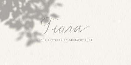 Tiara is a lovely modern calligraphy script typeface with contemporary accents. It is great for wedding invitations, branding, headline, logotype, apparel, packaging, advertising etc. Tiara script comes in uppercase, lowercase, punctuation, symbols & numerals, stylistic set alternate, ligatures, multilingual support . All lowercase letters include beginning and/or ending swashes which gives a realistic hand-lettered style. To use the swashes, a program that supports OpenType features is needed (Adobe Photoshop CS, Adobe Illustrator CC, Adobe Indesign, Corel Draw, ect.)
 - Municipal Pool JNL by Jeff Levine,
$29.00 A photo of the now closed [circa-1953] Lowell Municipal Pool (at 1601 N. 28th St.) in Boise, Idaho shows the words “Municipal Pool” formed into the cement of the entrance to the above-ground swimming facility. Both the lettering and building entrance designs harken back to the Art Deco era and the sign features stencil-like characters. This inspired a typeface aptly named Municipal Pool JNL, and is available in both regular and oblique versions.
 - Interbellum by Punch,
$22.00 Interbellum is an Art Deco inspired font family which contains 3 display fonts, 2 modern-looking text fonts and 4 AllCaps fonts. In combination, you can easily give your designs a bold, yet elegant look. And by using the many different style sets, it is able to stand tall in all sorts of designs. Although it was inspired by the roaring 20s, we still think of Interbellum as an everlasting time traveller that will definitely impress your clients.