3,998 search results
(0.009 seconds)
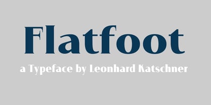
- Flatfoot by Brave Lion Fonts,
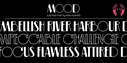
$9.00 - Mood by Device,
$39.00 - Market Deco - Unknown license
- Armalite Rifle - Unknown license
- Ukiah Caps - Unknown license
- Terry Script - Unknown license
- Umbrage - Unknown license
- Karmatic Arcade - Unknown license
- Fraulein - Unknown license
- Daisy Script - Unknown license
- Xtreme Chrome - Unknown license
- Yukarimobile - Unknown license
- Refrigeration - Unknown license
- Ruth Script - Unknown license
- Gisele Script - Unknown license
- Tetroserbogia - Unknown license
- HydrogenType - Unknown license
- Freelance Kamchatka - Unknown license
- Eurocentric - Unknown license
- AylaCSscript - Unknown license
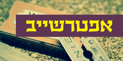
- Ktuviot MF by Masterfont,
$59.00 - Big In America - Unknown license
- Offshore Banking Business - Unknown license
- Maxine Script - Unknown license
- Arenzi - Unknown license
- Oil Age Heiroglyphs - Unknown license
- Q-Bert's Funeral - Unknown license
- Boxajoy by PizzaDude.dk,
$20.00 - Ellington Manor by BA Graphics,
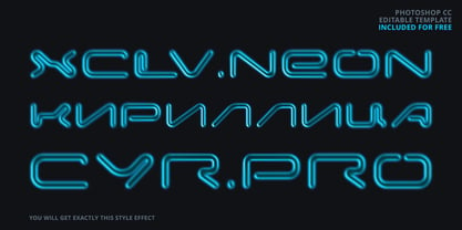
$45.00 - XCLV.NEON Pro Cyrillic by Viktor Konovalov,
$9.87 - M Stiff Hei PRC by Monotype HK,
$523.99 - Twilight - Unknown license
- Major Snafu - Unknown license
- Nuku Nuku - Unknown license
- Retriga - Unknown license
- Stargazers - Unknown license
- Corporate HQ - Unknown license
- Wild Freak - Unknown license
- Siamese Katsong - Unknown license
- Ranmorian Standard beta - Unknown license


