10,000 search results
(0.018 seconds)
- Russian - 100% free

- Gussian by Flawlessandco,
$9.00 Introducing "Gussian" - A Modern Sans Serif Font. Gussian is a contemporary sans serif font that effortlessly combines modern aesthetics with clean simplicity. There's some connected letters and some alternates that suitable for any graphic designs. This font support for some multilingual. Also contains uppercase A-Z and lowercase a-z, alternate character, numbers 0-9, and some punctuation. If you need help, just write me! Thanks so much for checking out my shop!
 - Old Russian by Grummedia,
$20.00Old Russian is a fake Cyrillic alphabet, based on old Slavic characters universally adopted in the old days of the Russian empire. Offering an opportunity to create a unique historical look. - RussianQuality - Unknown license

- Gyrussian - Unknown license

- Hessian by MADType,
$39.00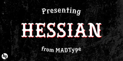
- Fussion by Variatype,
$12.00 Fussion is inspired by modern technology, it's really suited to your branding project or logotype and more commercial project. With more ligatures to make it flexible to any brand name. FONT FEATURES Additional Accents 66 Languages Kerning Alternates Ligatures SOFTWARE RECOMMENDATION Adobe Photoshop Adobe Illustrator
 - Rusthian by MC Creative,
$10.00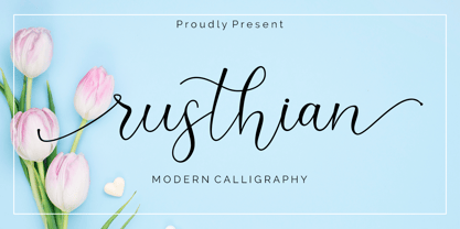 Rusthian a new modern & fresh calligraphy font with a lot of stylistic alternate make this font looks natural, elegant, and perfect for any awesome projects. Rusthian is perfect for many different project such as logos & branding, invitation, stationery, wedding designs, social media posts, advertisements, product packaging, product designs, label, photography, watermark, special events or anything. What’s Included : Standard Glyphs Ligature Works on PC & Mac Simple installations Accessible in the Adobe Illustrator, Adobe Photoshop, Adobe InDesign, even work on Microsoft Word. PUA Encoded Characters – Fully accessible without additional design software. Fonts include multilingual support for; ä ö ü Ä Ö Ü ß ¿ ¡ Thank you for your purchase! Hope you enjoy with our font!
 - Busstan by YonTypeStudio Co,
$10.00 A dapper, rustic, handwritten font with a personal charm. With quick-drying strokes and distinctive styles, Busstan is perfect for branding projects, household appliance designs, product packaging - or just as a style text overlay for any background image. That's it! I really hope you enjoy it - please do let me know what you think, comments & likes are always hugely welcomed and appreciated.
 - Ruffian by Scriptorium,
$18.00 - Seussian by Sylvestre Studios,
$20.00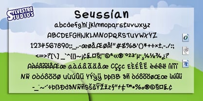
- Text by Alias Collection,
$60.00 Whereas blackletter types were hand written, Text letterforms are drawn using a series of graphic shapes that slot together in a series of permutations, one set for lower case and another for the upper case. As the link between the method of construction of the letterforms has been removed from the appearance (the quill pen with which they were written resulting in the angle and sharp stresses) there is no logic for these stylistic elements to work in any set way. As this fundamental rule of the blackletter style has been removed the typeface has become something other than a typical or derivative blackletter font.
 - Prussian Brew - Unknown license

- Rushine by Keristyper Studio,
$14.00 Say hello to Rushine Script, a vintage calligraphy brush stroke font. This font is good for logo design, Social media, Movie Titles, Books Titles, short text even long text letters, and good for your secondary text font with sans or serif. Featured: Standard Uppercase & Lowercase Numeral & Punctuation Multilingual : ä ö ü Ä Ö Ü ß ¿ ¡ Alternate & Ligature PUA encoded We recommend programs that support the OpenType feature and the Glyphs panel such as Adobe applications or Corel Draw. so you can use all the variations of the glyphs. Hope you enjoy our fonts!
 - Ruskin by Fine Fonts,
$29.00 The origin of Ruskin was a commission for Michael Harvey to design a signage font for the Dean Gallery in Edinburgh. The style of the letterforms was to complement the period of the building which was originally an orphanage built in 1839. Only uppercase letters were created at first with the lowercase letters—and other characters necessary for a font—added later. With elegant and slightly extended letterforms, Ruskin fulfilled its rôle well as a signage font. It also functioned extremely well as a general display font. It is particularly suited to item descriptions and placards in galleries and museums which are frequently read from an angle, as well as head-on. The fonts have both proportionally and monospaced numerals.
 - Sussan by Estudio Calderon,
$20.00 The Sussan type family is a hand lettering collection designed by Felipe Calderón. It contains sixteen different hand-drawn fonts and a set of funny illustrations designed by Jhony Velasco. On this occasion, we tried to match several font concepts to create nice pieces with them and each one is equipped with automatically exchanging alternates, ligatures, swash letters and some other feature.
 - 1350 Primitive Russian by GLC,
$44.00 This rough font was inspired by a Russian Cyrillic hand of the 1350s “Russkaja Pravda” (a Russian text of common Laws). As a Pro font, it supports Western and Northern European, Icelandic, Baltic, Eastern, Central European and Turkish specific characters, as well as Old Russian glyphs, including many which fell out of use in the 1700s, except in religious texts — in all over 136 Russian glyphs. The upper and lower case have the same form and almost same size, like in the original texts, which had only one size and style.
 - Ruffian bold - Unknown license

- Ruffian Outline - Unknown license

- X Ruffian by ThoroughBR&,
$9.00 X RUFFIAN Ruffian was a champion thoroughbred horse who won 10 consecutive races. A feat worth mentioning & repeating. Her tenacity & steadfast approach established the basis for this variable based font. The X represents both the Roman numeral 10, but also the X-factor for creating bespoke works of art. It is quite befitting that this font be named after a legendary champion. Which begs the question...Do you champion variety? X Ruffian's design motif uses a broad tipped chiseled marker that was set at an angle for that extra bit of vigor. Identical letter forms defeat that truly "hand rendered" look that we ultimately strive for. Each uppercase letter offers 10 (X) or more stylistic alternatives, the lowercase and number sets have 3+ options and an over under for those special characters that yield a long bottom or top (see images). Ligatures & bonus characters can add that unique offering to your already individual style & can easily be found via the glyphs panel in any open type program. With a gigantic glyph count of 688, you'll never run out of options. As a right of passage, we felt obliged to include a roman numeral set as the name beckons, which differs from the standard letter form in which you would use to create. This is a variable winner. See you at the races!
 - Prussian Brew Offset - Unknown license

- Prussian Brew Upper - Unknown license

- DS Russia Demo - Unknown license

- Komika Text - Unknown license

- Komika Text - Unknown license

- PanAm Text - Unknown license

- Komika Text - Unknown license

- Komika Text - Unknown license

- Medici Text - Personal use only

- Wedding Text by Tilde,
$39.75 - Faust Text by Solotype,
$19.95Barnhart Bros. and Spindler called this Faust Text when they introduced it in 1898. A quarter of a century later, they brought back a number of obsolete faces and renamed them. This one became Missal Text in their 1923 catalog. - Noam Text by TypeTogether,
$69.00 Adi Stern’s Noam Text shows that typographic progress is often in the small things — in the perfecting of familiar traditions and in staying loyal to the spirit of what came before. It can’t really be called progress unless it honours its history. In this way, TypeTogether is happy to introduce Noam Text: A Hebrew and Latin serif font that builds on its heritage with the twin tools of honour and progress. Since 1908, the Frank-Rühl fonts have dominated the Hebrew book and newspaper market. Noam Text’s design goal was to create a coherent family with both Latin and Hebrew serif text typefaces, each authentic to its own script, and which would serve as an alternative to last century’s predecessor. In short order, users will recognise Noam Text as a source of progress in its bilingual abilities. Hebrew and Latin have opposite reading directions, creating many issues: opposing directionality of the open counters; vertical stress in Latin, but horizontal in Hebrew; fewer extenders in Hebrew; and no Hebrew capital letters. All these have been taken into account in Noam Text’s modern design. Of unique importance — all punctuation marks have a Hebrew version, which makes each script complete and uncompromising. Among other technologically advanced details, Noam Text was programmed for all expected scenarios of mixing Hebrew, Latin, figures, and punctuation. Noam Text is intended mostly for setting long texts, so it strives to achieve maximum legibility in minimum space with its large x-height, short and fairly condensed Latin capitals, large and open counters, and low contrast. Originally derived from the Hebrew, the shallow horizontal curves and strong baseline serifs provide dynamism and enhance the reading flow. Noam Text Latin’s italic is rounded and reading friendly, is condensed to generate a lighter texture than the roman, and has a flowing stance. These virtues help it endure harsh printing conditions and subpar inks and paper. Noam Text’s three total weights provide a proper solution for integrating texts in both scripts, as well as a contemporary alternative for use in books, newspapers, and magazine design. Aligned with TypeTogether’s commitment to produce high-quality type for the global market, the complete Noam Text family displays an impressive amount of discretion, applying to wide use-cases by not edging too close to religious motifs or imbibing in secular indulgence. This means Noam Text can be the go-to family across the board and capitalise on the desire for clear typographic progress in this modern age.
 - Europa Text by Solotype,
$19.95This circa 1910 European face was introduced into the United States by a German type foundry traveling salesman during the great depression of the 1930s. We have used it quite successfuly in sizes as small as 10 and 12 point. - Jules Text by DSType,
$40.00 Jules Text is the perfect companion to the previously released Jules family.
 - Melville Text by Luhop Creative,
$27.00 Melville Family is a meticulously crafted font collection that falls under the transitional serif classification. It offers a variety of font styles, including italic and serif old style, with a total of 16 unique styles to choose from Melville is a versatile and flexible solution that can be used in various industries such as stationary office, newspaper, cover book, web design, and text. Discover how Neville can enhance your projects and meet your specific needs.
 - American Text by SoftMaker,
$9.99 American Text is a condensed American blackletter published by SoftMaker.
 - Qualion Text by ROHH,
$39.00 Qualion Text™ is a modern geometric sans serif typeface with humanist and calligraphic inspirations. It is a text family designed for excellent legibility. Qualion Text™ is a sibling of Qualion™ & Qualion Round™, geometric family with lots of swashes and ornaments. Letter shapes and proportions has been adjusted to fit paragraph text and small sizes: - typeface is narrower now in order to fit more text in the design space - larger stroke contrast - pronounced ink traps and tapering - elegant true italics made even more calligraphic - adjusted spacing and kerning - adjusted font weights The main purpose of the family is clean and legible paragraph text, however it is very attractive choice for branding, headlines and display use, too. The italic styles as well as thin, bold and black upright styles have very strong character and look great in display sizes. Italics are very fluent, calligraphic, subtle and elegant, from the other side bold and black uprigths are very modern, powerful and unique thanks to the pronounced ink traps. Qualion Text™ family consists of 20 styles - 10 weights with corresponding true italics. Both have extended language support, as well as broad number of OpenType features, such as small caps, case sensitive forms, standard and discretionary ligatures, swashes, stylistic sets, contextual alternates, lining, oldstyle, tabular and small cap figures, slashed zero, fractions, superscript and subscript, ordinals, currencies and symbols.
 - Oksana Text by AndrijType,
$33.00 Oksana Text Narrow is Oksana Text, narrower by 25%. Cyrillic and Latin, with real italics and swashed initials in six weights, is always slender.
 - Cardillac Text by Hoftype,
$49.00 Cardillac Text is the down to earth version of the subtle and high contrasted Cardillac family. More suitable for longer text and for strong headline applications. The Cardillac Text Family consists of 16 styles, provides many features which allow its application for ambitious typography. It comes in OpenType format with extended language support. All weights contain small caps, ligatures, superior characters, proportional lining figures, tabular lining figures, proportional old style figures, lining old style figures, matching currency symbols, fraction- and scientific numerals, matching arrows and alternate characters.
 - Lust Text by Positype,
$29.00 Yes, finally. This one took the most time and the most restarting. Years went into imagining what Lust Text should look like and how it should structurally behave in order to truly improve upon a setting that includes any of the Lust typefaces. I approached it as much from the side of the type designer, as I did a potential user. The flow, the warmth, the personality needed to be there, but all of the excess had to be removed responsibly. In the process, and in need of inspiration, I looked backward to historical artifacts and precedent. In each early Lust Text approach, the solution was lackluster and/or vanilla and not actually a ‘Lust’ typeface. The exercise was not in vain though. By exploring past examples, I found my footing drawing for media now and how it might be used later—all the while, producing seamless, elegant curves and restrained indulgence (that sounds almost silly to say, but I like it). The Lust Collection is the culmination of 5 years of exploration and development, and I am very excited to share it with everyone. When the original Lust was first conceived in 2010 and released a year and half later, I had planned for a Script and a Sans to accompany it. The Script was released about a year later, but I paused the Sans. The primary reason was the amount of feedback and requests I was receiving for alternate versions, expansions, and ‘hey, have you considered making?’ and so on. I listen to my customers and what they are needing… and besides, I was stalling with the Sans. Like Optima and other earlier high-contrast sans, they are difficult to deliver responsibly without suffering from ill-conceived excess or timidity. The new Lust Collection aggregates all of that past customer feedback and distills it into 6 separate families, each adhering to the original Lust precept of exercises in indulgence and each based in large part on the original 2010 exemplars produced for Lust. I just hate that it took so long to deliver, but better right, than rushed, I imagine.


Page 1 of 250Next page