2,505 search results
(0.018 seconds)
- Sphera by Lorenzo Vecchiotti,
$17.00 Sphera is the second font designed by Lorenzo Vecchiotti in 2022. It is composed entirely of circles or portions of a circle. Each capital letter touches the four sides of a square. It is a thin, elegant and geometric display font that is at its best in large sizes. 2 styles 185 glyphs for each style 14 ligatures Italian, english, french, spanish, german, danish Bigger images here: https://www.behance.net/gallery/162117209/Sphera-Display-Font
 - FourJuly by Ingrimayne Type,
$7.95 FourJuly contains three patriotic fonts that might be fun to use in July. They are also very hard to read, but perhaps not as hard as the somewhat similar letters in the fonts of FlagDay. FourJuly A has square, blocky letters with star interiors. FourJuly G and FourJuly H add diagonal stripes. FourJuly G and FourJuly H can be layered on top of FourJuly A to create bicolored letters. See the example here.
 - Mechanikschrift by Victory Type,
$12.00Mechanikschrift, roughly German for “mechanical writing”, is a typeface from Noah Rothschild and Victory Type. The aesthetic of this font is just what its name points towards: machine-like structure with a German flare. Minimalism is often associated with German design, and Mechanikschrift is a minimalist typeface. Furthermore, the designs of the characters, outside of the general theme of squared-off corners and angular appearance, are related to Herbert Bayer’s work at the Bauhaus. - Yalta Sans by Linotype,
$29.00 Yalta Sans combines the warmth of a traditional humanist design, the clarity of a grotesque and the modernity of a square sans. Several design traits contribute to this melding of diverse typographic concepts. Characters find their foundation in stroke-based shapes rather than constructed forms. Curve stokes are also slightly squared and counters are open. Curved strokes join verticals at nearly right angles to create a strong horizontal stress, aiding the reading process. The resulting design is exceptionally legible while still inviting. Although Yalta Sans is clearly differentiated from its calligraphic ancestors, many details of the design emulate the distinctive characteristics of typefaces from the Renaissance. Tapering horizontal stokes also give Yalta Sans a dynamic relationship with linear grotesque while its angled stroke terminals echo the work of a calligraphic brush Yalta Sans italics are cursive designs that are in keeping with humanistic letterforms and are markedly narrower than the Roman characters. Lining and old style figures, small caps and a suite of ligatures also make for a remarkably versatile typeface family.
 - Stempel by Linotype,
$29.99The Stempel family consists of two fonts; each made to look like a set of block stamps. Each letter appears inside its own roughly drawn square. Stempel One's letters are very simple form/counterform objects. Stempel Two's forms are more ornate: each square stamp has a thin border inside of it, and then the individual letterforms have been knocked-out, so that the colored area depicts the counters around the letters rather than the letters themselves. As a line of text is typed, a box appears for each letter entered, and all of the boxes slightly nudge against each other to form the line. The Stempel fonts have the appearance of a hand-made quality to them. Their forms appear too random, too delicate, and too thought out to have been made on a machine. Using these fonts will add a nice warm, linoleum-cut touch to your work. Both Stempel One and Stempel Two were designed by German designer Martina Balke in 2002, and are part of the Take Type 5 collection from Linotype GmbH." - Pepperwood by Adobe,
$29.00Pepperwood font is a joint work of the typeface designers K.B. Chansler, C. Crossgrove and C. Twombly. These artists also created the typefaces Rosewood, Zebrawood and Ponderosa together and as the names suggest, all of these typefaces are so-called wood types. The origins of this kind of typeface can be found in the early 19th century. Called Italian or Italienne, these typefaces quickly became very popular. They are distinguished by square serifs whose width is larger than the stroke width of the characters. When the letters are set together, the heavy serifs build dark horizontal bands. Pepperwood font has a couple of unique characteristics of its own. Small squares decorate the middle of the letters and the edges of the serifs are not straight, rather, they have small, fine tips. Pepperwood is reminiscent of the Wild West with its shootouts and heroes, but also suggests the glamor of the 1970s with their platform shoes and wild hair-dos. The different weights allow a large range of design possibilities. Used carefully in headlines, Pepperwood font is sure to draw attention. - Shentox by Emtype Foundry,
$69.00 During a visit to London in 2008 I fell in love with the square font used on the British car number plates. I was immediately inspired to start working on this font and have been developing it intermittently ever since. Several more trips to London and the project evolved before it finally took off and became Shentox. Despite the starting point being inspired by simple, everyday car plates, the font soon evolved into something fine and very rich in detail. Even though the square genre is very restrictive, Shentox is a highly legible contemporary font with a full range of weights, useable not only as a display family for headlines and posters, but as a distinct, clean font family for branding and general editorial use (Especially magazines). It has been carefully drawn paying extra attention to the details, high end finishes that makes Shentox a safe font for use in large scale work. For example, the curves of every individual corner have been adjusted character by character to avoid the common problems encountered with square fonts (Eg. darker corners between weights or a visually inconsistent radius between the Upper and Lowercases as a result of copy/paste). Shentox italic, which has a 12 degree slant, has been corrected to avoid distortion when slanted. The radius of the upper-right and lower-left corners are more pronounced, giving it a more fluid Italic feel. Shentox is available in Open Type format and includes ligatures, tabular figures, fractions, numerators, denominators, superiors and inferiors. It supports Central and Eastern European languages. This type family consists of 14 styles, 7 weights (Thin, UltraLight, Light, Regular, Medium, SemiBold and Bold) plus italics. Shentox PDF
 - Zawiya by Eyad Al-Samman,
$3.00 The word Zawiya in Arabic language means Angle in English language. "Zawiya" is a Kufic modern square-shaped Arabic typeface. The typeface has only right-angled angles which makes it full of open and closed squares and free from any curves or arches. This font comes in two different weights. I am originally an engineer and I have liked to draw geometric shapes since my early childhood. I decided to design a typeface that embodies both of the technical and artistic human that I have inside me. The main characteristic of "Zawiya" Typeface is in its modern and attractive right-angled and square-shaped styles for its all-Arabic characters. The character "Faa" is one of its most distinguished characters that I myself adore it so much. "Zawiya" Typeface is suitable for books' covers, advertisement light boards, titles in magazines and newspapers, posters, greeting cards, cards, covers, satellite channels, exhibitions' signboards and external or internal walls of malls or metro's exits and entrances, geometric instruments and tools, technical devices, computers and laptops, IT and electric devices and also calculators. It is advisable to use the font in fields related to sciences such as geometry, mathematics, physics, chemistry, astronomy, industry, economy, and other fields. It can also decorate surfaces of calculators, geometric tools, rulers, pens, computers, cars, ships, trucks, and other related electric and electronic devices. It is sharp design qualifies it to be printed in public signs in streets, airports, hospitals, schools, malls, hotels, mosques, and other public places. It can also be used in titles for Arabic news and advertisements appeared in different Arabic and foreign satellite channels.
 - Adamantium by Comicraft,
$39.00Looking for sharp-looking characters in ferocious action? Then look no further than this font, originally designed by Senior Comicraftsman John Roshell for GHOST RIDER 2099. Adamantium has also been featured in WOLVERINE and THE UNCANNY X-MEN. - Milla Cilla - Personal Use - Personal use only

- FF Kaytek Rounded by FontFont,
$50.99 Kaytek™ Rounded completes the Kaytek typeface family with seven carefully rounded weights. Every style of the typeface takes up exactly the same amount of space, thanks to the careful creation by Radek Łukasiewicz. This means designers can switch between styles without the text being reflowed, making it particularly useful in magazines, where space might be limited, and also on the internet, where hover links appear in a different style. Kaytek Rounded comes in seven weights, from Thin to Black. It pairs also with Kaytek Sans, Kaytek Slab, and Kaytek Headline.
 - Octava by ParaType,
$30.00 PT Octava™ was designed at ParaType in 2001 by Vladimir Yefimov. The first (Cyrillic only) version named Scriptura Russica (1996) consisting of three styles (book, italic, bold) was commissioned by the Russian Bible Society. Lately the Latin letters and bold italic were added. Inspired by Lectura, 1969, by Dick Dooijes and Stone Print, 1991, by Sumner Stone. In spite of large x-height the typeface is both space saving and quite legible at small sizes. Expert fonts including small caps (book) and old style figures are available.
 - Daytona Variable by Monotype,
$209.99The Daytona™ typeface family grew out Jim Wasco’s desire to design a readable and legible typeface for video and on screen use. Because of its high levels of legibility, the Daytona family is additionally an ideal design for display usage in digital user interfaces and a wide range of print applications. Wasco drew each character with legibility as a primary goal, some of the letters having unique attributes to minimize the ambiguity. Daytona Variables are font files which are featuring two width axes and have a preset instance from Thin to Fat. - Paragraph Stretch by Paragraph,
$15.00 When merely “extended” just would not do, here is Paragraph Stretch™: a super extended or elongated geometric display typeface. It is a typeface with an unicase effect: the capitals and lower case fit the same height and a similar width, so they are interchangeable: fancy a round “W” in all caps? Use the lower case. Want a straight “x” in lower case? Use the cap. And so on. Designed for use at larger sizes for logotypes, short titles or headings. It supports Western plus Nordic, Eastern European and Turkish languages.
 - Mejicana by Page Studio Graphics,
$29.00The PIXymbols™Mejicana fonts are designed to create both single color, and two-color titles. The fonts are designed for use in creating menus for Mexican restaurants, notices of festive occasions with a Mexican theme, promotion of Mexican folk crafts, and of travel to Mexico. Each font package includes both TrueType and PostScript versions, and is available in either PC/Win or Macintosh format. In order to avoid serious problems, be sure not to install the same fonts in both TrueType and PostScript on the same computer. - Shorai Sans Variable by Monotype,
$1,049.99 Shorai™ Sans balances the subtlety of traditional hand-drawn brushstrokes with clean, geometric outlines. An intellectual-looking sans serif, Shorai’s simplified letterforms and vast weight ranges provide creatives with a holistic branding solution. Shorai Sans was designed as a companion typeface to Avenir® Next, built to work harmoniously in modern global designs, while preserving the essence of Japanese handwriting. Shorai goes beyond existing Japanese sans serifs to provide a wide spectrum of expression and personality for designers to play with. Shorai Sans is opening new horizons in Japanese typography.
 - Romany by Ascender,
$50.99 The Romany™ typeface family is a delightful typographic confectionary that will bring affability and charm to both print and interactive design projects. Be it an online game, digital app, hardcopy packaging, or larger than life poster, Romany will deliver. When first designed by A.R. Bosco for American Type Founders in 1934, Romany was a single weight design. Relatively popular as hand-set type, Romany was not made into digital fonts – until now. The septuagenarian design was updated, reimagined and enlarged into a small family by Terrance Weinzierl.
 - Ballpoint by FontJuice,
$15.00 Ballpoint font family was designed by David Fox in 2021 for the FontJuice™ foundry. A rounded sans serif style, Ballpoint has a simplicity which does not reject traditional forms . It is non ornamental and non emotional, just clearly presentable. This font is suitable for logotype, brand, packaging, quotes, music poster, t-shirt, cover book and more custom design. More specifically, whilst the heavier weights are best used for display in advertising, the lighter weights remain readable in text. Ballpoint features uppercase, lowercase, numeral, punctuation & symbol, multilingual support.
 - Shorai Sans by Monotype,
$188.99 Shorai™ Sans balances the subtlety of traditional hand-drawn brushstrokes with clean, geometric outlines. An intellectual-looking sans serif, Shorai’s simplified letterforms and vast weight ranges provide creatives with a holistic branding solution. Shorai Sans was designed as a companion typeface to Avenir® Next, built to work harmoniously in modern global designs, while preserving the essence of Japanese handwriting. Shorai goes beyond existing Japanese sans serifs to provide a wide spectrum of expression and personality for designers to play with. Shorai Sans is opening new horizons in Japanese typography.
 - Terminax by Monotype,
$29.99Terminax™ is a highly legible monospaced sans serif font with an extensive character set. Unlike other monospaced fonts, Terminax has a personality all its own. Terminax is a futuristic and assertive font which is popular with titles, and headings. Why a Small Caps font you may ask? While most word processing and page layout software offer a small cap feature - this merely distorts the letterforms and creates squashed, uneven results. Terminax features small caps that were designed so their weight matches the upper case letters, providing a clean, attractive appearance. - Petroglyph by ParaType,
$25.00PT Petroglyph™ was designed by Ekaterina Kulagina and licensed by ParaType in 2002. The type was created on the basis of petroglyphs (rock-carvings) that are known in 77 countries. They remained in a form of geometrical drawings in the caves of North Spain and France. Scientists claim that the radial spread-out of circles or center-pointed circles that are usually depicted show the development of solar symbolism at that period of time. We know for sure that such mysterious signs as drawings carved on rocks already existed 40 centuries ago. - Griffo Classico by Linotype,
$29.99Griffo Classico™ was produced by Franko Luin in 1993. It is a revival inspired by the types cut by Francesco Griffo for the Venetian printer Aldus Manutius at the end of the fifteenth century. The roman is based on the type Griffo cut in 1496 for Bembo's de Aetna," and the italic on a type he cut in 1501 for an edition of Virgil. Griffo did not make separate italic caps, so Luin designed his own for Griffo Classico. This is a serviceable family with five weights, including small caps. - Ask For Mercy by Comicraft,
$49.00 She’s tall and thin with elegant, long legs and striking features. She can be seen in Comicraft’s COMIXOLOGY ORIGINALS series, ASK FOR MERCY. No, not Mercy herself — we’re talking about the ASK FOR MERCY font! Yes, you asked for Mercy -- begged for it even -- and now we are granting it to you! Mercy Mercy Me. ASK FOR MERCY contains alternate uppercase alphabets, auto-ligatures for a more random, hand-drawn appearance, and Comicraft's revolutionary Crossbar I Technology™, which puts that tricky character in exactly the right places.
 - ITC Novarese by ITC,
$40.99 Novarese font is the work of designer Aldo Novarese. He created 218 typeface cuts but as he was writing his book, Alfabeta, he decided to include only those he considered indispensable. He divided his fonts into 4 categories and in the designing of Novarese, took the best characteristics of each group and combined them into this font. In the style of Latin stone scripts of the second century BC. Novarese is a well-balanced and relatively wide text font with classic forms. ITC Novarese™ font field guide including best practices, font pairings and alternatives.
 - PIXymbols Baby Blocks by Page Studio Graphics,
$25.00 The PIXymbols™Baby Blocks font is designed to create both single color, and two-color titles or initials. Each package includes a document showing the full character set with key codes. The font package includes both TrueType and PostScript versions, and is available in either PC/Win or Macintosh format. In order to avoid serious problems, be sure not to install the same fonts in both TrueType and PostScript on the same computer. The font offers opportunities for various color treatments, with either single or double characters.
 - The font D3 Littlebitmapism Square, created by the entity known as D3, is a distinctive typeface that evokes the essence of early digital graphics and retro gaming aesthetics. As its name suggests, i...
- Praxis Next by Linotype,
$57.99 Praxis® Next has the same robust shapes and proportions as the original 1976 Praxis design. Its large x-height, substantial counters and open apertures guarantee high levels of legibility and reading ease in print and on screen. More weights, condensed designs and true cursive italics differentiate Praxis Next from the older design. Praxis Next shines where space is at a premium. The regular designs are modestly narrow while the condensed typefaces perform with grace in the most crowded of environments. The bold designs create powerful headlines and banners and the lighter weights are ideal for both long and short-form text copy. Because of its many weights and proportions, Praxis Next is also an ideal design to build a brand identity. Praxis Next Variables are font files which are featuring two axis and have a preset instance from Light to Ultra and Condensed to Roman. Pair Praxis Next with old-style designs like Bembo® Book and Stempel Garamond™ to create a dynamic typographic contrast. Or complement the design with its serifed counterpart, Demos® Next . Unger also drew ITC Flora® as an alternative italic design. Looking for something a little different? Pair Praxis Next with Masqualero™ .
 - Crox by NumidiaType,
$25.00 Crox™ is a sans-serif professional typeface inspired by crude geometry, creativity, and art. In the font family, there are 19 styles, including upright and italic, It is constructed of big lowercase letters with a maximum x-height for excellent optical reading. English letters are supported as a numerator and denominator set, this feature may aid in the creation of fractions using letters and numbers, as well as for sophisticated scripting and various scientific fractions forms. All weights support over 25 professional OpenType features within each style, with extensive coverage of western languages. These features were originally planned for personal and professional use, including multi-alternative characters in Styles: 1, 2, 4, 10, 11. Operational styles 6, 7 are enhanced with some scientific forms, to write the fit derived (SI units' expressions). Otherwise, it supports a wide range of professional factory pricing styles for business and marketing, as well as retail pricing styles in Sets 5, 8, and 9, with ligatures, old-style numerals, ordinals, swashes... Crox™ is enhanced with a poster weight like the fantastical type to fulfill your creative needs in three styles: poster, poster oblique, and poster italic for ADS and web design, branding, or product design. Glyphs: More than 970 glyphs, including those accessible with OpenType features. Powerful OpenType features: Standard Ligature, Alternate access, Automatic ordinals (English, French...), Case sensitive, localized forms, Numerator set, Denominator set, Subscript, Superscript, Swash, Stylistic alternate, Styles 1,2,3,4,5(Pricing style 1), 6(Derived Units),7(Advanced Fractions for Scientific units, Derived Units Vulgar Form), Set 8 (Pricing Style 2), Set (Pricing Style 3), Proportional Old-style, Tabular Old-style, Proportional Lining, Tabular Lining, Zero with slash, Fractions (Default, Automatic). Suitable for: logo and modern branding, web design, packaging, Product packaging, Articles, scientific document, Product user guides, multiple works in the Media, Design, ADS... Specimen Crox™ is a trademark of Yassine Abdi.
 - Masqualero by Monotype,
$50.99 The Masqualero™ family is a versatile solution for a deep and broad range of applications. In large sizes, the heavier designs are dark and handsome, while the lighter weights are charming and friendly in text copy. Thanks to its many variations and distinctive demeanor, both print and interactive designers will find that Masqualero expands their creative options, while setting the perfect tone to catch and hold readers’ attention. It’s About the Design Like the legendary jazz song of the same name, Masqualero is haunting and sophisticated. Drawn as a tribute to Miles Davis, its letterforms are as beautiful as his “Masqualero” composition. “I approached drawing the letters as if they were marble sculptures,” Says Jim Ford about his typeface. “Many sharp, black, modern sculptures filling a large park. All of them created with the same qualities – the flair of Miles' electric funk and rock sounds, the sparkly smooth finish and serifs like trumpet bells, the sweet lyricism and the tone and clarity of Miles’ horn.” What’s Available With six weights and italics, in addition to Stencil and Groove display designs, Masqualero is available as a suite of OpenType Pro fonts, providing for the automatic insertion of small caps, ligatures and alternate characters. Pro fonts also offer an extended character set supporting most Central European and many Eastern European languages. Thoughts About Use A book or album cover set in the Masqualero design sends a message: what’s inside is of value. Like jazz, the Masqualero typeface takes ordinary basic concepts and slips them into something special. Readers take notice and immediately recognize that what they’re viewing is a cut above – and radiates quality. “I see Masqualero as a luxurious typeface for exquisite typography,” says Ford. “I wouldn’t use it to sell toys or hot dogs. Masqualero sells diamonds, boats, real estate and champagne.” Perfect Pairings Antique Olive™ Neue Kabel® Neue Frutiger® Quire Sans™ Trade Gothic®
 - Avenir Next by Linotype,
$97.99 Avenir Next Pro is a new take on a classic face—it’s the result of a project whose goal was to take a beautifully designed sans and update it so that its technical standards surpass the status quo, leaving us with a truly superior sans family. This family is not only an update though, in fact it is the expansion of the original concept that takes the Avenir Next design to the next level. In addition to the standard styles ranging from UltraLight to Heavy, this 32-font collection offers condensed faces that rival any other sans on the market in on and off—screen readability at any size alongside heavy weights that would make excellent display faces in their own right and have the ability to pair well with so many contemporary serif body types. Overall, the family’s design is clean, straightforward and works brilliantly for blocks of copy and headlines alike. Akira Kobayashi worked alongside Avenir’s esteemed creator Adrian Frutiger to bring Avenir Next Pro to life. It was Akira’s ability to bring his own finesse and ideas for expansion into the project while remaining true to Frutiger’s original intent, that makes this not just a modern typeface, but one ahead of its time. Complete your designs with these perfect pairings: Dante™, Joanna® Nova, Kairos™, Menhart™, Soho® and ITC New Veljovic®. Avenir Next Variables are font files which are featuring two axis, weight and width. They have a preset instance from UltraLight to Heavy and Condensed to Roman width. The preset instances are: Condensed UltraLight, Condensed UltraLight Italic, Condensed Thin, Condensed Thin Italic, Condensed Light, Condensed Light Italic, Condensed, Condensed Italic, Condensed Demi, Condensed Demi Italic, Condensed Medium, Condensed Medium Italic, Condensed Bold, Condensed Bold Italic, Condensed Heavy, Condensed Heavy Italic, UltraLight, UltraLight Italic, Thin, Thin Italic, Light, Light Italic, Regular, Italic, Demi, Demi Italic, Medium, Medium Italic, Bold, Bold Italic, Heavy, Heavy Italic. Featured in: Best Fonts for PowerPoints
 - Brogado JNL by Jeff Levine,
$29.00Make room for Brogado JNL! This bold, yet squat slab serif font takes command when set into headlines. Although not thoroughly in the Western mold, Brogado JNL can still exude enough macho appeal to make its point strongly, yet clearly. - Pickle Standard by bb-bureau,
$65.00 Pickle Standard is the display version of bb-Standard rigorously built on a grid. Read the article by Madeleine Morley for Eye on Design: A Font as Crisp, Squat + Rounded as a Pickle 3 styles: italic, regular and reversed italic
 - Altogether Ooky by Comicraft,
$19.00 It’s Creepy and it’s Kooky, it’s Altogether Ooky! Created by Comicraft’s Festering Fontmeister, John Roshell, for “The New Addams Family” TV series, Altogether Ooky is just The Thing you'll be looking for when Gomez and Morticia come knocking at your door.
 - odstemplik - 100% free

- Cybertroops by Maulana Creative,
$12.00 Cybertroops is a square letterform concept as mono handwritten display font. With light mono-line stroke, fun character with a bit of ligatures. To give you an extra creative work. Cybertroops font support multilingual more than 100+ language. This font is good for logo design, Social media, Movie Titles, Books Titles, a short text even a long text letter and good for your secondary text font with sans or serif. Make a stunning work with Cybertroops font. Cheers, MaulanaCreative
 - Fusaka by Adobe,
$29.00Fusaka was created by graphic designer Michael Want, a highly original and specialized display typeface which bridges Kanji and Roman letterform styles. As in Kanji, each character fits into a square. The shape and the placement of letter and decorative strokes can make Fusaka look like Asian writing at first glance and allow it to be set either horizontally or vertically. Use Fusaka for a unique look on CD covers, magazine headlines, book titles and Web sites. - Grimblocks by Maulana Creative,
$15.00 Grimblocks is a Decorative Square Blocks font. With Sharp Bold stroke, Upright and fun character with a bit of ligatures. To give you an extra creative work. Grimblocks font support multilingual more than 100+ language. This font is good for logo design, Social media, Movie Titles, Books Titles, a short text even a long text letter and good for your secondary text font with sans or serif. Make a stunning work with Grimblocks font. Cheers, MaulanaCreative
 - Olney by Philatype,
$20.00 A square sans stripped down to basic, neutral shapes. Olney is primarily a display family with lighter weights that will remain legible at text sizes. The letterforms of Olney are designed to appear consistent, sturdy, and technical. Careful attention was given to the pure, almost modular forms, to ensure that the family looks timeless, rather than resorting to a contemporary or futuristic aesthetic. Each weight includes a thorough set of diacritics for Western and Central European languages.
 - MC Riegal by Maulana Creative,
$16.00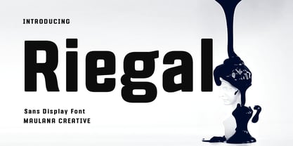 Riegal is a Square-is sans Display Tech font. Bold stroke, fun character with a bit of ligatures and alternates. To give you an extra creative work. Riegal font support multilingual more than 100+ language. This font is good for logo design, Social media, Movie Titles, Books Titles, a short text even a long text letter and good for your secondary text font with script or serif. Make a stunning work with Riegal font. Cheers, Maulana Creative
 - Protofo by Lafontype,
$19.00 Protofo is a modern-humanist sans-serif with characters that features various geometric shapes — from square, round and triangle. Protofo comes in 16 styles — upright and italic — from thin to black with each equipped with features such as localized, ligature, fraction, ordinal, superscript, numerator, nominator, subscript, proportional and tabular numerals. Protofo is also equipped with extended latin letters which can represent multi languages so making it perfect for any kind of project (display, editorial, web, interface, app, etc).

