6,983 search results (0.044 seconds)
  1. plasma poodle - Unknown license
  2. Bayao Hand - Unknown license
  3. Comic Book - Unknown license
  4. TRACK - Unknown license
  5. SinnerMovieCredits - Unknown license
  6. Eiszapfen - Unknown license
  7. Marusya - Unknown license
  8. Leipzig Fraktur - 100% free
  9. Pixel Cyr - Unknown license
  10. Zrnic Cyr - Unknown license
  11. Nautilo Font System by Die Typonauten, $9.90
    Technical systems rule!
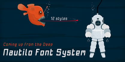
  12. OregonDry - Unknown license
  13. VIDEO - Unknown license
  14. DSJapanCyr - Unknown license
  15. Handsome by Shinntype, $50.00
    Handsome was the first digital typeface to resemble nice, ordinary, fully cursive handwriting. Or neon. In 2005, Handsome Pro was one of the first script typefaces to utilize the OpenType format to simulate the natural quality of writing, by automatically substituting alternate contextual glyphs. The effect follows the conventional “joining rules” of calligraphy, which are a formalization of the way in which letter forms are modified in cursive handwriting for the sake of speed and efficiency—and also perhaps to make life more interesting. For the look of real handwriting, Handsome is most convincing at around 15 pts. At much smaller or larger sizes it works differently. At display size, the feel of the non-nib styles is very slick, more like a speedball Kauffman, owing to the smoothness of the finish. As script fonts go, Handsome has a relatively large x-height, which can be useful if you don't want the “writing” to look too small.
  16. GauFontRoot - Unknown license
  17. Swashett - Personal use only
  18. AddCityboy - Unknown license
  19. Slave - Unknown license
  20. Lindsay Narrow - Personal use only
  21. Rosango - Unknown license
  22. TeknikohlRemix01 - Unknown license
  23. Ongunkan Sweden Dalecarlian Run by Runic World Tamgacı, $50.00
    The Dalecarlian runes, or dalrunes, was a late version of the runic script that was in use in the Swedish province of Dalarna until the 20th century.The province has consequently been called the "last stronghold of the Germanic script. When Carl Linnaeus visited Älvdalen in Dalarna in 1734, he made the following note in his diary: The peasants in the community here, apart from using rune staves, still today write their names and ownership marks with runic letters, as is seen on walls, corner stones, bowls, etc. Which one does not know to be still continued anywhere else in Sweden. The Dalecarlian runes were derived from the medieval runes, but the runic letters were combined with Latin ones, and Latin letters would progressively replace the runes. At the end of the 16th century, the Dalecarlian runic inventory was almost exclusively runic, but during the following centuries more and more individual runes were replaced with Latin characters. In its last stage almost every rune had been replaced with a Latin letter, or with special versions that were influenced by Latin characters.
  24. Elicit Script by Monotype, $40.99
    Elicit Script is a hybrid script family, that can be as casual or formal as the occasion demands. Created by Laura Worthington and Jim Wasco, the design is based on pointed pen Spencerian Script handwriting. “It’s like one of those German italics from the early 20th century, that have beautiful shapes that hold their own,” says Wasco. Elicit Script spans five weights, from Extra Light to Bold, and three styles – Formal, Normal and Casual. This makes it an incredibly versatile script design, easily paired with other typefaces and able to be dressed up or down, depending on what it’s used for. The monoline Casual style offers a more relaxed tone of voice, while Formal sits at the more decorative end of the spectrum. Designers can keep things straightforward, tidy and practical with the typeface’s simple caps, or add in swash caps if they need more exuberance and expression. Generous spacing means Elicit Script works well at smaller sizes as well. Elicit Script Variable Set is a single font file that features two axes: Weight and Contrast. The Weight axis has instances from Extra Light to Bold. The Contrast axis has instances from Casual (low contrast) to Formal (high contrast).
  25. Broadcast JNL by Jeff Levine, $29.00
    The vast resource of hand lettered vintage sheet music titles offers many interesting and unique variations on even the simplest styles of lettering. A simple thick-and-thin serif design circa the 1920s-1930s evokes a reminiscence of the Art Nouveau period combined with a touch of what was to come during the Art Deco era. Most charming is the fact this lettering is free of the formal rules and constraints of metal type, where designers are generally forced into conformity with uniform stroke widths, serif placements and character shapes.
  26. Smilly - Unknown license
  27. XXII DaemonRunes by Doubletwo Studios, $25.99
    Dark, Darker, Darkest - Daemon Runes.
  28. Romance Fatal Serif Std - Personal use only
  29. DOCK11 - Personal use only
  30. Existence Light - 100% free
  31. Days - 100% free
  32. decorative fontFINAL - Unknown license
  33. LT Starlight - 100% free
  34. Pianaforma - 100% free
  35. Sanskrit Roman - Unknown license
  36. Janda Apple Cobbler - Personal use only
  37. BigNoodleTitling - 100% free
  38. Obcecada Sans - Personal use only
  39. Elcsa - 100% free
  40. Fira Mono - 100% free
Looking for more fonts? Check out our New, Sans, Script, Handwriting fonts or Categories
abstract fontscontact usprivacy policyweb font generator
Processing