10,000 search results
(0.043 seconds)
- Tailwind by Grype,
$19.00 The world of aviation is filled with clean and iconic logotypes, yet some of the earlier logotypes were friendly and simple. The Tailwind family finds its origin of inspiration in an early Air Jamaica company logo, and from there is expanded into a small but comprehensive font family. Tailwind celebrates the typographic stylings of the 70’s, with the soft rounded terminals and open geometric feel, transcending its brand inspired origin to give birth to a family that feels both retro and modern. It inherited the friendly stylings of the mostly lowercase logo that inspired it, and goes on to include a full standard character set with expansive international support of latin based languages, small caps styles, and three weights jumping from light to regular to a heavyweight black. This family is ready to chart a course for your designs towards that of a modern, comfortable appeal. Here's what's included with the Tailwind Collection bundle: 382 glyphs per style - including Capitals, Lowercase, Numerals, Punctuation and an extensive character set that covers multilingual support of latin based languages. (see the 6th graphic for a preview of the characters included) 6 fonts in 3 weights: Light, Regular, Black . Small Caps versions available in all weights. Fonts are provided in TTF & OTF formats. The TTF format is the standard go to for most users, although the OTF and TTF function exactly the same. Here's why the Tailwind Collection is for you: You're in need of a soft rounded font with a variety of weights with small caps for your designs You're a retro airline junkie and have to have anything inspired by Air Jamaica You love VAG Rounded, but you really want something just a little different You really dig the Akademics & Bloomingdales logos, but would like a softer type in that genre You just like to collect quality fonts to add to your design arsenal
 - Eroded 2020 - Unknown license

- French Grotesque - Unknown license

- Ghost Scepter by Forberas Club,
$16.00 This font inspired by scary movie. You can this font for your journal logotype or something about scary or horror and maybe hardcore style. Let's try and have fun with this font.
 - April Blossom by Angele Kamp,
$22.00 April Blossom is a sweet, brush font with a playful character. This fun will look gorgeous on all your branding materials, cards, quotes, and any other lovely projects you are working on.
 - Dos Crayones by Fat Hamster,
$15.00 Dos Crayones - Hand drawn textured fonts Dos Crayones inspired by child crayons drawing. Textured fonts are perfect for your great projects, quotes, playful branding, children's products, fun greeting cards, packaging and more!
 - Cherrine by Solidtype,
$14.00 Cherrine is a handcrafted font. decorative, fun and friendly. Can used for various purposes. such as the title, logo, quotes, invitations, signage, posters, etc. International support for most Western Languages is included.
 - Godehyda by Anomieka,
$13.00 It's smooth, it's cute, it's fun, and it's mighty tasty: it's Godehyda! It is perfect for headings, flyer, greeting cards, product packaging, book cover, printed quotes, logotype, apparel design, album covers, etc.
 - Nurture Your Best by Seemly Fonts,
$14.00 Nurture Your Best is a modern and clean font. Its versatility and neat vibe will brighten up each of your designs. Have fun with this beautiful font and explore its endless variations.
 - Impression by profonts,
$41.99 Impression ist indeed quite impressive, art nouveau, hippy, flower power, groovy? Impression was redesigned and digitally remastered by German designer Ralph M. Unger for profonts. You want to have fun ? take impression!
 - Me & You by Green Adventure Studio,
$20.00 Me & You is a fun and playful display font. Masterfully designed to become a true favorite, this font has the potential to bring each of your creative ideas to the highest level!
 - Groupie by Resistenza,
$39.00 The idea was to mix liberty lettering with 70’s psychedelic posters and dedicate a font to Groupies. Check out the alternative glyphs and icons included. Have fun and be a Groupie
 - Kellvin by AEN Creative Studio,
$14.00 Kellvin is a fun and friendly display font, that can easily stand out. Simple but with a strong visual effect, this font will instantly make your creation more appealing than any others.
 - Whexjable by PizzaDude.dk,
$20.00Whexjable is full of fun and quirky letters - I have included loads of ligatures to complete the original distorted look! You will need to use OpenType supporting applications to use the autoligatures. - Lights Of Athena by Epiclinez,
$18.00 Lights Of Athena is a bold and smooth stylish script font. It's fun and casual, but demanding attention. Very suitable for headlines, titles, magazines, packaging, branding, apparel, adverts, logos, apps, and more.
 - AZ Clouds by Artist of Design,
$20.00 AZ Clouds was inspired from a need to develop a sans serif typeface with center accents for a t-shirt design. This font was designed for use as a fun bold headline.
 - Shining Monday by Subectype,
$16.00 Shining Monday is a fun and whimsical paint brushed display font. This font is perfect for children themed designs, especially when combined with bright colors. What's Include: Hello Angel Thank You, Subectype
 - Basic Pixel by Mandarin,
$12.00 Basic Pixel is the right font to have fun with. With 15 different styles you can combine styles and color like building blocks to create endless new combinations and intriguing visual outputs.
 - Boldscope by ahweproject,
$9.00 Boldscope is a fun, retro-psychedelic display font. No matter the topic, this font will be an incredible asset to your fonts’ library, as it has the potential to elevate any creation.
 - 2 Prong Tree - Unknown license

- Diamant Handwriting by 38-lineart,
$14.00 Diamant Handwriting is an upright handwritten font, which looks like a thick pen stroke. Form orientation is generally flowing horizontally, this is a reflection of composure in writing, we set the rhythm of each glyph so that the combination of high and low letters is very soft, try it, whatever you type with this font looks very calm. Activate the OpenType feature, because this font is equipped with ligatures (liga), Stylistic(salt), Contextual(calt) and initial alternates. We present all of this so that your writing is automatically setup, we also provide access to all alternates (aalt) features, this allows you to choose the glyph you like manually. We designed this font only for brand identity. Your brand will look different from other brands. You can also use it for short slogans to further amaze views and attract more customers to see you closer. 'Diamant' is another word of diamond that is often used in Europe, we give this name as a representation of the whole font as a symbol of luxury, brilliance and stability and comfort. We do not extend the theory and philosophy of this font, you better try it yourself, and you will be amazed. thank you
 - Salt & Spices Pro by Fontforecast,
$29.00 Salt&Spices Pro is a welcome addition to the ever popular modern calligraphy genre. Digitizing the many handwritten samples into a fully functional connected script was done with great precision, carefully guarding the authentic look and feel of vintage dip pen calligraphy. Salt&Spices Pro is a very versatile 9 font family, consisting of 3 casual styles: Regular, Bold and Shadow. With 587 glyphs each, they offer great flexibility in customizing words and phrases to suit your personal taste. For instance: the appearance of initial and terminal letters can be customized using the glyph pallet. Contextual alternates, Swashes and Stylistic sets give you the ability to replace spaces by 3 alternate connecting spaces or add swashes to initial/terminal letters. Double letter ligatures help sustain the natural flow of handwriting. In addition to the 3 calligraphic family members 3 SmallCaps Sans styles and 3 SmallCaps Serif styles were added. They all have 435 glyphs and match very well because they were designed using the same vintage nib. Each of the styles can add great variation to your designs and they supplement and support each other perfectly. Add exceptional language support to all that and you have the perfect ingredient to spice up even the most demanding design project.
 - Bembo Book by Monotype,
$34.99The origins of Bembo go back to one of the most famous printers of the Italian Renaissance, Aldus Manutius. In 1496, he used a new roman typeface to print the book de Aetna, a travelogue by the popular writer Pietro Bembo. This type was designed by Francesco Griffo, a prolific punchcutter who was one of the first to depart from the heavier pen-drawn look of humanist calligraphy to develop the more stylized look we associate with roman types today. In 1929, Stanley Morison and the design staff at the Monotype Corporation used Griffo's roman as the model for a revival type design named Bembo. They made a number of changes to the fifteenth-century letters to make the font more adaptable to machine composition. The italic is based on letters cut by the Renaissance scribe Giovanni Tagliente. Because of their quiet presence and graceful stability, the lighter weights of Bembo are popular for book typography. The heavier weights impart a look of conservative dependability to advertising and packaging projects. With 31 weights, including small caps, Old style figures, expert characters, and an alternate cap R, Bembo makes an excellent all-purpose font family. Bembo® Book font field guide including best practices, font pairings and alternatives. - Aphrodite Slim by Typesenses,
$57.00 Aphrodite Slim Pro is not just a lighter version of its sister Aphrodite Pro. Aphrodite Slim Pro has duplicated the quantity of characters of its partner, and that means more than 500 new glyphs, reaching a total of more than 1000. More delicate and meticulous, Aphrodite Slim Pro is once more a new typography with deep calligraphic ideals: We immersed ourselves into the world of each calligraphy ductus and each calligraphy masters by studying from decoration to lettering books. This was the key for the logic of Aphrodite Slim’s behavior. The new concept of Aphrodite Slim Pro was to join diverse styles of calligraphy in one in order to achieve an autonomous expressiveness, in fact, this is what calligraphy aims to, and we agreed to bring those ideals to the world of typography: It is justifiable to be inspired in hundred-year-old calligraphies, but it is even better if the results you obtain have a plus. A personal plus. During the creation process we were wondering whether it was possible to mix certain strokes of such rigid styles as uncial, (Li·n’s favourite style), with strokes of the copperplate, (Sav’s favourite style), and also to take and mix cualities of cancelleresca cursiva, formata and moderna; finally giving our creation a roman-transition italic look. So Aphrodite Slim takes ideals and aspects from those formal styles, following its own logic though, and emphasizing the fact of being a decorative typography. Calligraphy masters of our past are who we are in debt with. They are the cause we have lovely letters now. They have been spontaneous at the moment of creation, what differs from the type-designers of nowadays, whose spontaneity is more limited. Digital faces that we are used to see these days are a result of long hours of optical adjustments, grids, macros and inspirations of other existing typography, but without personal contributions. Aphrodite Slim wants to refute this. Its mission is to rescue de spontaneity of the artesanal lettering in order to obtain unique words; those which only calligraphy masters of our past or lettering artists of our present could give us. We have worked hard to achieve this, making Aphrodite the most universal font we could: It was necessary to study the most common words, focalizing more in the ones referring to “sensitivity”, of four of the most spoken languages in the world. Aphrodite Slim has an enormous quantity of decorative characters and special ligatures for phrases and words in English, French, Spanish and German. (See English, Français, Español, Deutsch PDF in the gallery section). We promise there is no existing type that decorates/ligates glyphs and words like Aphrodite Slim does: It is the first time a font like this really considers its purpose. -The way glyphs are ligated is insane- : Aphrodite Slim rescues some ideals of persons like Jan van den Velde (Italian cancilleresca writing of XVI Century) who understands ascenders and descenders as possibilities to beautify the lines of writing with curved strokes that seem to be dancing above and below of the words. This master also creates ascenders and descenders even where they are not necessary, on letters that do not actually need them: Aphrodite Slim takes this ideal. The font counts with a wide range of glyphs that seem not to be satisfied with its more primitive form and prefer to extreme their parts to be decorative. It also existed masters of calligraphy like José de Casanova of XVII Century, who, with a magnificant skill and a really personal mark, had the particularity of ligating words that were actually separated with spaces. This is another innovative feature in Aphrodite Slim. An investigation of the most common beginnings and endings words of the English language was done. Having that feature activated (discretionary ligatures), common words will start to ligate or to be decorated even when they are separated by spaces. Impossible to forget Francesco Periccioli of XVII Century and our experience us designers to face with works of him: His letters, that today are included in the group of cancellerescas modernas, have been a direct inspiration to the oldstyle figures and historical forms variables in Aphrodite Slim. Giovanni Antonio Tagliente (XVI Century) and his particular way of making tails and diagonals longer than usual, qualities that our creation reflects too. Finally, our adventures in Biblioteca Nacional and Barrio San Telmo, Buenos Aires, were essential for us to make Aphrodite Slim more complete and interesting: Sav did an excellent work when studying how the decorative miscellanea and swirls of early XX century were. She also investigated what particularities made those roman titling characters look antique so she could rescue some ideals for the oldstyle figures and historical forms variables. This also leaded her to create the ornaments variable in Aphrodite Slim. We are really proud of presenting Aphrodite Slim Pro, a typography that was the result of days and nights of working hard, because we do love what we do; and we are glad we are living in a present that gives us the possibility to spread this kind of art, because that is the way we consider our job: Aphrodite Slim Pro is Art. Hope you can appreciate the enormous work this type has. Features. Aphrodite Slim Pro is the most complete variable. It includes more than 1000 glyphs. Thanks to the Open-Type programming, it counts with a easy way to change/alternate glyphs if the application in which the font is used supports this. The variables contained in Aphrodite Slim Pro are also offered separately. Aphrodite Slim Text: It is the variable for lines and paragraphs. Thus it is the least ornamental and the most accurate to achieve a satisfying legibility. It has the Standard Ligatures feature in order to improve the possible conflicts some glyphs could have by others. Aphrodite Slim Contextual: It is the one that makes emphasis in decorating. It has the particularity of ligating/decorating words of common use in English, French, Spanish and German. It also has the quality of ligating common beginnings and endings of the common words in English. Aphrodite Slim Stylistic: With similar features of Slim Contextual. It includes a set of decorative numbers for a display use. Aphrodite Slim Swash: This one has special beginnings and endings to decorate words. Aphrodite Slim Endings: It makes words look as a signature. Aphrodite Slim Historical: It adds an antique look to the written word. It also has the special historical ligature function. Aphrodite Slim Titling: This one is the most decorative. Its copperplate inspired ornaments give words a special color, in order to handle the quantity of decoration, it comes with the standard ligature feature, which has the most common ligatures plus others that make decorative swirls not to be conflictive. Aphrodite Slim Ornaments: A set of 52 ornaments. Aphrodite Slim Pro includes all this features plus the Stylistic Set 1; Stylistic Set 2 and the possibility of Slashed Zero. We recommend you to check out the gallery in order to see all these features in action.
 - Barcis by insigne,
$24.75 Take your reader far away to a tropical morning, where the inviting aroma of a fresh roast introduces them to a gentle breeze and the first, warm light of day. Take them there with Barcis. This organic face with its tall x-height and neo-humanist attributes shows its free spirit through unique terminals, calligraphy-inspired strokes, and a rich variety of OpenType alternates All insigne fonts are loaded with OpenType options. Barcis is geared up for pro typography. The font features many numeral sets, with fractions, old-style figures, superiors and inferiors. OpenType-capable programs like Quark or the Adobe suite allow you to quickly change ligatures and alternates. You can see these options shown in the .pdf brochure. Barcis also features the glyphs to aid a variety of languages, together with Central, Eastern and Western European languages. In all, Barcis supports around forty languages that utilize the Latin script, earning Barcis the pick for for multi-lingual publications and packaging. Barcis features three different widths and seven weights from exceptional Light-weight to dense Black. Each of these individual fonts offers its own authentic italics and alternate glyphs as well. With its high versatility, Barcis is without a doubt an amazing titling font, a great choice for journals, a solid option for web use, or even for clearly defining your mark in logotype. Bring Barcis into your library, and use it to carry your audience away.
 - Rosamund Cyrillic by Ira Dvilyuk,
$17.00 Rosamund Cyrillic Script Font is an inky brush script with heavy downstrokes, and skinny loops, and upstrokes. It was made with my favorite brush pen and retains a playful handwritten look for all your designs and will be perfect for use in your projects, be it logos, signatures, labels, packaging design, or blog headlines. Also, it will look great in mugs, cards, gorgeous typographic designs, stationery, and much more. Rosamund Cyrillic Script contains a full set of uppercase letters and 2 full sets of lowercase letters, (standard and alternative), and 17 ligatures. Use alternate lowercase and double-letter ligatures to create a perfect hand-painted look in your creations. The Cyrillic part of the font includes a full set of gorgeous uppercase and lowercase letters, ligatures, numerals, a large range of punctuation. Rosamund Symbols is a font with over 50 unique, hand-drawn doodles and illustrations that can help to make your design awesome. A different symbol is assigned to every uppercase and lowercase standard character so you do not need graphics software just simply type the letter you need. Multilingual Support for 32 languages: Afrikaans, Albanian, Basque, Bosnian, Catalan, Danish, Dutch, English, Estonian, Faroese, Filipino, Finnish, French, Galician, Indonesian, Irish, Italian, Malay, Norwegian Bokmål, Portuguese, Slovenian, Spanish, Swahili, Swedish, Turkish, Welsh, Zulu And Cyrillic glyphs support for Russian, Belorussian, Bulgarian, Ukrainian, and Kazakh languages. Works perfectly on the Canva platform. For Cricut & Silhouette recommended. Thanks!
 - Technotyp by URW Type Foundry,
$39.99 The digital font Technotyp is based on the hot metal typeface created by the German typographer and type designer Herbert Thannhaeuser (1898-1963) for the former East German type foundry Typoart in Dresden. In the typography book ‘Der Schriftsetzer’ (Fachbuchverlag, Leipzig, 1952), by Paul Fritzsche, this absolutely beautiful slab serif design is presented in all its variations. Fritzsche remarked that – because of its rather condensed form and its relatively long ascenders – the 'Werkschrift' of the Technotyp (comparable with our 'Regular') seemed to be very well suited to serve as a text face, and recommended for this purpose that the face be cut for the composing machine. However, this never happened and the entire Technotyp family was made available for hand composition only. This is finally changing and being remedied for good now: URW++ proudly presents the new digital version of this really charming font family with its distinct flavor of the 1950s, adding it to the other digital renditions of Herbert Thannhaeuser fonts at URW++, namely Garamond No. 4 and Magna. The original Typoart family had an italic style for the light version only. The new digital version of Technotyp includes italic styles for the regular, medium and bold weights as well, enhancing the family to meet today’s standards and requirements for professional type setting. To further increase its usefulness, Cyrillic faces were created, too. True to the standard for all digital fonts at URW++, the character set for Technotyp covers all West- and East European languages.
 - Linex Sans by Monotype,
$29.99Linex Sweet was designed by Albert Boton in the late 1990s. It's a smallish family of three weights; the middle weight has an italic companion face. With its soft corners and slightly quirky head-serifs, Linex Sweet is a friendly design that sees much use. Several years later, Boton began sketching a new design, based on the original Linex Sweet but with a little more authority and grace. Linex Sans is the result. A mix of crisp angles and soft shapes, this new addition to the extended Linex family is both inviting and elegant. The subtle calligraphic overtones distinguish the design from more traditional sans serif designs. A three-weight family with a complementary italic for the Regular weight, Linex Sans is a versatile communications tool in both text and display sizes. It offers that mix of sophistication and joie de vivre that characterizes the designs of Albert Boton. Boton began his professional career as a carpenter. Fortunately for designers and typographers, he quickly turned from pounding nails to hammering out graphic design and constructing great letterforms as a profession. In his long career, he has created hundreds of distinctive, highly useful and award-winning designs. And even though he is now retired from active business, Boton continues to create fresh, new typeface designs. Add Linex Sans to the list. - DejaVu Sans Condensed - Unknown license

- DejaVu Sans - Unknown license

- Filibuster NF by Nick's Fonts,
$10.00The Ayes have it! The 1909 specimen catalog from the H. C. Hansen Type Foundry of Boston contained a lovely decorative face named Congress, which is the pattern for this font. It's a winning choice for distinctive headlines, and the uppercase letters are also suitable by themselves for use as decorative initials. The PC Postscript, Truetype and Opentype versions contain the complete Latin language character set (Unicode 1252) plus Central European (Unicode 1250) languages as well. - Victorian Fonts Collection by Burntilldead,
$14.00 Have you ever imagine to make layered Victorian logo as fast as you blink your eyes? or even make your document and website with victorian classical vibes? Abracadabra! Introducing you opentype font... King Edward and Queen Victoria fonts in one solid package. Very victorian, ornamental, decorative and classical. A solid combination that can bring your design, logo, document, website, etc. back to 1800 decade. Multilingual fonts-family and playful one with 200 alternate characters. Personal & commercial license is included! HOW TO GET ACCESS TO ALTERNATES? Make sure you run an APP or Software that allow you to access Glyph panel. All characters are available through Glyph panel, even more each of the alternate letter has it’s own unicode (PUA) so you can copy/paste from Apple Font Book or Windows Character Map. Total amount of glyphs 1814. OPENTYPE FEATURES - First lowercase (after a capital) and last letter swap automatically. You just need turn on Contextual Alternates. The Victorian graphic Dingbats collection joined together into standard font format (OTF and TTF). Easy to use and great for your decorative document, layout, sign, logo, etc.
 - Imagine a font that decided to throw on a tuxedo, sip a glass of exquisite wine, and then, mid-sip, dash off to join a carnival. That, my friend, is Reprise Script by Avid Technology. It's like the h...
- Stick Figure by Putracetol,
$24.00 The Stick Figure - Groovy Fun Font is a display typeface that embodies cuteness and uniqueness to the fullest. With its super thick and groovy letterforms featuring playful bubble-like endings, this font exudes a sense of fun and whimsy. It distinguishes itself further with a wide array of ligatures, adding extra character and distinction. Perfect for children's themes or any design that aims to convey joy and excitement, Stick Figure is a fantastic choice for logos, branding, headlines, titles, books, packaging, quotes, posters, children's toys, stickers, and more.
 - Pasefic Dream by Typebae,
$15.00 Pasefic Dream is a fun and whimsical font. It has a playful and quirky touch, allowing for a delightful and amusing feel. Both uppercase and lowercase letters can be combined to enhance the cuteness. Pasefic Dream is well-suited for designs that are fun and lighthearted, such as school-related designs, birthday invitations, summer-themed designs, holiday projects, t-shirt designs, crafts, stickers, sublimation, and much more. File Includes: Pasefic Dream-Regular Pasefic Dream-Outline Pasefic Dream-Shadow Pasefic Dream-Contour Feature: Alphabet, Numeral, Punctuation, PUA Encode, Multilingual
 - Merlod by Stawix,
$30.00 Merlod has depicted its characters from Latin-American sign painting and reinterpreted them into modern approaches. This typeface is a friendly, fun and flexible family that is fun to use, consisting of 3 different styles that each comes with 7 weights. Each style of Merlod – Norme, Autre and Queue, possess a distinctive character but works together compatibly. Merlod also comes with a special stylistic set that allows the user to be creative and playful with the type, it helps enhance many different possibilities that certainly will spice up your design.
 - Malikon by Alcode,
$20.00 Malikon is a classic script, with each letter having been carefully made to make your text look beautiful. This font is perfect for logos, badges, shirts, labels, clothing designs, etc. Try Malikon and enjoy the richness of OpenType features and let the fun and elegant fun make you happy and increase your creativity! You can use this font very easily. If you do not have programs that support OpenType features like Adobe Illustrator and CorelDraw X Versions, you can access all alternative flying machines using Font Book (Mac) or Character Map (Windows).
 - Orenji by Hanoded,
$15.00 Orenji is the Japanese word for Orange: it is a phonetic translation of the English word. I was actually looking for a certain shade of orange (the color), when I stumbled upon this fun word. I already toyed with the idea of creating a font loosely based on my son Sam's handwriting and I figured Orenji would be a good name for it. Orenji is a fun, cute and extravagant font. It has some uniquely shaped glyphs, comes with a giggle and a hug and more diacritics than you can throw a banana at.
 - Raisin Muffin by Gassstype,
$23.00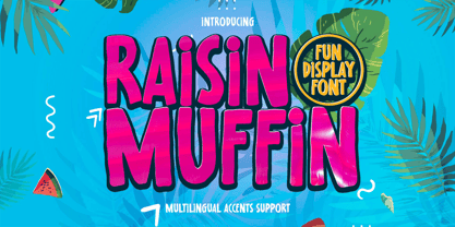 Hello Everyone, introduce our new product Raisin Muffin is a Fun Display Font .This is Cute & Lovely Craft font with a natural handwritten feel. This handmade font will make your design has a beautiful natural touch for each details. It is perfect for any design project as Invitation,logo, book cover, craft or any design purposes. Raisin Muffin is font with Creative Display Fun and challenging nuances. very suitable for the title, typography, Poster, magazines, brochures, packaging,Websites and much more for your design needs, making your designs more modern and professional.
 - Gacko by Beary,
$10.00 Are you looking for a display serif type with fun Ligature? You came to the right Font. Gacko is a display serif type with fun Ligature look attractive and natural. Masterfully designed to become a true favorite, this font has the potential to bring each of your creative ideas to the highest level! Every single letters have been carefully crafted to make your text looks beautiful. Gacko is PUA encoded, which means you could access all of the glyphs! Every letter has a unique and beautiful touch, which will make your design come alive! Thanks


