850 search results
(0.022 seconds)
- Irena by Hanoded,
$15.00 Irena is a cubist/expressionist font inspired by Vojtěch Preissig. Preissig (1873-1944) was a Czech typographer, printmaker, illustrator and teacher, whose work was influenced by Japanese Art and Symbolism. During WWII, Preissig supported the Czech resistance and he was arrested in 1940. He died on June 11th in Dachau concentration camp. This font was named after his daughter Irena Bernášková. The Irena font is angular and square(ish), yet easy to read. It comes with extensive language support.
 - Parallel by Typedepot,
$19.00 Parallel is unique quite thin and pretty "expressive" typeface, designed in order to serve the fashion industry. It also works pretty well as a typeface for print, headlines and identity issues.
 - Royalana by Kufic Studio,
$15.00 Royalana is a modern royal font with a minimalist factor. A complete font set containing all the important glyphs. Royalana has been inspired by the very minimalist and compact designs in trend to deliver a new look and yet keeping the professional outlook of any design or print. Royalana font set includes; Royalana Light, Royalana Light Italic, Royalana Regular, Royalana Italic, Royalana Bold, Royalana Bold Italic, Royalana Extra Bold & Royalana Extra Bold Italic. Kufic Studio is a platform that provides professional and high-quality designs & fonts to fill the gap that has been missing in the market.
 - Scaryfemita by TM Type,
$12.00 Scaryfemita – Classic Elegant Copperplate Calligraphy Script Font – Beauty Classic Luxury Royal Font Scaryfemita comes with glyph variations such as Ligature, Alternate, and Swash. You can combine it to make a perfect typography design. It is perfect for your upcoming projects such as luxury logo and branding, classy editorial design, woman’s magazines, cosmetic brands, fashion promotional, art gallery branding, museum, boutique branding, stationery design, blog design, modern advertising design, card invitation, art quote, home decor, book/cover title, special events and any more. This font is PUA encoded, which means you can access all of the glyphs and swashes with ease!
 - Welmock by Keristyper Studio,
$14.00 Welmock is a display/decorative font based on a vintage royal fantasy font with modified ornaments that make it look prettier. This font is good for logo design, Social media, Movie Titles, Books Titles, short text even long text letters, and good for your secondary text font with sans or serif. Featured: Standard Uppercase & Lowercase Numeral & Punctuation Multilingual : ä ö ü Ä Ö Ü ß ¿ ¡ Alternate & Ligature PUA encoded We recommend programs that support the OpenType feature and the Glyphs panel such as Adobe applications or Corel Draw. so you can use all the variations of the glyphs. Hope you enjoy our fonts!
 - Zygon Regular by Great Dane Designs,
$24.99 Zygon Regular is a shape changing, unicase display font inspired by British cultures and transcultural theory. Zygon Regular was inspired by the 2012 Royal Diamond Jubilee and the notion that the Jubilee, as a multicultural event, would feature celebrations inclusive of all cultures. The typeface is based on the Panjabi syllabary alphabet (Gurmukhi script) combined with the Latin alphabet. Zygon Regular contains a set of stylistic alternates as well as a range of standard and discretionary ligatures. These are accessible in applications that support OpenType features. Zygon Regular is especially suitable as a headline font for designs seeking a cultural edge.
 - KG Eyes Wide Open by Kimberly Geswein,
$5.00 Legible, pretty, neat, connected cursive handwriting.
 - Portfolio by Wilton Foundry,
$29.00 In spite of the fact that Portfolio's capitals are highly ornate, it is still very legible. Portfolio, in combination with its elegant lowercase, creates a prestigious presentation useful for Certificates, Wedding Invitations, Corporate Identities, Brochures, and Headlines.
 - Rowit by Twinletter,
$15.00 Introducing Rowit, a premium Arabic style font. The display brings luxury and prestige to your designs. This innovative typeface comes to give you the flexibility to create the look and feel you need for any occasion. Crafted with meticulous attention to detail, and containing hundreds of glyphs, this font collection is the best choice for bringing harmony to your designs.
 - Janda Everyday Casual by Kimberly Geswein,
$5.00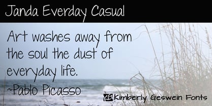 Neat, pretty feminine handwriting for everyday usage.
 - KG Eliza Schuyler Script by Kimberly Geswein,
$5.00 A pretty, upright handwritten script that is highly legible.
 - Spencer by The Northern Block,
$30.99 Spencer is a calligraphic semi-serif type family that has been carefully designed to provide easily distinguishable letterforms that are practical in use, as well as aesthetically appealing. It's natural and organic forms comes from a deep consideration of the efficiency of the visible word and provides the typeface with a distinct and unique voice. Named after Herbert Spencer, an educator and researcher of legibility at the Royal College of Art in the sixties and seventies, and influenced by other early typographers and legibility researchers, such as Walter Tracy and John Harris. Spencer was designed as part of a legibility study by Sofie Beier and Kevin Larson.
 - Sattler by astype,
$25.00 Joseph Kaspar Sattler, one of the great German art nouveau artists created these nice initials in 1897 for the famous royal monumental book project Die Nibelunge for the Reichsdruckerei Berlin. Only 200 exclusive signed masterpieces were printed in four years from 1900 till 1904. Joseph Sattler was the art director, typographer and designer in one person. The Reichsdruckerei showed samples of the unfinished work in 1900 at the world exhibition in Paris to advertise the high craftsmanship of the German presses. Style Initials A uses the OpenType features Superscript and Scientific Inferiors to change the fill layer. You can combine up to three different color inks.
 - PF Monumenta Pro by Parachute,
$69.00 Royal, majestic, elegant. These letters are based on Roman and Greek characters carved on stone. They come in 3 different styles. Normal and Shaded are designed to have serifs with a finer thinning. On the other hand, Metallic is bolder and simulates in the most realistic way three-dimensional metallic lettering. There are some alternate characters placed at lowercase positions as well as a few stylistic alternates which are accessed through the OpenType features. Pay attention to letters like Greek Omega (lowercase position) and Greek Xi (lowercase position) as well as B, R, K (lowercase position). Monumenta Pro was recently upgraded to support Latin, Greek and Cyrillic.
 - 1672 Isaac Newton by GLC,
$42.00 Isaac Newton, father of the theory of gravity, used several forms of handwriting in his life, in numerous texts about numerous scientific subjects. Here, we propose a handwritten font, using a particularly legible script form, coming from texts written in 1672, the year he presented a new reflecting telescope to the Royal Society. It is a Pro font containing Western, Eastern, Central and Northern European, Icelandic, Baltic, and Turkish diacritics. The alternates and ligatures allow the font to look as closely as possible to the real thing. The features allow OTF software to vary the characters of a word automatically, with no more work than selecting contextual alternates and standard ligatures.
 - KG The Fighter by Kimberly Geswein,
$5.00 This pretty script is neat and legible and nicely connected.
 - Orchids by Okaycat,
$29.50 Hand drawn orchid Illustrations, these flowers make very pretty designs.
 - KG Drops Of Jupiter by Kimberly Geswein,
$5.00 Pretty handwriting in an upright, classic feminine style. Nice and neat.
 - "Royal Acidbath" is not just a font; it's a trip down a lane where artistry and eccentricity meet to create something truly unique and captivating. Developed by Sharkshock Productions, this font enca...
- Banks and Miles by K-Type,
$20.00 K-Type’s ‘Banks & Miles’ fonts are inspired by the geometric monoline lettering created for the British Post Office in 1970 by London design company Banks & Miles, a project initiated and supervised by partner John Miles, and which included ‘Double Line’ and ‘Single Line’ alphabets. The new digital typeface is a reworking and extension of both alphabets. Banks & Miles Double Line is provided in three weights – Light, Regular and Dark – variations achieved by adjusting the width of the inline. Banks & Miles Single Line develops the less used companion sans into a three weight family – Regular, Medium and Bold – each with an optically corrected oblique. Although the ‘Banks & Miles Double Line’ and ‘Banks & Miles Single Line’ fonts are based on the original Post Office letterforms, glyphs have been drawn from scratch and include numerous adjustments and impertinent alterations, such as narrowing the overly wide Z and shortening the leg of the K. Several disparities exist between the Post Office Double and Single Line styles, and K-Type has attempted to secure greater consistency between the two. For instance, a wide apex on the Double Line’s lowercase w is made pointed to match the uppercase W and the Single Line’s W/w. Also, the gently sloping hook of Single Line’s lowercase j is adopted for both families. The original Single Line’s R and k, which were incongruously simplified, are drawn in their more remarkable Double Line forms, and whilst the new Single Line fonts are modestly condensed where appropriate, rounded letters retain the essentially circular form of the Double Line. Many characters that were not part of the original project, such as @, ß, #, and currency symbols, have been designed afresh, and a full set of Latin Extended-A characters is included. The new fonts are a celebration of distinctive features like the delightful teardrop-shaped bowl of a,b,d,g,p and q, and a general level of elegance not always achieved by inline typefaces. The Post Office Double Line alphabet was used from the early 1970s, in different colours to denote the various parts of the Post Office business which included telecommunications, counter services and the Royal Mail. Even after the Post Office was split into separate businesses in the 1980s, Post Office Counters and Royal Mail continued use of the lettering, and a version can still be seen within the Royal Mail cruciform logo.
 - Hand Writing OC by Okaycat,
$8.99 A pretty hand-written font that is very legible and high in style.
 - Chevin Pro by G-Type,
$72.00 Chevin is a contemporary rounded type family in 6 weights which was designed with functionality and legibility in mind. With its open counters and slightly condensed style, Chevin can be used for text and is particularly suited to signage. Erik Spiekermann is a fan, noting that Chevin “is charming without being cute, and very legible even in small sizes because of its restrained shapes and simple construction.” Chevin is named after a hill on the outskirts of Otley in West Yorkshire. Since 2007, the type family has been highly prominent in the UK as Royal Mail’s corporate font and the typeface that adorns every Post Office in the country. The Chevin Pro set includes additional Greek and Cyrillic layouts.
 - Frenchute by Tipo Pèpel,
$22.00 France 1727, the book Le chemin Royal de la Croix is published. Centuries later the historical publication comes into the hands of Josep Patau, who uses its printed pages as a reference for a new digital typeface. Previously created for printing, those shapes adapt now to the screen and show the sophistication and authenticity of true Garalde types. Frenchute is a multipurpose typeface with 3 optical sizes. All the shapes were modified to cover different typographic needs. The diagonal axis and the moderate stroke contrast are taken further in the italics letterforms, where the design is far more expressive. The character set includes decorative forms and italic capitals with swashes, so the text looks prettier.
 - Chevin Std by G-Type,
$60.00 Chevin is a contemporary rounded type family in 6 weights which was designed with functionality and legibility in mind. With its open counters and slightly condensed style Chevin can be used for text and is particularly suited to signage. Erik Spiekermann is a fan, noting that Chevin “is charming without being cute, and very legible even in small sizes because of its restrained shapes and simple construction.” Chevin is named after a hill on the outskirts of Otley in West Yorkshire. Since 2007 the type family has been highly prominent in the UK as Royal Mail’s corporate font and the typeface that adorns every Post Office in the country. The Chevin Pro set includes additional Greek and Cyrillic layouts.
 - Gothic Grotesk JNL by Jeff Levine,
$29.00 In a specimen book from Stevens, Shanks & Sons, Ltd. of London (circa1930s) “Royal Gothic” was their version of a classic grotesk sans that had been in use as far back as 1899 when the Keystone Foundry called it “Charter Oak”. The terms "gothic" and "grotesk" were equally applied to early sans serif typefaces – at first not well embraced by printers as being too ugly (grotesque) for use. One familiar characteristic of early grotesk fonts (such as this one) is the numerous variations of character widths and shapes. By combining those two terms into a font name, the digital version of this design is called Gothic Grotesk JNL, and is available in both regular and oblique versions.
 - Mulkshake by PizzaDude.dk,
$20.00Mulkshake is messed up pretty good, and was acutually made on a real bad copymachine! - MoxyRoxie - Unknown license

- Hebrew Century by Samtype,
$39.00 This is a font from the 10th century and is still pretty. This is a classic format.
 - Swallowtail Butterflies by Okaycat,
$29.50 Okaycat Font Foundry proudly presents "Swallowtail Butterflies"! An excellent illustrated picture font containing so many pretty butterflies.
 - Oscar by Pelavin Fonts,
$25.00 Inspired by the elegance and sophistication of Hollywood's Golden Era, Oscar is a lyrical nod to the pinnacle of cinema achievements, the Academy Awards. Its slim, graceful features are accentuated by undulating triple waves. Delicate yet study, it will handily support messages both solemn and joyful. Use Oscar when you wish to convey a sense of celebration and prestige, a reference to the era of Art Deco and the 1920s or, a feeling of grace and ceremony.
 - Royalbrick by Bake me a font,
$20.00 Royalbrick is a contemporary display unicase typeface. It is a part of upcoming type family — light and condensed style. The font was inspired by factory stamps’ typography on bricks made in 19-20 century on Russian manufactures — this kind of bricks was also called “royal bricks”. It has a unique image with “squashed” stems and dynamic expanding strokes, and there are also some kind of ancient Cyrillic’s vibes in it’s letterforms. It is an excellent example of combining national character with modern trends and expressive graphics. Royalbrick consist of extended Latin and Cyrillic, figures, two sets of punctuation (normal and "thin" with ss01), few ligatures and stylistic alternatives and a special set for letters with accents — ss02 named "Downstairs Accents". The font has 292 glyphs.
 - Garnet Euro Typewriter by Coniglio Type,
$19.95Garnet is a rare TT typewriter face, made digital from analog samples gathered with great care by Coniglio Type. A time and place; type and life. Garnet Euro Typewriter is the first new release by designer Joseph V Coniglio in over 5 years. It is contemporary designer type, made from the struck steel hammers of an art deco san serif face transferred from a mechanical 1926 Royal Portable typewriter. It has an obsessively complete commercial roman character set ––for the pre-opentype environment of the late 1990's. Yes, it has that great “Monopoly Game” question mark -- and all on a period-piece typewriter! You should have no trouble grafting that sorely needed Euro symbol.” –And he very well did! - Hyperspit by PizzaDude.dk,
$20.00Hyperspit is really the CAPS of my other font Family Cat. They are just messed up pretty good! - Queen Sipur by Forberas Club,
$16.00 Queen Sipur is pretty style modern font. Nice to application for cute, funny, playful, cartoon, birthday and cover book.
 - Altemus Holidays One by Altemus Creative,
$11.00 A collection of 174 holiday icons and cuts for New Years, Valentines Day, Presidents Day and St Patricks Day.
 - LD Abe Lincoln by Illustration Ink,
$3.00LD Abe Lincoln font is based on actual documents containing President Lincoln's own handwriting. Enjoy this font rooted in history. - Hello Valentine by Yoga Letter,
$12.00 This pretty font is called hello Valentine. This font is very easy to use, and to bring out a pretty tail is not difficult because there are guides included. This font is perfect for expressing your happiness with your partner. This font is very beautiful and elegant that can be used for Valentine's Day, weddings, capturing romantic stories, quotes, branding, logos, banners, and more.
 - Bangel by Art Grootfontein,
$19.00 Bangel is a contemporary display font family with a strong personality. The eye-catching letter design is quite geometric, but also pretty expressive and fun. It supports broad latin languages and comes with 4 styles + a special free Wave bonus. Bangel is a pretty good choice for logotypes, branding, headlines and posters. This typeface is also a powerful option for use on social media, web & UI design.
 - Knoo by ffeeaarr,
$11.00 Knoo is a bold typeface with some pretty futuristic characters. This version has new additional characters compared to the previous version.
 - Seashells by Okaycat,
$29.50 Seashells is a picture font, containing all pretty sea shells. Each shell appears in outline form and also as a solid graphic.
