10,000 search results
(0.033 seconds)
- P22 Tyndale by IHOF,
$24.95Quill-formed roman/gothic with an olde-worlde flavor. Some background in the designer's own words: "A series of fonts came to mind which would be rooted in the medieval era -for me, a period of intense interest. Prior to Gutenberg's development of commercial printing with type on paper in the mid-1400s, books were still being written out by hand, on vellum. At that time, a Bible cost more than a common workman could hope to earn in his entire lifetime. Men like William Tyndale devoted their energies to translating the Scriptures for the benefit of ordinary people in their own language, and were burned to death at the stake for doing so. Those in authority correctly recognized a terminal threat to the fabric of feudal society, which revolved around the church. "This religious metamorphosis was reflected in letterforms: which, like buildings, reflect the mood of the period in which they take shape. The medieval era produced the Gothic cathedrals; their strong vertical emphasis was expressive of the vertical relationship then existing between man and God. The rich tracery to be seen in the interstices and vaulted ceilings typified the complex social dynamics of feudalism. Parallels could be clearly seen in Gothic type, with its vertical strokes and decorated capitals. Taken as a whole, Gothicism represented a mystical approach to life, filled with symbolism and imagery. To the common man, letters and words were like other sacred icons: too high for his own understanding, but belonging to God, and worthy of respect. "Roman type, soon adopted in preference to Gothic by contemporary printer-publishers (whose primary market was the scholarly class) represented a more democratic, urbane approach to life, where the words were merely the vehicle for the idea, and letters merely a necessary convenience for making words. The common man could read, consider and debate what was printed, without having the least reverence for the image. In fact, the less the medium interfered with the message, the better. The most successful typefaces were like the Roman legions of old; machine-like in their ordered functionality and anonymity. Meanwhile, Gutenberg's Gothic letterform, in which the greatest technological revolution of history had first been clothed, soon became relegated to a Germanic anachronism, limited to a declining sphere of influence. "An interesting Bible in my possession dating from 1610 perfectly illustrates this duality of function and form. The text is set in Gothic black-letter type, while the side-notes appear in Roman. Thus the complex pattern of the text retains the mystical, sacred quality of the hand-scripted manuscript (often rendered in Latin, which a cleric would read aloud to others), while the clear, open side-notes are designed to supplement a personal Bible study. "Tyndale is one of a series of fonts in process which explore the transition between Gothic and Roman forms. The hybrid letters have more of the idiosyncrasies of the pen (and thus, the human hand) about them, rather than the anonymity imbued by the engraving machine. They are an attempt to achieve the mystery and wonder of the Gothic era while retaining the legibility and clarity best revealed in the Roman form. "Reformers such as Tyndale were consumed with a passion to make the gospel available and understood to the masses of pilgrims who, in search of a religious experience, thronged into the soaring, gilded cathedrals. Centuries later, our need for communion with God remains the same, in spite of all our technology and sophistication. How can our finite minds, our human logic, comprehend the transcendent mystery of God's great sacrifice, his love beyond understanding? Tyndale suffered martyrdom that the Bible, through the medium of printing, might be brought to our hands, our hearts and our minds. It is a privilege for me to dedicate my typeface in his memory." - Kaglia by Letterhend,
$17.00 Kaglia is a font duo package contain a hand drawn bold script and sans serif which looks great to be paired especially for vintage and adventure theme! This font duo is purposely made for headline, display or logotype, and signature which need a standout appearing. This font is also suitable to be applied especially in logo, and the other various formal forms such as invitations, labels, logos, magazines, books, greeting / wedding cards, packaging, fashion, make up, stationery, novels, labels or any type of advertising purpose. Features : Kaglia Script Regular and Rough Kaglia Sans Regular and Rough uppercase & lowercase numbers and punctuation multilingual alternates & ligatures PUA encoded We highly recommend using a program that supports OpenType features and Glyphs panels like many of Adobe apps and Corel Draw, so you can see and access all Glyph variations. How to access opentype feature : letterhend.com/tutorials/using-opentype-feature-in-any-software/
 - Chin Up Buttercup by Nicky Laatz,
$16.00 Introducing Chin up! Buttercup! A Perfectly Playful new font pair with a handy doodle font consisting of 40 complimentary Illustrations. Consisting of a Script, a Cute Sans Serif and a handy doodles font, Chin Up Buttercup are perfect companions for designing greeting cards, quotes, typographic designs, wall art, branding, packaging, websites, photos, photo & photography overlays, signs, window art, scrapbooking, tags and so much more. The script has an alternate upper and lowercase character set, as well as a large selection of Standard Ligatures - allowing you to make your design truly unique. Not to be left out , the ‘Cutecaps’ comes with alternate characters in the uppercase set and cute little ligatures as well.
 - Silex by Our House Graphics,
$14.00 A different kind of beauty. Silex began life in the labs of R.U.S.S.T Institute a number of years ago, starting with a skeleton of C.A.D./C.A.M system fonts, a disused tungsten carbide blade off an old milling machine for a soul and a little box of OpenType features for brains. This family of 3 solid, Silex is a hard-edged, hard-working display fonts. Suitable for headlines, logos, heavy equipment and... If you are a wrestler or mixed martial arts fighter, your resume. OpenType features include stylistic alternates, discretionarily ligatures, case sensitive glyphs, small caps, dozens of standard and discretionary ligatures.
 - HVD Comic Serif Pro by HVD Fonts,
$- So many designers hate Comic Sans. They think people who don't know design are overusing this funny little friendly font, which is nearly every time out of place. Some years ago, type designer Hannes von Döhren created a free alternative to Comic Sans. The difference: It has serifs and a much cooler look. The big success of the HVD Comic Serif pushed Von Döhren to create a Pro Version with an eastern, central and Western European language support. “The HVD Comic Serif should spread all over and make the world a little bit better.” says Hannes.
 - Vektori by Suomi,
$19.00 Vektori family comes from those Atari games that had those distinct vector graphics with thin and precise straight lines.
 - Astrology by Monotype,
$40.99Astrology signs that had been designed for newspaper and printers purposed in the hotmetal aera from the Monotype caster. - Ronet by yasireknc,
$10.00 It can be tricky to find typefaces that can convey the feeling of personal warmth that comes from a handwritten note, custom brandings, special series of products, especially as we type more and more and write with a pen or pencil less and less. To add some more of that warmth to a font, I’ve made Ronet. A duo font based on the my handwriting. Double eponymous styles of the font —Ronet and Ronet Alternative— each have a unique flavor with its own rhythm and character. It can be used on branding designs, product labels, invitation cards, social purposes which is bloggers, influencers but they were capable of so much more, and I’m happy to share them for general use. Ronet has extraordinary alternative characters, that makes these fonts so impressive. These two styles have dynamic substitution, alternates, and beautiful kerning! Nevertheless, they each support an impressive range of languages using the Extended Latin alphabets and because they were designed to work well in a simple tool, a rare feature of these fonts is that they look just as good no matter where you use them. LOTS of writing, and then even more care once I developed and refined digital outlines from the samples. Ronet and Ronet Alternative each wrote pages and pages of letters to produce lots of examples for comparison and selection, in order to get the most authentic overall texture that captured the spirit of my left hand.. Ronet feels friendly and personal, like a neighbor or local shopkeeper who always seems happy to see you. This will perk up your social feeds in a snap. Start with Ronet and just add in your design to make it perfect. What started with a simple pen and paper has become a diverse and ever-expanding creative outlet that blends hand-drawn creativity with cutting-edge technology — and the end results are popping out everywhere, from advertising to design and decor to art and DIY.
 - CoffeeMug by Ingrimayne Type,
$10.00 CoffeeMug has letters on coffee mugs. Upper-case letters have the handles to the left and lower-case characters have the handles to the right. The letters on the mugs are from the typeface InsideLetters. The typeface contains characters that will add color to letters. There are two ways to do this. One uses layers and the other a combination of characters, some with zero-width. A file in the gallery explains the ways that this can be done.
 - Wedding by HiH,
$10.00 Wedding Regular was originally designed by Morris Fuller Benton for ATF and released as Wedding Text in 1901. It is a lighter version of his ENGRAVER'S OLD ENGLISH of the same period. Wedding Regular is based on the Textura style of blackletter that continued in popularity in England into the 16th century, long after the Dutch, French and Italians had moved to a Roman model that expressed the Renaissance humanism of the period. Wedding Headline is a still lighter version of the regular text face, suitable for setting larger sizes while still preserving the delicacy of the decorative hairlines. Textura continues in use in England and the United States for newspaper mastheads, gift shop signs, wedding invitations and programs and other applications where a feeling of tradition is desired. I recently saw an 1980ish photo of a “Tubby Isaac” sign in London using textura. I believe Benton’s design captures that feeling without being heavy-handed and still remaining quite readable for eyes accustomed to Roman lettering. Both Wedding Regular and Wedding Headline convey a comfortable familiarity. These two fonts may be purchased together at an attractive discount or they may be purchased separately. The full character set may be found in the pdf file that you can download from the gallery section. The two monks (alt-0172 and alt-0177) are from a set of sixteenth century decorative initial letters by Gering and Renbolt. Please note that there are two different eszetts, the blackletter style at alt-0126 and the antiqua style at the alt-0223.
 - F2F Provinciali by Linotype,
$29.99Heavy techno music, a personal computer, a font creation program and some inspiration had been the sources to the Face 2 Face font series. Alessio Leonardi and his friends had the demand to create new unusual faces that should be used in the leading german techno magazine Frontpage". Even typeset in 6 point to nearly unreadability it was a pleasure for the kids to read and decrypt the messages. The Provinciali letters look like they would be reversed in the spotlight." - Dritch by Grontype,
$14.00 Dritch. is a mystical font with a unique and modern geometric style. It is suitable for logos, quotes, social media posts, film titles and stationary. It works with different themes such as mystical, tribal, ethnic, magical, and fantasy. Enjoy! is a fresh, geometric, sans-serif font family. The geometric, near-monoline construction lends a classic durability, tempered by softened edges and vibrant shapes. Friendly and charismatic in lowercase; sophisticated and authoritative in uppercase. Hard lines and sharp corners mesh with smooth, rounded letterforms, while humanist nuances add warmth
 - Orplid Pro by RMU,
$40.00 Hans Bohn’s Orplid, a shadowed sans serif font strongly influenced by the then prevailing Bauhaus style, and released by Klingspor in 1929, was revived and vastly extended for multilingual use. In addition, a filling style was made to easily accomplish colorful headlines, ads and posters. Both styles come with alternatives for A, M, N and W.
 - Aragon Condensed by Canada Type,
$24.95The condensed version of Hans van Maanen's Aragon is a headline star. The elements that made Aragon a popular "Dutch Garamond" text repeat here, with the slight stress shifts and tapering stems optimized for headline use. Aragon Condensed also comes in bold and italic variations. All three fonts contain extended language support, superiors and inferiors, and class-based kerning. - Sidewalk Cafe BF by Bomparte's Fonts,
$40.00 Sidewalk Cafe will serve up a look from your Font Menu that’s delectably deco. Though developed from a few hand-lettered words found on a 1930s poster, it retains a contemporary flavor. The shaded version is designed to be layered over Sidewalk Cafe Underlay, to create contrasting color possibilities, as both share the same kerning values. Supports Western and Central European Latin languages, in addition to Baltic, Celtic, Esperanto, Romanian and Turkish.
 - Kailey Force by Great Lakes Lettering,
$30.00 Kailey Force contains 3 powerful effects for her kissing cousin: Kailey. The Bold (Drop Shadow), the Brave (Distressed), and the Beautiful (Combined). Kailey is a hand lettered, voluptuous typeface that is very special to the Great Lakes Lettering team. This oblique font is inspired by Molly Jacques’ “signature” lettering style, using bold brush strokes, fluid flourishes, and distinctive characters. Kailey has a distinct feminine feel that takes on a bold attitude to match her curves.
 - Oceanside Sans by Bebop Font Foundry,
$19.00 Oceanside Sans is a display typeface produced in 2022 by Bepop Font Foundry. This typeface was born out of a month-long trip to the Bahamas. The scenery, both natural and architectural, was stunning, yet restrained. Each settlement featured its own flavor of beautiful hand-painted signs promoting local businesses - fresh fish & Conch, liquor, ice, gifts, and more. Oceanside pays homage to the visual vernacular of the islands we visited during our stay.
 - Maskule by Invasi Studio,
$15.00 Maskule Combo is a vintage combination pairing font that captures the essence of hand-painted signs. It features two fonts: Maskule Regular and Script, which work harmoniously together. With its charming and nostalgic style, it's the perfect choice for creating designs with a vintage theme. Whether you're working on headings, flyers, greeting cards, product packaging, book covers, printed quotes, logotypes, or album covers, Maskule Combo will add a touch of timeless appeal to your projects.
 - Fashionable JNL by Jeff Levine,
$29.00 For years, the print ads for the Hickok Jewelry Company [renowned for their line of men's belts, suspenders, wallets, cufflinks, etc.] featured its name and related main line ad copy hand-lettered in a condensed monoline with Art Deco styling. This has been reproduced in Fashionable JNL, available in both regular and oblique versions. For those of you who are wondering: yes, the founder of the company was a distant relative of "Wild Bill" Hickok.
 - Marclane by Ironbird Creative,
$10.00 Marclane is a hand drawn slab serif typeface. This item consist of 4 fonts in various styles which you can play around with it and also come with MARCLANE DINGBAT to make better design. This typefaces is perfect for people looking for vintage aesthetic and organic feel or design needs with a touch of classic western. What Will You Get : Marclane Slab Serif Marclane Dingbat If you have any questions, please contact (ironbirdcreative@gmail.com)
 - Lace Line by Kaer,
$19.00 Hi, I’m the Lace line font! I’m drawn by hand. Each of my letters is a curved lace! I will perfectly fit sports design either it is a print, a sports team logo, or even the score of the match. I include Latin uppercase, lowercase, numbers and special symbols. So that I’m even more attractive my designer Kaer created a lot of great ligatures. I’m young and cool! Let's go, go, go!
 - Supergravity by Maulana Creative,
$12.00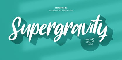 Supergravity is a casual hand-written font. With regular contrast stroke, slant and fun character with some of ligatures. To give you an extra creative work. Supergravity font support multilingual more than 100+ language. This font is good for logo design, Social media, Movie Titles, Books Titles, a short text even a long text letter and good for your secondary text font with sans or serif. Make a stunning work with Supergravity font. Cheers, MaulanaCreative
 - Volatter by Maulana Creative,
$11.00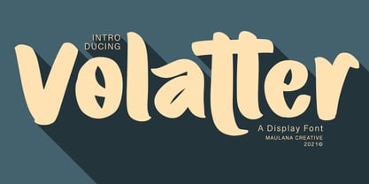 Volatter is simply handwritten display font with natural hand drawn, clean bold stroke, uprights and fun character. To give you an extra creative work. Volatter font support multilingual more than 100+ language. This font is good for logo design, Social media, Movie Titles, Books Titles, a short text even a long text letter and good for your secondary text font with sans or serif. Make a stunning work with Volatter font. Cheers, MaulanaCreative
 - La Paloma Script by Make Media Co,
$16.00 Add a touch of elegance to your work with La Paloma Script - A clean, modern, hand-written typeface with over 170 Ligatures and Decorative End Characters to add a dash of luxury to any project. And if you're looking for a lovely logo font, you just found it! La Paloma was designed with Branding in mind! But don't stop there, use this chic type in headlines & titles, signage, greeting cards, invitations & more!
 - Gibson Girl JF by Jukebox Collection,
$32.99 Based on a hand lettered sample from the early 20th Century, Gibson Girl is a heavy script font with a vintage flair. During the end of the 19th Century, the “Gibson Girl” created by illustrator Charles Gibson, was considered the ideal of feminine beauty and poise in that time period. The term has become associated with the Gilded Age in America. The design of the Gibson Girl font reflects both femininity and self confidence.
 - Lamp Post JNL by Jeff Levine,
$29.00 Lamp Post JNL is a digital interpretation of a design popular in the early 1900s called Post Old Style; no doubt inspired by a certain Saturday periodical with a similar name. There is an intrinsic charm to lettering that evokes a hand-made look, and this design is a perfect example of the genre. Available in both regular and oblique versions, it will add the nostalgia of simpler times to any print or web project.
 - P22 Bangersfield by IHOF,
$29.95 Bangersfield is a four-member font family from Robby Woodard. With line treatments clearly inspired by cased meat products, these fonts function as a healtier alternative to Comic Sans. The casual hand lettering works well for light-hearted design and comic lettering. These fonts are stuffed with opentype features, extra ornaments, and a full Central European character set—over 400 characters per serving. Satisfy your hunger for a fresh take on a stale genre!
 - No Bad Days by Cardigan,
$25.00 Get RAD with this unique, fun, handwritten font by Cardigan. This pack includes two fonts. A bold, brush font with a supporting thin, handwritten script font. These typefaces ooze good vibes, adding a fun and edgy style to any design. Whether you need a hand drawn feel to a logo or a bold organic font that jumps off any page. No Bad Days has your back and is a total dream to work with.
 - Beaucoup PB by Pink Broccoli,
$14.00 A totally off the wall crazy sans serif display type, Beaucoup started as a digitization of a film typeface called “Bippie” by Facsimile Fonts. From there, it was taken and built out to an extensive character set ready to take you for a wild ride. Completely loco, yet somehow still easily legible, this typographic wildchild is dying for you to get your grubby little hands on it and take it for a spin!
 - ArgentaBobbed by Ingrimayne Type,
$5.00ArgentaBobbed is an informal, "hand-printing" font with little balls that some people, often children, like to add to the ends of strokes. Maybe it could be called a ball-serif or dot-serif font. The family has six members. Each of the two weights, plain and bold, have oblique styles. There are also two variants: ArgentaBobbed-Wig is squiggly handwriting with the dots, and ArgentaBobbed-Squish is condensed handwriting with dots. - Woodstock by Linotype,
$29.99Woodstock is a round, heavy, lovable serif display typeface. Just as music brought many together in the spirit of love during the 1960s and the Woodstock music festival, this face brings a smile to the eye of the beholder. Many traces of the hand can be seen in the curves and the joins of Woodstock's forms. Try using Woodstock in headlines, logos, or greeting cards, in point sizes from 12 on upward. - WORKSHOP Brush by Posterizer KG,
$19.00 WORKSHOP Brush is one more of three WORKSHOP handwritten fonts, created to imitate a manuscript written with brush. You can use the alternates and ligatures to give your design a realistic, hand painted look. If you find a single repeating glyph, you can change that by toggling between Stylistic Alternates. There are Cyrillic glyphs and few Stains in the same style. WORKSHOP Brush is the perfect choice for those who prefer more expressive typography.
 - Lodgepole by Tall Trees Design Co,
$20.00 Lodgepole is a hand illustrated font family created by Zach Minard of Tall Trees Design Co. Inspired by timeless legibility and worn National Park signage. Lodgepole Regular and Book are designed to pair perfectly together, while both of these styles are available as Solid (With no internal texture) or Grit. Lodgepole Grit uses the strokes from the original pen-to-paper illustration for all texture, creating an authentic one-of-a-kind texture.
 - Wroxeter by Greater Albion Typefounders,
$10.00 Wroxeter is Greater Albion Typefounders' customary Black Letter release for Christmas 2013. It's a typeface family for all times of year though, a good clear traditional black letter re-creation offered in a family of four typeface:- regular, wrought (a hand-tooled look a la Mr F Goudy), oblique and narrow forms. The tradition of typefounders' black letter revivals which don't over-burden themselves with historical precedent continues in this highly refined and polished family.
 - Sugar Medley by Scrowleyfonts,
$16.00 Sugar Medley was originally inspired by piped icing writing on celebratory cakes. It lends itself to any project requiring a ‘controlled messy’, fun feel. It has a total of 885 glyphs, every letter has 5 alternates to create that hand lettered look. Sugar Medley also includes a full set of stylistic alternates which really goes wild with curls and swirls. These are complemented by a total of 38 ornaments including reflections and rotations.
 - Annadalea by EVCco,
$12.00 This typeface pays homage to numerous Victorian and Art Nouveau predecessors, while straying somewhat beyond their usual conventions. All lowercase letters ascend in unison, whereas capitals descend below the baseline. A rigid set of uniform strokes keeps the chaos reigned in, while various calculated inconsistencies affect a vaguely hand-drawn quality to this quirky, downright decadent font. Comes packaged with the standard complement of alpha-numeric glyphs, punctuation marks, mathematical symbols, and Western European diacritics.
 - Emjay by A New Machine,
$19.00 Emjay is a whimsical hand drawn all caps serif font. It has 4 glyphs per letter - upper and lowercase as well as 2 more sets of glyphs - that make for a more unnatural handmade feel. Any user can interchange letters using caps and lowercase. With contextual alternates on, opentype programs will place different glyphs automatically. Also includes a number of ligatures for even more unique type setting. Great for use in posters, headlines, invitations, etc.
 - Materhorn NF by Nick's Fonts,
$10.00This is a new and improved version of an old freeware font named Materhorn, hased on a design originally called Fanfare, designed by Louis Oppenheim in 1927 for H Berthold AG. The outlines have been completely redrawn, the entire font has been thoughtfully hand-kerned, and OpenType features have been added. Additionally, the font contains not only the complete Latin language character set (Unicode 1252) plus also support for Central European (Unicode 1250) languages - Lesthone by Nathatype,
$29.00 Lesthone is a display font that seamlessly merges vintage aesthetics with modern elegance. The rounded shapes of Lesthone contribute to its friendly looks. Each letter has its own personality, and this contributes to the font's handcrafted appeal. On the other hand, the most standout characteristic of Lesthone is its slightly rough texture that add a rustic charm. This font includes beautiful ornaments as a bonus. Lesthone fits in headlines, logos, branding materials, and many more.
 - Luckiest Softie Pro by Stiggy & Sands,
$29.00 Our Luckiest Softie Pro is a softened variation of our Luckiest Guy Pro typeface, inspired by hand-lettered vintage 1950's advertisement. The charm of the original typeface is enhanced with softened corners to give the typeface a more cuddly charisma. Opentype features include: - SmallCaps. - Full set of Inferiors and Superiors for limitless fractions. - Tabular, Proportional, and Oldstyle figure sets (along with SmallCaps versions of the figures). - Stylistic Alternates for Caps to SmallCaps conversion.