10,000 search results
(0.316 seconds)
- Becket by Linotype,
$29.99Gustav Jaeger's Becket typeface embodies a retro-medieval aesthetic. Base letterforms that might have been at home with a writer of Irish uncials have been streamlined according to late 20th century tastes to create a timeless effect. Becket is the perfect font to set headlines and logos for clients in the music industry. - Middle Earth Variable by Mans Greback,
$69.00 Middle Earth is a Medieval calligraphy serif font. With the historic charm of ancient manuscripts and the ethereal beauty of elven realms, Middle Earth typeface weaves tales of valor and legends. Variable font! Only one font file, but the file contains multiple styles. More info about Variable Fonts: https://mansgreback.com/variable-fonts
 - Edda Morgana NF by Nick's Fonts,
$10.00In the 1921 work Letters and Lettering by Frank Chouteau Brown, these letterforms were offered as examples of typical medieval English fare. The font is all caps, but there are variant letterforms in all the lowercase positions. Both versions of the font include 1252 Latin, 1250 CE (with localization for Romanian and Moldovan). - Abelarde by Scriptorium,
$18.00Abelarde is a classic medieval gothic style font which combines traditional blackletter style lower case characters with more ornate and decorative capital letters with some nice swash features. We've done some simpler fonts in the same general vein like Cymbeline, Aneirin and Perigord, but Abelarde takes the style to a higher level. - Cuthbert by Ingrimayne Type,
$9.95 Cuthbert is an unusual, semi-script, pseudo-medieval typeface. The capital letters are exuberant and whimsical. However, both the regular and italics styles are graceful enough to be used for purposes such as invitations. Included as a third member of the family is Cuthbert-ZNick, a corroded, distorted version of Cuthbert Regular.
 - Transport New by K-Type,
$20.00 Transport New is a redrawing of the typeface designed for British road signs. In addition to the familiar Heavy and Medium weights, Transport New extrapolates and adds a previously unreleased Light weight font originally planned for back-lit signage but never actually applied. Version 3.0 of Transport New features significant improvements including numerous outline and spacing refinements, and a full complement of Latin Extended-A characters. Also, to align Transport New with the 2015 release of Motorway, the other typeface used for UK road signage, Italic fonts for all three weights have been added. Originally designed by Jock Kinneir and Margaret Calvert beginning in 1957 and first published on the Preston bypass in 1958, the original Transport font has subtle eccentricities which add to its distinctiveness, and drawing the New version involved walking a tightrope between impertinently eliminating awkwardness and maintaining idiosyncrasy. The Grotesk roots of the glyphs were investigated and cheekily fine-tuned – uncomfortably close terminals of characters such as 5, 6, C, G, and e were shortened, the S and s were given a more upright aspect and their protruding lower terminals tucked in, overly wide glyphs like the number 4 were narrowed, and some claustrophobic counters were slightly opened up. The question mark was redesigned and parentheses given some stroke contrast. The x height was edged fractionally even taller. The Heavy font is actually more of a Bold, and the Light is pretty much a regular weight, but the original nomenclature has been retained for old times’ sake.
 - Ricardo by Bureau Roffa,
$19.00 Rather than confining itself to a single style, Ricardo combines the best of two worlds: the conceptual clarity of a geometric design with the legibility and warmth of a humanist design. Its open counters, crisp joints, and even texture allow for effective use in long-form text settings, while its simple geometric shapes combined with some unexpected details make it highly suitable for display settings such as branding and marketing. Ricardo contains seven carefully chosen weights, ranging from ExtraLight to ExtraBold. The Medium weight functions as a slightly darker alternative to the Regular. Ricardo’s 812 glyphs per style support over a hundred languages, and also include arrows and case-sensitive punctuation. The Ricardo family consists of three subfamilies: Ricardo, Ricardo ALT, and Ricardo ITA. Ricardo contains the most conventional forms, and is the most suitable option for long-form text. Ricardo ALT contains simplified shapes for the a, j, u, and t, which are also accessible through Stylistic Set 2 within Ricardo (in opentype-savvy applications). The cursive-like italics of Ricardo ITA provide a slightly more eccentric alternative to the standard italics. Furthermore, all styles contain stylistic alternates that swap the blunt apexes in A, M, N, V, W, v, w, y, and 1 for pointier ones. These are also accessible through Stylistic Set 1. Other opentype goodness includes: (discretionary) ligatures, smallcaps, case-sensitive forms, fractions, nine sets of numerals, and more. David Ricardo (1772-1823) is considered the first of the classical economists, and combined ground-breaking mathematical abstractions with an understandable down-to-earth way of explaining his ideas.
 - Caros Soft by cretype,
$20.00 Caros Soft is the rounded version of Caros. Caros Soft Family is a modern sans-serif typeface that is clean, simple and highly readable. Letters in this type family are designed with geometric shapes without any decorative distractions. The spaces between individual letter forms are precisely adjusted to create the perfect typesetting. Caros Soft is a versatile type family of 18 fonts. Caros Soft family consists of 9 weights (Thin, ExtraLight, Light, Regular, Medium, Bold, ExtraBold, Heavy & Black) with their corresponding italics. The Open Type fonts contain complete Latin 1252, Cyrillic, Central European 1250, Turkish 1254 character sets. Each font includes proportional figures, tabular figures, numerators, denominators, superscript, scientific inferiors, subscript, fractions and case features. We highly recommend it for use in books, web pages, screen displays, and so on.
 - Roundhand BT by ParaType,
$30.00 Roundhand was created by Matthew Carter in 1966 on the basis of handwriting by Charles Snell, an English calligrapher of XVII-XVIII known in particular by his "The Pen-man's Treasury Open'd" written in 1694. The typeface has continuous cursive shapes with oval aspect, high contrast emphasized by abrupt transitions from thin to thick and regularity of slope. Its capitals are often used as initials in combinations with other typefaces. The current digital version of the typeface has 3 styles of different weights. Roundhand is clear and easy to read and is well-suited for medium size texts and headlines. It will work well in invitations, menus, packaging, and advertising accentuating elegance and the subtle nature of the content. The Cyrillic version was developed by Vladimir Yefimov and Isabella Chaeva. Released by ParaType in 2013.
 - Quanton by Mans Greback,
$49.00 Quanton is a clear serif typeface in a modern style. Its sharp edges and soft curves combines to the perfect balance of tradition and innovation. Quanton has character and personality, while keeping regular and maintaining its legibility, making for an optimal headline and bodytext style. The Quanton family consists of eight typeface styles: The weights Thin, Medium, Bold and Black, and each thickness as Italic. The font is built with advanced OpenType functionality and has a guaranteed top-notch quality, containing stylistic and contextual alternates, ligatures and more features; all to give you full control and customizability. It has extensive lingual support, covering Arabic and all Latin-based languages, from North Europe to South Africa, from America to South-East Asia. It contains all characters and symbols you'll ever need, including all punctuation and numbers.
 - VVDS Organum by Vintage Voyage Design Supply,
$10.00 Elegant and easy to use serif font family with contrast in vertical and horizontal strokes. Its variety of weights provides a range of choices that will help you to find the best typographic look. Use all caps to get the classic serif look, like Didones, or use it normally for a playful serif look. Normal and Medium widths are good for text blocks and Thin and Light, or Bold and Black are perfect for Headliners. Every letter in a word looks like as if written specially next to each other, as in hand lettering. You can use it in gentle and minimal projects, and also in projects with bold and heavy typographic base. Also, for more individuality, Organum comes with discretionary ligatures and few stylistic alternates for every caps and some lowercase letters.
 - Artico Soft by cretype,
$20.00 Artico Soft is the rounded version of Artico. Artico Soft Family is a modern sans-serif typeface that is clean, simple and highly readable. Letters in this type family are designed with genuine neo-grotesque and neutral shapes without any decorative distractions. The spaces between individual letter forms are precisely adjusted to create the perfect typesetting. Artico Soft is versatile type family of 18 fonts. Artico family consists of 9 weights (Thin, ExtraLight, Light, Regular, Medium, Bold, ExtraBold, Heavy & Black) with their corresponding italics. The Open Type fonts contain complete Latin 1252, Cyrillic, Central European 1250, Turkish 1254 character sets. Each font includes proportional figures, tabular figures, numerators, denominators, superscript, scientific inferiors, subscript, fractions and case features. We highly recommend it for use in books, web pages, screen displays, and so on.
 - Gabriela by Latinotype Mexico,
$29.00 The Gabriela project is of great importance to us since it is the first font published by Latinotype México which is our brand-new sister foundry in Mexico. Gabriela, yet more versatile, shares all of its DNA with Gabriela Stencil. The font is an excellent choice for short and medium-length text. Gabriela is a Didone typeface well-suited to classy branding and editorial designs. Its alternate version includes swashes and more than 300 glyphs and 75 ligatures, allowing for more stylized designs. It may look different from its "regular" counterpart, but the essence of both is the same. Gabriela comes in 9 styles, ranging from Thin to Black, and includes matching true italics. Each font weight has an average of 750 characters which support more than 200 Latin-based languages.
 - Core Mellow by S-Core,
$20.00 Core Mellow is a condensed geometric sans-serif typeface family that can be used in various applications especially for short texts. The letterforms in roman style are mild, minimal, simple, and clean in appearance. The Core Mellow Family consists of 3 widths (Compressed, Condensed, Normal), 7 weights (Thin, Extra Light, Light, Regular, Medium, Bold, Extra Bold) and Italic for each format. The Core Mellow provides a wide range of character sets to support Cyrillic, Central and Eastern European characters and advanced typographical support with features such as proportional Figures, tabular Figures, numerators, denominators, superscript, scientific Inferiors, subscript, fractions, standard ligatures, discretionary ligatures and stylistic alternates. Core Mellow looks smooth in any layout with its sleek rounded lines, use it for your magazines, brochures, web pages, screens, and so on.
 - Artico by cretype,
$20.00 Artico Family is a modern sans-serif typeface that is clean, simple and highly readable. Letters in this type family are designed with genuine neo-grotesque and neutral shapes without any decorative distractions. The spaces between individual letter forms are precisely adjusted to create the perfect typesetting. Artico is versatile type family of 72 fonts. Artico family consists of 9 weights (Thin, ExtraLight, Light, Regular, Medium, Bold, ExtraBold, Heavy & Black) and 4 widths (Extra Condensed, Condensed, Normal & Expanded) with their corresponding italics. The Open Type fonts contain complete Latin 1252, Cyrillic, Central European 1250, Turkish 1254 character sets. Each font includes proportional figures, tabular figures, numerators, denominators, superscript, scientific inferiors, subscript, fractions and case features. We highly recommend it for use in books, web pages, screen displays, and so on.
 - Laverty Castaroza by Letterhend,
$17.00 Introducing, Laverty Castaroza. A one of a kind display typeface with unique ligatures, provided in 4 weights - bold, medium, regular, light. This font perfectly made to be applied especially in logo, and the other various formal forms such as invitations, labels, logos, magazines, books, greeting / wedding cards, packaging, fashion, make up, stationery, novels, labels or any type of advertising purpose. Features : uppercase & lowercase numbers and punctuation multilingual ligatures alternates swashes PUA encoded We highly recommend using a program that supports OpenType features and Glyphs panels like many of Adobe apps and Corel Draw, so you can see and access all Glyph variations. For accessing opentype feature, kindly check this link letterhend.com/tutorials/using-opentype-feature-in-any-software/ Email us to letterhend@gmail.com if you need something! Happy Designing!
 - KAPITAL by Superfried,
$32.00 KAPITAL is an elegant, geometric uppercase sans. It is available in standard and stencil style across four weights – light | regular | medium | demi – covering 346 glyphs. It is based on the capital character set from a previous release – Basik. Continuing the clean, geometric aesthetics, KAPITAL was refined further to create a more minimal style. This enabled the characters to discreetly perform their role – to simply convey the message of the writer without distraction. To achieve this, special attention was applied to the form consistency of the glyphs across the weights and negative space throughout. In many typefaces as the weight is increased the form and style can deviate significantly from the original design. With regards to negative space – although inevitable – wherever possible key letterforms were adjusted to alleviate this.
 - Caballero by Fabio Godoy,
$29.95 Typographical Caballero is a family created by Fabio Eduardo Godoy Angel, the concept is inspired by a type with firm and clear, with perfect posture and personality to be used by Graphic Designers and Architects, in terms of print, TV Corporate Identity, Merchandising - Other Projects. Ideal for antetétulos, titles, subtitles, texts from 12 Pts. Caballero Outline and Caballero Outline Italic, are presented as an option for antetétulos, titles and subtitles as well as short texts from 20 Pts. Caballero in his presentation Outline, allows wide range of applications in regard to the use of color, and be combined with Caballero Regular and Caballero Italic. Font Project Caballero, is set with a vertical and horizontal logic calligraphic lines, amount of contrast medium, antlers mullet and its completions are straight.
 - AmpleAlt by Soneri Type,
$50.00 AmpleAlt is a alternate version derived from Ample type family. AmpleAlt is a display type family, optical mono linear and a bit squarish in nature. It has smooth curve instead of sharp angle formed by the junction of two strokes, which is a prominent feature of its design. It is designed to be a little eye-catching yet legible. It has clear and distinguishable letterforms, which helps to elaborate and emphasis the message. It is graphically strong and command viewer's attention. The overall appearance of type is suitable in setting it as heading, title, headline, etc. The type family consists of six weights viz. Thin, ExLight, Light, Regular, Medium and Bold. Considering the nature of this type family, italics have been excluded. AmpleAlt is designed by Aakash Soneri in the year 2014.
 - Ciutadella by Emtype Foundry,
$69.00 Ciutadella was originally commissioned by Mario Eskenazi’s studio. It is a versatile geometric sans serif, a simple, clean and direct family. Its power resides in an overhaul simplicity that reflects an “open” personality, easily suitable to be used across a wide range of applications, from identity systems to publications. Although it has been conceived to be used as a display typeface, it performs well in intermediate length texts mostly because of some specific characteristics such as the alternate two-story ‘a’. It is available in Open Type format and includes Alternate Characters, Ligatures, Tabular Figures, Fractions, Numerators, Denominators, Superiors and Inferiors. It supports Central and Eastern European languages. The type family consists of 10 styles, 5 weights (Light, Regular, Medium, SemiBold and Bold) plus italics. See also Ciutadella Rounded and Ciutadella Slab. Ciutadella PDF.
 - Boos by Fontex,
$29.00 A lot of time and effort has been put into the process of creation the Boos Font. A careful analysis of the current font market and overly increasing customer needs have shaped Boos' final appearance and content. We don't have a precise target audience for Boos, since the amazing amount and structure of the chosen characters enables a very wide utilization. It will be best suited for headlines for classy magazines. It's look and feel came from a different designing approach, so that it can successfully satisfy the needs of even the neediest. Shining with calm and dignity, while in the roots being aggressive, it has successfully connected classic and modern styles - representing it's largest value. Medium, bold, black and light versions are included in the complete package, at a discounted price!
 - Branding by Latinotype,
$39.00 Branding, a modern typeface for modern needs! Branding, especially designed for meeting contemporary aesthetic and functional needs, is the interpretation of a modern typeface from the designer’s own perspective. This typeface encapsulates a wide range of nuances and combines, seemingly, opposite elements such as technology and friendly rounded shapes. In addition, alternative characters make Branding an ideal tool for both graphics designers and art directors. Branding is a sans-serif spurless typeface with a medium-large x-height, slightly wider horizontal proportions, straight curves and convex terminals. This font is well-suited for logotypes, isotypes, short text, etc. Branding comes in 7 weights—ranging from Thin to Black—with matching italics and includes a set of 544 characters that supports 128 different languages. European accents, old style numbers and multiple alternates are also included.
 - Neftali Pro by TipoType,
$25.00 2015 First Prize TipoType award. Neftali is a type family designed for continuous reading in long texts & editorial design, created as an interpretation of Pablo Neruda’s “Poema 20”. This work delivers a subtle experimentation of Baroque and Roman styles, rescuing features from some of the most successful chilean typefaces such as “Australis”, “Berenjena” and “Biblioteca”, along with its particular calligraphic details, medium weights, accentuated strokes, and wide curves that seek to project Pablo Neruda’s particular way of reciting. This typeface contains uppercase, lowercase, small caps, oldstyle, and tabular numbers; in addition to a true italic for every weight; and calligraphic details designed to compose his poems. A typography to talk about everything, except love… (Special thanks to: Francisco Gálvez & Patricio Truenos; without the help of the latter, this project wouldn’t have had an ending)
 - AmpleSoft by Soneri Type,
$50.00 AmpleSoft is a softer version derived from Ample type family. AmpleSoft is a display type family, optical mono linear and a bit squarish in nature. It has smooth curve instead of sharp angle formed by the junction of two strokes, which is a prominent feature of its design. It is designed to be a little eye-catching yet legible. It has clear and distinguishable letterforms, which helps to elaborate and emphasis the message. It is graphically strong and command viewerís attention. The overall appearance of type is suitable in setting it as heading, title, headline, etc. The type family consists of six weights viz. Thin, ExLight, Light, Regular, Medium and Bold. Considering the nature of this type family, italics have been excluded. AmpleSoft is designed by Aakash Soneri in the year 2014.
 - Space Throne by Mans Greback,
$59.00 Space Throne is a technological sci-fi typeface drawn and created by Mans Greback between 2018 and 2021. A rough digital typeface, this futuristic lettering has a high-tech look with a touch of apocalyptic decay. Space Throne is a LCD cyberpunk typeface family consisting of four styles: In addition to the eroded Regular style, it has the clean weights Thin, Medium and Bold. The font is built with advanced OpenType functionality and has a guaranteed top-notch quality, containing stylistic and contextual alternates, ligatures and more features; all to give you full control and customizability. It has extensive lingual support, covering all Latin-based languages, from North Europe to South Africa, from America to South-East Asia. It contains all characters and symbols you'll ever need, including all punctuation and numbers.
 - Monotype Engravers Old English by Monotype,
$29.99 The rather wide, caps-only Monotype Engravers family imitates scripts that evolved from copperplate and steel plate engravers hands of the nineteenth century, which were a quite expressive medium! Monotype Engravers' letters show a strong contrast between thick and thin strokes and have sharply cut serifs. In 1899, Robert Wiebking (who worked for a number of foundries in his time) designed an all-caps typeface named Engravers Roman."" Shortly thereafter, American Type Founders, Inc. (ATF) released another successful ancestor of this design in 1902, ""Engravers Bold,"" designed by Morris Fuller Benton. Engravers Bold was also released by the Barnhart Brothes & Spinder foundry. Also made available by Lanston Monotype at the beginning of the twentieth century, the Engravers faces soon became a popular choice for letter heads, advertising and stationery.
 - HS Almidad by Hiba Studio,
$50.00 HS Almidad has been started in coincidence with my designing logotypes consisting of triangle geometric, looking shape and overall structure. After designing several words, I thought of using the design concept of this logo to develop a geometric Kufi font. All letters of this typeface family were conceived with suitable and coordinated dimensions to create five weights: Thin, Light, Regular, Medium and Bold: They support Arabic, Persian, Urdu and Kurdish languages. With a triangle look, this font is a simple and creative addition, which can be useful for book titles and variety of other geometrical constructions projects. It brings new design concept to enhance beauty and harmony and enrich our previous geometrical font contributions, which started with the release of HS Alhandasi , HS Almohandis and HS Alfaris from HibaStuido.
 - AmpleSoftPro by Soneri Type,
$60.00AmpleSoft Pro is an extended version of AmpleSoft type family. AmpleSoft Pro Includes Extended Languages Character Set for following: Azerbaijan, Belarus, Bulgaria, Czech Republic, Kazakhstan, Latvia, Lithuania, Polish, Romania, Russia, Slovakia, Ukraine, Uzbekistan, Vietnam. AmpleSoft Pro is a display type family, optical mono linear and a bit squarish in nature. It has smooth curve instead of sharp angle formed by the junction of two strokes, which is a prominent feature of its design. It is designed to be a little eye-catching yet legible. It has clear and distinguishable letterforms, which helps to elaborate and emphasis the message. It is graphically strong and command viewer's attention. The overall appearance of type is suitable in setting it as heading, title, headline, etc. The type family consists of six weights: Thin, ExLight, Light, Regular, Medium and Bold. - Monotype Engravers by Monotype,
$40.99 The rather wide, caps-only Monotype Engravers family imitates scripts that evolved from copperplate and steel plate engravers hands of the nineteenth century, which were a quite expressive medium! Monotype Engravers' letters show a strong contrast between thick and thin strokes and have sharply cut serifs. In 1899, Robert Wiebking (who worked for a number of foundries in his time) designed an all-caps typeface named Engravers Roman."" Shortly thereafter, American Type Founders, Inc. (ATF) released another successful ancestor of this design in 1902, ""Engravers Bold,"" designed by Morris Fuller Benton. Engravers Bold was also released by the Barnhart Brothes & Spinder foundry. Also made available by Lanston Monotype at the beginning of the twentieth century, the Engravers faces soon became a popular choice for letter heads, advertising and stationery.
 - Neon Rounded by Joe Hewitt Design,
$12.99 Neon Rounded is a rounded monoline typeface inspired by retro neon light bulbs often used in signage. Neon bulbs were first seen back in 1910 in Paris. They later became popular in 1930s New York, especially on Broadway and the Las Vegas strip. Although Neon Rounded was designed with eye-catching signs in mind, its possible usage is vast. Clothing brands, road signs, logos and advertising. The heavier weights lend themselves to children's books and toys, while the lighter weights provide a more modern, futuristic feel. The typeface contains lower and uppercases in five weights: Light, Regular, Medium, Semi-bold and Bold. There are also alternatives for most letters and all numbers. The glyph set includes all languages covered in Basic Latin, Latin-1 Supplement and Latin Extended-A scripts.
 - HS Aleman by Hiba Studio,
$59.00 HS Aleman is a modern OpenType Arabic Typeface. It is a modern Kufi / Naskh hybrid and keeps the balance between its construction and its flexibility in the transition between the thick and thin parts and it also contains a harmonious smooth curve at its parts in all characters, numbers and marks. This font contains some extended characters (swash), some variants of some characters (Stylistic Set), which gives the user some flexibility in using some characters. The font weights are refined with enhanced legibility and are ideally suited to advertising, extended texts in magazines, newspapers, book and publishing, and creative industries, meeting the purposes of various designs. This typeface supports Arabic, Persian, Pashtu, Kurdish Sorani, Kurdish Kirmanji and Urdu variants and it is available in '''five weights: light, regular, medium, bold and black.
 - Jiho Soft by cretype,
$20.00 Jiho Soft Family is a modern & soft sans-serif typeface that is clean, simple and highly readable. It is the rounded version of Jiho Family. Letters in this type family are designed with minimal & modern shapes without any decorative distractions. The spaces between individual letter forms are precisely adjusted to create the perfect typesetting. Jiho Soft is versatile type family of 18 fonts. Jiho Soft family consists of 9 weights (Thin, ExtraLight, Light, Regular, Medium, Bold, ExtraBold, Heavy & Black) with their corresponding italics. The Open Type fonts contain complete Latin 1252, Cyrillic, Central European 1250, Turkish 1254 character sets. Each font includes proportional figures, tabular figures, numerators, denominators, superscript, scientific inferiors, subscript, fractions, old style-figures and case features. We highly recommend it for use in signage, books, web pages, screen displays, and so on.
 - Doodly by Luxfont,
$8.00 Introducing a funny, playful doodle font with soft sloppy glyphs. Easily turning text into handwritten. Font family is cool for complementing a design with a doodle or sketch illustration, the font does not have complex spelling of letters, therefore it is suitable for a children's audience and will complement a children's book, as well as fit into any design with a playful holiday theme, and much more. Family has 2 font styles with different interchangeable letters (different only uppercase and lowercase, other glyphs are identical) - can be used as alternate's. Family of 6 fonts is divided into 3 types: regular/basic, italic and outline. Features: 6 fonts 2 styles (Regular, Medium) with different interchangeable letters (different only uppercase and lowercase, other glyphs are identical) 3 types: Basic, Italic, Outline Kerning ld.luxfont@gmail.com
 - Redzein by Almarkha Type,
$15.00 Introducing our latest Vintage Slab called Redzein Retro Display Slab with vintage taste can make your logotype become more interesting. inspired by the decorative arts and architecture movement. Redzein fonts is perfect for your project and allows you to create designs, headlines, posters, logos, badges, t-shirts and many more that are beautiful. It is also best used for posts, logos, posters, certificates, labels and more.
 - Manson by Linecreative,
$18.00 Manson font , created because it was inspired by the shape of colossal stone pillars, a unique shape where at the waist the font structure is curved and this gives a solid impression. This font perfect for vintage and poster designs as well as for your logo design, brand image, retro poster, handwritten quotes, product packaging, merchandise and more What you get dear, you will get :
 - Sketchup by Almarkha Type,
$25.00 Introducing our latest Sketch Display Slab called Sketchup Display Slab with Sketch taste can make your logotype become more interesting. inspired by the decorative arts and architecture movement Sketchup fonts is perfect for your project and allows you to create designs, headlines, posters, logos, badges, t-shirts and many more that are beautiful. It is also best used for posts, logos, posters, certificates, labels and more.
 - Stay ALive by Storictype,
$17.00 Stay Alive Typeface is Inspired by victorian style, poster, sign painter, 1800s bring classic touch on this decade, which is combining modern and classic typography with some awesome features that have a strong shapes so it will create more attention for people to look more closely. You can use this font for various purposes.such as logo, t-shirt, posters, lable, letterhead, book cover, and many more.
 - Lonesome Zombies by Gassstype,
$25.00 Hello Everyone, introduce our new product Lonesome Zombies Terrible Bloody Typeface Brush font Best for poster, horror poster, childrenbook, cartoon rough, comic and project that need horror vibes. Letters are made with brushes on Procreate. Then crafted carefully drawn into vector format. That is why Lonesome Zombies has Stylish and strong characteristic more natural look to your text with a more modern look to your text.
 - Brexo by Almarkha Type,
$25.00 Hello Everyone, Introduce our new collection, Brexo – Extended Sans Display famous logos of Technology and brands that have very strong characteristics, very suitable for posters, t-shirt, packaging, branding, logotype and more. Brexo font with strong and challenging nuances. very suitable for the title, typography, clothes, Poster, magazines, brochures, packaging,Websites and much more for your design needs, making your designs more modern and professional.
 - Madayuki by Gatype,
$14.00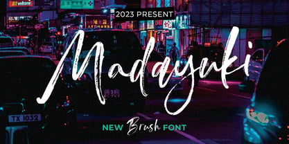 Madayuki Brush handmade It comes with a signature and unique style that is perfect for making any design stand out! This font is perfect for branding, wedding invitations, magazines, mugs, business cards, quotes, posters and more. Help File Madayuki Type Features: Uppercase - Lowercase Numbers & Punctuation Perfect for Headlines, Logotypes, Signs, Posters, Letterheads, T-Shirts and more. Supports International Languages Hope you enjoy with our Fonts Thank You!