10,000 search results
(0.039 seconds)
- FF Metamorph by FontFont,
$41.99 Austrian type designer Markus Hanzer created this display FontFont in 1994. The font is ideally suited for advertising and packaging, music and nightlife as well as poster and billboards. FF Metamorph provides advanced typographical support with features such as ligatures, alternate characters, and case-sensitive forms. It comes with proportional oldstyle figures.
 - Dosty by Dhan Studio,
$18.00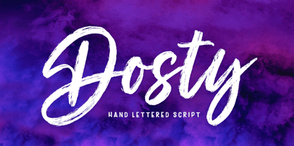 Dosty is a unique textured brush font because this brush font is made digitally. It's a contemporary approach to design, and has underlines and also several ligatures. Suitable for use in title designs such as book tittles, stationery designs, quotes, branding, logos, clothing, invitations, greeting cards, t-shirts, packaging designs, posters and more.
 - Chunky Nouveau JNL by Jeff Levine,
$29.00 Chunky Nouveau JNL was inspired by a circa-1928 water applied decal for the Top Most Insulated Jug. The plump, rounded hand lettering of the brand name was given a slightly thicker treatment to create a more poster-oriented display design. Chunky Nouveau JNL is available in both regular and oblique versions.
 - Old Friend by Eotype,
$14.00 OldFriend is multipurpose and unique display font. This font can give your designs a playful and friendly impression. You can use this font for retro, vintage and urban designs. This font comes with alternative style and ligature features which are suitable for various projects such as logos, product labels, posters and many more.
 - Xspace by Artyway,
$14.00 I'm thrilled to present you a new futuristic typeface. Smooth humanistic forms and elongated proportions, modern trends dictate a new fashion in type design. Perfect for science research posters, modern futuristic logos, automotive type design and more. Check how it works and let me know, I am always glad to hear your opinion.
 - Labyrinthus Rounded by Cerri Antonio,
$30.00 Labyrinthus Rounded is a multiline decorative font that works very well for identity logos, posters and 3D-works. It continues the tradition of the precedent Labyrinthus but with a softer rounded impact. It's interesting to note that with it it's possible to play with the multiline concept to create endless overlapping geometric creations.
 - Sugary Pancake by Hanoded,
$15.00 Sugary Pancakes - ahh, my kids love them. We don't make them too often, as they are 'energetic' enough as it is. This calorie-rich font is ideal for Children's Books and posters: it is fun, bouncy, very legible and full of character. Comes with a topping of diacritics and a stack of happiness.
 - Awesome Brush by Gatype,
$10.00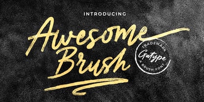 Awesome Brush is a unique textured brush font, because this brush font is made digitally. contemporary approach to design, and has underlines and also has several ligatures. Suitable for use in title designs such as tittle books, stationery designs, quotes, branding, logos, clothing, invitations, greeting cards, t-shirts, packaging designs, posters and more.
 - Celtiva Florance by GuseType,
$12.00 Celtiva Florance is a display serif font. This font is perfect for various designs especially classic, retro and vintage style. this font also good for your project like logotypes, magazine headlines, posters, cover albums and much more. Celtiva Florance provides a collection of glyphs include numeral & symbols, multilingual support, alternative glyphs & ligatures.
 - Raven Hell by Creativemedialab,
$20.00 Raven Hell is a simple and modern gothic font. What's unique about Raven hell is that it can be sans or blackletter, depending on your choice of design theme. Raven Hell can be used in many types of modern designs ranging from product labels to tattoos, badges, logos, poster titles, and much more.
 - React BTL by BoxTube Labs,
$22.00 React is modern athletic display block font family. It's timeless shapes and features will give you an instant athletic feel to your project. React features both chamfered corners and rounded giving it a unique approach. These fonts are perfect for sports logos, branding, posters, apparel design, magazine headlines, labels and so much more.
 - Mental Duck by PizzaDude.dk,
$17.00 Drawn with a thick marker, I present to you: Mental Duck! A loose and laid back comic book font, suitable for both comics, posters, products for children, toys ... in fact anything that needs a legible and handdrawn look. Comes in three different versions: Regular, Fill and Shadow. Mix them for great results!
 - Hello Jack by Sipanji21,
$15.00 Hallo Jack is a funny, bold and cute display font with a sharp corner. Get inspired by its unique feel, and turn to add a lovely charm to any crafts project, this font suitable for any project about kids, children, or Student, like, book Cover, kids shirt, baby shower poster, and etc.
 - Welanger Kesley by madeDeduk,
$16.00 Introducing Welanger Kesley is a Display Sans, use this font for any branding, product packaging, invitation, quotes, label, poster, logo etc. Feature Uppercase & Lowercase Number & Symbol International Glyphs Multilingual support Alternative Ligature Feel free to drop us a message any time and follow my shop for upcoming updates Hope you enjoy it.
 - Conundrum by Atom,
$14.00 Conundrum is a cool, rough brush font, quickly painted on paper, so it looks natural and organic. If you want a font character that is unique and different than others, Conundrum is worth a try. With this bold concept it would be suitable if used for movie titles, magazine titles, covers, posters, etc.
 - Cookie Treat by Tanincreate,
$18.00 Cookie Treat casual hand-lettered font. It is suitable for recipe and cook books, promotional, packaging designs, labels, greeting cards, cosmetic brands, posters, title, typography based branding, quotes, children's book, brochure, advertising, creative headers and so much more. Fun and casual, with uneven letters, this font brings a dynamic vibe to your projects.
 - MGN Humble by Morgana Studio,
$17.50 MGN Humble is a sans-serif type that provides room for users to express their experimental and playful side. The pixelated strokes engage venturously with the need to communicate excitement; a perfect set for clothing, gaming, technology, and experimental poster use. Currently available in a beta version and to be developed further.
 - Bugbear by Hanoded,
$15.00 A Bugbear is a kind of hobgoblin, comparable to the Bogeyman. No tablets or gizmos were involved in the creation of this font. It was made entirely by hand, using an old-fashioned roller ball pen and a sheet of paper. Use Bugbear for your children’s book covers, party posters and product packaging.
 - High Tea by Hanoded,
$15.00 High Tea is a handmade typeface, which was inspired by a 1930's menu from a classy restaurant. High Tea is a classy font, with some unique letters and an overall 'Upper Crust' feel to it. It is ideal for headlines and posters. Care for a spot of milk in your Oolong, darling?
 - Bollofora by Akifatype,
$14.00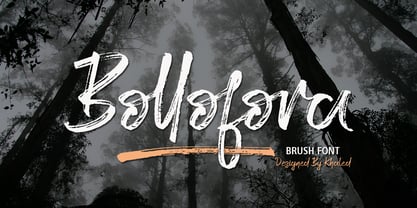 Bollofora is a textured brush font, a contemporary approach to design, naturally handmade and with underscores. It also has alternatives and ligatures that make your design more attractive.Suitable for use in title design such as clothing, invitations, tittle books, stationery designs, quotes, branding, logos, greeting cards, t-shirts, packaging designs, posters and more.
 - Nafigat Script by stiplinestudios,
$13.00 Nafigat Script goes with Romantic and Modern Calligraphy, ready to give your design project with Fresh and Fabulous Style. This font have an 264 Standard Glyph + 408 Glyph Alternate in Open Type Standard Format. Perfect for wedding, branding and romantic invitation and Also Suitable for various purpose such as digital lettering, headings, logos, wedding invitation, t-shirt, letterhead, signage, lable, news, posters, badges, branding materials, t-shirt, print, business cards, quotes, logo, poster, and suitable for any graphic design project. Nafigat Script comes as a single font file packed full of great features. It contains a full set of lower & uppercase letters, a large range of punctuation, numerals, and multilingual support. The font also contains several swashes and stylistic alternates for those who have open type capable software (e.g. Photoshop/Illustrator).
 - Woodshed by Putracetol,
$22.00 Woodshed - Decorative Serif Font. Woodshed have classic decorative, retro and trendy display. Woodshed font inspired by decorative serif of the vintage posters. But in Woodshed font I combine several variations such as the ligature. It makes Woodshed font even more unique and different. Woodshed is also great for any kind of display purpose from album, cover,poster, label, tshirt, apparel, signage, quote, logo, greeting card,logotype and many more. Woodshed is also support multi language. The alternative characters were divided into several Open Type features such as Swash, Stylistic Sets, Stylistic Alternates, Contextual Alternates, and Ligature. The Open Type features can be accessed by using Open Type savvy programs such as Adobe Illustrator, Adobe InDesign, Adobe Photoshop Corel Draw X version, And Microsoft Word. This font is also support multi language.
 - Nutshell Crew by IKIIKOWRK,
$19.00 Proudly present Nutshell Crew - Street Brush Type, created by ikiiko. Nutshell Crew is a rough handwriting type inspired by hand-drawn street brushes. A type of decorative font that features bold, brush-like strokes, often resembling calligraphy, graffiti, or hand-painted lettering. This font features a rough and edgy style, making it ideal for any urban-inspired design project with a blend of grungy and hand-drawn lines will give your words a distinctive and rebellious character, setting you apart from the crowd. The perfect one for the modern-day hipster! This type is very suitable for making a streetwear brand, poster or magazine layout, posters, album covers, quotes, or simply as a stylish text overlay to any background image. What's Included? Uppercase & Lowercase Numbers & Punctuation Alternates Multilingual Support Works on PC & Mac
 - Loft by Monotype,
$40.99Loft is a typeface family of extremes: from the extra compressed Hairline to the extra wide Mammoth. Paris-based designer Julien Janiszewski’s aim was to create a type family based on a strict hierarchy — a suite that would provide graphic designers with a tool to create systematic solutions. Its design was inspired by 19th-century wood type as well as the sign saying “DÉFENSE D'AFFICHER” (Post No Bills) that is ubiquitous in France. Loft comes in seven weights with matching italics. Interestingly, counter widths remain the same across all weights. As weights increase, the characters extend by building stroke thickness outside the counter. Loft is space-efficient in lighter weights while making an increasingly stronger statement as the designs become heavier. The Loft typeface family is distinctive, versatile, and always intriguing. - Tatline by Groteskly Yours,
$15.00 Tatline was intended to be a fun side project that developed into something cool and rather unprecedented. It's bold, it's chunky —and it just looks good whether it's a mock movie poster or a key element in a brand identity for a business. With serifs thicker than stems, it looks more down to earth, solid, reliable and firm. And yet there's an almost imperceptible playfulness in the way it looks and behaved on the screen and paper. Tatline would look great on posters and flyers. We've tried creating a coffee brand identity with it —and surprise, looks great again. Maybe it's magic, but we like to think it's just a result of tough work put into creation of Tatline. Try it yourself and let us know what you think!
 - Abnormal by Jan Buble,
$20.00 Are you getting bored by the growing number of sans-serif fonts that absolutely lack character? Do clean typography and sleek curves repulse you? Maybe it’s time to forget the normal and set sail into the murky waters of abnormality. Abnormal features four styles, ranging from an almost monolinear Light to a reverse-contrast Bold. The design pays homage to 19th century poster typefaces, with their crude character and unconventional means of catching the eye. It is one of the few typefaces out there that features reversed contrast and no serifs. These properties make it an ideal choice for large headlines, posters, flyers and essentially all applications where getting attention is a paramount. Abnormal offers extended language support, standard ligatures, alternative lowercase “a”, fractions, ordinals and a plethora of quirkiness at your disposal.
 - Hideout by Monotype,
$50.99 Jim Ford's Hideout typeface is definitely walking on the wrong side of the law. Inspired by the flared serif lettering of antique tobacco tins, its sturdy shapes are confident, eye-catching, and hark back to the Wild West. Large sizes bring Hideout's details to life, emphasising the delicate nicks in its Ks and Rs. For designers that need to soften some of its swagger, a set of decorative alternatives offer a little Art Deco elegance, adding some refinement to its chunky letterforms. With its 14 weights, Hideout is an adaptable design that works especially well when used for display – for example in book covers, packaging, posters, restaurant menus, or editorial. Don't miss the ghost weights, which hint at the kinds of weathered lettering found on faded and peeling Wanted posters.
 - Australia Script by Dhan Studio,
$16.00 Australia Script is an elegant style handwritten font with a slightly rough scratch, which has a signature style, this font is intentionally made with ligatures and unique alternatives to your various personal designs. Perfect for invitations, greeting cards, news, branding, logos, business cards, posters, product packaging, blog posters, etc. How to access all alternative characters, using Windows Character Map with Photoshop: https://www.youtube.com/watch?v=Go9vacoYmBw How to access all alternative characters using Adobe Illustrator: https://www.youtube.com/watch?v=XzwjMkbB-wQ Australia Script is coded with PUA Unicode, which allows full access to all the extra characters without having special designing software. Mac users can use Font Book , and Windows users can use Character Map to view and copy any of the extra characters to paste into your favourite text editor/app.
 - Slim Pickens by Dear Alison,
$19.00Have you ever seen lettering that you can connect with but have no clue where you've seen it before? It strikes a chord with certain feelings but you don't know why. Slim Pickens was inspired by the lobby card and poster titling from the 1949 Doris Day film "My Dream is Yours", and keys into the look and feel of vintage handwritten film poster titling. Something about that era in film made it easy to tie visuals with getting swept up in all sorts of emotions, good and bad. A narrow font, full of life and wonderfully hand-drawn, Slim Pickens is an accent font you'll want to have in your font collection for those tight fits, so buy it today and fill in the gaps of your designs with a little nostalgia! - Miss Donna by Scholtz Fonts,
$15.00 Miss Donna - contemporary, powerful, versatile and casual. Curvy, sassy, fast-talking, and utterly useable, she takes you into the world of movie posters, decor ads, fashion posters and tags, greeting cards and invitations. Her lines are bold, clean and legible. The Miss Donna family comes in four styles: - REGULAR - clean good lines and generous curves - for decor ads, greeting cards, copy - NARROW - slim (more compact), and elegant with contained curves - for greeting cards, invitations, copy - BLACK - bold statement, round, generous curves - for movie posters, fashion posters - BLACK CAPS - especially designed for "all-caps" printed text. Use for headings & subheads. Miss Donna Black Caps contains capitals in two sizes and this gives you the ability to generate text of two types: - a correctly spaced and kerned upper case, OR - a TRUE Small Caps -- as opposed to the false Small Caps produced by a well-known word processing application. In a correctly proportioned Small Caps the stroke width should not be reduced in the same proportion as the letter height is reduced. The stroke width of the small capitals should rather be equal or close to the stroke width of the corresponding upper case characters. Note: When using script fonts it is NOT usually advisable to use text in ALL caps. The best effects for headings and subheads are obtained with an initial upper case letter followed by lower case characters. BUT, Miss Donna will still produce excellent results with all caps if you are using an application that supports kerning. If you are using upper and lower case then it is not necessary to use kerning, although it may make a slight difference on occasion. Miss Donna contains over 235 characters - (upper and lower case characters, punctuation, numerals, symbols and accented characters are present). It has all the accented characters used in the major European languages.
 - Tescellations by Ingrimayne Type,
$9.95 Though there are many thousands of digital typefaces available, none seem to be made exclusively of letters that tessellate, a complete tessellating alphabet. This void is now filled with not one typeface, but a group of typefaces, the Tescellations kinship group. Even though I am aware of only one use for this typeface--writing about tessellations--that does not mean there are not hundreds or perhaps thousands of other uses. These typefaces are a byproduct of two maze books I designed, Puzzling Typography and Puzzling Typography A Sequel. I found the challenge of making mazes from tessellations, including letter tessellations, intriguing and these typefaces are a byproduct that endeavor. There are seven members of this typeface kinship group. I tried to select the the glyphs that fit together best to form Tescellations; it is the most readable of the lot. The reason for an Italics version is that I needed one for the maze project. In constructing it, I tried to include as many different lower-case glyphs as I could rather than just skew the regular version. A purist might insist that the tessellation deal with the counters. My approach was to worry only about the exterior of any letter that has an interior, but for anyone who who might object to the counters, versions with filled counters are included. What did not fit into Tescellations was dumped into Tescellations Two, which is somewhat of a ransom-note type of face. It comes in two styles, a regular version and a version in which the counters are removed. TescellationPatterns shows how many of the characters in these typefaces tessellate. It has over 100 tessellation patterns, each on only one character. Simply type several lines with any character and make sure the leading is the same as the font size, and you have an instant tessellation pattern of a letter.
 - Mesotone BT by Bitstream,
$50.99Matt Desmond (MADType, Pufficlaude BT) would like you to meet Mesotone BT. This computer typeface design is monoweight and somewhat monowidth. The squarish unicase glyph forms feature eased corners and rounded terminal ends, which takes some of the edge off its techi look. Yet Mesotone still inspires one to explore the outer limits of the design universe. So, don’t tone it down; Mess with the fringes. Get Mesotone. Available in PostScript OpenType format, Mesotone’s extended glyph set covers the Western and Central European, Baltic and Turkish languages. - ITC Spirit by ITC,
$29.99While designing ITC Spirit, Patty King was influenced by classic typeface styles. The letter forms are clearly based on those of the Unziale, which, like ITC Spirit, is also composed of only capital letters. Hints of the Asian brush script style also show in this font. The irregular outer contours are best highlighted in larger point sizes and give the font the look of handwriting. ITC Spirit with its calligraphic style is best used for headlines and short texts in point sizes of 12 and larger. - Posh by Lián Types,
$49.00 I've always been in love with fat didones. That’s the reason of Posh. In search of something unique, I started this family back in 2013 with the aim of creating the fattest yet readable bodonian typeface in the market: It was a challenge, because roman fonts need generous counters (or what some call white spaces) and taking them to the extreme of inexistence attempted against the construction of many glyphs. Ears, dots, terminals and serifs always need some extra space so I had to find the exact point of boldness to make characters which have those attributes work well in the middle of those which haven't. (1) After a while, I felt I was again ‘in my element’: Big contrasted letters, sexy and elegant curves, and that Lubalinesque feeling that characterise my fonts. (2) Words written with Posh are a explosion of elegance and sensuality due to the fact that its didone attributes were exaggerated. Since it’s full of alternate glyphs, one can change and choose them until a nice block of ‘‘black’’ is achieved. (3) To accompany the regular style, I designed Posh Inline, a font with the same quantity of glyphs than the regular one; an all caps style called Posh Capitals, and also a really playful Italic version. I hope you find this one delicious like I do! This font is dedicated to all who understand letters are not just meant to be read, but also to be appreciated in group and individually. Enjoy it. NOTES (1) In example, it can be easy to design a fat letter ‘n’ with almost no counter, but really tough to make a satisfactory letter ‘s’ with serifs to match that ‘n’. (2) Also, it wasn't my first attempt in fat didones. Take a look at my font Reina, made in 2012. (3) Posters above show many words with ball terminals that seem to dance above and below the words in order to fill those “undesired” blank spaces.
 - Bunken Tech Sans by Buntype,
$49.00 The Bunken Tech Sans superfamily: A reminiscence of constructed fonts of the modern age designed with considerably cleaner forms. Bunken Tech Sans follows in the best tradition of the straight-lined and somewhat angular structures of its predecessors while offering a much more open and mild design. The shapes of the letters are therefore reduced to the most essential elements: The spurs on a, b, n and other lower case letters occur just as little as decorative or style details, the lightly rounded inside edges are more pleasing to the eye than certain historic role models and make for a harmonic, flowing style. Use In particular Bunken Tech Sans stands out as an easy, distinctive headline font with its straight-lined, technical design. Open counters and large x-height make it equally suited for use in shorter texts. It is also perfectly complemented by Bunken Sans or Bunken Slab in longer texts (available soon). Features Available in 10 styles with widths ranging from Light to ExtraBold with associated Italics. All of the styles are very extensive: Support for at least 58 languages, Small Capitals, 9 number sets (e.g. Lining, Oldstyle, Tabular and Small Cap Figures), ligatures, alternate characters, numerous Opentype functions, and lots of other small features that make it more pleasant to work with the font on a daily basis as well as fulfilling typographic desires. Each style contains more than 870 characters! Each style is available in a professional (Pro) and standard (Std) edition with a reduced range of functions. (Language support, OpenType features and number of glyphs). Details can be found on the respective pages. Bunken Tech Sans is part of the Bunken Tech superfamily and is available in Condensed, Normal and Wide. Also of interest: The slab serif variation Bunken Tech Slab Features in Detail: 12 Weights: -Light -Book -Medium -SemiBold -Bold -ExtraBold and corresponding Italics 3 Widths: -Condensed -Normal -Wide Alternate Characters: A, E, F, L, S, e, f, t, s, y, etc. Small Capitals 5 Sets of Figures: -Lining Figures -Old Style Figures -Tabfigures -Old Style Tabfigures -Small Cap Figures Automatic Ordinals Automatic Fractions Extended Language Support and more...
 - Anselm Sans by Storm Type Foundry,
$63.00One of the good practices of today’s type foundries is that they release their type families as systems including both serif and sans serif type. Usually, the sources of inspiration need to be well tried with time and practice, since production of a type family is such a laborious and complex process. From the beginning, it needs to be clear that the result will be suited for universal use. Such systems, complete with the broad, multi-lingual variations permitted by the OpenType format, have become the elementary, default instrument of visual communication. Non-Latin scripts are useful for a wide scope of academic publications, for packaging and corporate systems alike. And what about outdoor advertisement designated for markets in developing countries? Cyrillics and Greek have become an integral part of our OpenType font systems. Maybe you noticed that the sans serif cuts have richer variety of the light – black scale. This is due to the fact that sans serif families tend to be less susceptible to deformities in form, and thus they are able to retain their original character throughout the full range of weights. On the other hand, the nature of serifed, contrasted cuts does not permit such extremes without sacrificing their characteristic features. Both weights were drawn by hand, only the Medium cut has been interpolated. Anselm Ten is a unique family of four cuts, slightly strengthened and adjusted for the setting in sizes around 10 pt and smaller, as its name indicates. The ancestry of Anselm goes back to Jannon, a slightly modified Old Style Roman. I drew Serapion back in 1997, so its spirit is youthful, a bit frisky, and it is charmed by romantic, playful details. Anselm succeeds it after ten years of evolution, it is a sober, reliable laborer, immune to all eccentricities. The most significant difference between Sebastian/Serapion and Anselm is the raised x-height of lowercase, which makes it ideal for applications in extensive texts. Our goal was to create an all-round type family, equally suitable for poetry, magazines, books, posters, and information systems. - Digital Sans Now by Elsner+Flake,
$59.00 Digital Sans Now combines and completes the many diverse requests and requirements by users of the past years. By now, 36 versions for over 70 Latin and Cyrillic languages have become available, including Small Caps. Digital Sans Now is also available as a webfont and reflects, with its simplified and geometric construction and its consciously maintained poster-like forms as well as with its ornamental character, the spirit of the decorative serif-less headline typefaces of the 1970s. The basic severity of other grotesque typefaces is here repressed by means of targeted rounds. Exactly these formal breaks allow the impression that it could be used in a variety of visual applications. Short texts, headlines and logos of all descriptions are its domain. It is because of this versatility that the typeface has become a desirable stylistic element, especially in such design provinces as technology, games and sports, and that, for many years now, it appears to be timeless. Additional weights designed on the basis of the original, from Thin to Ultra, the Italics, Small Caps and alternative characters allow for differentiated “looks and feels”, and, with deliberate usage, give the “Digital Sans Now” expanded possibilities for expression. The basis for the design of Digital Sans Now is a headline typeface created in 1973 by Marty Goldstein and the Digital Sans family which has been available from Elsner+Flake since the mid-1990s under a license agreement. The four weights designed by Marty Goldstein, Thin, Plain, Heavy and Fat, were originally sold by the American company Visual Graphics Corporation (VGC) under the name of “Sol”. Similarly, the company Fotostar International offered film fonts for 2” phototypesetting machines, these however under the name “Sun”. The first digital adaptation had already been ordered in the mid 1970s in Germany by Walter Brendel for the phototypesetting system Unitype used by the TypeShop Group, in three widths and under the name “Digital Part of the Serial Collection.” Based on the versions by VGC, Thin, Plain, Heavy and Fat, new versions were then created with appropriate stroke and width adaptations for data sets for the fonts Light, Medium and Bold as well as for the corresponding italics
 - Anselm Serif by Storm Type Foundry,
$63.00 One of the good practices of today’s type foundries is that they release their type families as systems including both serif and sans serif type. Usually, the sources of inspiration need to be well tried with time and practice, since production of a type family is such a laborious and complex process. From the beginning, it needs to be clear that the result will be suited for universal use. Such systems, complete with the broad, multi-lingual variations permitted by the OpenType format, have become the elementary, default instrument of visual communication. Non-Latin scripts are useful for a wide scope of academic publications, for packaging and corporate systems alike. And what about outdoor advertisement designated for markets in developing countries? Cyrillics and Greek have become an integral part of our OpenType font systems. Maybe you noticed that the sans serif cuts have richer variety of the light – black scale. This is due to the fact that sans serif families tend to be less susceptible to deformities in form, and thus they are able to retain their original character throughout the full range of weights. On the other hand, the nature of serifed, contrasted cuts does not permit such extremes without sacrificing their characteristic features. Both weights were drawn by hand, only the Medium cut has been interpolated. Anselm Ten is a unique family of four cuts, slightly strengthened and adjusted for the setting in sizes around 10 pt and smaller, as its name indicates. The ancestry of Anselm goes back to Jannon , a slightly modified Old Style Roman. I drew Serapion back in 1997, so its spirit is youthful, a bit frisky, and it is charmed by romantic, playful details. Anselm succeeds it after ten years of evolution, it is a sober, reliable laborer, immune to all eccentricities. The most significant difference between Sebastian/Serapion and Anselm is the raised x-height of lowercase, which makes it ideal for applications in extensive texts. Our goal was to create an all-round type family, equally suitable for poetry, magazines, books, posters, and information systems.
 - Aviano Future Variable by insigne,
$99.99 Because you demanded it, the Aviano series is back with a variable version of the futuristic sans serif Aviano Future. Aviano Future’s strong letterforms will make you look like a rock star. Aviano Future Variable is a medium-contrast sans serif titling face that has a bold and futuristic look. It has a bowed square shape which gives it an interesting appearance that is both unique and eye-catching. Given that it has a variable axis any weight can be selected with no loss of clarity or legibility. Aviano Future's expanded forms give the letterforms heft and intensity. Aviano Future is a powerful yet adaptable title face that builds on the award-winning traits of Aviano and elevates them. Aviano Future Variable contains a ton of OpenType capabilities and comes in ten different defined weight instances with "fast" italic forms for emphasis. Want to use more traditional rounded forms? Need swash forms? Art Deco alternates? Aviano Future includes 400 alternate characters. Twelve style sets are available, two sets of art deco inspired alternates, small forms, tough swash, constructivist titling and traditional stylistic alternates. Aviano Future also includes 40 discretionary ligatures for artistic typographic compositions. Additionally, there are glyphs in this family to accommodate a variety of languages, and Cyrillic support was added in 2022. An extensive selection of sans serif typographic systems can be found in the Aviano family. The typefaces can be used alone or in combination to suit the needs of any project. The family's fonts have all been meticulously designed to assist ensure maximum impact and usability at any size. Aviano, Aviano Serif, Aviano Sans, Aviano Didone, Aviano Flare, Aviano Copper, and Aviano Slab are presently part of the Aviano collection. A skilled designer who wishes to create a technological, futuristic, or epic design should consider Aviano Future. Aviano Future Variable will make your design stand out from the competition, regardless of whether you are designing a logo, poster, flyer, website header, or banner ad. Why wait? With the exciting and versatile Aviano Future Variable at your disposal, reach new heights and create a brand that stands out from the rest.
 - Zigfrida by Anderson Ruda,
$20.00 Zigfrida Typeface was born from a process of re-designing a logo where, through a grid created, I was developing all its main characters. As the project grew, it was noted that it was necessary not only to limit itself to the Latin alphabet, but also to develop Cyrillic characters. Its possibilities of use are endless, can be used in projects for your favorite sport, signs, posters, large formats, advertising projects, architectural, packaging, titles, among others. The result of all this was the development of a font that has up to 747 glyphs that can understand 100% of Latin languages and the vast majority of countries that use the Cyrillic alphabet. It has unique personality and characteristics that bring a differential to any project it is part of. ----- A Zigfrida Typeface nasceu a partir de um processo de re-design de um logotipo onde, através de um grid criado, fui desenvolvendo todos os seus principais caracteres. A medida que o projeto foi crescendo, observou-se que era preciso não apenas se limitar ao alfabeto latino, mas também desenvolver os caracteres cirílicos. Suas possibilidades de uso são infinitas, pode ser utilizada em projetos para seu esporte favorito, sinalizações, cartazes, grandes formatos, projetos publicitários, arquitetônicos, embalagens, títulos, entre outros. O resultado de tudo isso foi o desenvolvimento de uma fonte que possui até 747 glifos capaz de compreender 100% dos idiomas latinos e a grande maioria dos países que utilizam o alfabeto cirílico. Tem personalidade e característica únicas que trazem um diferencial para qualquer projeto que ela fizer parte.