10,000 search results
(0.025 seconds)
- Ghostly Guffaws by Putracetol,
$22.00 Introducing Ghostly Guffaws, a Halloween Funny Theme Font that encapsulates the spooky yet playful spirit of Halloween. This unique display font, crafted with precision. Ghostly Guffaws is characterized by its all caps lettering, making it a perfect choice for bold and eye-catching headlines. With seven distinct variations tailored to fit the eerie theme, this font is versatile and adaptable. Whether you’re designing logos or branding materials, Ghostly Guffaws adds a touch of whimsy and horror that’s bound to captivate your audience. It’s not just limited to Halloween; use it for children’s themes, crafting projects, invitations cards, packaging designs, posters titles, business signage, greeting cards stickers books magazines or any design needing a dash of creepy charm.
 - Della Brian by Letterhend,
$19.00 Introducing, Della Brian - a lovely wedding typeface. This font has many stylistic alternates, ligatures, swashes so you can play around with them using opentype features and creates lettering with natural touch. This type of font perfectly made to be applied especially in logo, and the other various formal forms such as invitations, labels, logos, magazines, books, greeting / wedding cards, packaging, fashion, make up, stationery, novels, labels or any type of advertising purpose. Features : uppercase & lowercase numbers and punctuation multilingual alternates and ligatures swashes PUA encoded We highly recommend using a program that supports OpenType features and Glyphs panels like many of Adobe apps and Corel Draw, so you can see and access all Glyph variations.
 - Konya by 38-lineart,
$12.00 Konya is a signature script-style font with a very luxurious look. It can look very soft and very firm in an elegant frame, high but not too towering, and flat but not too low. Its appearing with a balance like dervish whirling around in ‘Konya town’ with two hands stretched, one hand facing to the sky and the other hand facing to the earth. This font is perfect for branding, as we equipped it with a number of alternatives that allow you to make it a feminine and masculine logo, and some swash to add to the firmness of signature. This font also has ligatures to present a natural handwritten impression.
 - Strikers Script by Mans Greback,
$59.00 Strikers Script is a vintage baseball font. In a cool retro look, this calligraphic family has an optimistic attitude and the genuine appearance of a sport jersey or a club logotype. The Strikers Script family consists of 14 professional styles, such as Thin, Bold, Outlined and Swashes, plus more variations and combinations, complimenting each other for ultimate usability. Use underscore _ to make a swash. Example: Letter_ Use multiple underscores to make longer swashes. Example: Baltimore____ For the outlined version, use symbols < > around the word to make beginning and end. Example: The font is built with advanced OpenType functionality and has a guaranteed top-notch quality, containing stylistic and contextual alternates, ligatures and more features; all to give you full control and customizability. It has extensive lingual support, covering all Latin-based languages, from Northern Europe to South Africa, from America to South-East Asia. It contains all characters and symbols you'll ever need, including all punctuation and numbers.
 - P22 Casual Script by IHOF,
$39.95 P22 Casual Script Pro is a flexible OpenType font based on mid-20th Century hand drawn advertising lettering scripts. As an alternate to thicker casual script styles, this free-flowing thin brush style is evocative of vintage product advertisements and packaging lettering and is highly suitable for a retro flavor. The Pro font includes over 500 glyphs with at least 2 of all upper and lower case characters with OpenType scripting and ligatures for a more natural and random effect. There is also a unique feature not found in other script fonts: Small Caps! While it may seem unnatural for a script font to have small caps, these work well as an authentic variation of brush script lettering for advertising. Also included in the Pro version is a full Central European character set, swash characters and more. OpenType features include: Small Caps, ligatures, discretionary ligatures, swashes, contextual alternates, stylistic alternates, Old Style/Lining Figures
 - Full Neue by Bülent Yüksel,
$19.00Full Neue is the younger brother of original Full Sans, Full Slab and Full Tools. Ideally suited for advertising and packaging, editorial and publishing, logo, branding and creative industries, poster and billboards, small text, way-finding and signage as well as web and screen design. Full Neue provides advanced typographical support for Latin-based languages. An extended character set, supporting Central, Western and Eastern European languages, rounds up the family. The designation “Full Neue LC 50 Book” forms the central point. The first figure of the number describes the stroke thickness: 10 Thin to 90 Bold. Full Neue LC comes 5 weights and italics also Full Neue SC comes 5 weights and italics total 20 types. The family contains a set of 485 characters. Case-Sensitive Forms, Classes and Features, Small Caps from Letter Cases, Fractions, Superior, Inferior, Denominator, Numerator, Old Style Figures just one touch easy In all graphic programs. Full Neue is the perfect font for web use. You can enjoy using it. - M Lady PRC by Monotype HK,
$523.99 M Lady is a design inspired by Agfa Waddy’s rather elegant design comes with narrow proportion. M Lady is a rare condensed design in world of Chinese typefaces. Entry and finial points of strokes are squarish, with a sharp but small symmetric serif. It has a medium contrast to improve character recognition. Its thin stems (豎) make it suitable for fine print with minimal conglutination. Dots (點) are straight, reversely curved or round. Downstrokes (撇、捺), ticks (剔) and hooks (勾) are highly regular and consistent. Dots (點), downstrokes (撇、捺) and ticks (剔) are long, smooth, monolinear and curved with small symmetric serif and sometimes angled entry and finial points of strokes to create subtle sharpness in the midst of its softness and elegance, which is better for larger text print. Its features and construction create subtle sharpness in the midst of softness and slim elegance. It is best suited for casual subheading or display, set upright (non-slanted), non-condensed (naturally condensed).
 - M Lady HK by Monotype HK,
$523.99 M Lady is a design inspired by Agfa Waddy’s rather elegant design comes with narrow proportion. M Lady is a rare condensed design in world of Chinese typefaces. Entry and finial points of strokes are squarish, with a sharp but small symmetric serif. It has a medium contrast to improve character recognition. Its thin stems (豎) make it suitable for fine print with minimal conglutination. Dots (點) are straight, reversely curved or round. Downstrokes (撇、捺), ticks (剔) and hooks (勾) are highly regular and consistent. Dots (點), downstrokes (撇、捺) and ticks (剔) are long, smooth, monolinear and curved with small symmetric serif and sometimes angled entry and finial points of strokes to create subtle sharpness in the midst of its softness and elegance, which is better for larger text print. Its features and construction create subtle sharpness in the midst of softness and slim elegance. It is best suited for casual subheading or display, set upright (non-slanted), non-condensed (naturally condensed).
 - Tepuy by John Moore Type Foundry,
$20.00 Tepuy is the name given to the ancient plateau-shaped mountains that abound in the Venezuelan Amazon. Tepuy is a display typeface inspired by the symbolic forms of the Venezuelan ethnic roots. It is constructed based on a very precise geometry of open forms that produce a double letter in form and counterform. Tepuy originates as an evolution curve of my Font Makiritare rectilinearly. Was devised for a book of photographs of the ancient mountains of the Venezuelan Amazon, its form and Makiritare are morphologically inspired crafts in the ethnic groups of the region. Tepuy is held in a very precise geometric construction based on rounded forms, each letter is a form envelope enclosing another in counterform, is a letter to display. Tepuy comes in four versions Regular, Light and thin, and there is a double line version enclosed. Tepuy recommended for creative headlines for the label and packaging design aimed at all ages.
 - Peachi by My Creative Land,
$25.00 Peachi is a serif typeface loosely based on Morris Fuller Benton’s Souvenir forms and some other serif fonts designed in the early 1900s. It has a soft look - round corners, slightly curved legs of capital K, R, V and W; and lowercase k, v, w and y. Rather heavy ball terminals and a very large x-heigh make Peachi a perfect choice for designing titles, book covers, for branding, quotes design - basically any design that needs to make an impact and to be remembered. Peachi is released in 6 weights from Thin to Black and has stylistic alternates that make it even more versatile. While the default style follows Souvenir’s trend, the alternative style looks more modern. It’s totally up to you which style to choose for your design. To access all alternates and ligatures you’ll an OpenType aware application such as Adobe Suite or MSWord. March 2021 Update: more alternates and ligatures have been added!
 - Autografia by Mans Greback,
$59.00 Autografia is a high-quality signature typeface. The typeface family is provided in five weights: Thin, Light, Medium, Bold and Black. The weights compliment each other and makes for a truly formative script typeface, to be used in any context and with the right assertion. Autografia's large, round capital letters contrast against its short and streamlined lower case, resulting in a characteristic autograph style. Use underscore _ anywhere in a word to make an underline. Example: Sign_ature Use multiple underscores for different underlines. Example: Hand_____writing (Download required.) The font is built with advanced OpenType functionality and has a guaranteed top-notch quality, containing stylistic and contextual alternates, ligatures and more features; all to give you full control and customizability. It has extensive lingual support, covering all Latin-based languages, from North Europe to South Africa, from America to South-East Asia. It contains all characters and symbols you'll ever need, including all punctuation and numbers.
 - Full Slab by Bülent Yüksel,
$19.00Full Slab is the younger brother of original Full Sans, FullNeue and Full Tools. Ideally suited for advertising and packaging, editorial and publishing, logo, branding and creative industries, poster and billboards, small text, wayfinding and signage as well as web and screen design. Full Slab provides advanced typographical support for Latin-based languages. An extended character set, supporting Central, Western and Eastern European languages, rounds up the family. The designation “Full Slab LC 50 Book” forms the central point. The first figure of the number describes the stroke thickness: 10 Thin to 90 Bold. Full Slab LC comes 5 weights and italics also Full Slab SC comes 5 weights and italics total 20 types. The family contains a set of 485 characters. Case-Sensitive Forms, Classes and Features, Small Caps from Letter Cases, Fractions, Superior, Inferior, Denominator, Numerator, Old Style Figures just one touch easy In all graphic programs. Full Slab is the perfect font for web use. You can enjoy using it. - Absentia Display by DR Fonts,
$19.00 This modern display typeface expands the Absentia collection with an impactful option for headlines, titles and logos. Graced with the geometric DNA of its distinctive lineage, the new addition emerges as a refreshing alternative for large size typesetting. Absentia Display borrows design attributes from the Sans and Slab families, in the form of slanted finials (‘a’, ‘e’, ‘C’) and one-sided serifs (‘b’, ‘F’, ‘H’). But in contrast to its relatives' measured restraint, it distinguishes itself with uninhibited boldness. Featuring stencil face breaks, basic glyph components are either abridged or completely omitted, as the shoulder of lowercase ‘m’ or the diagonal stroke of capital ‘W’. Modular letterforms set this typeface apart with a stylish appearance; round diacritic dots (‘i’, ‘Ü’) and curved transitions (‘E’, ‘L’) breathe a lighthearted attitude. Designers can scale up and go loud with Absentia Display, available in ten weights with matching italics and two variable fonts. From the refined Hairline to the robust Black, this versatile family serves a wide range of needs and styles.
 - Fragua Pro by deFharo,
$14.00 Fragua Pro is a family of 14 fonts (Latin Extended-A and the Cyrillic alphabet) Condensed Sans Serif of geometric construction inspired by the Russian constructivism of the mid-20th century; the typography has a rounded finish in all corners to avoid the coldness of the rectilinear fonts and providing warmth and docility, the ascending and descending short and a high height of the x make it very compact, all this results in a unique typeface with maximum readability due to the careful configuration of metrics and Kerning. The cursive styles have an inclination of 8 degrees and a narrower proportion than the regular ones, they also have their own letters and meticulous optical corrections to compensate for the deformations produced by the inclination. Fragua Sans has Advanced Open Type functions, several alternative letters, full support for numbers, monetary symbols and crypto currencies and more. 681 glyphs. This typography is specially designed for advertising and editorial composition, behaving correctly in both short and medium texts and headlines where horizontal space saving is needed, being an ideal typographic system for signage, editorial or corporate design. This typography is dedicated to the memory of my grandfather C·ndido (Pa), the blacksmith of my town. THE COMPLETE 14 FONTS PACKAGE INCLUDES THE REGULAR VERSION IN "VARIABLE FONT" FORMAT, compatible with Adobe CC 2018.
 - Sisters by Type-Ø-Tones,
$40.00 Sisters is a lively set of stencil display typefaces designed by Type-Ø-Tones’ co-founder Laura Meseguer. The family features four fresh fonts that share foundational principles of construction yet complement each other—as sisters do—by celebrating their differences. Variations in contrast, weight, and design characteristics result in four distinct styles dubbed One through Four. This cool quartet contains no lowercase, asserting the family’s rightful place in the titling typography space. Like many Type-Ø-Tones typefaces, Sisters was conceived as a custom lettering project—in this case, the design was crafted for the identity of an art exhibition. Laura initially drew only the limited character set the show required, but from the outset, she saw great potential for a fully developed type family based on her lettering concept. The first member of Laura’s new family was, naturally, Sisters One. She later added contrast to produce Sisters Two, then equalized the weight of Sisters Two to create Sisters Three. To round out the group, Laura added a deco touch to Sisters Two, resulting in the festive but retro-elegant Sisters Four. Each Sister shares DNA with the other members of the family, just as human siblings do :). Credit for the Sisters name goes to Eider Corral and we couldn’t imagine a more fitting moniker for this little family.
 - Cushy by Jeff Kahn,
$- Cushy is a versatile san serif font that’s stuffed with numerous plush swashes and unique alternates. But it’s not limited to display use only. Cushy is well suited for text or display applications. Cushy’s large “x” height, square proportions, and generous even weight enhance its legibility in all point sizes. The font’s bold personality radiates friendliness and warmth. Clean classic proportions lend it authority and vigor. Cushy bends around corners and flows throughout. You won't find any sharp corners. The diagonal strokes possess a subtle arch and enhance its characteristics. Available in 8 styles with multiple weights: Thin, Light, Regular, Bold, including italics. Cushy includes stylistic sets, stylistic alternates, swashes, ligatures & discretionary ligatures, and foreign language diacritic glyph support. Cushy provides 40 distinctive swash options, 17 ligatures, and 13 alternates. Weights include Thin, Light, Regular, Bold, with italics. Cushy is suited for corporate ID, retail, magazines, books, brochures, websites, logotypes, etc.
 - Hurricane by TypeSETit,
$44.99 A storm has been brewing. It’s Hurricane. A complete redesign of a popular style. New flair and excitement abounds with this fast moving spirited brush script. This updated version of Hurricane was created with high end advertising in mind but can also be used for designs outside of commercial uses— greeting cards and social expression, or even scrap-booking projects. There are three regular styles and a PRO version of the script styles, plus a graphics font to add an extra breeze to your work. Hurricane Regular is straight forward with the more Roman capital forms. The Script version swaps the caps out for the more flourished uppercase. And finally, the Swash version contains many of the alternate letter forms found in the PRO version. Hurricane Pro offers the features of all three of the regular Hurricane versions with added OpenType programming and additional alternate glyphs. The Contextual feature of Hurricane swaps out the regular forms for more flashy characters along with necessary ligatures and alternates that give perfect flow to the words. Access the stylistic sets for even more creative options. In addition, see GLORY— a sans serif spin-off (pun intended) to complement the script styles. The Glory styles contrast to Hurricane’s slanted, brushy speed. In addition, an inline font has added to complete the pro package. I sincerely hope you enjoy this exciting update to a font I have always found to have huge potential.
 - Megumi by Eclectotype,
$70.00 Megumi was originally commissioned as a headline face for a fashion and lifestyle magazine with a heavy Japanese influence. The uppercase letters are narrow and have an almost monospaced aesthetic, being influenced by Romaji letterforms. Serifs are severe, and curves sinuous. Although experiments were made with extra weight, it was decided that only this ultra light weight would be developed, to be set large in headlines. The italic has an over-the-top 35° slant (so slanted in fact that the backslash from the italic is the exact same shape as the forward slash in the Roman) and a discretionary ligature feature that can be engaged to add extra interest to headlines. The Roman has a few wide alternate glyphs for round uppercase characters. Both styles have a stylistic set (ss03) feature which switches regular parentheses for angle brackets, which the Art Director thought “looked cool”. In a mess of venture capitalist pull-outs and Covid related issues, the publication never came to be, but the Hipster Japanophile Magazine World’s loss is your gain, as this beautifully crafted, editorial oddity is now available to license. Use it editorially, obviously, but it would also look great on posters, perfumes, postmodern publications, and perhaps some other things that don’t begin with p.
 - Delightful by Jessie Makes Stuff,
$12.00 Delightful is a whimsical and cheerful handwritten font family of varying weights and widths. This typeface is like if Comic Sans had a cousin who studied abroad one summer and now wears scarves to look more grown up, even though inside she's still the same, sweet marshmallow she always was. The letters were inspired by my handwriting on a good day - slowed down, legible, and intentionally drawn. I even threw in some of my favorite doodles as alt characters because the set wouldn't be complete without them. And the name was inspired purely by how it feels when I see it - and by my word of the year, delight. Delightful is ideal for anyone who wants to include a bit more warmth and a personal touch with their messaging. It's friendly and non-threatening, and will enhance personal projects or professional ones alike - whether you're a designer, an Instagram influencer, or you need to create some flyers for the local Mom 'n Pop Shop. There are two versions of this font. The original style is slightly more rounded and gets chubbier as you increase its boldness, and the stretched style is like a condensed version, except it's been stretched taller rather than squished narrower. I hope you delight in it as much as I do!
 - Hachi Maru Pop by Norio Kanisawa,
$40.00 It is a cute font that imaged a circle that was popular among young Japanese girls in the 1970s and 1980s, plus elements of the current round character as well. The momentum of the circle fads of the 70s and 80s back then seemed to have been great, and it seems that there were schools that prohibited the use of the round letters as students were all writing, too. In addition, a circular letter contest was held, and it seems that the work selected from many entries was released as a phototype. I tried to round up to the limit while incorporating the elements of that circle and the elements of the round letters that the current Japanese girls would write. It corresponds to Hiragana · Katakana · Alphabet · Numerals · Symbols · Kanji(chinese characters). You can also write vertically. You can use it easily, because it contains JIS first · second level, and IBM extended Kanji(about 6700chinese characters). I think that it is an eye-catching design although it lacks a little on readability, so it is also recommended to use it point-wise. The name "Hachimaru" is a thing that touched "80" in the 1980s. The 80s is one of my favorite times. I think that the power to young girls 'Kawaii' such as circle letters, fancy goods and idols was a very strong era. I hope I can express even a little "Kawaii" culture of that unique and unique 80's Japan. <「はちまるポップ」紹介文> 1970年〜80年代に、日本の若い女の子の間で流行した丸文字をイメージし、現在の丸文字の要素もプラスしたかわいいフォントです。 70〜80年代当時の丸文字の流行の勢いは凄かったらしく、学生さんもみな書いていたそうで、丸文字の使用を禁止する学校もあったそうです。 また、丸文字のコンテストが行われ、多数の応募から選ばれた作品が写植書体としてリリースされたこともあるそうです。 その丸文字の要素と、現在の日本の女の子が書くような丸文字の要素も取り込みながら、極限まで丸っこくしてみました。 ひらがな・カタカナ・アルファベット・数字・記号類・漢字に対応しており、縦書きもできます。 漢字はJIS第一水準・第二水準・IBM拡張漢字に対応(約6700文字)しているので、使い勝手も良いかと思います。 可読性には少々欠けますが目を引くデザインだと思うので、ポイント的に使うのもオススメです。 名称の「はちまる」は80年代の「80」をもじったものです。 80年代は私の好きな時代の1つです。丸文字をはじめ、ファンシーグッズやアイドルなど、若い女の子の「かわいい」へのパワーがとても強い時代だったんだなぁと思います。 その個性的で独特な80年代日本の「かわいい」カルチャーを少しでも表現できてればいいなぁと思います。 <スタイルカテゴリー> 手書き風、丸ゴシック
 - ITC Schuss Hand by ITC,
$29.99Designed by German graphic designer Jochen Schuss. ITC Schuss Hand and ITC Schuss Hand Bold can probably best be described as excellent all around scripts useful for a broad spectrum of advertising purposes as well as for those applications that benefit from a refined handwritten appearance. The characters themselves have a soft, almost “liquid” appearance which is enhanced by the subtle swelling at most of the stroke terminals. The slightly condensed nature of the characters plus a relatively large x-height ensures that both weights are ideal for the advertising arena. An additional feature on ITC Schuss Hand and ITC Schuss Hand Bold are the capital letters which can actually be used on their own in word settings whereas most script capitals are designed just for initialing purposes. The designer has also invested a good deal of careful thought to the way in which a high percentage of the lowercase letter combinations overlap to create an authentic hand-scripted appearance. This, together with the italicized letter forms, will make Schuss Hand and Schuss Hand Bold ideal candidates for those occasions when paper correspondence requires an informal style. So, as is claimed, an excellent all around script style. - Radium J - Unknown license

- BR Sonoma by Brink,
$30.00 BR Sonoma is a new geometric grotesque built for the 21st century with a finely tuned modern aesthetic. BR Sonoma builds on the foundations laid by the classic Swiss grotesques such as Helvetica and Univers but combines their features with a stronger geometric base usually found in other early classics such as Avant Garde, Futura and Avenir.
 - Fine And Dandy JNL by Jeff Levine,
$29.00 Fine and Dandy JNL comes from the hand lettered title of the 1929 movie "Isle of Escape"; found on the sheet music for its theme song "My Kalua Rose". An engraved and fancy Roman, the style combines elements of Western, Art Nouveau and Art Deco into one attractive type design; available in both regular and oblique versions.
 - Old Letterhand by JOEBOB graphics,
$24.00 'Old letterHand' is a very legible handwritten script font, created with a fine brush pen. The font was made with old style lettered ads in mind but it is has a modern look. It features a couple of ligatures, alternate characters and a few swashes for you to play around with. Related fonts are fourHand and blackHand.
 - Chunky Rosie by Gartype Studio,
$10.00 Inspired by a chunky character, we present to you Chunky Rosie, a handwritten with chunky characters comes with alternates and multilingual glyphs to help people around world with that unique accent. Chunky Rosie is very suitable like as text, cover book, poem, handwritten style, and more.That way easily change the glyphs to make more unique glyphs
 - Handmade Dropshadow JNL by Jeff Levine,
$29.00 Handmade Dropshadow JNL was modeled from lettering found on a vintage silk screened metal sign used for point-of-sale marketing. Before the advent of computers and modern techniques, silk screens were hand cut using material called frisket and knife tools, and the lettering reflected the human inconsistencies of cutting these lettering into the template surface for transfer.
 - Linotype Centennial by Linotype,
$29.99 Centennial appeared in 1986 in honor of Linotype’s 100th birthday. The roman and light cuts of the font are reminiscent of the Century typeface, particularly on that of Linn B. Benton and Morris F. Benton, designed around the turn of the 19th century for the American Type Founders. Like Century, Centennial too embodies a cool, reserved neutrality.
 - Swordtail by Type Innovations,
$39.00 A friend bought me a Chinese calligraphic brush set in a beautifully decorated box. I started to letter the alphabet on parchment, in my own hand, using quick strokes and found the resulting script had an interesting energy to it. After further refinement in my font application software 'Swordtail' was born. A great free-hand script.
 - Eyeballs by Bitstream,
$29.99Eyeballs was designed at Bitstream by designer David Robbins. Its beginnings can be found in Bitstream’s Old Dreadful No. 7, where Mr. Robbins first conceived the capital I. He was later asked by Bitstream to develop the entire character set. The result is a humorous meld of cartoon and typography. A word of caution: Watch how you use it! - Wood Sans Narrow JNL by Jeff Levine,
$29.00 Wood Sans Narrow JNL is based on examples of an extra condensed Hamilton Wood Type. The design was cleaned up a bit to provide more uniform stroke widths, but still retains the nostalgic feel of a tall, narrow type face found on broadsides and posters of the late 1800s. It is available in both regular and oblique versions.
 - Brattleboro Stencil JNL by Jeff Levine,
$29.00 The inspiration for Brattleboro Stencil JNL was found within a reproduction of a sales catalog for stencil punch dies manufactured by S.M. Spencer & Co. (originally of Brattleboro, VT), circa 1868. Basically a sans serif letter, the font's unusual feature is its "split tail" design where the letters take on a bit of a "Western" look in appearance.
 - Mechanized JNL by Jeff Levine,
$29.00 Mechanized JNL is a solid interpretation of Jeff Levine's stencil font Trencher JNL. Both fonts were based on a photo of hand-cut stencils found on a 1940's trenching machine in the collection of the Marine Corps Mechanized Museum at Camp Pendleton, California. Thanks to restoration volunteer Brian Platzer for providing the images of those stencils.
 - Yeah Baby by Comicraft,
$29.00Mmm-hmmm! Dig that crazy beat! Following the success of Lilou's GIRLS!GIRLS!GIRLS! font, we couldn't wait to give you More!More!More! Yeah, Baby! It's a font and it's clip art and it's bound to make heads turn and temperatures rise. Get up on the dance floor, girl, and dance the way you've never danced before! - Eunoia by Shinntype,
$39.00 Eunoia is an eye-popping, high-contrast, condensed, geometric, sans serif typeface. The family is not, as is usual, built around variance in weight or skew, but alternate letterforms. Eunoia is a system of six fonts with interchangeable characters. Use the fonts individually (each has a quite distinct personality), or mix and match to create eunique wordmarks.
 - Dirty Money SRF by Stella Roberts Fonts,
$25.00 Dirty Money SRF is a novelty font with a limited character set emulating the lettering found on U.S. currency. The typeface was designed by Brad O. Nelson of the Brain Eaters Font Company. The net profits from my font sales help defer medical expenses for my siblings, who both suffer with Cystic Fibrosis and diabetes. Thank you.
 - Visual Arts JNL by Jeff Levine,
$29.00 Visual Arts JNL is a classic Art Deco typeface based on the hand lettering found on a 1930s-era WPA (Works Progress Administration) poster for Women Artists. The exhibit took place in the Federal Art Gallery in Boston, and was part of the arts project underwritten by the WPA to keep many creative people working during the Depression years.
 - Petroglifos by John Moore Type Foundry,
$19.00 Petroglifos is a dingbats font as a collection of pre-Hispanic petroglyphs of indigenous ethnic Venezuela, most of them are found in signs carved in stone or painted in caves of the pre-Hispanic period, each icon is an accurate representation of these ancestral signs. Forms are very interesting from a visual, anthropological, historical and semiotic point of view.
 - Clufy by Runsell Type,
$22.00 Clufy is an editorial serif typeface inspired by neoclassical serif style typography. Clufy is perfect for headlines, editorial design, monograms, branding, logos, poster design, and more. Clufy includes approximately 601 glyphs support with features such as ligatures, alternate characters, old-style figures, fractions, numerator/denominator, superior/inferior, and various symbols, also support around 200 languages in Latin.
 - Qolling by Dora Typefoundry,
$17.00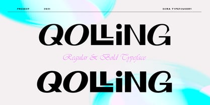 Introducing Qolling is a modern display font, designed for maximum visual and emotional impact. It has a classy and elegant look, Qolling gives your words a powerful sound and is fun to use in your graphic design and screen use projects such as branding, magazines, editorials. , wedding invitations, logo designs, posters, social media and more! Thank you
