10,000 search results
(0.166 seconds)
- Afrah by Creativetacos,
$18.00 Afrah Serif Font Family Pack is a beautiful serif font that comes with 5 different weights. It includes all basic glyphs with Non-English characters. It can be used for headlines, posters, branding, packaging, presentations, logo, quotes, titles, magazine headings, web layouts, advertising, invitations, packaging design, books, and nearly any creative design. Included Features: Font Weight: Regular, Thin, Light, Round and Bold Afrah Font Features: Uppercase Letters Lowercase Letters Numbers & Punctuation Non English Characters ( Latin Supplement + Latin Extended A) Supported Characters: ABCDEFGHIJKLMNOPQRSTUVWXYZ abcdefghijklmnopqrstuvwxyz 0123456789 !"#$%&'()*+,-./:;=?[]^_`{|}~¡¢´¿ˆˇˉ˘˙˚‘’“”‰⁄€ ÀȦÁÂÃÄÅÈÉÊËÌÍÎÏÑÒÓÔÕÖØÙÚÛÜĂàáâäåèé êëìíîïñòóôõöøùúûüÿĀāĂ㥹ĆćĈĊċČčĎďĒēĔĕĖė ĘęĚěĜĞğĠġĤĨĩĪīĬĭİıĴĹĽľŁłŃńŇňŌōŎŏŔŘřŚśŜŠš ŤťŨũŪūŬŭŮůŴẀẂẄẼỲŶŸŹźŻżŽž ǫɢɪɴʀʏʙʜʟᴀᴄᴅᴇᴊᴋᴍᴏᴘᴛᴜᴠᴡᴢꜰꜱ
 - Pork Chop by Font Kitchen,
$9.99 Order a platter of sizzling Pork Chop, a sans serif from Font Kitchen. Rounded squared contours and horizontal terminals give this serif typeface a futuristic feel, while still remaining readable at smaller sizes. 10 weights are available with obliques, weighing in at 20 styles, each fresh cut and farm-raised. This font family is served with sides of expansive ligatures, kerning pairs, stylistic alternates, proportional and tabular figures, and versatile fractions. Pork Chop is a great way to add a calculated, futuristic, yet still approachable feel to your next project.
 - D Hanna Soft by W Type Foundry,
$29.00 D Hanna Soft is a sans serif type family of 9 weights plus matching italics. It is inspired by the geometric style sans serif faces with a mix of rounded shapes and a little bit of black in some corners. The medium weights serve very well in body text, while the thinner and bolder styles make an excellent choice for headlines . D Hanna Soft is equipped with a complete set of opentype features including alternative glyphs, fractions, ligatures and many more. It is perfectly suited for highlighting lettering, magazines, web, interaction design, advertising, logotypes, etc.
 - Belinsky by Tabular Type Foundry,
$32.99 Belinsky is a monospace sans serif typeface inspired by early 20th century geometric sans serifs, architectural letterings, and retro video games to some extent. Its exaggerated proportions and sharp details appear less harsh thanks to the corner rounding. It is comprised of a standard and text families, and the latter is especially suited for small text and programming, with wider spacing and more centralised gravity of certain letters like E. It still gives your codes a lot of personality. The typeface name is a reference to the designer�s favourite animated film, American Pop.
 - Stenzilla by DarezD,
$13.00 Stenzilla is a stencil font based on a rounded sans serif, a careful design, with cuts on the same diagonal axis for the curved strokes and elegant slight curves on the oblique strokes. Useful for branding, highlighted paragraphs, signs, headlines, or reading text. The design incorporates characters from the Cyrillic alphabet, special characters, and characters with diacritical marks. It has the versatility of a sans serif that allows it to be used in a wide variety of designs and styles along with the cut-stroke grace of a stencil font.
 - Dionisio by CastleType,
$49.00 Dionisio, a CastleType original, takes its inspiration from one of the overlooked treasures of the CastleType library: Ransahoff. The latter is extremely condensed and very elegant. I particularly like its hairline slab serifs and cross-bars. I decided to use it as a starting point for a new design, but to make the proportions more classic and to make it more sensuous with gentler curves and bracketed cross-bar serifs. The result is very Bodoni-like, but less extreme and more contemporary looking. Meanwhile, Dionisio maintains a hint of Ransahoff with condensed letterforms and very fine serifs. Dionisio brings together the best of both, making it the perfect choice where a slender, sophisticated typeface is needed. Dionisio is available in two widths: normal and condensed, five fonts each. Includes an extensive character set and OpenType features.
 - Genesa by Typogama,
$19.00 The Genesa typeface is a condensed, rounded sans serif typeface with a contemporary styling ideal for editorial or branding design. With it’s 4 weights and accompanying italics, this family can be used for large titles or display settings but is equally legible in small sizes for longer passages of text. Genesa combines a strong, vertical constructed style with a softer rounded approach that adds a humanist flavour. This typeface covers multiple languages through an extensive character set and a wide range of Opentype features that allow various character or numeral choices. A set of over 60 pictograms and arrows are equally features and through their carrying weights, can also be combined seamlessly with any style of the family.
 - Triump by Latinotype,
$26.00 The typeface family Triump is a simple sans serif with 6 weights from Thin, ideal for use as an epigraph, to Black for head titles of special impact. Excellent for applying in graphic design as logos, trademarks, posters, editorial and web design. Inspired by the classic types of the late twentieth century with rounded corners that give the typography a smooth appearance with rounded ends, with a horizontal stroke that exceeds the vertical in the letters A, E, F, H, J and K which gives a distinct personality. Triump comes with a Black weight in normal and italic Line both upper and lowercase letters, especially to give a vintage look to the designs.
 - Holgada by Graviton,
$24.00 Holgada font family has been designed for Graviton Font Foundry by Pablo Balcells in 2020. It is a geometric sans serif typeface with refined rounded endings that provide a soft and friendly appearance. Its generic shapes make it suitable for any kind of project, text length and size. Thanks to its clear legibility, it can be used in long body texts in very small sizes, in big size headlines and everything in between. The rounded endings not only provide a particular softness when used in body text, but also a distinctive touch when used in display situations such as logos and headlines. Holgada consists of 12 styles, each containing small caps and glyph coverage for several languages.
 - Gilhaus by Parker Creative,
$18.00 Inspired by the classic German Antiqua style, Gilhaus is a totally original modern serif rooted in iconic history and built for modern projects including branding, web and digital apps, large format printing, and more. While subtle serifs and soft edges bring in an element of warmth and approachability, Gilhaus is balanced out by the bold angular strokes and high contrast letterforms typically found in classic Antiqua typography.
 - Sambo Briliant by Gian Studio,
$10.00 Brilliant Sambo Featuring Slab Serif totality and elegance. One of my most recent first releases, naturally drawn with pinpoint accuracy. Sambo Brilliant has the perfect amount of simplicity and subtlety for your next project. It perfectly represents the retro and vintage aesthetic. I recommend this font for your next logo, invitation, and home decor project that needs a succinct alternative combination touch! Sambo Brilliant appears with strong characters available: Get inspired by the image above and feel free to share with me what you get by using this font.
 - Enyo by Antipixel,
$20.00 Enyo Slab is a decorative, display, serif handwritten font. This font will provide an informal look to your work! It can be used for small ammount of text, and specially for display usage because of its glyph quality. Enyo offers OpenType features, including ligatures, alternates, smallcaps, scientific superior/inferior figures, oldstyle figures, fractions, slashed zero, and kerning. This handwritten font has a large glyph coverage, supporting at least 133 languages including English, Spanish, French, German, Italian, Portuguese, Swedish, Polish, Czech, Vietnamese, Russian, among many others. Enyo has also available the Cyrillic and Greek alphabets.
 - Wanderer by FontMesa,
$25.00This font was inspired by the title logo of the TV show The Wild Wild West (season two). The font was named after the train in the TV show. Wanderer is a combination of my Classic Tuscan Rodeo Clown font and a Robust Slab Serif font. Wanderer is available as a stand alone font or with the optional fill fonts. Caution: Use of this font may cause the Wild Wild West theme song to play over and over in your head. Solution: Try temporarily using another FontMesa font such as Rough Riders. - Maiden Orange Pro by Stiggy & Sands,
$29.00 Our Maiden Orange Pro is a light and festive slab serif font inspired by custom hand lettered 1950's advertisements. Clean and legible, while also being offbeat and friendly, this font lends itself to a wide variety of uses. The SmallCaps and extensive figure sets offer a slightly more serious tone as well as a wider range of design use. Opentype features include: - SmallCaps. - Full set of Inferiors and Superiors for limitless fractions. - Tabular, Proportional, and Oldstyle figure sets (along with SmallCaps versions of the figures). - Stylistic Alternates for Caps to SmallCaps conversion.
 - QuickType by Wiescher Design,
$39.50 QuickType is a typeface I designed for demonstration purposes. I used it to illustrate my first book about type design. It has crooked slab serifs and looks very much like a typewriter font. But in order to make things clear I had to overdo some curves and so QuickType turned out a very distinct typewriter typeface. Since those days I worked on the shapes from time to time, so it got better and I extended it to include several neccessary cuts. Now it is a full fledged very usable font. Yours very quick Gert Wiescher.
 - Selebor by takoliko,
$10.00 Selebor is a slab serif font. Selebor inspired by the 80s and 90s vibe font. The font is perfect for you that want to create a project that have a retro feeling but not to old. it perfect for designing stickers, t-shirt, a food logo and design that used a smiley themed or vintage cartoon on it. Selebor can be used as a fun or a formal kind of project. It support multilingual language. It can easily be matched to your projects, and good for communicating your brands.
 - Hondo Grunge by Fontasmic,
$16.99 The Hondo Grunge fonts are a collection of ultrabold eroded slab serif typefaces with a dynamic look and extended functionality. Accented with decorative and functional inktraps and complete with Slant and Backslant styles, this heavyweight has a high performance hardcore edge to it. Ideal for titling, poster work, logos, and small bits of copy. For the Opentype savvy, the Opentype version contains a complete alternate set of base characters, which by enabling contextual alternates option will force the typeface to continually alternate between the original & alternate character sets for a more spontaneous look.
 - Ye Carbon by Yinon Ezra,
$30.00 Slab-serif typeface, with pulsating and flexible forms, which gives the font its humanistic character. Ye Carbon crystallized into its forms in search for graphic language that would represent a sense of matter, of letters written by hand. The delicate finishes at the edges of the letters, and the flexibility of the of shapes, gives a feeling of matter, and bring the font to life. Ye Carbon will be a wonderful tool for variety of uses, thanks to its neat nature, and its forms in motion vibe, a rare and winning combination.
 - Ridge Cliff by Letterhend,
$17.00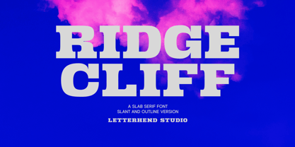 Ridge Cliff is a slab serif typeface with strong look and feel.This type of font perfectly made to be applied especially in logo, headline, signage and the other various formal forms such as invitations, labels, logos, magazines, books, greeting / wedding cards, packaging, fashion, make up, stationery, novels, labels or any type of advertising purpose. Features : uppercase & lowercase numbers and punctuation multilingual PUA encoded We highly recommend using a program that supports OpenType features and Glyphs panels like many of Adobe apps and Corel Draw, so you can see and access all Glyph variations.
 - Verge by Type Fleet,
$9.00 Verge exploratory information transmitter Verge type family operates at the very edge of art and technology in the typographic constellation. Its fairing is designed with a new technique that adds better stability to the curvature. It is prepared for all environments and communicates with minimized latency. The letters of this contemporary slab serif are compact, clear and rather simple. It is suitable for branding, longer texts, information graphics and signalization. The typeface’s x-height is a little above 70% of its capitals. The italics are designed at a 7° angle.
 - Postulat by ParaType,
$30.00 Postulat is a contemporary slab serif typeface. The family contains 16 fonts: 8 romans with matching italics, from Hairline to Bold. The character set include contains more than 600 glyphs which support most Latin and Cyrillic languages. The font uses a combination of smooth and extremely simple straight shapes. The author abandoned the use of teardrop-shaped classical elements, replacing them with straight ones, which makes Postulat more dynamic and modern. These unique features give the font a unique personality. Postulat is the perfect choice for headlines, logos, branding, packaging, publications and websites.
 - Catesoge PS by pentagonistudio,
$19.00 Catesoge Is A Bold Slab Serif Typeface Inspired By Retro and Vintage Style. SOFTWARE REQUIREMENTS : Fonts and alternate : No special software required they may be used in any basic program /website apps that allows standard fonts That's it folks! You can go ahead and get cracking :) Follow My Shop For Upcoming Updates Including Additional Glyphs And Language Support. And Please Message Me If You Want Your Language Included or If There Are Any Features or Glyph Requests, Feel Free to Send me A Message. Have a Good Day !
 - Adverb Mono by Rumors Foundry,
$9.00 Adverb Mono is an atypical monospaced, squared proportional, slab-serif and low contrast typeface inspired by the American Type Founders' "OCR-A" and the latest work of Adrian Frutiger "OCR-B" designed during the second half of the 20th century. The typeface (in his 1.00 version) counts five different weight, from Thin to Bold, and a pixelated redesign of the regular weight inspired by the retrogaming consoles' graphics. It counts more than 240 different glyphs continuously updated. Designed by Gabriele Bellanca for IED Florence Typography Masterclass 2020/21. All rights reserved.
 - HS Sporaces by Helipad Space,
$10.00 Introducing, HS Sporaces! An Experimental Slab Serif Display Font with four styles. It looks strong and stylish that can be used for all your project needs. This font can be used at any time and on any project. So, HS Sporaces font can't wait to give its touch to all your design projects such as sport theme, magazine, movie, poster design, printing, personal branding, promotional materials, logotype, product packaging, etc. In use, it can be mixed and matched in every word in a design project. Thank You HS
 - ITC Tremor by ITC,
$29.99ITC Tremor is the work of British designer Alan Dempsey. You might think that it looks like the letters are in a seismically lively geological zone, but Dempsey had other kinds of motion in mind. Most of the faces I design come from trace 'work-outs' for advertising products. In the case of Tremor, it was to reflect a lively teenager," says Dempsey. The result is ITC Tremor, a cartoony slab serif typeface with irregular angles, straight-edged curves, and lines surrounding each character, making them look like they are jittery. - FF Zine Sans Display by FontFont,
$65.99 German type designer Ole Schäfer created this sans FontFont in 2001. The family has 10 weights, ranging from Regular to Black (including italics) and is ideally suited for editorial and publishing and sports. FF Zine Sans Display provides advanced typographical support with features such as ligatures, alternate characters, case-sensitive forms, super- and subscript characters, and stylistic alternates. It comes with proportional lining and tabular lining figures. This FontFont is a member of the FF Zine super family, which also includes FF Zine Serif Display and FF Zine Slab Display.
 - Kafenia by A.E.T.O.S,
$24.99 Kafenia is a geometric display typeface, consisting of capitals and small capitals only. Inspired by the combination of vintage and decorative aesthetics with squarish and compact look, Kafenia claims to be a classy and old stylish slab serif. With more than 1540 glyphs Kafenia is a great tool for your designing needs. Flexible, easily wrapped and reformed with plenty of open type features, Kafenia aims to provide versatility and lots of options for unique results in logos, posters, headlines and every design inspiration you dare bring to life.
 - Retrofit by Vanderfont,
$29.00 The evocative and original Retrofit is based on typefaces of the 1940s and 50s, which extolled the virtues of American products in glossy magazines for the new suburban consumer. Oversized terminal bulbs and occasional slab serifs lend a rhythm and a bouncing baseline provides just the "zing" to spice up that bland typographic treatise. Retrofit's easy familiarity can be seen on children's books, games, food packaging, and other places where a kid friendly note is needed. Retrofit has been adapted by Quickutz for their punched letter cutting tool, and re-named "Maggie".
 - NS Deckpress by Novi Souldado,
$30.00 Inspired from the letterpress achieve and printed media from the 19th century. We talk about headlines, labels, playing cards, postcards, book covers, signs, and many more. That's where the DECKPRESS has risen. An old vibes all-caps fonts, armored with the robust yet decorative ornamental slab-serif style. Double up the majestic, it comes with the layered style to give an amplification back to the vintage era. It is an inevitable partner for your classical heritage touch of visuals such as signage, logotype, sign painting, label, header, ornamental typographic design, you name it, old sports.
 - Gliny by Typesketchbook,
$45.00 Gliny was created by mixing different styles of handwriting fonts that derived from various tools such as pen, markers, drafting pens, painting brushes, writing brush and etc. In order to develop a new and diverse font styles. We also keep incomplete details and uneven textures that resulted from a writing process. We provide various font styles to help you mix and match them to suit your creative work harmoniously. Gliny comes with different font families such as brush, slab serif, heavy, handmade script for making your amazing work !!
 - Odisean SC - Personal use only

- Diocletian by Type Fleet,
$12.00 Diocletian fortiter in re, suaviter in modo Diocletian typeface captures the essence and glory of the Diocletian’s palace, one of the most imposing heritages of the late Roman empire. It is designed to bring the confidence and fortune to contemporary communication in a heroic and gentle manner. Diocletian typeface is based on the Uncial script, made up of wide, rounded letters. It is desirable for cafes, restaurants, shops, hotels and apartments. The typeface’s x-height is around 76% of its capitals. The font is enriched with ligatures and special characters.
 - BAQ Metal by Thinkdust,
$10.00 Another font for the BAQ family, BAQ metal brings back the classically solid, sturdy form of its predecessors with a rough and ready finish. The roundness of this font doesn’t take away from its impact, but does keep it from being too harsh, while the texture creates extra legibility at smaller sizes. Really though, BAQ metal works better when it’s bigger, standing out with its coarse appearance and rotund fullness. Use it to create outstanding headlines and catch people’s attention without being aggressive, even in a variety of different languages.
 - Trečiokas by Rokas Cicenas,
$9.00 I present you Trečiokas typeface. This two font family is based on written letters that were sketched by using paint markers and afterwards pollished digitally. Glyphs mostly are connected, leaving some separate, as a contrast to round and soft letter shapes. It includes extended latin character set. In 2013 I made the Aerofont project, which included custom music instruments that were made based on Trečiokas Normal letter shapes. The main idea was to connect music and typography, by making sound emitting letters. You can watch the project video here.
 - Scritta Nuova by Anatoletype,
$16.00 Scritta Nuova was born to transpose my personal handwriting and evolved today into a smart typeface that maintains the original feel with improved legibility and visual balance. The steady rhythm and roundness of Scritta Nuova give the impression of a smooth, girlish and gentle writing. It also evokes retro calligraphic styles taught in Italian schools around the 1950s, which might have influenced in one way or another my original handwriting. Note that the capital letters can be nicely set next to each other without overlapping, unlike script typefaces with swashy capitals created as initials.
 - Architype Schwitters by The Foundry,
$99.00 Architype Konstrukt is a collection of avant-garde typefaces deriving mainly from the work of artists/designers of the inter-war years, whose ideals have helped to shape the design philosophies of the modernist movement in Europe. Due to their experimental nature character sets may be limited. Architype Schwitters was developed from the phonetic experiments made by Kurt Schwitters with his 1927 universal alphabet, where he attempted to link sound and shape. He ‘played with’ using heavier, wider, rounded forms to convey the vowels, creating a unique visual speech texture.
 - Constant by Underscore,
$32.00 Constant is a meticulously constructed slab serif display typeface of a sturdy lineage. The strong horizontal and vertical rhythm and calculated angles dominate its appearance, yet sweeping broad shapes infuse the design with an overall warm undertone. Constant is best suited for setting short headlines, word marks, posters and other visual communication ephemera. Particular when set in all uppercase the typeface’s squarish and resolute nature commands attention and projects authority. Despite the prominent slab serifs and their angular corner details, these fonts work well also for shorter text passages, especially in the lighter to medium weights. When typesetting Constant in paragraphs spanning several lines the face requires a fair amount of leading to not appear vertically compressed. As customary for Underscore’s catalog the fonts have very extensive support for languages in the Latin script, reaching from Afrikaans to Vietnamese and Zulu. The fonts are carefully spaced, kerned and hinted, and include a variety of typographic glyphs and OpenType features like various ligatures, number features and case alternatives. Constant has been developed and released in 2018 as the proud forth release from the Underscore label. This design by Johannes Neumeier is available from the Underscore webshop as well as selected retailers.
 - DM Unarmed by DM Founts,
$12.50 Unarmed began life as a series of rectangles in Fireworks. The task was designing my own business card for the first time in years, and the perfect lettering couldn't be found in either free or commercial fonts. While there were some good choices, none of them really communicated who I was. Initially only the lowercase letters in my name were created, with each being designed around a 7 x 4 grid of squares. I liked the result so much that I wanted to use the same typeface in different projects - and to save time in future, I decided to create this font. In creating DM Unarmed, the intention was to avoid diagonal lines, and to keep all the lines horizontal, vertical and grid-like. This made creating some of the characters - particularly the rounded ones and the letters X and Z - challenging. Coming from both worlds, I wanted to achieve a blend of technicality and creativeness, without trying to pretend one was the other. For best results this font should be used for large and prominent text, although it works at smaller sizes up to 12pt. I've spent a lot of time trying to hint a few characters that wouldn't play ball, such as 2, 7 and 8. In case you're wondering: DM Unarmed got its name from my philosophy of facing challenges without reliance on tools and weapons.
 - TT Rationalist by TypeType,
$39.00 Please note! If you need OTF versions of the fonts, just email us at commercial@typetype.org TT Rationalist useful links: Specimen | Graphic presentation | Customization options We thought, "What if we provide the user with a collection of matching fonts, each of which would still be unique?"—and so we started developing TT Rationalist. For those familiar with the bestsellers TT Norms® Pro and TT Commons Pro, the new font will be intuitive to use. It has similar proportions, characteristics and functionality, but yet it is an independent and original font family. Unlike the geometric sans serifs TT Norms® Pro and TT Commons Pro, TT Rationalist is a slab serif typeface. It is functional and original. Slabs are characterized by massive rectangular serifs, but in TT Rationalist they are trapezoidal and refined, which makes them look modern. Speaking of modernity, when creating the typeface, we wanted to avoid the excessive historicism that can be seen in many slab serif fonts. We have been particularly careful working on the Black style, which in the first sketches had something in common with the Wild West posters. When we balanced out the excessive contrast caused by visual compensation, the font stopped evoking retro associations. Now TT Rationalist Black is perfect for headlines, especially on posters and posters, and works great with Light styles in TT Norms® Pro and TT Commons Pro. The new typeface works well for both headings and text arrays. It looks especially aesthetically pleasing in printed production (books, magazines, brochures). The TT Rationalist typeface consists of 22 two styles: 10 upright, 10 real Italics and two variable fonts, each with over 950 glyphs. It supports over 200 languages and contains 27 OpenType features. In addition to the standard ones, there are Small Capitals for Latin and Cyrillic languages, alternative versions of the ampersand and the letter g. The italics have two stylistic sets allowing to switch the design of style-forming characters (k, v, w, y, z) between italic and classical forms. TT Rationalist font field guide including best practices, font pairings and alternatives. FOLLOW US: Instagram | Facebook | Website
 - Karela by Blancoletters,
$39.00 English description Karela is a humanist slab serif family. Karela is also the Basque word for gunwale, this is, the widened edge at the top of the side of a boat, where the edge is reinforced with wood or other material and to which the thwarts are attached. Gunwales resemble the way slab serifs reinforce vertical stems giving a more robust appearance to the letters. The sturdy, solid and often mechanical structure that is customary in slab serif or mechanistic typefaces is softened in Karela applying subtle tweaks as: humanist proportions, slightly curved endings in ascenders, and curved edges in serifs. The influence of calligraphy is noticeable all over the character set, especially in counters and letters with instrokes like “m”, “n” and “r”, and it becomes explicit in the italics. On the other hand, its low contrast, generous x-height and the constant width of characters across weights makes it very convenient for editorial uses when low resolution is a concern. Karela pursues to give a human touch to a strong and highly functional structure. It seeks for the ideal combination of strength, precision and warmth of the wooden parts painstackingly handcrafted by ancient boat builders. Besides its 12 standard styles, Karela offers also four additional fonts called "grades". Grades are subtle changes in stroke weight in order to compensate for differences in printing media or display conditions of text layouts. To minimize these subtle changes without a reflow of the text they have to be designed with the same character width of the base style. Karela offers 4 grades for its Regular weight: Grade Minus 5, Grade Minus 5 Italic, Grade Plus 5 and Grade Plus 5 Italic. This makes possible to counteract the effect of changes in paper, temperature, paper, background color… In addition, Karela takes this no‑reflowing idea from grades and extends it to the whole range of styles, allowing to play with any of its weights without undesirable text reflows. Enjoy the layout stability while you experiment and play with variations! Karela presents also a wide range of Opentype features for a professional text layout.
