10,000 search results
(0.019 seconds)
- News Copy JNL by Jeff Levine,
$29.00 Found within the pages of the 1934 edition of the American Type Foundry’s “Book of American Type” is a sans serif design with rounded terminals that emulates a typewriter face. “Jumbo Typewriter” is reminiscent of the type of lettering formerly found on teletype news copy. “Teletype” was a division of Western Electric (part of AT&T), and the machines utilized telephone lines to electronically type and send (as well as receive) messages worldwide. Many folks will remember the sound of teletype machines in the background when radio stations had their news breaks. Now available digitally as News Copy JNL, it is available in both regular and oblique versions.
 - Aptifer Sans by Linotype,
$29.00 Aptifer Sans and Aptifer Slab are two 21st century typeface families created by Mårten Thavenius. Each family has seven weights, in roman and italic respectively, making 28 font styles in total. A heritage from two design traditions can be seen in Aptifer. One is the robust American gothic typefaces, like M. F. Benton’s, from around 1900. This is combined with the openness and legibility that comes from the humanist tradition. The sans serif part of the family, Aptifer Sans, is designed without excessive details disturbing the reading. Its sibling, Aptifer Slab, with its wedge slab serifs is more eye-catching but still suited for text settings. The italics fit well into the text flow of the roman. They are a bit narrower than the roman and have cursive characteristics. Both Aptifer Sans and Aptifer Slab are highly legible typefaces and can be used both in print and on screen.
 - Sainted Medium by Wooden Type Fonts,
$15.00 Slab serif display, medium weight
 - Gallatin Bold by Wooden Type Fonts,
$45.00 Slab serif in 3 weights
 - Acklebury by Studio Buchanan,
$32.00 Acklebury is a chunky, reverse contrast, slab-serif typeface available in two styles. It has heaps of personality, plenty of open type features, and a whole host of special characters and dingbats. Although it's drawn from historical sources, Acklebury is not a straight revival, rather more of an homage to the many, varied, extended lining figures of the late 1800's. Acklebury celebrates the once labelled 'hideous' combination of wide rounded forms and hard slab serifs. Only using modern type technology to fix the spacing and kerning issues that would of been impossible with metal or wooden type. Acklebury is not a French Clarendon, neither is it really an Italienne... but it is phat, wide and hella funky.
 - Railham by OhType!,
$25.00 RAILHAM is a slab typeface with more than 330 glyphs including uppercase, lowercase, numbers, small caps, accents, punctuation, currencies, etc. Inspired by the tracks of a railroad, with stems that narrow at the top, Railham typeface, like a train looks to the future without forgetting the fundamentals of a long road, detaining in the detail of every element to form a strong, fast and versatile family. Retaking and uniting essential concepts of typography, rounded serifs with especially wide base, forms and counterblocks that complement together, RailHam typeface neatly adapts to any topic, besides being practical and readily legible in small and large formats, joining a select list of modern slab serif fonts.
 - Enzia by insigne,
$21.99 Enzia is a friendly and flowing sans serif. Enzia exists somewhere between a slab serif and a semi-sans, and features flared vertical stems and rounded terminals. Its bulbous terminals and open counters inject a flavor of ease and excitement. Enzia provides plenty of impact and is best used with short to medium length texts. Six different weights provide plenty of versatility and contrast for poster designs, logotypes and headlines, while still retaining excellent legibility for extended copy.
 - Roklet by Maulana Creative,
$12.00 Roklet is a semi slab serif font. With round bold stroke, fun character with a bit of ligatures and alternates. To give you an extra creative work. Roklet font support multilingual more than 100+ language. This font is good for logo design, Social media, Movie Titles, Books Titles, a short text even a long text letter and good for your secondary text font with sans or serif. Make a stunning work with Roklet font. Cheers, Maulana Creative
 - Okojo Pro by Wordshape,
$20.00 The Okojo Pro Complete family is a reworking of Wordshape’s immensely popular Okojo family of typefaces. It includes Okojo Pro, a semi-geometric sans serif, Okojo Slab Pro, a semi-geometric slab serif, Okojo Pro Display, a round-cornered sans serif variation, and Okojo Slab Pro Display, a round-cornered slab serif. The entire Okojo Pro family looks great at small or large sizes. The Okojo Pro family is designed for readability in long texts while simultaneously functioning as effective display type. Features of Okojo Pro Display: - all lowercase characters have an enlarged x-height, creating less optical dazzle than typefaces like Futura, Neutra or Avant Garde - more humanist numerals and punctuation for enhanced readability - complete Western, Central and Eastern European characters sets - radically improved spacing guaranteeing beautiful results in print and on screen for the Czech, English, Hungarian, Croatian, Esperanto, Maltese, Romanian, Turkish, Albanian, French, Portuguese, Spanish, Basque, Bulgarian, Finnish, Swedish, Norwegian languages The Okojo Pro Display family is influenced by the type designs of Paul Renner and Herb Lubalin, but smoothed over with more than a bit of Americana. Both work well on-screen as webfonts and in print as book type. Each is hinted with accuracy and kerned with precision.The lighter weights are slightly slimmer than the regular and bold weights to give the typeface more of a vertical feel, inviting readers' to rapidly read typeset text with a maximum of contrast and a minimum of optical distortion. Okojo: it’s a little bit country and a little bit rock’n’roll.
 - Menalde by Edignwn Type,
$12.00 The font is called "Menalde", it is slab serif display with vintage themes. The font comes with 4 style typefaces (regular, rounded, rough and textured). Uppercase and lowercase have different unique stamp textures, so you can combine the same 2 letters and not be boring . The Menalde matches applies in some designs such as the logotype, poster, label, badge, packaging, branding, and more custom design. Menalde includes : 4 style typefaces (regular, rounded, rough and textured) All-caps, numeral, symbol and punctuation Multilingual PUA Encoded Thank you for your support and choosing us.
 - People Talk JNL by Jeff Levine,
$29.00 A title card with cast credits for the 1935 movie “The Whole Town’s Talking” (starring Edward G. Robinson and Jean Arthur) formed the basis for People Talk JNL. The hand lettered names were done in a slightly condensed slab serif – mostly rectangular in shape with rounded corners. A few characters take on their own unique appearance. People Talk JNL is available in both regular and oblique versions.
 - Kaluny Pro by Muykyta,
$12.00 Kaluny Pro is a humanistic style font. It has two versions: one slab serif and one non-slab serif. Modern and with some classic features, it is easy to read and forms a homogeneous set.
 - ChunkFive Roman - 100% free

- Pasture by Ryan Keightley,
$19.00 Pasture is a display serif in a range of weights. Rounded interior and exterior corners, curvaceous details, and rotund terminals give it a warm, handmade quality. Classic style that is, at the same time, right at home in modern spaces.
 - Courier New OS by Monotype,
$50.99 Designed as a typewriter face for IBM, Courier New was re drawn by Adrian Frutiger for IBM Selectric series. A typical fixed pitch design, monotone in weight and slab serif in concept.
 - DIVERGENT - Personal use only

- Idolwild - Unknown license

- Bigplace Caps ExtBd ExtCond - Personal use only

- Calluna by exljbris,
$- Calluna was born more or less by accident. When I needed a little break from designing Museo I was just fiddling around a bit to see if maybe a full slab serif would be something to have a look at. The first thing I did, of course, was to put slab serifs on the stems of Museo. When I did, something nice happened. Slab-serifs with a direction! I ended up using the idea for something I always wanted to do: making a rather serious text face. The goal was to make a text font, but one with enough interesting details. In the end it all came down to finding the balance in a typeface between the robustness needed to function as a text face and enough refinement to look good as a display font. Check out Calluna Sans™ which is a great pair for Calluna™.
 - Apéro by Resistenza,
$39.00 A cheerful handwritten font family composed by 8 fonts. 5 slab weights, 2 slab effects and a sans serif. Handmade, friendly and classy, this family is inspired in one of our favorite traditions in Torino, “ L'Aperitivo ”. The social event every afternoon! Before dinner friends meet in the local bar and spend the time together eating, drinking, talking, laughing and eating and drinking again. Handwritten to get a friendly and human feeling. Letterforms specially designed to take the charming mood of this event. The sans serif has been inspired in some letterings found in old local liquor labels. Check out also ‘Modern Love Slanted’ Turquoise Nautica
 - Indus by Linotype,
$29.99Linotype Indus is part of the Take Type Library, which features winners of Linotype’s International Digital Type Design Contest from 1994 to 1997. Designed by P.H. Hashin from India, Indus finds its historical roots in inscriptions found on ancient Indian graves. Thus Indus has a unique look and is versatile in point sizes from middle to headline. The font combines well with sans serif and slab serif typefaces. - Ristretto Pro by Mint Type,
$- Ristretto Pro is an extremely narrow display sans-serif font family available in 8 weights. It features rich language support, 6 sets of figures and small caps. Ristretto Pro also comes with its slab-serif counterpart - Ristretto Slab Pro.
 - Aiger by HansCo,
$15.00 Aiger is a slab type font with rounded characters on each side. Use this display slab font to add that special retro vintage touch to any design idea you can think of! Very suitable for logotype, Stickers, Packaging design, Cricut Project, headlines, brand identity, t shirt or apparel industry, posters, magazines, books, YouTube, Instagram, websites, or any of your creative design projects. Enjoy!
 - Mr Porter by Pelavin Fonts,
$20.00 A robust, mono-weight typeface with gently rounded slab serifs, Mr. Porter harkens back to celebrated roots in late 17th Century England. Not for the meek or faint-of-heart, it lends a nutty, chocolaty, toffee flavor to both a stout and pale variety, with lots of malty goodness. Rich and full-flavored with notes of coffee, licorice and molasses, it promises delightful pairings for an infinite variety of typographic solutions.
 - MC Byrdens by Maulana Creative,
$23.00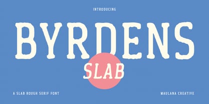 Byrdens is a retro slab serif font. With regular rounded stroke, fun character. To give you an extra creative work. Byrdens font support multilingual more than 100+ language. This font is good for logo design, Social media, Movie Titles, Books Titles, a short text even a long text letter and good for your secondary text font with script typeface. Make a stunning work with Byrdens font. Cheers, Maulana Creative
 - Basic Stencil JNL by Jeff Levine,
$29.00 Basic Stencil JNL was inspired by a lettering stencil sold by Dymo around 1968 that featured a sans serif design with rounded corners and an overall square look to the characters. This bold stencil design is available in both regular and oblique versions.
 - Astroph by Figuree Studio,
$18.00 Astroph - Retro Slab Serif Font Astroph Slab Serif font is perfect for your upcoming projects. Such as logo branding, editorial design, fashion, adventure apparel, stationery design, sport design, blog design, modern advertising design, card invitation, badge, art quote, home decor, book/cover title, special events, and more. Astroph is coming with 3 Styles: Astroph Regular Astroph Rough Astroph Aged That's it! Have fun with Astroph Slab Serif Font. Thank you! Figuree Std
 - GirderSuper by Wooden Type Fonts,
$15.00 A heavy slab serif font very useful for display.
 - BF Fiona Script by BrassFonts,
$36.00See also BF Fiona Serif and BF Fiona Slab. - Vaccine by ParaType,
$30.00 Vaccine is a slab serif font family with a mixture of the usual and one-sided serifs. We call it ‘semi semi slab serif’. Serifs and terminals have soft rounded shapes, but stem junctions on the contrary use hard constructions. Such combination of basic design features makes the font distinct and strong in a setting and delicate and soft in appearance. This design peculiarity, together with low contrast and strong serifs, produces the qualities needed for using the font in small sizes, in low quality print, and in bad reading conditions. Vaccine got modern stylish design and has a prominent place in the set of popular faces. The family consists of 10 members - five weights with the corresponding italics. It can be used in a wide range of applications - magazines, advertising, corporate identity, urban navigation, packaging, children books, etc. Design by Manvel Shmavonyan with the help of Gayane Bagdasaryan as a consultant. Released by ParaType in 2013.
 - Liong by Dikas Studio,
$15.00 Liong is a bold & retro slab serif typeface inspired by western typography signane, they have a contrast weight bar and slab with fun and fancy character. Liong comes with 4 style regular, italic, slab & slabitalic, perfect for logos, badges, typography and any retro design needs.
 - Preferred Shares JNL by Jeff Levine,
$29.00 A bold, condensed slab serif face A July 9, 1935 trade paper ad for Paramount Pictures’ 1st quarter film releases sported hand lettering with chamfered slab serifs. This condensed type design is now available as Preferred Shares JNL in both regular and oblique versions.
 - Shirin by Ahmet Altun,
$- With this nice, rounded-corner handwriting font that is like comic, slab style; sweet and radiant logos, texts and every kind of graphics, editions and printings like magazines, brochures can be created. Text printouts look pretty smart.
 - AZN Knuckles Varsity by AthayaDZN,
$10.00 Introducing "AZN Knuckles Varsity" font by AthayaDZN. Revolutionizing a varsity slab serif, combining sharp and rounded edges, angled serif, and a variety of weights, fitting it into the modern scene. Equipped with 3 styles ( Defined, Regular, Stencil ) Use the Defined version if you are aiming for that slab serif look, just like the name suggested, it defines the modernized slab serif on each letter, giving it that retro look yet still in the modern scene. Especially on the light weight of this version, the slab serif is really prominent. Use the Regular Version if you are aiming for any type of design that you see this font fits especially the modern scene, just like how it's advertised. Use the Stencil version if you are aiming to make a statement, my favorite one is the Bold and Italic version of the Stencil if I was to make a statement, just like the preview where it says "Anarchy", the separated shapes of the letter combined with it's bold and slanted shape is perfect to make a strong statement. Language Support : Afrikaans, Albanian, Danish, Dutch, English, Estonian, Filipino, Finnish, French, Galician, Indonesian, Irish, Italian, Luxembourgish, Norwegian, Portuguese, Romansh, Scottish Gaelic, Spanish, Swedish, Swiss German, Uzbek (Latin). And that's it for this font, thank you for purchasing the product, I wish you success on your projects. Please enjoy the font and let me know if you needed any help or if you have any questions -Athaya twitter.com/Athaya_DZN behance.net/athayadzn
 - Marvis by Larin Type Co,
$15.00 Marvis is a vintage collection of fonts that includes serif, true italic, script, sans serif and slab serif each of them has two style - Clean and Rough style. Also for the script includes Alternates and Swashes. This collection was inspired by vintage signage, logos and this fonts are perfectly suitable for any vintage project and will make it at a high level. This fonts is easy to use has OpenType features. Font collection includes: Full Capital alphabet A-Z for Sans and Slab Full alphabet Uppercase and Lowercase A-z for Serif, Italic, Script Numbers, fractions for Serif, Italic, Script, Sans and Slab Punctuation and symbols for Serif, Italic, Script, Sans and Slab Alternates for Uppercase for Serif and Script Alternates for Lowercase for Script Swashes for Script Ligatures for Serif and Italic "Tb, Th, Tk, Tl, ct, fb, ff, ffi, fi, fh, fk, fl, st"
 - Fontin - Unknown license

- Kimberley - Unknown license

- Yukarimobile - Unknown license

- Selectric Pyramid by Indian Summer Studio,
$45.00 Selectric Pyramid is a typewriter font. Egyptian slab serif · Geometric slab serif Pyramid is version of Memphis (1929) by Dr. Rudolf Wolf. The part of the large project on revival and further development (by drawing many additional glyphs, sometimes over 1000) of the 20th century’s typewriters’ fonts.
 - MM Indento by MM Fonts,
$19.00 Indento is a multi-purpose modern geometric slab serif for headlines, posters, branding but fairly legible to be used as longer text. The straight and rounded corners combined with deep cuts and asymmetric serifs gives it a distinctive look while still keeping its rigorousness and legibility. The family consist of three weights, each with a companying italic. The extensive character set—513 glyphs in each font—includes support for Central and Eastern European languages and OpenType features like small caps, ligatures, fractions, slashed zero, stylistic alternates and more.


