10,000 search results
(0.081 seconds)
- Caught by Sensatype Studio,
$15.00 Caught is Unique Vintage Serif font with a fancy, unique, and vintage serif, font that you can combine to get any variations and unique shapes easily just in seconds with choose alternates of them. It is a serif display font with moderate contrast that perfect for branding projects, logo, wedding designs, social media posts, advertisements, product packaging, product designs, label, photography, watermark, invitation, stationery, and any projects, it makes with a high level of legibility. What's Included: Character set A-Z Numerals & Punctuation Accented Characters (West Europe) Works on PC & Mac Recommended using Adobe Illustrator or Adobe Photoshop. Wish you enjoy our font. :)
 - Alethia Pro by Mint Type,
$- Alethia Pro is a grotesque sans-serif typeface with high contrast in all weights. It has been designed to serve as a display typeface in various editorial projects, such as magazines or corporate brochures, as a sans-serif pair to serif types of modern style. Alethia Pro comes in 8 weights + matching italics, each supporting numerous Latin-based languages as well as major Cyrillic languages. It is packed with OpenType features like ligatures, small caps, 6 sets of digits, 3 stylistic sets, superiors and inferiors, fractions, ordinals, respective punctuation varieties including all-cap punctuation, as well as language-specific alternates.
 - Filosofi 3 finger Italic by Rhd Studio,
$12.00 Filosofi 3 Finger Sans Serif Font that we created special for Display, Logo and Branding A new Serif font that is nice to leverage designer or product owner that need solutions to make their design look more gorgeous and vintage. And specially for this font, We prepared any characters to help you create gorgeous for your creative needs specially for headline, and typography needs. Filosofi 3 Finger Sans Serif font ready with: Stylish Shape to get creative Preview as a inspirations that you can do with this font Ready with All Uppercase characters Wish you enjoy our font. :)
 - Revla Sans by Eclectotype,
$40.00 NEWSFLASH! Revla Sans is now available specially tailored for smaller settings. Take a look at Revla Sans Text ! Meet Revla Serif 's dorky younger brother, or should that be brothers? Revla Sans is a grotesque companion to Revla Serif, in four weights. The weights can be used pretty easily as grades, so that text set at different sizes has similar thickness. The contextual alternates engine from its serifed sibling is used to pseudo randomise the text and avoid the monotony of repeating glyphs. Other features include case sensitive forms, standard and discretionary ligatures, stylistic sets and automagic fractions.
 - Naerya by IbraCreative,
$17.00 Naerya, a modern stylish serif font, effortlessly blends sophistication with contemporary design elements. With its sleek and clean lines, Naerya exudes a sense of timeless elegance, making it an ideal choice for projects that demand a touch of class. The font’s well-crafted serifs add a distinctive flair, striking a perfect balance between tradition and modernity. Naerya’s letterforms showcase a harmonious interplay of curves and straight lines, resulting in a balanced and refined aesthetic. Whether used for editorial design, branding, or digital applications, Naerya stands out as a versatile and visually pleasing serif font that lends a touch of sophistication to any project.
 - Blize Queen by Putracetol,
$24.00 Blize Queen - Display Serif Font. Blize Queen is bold, groovy, clean and unique with display fell. Blize Queen is very versatile serif font that works great in large and small sizes. Helps to create layout display design in 60s or 70s design projects. Blize Queen is a display serif font with beautiful ligatures, tons of alternative glyphs and multilingual support. Come with open type feature with a lot of alternates, its help you to make great lettering. Blize Queen best uses for heading headlines, cover, poster, logos, quotes, product packaging, merchandise, social media & greeting cards and many more.
 - Vigofam by Keristyper Studio,
$14.00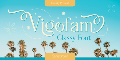 Vigofam serif typeface is an elegantly themed font that has a dynamic serif style. This font is good for logo design, Social media, Movie Titles, Books Titles, short text even long text letters, and good for your secondary text font with sans or serif. **Featured:** * Standard Uppercase & Lowercase * Numeral & Punctuation * Multilingual : ä ö ü Ä Ö Ü ß ¿ ¡ * Alternate & Ligature * PUA encoded We recommend programs that support the OpenType feature and the Glyphs panel such as Adobe applications or Corel Draw. so you can use all the variations of the glyphs. Hope you enjoy our fonts!
 - Fendgy by Aiquitype,
$10.00 Introducing "Fendgy - Classy Display Serif Font". Fendgy-Classy Display Serif Font is an elegant and refined typeface that exudes a timeless sophistication. With its meticulously crafted letterforms, this font embodies a perfect balance between classic charm and contemporary design. Its graceful strokes and distinctive serifs make it an ideal choice for luxurious branding, editorial design, and upscale packaging, imparting a sense of refined exclusivity to any project. What's Included? 1. PUA Encode 2. Uppercase, Lowercase, Numerals and Punctuation 3. Ligature Collection 4. Stylistic Alternate 5. Installed on Mac and Windows 6. Language Support : Western Europe 7. Multilingual Support Enjoy Our Font!
 - Kaelorin by RagamKata,
$14.00 Say hello to new serif font, Kaelorin! Introducing Rosalind, a stunning modern retro serif font that effortlessly combines aesthetic charm with captivating alternate characters. This typeface falls into the category of modern retro serif fonts and is designed to bring a touch of nostalgia and elegance to your design projects. What sets Rosalind apart are its intriguing alternate characters. These alternates offer a wealth of creative possibilities, allowing you to experiment with various letter combinations and create unique and eye-catching typographic compositions. Each alternate has been thoughtfully designed to ensure visual coherence and seamless integration within the font.
 - Romavich by Arterfak Project,
$27.00 Introducing Romavich, a beautiful condensed serif font, inspired by the modern serif style features with thin lines and bold serifs. This casual and minimalist typeface is versatile and can be used for a wide range of designs, including magazines, editorials, posters, logos, branding, logotypes, wedding, fashion, cards, titles, and more. Romavich is an all-caps font with small caps, allowing you to create an elegant short texts and quotes. It comes equipped with numerous alternates and ligatures, adding a gorgeous touch to your designs. What you’ll get : Uppercase Smallcaps Numbers & symbols Punctuation Stylistic alternates Custom ligatures Multilingual support PUA Encoded Thank you!
 - Rostema by RagamKata,
$16.00 Rostema - Display Serif Introducing Rostema, a captivating blackletter serif display font that seamlessly bridges the gap between tradition and modern design. This typeface is a testament to the timeless beauty of blackletter fonts, infused with a contemporary twist that makes it perfect for a wide range of creative applications. Whether you're designing posters, branding materials, invitations, or any other creative endeavor that demands a bold and distinctive typeface, Rostema is your go-to font. Its blackletter serif display style adds a touch of drama and sophistication to your designs, setting them apart and leaving a lasting impression.
 - Comma Base by Martin Majoor,
$- Comma Base is a sans typeface for it has no serifs. No wait, it is a typical serif typeface because it has a high contrast. Strictly speaking, Comma Base is a missing link between serif and sans, offering the best of both worlds. Comma Base supports several OpenType features for advanced typographic control. It consists of 16 styles, 8 weights from Hairline to Ultra, in both roman and italic. Comma Base is a uniwidth font. This means changing a text from normal to bold doesn’t effect the set width, a professional feature that is highly appreciated by graphic designers.
 - Romantic SS by Sensatype Studio,
$15.00 Romantic is a Modern Beauty Sans Serif A Sans Serif font that we created special for branding needs with classy shape to add value of your brand. It's so nice to leverage designer or product owner that need solutions to make their design look more classy and fashionable. And specially for Romantic font, We prepared any characters with Elegant shape to help you create classy style of your design. Romantic Modern Beauty sans serif font ready with: Lowercase and Uppercase characters Numbers and Punctuations Preview as a inspirations that you can do with Romantic font Wish you enjoy our font.
 - Romance Breakin by Fikryal,
$25.00 Romance Breakin Vintage Serif Font is a type of serif font with a classic design inspired by the vintage era. The font has a characteristic bold line that looks elegant and gives a classy impression to every text display. The uniqueness of this font lies in its serif style, which gives an elegant and romantic touch to every word and sentence written with this font. With its advantage in providing a vintage and romantic impression, “Romance Breakin” Vintage Serif Font is suitable for graphic design such as logos, letterheads, posters, greeting cards, or designs for social media. This font can also be used for design projects that require a classic and elegant touch, such as wedding party designs, invitations, and vintage-style related products. Multilingual Support If you have any questions please don’t hesitate to contact me Thank you
 - Varisse by AVP,
$19.00 Varisse spans over two centuries of type design and draws its inspiration from well-loved classics that are as fresh today as they were when they were created. The range stretches from a quintessential 18th century transitional serif to an uncompromising 20th century sans. Think Baskerville, think Gill. The idea was to create a family that shared similar forms and the same vertical metrics, allowing them to be mixed to provide impact and readability as required. With a generous x-height and a host of options, the Varisse family is ideally suited to branding, packaging, magazines and editorial. It also provides a wealth of opportunity in website presentation. The fonts are divided into five subfamilies by degree of ‘serification’. Varisse Sans Varisse Soft Sans Varisse (normal) Varisse Soft Serif Varisse Serif Each subfamily contains six weights and accompanying italics.
 - Behooved by Putracetol,
$25.00 Behooved - Ligature Serif Font. Behooved is equipped with swash, stylistic and titling alternates as well as with standard and discretionary ligatures. Behooved is a ligature serif font with strong character and soft features. Behooved is a stylish serif font that is both retro and great ligature font. It's thick curves give a groovy vibe with the serifs bringing it slightly back to traditional. Comes with alternatives and ligatures, helps to create stunning logos, quotes, posts, blog posts. branding projects, magazine imagery, wedding invitations, and much more. The alternative characters were divided into several Open Type features such as Swash, Stylistic Sets, Stylistic Alternates, Contextual Alternates, and Ligature. The Open Type features can be accessed by using Open Type savvy programs such as Adobe Illustrator, Adobe InDesign, Adobe Photoshop Corel Draw X version, And Microsoft Word. This font is also support multi language.
 - Elephantmen Greater and Taller by Comicraft,
$19.00 Roll up! Roll up! The world’s largest three (letter-)ring circus of Great and Tall Elephantmen fonts is now touring cities and towns in your area! See the amazing exploits of fonts of heretofore unimagined heights and weights! Gasp as x-heightwire artist John Roshell walks great and tall on the typerope up above your headlines! Look in wonder as Elephantmen get greater and taller on stilts, staggering around with their trunks high in the air as well as loose around their waists! Peer cautiously into the sky as the greatest and tallest Elephantmen disappear into the clouds as they swing up on the trapeze... Yes, the Comicraft Big Top is always full of surprises... so hurry, hurry, hurry to download your ticket to the Greatest and Tallest Show on Earth in the comfort of your own home! See the families related to Elephantmen Greater & Taller: Elephantmen, Elephantmen Great & Tall, & Elephantmen Greatest & Tallest.
 - Elephantmen Greatest and Tallest by Comicraft,
$19.00 Roll up! Roll up! The world’s largest three (letter-)ring circus of Great and Tall Elephantmen fonts is now touring cities and towns in your area! See the amazing exploits of fonts of heretofore unimagined heights and weights! Gasp as x-heightwire artist John Roshell walks great and tall on the typerope up above your headlines! Look in wonder as Elephantmen get greater and taller on stilts, staggering around with their trunks high in the air as well as loose around their waists! Peer cautiously into the sky as the greatest and tallest Elephantmen disappear into the clouds as they swing up on the trapeze... Yes, the Comicraft Big Top is always full of surprises... so hurry, hurry, hurry to download your ticket to the Greatest and Tallest Show on Earth in the comfort of your own home! See the families related to Elephantmen Greatest & Tallest: Elephantmen, Elephantmen Great & Tall, & Elephantmen Greater & Taller.
 - 161 Vergilius by GLC,
$38.00 This font was inspired by the rare manuscript Roman Quadrata used by an unknown scribe to inscribe a copy of the Roman poet Virgil’s GEORGICS, somehwere around 161 to 180 AD. Only a few sheets have survived, now preserved by different libraries around the world. In creating this font, we have adapted it for contemporary users, making differences between U and V; I and J (which made no difference at all to ancient Latin scribes) and naturally adding the glyphs for Thorn, Oslash, Lslash, W, Y, as well as the usual accented characters and punctuation, none of which existed at the time. Only capitals are present in the original; but we have provided alternates: so alternating each character A-Z/a-z will give a pleasant appearance of manual script. We have added the Roman numerals “I V X L C D M” in the OTF/TTF versions usable as “Old Style Numerals” alternates.
 - The Wayfaring Font by Set Sail Studios,
$13.99 Hey guys, I'm really excited to introduce The Wayfaring Font Duo! A hand-painted set of fonts designed to add a rustic and whimsical charm to your design projects. It's rough around the edges and not without imperfections - but aren't we all? With distinctive bold & playful brush strokes, The Wayfaring Font Duo is ideal for your logo designs, product packaging, wedding designs, book covers, social media posts, merchandise & more. The awesome thing about this typeface duo is that it's so easy to mix up the various font styles and create totally unique, hand-made looking words each time. Not only are there 2 sets of upper & lowercase characters, there is also a unique 'all-caps' version - which not only looks great as a supporting font, but can also be combined with the regular Wayfaring font to give you even more layout options. I'm serious! Just throw a small-caps character in the middle of a word, it's really fun to play around with.
 - Hypnotique by Comicraft,
$19.00 Do we have a volunteer from the audience! Yes, you young lady, step into the ring, there's no need to be afraid! What's your name? Hypnotique? How appropriate! Now, don't turn away, look into my eyes, look into my eyes, the eyes, the eyes, not around the eyes, don't look around my eyes, look into my eyes, aaaannnndd you're under. And on the menu of mesmerism tonight is a waking dream of letterforms that will keep you on the threshold of consciousness and yet illuminate your every hypnagogic hallucination! Now that we have your focused attention and reduced your peripheral awareness you have an enhanced capacity for response to the suggestion that you should not only purchase this font, but our entire library of fonts. On the count of three you will wake up and you will think of nothing else but acquiring all the tools all good graphic designers should have in their font library. And all we had to do was snap our fingers.
 - Croft by Stiggy & Sands,
$24.00 Historical typography makes a comeback. A revival of one of the most popular of a number of rugged typefaces used around the turn of the century, Croft revives the creation of Lewis Buddy III, known as "Roycroft" in 1912 ATF catalogs. It also, according to ATF, was designed "partly" by Morris Benton, around 1898. The original typeface might be considered an early form of grunge fonts. This typestyle maintains historical flavor, while also being relevant today. It has been expanded to have more discretionary ligatures and numerals sets for versatility, and maintains the original stylistic alternates and standard ligatures. See the 5th graphic for a comprehensive character map preview. Opentype features include: Full set of Inferiors and Superiors for limitless fractions. Tabular, Proportional, and Oldstyle figure sets. A small collection of Discretionary & Standard Ligatures. Stylistic Alternates for variations of several characters such as R, u, t, etc. Approx. 482 Character Glyph Set: Croft comes with a glyphset that includes standard & punctuation, international language support, and additional features.
 - The qoestter by Alit Design,
$19.00 Presenting the ✨The Qostter Retro Serif Font✨ by alitdesign. The Qostter Retro Serif font is inspired by stylish designs from the 80s to 90s. At that time the font style like "The Qotter" had a firm and trendy impression. The Qotter retro font has a wide selection of alternative characters and swashes that make it easy to create bold retro-style designs. The Qostter Retro Serif font is very suitable for making designs with retro concepts, simple and playful designs, for example making magazine cover designs, music covers, YouTube thumbs, text headers, logotypes and so on with an elegant retort theme. Besides that this font is very easy to use both in design and non-design programs because everything changes and glyphs are supported by Unicode (PUA). The Qostter Retro Serif font has a total of 758 glyphs including symbol, multilingual and alternative glyphs. We really enjoyed the process of making The Qostter Retro Serif font, we hope you are also happy when using The Qostter Retro Serif font. Language Support : Latin, Basic, Western European, Central European, South European,Vietnamese. In order to use the beautiful swashes, you need a program that supports OpenType features such as Adobe Illustrator CS, Adobe Photoshop CC, Adobe Indesign and Corel Draw. but if your software doesn't have Glyphs panel, you can install additional swashes font files.
 - Behind The Nineties Sans by Casloop Studio,
$9.00 Introducing Behind The Nineties Sans - the perfect counterpart to our beloved font, "Behind The Nineties." This new sans-serif addition effortlessly captures the classic vibes of the 80’s and 90’s while infusing a contemporary touch for a timeless yet modern aesthetic. Key Features: Sans Serif Sophistication: "Behind The Nineties Sans" exudes sleek and modern elegance, offering a clean alternative to its serif predecessor. Regular and Italic Styles: Whether you prefer a straightforward look or a touch of italicized flair, this font provides versatility for all your design needs. Classic with a Contemporary Twist: Embrace the spirit of the 80’s and 90’s with a font that seamlessly blends classic elements with contemporary sophistication. Editorial Excellence: Elevate your editorial projects with the precision and clarity of "Behind The Nineties Sans," ensuring a polished and professional appearance. Luxury Serif Companion: Pair it with "Behind The Nineties" serif font for a cohesive design that radiates opulence and luxury. Dramatic Impact: Make a statement with the font's dramatic presence, capturing attention and adding a bold touch to your creative endeavors. Multi-language support including Western European, Central European, South Eastern European, South American, Oceanian, and even Esperanto. "Behind The Nineties Sans" is your go-to font for achieving a harmonious blend of nostalgia and modern flair. It's time to redefine classic design with this exquisite sans-serif typeface.
 - Range Sans by Eclectotype,
$36.00 This is Range Sans, the sans-serif counterpart to Range Serif . It can be categorized as a grotesque, with the idiosyncratic angular details from the serif family making themselves known in the arches and bowls of the lower case. The range of weights is larger than Range Serif, with two more weights at the lighter end of the spectrum. The weights from light to black correspond to their seriffed sisters, so can be interchanged with them freely while maintaining a similar text color and vertical metrics. This is useful for adding emphasis; Range Sans is deliberately lacking an italic, but the italics from Range Serif work better than you might expect in running text, particularly for the light and regular weights. Range Sans has a contemporary, somewhat geometric look that lends itself to uses such as corporate identities, minimalist graphic design, and logos. The middle weights do work well in running text, however, with the angled details being less noticeable at small sizes. Designed for demanding typography, supporting most Latin-based languages, Range Sans is equipped with true small caps for all weights, an array of numeral styles (proportional- and tabular- lining and oldstyle figures, small cap figures, numerators, denominators, superscripts and subscripts/scientific inferiors), automatic fractions, a set of useful arrows, case-sensitive forms, and a range of currency symbols including recent additions: Turkish Lira, Indian Rupee and Russian Ruble.
 - Retail Packaging JNL by Jeff Levine,
$29.00 The retail storage box for a vintage metal numbering stamp manufactured by the American Numbering Machine Company had its brand name hand lettered in an Art Nouveau style that most likely went back to the 1920s, as the company was in existence from 1908 to around 1971. Numbering machines were used in offices, schools, libraries, and anywhere a series of numbers needed to be marked onto printed items. Similar to what was called a ‘crash numberer’ used in letterpress shops, the machines could be set to do a run of digits [for example: 4000, 4001, 4002] or repeat numbers for forms used as carbon copies. As computers took over most forms of printing, the use of numbering machines dwindled, but they are still available. The American Numbering Machine Company was one of several Brooklyn, New York companies that specialized in the manufacture of these machines. Retail Packaging JNL replicates the lettering from their packaging, and is available in both regular and oblique versions.
 - Basic Commercial by Linotype,
$57.99 Basic Commercial is a family of fonts based on historical designs from the hot metal type era. First appearing around 1900, these designs were created by type designers whose names have not been recorded, but whose skills cannot be overlooked. These typefaces were popular among groups and movements as diverse as the Bauhaus, Dadaism, and the masters of Swiss/International-Style typography. They influenced a variety of later grotesque fonts, such as Helvetica and Univers. Basic Commercial was distributed for many years in the United States under the name Standard Series. The typeface worked its way into many aspects of daily life and culture; for instance, it became the face chosen for use in the New York City subway system’s signage. The Basic Commercial family members have a clear and objective design. Their forms exhibit almost nothing unusual, but remain both lively and legible nonetheless. Perhaps for this reason, Basic Commercial’s design has been popular with graphic designers for decades.
 - Ressonant by Octopi,
$9.00 With reference to the Type Heritage Project, this font (designer unknown) was cut by Henry Brehmer of New York for the Dickinson Type Foundary of Boston in c1879 and had the original trade name of Renaissant. John F. Cumming later cut a light-face derivative called “Artistic.” A history of the un-patented face can be found at the Type Heritage Project website. Ressonant has a full character set as well as ligatures, superiors, inferiors, numerators, denominators, old style figures, and auto-fractions. There are also alternate caps for N and M as in the original, and, unlike the original, comes in four weights. This font is a documented revival of a 19th-century typeface. The year, country, designer and/or foundry of origin will be published in a series of textbooks entitled “The Type Heritage Project.” Volume I explores quintessential Victorian faces, a spectacular trove of innovative gems; you can see samples by clicking the Type Heritage Project link above.
 - F2F Mekanik Amente by Linotype,
$29.99The Face2Face (F2F) series was inspired by the techno sound of the mid-1990s, personal computers and new font creation software. For years, Alessio Leonardi and his friends formed a unique type design collective, which churned out a substantial amount of fresh, new fonts, none of which complied with the traditional rules of typography. Many of these typefaces were used to create layouts for the leading German techno magazine of the 1990s, Frontpage. Leonardi and his fellows would even set in type at 6 points, in order to make it nearly unreadable. It was a pleasure for the kids to read and decrypt these messages! F2F Mekanik Amente appears as if it had once been a normal font whose letters were horribly attacked by a pair of scissors. This font could be a very creative choice for headlines. F2F Mekanik Amente is one of 41 Face2Face fonts included in the Take Type 5 collection from Linotype GmbH. Leonardi designed 11 of these himself." - Balshan MF by Masterfont,
$59.00 Derived from old signage, this serif font is unique and readable in titles and text as well.
 - Plastelina MF by Masterfont,
$59.00 Very versatile sans serif font, designed with a soft touch of elegance. Great for invitations and headlines
 - Zarina by BohFonts,
$- Sans serif typeface with calligraphic features and outstanding contrast between curve and line designed for small text.
 - Gusto Black by BA Graphics,
$45.00A real heavy weight, a chunky sans serif that packs some real Punch. No fancy frills here. - Hermainita by Ingrimayne Type,
$9.00 Hermainita is a calligraphic typeface that is very legible. Yngreena is a serifed version of this face.
 - Angulatte by Gerald Gallo,
$20.00 Angulatte is a sans serif font made up of characters that are drawn with only straight lines.
 - Mimi MF by Masterfont,
$59.00 Simple yet decorative serif stroked font . Use for titles, signage, captions etc. Highly legible at children books.
 - Tzoba MF by Masterfont,
$59.00 Inspired by old manuscript serif font, this low contrast font makes it high legible for long texts.
 - Trilium JNL by Jeff Levine,
$29.00Trilium JNL is a tri-line sans serif font that was modeled from some 1970s retail packaging. - Manchester by BA Graphics,
$45.00A Bold Powerful Condensed serif face; great for book jackets, magazines, ads and just about any application. - Clique by Device,
$29.00 A clean elegant subtly flared serif in three weights suitable for high-fashion and luxury brand use.