10,000 search results
(0.016 seconds)
- DuBois JNL by Jeff Levine,
$29.00DuBois JNL is based on hand lettering designed by Albert DuBois of New York City, and originally titled "Round Block". His design was found in an old sign painters' design book from the early 1900s and has been translated to digital form by Jeff Levine. All of the quirks and charm of hand lettering have remained. - ITC Underscript by ITC,
$29.99Underscript, from designer Claudio Rocha, is an alphabet of capital letters in handwritten style. Each letter has a corresponding alternative form and using both randomly in a text can give it the look of real handwriting. One constant element in the font is its stroke width. The strong figures are even and have rounded corners, lending them a cheerful appearance. All other attributes vary from letter to letter. Wide and narrow, high and low, the figures line themselves up unevenly on the base line. So can Underscript create a dynamic overall image with contrast. Underscript is perfect for cartoons, comics and anything light and carefree. - Neue School by Daniel Brokstad,
$29.00 Neue School is a modern sans serif font with extra tight tracking & deep ink traps. Designed to maximize the available space, make impactful headlines. Inspired by old school narrow poster fonts, presented in a “neue”-way. The font consists of 8 weights, across 2 widths, plus italics. Symbols are fixed weight throughout, as a contrast to the font weights. There are 2 additional OpenType stylistic sets. Stylistic Set 1 adds more rounded edges to specific characters for a softer look. Stylistic Set 2 makes lowercase ascenders and symbol height equal to capital height, making it ideal for stacking type more easily with all same height.
 - Punkaholic by Sharkshock,
$115.00 Punkaholic started out as a loopy, all caps display font with a semi condensed feel. Before completion some of the letters such as A and W were given a more traditional look and were penciled in for alternates. In the end, however, they were added as uppercase characters instead. For this reason most words in lowercase vary in appearance from their uppercase counterparts. This dichotomy between straight lined capitals and rounded ones makes for some interesting contrasts. Punkaholic works best in less formal settings such as café menus, t-shirts, or children’s publications. It comes in 3 styles and contains Latin, extended Latin, punctuation, and kerning.
 - Moonlit Walk JNL by Jeff Levine,
$29.00 Another variant to the ever-popular Art Deco sans lettering with solid centers (no counters) was found in the hand-lettered title on the cover of the 1933 song "There's A Ring around the Moon". This became the basis for the digital typeface Moonlit Walk JNL, available in both regular and oblique versions.
 - Galette by Paragraph,
$- Galette is a contemporary all-purpose sans-serif for printing and online delivery, allowing the use of one layout both as printed material and online without loss of quality or legibility. Not only a high resolution printing font with extensive kerning, it was designed from the ground up for clear and uniform display on the computer screen. It displays more predictably than the traditional fonts: no overhangs are used, the stroke thickness of capitals and lower case letters is identical, making hinting or antialiasing smoother at any point size and zoom combination. The hint of Art Nouveau makes the font more expressive and individualistic. A number of alternative capitals allows the font’s expression to be turned up or down at will. A generous complement of accented characters (Western & Eastern European, Baltic, Turkish) enables multi-lingual use.
 - Solitas Slab by insigne,
$- Slab serif, meet the curves of Solitas. The new slab sister of insigne’s successful Solitas family will turn your head with its soft, but distinct look. Solitas Slab defies the typical feel of the robust slab category with her more compact structure and rounded corners to create a confident charm that complements everything sweet from cookies and puppies to whiskers on kittens. Solitas Slab offers you a full suite of 42 well-rounded fonts that read well both in print and online. Its round, open letter types make it quick to read, and the intermediate weights execute impeccably for copy, while bolder versions make expressive headlines and subheadings. Using its subtle geometry, its seven weights and three widths along with its optically adjusted italics tackle even the most complicated, ambitious typography with heart-warming grace and poise. Solitas Slab OpenType options include titling caps, small capitals, ligatures, ordinal characters, fractions, numerator and denominator as well as superscript and subscript. Solitas Slab also supports Western European, Central and Eastern European languages. Enjoy the softer side of Solitas Slab today for your packaging, web, or print. You’ll soon find this friendly font to be one of your favorite things.
 - Gentona by René Bieder,
$25.00 Designed for a wide range of applications, Gentona was intended to support the goals of contemporary design paired with a mostly swiss oriented demand on typography – neutrality. The result is a nine-weight neo-grotesque family ranging from sharp and fine thin cuts to muscle-bound and strong heavy weights. Gentona’s confident and open shapes support legibility especially in small sizes while its alternative shapes and letterforms create flexibility. A wide range of typographic features round up the whole family.
 - Cover Letter JNL by Jeff Levine,
$29.00 The handmade title on the cover for the 1939 edition of “A Wand’ring Minstrel” [from Gilbert and Sullivan’s “The Mikado”] was rendered with a round nib lettering pen in an Art Deco style. This type design is now available as Cover Letter JNL in both regular and oblique versions. However, the font’s name is a bit of a pun, as it has nothing to do with cover letters, but rather the lettering found on the cover of the sheet music.
 - Classic XtraRound by Durotype,
$49.00 Classic XtraRound is a companion typeface to Classic Round, designed by Ben Blom. Although Classic Round has a lot of roundness, Classic XtraRound has more. Classic XtraRound has maximum roundness — no sharp corners, anywhere. Classic XtraRound has maximum roundness — and is still legible. It can be used as an interesting workhorse in small text sizes. It makes eye-catching headlines in big display sizes. Classic XtraRound can be combined in any way with Classic Round, to create an interesting variation and sameness within the same document, brochure, catalog, advertisement, etc. For more information about Classic XtraRound, download the PDF Specimen Manual.
 - 1462 Bamberg by GLC,
$38.00 Font designed from that used in Bamberg by Albrecht Pfister, in early years of printing, exactly for a book titled "Ackermann Von Böhmen" writen in old German by Johannes Von Tepl, and decorated by a lot of splendid colored carved woods. This font include "long s", naturelly, as typically medieval, but any abbreviated characters, and, curiously no german "ß", no more than "W". (The only one I did found where a hand drawn one.) In addition, the "k" have not a German gothic form. Added, the accented characters, no longer existing on this time, and capitals when was a lack. A render sheet, in the font file, makes all easy to identify on a keyboard. This font is used as variously as web-site titles, posters and fliers design, editing ancient texts... This font supports as easily enlargement as small size, remaining readable, original and beautiful, especially in capitals.
 - Basique Pro by Par Défaut,
$25.00 Basique Pro is a modern, geometric sans serif font family. It contains more than 1000 characters including the Latin, Cyrillic and Greek alphabet. There are also 14 OpenType features (Superior; Inferior; Numerator; Denominator; Fraction; Tabular Lining; Slashed Zero; Small Capital; Small Capitals from Capitals; Standard Ligature; Case Sensitive; Ordinals; Access All Alternates; Stylistic Set)
 - Renaisperian by Intellecta Design,
$22.90fancy decorative frame with a script capital - Zigzag by Volcano Type,
$60.00 ZIGZAG is a funny font family whose letters have four varieties each in order to multiply expressions and attract the eye by breaking the rhythm of reading. There are two styles available Rounded and Not Rounded. The variations oscillate between a hand-drawn design and a geometric or imaginative drawing. Opentype’s function lets you choose between different variations of each glyph and contextual variables allow to mix the styles. Benoît Bodhuin designed ZIGZAG Rounded in 2011/12 for the theatre Vivat. In 2013 ZIGZAG Rounded was supplemented by ZIGZAG Not Rounded.
 - Pagnol by Typorium,
$15.00 The Pagnol typeface has been designed with a principle developed by A. M. Cassandre in 1937, when the great French designer created the Peignot typeface following paleographic studies on the evolution of letterforms. Researches in the history of writing have proved that the lowercase "a" is at its origin nothing but the "A" shape transformed through centuries by scribes until the invention of printing. A large number of lowercases meanwhile kept their original shapes. If the scribes’ hand didn’t find the necessity to simplify them, it is only because these letters could be easily written. Integrating the classical shapes of capitals to the lowercases has already been used, keeping the lowercases which are only a deformation of capitals. Nevertheless, the respect of readability imposes to keep ascendants and descendants from traditional lowercases which serve as optical focus points in a text and make reading easier. The particularity of Pagnol is to use rounded shapes on top and bottom of pointed capital letters to make them fit with corresponding lowercases (Aa, Mm, Nn, Vv, Ww, Zz). Lowercases proportions are wide, to be in tune with classic lowercase shapes in order to optimize readability. Five weights in roman and italic have been designed to offer a wide palette of typographic possibilities in all sizes and all paper and screen supports.
 - VLNL Berlagebrug by VetteLetters,
$30.00 VLNL Berlagebrug Designer Donald DBXL Beekman daily crosses the Berlage bridge spanning the Amstel river in Amsterdam. The Berlagebrug was built as part of the city planning project ‘Plan Zuid’ by H.P.Berlage and opened in May 1932. Its name, carved out of two granite headstones, sparked the design of this font family. The original lettering is attributed to Anton Kurvers in the early 19th century, and can be seen on many Amsterdam buildings and bridges. It’s typical lettering of the Amsterdamse School, the Dutch equivalent of the expressionist art deco architectural style, and mostly known for its extravagant brick work. VLNL Berlagebrug is a rounded display font that comes in three outline styles matching the building materials used in the bridge. Gietijzer (cast iron) is smooth, Zandsteen (sandstone) has a softly distressed outline, and Graniet (granite) is outspoken rough and crumbled. The capital letters in VLNL Berlagebrug are in the Amsterdamse school style, the lowercases are more straight alternate capitals, giving you more design options.
 - Jerky by Noir Typo,
$15.00 Jerky is a strange and vibrant titling typeface.Drawn with a ruling pen, this typeface work with capital and small capital only by default. Inspired by calligraphy it emanates an Rock&Roll visual atmosphere or an horror movie ambiance.
 - Oman by Par Défaut,
$35.00 With five weights and four contrasts, all grouped in three version : sans-serif, slab, serif and all this doubled by a true italic, Oman regroup 120 different styles declined in four variables. Perfect from headlines to text, Oman will meet your needs with a many languages to support (Latin pro, Cyrillic), 14 OpenType features (Fraction, Numerator, Denominator, Tabular figure, Oldstyle figure, Small capital, Small capital from capital, Ordinal, Stylistic set, Case sensitive, Discretionary ligature, Contextual alternate and All access alternate). • Numerator and Denominator includes numerals and currency • Tabular Figure includes : numerals, currency, OldStyle numerals, small capital numerals, small capital currency. • Small Capital features includes the Latin & Cyrillic alphabet with the accents. • Ordinal feature includes the Latin & Cyrillic alphabet. • Two Stylistic set for “a” & “g” includes accents. • Discretionary Ligature includes “AE”, “AÉ”, “IJ”,“OE”, available in lowercase, small capital and ordinal. • Contextual Alternate includes ligatures for arrows : <-->^|v|<->v^|. Add n, d or +, for numerator, denominator or case arrows. All Case sensitive characters become after the uppercase and number.
 - Sparrowhawk by Device,
$29.00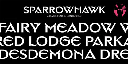 Sparrowhawk, a capitals only titling, evokes a suburban English gentility.
 - Codeworld by Par Défaut,
$49.00 Codeworld is a geometrical sans serif font family (5 weight, italic and variable) It contains more than 800 characters including the Latin, Cyrillic and Greek alphabet. There are also 13 OpenType features (Superior; Inferior; Numerator; Denominator; Fraction ; Small Capital; Small Capitals from Capitals; Contextual Alternate; Case Sensitive; Access All Alternates; Stylistic Set; Standard Ligature; Discretionary Ligature).
 - OTC Eugen by Ograda Type Company SRL,
$29.00 OTC Eugen is a geometric grotesque with industrial socialist aspect. It is a somewhat brute interpretation of the graphic environment and old era typography found around cities or in the country side in Romania. It works best as a display typeface used in big titles, in branding projects for clear wordmarks, or around the house where you can just go wild and make your own mark with the stencil version. Two styles: Display & Stencil. Various stylistic and contextual alternates, and a considerable amount of ligatures, arrows and more. Language support for: Basic Latin, Western, Central & Eastern European languages.
 - Tertius by Scholtz Fonts,
$21.00 Tertius, with its high ascenders and clubbed serifs, is a modern interpretation of the classic Carolingian style (7th - 9th centuries AD). There was no capital form in the Carolinian hand and Roman square capitals were originally used with it. The Carolingian hand began, after a while, to develop more cursive tendencies as people looked for a way to speed up the writing process. I have “capitalized” on this trend and have devised an appropriate and dramatic set of flowing capitals for this family. With its elegant swashes and bold letter shapes, Tertius embodies the romance of medieval life, of knights, castles, and chivalry. Tertius comes in four styles:- -- Regular: with elegant, smoothly penned characters; -- Crenellated: written with a scratchy pen over rough parchment -- many drops of ink and blotches have been left on the parchment (“Crenellated” means battlements -- the rough protrusions on the top of castle walls); and -- Romantic: the capitals have been loosely overwritten generating a contemporary version of illuminated capitals. -- Illuminated: richly decorated illuminated capitals for use with Tertius Regular (28 characters) All fonts have been carefully crafted, letterspaced and kerned and contain full character sets of 237 characters.
 - Coastal by Arkitype,
$10.00 Coastal is a typeface made up of 12 fonts, it is a display sans family with some cues that give it a fun looking and informal type family. Coastal has rounded, rough, hand and outline versions so there are a lot of options to play around and have some fun with. Coastal is great for headlines, posters and artwork where larger type is needed. It also has some neat alternate glyphs that give the user a few more additional options to get creative with.
 - Brittes by Eurotypo,
$60.00 Brittes is a fontface inspired in a formally English round hand, also called anglaise or Copperplate script. The calligraphy was the dominant style among 18th-century writing masters, whose copybooks were splendidly printed from models engraved on copper. In the mid-1800's, the Spencerian form of penmanship became a standard. An elegant handwriting was much prized. Today, in our computer age, a fine, beautiful, and legible handwriting brings a warm personal touch to your graphic design and visual communications projects. This font comes with three different kinds of capitals, regular and swashes to choose from, a full set of stylistic alternates, standard and discretional ligatures. Old style numerals ornaments and tails.
 - Glorious Song by Stiggy & Sands,
$24.00 A type from vintage Hollywood to your computer screen. Glorious Song is a display serif typestyle that was inspired by the poster lettering for the 1948 movie "Words and Music". It's an all capitals typeface that has alternate caps in the lowercase slots to convey all of the spunk and visual dance of the original inspiration. See the 5th graphic for a comprehensive character map preview. Glorious Song comes with features for customisation options: - An all capitals typeface with alternate capitals in the lowercase slots - A Ligatures feature that alternates between Capital and Alt Capitals characters. - A SmallCaps feature just to mix things up a little. - A Full set of Inferiors and Superiors for Limitless Fractions - Tabular and Proportional figure sets Approx. 546 Character Glyph Set: Glorious Song comes with a glyphset that includes standard & punctuation, international language support, basic ligatures, alternate numeral styles, subscript and superscript, and Small Cap letters.
 - Mingo Gothic SG by Spiece Graphics,
$39.00 This typeface appears to be straight out of a science fiction movie thriller. Mingo is a slightly condensed, somewhat vain gothic with thick vertical strokes proudly tapering downward. Capitals which are normally completely round are now square inside with curving outside corners. Lowercase letters carry the same design traits. And, in the capital A and H, crossbars extend on both sides helping give the face a pronounced retro look. Mingo Gothic is a close cousin to Raleigh Gothic and is an excellent choice for book covers and large display settings. Small caps, fractions, and alternate characters have also been developed for greater layout versatility. Mingo Gothic Bold is now available in the OpenType format. Some new characters have been added to this OpenType version as stylistic alternates, historical forms, small caps, oldstyle figures, ornaments, and f-ligatures. These advanced features work in current versions of Adobe Creative Suite InDesign, Creative Suite Illustrator, and Quark XPress. Check for OpenType advanced feature support in other applications as it gradually becomes available with upgrades.
 - Caslon Titling by Monotype,
$29.99Monotype Caslon Titling was made available for hot metal casting in 1932. The capital Monotype Caslon Titling letters were based on types from the Stephenson Blake Foundry, previously the Caslon Foundry. Originally designed by William Caslon in the eighteenth century, Caslon is considered an old face although it has characteristics which were later found in the transitional typefaces. The Monotype Caslon Titling font has a distinctive style, generous width and strong color, ideal for use in advertising, magazines and on book jackets. - Wieldy by Type Fleet,
$12.00 Wieldy crafted character Wieldy is a prime quality typeface rooted in the tradition of good craftsmanship, full of character and reach in details. Extended serifs, connected with dots, are just some design features this artisanal font can offer. Wieldy is based on the ahistoric forms developed by Central European Arts and Crafts movement. It is suitable for visual identities, packaging or book headings. The typeface’s x-height is around 72% of its capitals. The font is endowed with details, ligatures and special characters.
 - Contract by resource.studio,
$25.00 A New Typographic workhorse with robust round over corner curvature construction. Rounded condensed sans serif. 331+ Characters Upper & Lowercase Adobe Latin 3 - CE
 - Octopuss by ITC,
$29.99Octopuss is an energetic titling typeface designed in 1970 by Colin Brignall for Letraset dry transfer sheets. Brignall expanded the basic alphabet with an outline variation with a shadow, which makes the typeface look three dimensional, almost like it is floating. Octopuss font displays the unmistakable signs of the typefaces of the 1970s, as do Countdown and Harlow, also designed by Brignall. The circular strokes of the capitals that drop well under the base line are striking and unique. Because of the small white spaces of its lower case letters, the rounded, robust Octopuss is meant exclusively as a headline font and should be set in large point sizes. - Sinah by Linotype,
$29.99Linotype Sinah is part of the Take Type Library, selected from the contestants of Linotype’s International Type Design Contests of 1994 and 1997. Designed by the German artist Peter Huschka, Linotype Sinah is a rounded, ornamental font with many strokes ending in teardrop forms. The letters of this wide-running font do not share a common base line. The capital S and the lower case l both drop under it although neither have descenders. Overall, Linotype Sinah has an almost Asian or Indian feel. The font must be used with generous line spacing and is intended exclusively for headlines or shorter texts in point sizes of 12 or larger. - Santa Fe by ITC,
$29.99Santa Fe was created by British designer David Quay in 1983. Distinguishing are its script characters and the lower case e, which has the form of a capital E. The letters of this font emphasize the base line. Rounded corners pair with elegant forms to give Santa Fe a flowing, cheerful look. The figures are reminiscent of American advertisements of the 1960s with their light, carefree images. Like with most script fonts, the letters of Santa Fe should be set close enough together that they touch. An added bonus are the various alternative forms with which Quay provided Santa Fe and the many design possibilities which they offer. - Sinah Sans by Linotype,
$29.99Linotype Sinah is part of the Take Type Library, selected from the contestants of Linotype’s International Type Design Contests of 1994 and 1997. Designed by the German artist Peter Huschka, Linotype Sinah is a rounded, ornamental font with many strokes ending in teardrop forms. The letters of this wide-running font do not share a common base line. The capital S and the lower case l both drop under it although neither have descenders. Overall, Linotype Sinah has an almost Asian or Indian feel. The font must be used with generous line spacing and is intended exclusively for headlines or shorter texts in point sizes of 12 or larger. - SK Coisa by Shriftovik,
$32.00 SK Coisa is a decorative slanted geometric typeface with a daring character. Its sharp shapes and angles, and indeed the whole structure, scream for its extraordinary nature. It is unusual and stands out, and most importantly, it does not hesitate to be not like everyone else. SK Coisa is built on the contrast of rounded and sharp geometric shapes, and because of it, its appearance is impossible to forget. The typeface has both capital and lowercase characters. It supports the basic and expanded Cyrillic and Latin alphabet, as well as many other languages and character sets. If you want your design to scream, then SK Coisa is exactly what you need!
 - Eirinn by Linotype,
$29.99Eirinn was designed by Norbert Reiners for Linotype in 1994. Its forms are based on those of Irish scripts of the 7th and 8th centuries, an example of which can be found in the Book of Kells in Dublin. Characteristic of this style are for example the lower case f with its short cross stroke on the base line and long cross stroke above, the unusual form of the g, and the t, whose form is almost like that of a c. This style consisted of a mixture of lower case and capital letters at the time of its conception, but Eirinn has a full set of both lower case and capital alphabets. At first glance the viewer is reminded of ancient and indecipherable writings of the Celts before the forms of our contemporary letters and words become evident. Eirinn will lend a touch of mysticism and secrecy to any text. - Phiz by Shinntype,
$29.00 Phiz is a diverse suite of 28 decorative fonts based on Figgins Sans Extra Bold. Classic (10 fonts), Rounded (7 fonts), Rough (4 fonts) and Particles (7 fonts). The Rough and Particles styles emerge as a unique niche—neither imitating distressed printing (e.g. the “rusty” look), nor casual, hand-drawn styles. These type designs are conceived and executed as complex algorithmically-generated graphic procedures, in which repetitive elements have been artfully applied to the Sans capitals, and manually nuanced. As such they also differ substantially from textured glyph shapes that have been cut out from larger pattern fields, for the constituent particles are disposed in relation to the specific shape of each character they define. The caps-with-small-caps format was chosen for two reasons. Firstly, titling display usage is predominantly capitals, and secondly, rather like optical scaling, having the same resolution of texture available in two different “sizes” (upper and lower case) should prove useful in the hierarchy of page layout—not primarily for setting upper and lower case text as caps-with-small-capitals, although this is of course an option. All figures and major symbols (punctuation and currency) are provided in both cap and small cap height.
 - ITC Gramophone by ITC,
$29.99ITC Gramophone is a work of Canadian designer Serge Pichii. The distinguishing feature is the large spiral which is part of the form of almost every capital letter as well as many other characters. The capitals can also be used as drop capitals. The forms of ITC Gramophone are perfect for displays and will surely catch the eye of any reader. - Geometry Soft Pro Bold N - 100% free

- Cal Roman Modern by Posterizer KG,
$19.00 Cal Roman Modern is one more font from PKG “Cal” (Calligraphic) group. This time for calligraphic sketches we used a wide brush instead of the iron pen. Instead of minuscule letters, there are Small Caps (which are the same weight as capitals). Because there is no difference in the stroke thickness of capital letters and lowercase capital letters the difference in height is only one pen width, because of that, it is possible to use small capitals together with capital letters without noticing a difference in the thickness of the letters. Cal Roman Modern font is rhythmic, informal elegant, bright and light. As such, this font is widely used in the typographic creation of shorter text forms: magazine, catalogs and book titles, logos, posters, movie spots, banners...
 - Morning Cookie by Bogstav,
$17.00 Yet again, a font inspired by my work as a kindergarten teacher! The other day, I had a conversation with some of the kids, about what they ate for breakfast. Some had oatmeal, some bread and others yogurt. But this kid - he insisted that every morning, his mother would serve him cookies, “morning cookies”. It sounded too good to be true, and when I asked his mother, it turned out that “cookies” were actually bread, but to make it sound more appetising, they called it cookies! The letters are rounded and in some way quite naive, but still clear and legible. With an extreme ascender and descender, the font stands out with its oddities. I’ve added 3 different versions of each lowercase letter!
