2,223 search results
(0.016 seconds)
- Quincy by Wiescher Design,
$12.00 »QUINCY« started as an art project. I was stitching roughly cutout letters together on a piece of wooden board, but I didn’t like the result! So I ended up with a font in three cutout styles. I thought it was so unusual and really beautifully ugly, that I finished it, adding flashes here and there. Now I am offering this absolutely unusual font as a packet of three for you to enjoy. Have at least as much fun working with it as I had designing the packet. The font is great for packaging or posters, or whatever comes to your imaginations.
 - Grafema LC by Letter Collective,
$30.00 Grafema LC was designed by Jacklina Jekova & Todor Georgiev and published by Letter Collective. Grafema LC contains 16 styles and family package options. This Font Family Features: • 578 glyphs in 7 variants – upright, italic, textured, filled, rough, traditional contrast and inverted; • Handwritten with a calligraphic flat brush in 2 brush angles – 35° and 85°; • Extended Latin and Extended Cyrillic; • Coverage of multiple OpenType features – ligatures, stylistic alternates, and contextual alternates; • Suitable for web, print, motion graphics, etc; • Perfect for headlines, posters, packaging and greeting cards, etc. Grafema LC is a system of display typefaces consisting of 7 variants – upright, italic, textured, filled, rough, traditional contrast and inverted. Grafema LC started off as handwritten calligraphic works using a flat brush and variable angles of writing – 35° and 85°. It supports Extended Latin and Extended Cyrillic – more than 120 languages all together. The balanced natural texture of Grafema LC with unique details makes it perfect for headlines, but also suitable for long text. It is perfect for graphic design projects, like packaging, posters, events, blogs, social media and greeting cards. Grafema LC comes with a range of OpenType features – including old-style numerals, typographic features such as ligatures, stylistic and contextual alternates. The typeface is suitable for web, print and motion graphics.
 - DIY Fantasy Stamp by TypoGraphicDesign,
$19.00 The typeface DIY Fantasy Stamp is designed in 2020 for the font foundry Typo Graphic Design by Manuel Viergutz. The display typeface is inspired by the crafts of 20s and 40s. The basis for this authentic stamp font was a letter case with a rubber stamp from Simplex. This analog character set of 85 stamps, was digitally extended to 500+ glyphs. 5 font-styles (Sharp, Dirty, Rough, Invert, Heavy) with 546 glyphs (Adobe Latin 3) incl. decorative extras like icons, arrows, dingbats, emojis, symbols, geometric shapes, catchwords, decorative ligatures (type the word #LOVE for ❤ or #SMILE for ☺ as OpenType-Feature dlig) and stylistic alternates (4 stylistic sets). For use in logos, magazines, posters, advertisement plus as webfont for decorative headlines. The font works best for display size. Have fun with this font & use the DEMO-FONT (with reduced glyph-set) FOR FREE! Font Specifications ■ Font Name: DIY Fantasy Stamp ■ Font Weights: Sharp, Dirty, Rough, Invert, Heavy + DEMO (with reduced glyph-set) ■ Font Category: Display for headline size ■ Glyph Set: 546 glyphs (Adobe Latin 3) ■ Specials: Decorative extras like arrows, emojis, ornaments, geometric shapes, catchwords, decorative ligatures (type the word #LOVE for ❤ or #SMILE for ☺ as OpenType Feature. dlig) and stylistic alternates (4 stylistic sets) ■ Design Date: 2020 ■ Type Designer: Manuel Viergutz
 - Agatized Informal by ULGA Type,
$26.00 Agatized Informal is a rough-edged stencil typeface with chunky letterforms and tight spacing. Designed primarily for display use, it’s ideal for posters, logos, advertising, book cover designs or small chunks of text such as pull-out quotes. The design is something of an enigma, a curious mish-mash of genres – imagine splicing Uncle Buck and Deadpool into a horror movie – it’s big, bold and funny although has a dark side. But what really makes this typeface a joy to drive is its boot full of alternative characters and ligatures. There is a saying: Use sparingly. Not on this street! Make your Glyphs palette burn rubber. Set your OpenType to full throttle: crank up your style and get those liga-tyres screeching. Agatized is a souped-up old campervan spinning doughnuts on the beach. The design started life as a piece of lettering for a book design that didn’t progress past the sketch stage. I liked the rough, dense character shapes, so during some down time I started drawing more characters and the lure of a new typeface pulled me in from there. Although this is a single-weight typeface it has a younger sibling, Agatized Formal, a neater, more dapper brother, smoother round the chops and smartly dressed – certainly no less fun though.
 - Colonial Press by Simeon out West,
$25.00 Colonial Press is a font based on serif typefaces designed by William Caslon I (1692-1766) and various revivals thereof. Caslon is cited to be the first original typeface of English origin, but some type historians point out the close similarity of Caslon's design to the Dutch Fell types, presumed to be the work of Dutch punchcutter Dirck Voskens. Colonial Press harkens to the look and feel of newspapers in Colonial North America around the mid 1700s without the rough edges commonly associated with colonial printing and many reconstructions. The rough quality of the American typeface is believed to be the result of oxidation from the exposure to seawater during the long voyage from England to the Americas. Colonial Press is a heavy font that retains some of the handcut quality of these fonts while smoothing out the irregularities that make many of these fonts so visually distracting at larger point sizes. For the italic version of this font, I chose to emulate the more ornate letterforms that I have encountered, giving the italic characters a more ornamental feel. Colonial Press comes with full punctuation and a 362 glyph character set for most Western European-based Latin alphabet languages. It is a font that is designed both for normal typing and for larger, decorative display.
 - Gens De Baton by HiH,
$10.00 Gens De Baton is based on a charming lower case alphabet that appeared in the Almanach des Enfants pour 1886 (Paris 1886) under the heading “Amusing Grammar Lessons.” Gens De Baton means simply “Stick People.” The unknown designer turned the bare letter forms into drawings of people for the enjoyment of the children for whom the almanac was intended. The letter forms themselves were based on the French Romain du Roi (King’s Roman), except for the ‘g’ and the ‘j’ -- which were based on Baskerville. The letters ‘w’ and ‘y’ were not included, as they are seldom seen in French. We have left the letters somewhat rough, as they appeared in the Almanach des Enfants , resisting the temptation to clean up all the lines and render them with digital perfection. We have used our HiH Firmin Didot to supply an upper case and auxiliary characters, as Didot was originally a modified version of Romain du Roi. It is interesting to observe the contrast between the polished look of the Didot upper case and the rough, hand-drawn look of the lower case. Purchasers of this font have our permission to use it for the amusement of adults as well as children. We recommend setting Gens De Baton at 24 points or larger.
 - Phiz by Shinntype,
$29.00 Phiz is a diverse suite of 28 decorative fonts based on Figgins Sans Extra Bold. Classic (10 fonts), Rounded (7 fonts), Rough (4 fonts) and Particles (7 fonts). The Rough and Particles styles emerge as a unique niche—neither imitating distressed printing (e.g. the “rusty” look), nor casual, hand-drawn styles. These type designs are conceived and executed as complex algorithmically-generated graphic procedures, in which repetitive elements have been artfully applied to the Sans capitals, and manually nuanced. As such they also differ substantially from textured glyph shapes that have been cut out from larger pattern fields, for the constituent particles are disposed in relation to the specific shape of each character they define. The caps-with-small-caps format was chosen for two reasons. Firstly, titling display usage is predominantly capitals, and secondly, rather like optical scaling, having the same resolution of texture available in two different “sizes” (upper and lower case) should prove useful in the hierarchy of page layout—not primarily for setting upper and lower case text as caps-with-small-capitals, although this is of course an option. All figures and major symbols (punctuation and currency) are provided in both cap and small cap height.
 - HeroesX by Mightyfire,
$10.00 If you are looking for a font that have strong looks, meet HeroesX. We create HeroesX with a firm, strong and tough looks. This font is perfectly suit for book title, gymnastic logo, sport logo, game logo and any other creative arts.
 - Times Europa Office by Linotype,
$50.99The Times Europa Office family is designed after the model of the original serif family produced by Walter Tracy and the Linotype Design Studio in 1974. A redesign of the classic Times New Roman typeface, Times Europa was created as its replacement for The Times of London newspaper. In contrast to Times New Roman, Times Europa has sturdier characters and more open counter spaces, which help maintain readability in rougher printing conditions. Times Europa drastically improved on the legibility of the bold and italic styles of Times New Roman. Overall, text set in Times Europa is easier to read, and quicker to digest. Akira Kobayashi, Linotype’s Type Director, brought Times Europa up to speed for the new millennium in 2006. Now optimized for office communication instead of newspaper design, Times Europa Office offers a familiar yet refreshingly new appearance for serif text. Because of The Times of London’s specific printing conditions in the early 1970s, Times Europa originally had some intentional errors built into its letterform design. These inconsistencies created an even image in newspaper text in the long run. However, these design elements bear no role on modern office communication and its needs. Kobayashi redrew these problem forms, eliminating them completely. Now Times Europa’s font weights appear clearer and easier to read than ever before. - P22 Morris by P22 Type Foundry,
$24.95 William Morris (1834-1896) was probably the most influential figure in the decorative arts and private press movements of the late 19th and early 20th century. In reaction to the increasing lack of quality that the industrial revolution brought on, Morris sought a return to the ideals of the medieval craftsman. Dissatisfied with the commercially available typefaces of the day, he undertook the design of the fonts for his books himself. The P22 Morris font set features new versions of Morris's famous type designs for his Kelmscott Press. The two main fonts include full international character sets for Western European languages. P22 created MORRIS GOLDEN with a rough edge to simulate the look of printing on handmade paper. There is a more "refined" recent version of Golden, but its sterile digitization does not approach the effect that Morris achieved in his Kelmscott books. You'll notice the handmade effect less in the smaller sizes but will find it quite decorative in the larger sizes. (Morris cut his Golden type in only one size for the Kelmscott Press, approximately equal to 14 points.) P22's version of MORRIS TROY is more smooth than Morris Golden and is true to the original Morris design. It is based on the Kelmscott Troy type (an 18 point font) and its smaller counterpart, the Chaucer type (a 12 point font). American Type Founders made an unauthorized version of Troy, "Satanick," 189?, contrary to Morris's wish that it not be made available commercially.(Legend has it that the naming of Satanick comes from William Morris telling the agent inquiring about making copies of his fonts available to go to hell) Several digital versions of Troy (and Satanick) have appeared over the years. The P22 version offers a much more accurate rendering than any previous version. Morris designed the original Troy font to be spaced very tightly; our version reflects and honors his intention. The MORRIS ORNAMENTS are based on those Morris designed and used in his Kelmscott Press books. Characters in the positions of the letters A to Z are decorative drop cap initials. Characters in the number key positions reproduce other Morris embellishments. (See the accompanying key chart.) As with all headline fonts and complex dingbats characters, this font is best used at larger point sizes (e.g., 48, 72, 120). Use in body text or at small point sizes on-screen may not achieve desired results. P22 is grateful to William S. Peterson, Steven O. Saxe and the Lightsey-Offutt Library who gave invaluable research assistance to this project.
 - Karine by Mightyfire,
$10.00 If you're looking for a simple, clean and modern font, here is Karine. We have three styles that can be used in any writings. The looks of the font is feminine yet tough since it has neat and clean style. Enjoy in using Karine! :)
 - Amiga by Volcano Type,
$19.00 The Amiga is a family of home computers originally developed by Amiga Corporation as an advanced game console. Development on the Amiga began in 1982. Commodore International introduced the machine to the market in 1985, after having bought Amiga Corp. The machine was ahead of its time, sporting a custom chipset with advanced graphics and sound capabilities, and a sophisticated multitasking operating system.
 - Gresic by Yukita Creative,
$14.00 Gresic is a modern sans serif font, which is very bold, and contrasting, a font with this style is being sought after on the planet for modern design needs such as logo design, application design, website, social media, and others. Why not try Gresic Modern Font today? It comes in uppercase, lowercase, punctuation, and numbers; no more worrying about anything else.
 - New Bayreuth by URW Type Foundry,
$39.99 New Bayreuth is a new and improved version of the original Bayreuth font (Friedrich Hermann Ernst Schneidler, 1932). New Bayreuth was reworked, redesigned, completed and digitally remastered by Ralph M. Unger for URW++, based on specimen taken from old font catalogues. Besides Ganz Grobe Gotisch and Legende, New Bayreuth is the third type design by Schneidler that URW++ brought back to (digital) life.
 - Fakodi by Twinletter,
$15.00 Introducing the Fakodi Arabic style font. The best modern Arabic-style font designs are brought together in this exclusive font set. From stylish and elegant to modern and bold, you will create amazing designs for all occasions. Designed for both uppercase and lowercase letters and available Alternate, this font is perfect for creating captivating designs with a middle eastern feel.
 - Rigney by Solotype,
$19.95Bill Rigney, an old job printer in my home town, established his shop in 1896, closed it in 1900 to take a steady job, stored the equipment in a large shed, and reopened for business upon his retirement in 1950. What a find! A bonanza of old type! We became good friends and upon his death I bought the type. Bless you Bill. - Aisle Seats JNL by Jeff Levine,
$29.00The Redikut Letter Company of Hawthorne, California specialized in die-cut cardboard display letters used by sign makers to achieve a three-dimensional effect on show card and display work. A set of these letters purchased by Jeff Levine brought back memories of classic movie houses with their fancy display and lobby cards, and thus was created "Aisle Seats JNL". - Kilutz by Twinletter,
$13.00 Introducing "KILUTZ Font" - The Essence of Summer Brought to Life. KILUTZ Font embodies the very spirit of summer, making it your go-to choice for infusing a touch of the season into your creative projects. What’s Included : File font All glyphs Iso Latin 1 Alternate, Ligature Simple installations PUA Encoded Characters – Fully accessible without additional design software. Fonts include Multilingual support
 - Chalkaholic by Hanoded,
$15.00 It seems black crayons are out of stock where I live. I can buy all the colors I want, except black ones… I really needed a crayon, so I bought this ridiculously expensive professional marker crayon ($14 for 1!!!) and created this font. Use it for… well, uhm, dunno… book covers, product packaging and restaurant menus? Just have a ball!
 - Brush Crush by Hanoded,
$20.00 I bought a few new pencils and I tried them out using Chinese ink and quality French watercolor paper. The result is Brush Crush - a very nice brush font. Brush Crush would look perfect on packaging, book covers, posters and headlines and comes with alternates for all lower case letters. Needless to say, Brush Crush speaks most Latin-based languages.
 - Tambor by CastleType,
$39.00 Over the years I have bought many books and music CDs in persuit of my passion for African and Latin (and especially Afro-Latin) cultures. I've noticed that a great number of these books and CDs feature either of two popular display fonts that are, in my opinion, very much overused. As an alternative, I designed Tambor. The Tambor family includes seven styles.
 - Hugehito Brush by ijemrockart,
$13.00 Introducing a lovingly handmade new typeface, Hugehito Brush, a fun and imperfect modern brushed script font with a tough of uniqueness driven. Design like a professional with this typeface that fits perfectly for your wedding invitations, street ads, Instagram posts, t-shirt design, branding, and much more.
 - Ongunkan Northern Arabian Scrip by Runic World Tamgacı,
$49.99 The Ancient North Arabian scripts Ancient North Arabian is the name given to a group of scripts belonging to the South Semitic script family, which also includes the Ancient South Arabian alphabets (musnad and zabūr) and the vocalized alphabets used in Ethiopia for Geʿez, Amharic, etc. The Ancient North Arabian scripts were used both in the oases (Dadanitic, Dumaitic, Taymanitic,) and by the nomads (Hismaic, Safaitic, Thamudic B, C, D, and possibly Southern Thamudic). There are tens of thousands of inscriptions and graffiti in these scripts which were used in the period roughly between the sixth century BC and the fourth century AD. See the descriptions of the individual scripts below
 - Akkordeon by Emtype Foundry,
$69.00 Akkordeon is a display font family roughly inspired by grotesques from the XIX and XX centuries. It is not conceived as a family of constant width but has a variable breadth from narrow to expanded, offering a wide gradation of weights. Akkordeon is designed to be used in short texts such as magazine titles, banners, cover books, charts, advertising, branding and any situation where a compact, solid and powerful font is required. The type family consist of 14 weights and support for Central and Eastern European languages. Learn more about the Akkordeon design process at the Emtype’s Blog Check out Akkordeon Slab which is a great pair for Akkordeon.
 - Shark Snack by Comicraft,
$19.00 Dumm DUM. Dumm DUM. Duh dum duh dum duh dum DUMMMM... Just when you thought it was safe to get back in the water, this font surfaces to take one last bite out of your summer vacation skinnydip! Scream and scream again — it won’t do you any good, SHARKSNACK is rough and ready to EAT YOU ALIVE! It’s too late to close the beaches, Chief Brody, this particular set of saw tooth letters has already consumed Dracula, the Werewolf, the Frankenstein Monster and any number of 70s comic book characters foolish enough to dip a toe in its maw!
 - Vintage King by Putracetol,
$25.00 Introducing Vintage King. A retro bold script style font, come with clean and rough font version. Inspired from retro typography and lettering in the 70's and 80's combine with bold typography style. Vintage King is perfect for vintage and retro design, badge, logos,t-shirt, poster, branding, packaging, signage, book coverand so much more! Come with Opentype feature with a lot of alternates, its help you to make great lettering. This font is also support multi language. The extrude and shadow in the preview are not included in the package, it is used only for presentation purposes.
 - Stay Bold by Set Sail Studios,
$12.00 #boldisbeautiful, and there's a whole lotta bold in this hand painted brush font, Stay Bold! With extra chunk in the trunk and a rough paintbrushed edge, Stay Bold cuts straight to the point; ideal for designing big impact merchandise, eye catching social media & marketing posts, and attention-grabbing product packaging & branding projects. Stay Bold supports uppercase, lowercase, numerals and a large range of punctuation. Includes multilingual support for the following languages; English, French, Italian, Spanish, Portuguese, German, Swedish, Norweigen, Danish, Dutch, Turkish, Polish, Finnish, Indonesian, Filipino, Malay Thanks for checking it out, and don't forget; Fortune favours the bold.
 - Revolage by FallenGraphic,
$15.00 Revolage. Revolage is a vintage sans serif and script including Rough, & Clean versions as well as Oblique versions . Revolage is a versatile sans serif and script typeface that gives a vintage aesthetic. With it’s unique & distinct characteristics it sets itself apart, while also maintaining a strong timeless appeal overall. Textured versions allow Revolage to be a complete set without the need for 3rd party effects to create a printed look, eliminating a step in the process of finalizing your piece FEATURES : Character Set A-Z Numberal Accents (Multilingual characters) PUA encode Alternates Ligature MULTiLINGUAL ACCENT žŠŒšŸÀÁÂÃÄÅÆÇÈÉÊËÌÍÎÏÐÑÒÓÔÕÖØÙÚÛÜÝßàáâãäåæçèéêëìíîïðñòóôõöøùúûüýÿ
 - Wild Wolf by HansCo,
$12.00 Wild Wolf is a handwritten display font with a bold and rough style in a dry brush texture. This texture is very detailed. You can get the swash brushes include as an alternate in this font. Wild Wolf is suitable for logos, product branding, printable templates, posters, flyers, shirts, or for text overlay to any background image. Highly recommended to use it in OpenType capable software - there are plenty out there nowadays as technology catches up with design. The OpenType features can be accessed by using programs such as Adobe Illustrator, Adobe InDesign, Adobe Photoshop Corel Draw X version, Afinity and more. Enjoy!
 - Unless by Gassstype,
$23.00 Introducing of our new product Unless is Terror Brush Font and Multilanguage support font with a dramatic movement with special alternative glyph and Ligature glyph. This font is great for your next creative project such as logos, printed quotes, invitations, cards, product packaging, headers, Logotype, Letterhead, Poster, Label, and etc. That is why Unless has Rough and strong characteristic more natural look to your text with a more modern look to your text. You can activate Ligature and Alternative glyphs OpenType panel . Unless is perfect for homeware designs,branding projects, Logo design, Quotes product packaging,and cartoon.
 - Telegraph by ParaType,
$25.00 Telegraph font family was developed on the base of scanned images of telegraph printing machines. It consists of 4 styles: Natural is the most close to original scans with all defects of positioning and dirty print on the rough telegraph paper tape; Clean style uses cleaned contours, but keeps disorder in positioning; Straight is straightened along base line; Clean Straight style has self-explaining name. The fonts can be used for imitation of wire texts and in advertising and display typography. Upgraded version with extended character set was released in 2011 by ParaType. Designer Gennady Fridman.
 - Ollykers by Maulana Creative,
$9.00 Ollykers is a Brush script font, With a rough stroke brush and fun character. It has Opentype features of ligatures, alternate lowercase, swashes and couple of cursive characters lowercase such as b,d,g,h,k,t. Makes it a perfect choice for branding and digital designs. Use this font for logos, social media, websites, blogs, instagram, social media, business cards, branding, and more! Ollykers brush script font support multilingual more than 100+ language. and good pair for your secondary text font with sans or serif. Make a stunning work with Ollykers brush script font. Cheers, Maulana Creative
 - Mental Health by Gassstype,
$23.00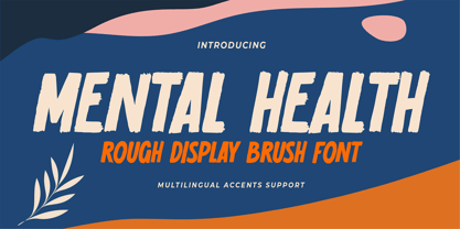 Hello Everyone, introduce our new product Font Mental Health is a Rough Display Brush Font.This is a Textured Natural Style and classy style with a clear style and dramatic movement. This font Mental Health is great for your next creative project such as logos, printed quotes, invitations, cards, product packaging, headers, Logotype, Letterhead, Poster, Design this font is great for your creative projects such as watermark on photography, and perfect for logos & branding, invitation,advertisements,product designs, stationery, wedding designs,label ,product packaging, special events or anything that need handwritting taste. You can activate 6 Alternates glyphs OpenType panel.
 - Sole Serif by CAST,
$45.00 Sole Serif is a newspaper face with features relating to book typography. Inspiration from Francesco Griffo’s romans was adapted to resist the rough usage typical of newspaper printing without any loss of quality. Sole Serif is available in an extensive range of cuts including extra bold and ultra thin. With its big x-height, short ascenders and a roundish and wide italic for text and titles, it has all the attributes of a newspaper face. Nonetheless, details like the inclined axis, calligraphic terminations, Renaissance proportions and a refined but slightly mannered design, all evoke the book rather than the daily paper.
 - Infield by BoxTube Labs,
$24.00 Infield is a modern and edgy athletic font family with four creative styles for added flexibility in your design workflow. It's perfect for sports logos, branding, posters, apparel design with its bold and confident appearance. The upper- and lowercase vintage characters of Infield Rough comes with different renders to add authenticity and a more natural look. Infield features a full Adobe Latin 1 character set, with support for most western languages including: Afrikaans, Basque, Breton, Catalan, Danish, Dutch, English, Finnish, French, Gaelic, German, Icelandic, Indonesian, Irish, Italian, Norwegian, Portuguese, Sami, Spanish, Swahili and Swedish. Infield Display is A-Z & 0-9 only.
 - Tarte Tatin by Hanoded,
$15.00 A Tarte Tatin is a French upside down apple pie. The story goes that one of the Tatin sisters (who ran Hôtel Tatin in Lamotte-Beuvron 169 km south of Paris), was baking a regular apple pie, but put the apples first and, realising her mistake, tried to rescue the dish by adding the pastry and sticking it in the oven. Tarte Tatin is a really nice all caps font. It was made with a Japanese brush pen on rough paper. Tarte Tatin comes with extensive language support and a set of alternates for the lower case letters.
 - Cherston by Larin Type Co,
$15.00 Cherston this is a beautiful font family that includes 10 styles. Display Sans with sharp corners, rounded and rough style, made in three weights, light, regular and bold. This family also includes handwritten script fonts, it fits perfectly with this family, you can use it as an additional or main one. In this font, all the letters are uppercase, you will find a variety of ligatures and alternates that will help you create a unique design for your project, try to change the ligatures and alternatives and you will see how many options you can choose.
 - Kono by Thinkdust,
$10.00 Kono is a font straight from the modern, gritty, warfare computer game genre. Rough and ready, with letters that double as numbers and look fit to be sprayed on a bunker wall, Kono brings you a bleak example of the near-future, where pragmatism rules out over artistry. Kono itself, ironically, is stylistically crafted to capture this feeling, carefully selecting the perfect mix between flat, straight lines and rounded corners, using wide, squat characters to mimic practical architectural styles. Kono is great for capturing a bleak but somewhat heroic attitude, whether you want to use that to encourage optimism or advertise pessimism.
 - Raqillas by Zamjump,
$13.00 Raqillas, its modern rough brush with original dry brush imperfections, and highly bouncy base line, is crafted to be simple and straightforward but unobtrusive, Ideal for logos, handwritten quotes, product packaging, headers, posters, apparel, merchandise, social media & greeting cards. Basic Latin A-Z and A-z Symbol Numerals PUA Encode Multilingual Support You need a program that supports OpenType features such as Adobe Illustrator CS, Adobe Indesign & CorelDraw X6-X7. There are additional ways to access alternatives, using the Character Map (Windows), Nexus Font (Windows), Font Book (Mac) or a software program such as PopChar (for Windows and Mac).
 - TyfoonScript by Fontforecast,
$20.00 TyfoonScript is the handwritten relative of TyfoonSans. With its slightly rough contours it has a lot of personality and good legibility when used in small sizes. It consists of 719 glyphs, has multiple language support and comes in 3 weights. Stylistic alternates, ligatures and contextual alternatives contribute to an authentic handwritten appearance. Fractions, old-style and tabular figures are also included. Suitable for blocks of text as well as quotes, remarks, statements or a personal friendly emphasis. TyfoonScript and TyfoonSans share the same metrics and blend together perfectly. They can be used in the same text frame without adjustments to leading or size.