2,162 search results
(0.017 seconds)
- Stubby Rough by Tipos Pereira,
$10.00 Stubby Rough is a display type family with 4 styles, inspired by the vernacular landscape. It was made for titles, headlines and also packages, posters and everything that provide space for a rude, fat and widish type. Nonetheless it can be a type for text if you are looking for an informal shape, with eleven styles mixing from a narrowed thin to a sloppy ultrabold. Stubby has a tight spacing looking to fit in squeeze places, trying to simulate some real spirit of the botecos from Brazil, always serving very cold beer in stubby brown bottles. Stubby Rough is a distressed version of the original Stubby.
 - BPtypewrite - 100% free

- Rouge by Dharma Type,
$14.99 This unique font has been designed and is based on lip rouge on windscreen. But it inspires a different feeling for different people; e.g. Organic, mathematical or ancient. Rising Star on April 2008.
 - Mom´sTypewriter - Unknown license

- Traveling _Typewriter - Unknown license

- Typewriter from hell - Unknown license

- Nexus Typewriter Pro by Martin Majoor,
$49.00 Nexus (2004) consists of three matching variants – a serif, a sans and a slab – which makes it a highly versatile typeface. Nexus started as an alternative to Seria, a typeface Majoor had designed some 5 years earlier. But soon the design developed into a new typeface, with numerous changes in proportions and in details and with a redrawn italic. Besides the three connected versions (Nexus Serif, Nexus Sans, Nexus Mix) Majoor designed a monospaced version called Nexus Typewriter. The Nexus family is a workhorse typeface system like Scala, with features such as small caps in all weights, four different sorts of numbers and an extensive set of ligatures. All fonts in the Nexus family come in regular, italic, bold and bold italic. Free bonus: there are more than 100 elegant Swash italics and dozens of arrows and other icons. The Nexus family was awarded the First Prize at the Creative Review Type Design Awards 2006.
 - Intellecta Typewriter 2 by Intellecta Design,
$24.90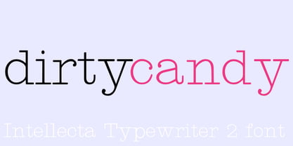
- Secret Service Typewriter by Red Rooster Collection,
$45.00Based on proofs of an early Remington typewriter font from the Keystone Type Foundry, circa 1905. - Erased Typewriter 2 by Intellecta Design,
$27.00 A distressed typewriter font design, great for mimicking the distressed and sloppy ink effect of older machines.
 - ITC American Typewriter by ITC,
$40.99 ITC American Typewriter was designed by Joel Kaden and Tony Stan. It is an ode to the invention that shaped reading habits and the idea of legibility, the typewriter. A compromise between the rigidity of its ancestor and the expectations of the digital age, ITC American Typewriter retains the typical typewriter alphabet forms, lending the font a hint of nostalgia. ITC American Typewriter™ font field guide including best practices, font pairings and alternatives.
 - Typewriter Sans JNL by Jeff Levine,
$29.00 At first glance, Typewriter Sans JNL seems to look like the pantograph lettering of an engraved sign or the rounded-end lettering from an architect's templates. It might also be mistaken for plastic pin-back lettering used on some bulletin boards. In actuality, the design is based on examples of an electric typewriter ball element with a sans font named "Dual Gothic", suggested for use "in credit reports and other financial applications".
 - Smith-Premier Typewriter by Intellecta Design,
$20.90 Smith-Premier Typewriter is a typewriter font design, great for mimicking the sloppy ink effect of older machines.
 - 1913 Typewriter Carbon by GLC,
$38.00 1913 Typewriter Carbon is the bold version of GLC foundry's 1913 Typewriter. It is available in two styles: Normal, and Underlined (Bold). It is a complete alphabetic font. It is used as variously as web-site titles, posters design or books editing. It may be preferable, if possible, when printing, to choose a pale color - dark grey instead of heavy black, for exemple - to give a good appearance, just like the real one, and still benefit from the full details. With inkjet printers, it may be used the economic or draft option with a good result too. The old typewriter characters size is 11 or 12 points, but this font supports easily enlargement.
 - One More Typewriter by Ana's Fonts,
$15.00 One More Typewriter font is a monospaced typewriter font in two styles: Regular and Italic, and two weights: Regular and Bold. This makes it versatile and ready to use in modern and vintage designs alike. This font is also very legible at a wide range of sizes and looks great in both long or short texts, in digital collages, branding and packaging, social media posts, logotypes, etc.
 - Lucida Sans Typewriter by Monotype,
$29.99Lucida Sans Typewriter adapts the humanized look of Lucida Sans to the fixed pitch of typewriter fonts, in which all letters have the same set width. The vertical proportions, strong stem weights, and crisp details of Lucida Sans are continued in the Lucida Sans Typewriter font family. The result is a strong, clear, fixed-pitch design that can be used wherever a functional, legible monospaced font is needed, in typewritten correspondence, memos, and telefaxes, in commercial forms, invoices, and packing lists, in programming and data processing applications, and in line printer emulations and terminal emulations. Lucida Sans Typewriter is economical in setting: at a 10 point size, it is equivalent to a 12 pitch typewriter font. For improved legibility in long lines of 80 characters or more, users can add extra line spacing, equivalent to 20% or more of the font size. When proportional fonts are needed for text to accompany Lucida Sans Typewriter, then Lucida Bright can be used. - Bitmap Typewriter JNL by Jeff Levine,
$29.00 Auto-scanning an example of a vintage typewriter font created the design which is now the digital typeface Bitmap Typewriter JNL, available in both regular and oblique versions.
 - Parma Typewriter Pro by No Bodoni,
$35.00 PARMA is a type-writer style face with the form and elegance of a Bodoni. Functional beauty was the aim of mating the two disparate ideas in one type, creating a utilitarian face with graceful features. We�re even converting the keys on our beloved old Olivetti portable to type in Parma Typowriter. And then we�re going to get a Lambretta scooter to go zipping around in and maybe one of those front opening Fiat cars for drives in the countryside. Hey, waiter! Where�s my order of Giambotti? And more Sangiovese for everyone!
 - Antique Typewriter JNL by Jeff Levine,
$29.00 “Victoria Underwood” was found within the pages of the 1923 American Type Founders specimen book. It was one of many printing fonts faithfully replicating those used on various makes and models of actual typewriters. The purpose of such type was to allow mass production of letters or notices that could appear personalized rather than shop printed. Antique Typewriter JNL is the digital version of this design, and is available in both regular and oblique versions.
 - Typewriter Olympia SM8 by Simeon out West,
$25.00 This font, based on old Olympia SM and SF typewriters from the 50’s and 60’s provides a nice clean, yet quirky look for your documents. Being a reproduction inspired by a typewriter, it works better at smaller sizes.
 - Grungy Old Typewriter by FontFuel,
$14.00 Grungy Old Typewriter is based on two typed letters, each on two pages and dated 1901. The results are eroded, rough, irregular and grungy. The final results are a vintage look. As a designer, I wanted as much flexibility as possible, so there are six versions that are designed to work together. Additionally, I decided to keep the grunge and irregularities within the shape and not include surrounding typewriter or paper marks. I leave it to the design to add those elements as desired. One note, the letter spacing is much tighter than an old typewriter. I felt that readability for modern readers suffered from the added space. Of course, you can get that same look by increasing the letter spacing in your favorite design program.
 - Victorian Typewriter JNL by Jeff Levine,
$29.00 The titles in various sections of an 1890 catalog for stencil manufacturing supplies were set in metal type that closely resembled the lettering found on a typewriter. These examples became the basis for Victorian Typewriter JNL, which is available in both regular and oblique versions.
 - Remington Elite Typewriter by Intellecta Design,
$24.90a digitization of Remington Elite model typewriter machine alphabet - LTC Remington Typewriter by Lanston Type Co.,
$39.95 Remington Typewriter, whose original designer is unknown, was one of the earliest Lanston Monotype designs. The italic was designed by Frederic Goudy in 1927. His approach was to make an unconventional typewriter form that looked well-spaced even though all letters shared the same width.
 - Garnet Euro Typewriter by Coniglio Type,
$19.95Garnet is a rare TT typewriter face, made digital from analog samples gathered with great care by Coniglio Type. A time and place; type and life. Garnet Euro Typewriter is the first new release by designer Joseph V Coniglio in over 5 years. It is contemporary designer type, made from the struck steel hammers of an art deco san serif face transferred from a mechanical 1926 Royal Portable typewriter. It has an obsessively complete commercial roman character set ––for the pre-opentype environment of the late 1990's. Yes, it has that great “Monopoly Game” question mark -- and all on a period-piece typewriter! You should have no trouble grafting that sorely needed Euro symbol.” –And he very well did! - Manual Typewriter JNL by Jeff Levine,
$29.00 Manual Typewriter JNL was modeled from an example of the 1933 design originally created by Morris Fuller Benton, and is available in both regular and oblique versions.
 - Iron Lake Rough by Alphabet Agency,
$15.00 Iron Lake Rough is a pioneer era inspired slab serif font. The font works great in western, rustic and outdoor related themes.
 - Posterizer KG Rough by Posterizer KG,
$30.00 Posterizer KG Rough is basically a hand-printed texture version of the Egyptian Slab Serif font Posterizer KG that already exists. Posterizer Kg Rough looks good on substrates with a rustic texture like wood, metal, textile, rough paper. It contains all the Latin and Cyrillic glyphs.
 - Melts Script Rough by Estudio Calderon,
$20.00 Melts Script Rough by Estudio Calderón is the textured version of Melts Script. It has a texture design in high definition that runs very good in any size and concepts. Good news! It includes a free version of “Melts Script Rough Sanscript One”. Specimen
 - Rough Fleurons Calligraphic by Intellecta Design,
$21.90 A dingbat collection of various border and flourish like elements drawn with a calligraphic touch.
 - Rough Stamp Times by TypoGraphicDesign,
$9.00 The typeface Rough Stamp Times is designed from 2016–2022 for the font foundry Typo Graphic Design by Manuel Viergutz. The display font based on the original rubber stamps from flea market. The font started from 50+ stamps (analog) and was finally digitalize and extended to 600+ glyphs (digital). 4 font-styles (Rough, Clean, Misprint, Impact) with 601 glyphs incl. decorative extras like icons, arrows, dingbats, emojis, symbols, geometric shapes (type the word #LOVE for ♥︎ or #SMILE for ☺ as OpenType-Feature dlig) and stylistic alternates (9 stylistic sets). For use in logos, magazines, posters, advertisement plus as webfont for decorative headlines. The font works best for display size. Have fun with this font & use the DEMO-FONT (with reduced glyph-set) FOR FREE! Font Specifications ■ Font Name: Rough Stamp Times ■ Font Styles: 4 (Rough, Clean, Misprint, Impact) + DEMO (with reduced glyph-set) ■ Font Category: Display for headline size ■ Font Format:.otf (Mac + Win, for Print) + .woff (for Web) ■ Glyph Set: 601 glyphs incl. extras like icons (decorative extras like arrows, dingbats, emojis, symbols) ■ Design Date: 2016–2022 ■ Type Designer: Manuel Viergutz
 - Neato Serif Rough by Adam Ladd,
$25.00 Neato Serif Rough is a hand drawn, quirky serif font with a textured, letterpress appearance. It features stylistic alternates, standard and discretionary ligatures, and swashes to add options and flair. The typeface has a unique blend of sophistication with its high contrast of thicks and thins and also playfulness with the distinct ball terminal characters—especially evident in the lowercase “e”. It is slightly condensed and great for display headlines, titles, packaging, branding, and more.
 - PTL Attack Rough by Primetype,
$65.00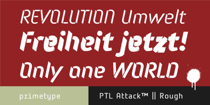
- Rough Print JNL by Jeff Levine,
$29.00 The Superior Marking Equipment Company was originally located in Chicago, Illinois and over the years produced a line of both commercial and toy rubber stamp printing sets which were used for making signs, posters, tickets and other printed items. Rough Print JNL reproduces the scanned images printed from one of the toy rubber stamp sets. The sample characters were smaller than one half inch in height and were further reduced during scanning. This gives the end result of a typeface which looks like rubber stamp imprints at small sizes, and very angular, distorted, somewhat grunge type when printed at larger sizes. There is a limited character set consisting of alphabet, numerals, some punctuation and currency symbols. No kerning was added to keep the hand-made appeal. Rough Print JNL is an all caps font with the letters and numbers jogged randomly on both the caps and lower case keystrokes. For a similar design with lower case, Amateur Printer JNL is recommended.
 - Cheddar Gothic Rough by Adam Ladd,
$25.00 Cheddar Gothic Rough is a hand-drawn, textured display all-caps typeface with condensed proportions. The uppercase characters add distinction with extended crossbars and chiseled terminals, while the lowercase provides a more classic sans serif appearance. Carefully drawn for quality and readability, but still rough enough to exhibit the handmade details. Cheddar Gothic Rough is great for display, branding, packaging, advertising, food, sports, titles, and more.
 - CA Rough Rider by Cape Arcona Type Foundry,
$29.00 Rough Rider is a handcrafted bold italic typeface. Intended as a rough display style typeface it’s perfect for illustrative titles, logotypes and small texts. Initially developed for a logo design, Rough Rider was expanded to a full Central European character set.
 - FF Elementa Rough by FontFont,
$47.99 Lithuanian type designer Mindaugas Strockis created this display FontFont in 2002. The family contains 2 weights: Regular and Bold and is ideally suited for advertising and packaging, film and tv as well as software and gaming. FF Elementa Rough provides advanced typographical support with features such as alternate characters, case-sensitive forms, and stylistic alternates. It comes with tabular lining figures. This FontFont is a member of the FF Elementa super family, which also includes FF Elementa.
 - Core Magic Rough by S-Core,
$20.00 Core Magic Rough is a textured version of Core Magic which is a layered type family consisting of seven 3D effect layers, eight 2D effect layers and one shadow effect layer. Uppercase and lowercase letters are separated by such features that counters are opened or closed. Core Magic provides other closed counter styles such as numbers with opentype feature (Stylistic Alternatives). Using Core Magic Rough with Core Circus Rough could make your works more charming and special with endless combinations (at least 262,551 kinds). This family is really nice for book titles, headlines, logotypes and any artworks.
 - FF Advert Rough by FontFont,
$49.99 Dutch type designer Just van Rossum created this display and sans FontFont in 1992. The family has 5 weights, ranging from One to Five and is ideally suited for advertising and packaging, film and tv, music and nightlife as well as poster and billboard projects. FF Advert Rough provides advanced typographical support with features such as ligatures, alternate characters, case-sensitive forms, fractions, super- and subscript characters, and stylistic alternates. It comes with a complete range of figure set options – oldstyle and lining figures, each in tabular and proportional widths. This FontFont is a member of the FF Advert super family, which also includes FF Advert.
 - Hockeynight Sans Rough by XTOPH,
$25.00 "Hockeynight Sans Rough" is the Letterpress version of my font "Hockeynight Sans". It's a contemporary college-sports font with the little twist – that its a misprinted grunge font. With its detailed grunge textures it is designed to go big and bold. "Hockeynight Sans Rough" is an uppercase font and it offers alternate glyphs as lowercases. Also you find a lot of bonus glyphs in the alternate glyphs panel! It pairs perfect with my other "Hockeynight" Fonts – Check it out!


