10,000 search results
(0.03 seconds)
- Coplette by Maulana Creative,
$15.00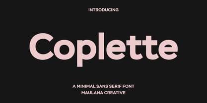 Coplette is a minimal semi geomtric shape sans serif font. With medium low contrast stroke, fun character with a bit of ligatures and alternates. To give you an extra creative work. Coplette font support multilingual more than 100+ language. This font is good for logo design, Social media, Movie Titles, Books Titles, a short text even a long text letter and good for your secondary text font with sans or serif. Make a stunning work with Coplette font.
 - MC Belotra by Maulana Creative,
$18.00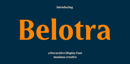 Belotra is a semi serif decorative display font. With medium low contrast stroke, fun character with a bit of ligatures and alternates. To give you an extra creative work. Belotra font support multilingual more than 100+ language. This font is good for logo design, Social media, Movie Titles, Books Titles, a short text even a long text letter and good for your secondary text font with script or serif. Make a stunning work with Belotra font. Cheers, Maulana Creative
 - MC Botes by Maulana Creative,
$17.00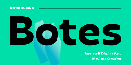 Botes is a modern semi-geo humanist sans serif font. With medium stroke, fun character with a bit of ligatures and alternates. To give you an extra creative work. Botes font support multilingual more than 100+ language. This font is good for logo design, Social media, Movie Titles, Books Titles, a short text even a long text letter and good for your secondary text font with script or serif. Make a stunning work with Botes font. Cheers, Maulana Creative
 - Okojo Pro by Wordshape,
$20.00 The Okojo Pro Complete family is a reworking of Wordshape’s immensely popular Okojo family of typefaces. It includes Okojo Pro, a semi-geometric sans serif, Okojo Slab Pro, a semi-geometric slab serif, Okojo Pro Display, a round-cornered sans serif variation, and Okojo Slab Pro Display, a round-cornered slab serif. The entire Okojo Pro family looks great at small or large sizes. The Okojo Pro family is designed for readability in long texts while simultaneously functioning as effective display type. Features of Okojo Pro Display: - all lowercase characters have an enlarged x-height, creating less optical dazzle than typefaces like Futura, Neutra or Avant Garde - more humanist numerals and punctuation for enhanced readability - complete Western, Central and Eastern European characters sets - radically improved spacing guaranteeing beautiful results in print and on screen for the Czech, English, Hungarian, Croatian, Esperanto, Maltese, Romanian, Turkish, Albanian, French, Portuguese, Spanish, Basque, Bulgarian, Finnish, Swedish, Norwegian languages The Okojo Pro Display family is influenced by the type designs of Paul Renner and Herb Lubalin, but smoothed over with more than a bit of Americana. Both work well on-screen as webfonts and in print as book type. Each is hinted with accuracy and kerned with precision.The lighter weights are slightly slimmer than the regular and bold weights to give the typeface more of a vertical feel, inviting readers' to rapidly read typeset text with a maximum of contrast and a minimum of optical distortion. Okojo: it’s a little bit country and a little bit rock’n’roll.
 - Hangbord DSG - Unknown license

- Kpop Vibes by Ronny Studio,
$19.00 Inspired by the emerging Korean culture that grabbing the worldwide actuation in so many realms of the industry. To bridge the vibes and to make it easier to consume, we found the gap to fill with simple things in life that are useful for it, and yes, it's a new day it's a new font. So without any further ado, please welcome Kpop Vibes. series of Korean vibes typefaces. It's a sans-serif font with bold and strong vibes to catch up with today's graphic design trends. 2 Font Style: - Regular - Italic Kpop Vibes Features: - Uppercase - Lowercase - Numbers & Punctuation - Alternate Style - Multilingual Support - Simple installation All features and special characters of this font are included in one file. So that it is easily accessible by using a program or software that supports opentype such as Adobe Illustrator, Adobe Photoshop, and Adobe Indesign). This font is also very easy to use as it is compatible for all supported software even for non-opentype. Please comment us if you have any questions Thank you and have a nice day. Thank You
 - Core Sans DS by S-Core,
$20.00 Core Sans DS is a rounded version of Core Sans D and a modern interpretation of condensed sans-serif typeface designed by S-Core and the whole family consists of 2 widths (Condensed, Normal), 7 weights (Thin, Light, Regular, Medium, Bold, Heavy, Black) with their corresponding italics. Core Sans DS features a condensed geometric construction and has a large x-height which enhances legibility. The family is ideal for signage, headline as well as body text. Core Sans DS is a part of the Core Sans Series such as Core Sans N SC, Core Sans N, Core Sans NR, Core Sans M, Core Sans G,Core Sans A, Core Sans GS and Core Sans ES. Letterform in this type family is simple, clean and highly readable. The spaces between individual letter forms are precisely adjusted to create the perfect typesetting. Core Sans DS supports complete Basic Latin, Cyrillic, Central European, Turkish, Baltic character sets. Each font includes proportional figures, tabular figures, numerators, denominators, superscript, scientific inferiors, subscript, fractions and case features.
 - Sutro by Parkinson,
$25.00 My affection for Slab Serifs began in the early 1960s in Kansas City with Rob Roy Kelly and his fabulous collection of wood type. In the 1970s tried to re-create a Nebiolo Egiziano for Roger Black. Again for Roger, in the 1980s I designed a Slab Serif logo for Newsweek Magazine. Finally, in 2003, designed the Sutro Family. There were things I didn't like about it, so when I did Version 2 for Open Type, I changed it around a little, making it a much nicer Sutro.
 - Relato by Emtype Foundry,
$69.00 Relato has a low contrast and “a muscular” structure that makes it useful for setting longer text. In display sizes it has a variety of details that lends it a unique and personal expression. The formal principle of the serif, the variety of terminal strokes and the combination of curves and semi-straight lines gives the Relato a more “human” flavor. The inspiration for the design comes from different traditional calligraphic styles. The upper case letter, for example, is based on roman capitals from the Rennaissance, whereas the lower case relates to humanist handwriting. Even so, Relato is a decidedly contemporary typeface, proposing individual ideas on the design of type. The italic has a distinct typographic color thanks to the construction principle of broken lines. The bold weights have an increased contrast in the union of the strokes which helps improve legibility in small sizes and reinforce their personality in display sizes. The family consists of a Regular version, Italic, Small caps, Semibold and Bold. For a sans serif version of Relato, please see Relato Sans.
 - Seriatim by David Thometz Design,
$24.95 As seen on Typophile.com, DTD Seriatim is a new and innovative take on the geometric sans-serif, with a wide variety of alternate characters and elegant ornaments to make it a highly versatile type for display or more discreet text use.
 - banister by One Fonty Day,
$15.00 Banister looks both contemporary and vintage. It contains a total of 12 styles including two main styles (Normal and Loaded), and for each style it comes with two widths (Semi-condensed and Semi-Expanded) and three weights (Light, Regular and Bold). The 40’s inspired style is subtle in banister, so it comes across more contemporary. Also, slightly curved strokes can be found on some letters, which gives a more organic feeling overall. To gain full advantage of banister, you can toggle “Fill” and “Stroke” on any editable applications to experiment the style, also layering normal and loaded styles let you discover something unexpected. Banister is versatile, simple and organic looking typeface, and good for headlines, logos, tiles and any large texts.
 - In a Jar by Latinotype,
$29.00 In a Jar is a display typeface based in hand lettering. Inspired by the grandmother's kitchen, its colors, forms, smells and the new way for rescue this old things. Designed for use in short text and big sizes is perfect for brand design, headlines, labels, greetings cards and all kind of things related to kitchen and foods. In a Jar is a sweet little family that include alternates, compounds words, ligatures plus a serie of dingbats and ornaments very cute to compliment and accentuate the handmade design. Try and enjoy all fun in a jar! Designed by Coto Mendoza with technical support of Luciano Vergara.
 - Bornholm Tejn Low by Trine Rask,
$25.00 Bornholm Tejn is named after a village »Tejn« on the only rocky island in Denmark »Bornholm« Bornholm Tejn Low is the lowercase variant of Bornholm Tejn, released in 2012, the first face in a series of rough stone cut typefaces, that shares proportions, but differs in any other aspect like different pieces of rock. It is a powerful face, but still very friendly. Good for very big sizes, but can be used for small texts, movie titles, cartoons … Bornholm Tejn Low has a large x-height which supports the heavy and black look of the typeface. It contains tabular and proportional old style and lining figures.
 - ClerestorySSK - Unknown license

- Berlin Sans by Font Bureau,
$40.00 Berlin Sans is based on a brilliant alphabet from the late ’20s, originally released by Bauer with the name Negro, the very first sans that Lucian Bernhard ever designed. Assisted by Matthew Butterick, David Berlow expanded this single font into a series of four weights, all complete with expert character sets, plus a dingbat font. Imaginative & little-known, it promises enticing opportunities to the adventurous typographer; FB 1994
 - Temporal by E-phemera,
$20.00Temporal is one in a series of fonts designed for use in creating replica vintage newspapers. It is inspired by the nameplates of major metropolitan newspapers from the 1920s. Its rough character is apparent at headline sizes, and it remains nicely legible at small sizes. In addition to a complete international character set, it contains east and west coast variations for some letters, along with extra ligatures traditional for blackletter typesetting. - Mexia NF by Nick's Fonts,
$10.00Another addition to the Whiz Bang Woodtype series, this typeface is a double-wide, extrabold version of the so-called Tuscan style of lettering, popular at the end of the nineteenth century. Named after a small town in Texas, which the locals pronounce "meh-HAY-a." Both versions of this font contain the Unicode 1252 Latin and Unicode 1250 Central European character sets, with localization for Romanian and Moldovan. - Hexagraph by Red One Graph,
$12.00 Thanks for checking out Hexagraph Font! This is my first font and type face in foundry world. Hexagraph inspired by geometrical form of hexagon shape, produces a series of letters that have a sci-fi - technological impression. This font is very unique in that it is entirely an extension of the hexagon shape. You can use this font for magazine cover, game support graphic elements, tech product advertisements, or whatever.
 - F2F HogRoach by Linotype,
$29.99The Techno sound of the 1990s, a personal computer, a font creation software and some inspiration had been the sources to the F2F (Face2Face) font series. Thomas Nagel and his friends had the demand to create new unusual faces that should be used in the leading german techno magazine Frontpage". Even typeset in 6 point to nearly unreadability it was a pleasure for the kids to read and decrypt the messages." - Last Episode by Hanoded,
$16.00 I was watching a nice series the other day, which I quite enjoyed, but then I realised that the episode I was watching was in fact the last one. That kinda upset me, as I was just getting into the story. Last Episode is a handmade, all caps font - great for titling, book covers and posters. It comes with a set of alternates and some really interesting discretional ligatures.
 - Bolton Commercial by Greater Albion Typefounders,
$14.00 Bolton Commercial revives and updates one of Greater Albion's designer's earliest typeface families, Bolton, which was recently used on the credits of a popular UK television series. The family consists of five faces- Regular and Obliqued, Blocked, Embossed and Engraved. All have a late Victorian/Edwardian feel and are ideal for posters, signage, Book covers...and of course television credits! Bolton Commercial combines the virtues of flair, fun and legibility.
 - F2F Screen Scream by Linotype,
$29.99Heavy techno music, a personal computer, a font creation program and some inspiration had been the sources to the Face 2 Face font series. Thomas Nagel and his friends had the demand to create new unusual faces that should be used in the leading german techno magazine Frontpage". Even typeset in 6 point to nearly unreadability it was a pleasure for the kids to read and decrypt the messages." - Bornholm Sandvig by Trine Rask,
$25.00 Bornholm Sandvig is named after the village, "Sandvig", on the only rocky island in Denmark, Bornholm. It is the second face in a series of rough stone cut typefaces, that shares proportions, but differs in any other aspect like different pieces of rock. It is a powerful face, but still very friendly. Good for very big sizes, but can be used for small texts, movie titles, cartoons, etc.
 - Ozymandias NF by Nick's Fonts,
$10.00One in the series of fonts called Whiz-Bang Wood Type, intended to be set large and tight. Suitable for any occasion, Ozymandias is a caps and small caps font, available in solid and outline versions. The name is taken from a poem by Shelley. Both versions of this font contain the Unicode 1252 (Latin) and Unicode 1250 (Central European) character sets, with localization for Romanian and Moldovan. - Fireside Chat NF by Nick's Fonts,
$10.00This unusual display face is another in a series of works based on the work of lettering artist Samuel Welo. The sinewy curves and radiant inline decoration give this typeface a cozy, warm and inviting charm. Named after the informal radio addresses popularized by Franklin Delano Roosevelt in the 1930s. Both versions of this font include the complete Latin 1252 and CE 1250 character sets, with localization for Romanian and Moldovan. - Garstang Engraved by Greater Albion Typefounders,
$18.00 Garstang Engraved is the latest in Greater Albion's series of ‘wood type’ inspired fonts. Garstang Engraved is a hand-cut Roman, suggesting the late Victorian era, but the type of thing that continued in use well into the twentieth century. If you want a title face that has versatility and suggests a past history, as well as the art of finely cut wood type, then this is it!
 - Outer Loop NF by Nick's Fonts,
$10.00Here’s the follow-up to my Route 66 series, patterned after the typeface used on signage on the U.S. interstate highway system for fifty years. The numbers and uppercase letters are true to the original, while a number of the lowercase letters show the influence of the new Clearview type. Both versions of the font include 1252 Latin and 1250 CE (with localization for Romanian and Moldovan) character sets. - Famosa Core Edition by TypeThis!Studio,
$50.00 Modern aesthetic meets classy handmade elegance. Famosa is designed for all your stylish fashion magazines, clothing brands, and logos as well as your elegant blogger themes. The highlights are for sure the beautiful ligatures, such as sh, ct, fb and more. If you need more features like small caps, special symbols, extensive language support like Vietnamese, please visit: https://typethis.studio -- Famosa is well known from Netlix' Series 'Sweet Magnolias'
 - Pravoslavnie by Simeon out West,
$25.00 This is the first of several Eastern fonts I have created and is the prize of the collection. The Pravoslavnie font is highly decorative, with a more complicated letter ‘a’ and a series of flourishes substituting for punctuation. Like its sister font, Pravoslavnie 3 is highly decorative. It differs from the first version of this font, as it has a less decorative ‘a,’ full punctuation marks, and less ornate number forms.
 - Vonnes by Font Bureau,
$40.00 Vonnes was designed by David Berlow working closely with Neville Brody on corporate redesign for Jim Von Ehre at Macromedia. Core weights are loosely based on Bauer’s Venus, 1907–1910. Berlow expanded the ideas behind the series to 56 fonts, the heart of the redesign. The Macromedia program was hailed as one of the most successful models of modern total design for innovative cutting edge companies; FB 2007
 - Horizon by Bitstream,
$29.99Horizon was inspired by the style of the lettering used in the original Star Trek TV series. Quite fittingly, this font was used 21 years later in the film Star Trek: Into Darkness. In keeping with the digital experimentation of the 90s, Horizon has a space-age look—with sharp, unexpected angles that were achieved sharply with digital tools. It was designed in 1992 by Bitstream staff designers. - F2F ZakkGlobe by Linotype,
$29.99The Techno sound of the 1990s, a personal computer, a font creation software and some inspiration had been the sources to the F2F (Face2Face) font series. Thomas Nagel and his friends had the demand to create new unusual faces that should be used in the leading german techno magazine Frontpage". Even typeset in 6 point to nearly unreadability it was a pleasure for the kids to read and decrypt the messages." - Eckhardt Poster Board JNL by Jeff Levine,
$29.00 Eckhardt Poster Board JNL further continues Jeff Levine's series of sign painter-oriented fonts, named in honor of his good friend Albert Eckhardt, Jr. (who ran Allied signs in Miami, Florida from 1959 until his passing). The typeface is a casual brush style, modeled from an image of a do-it-yourself sign making kit comprised of stencils, paint and brush spotted for sale through an online auction.
 - Polyline by Mårten Nettelbladt,
$- Polyline is based on a small 3x5 grid giving it a rather crude and technical look, further emphasized by the monospacing. ‘Polyline’ is a command often found in CAD-software that is used to create a series of connected lines. The typeface can also be installed as an AutoCAD .shx font, included in the download along with the .shp source file and the stroke shapes for all characters as .pdf
 - Belizio by Font Bureau,
$40.00 The eight-part Belizio series updates the first Font Bureau typeface. David Berlow’s family is based on Aldo Novarese’s Egizio, designed in 1955 for Nebiolo. It was first prompted by the popularity of Haas Clarendon, designed by Hoffmann and Eidenbenz, an impeccably Swiss revival of the traditional English letterform. Aldo Novarese was among the first to investigate a true italic designed in the Clarendon style; FB 1987–98
 - Dans Le Toilette by Latinotype,
$25.00 Dans le toilette is a fun dingbat inspired by things that happen fast in the bathroom every morning. You can use them on posters, covers, patterns, brands and all kind of image with a vintage touch. Dans le toilette is part of the dingbats series designed by Coto Mendoza including Dans le cuisine, Dans le jardin and Dans le Noël. Make your day with a fun morning Dans le toilette!
 - F2F Pixmix by Linotype,
$29.99The Techno sound of the 1990s, a personal computer, a font creation software and some inspiration had been the sources to the F2F (Face2Face) font series. Thomas Nagel and his friends had the demand to create new unusual faces that should be used in the leading german techno magazine Frontpage". Even typeset in 6 point to nearly unreadability it was a pleasure for the kids to read and decrypt the messages." - Bornholm Tejn by Trine Rask,
$25.00 Bornholm Tejn is named after the Tejn village on the only rocky island in Denmark, Bornholm. It is the first face in a series of rough stone cut typefaces, that shares proportions, but differs in any other aspect like different pieces of rock. It is powerful face, but still very friendly. Good for very big sizes, but can be used for small texts, movie titles, cartoons and more.
 - Sincerely Yourz by Outside the Line,
$19.00 Sincerely Yourz is another font in the Love Letters series from Outside the Line. It is a hand-printed font with extra letter spacing. All the letters have about the same height. All vowels are lower case whether they are caps or not. This font has a fresh contemporary hand-lettered look. While it can be used as a headline font it is really designed for body copy.
 - Wigwam NF by Nick's Fonts,
$10.00One in the series of fonts celebrating the Halcyon Days of Handlettering. Wigwam evokes, among other things, memories of summer camps and trailer parks of a bygone day. Based on a font presented in the 1933 book Lettering of Today by W. Ben and Ed C. Hunt. Both versions of this font contain the Unicode 1252 (Latin) and Unicode 1250 (Central European) character sets, with localization for Romanian and Moldovan.

