10,000 search results
(0.081 seconds)
- Galactic by BA Graphics,
$45.00A heavy bold serif face, packs great punch; excellent headline font. Can be used for many different applications. - Hercílio by Sea Types,
$25.00 Hercílio is a typographic family without condensed serif, modern and geometric inspired by the architectural forms of the Hercílio Luz Bridge in Florianopolis | Brazi Comprising eleven (11), weights of which ten (10) business are: Five weights Romans: Light, Normal, Regular, Medium and Bold Five Italics weights: Light, Normal, Regular, Medium and Bold And a weight (FREE) Hercílio Decorative Comprising 430 glyphs in each source, brings support for 56 languages (Latin and West, Central and East European) still has features Open Type, ligatures and tabular figures. http://www.cort9.com/wp-content/uploads/2016/05/Specimen_Hercilio.pdf
 - Decize by Eurotypo,
$36.00 Decize font is a classic “Didona”, characterized by extreme contrast in thick strokes and thin strokes, by the use of very short serifs, and by the vertical stress of the letters. This version, designed by Carine de Wandeleer, is slightly condensed and is also enriched by a full set of OpenType features of tails, ligatures, alternates and swashes. Decize Italica is a true "italic" This font was designed and carefully drawn to combine with Decize Regular, it has 652 glyphs and the same OpenType features than the regular version.
 - David Hadash Script by Monotype,
$50.99Monotype Imaging is pleased to present David Hadash (New" David), the full family of typefaces by Ismar David, in its intended authentic form. The Estate of Ismar David has sought to revive this jewel of Twentieth-Century design by granting an exclusive license to Monotype Imaging to implement it in industry-standard format. Never before has the typeface in its full set of sub-styles been made available to the design community. David Hadash consists of three style families, Formal, Script, and Sans. Each of these appears in three weigths: regular, medium, and bold. Originally devised as a companion to the upright Formal style, the Script style has a beauty and grace all its own that allows it to be used for full-page settings also. While it is forward-leaning and dynamic, it does not match any of the existing cursive styles of Hebrew script. Ismar David created an eminently readable hybrid style which is like no other by inclining the forms of the upright while blending in some features of Rashi style softened with gentle curves. One can say that the Script style is the first truly italic, not just oblique, typeface for Hebrew script. Although the proportions of the Sans style are very similar to those of the Formal style, its visual impression is stunningly different. If the Formal style is believably written with a broad-point pen, the Sans is chiseled in stone. Rounded angles turn angular and stark. The end result is an informal style that evokes both ancient and contemporary impressions. David Hadash (Modern) supports the writing conventions of Modern Hebrew (including fully vocalized text) in addition to Yiddish and Ladino. David Hadash Biblical is a version of the Formal style that supports all the complexities of Biblical Hebrew, including vocalization and cantillation marks. " - David Hadash Biblical by Monotype,
$50.99Monotype Imaging is pleased to present David Hadash (New" David), the full family of typefaces by Ismar David, in its intended authentic form. The Estate of Ismar David has sought to revive this jewel of Twentieth-Century design by granting an exclusive license to Monotype Imaging to implement it in industry-standard format. Never before has the typeface in its full set of sub-styles been made available to the design community. David Hadash consists of three style families, Formal, Script, and Sans. Each of these appears in three weigths: regular, medium, and bold. Originally devised as a companion to the upright Formal style, the Script style has a beauty and grace all its own that allows it to be used for full-page settings also. While it is forward-leaning and dynamic, it does not match any of the existing cursive styles of Hebrew script. Ismar David created an eminently readable hybrid style which is like no other by inclining the forms of the upright while blending in some features of Rashi style softened with gentle curves. One can say that the Script style is the first truly italic, not just oblique, typeface for Hebrew script. Although the proportions of the Sans style are very similar to those of the Formal style, its visual impression is stunningly different. If the Formal style is believably written with a broad-point pen, the Sans is chiseled in stone. Rounded angles turn angular and stark. The end result is an informal style that evokes both ancient and contemporary impressions. David Hadash (Modern) supports the writing conventions of Modern Hebrew (including fully vocalized text) in addition to Yiddish and Ladino. David Hadash Biblical is a version of the Formal style that supports all the complexities of Biblical Hebrew, including vocalization and cantillation marks. " - David Hadash Formal by Monotype,
$50.99Monotype Imaging is pleased to present David Hadash (New" David), the full family of typefaces by Ismar David, in its intended authentic form. The Estate of Ismar David has sought to revive this jewel of Twentieth-Century design by granting an exclusive license to Monotype Imaging to implement it in industry-standard format. Never before has the typeface in its full set of sub-styles been made available to the design community. David Hadash consists of three style families, Formal, Script, and Sans. Each of these appears in three weigths: regular, medium, and bold. Originally devised as a companion to the upright Formal style, the Script style has a beauty and grace all its own that allows it to be used for full-page settings also. While it is forward-leaning and dynamic, it does not match any of the existing cursive styles of Hebrew script. Ismar David created an eminently readable hybrid style which is like no other by inclining the forms of the upright while blending in some features of Rashi style softened with gentle curves. One can say that the Script style is the first truly italic, not just oblique, typeface for Hebrew script. Although the proportions of the Sans style are very similar to those of the Formal style, its visual impression is stunningly different. If the Formal style is believably written with a broad-point pen, the Sans is chiseled in stone. Rounded angles turn angular and stark. The end result is an informal style that evokes both ancient and contemporary impressions. David Hadash (Modern) supports the writing conventions of Modern Hebrew (including fully vocalized text) in addition to Yiddish and Ladino. David Hadash Biblical is a version of the Formal style that supports all the complexities of Biblical Hebrew, including vocalization and cantillation marks. " - Retro Blanche by Pista Mova,
$9.00 Blanche is a hand-drawn, retro script font. This font is perfect for all your fun designs! Use Blanche to create logos, branding, stickers, shirts, signs, posters, quotes, instagram posts, procreation designs and more! Includes shadow/extrude versions that are perfectly sized to fit Blanche Regular - so you can layer both fonts easily! Blanche Regular Blanche Extrude Thank You!
 - 1726 Real Española by GLC,
$42.00 This family was inspired from the set of fontfaces used by Francisco Del Hierro, to print in 1726 the first Spanish language Dictionary from the Spanish Royal Academy (Real Academia Española, Diccionario de Autoridades). These two Transitional styles are said to have been the first set of official typeface in Spain, like the French “Reale” (take a look at our "[/fonts/glc/1790-royal-printing/ 1790 Royale Printing)". In our two styles (Regular & Italic), fontfaces, kernings and spaces are as closely as possible the same as in the original. This Pro font is covering Western, Eastern and Central European, Baltic and Turkish languages, with standard and “s long” ligatures and twin letters in each of the two styles and a few Italic swashes inspired from the font used in 1746 by the same printer for another edition from the Royal Academy.
 - Great Monday by Designova,
$23.00 Great Monday is unique, fresh and beautiful handwritten font for branding / logo design / logotypes / greeting cards / promotional graphics and anything in between. Great Monday is completely handmade with passion, perfection as well as aesthetics at it's level best. Unique Ligatures We have created 14 unique ligatures to make sure the font looks beautiful and professional. Extended Character Sets Along with the basic Latin character set, we have added Western European, Central European, South Eastern European character sets for your convenience. The font contains a total of 336 glyphs. Advanced Kerning We have performed advanced, in-depth kerning for all possible letter combinations. What You Get This font being a handmade typeface, comes with only single weight (Regular). CREDITS: Font designed by Lis at Fontastica, produced by Fontastica, distributed by Designova. Created with ProCreate and Fontself on iPad Pro.
 - Filson Soft by Mostardesign,
$25.00 Filson Soft is the rounded version of the popular Filson Pro . At first sight, the main feature of Filson Soft are the distinctive letters ‘K’, ‘Q’ and especially ‘R’ that make the font family very elegant. With its rounded terminaisons, this font family is also perfect for original titles and will give you future creations a nicely friendly aspect. But with all these originals features, Filson Soft is highly legible and quite versatile. Its large x-height, even performs nicely in small sizes. Filson Soft comes in 8 weights - Thin, Light, Book, Regular, Medium, Bold, Black, Heavy with a professional range of Opentype functions such as lining and oldstyle figures, stylistic alternates, case sensitive forms, localized forms, stylistic set, arrows and f-ligatures. For better typographic control, Filson Soft also includes an OpenType class kerning with thousands of kerning pairs.
 - Wishes Script by Typesenses,
$32.00 Plenty of swashes, ligatures, beginning and ending shapes, Wishes is a wit option for invitations, cards, stationery, fashion and apparel, among a wide range of uses. The curves of the cursive style are neither too solemn or pompous, its grace and playfulness are more 1950s than 1750s. This family offers the designer an additional decorative toolkit full of frames, ribbons, hearts, flowers and ornaments, plus a collection of caps and small caps. Wishes Script Pro includes the complete set of Script characters plus Ornaments and Caps. The family offers optically optimized Display and Text styles for each of the weights: Light, Regular and Bold. Use professional software that widely support Open Type features. Otherwise, you may not have access to some glyphs. For further information about features and alternates, see the User Guide Use Wishes to express your greetings!
 - Type Ultimate by VP Creative Shop,
$39.00 Type Ultimate is an exquisite serif font that combines elegance and sophistication. It comes in regular and italic versions, each containing a stunning collection of 383 ligature glyphs and alternate glyphs, as well as 26 swashes for both regular and italic versions. With its extensive character set, Type Ultimate supports a wide range of languages, making it a versatile choice for various projects. This font is perfect for creating a memorable logo, establishing a strong brand identity, and making headlines that stand out. Its timeless and refined design also makes it an excellent choice for elegant wedding invitations and other formal occasions. Overall, Type Ultimate is a font that exudes beauty and refinement, adding a touch of sophistication to any project it's used in. Language Support : Afrikaans, Albanian, Asu, Basque, Bemba, Bena, Breton, Chiga, Colognian, Cornish, Czech, Danish, Dutch, Embu, English, Estonian, Faroese, Filipino, Finnish, French, Friulian, Galician, Ganda, German, Gusi,i Hungarian, Indonesian, Irish, Italian, Jola-Fonyi, Kabuverdianu, Kalenjin, Kamba, Kikuyu, Kinyarwanda, Latvian, Lithuanian, Lower Sorbian, Luo, Luxembourgish, Luyia, Machame, Makhuwa-Meetto, Makonde, Malagasy, Maltese, Manx, Meru, Morisyen, North Ndebele, Norwegian, Bokmål, Norwegian, Nynorsk, Nyankole, Oromo, Polish, Portuguese, Quechua, Romanian, Romansh, Rombo, Rundi, Rwa, Samburu, Sango, Sangu, Scottish, Gaelic, Sena, Shambala, Shona, Slovak, Soga, Somali, Spanish, Swahili, Swedish, Swiss, German, Taita, Teso, Turkish, Upper, Sorbian, Uzbek (Latin), Volapük, Vunjo, Walser, Welsh, Western Frisian, Zulu Ligatures Uppercase - AB,AC,AD,AG,AK,AL,AM,AN,AP,AR,AS,AT,AV,AY,BE,BL,BO,BU,CE,CH,CK,CO,CT,DE,DI,DO,EA,ED, EE,EF,EI,EL,EM,EN,EP,ER,ES,ET,EV,EX,EY,FA,FE,FF,FI,FO,FR,FT,FU,GA,GE,GH,GO,GR,HA,HE,HI, HO,HT,KE,KI,KN,LA,LD,LE,LF,LI,LL,LO,MA,ME,MI,MM,MO,MP,MU,NA,NC,ND,NE,NG,NK,NO,NS,NT, NY,OA,OD,OK,OL,OM,ON,OO,OP,OR,OS,OT,OU,OW,PA,PE,PL,PO,PP,PR,RA,RD,RE,RI,RO,RR,RS,RT, RY,SA,SE,SH,SO,ST,SU,TA,TE,TH,TI,TL,TO,TR,TS,TT,TU,UG,UL,UN,UR,US,UT,VE,VI,WE,WH,WI,WO,YO, YS,MEN,WER,FRO,RON,ROM,THE,AND,ING,HER,HAT,HIS,THA,ERE,FOR,ENT,ION,TER,WAS,YOU,ITH, VER,ALL,THI,TIO,OUL,ULD,IGH,GHT,AVE,HAV,ICH,HIC,HIN,HEY,ATI,EVE,HING,WERE,FROM,THAT,THER, TION,OULD,IGHT,HAVE,THIS,THIN,THEY, ATIO,EVER,MENT Lowercase - ab,ad,ag,ai,ak,al,am,an,ap,as,at,av,ay,ba,be,bl,bo,bu,ca,ce,ch,ck,co,ct,de,di,do,ea,ec,ed,ee,ef,eg,ei,ej,el,en,ep,es,et,ev,ew,ey,fa,fe,fi,fo,fr,fu,ga,ge,gh,gi,gr,ha,he,hi,ho,ht,ic,id,ie,ik,il,im,in,io,ir,is,it,iv,ke,ki,kn,la,ld,le,lf,li,lo,ly,ma,me,mi,na,nc,nd,ne,ng,ni,nk,nl,no,nt,ny,oa,oc,od,of,oi,ok,ol,om,on,oo,op,ot,ou,ov, ow,pa,pe,pi,pl,po,pp,qu,ra,rd,re,ri,rm,rn,ro,rr,rs,rt,ru,ry,sa,se,sh,si,so,sp,ss,st,su,ta,te,th,ti,tl,to,ts,tt, tu,uc,ug,um,un,up,ur,us,ut,va,ve,wa,we,wo,xp,ye,yo,ys,men,wer,fro,rom,ron,the,and,ing,her,hat,tha, ere,for,ent,ion,ter,you,ver,thi,ght,ave,hey How to access alternate glyphs? To access alternate glyphs in Adobe InDesign or Illustrator, choose Window Type & Tables Glyphs In Photoshop, choose Window Glyphs. In the panel that opens, click the Show menu and choose Alternates for Selection. Double-click an alternate's thumbnail to swap them out. Mock ups and backgrounds used are not included. Thank you! Enjoy!
 - FarHat-Acordes - Unknown license

- FarHat-Acordes b y # - Unknown license

- Gersy by Maulana Creative,
$13.00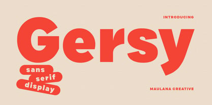 Gersy is a fancy sans serif display font. With bold stroke, fun character. To give you an extra creative work. Gersy font support multilingual more than 100+ language. This font is good for logo design, Social media, Movie Titles, Books Titles, a short text even a long text letter and good for your secondary text font with script or serif. Make a stunning work with Gersy font. Cheers, Maulana Creative
 - Bladis Night by Scoothtype,
$10.00 Bladis Night is a font duo between a serif and modern script fonts. Bladis Night is good for logo branding, wedding invitation, typography wedding, quotes text, magazine, or anything you want to do. Bladis Sans Serif includes numbers punctuation, alternates, and it also supports other languages. Bladis Night was built with OpenType features and includes ligatures, beginning and ending swashes , numbers, punctuation, and it also supports other languages. Thank you!
 - Madame by Linotype,
$40.99 The font, Madame, first appeared in a sample with similar fonts, presented by the Fonderie Typographique Française in the 19th century. The font consists of three cuts, letters, accents and numericals. The flamboyant Madame is meant for titles and headlines, emphasis in text or as initials. It combines well with both serif and sans serif fonts, but should be used sparsely to maximize the advantages of its ornate forms.
 - Indus by Linotype,
$29.99Linotype Indus is part of the Take Type Library, which features winners of Linotype’s International Digital Type Design Contest from 1994 to 1997. Designed by P.H. Hashin from India, Indus finds its historical roots in inscriptions found on ancient Indian graves. Thus Indus has a unique look and is versatile in point sizes from middle to headline. The font combines well with sans serif and slab serif typefaces. - Herzchen by Font-o-Rama,
$25.00Herzchen is a well developed sans serif font. The curving and swinging letter forms remind a little of serif fonts, on closer inspection, however, they rather remind of upright italics. Playful details give charm to the typeface and make Herzchen lively and distinctive. With four cuts the typeface is suitable for simple corporate and editorial design projects. In addition there are many ligatures in the expert-set for individual use. - Cruz Cantera BT by Bitstream,
$50.99 Cruz Cantera is a crisp and stylish yet informal sans serif typeface created by NYC type designer Ray Cruz. It is a slightly condensed design. The vertical strokes have rounded terminals, and there are some characters with serifs. Notable characters include the upper and lowercase E. There are three weights and each works equally well alone, or together for both display and text. Original design by Ramon Cruz completed in 2002.
 - Rosengarten by Typogama,
$19.00 Rosengarten is a condensed, bold typeface inspired by the work of Lucien Bernhard and the Plakatstil mouvement. With bold, rounded serifs, this typeface was created for use in headlines and larger point sizes. A complimentary sans serif style was integrated as a secondary weight with accompanying italics to allow a combination of styles to be set in layouts. This typeface includes an extended Latin and Cyrillic language support.
 - Tipo Movin CDMX by Ixipcalli,
$- La versión propuesta por la SEMOVI (Secretaria de Movilidad) es un estilo más angosto y ortográfico, creadó con la finalidad de aligerar las aplicaciones tipográficas del sistema. Se emplea oficialmente en todas las aplicaciones del sistema de Movilidad Integrada de la Ciudad de México. El creador de la tipografía es Lance Wyman. En esta edición, los tipos minúsculas son una adaptación “no oficial” para el Tipo Movin CDMX, enriqueciendo la tipografía a un estilo visual de altas y bajas, por lo que se prescinde del diseño base como trabajo propio para enfatizar los tipos minúsculas exclusivamente, además de que se han añadido algunos caracteres de acentuación extendiendo su uso a otros lenguajes. Los tipos son una nueva propuesta por Ixipcalli en el presente año 2023. The version proposed by SEMOVI (Secretary of Mobility) is a narrower and more orthographic style, created with the purpose of lightening the typographic applications of the system. It is officially used in all the applications of the Integrated Mobility system of Mexico City. The creator of the typeface is Lance Wyman. In this edition, the lowercase types are an “unofficial” adaptation for the Tipo Movin CDMX, enriching the typography to a visual style of highs and lows, so the base design is dispensed with as my own work to emphasize the lowercase types exclusively, In addition, some accentuation characters have been added, extending their use to other languages. The types are a new proposal by Ixipcalli in the current year 2023.
 - Taler by Serebryakov,
$40.00 Taler is a serif typeface is represented by seven weights. It was conceived as a continuation of the sans-serif Nekst. In the process of design it became clear that it is a completely different typeface. The rectangular, slightly elongated serifs, the plastic stiffness, and the combination of different styles make Taler a true representative of contemporary. It's old-fashioned and modern, it's for a display titles and for plain text, it's rough and elegant — it's all present in design at the same time. The duality of it nature is it peculiarity.
 - Mattire by Ahmad Jamaludin,
$15.00 I'm present to you for new serif, Mattire! Mattire is a stylish font that is both classic and minimal. A bold, high contrast font that is perfect for header magazine, web, feminine logo marks & editorial design. It's a mix between a classic serif and a futuristic sans serif. Mattire fits perfectly into those modern moodboards. It come with a unique lower and uppercase plus numbers, punctuation & multilingual letters. Features : OTF Letters, numbers, punctuation, multilingual support, accent Ligature If there is a problem feel free to message or contact at : dharmasahestya@gmail.com Thank you and enjoy!
 - Rincon by Rachel Kick,
$14.00 Rincon is a serif font with 201 glyphs including ligatures and alternatives. It was designed by Rachel Kick in Los Angeles, California. Inspired by beautiful serif while maintaining a friendly and approachable feel, Rincon is perfect for branding, display, or marketing. Rincon has the ability to hold it's own as a single word headline, or in a paragraph form. It also works well with simple sans serif or script font compliments. The ligatures increase its legibility and adjust each character to work perfectly with the character next to it.
 - Arthur Cabinet by SIAS,
$49.90 The Arthur Cabinet font family offers a most particular range of seven fancy ornamental fonts in the spirit of the Art Deco era. These fonts celebrate the age of elegance, stylishness and refinement to its very best. They give you a unique tool for exquisite designs. The fonts of this family are derivatives from the Arthur Sans series, which you may also want to have a look at. Use this unique typefaces for distinctive personal stationary, outstanding headlines, captivating brochures and invitations; for marvellous logotypes, wonderful menus, hotel leaflets, exciting ads … for brillant designs. Each Arthur Cabinet font features the same comprehensive Euro-Latin encoding for full language support. Additionally, every font includes a small supplementary set of fine ornaments. – For an even more comprehensive range of Arthur embellishments check out the font Arthur Sans Regular or Arthur Ornaments! Have also a look at the sister fonts of the gorgeous Arthur Sans Family, which will offer you yet another wonderful scope of fascinating typographic possibilities. ________________________________________________________________________________ Tip: Set Sample text (see below) manually to [ABCDE…] to view effectively the fonts most relevant parts! ________________________________________________________________________________
 - TV Western JNL by Jeff Levine,
$29.00 In the 1889 Franklin Type Foundry specimen book is a type face called “Armenian”. With lighter weight horizontal slab serifs than more traditional Western fonts, it could be pictured as being used as copy on wanted posters or town notices. This is now available as TV Western JNL in both regular and oblique versions.
 - Nouveau Thin JNL by Jeff Levine,
$29.00 A condensed, light face spurred serif alphabet was shown on an antique catalog page from Spon & Chamberlain Publishers as “French”. The catalog likely sold tools and dies to stonecutters for making inscriptions in marble, granite and so forth. This elegant design is available digitally as Nouveau Thin JNL in both regular and oblique versions.
 - Marchellia by Namara Creative Studio,
$9.00 Marchellia is modern serif font with luxurious style. Come with 4 variant to choose, Regular, Italic, Outline and Rounded. It’s perfect for headlines, logos, quotes, packaging, magazine covers, editorial design, and many project with suitable purpose to making art/design project look pretty and trendy. Features : Alternates, Ligatures and Multilingual Support. Elegant and Luxurious Style.
 - Nouveau Meadow JNL by Jeff Levine,
$29.00 A poster for the publication “The Quartier Latin – A Magazine Devoted to the Arts” featured the magazine’s name in a light Art Nouveau serif style. The Quartier Latin was published between 1896 and 1899 by the American Art Association of Paris. This is now available as Nouveau Meadow JNL in both regular and oblique versions.
 - Agraham by Hishand Studio,
$15.00 Agraham is aesthetic serif font which the inspiration come from the unique Italy's vibes and some little touch from the beauty of Paris, France. It is so perfect for Logo brand, product packaging, advertisement, social media post, fashion brand, magazine headers and many more complete with ligatures alternates regular italic icon kerning multilingual support
 - Dining Out JNL by Jeff Levine,
$29.00 A 1940s ad flier for the Los Angeles restaurant “Lucca Paris Inn” had its name hand lettered at the top of the page in a condensed Art Deco slab serif with some stylized characters. Given a more uniform look, the end result became Dining Out JNL and is available in both regular and oblique versions.
 - Farm to Market by Brittney Murphy Design,
$8.00 Farm to Market is a rustic all caps serif font family from Brittney Murphy Design. Featuring a Regular, Bold, and Fancy version with 435+ glyphs in each. The Farm to Market Font Family supports most Latin based languages and has several ligatures and alternates. Great for crafts or decor with a country farmhouse feel! :)
 - Nostalgia Collective by RagamKata,
$14.00 Nostalgia Collective is a vintage serif font. With many alternate features for each letter, Nostalgia Collective provides flexibility and variety in the appearance of the text. Each letter has a unique alternative, adding a creative and eye-catching touch to your designs. Features : - Regular, Italic - Ligatures & Alternates - Letters, numbers, symbols, and punctuation - Multilingual Support
 - Monthelo by Blankids,
$20.00 Monthelo font under inspiration of vintage bar signage, hotel signage, barbershop signage ect. Montelo has a classic impression but still elegant suitable for modern and classic designs project. Montelo include 3 variation style is regular script, extured and serif. Monthelo are perfect for badge, label, tshirt design, branding, logotype, poster, book cover, packaging and more.
 - Bervina by Balevgraph Studio,
$12.00 Bervina is an elegant and delicate serif font. It looks beautiful on a variety of designs requiring a personalized style, such as wedding invitations, thank you cards, weddings, greeting cards, logos and so on. Bring your projects to the highest levels! Features: Multilingual Ligatures Alternates PUA encoded Files Included: Bervina Regular ttf Bervina Italic ttf
 - Esfand by Naghi Naghachian,
$98.00 Esfand is a modern Sans Serif font family in three weights, Light, Medium and Bold.The Esfand innovation is a contribution to the modernisation of Arabic typography; gives the Arabic font letters real typographic arrangement and provides for more typographic flexibility. Esfand supports Arabic, Persian, and Urdu and includes proportional and tabular numerals for the supported languages. The Esfand Font family is available in Three weights; Light, Medium and Bold. Its intuitive design arrangement fulfills the following needs: - It is precisely crafted for use in electronic and print media. Esfand is not based on any pre-digital typefaces and it is not a revival. Rather, its forms were created with today’s ever-changing technology in mind. - Esfand is suitable for multiple applications, and gives the widest potential for acceptability. - It is extremely legible not only in its small sizes, but also when the type is filtered or skewed, e.g., in Photoshop or Illustrator. Esfand's simplified forms may be artificially oblique with InDesign or Illustrator, without any degradation of its quality for the effected text. - Esfand is an eye-catching and classy typographic image that was developed for multiple languages use and writing conventions. - Esfand uses the very highest degree of geometric clarity along with the necessary amount of calligraphic references. The Esfand typeface is of a high vibration that is finely balance between calligraphic tradition and the contemporary sans serif aesthetic commonly seen in Latin typography.
 - Felbridge by Monotype,
$29.00 The impetus behind Felbridge was both ambitious and highly practical: to develop an ideal online" typeface for use in web pages and electronic media. Robin Nicholas, the family's designer, explains, "I wanted a straightforward sans serif with strong, clear letterforms which would not degrade when viewed in low resolution environments." Not surprisingly, the design also performs exceptionally well in traditional print applications. In 2001, to achieve his goal, Nicholas adjusted the interior strokes of complex characters like the M and W to prevent on-screen pixel build-up and improve legibility. Characters with round strokes were drawn with squared proportions to take full advantage of screen real estate. In addition, small serifs were added to characters like the I, j and l to improve both legibility and readability. "The result," according to Nicholas, "is a typeface with a slightly humanist feel, economical in use and outstanding legibility - even at relatively small point sizes. Most sans serif typefaces have italics based on the simple "sloped Roman" principle, but italic forms for Felbridge have been drawn in the tradition of being visually lighter than their related Roman fonts, providing a strong contrast when the italic is used for emphasis in Roman text. The italic letter shapes also have a slightly calligraphic flavor and distinctive "hooked" strokes that improve fluency. Felbridge is available in four weights of Roman - Light, Regular, Bold and Extra Bold - with complementary italics for the Regular and Bold designs. The result is a remarkably versatile typeface family, equally comfortable in magazine text copy or in display work for advertising and product branding. As a branding typeface, Felbridge works in all environments from traditional hardcopy materials to web design, and is even suitable for general office use. As part of a corporate identity, this no-nonsense typeface family will be a distinctive and effective communications tool." Felbridge™ font field guide including best practices, font pairings and alternatives.
 - Maknoe by ahweproject,
$14.00 Maknoe is a classic serif typeface. This beautiful serif font is suitable for logo, headline, cover book, magazine, and many more. Maknoe font is PUA encoded, which means you can access all of the glyphs and swashes with ease!
 - An Electronic Display LED LCD LED7 Seg 3 by Fortune Fonts Ltd.,
$15.00 * For when you need the most realistic looking electronic display. * See User Manuals Main advantages: - Spacing between characters does not change when entering a decimal point or colon between them. - Custom characters can be produced by selecting any combination of segments to be displayed. Low cost electronic displays have a fixed number of segments that can be turned on or off to represent different symbols. A digital watch would be the most common example. Fonts typically available for depicting electronic displays are often in the artistic style of these common LED or LCD displays. They provide the look-and-feel, but fall short when technical accuracy is required. Failure to represent an accurate and consistent representation of the real thing can be a cringe-worthy experience for the product design and marketing team, or even the hobbyist for that matter. To solve this problem, Fortune Fonts has released a range of fonts that accurately depict the displays typically found on low cost electronic devices: watches, answering machines, car stereos, alarm clocks, microwaves and toys. These fonts come with numbers, letters and symbols predefined. However, they also allow you to create your own segment combinations for the custom symbols you need. When producing manuals, marketing material and user interfaces, accuracy is an all-or-nothing concept. Instructions in the user manual describe how to turn these fonts into realistic displays according to your own design, in the manner of the images above. If you cannot see a license option for your specific application, such a license may be purchased from here. By purchasing &/or using &/or distributing the fonts the buyer user and distributor (including Monotype Imaging Inc. & Monotype Imaging Hong Kong) agree to (1) indemnify & hold harmless the foundry, for any consequential, incidental, punitive or other damages of any kind resulting from the use of the deliverables including, but not limited to, loss of revenues, profits, goodwill, savings, due to; including, but not limited to, failure of the deliverables to perform it’s described function, or the deliverable’s infringement of patents, copyrights, trademarks, design rights, contract claims, trade secrets, or other proprietary rights of the foundry, distributor, buyer or other parties (2) not use the fonts to assist in design of, or be incorporated into, non-software displays

