10,000 search results
(0.036 seconds)
- Bangfel by Muksal Creatives,
$12.00 Bangfel is a modern font that is both memorable and stylish. The smooth curves of the a and the curved stems of the ascending letters make for a unique font. It's a mix between a classic serif and a futuristic sans serif. Bangfel comes with a full uppercase, lowercase, numbers and punctuation + European language support. This font is perfect for fashion related branding or editorial design and displays both masculine and feminine qualities.
 - Nostalgic Whispers by UICreative,
$23.00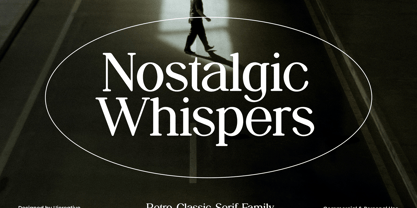 Introducing our new product the name Nostalgic Whispers Serif Font Family comes with 9 different weights. Modern Sans Serif font that beautiful classy, elegant, and modern. This font is perfectly suited for a wide variety of projects, such as signature, stationery, logo, wedding, typography quotes, magazine or book covers, website headers, clothing, branding, packaging design, and more. Also for fashion-related branding or editorial design and displays both masculine and feminine qualities.
 - Brother Garage by Edignwn Type,
$18.00 Introducing Brother Garage, the ultimate vintage motorcycle-inspired font collection designed to bring the spirit of the garage to your designs. This combines the best of stencil serif and sans serif fonts. With three unique styles - regular, rough, and stamp - Brother Garage offers authenticity, allowing you to effortlessly bring your designs with the rustic and classic looks. But that's not all! Alongside the Brother Garage fonts, you'll receive a fantastic bonus of 13 crafted illustrations.
 - MC Karnet by Maulana Creative,
$15.00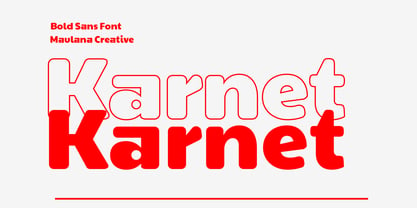 Karnet is a unique sans serif font. Bold stroke, fun character with a bit of ligatures and alternates. To give you an extra creative work. Karnet font support multilingual more than 100+ language. This font is good for logo design, Social media, Movie Titles, Books Titles, a short text even a long text letter and good for your secondary text font with script or serif. Make a stunning work with Karnet font. Cheers, Maulana Creative
 - Konung by Dima Pole,
$23.00 Konung (konge, koning, ~king) – appointed guardian who is trusted to transfer the Wisdom (Kon) to a new land. Konung is a friendly type, which is an amalgam of several writing culture. It offers re-unite originally of kindred peoples and their Outlook on life. Konung type is soft and elegant, it includes 925 glyphs, Slavic and European alphabets, over 20 Opentype features, small caps, serif and sans-serif styles and so on.
 - Ponzu by Mint Type,
$40.00 Ponzu is an elegant stencil-style display sans-serif. Its shape is defined by the sharp endings created by stems that vanish in infinite contrast. It is a hybrid typeface that features beautiful terminals typical for serif fonts. It is perfect for display use in editorial, branding, posters, screen applications etc. Ponzu comes in 9 weights each with complimentary stylish italics. Each style supports multiple languages including Cyrillic script and is packed with OpenType features.
 - Heyday by Hemphill Type,
$30.00 Heyday is a font in its prime! This font was inspired by vintage style typography with the use of thick rounded serifs, while the shape of the letterform has a contemporary edge which brings it into the modern day. This combination of classic and modern creates a unique look and feel that enables the font to feel at home in any era. The Heyday family consists of a serif and sans weight.
 - Rolide by Craft Supply Co,
$20.00 Introducing Rolide – Expanded Sans Serif Contemporary Charm Rolide – Expanded Sans Serif presents a unique blend of contemporary charm with its wide and boxy shape. Versatile Design Solution This font is your versatile design solution, ideal for titles and body text. Its non-bold style strikes a harmonious balance between subtlety and impact. Wide & Expanded Rolide’s wide and expanded characters add a touch of modernity to your projects. They stand out without overwhelming the content. Perfect for Titles and Body Text Whether for titles or body text, Rolide is the perfect choice. It maintains clarity and readability, making your content engaging. Elegance in Simplicity In the world of fonts, Rolide embodies elegance through simplicity. Its clean lines and non-bold form offer a contemporary feel. In Conclusion In conclusion, Rolide – Expanded Sans Serif is the font that marries wide, expanded, and non-bold characters to create a contemporary and versatile design solution. It ensures your titles and body text are engaging, clear, and subtly impactful, appealing to a broad range of readers.
 - Baedar by Craft Supply Co,
$20.00 Introducing Baedar – Bold Rounded Sans Serif Font Baedar – Bold Rounded Sans Serif, a font designed to captivate your attention, is both inviting and approachable. Its rounded corners create a warm and friendly vibe that instantly draws in readers. Eye-Catching Appeal Baedar’s boldness immediately grabs your eye, making it perfect for headlines and attention-grabbing text. Whether it’s a poster, website, or marketing material, this font ensures your message unequivocally stands out. Versatile Usage Furthermore, with its rounded edges, Baedar exudes friendliness. Consequently, it suits a wide range of projects, from branding to social media posts, adding a touch of approachability to your content. Readability and Impact Moreover, Baedar combines readability with visual impact, making it ideal for conveying important messages with flair. Its boldness ensures crystal-clear clarity, while the rounded corners gently soften the overall look. In Conclusion Baedar – Bold Rounded Sans Serif Font strikes the perfect balance between eye-catching design and friendliness, making it an excellent choice for various creative endeavors. Therefore, seize your audience’s attention and convey your message effectively with this versatile font.
 - Newspoint by Elsner+Flake,
$35.00 The design of the Newspoint typeface is based on the tradition of the American sans serif faces of the last century. This form expression was greatly influenced by the News Gothic type which was created by Morris Fuller Benton in 1908, and has, once again, become very popular. When the development of sans serif types such as Futura and Kabel by Renner and Koch began in 1925, the design of American sans serif types receded somewhat into the background. In the 1950’s, however, they experienced a renaissance which continues to this day. Thanks to its clean design and the relatively large x-height, the Newspoint is well suited for informative texts in newspapers, magazines, and brochures. In packaging design, as well, the Newspoint can display its strength in small print. Newspoint was developed as a customer-specific variation of the News Gothic. In contrast to the News Gothic, however, the face appears to be softer and more appealing thanks to the changed interpunctions. If so desired, the alternative characters give the typeface expanded individuality and a richness of design options.
 - Luminaire by Muksal Creatives,
$17.00 Luminaire is an intriguing and modern sans serif font. With its clean and minimalist characteristics, Luminaire exudes a professional and contemporary impression when used in designs. One of the captivating features of Luminaire is its alternate style, specifically the display style. This unique feature allows users to combine two different styles within a single word, creating a distinct and eye-catching visual appearance. In display mode, Luminaire offers experimental and striking variations of letterforms. Certain characters exhibit alternative shapes with artistic touches, such as curved lines or changes in the basic structure of the letters. This grants greater design flexibility and makes words written in Luminaire font stand out. Luminaire also maintains the essential aspects of clarity and legibility expected from a sans serif font. When used in longer texts or paragraphs, this font remains easy to read and provides a professional and well-organized appearance.Overall, Luminaire is an appealing sans serif font with a modern style and a unique alternate style feature. It can add artistic touches and uniqueness to your designs while preserving the important aspects of clarity and legibility.
 - Futura Now Variable by Monotype,
$383.99 For nearly 90 years, Paul Renner’s Futura has been as popular as it is versatile—from children’s books to fashion magazines to the plaque on the Moon. Futura is a typographic icon. Futura Now offers designers a chance to see Futura with fresh eyes. It’s more truly Futura-like than any digital version you’ve ever worked with. “It brings some much-needed humanity back to the world of geometric sans serifs,” says Steve Matteson, Monotype’s Creative Type Director who led the design team. “Despite its reputation as the ultimate modern typeface, Futura Now is surprisingly warm,” he explains. “It’s just as at home set next to a leafy tree as it is next to a stainless-steel table, because it skillfully navigates the border between super-clean geometry and humanist warmth.” Futura Now—the definitive Futura—contains 102 styles, including: new Headline and Text weights; new Script and Display weights and styles; and new decorative variants (outlines, inlines, shadows, and fill). Its contemporary alignment of names and weights makes the family easier to understand and use, and its comfortable Text and judicious Headline subfamilies provide instantly refined spacing. With a large Latin, Greek, and Cyrillic character-set, Futura Now serves a wider international creative community. Futura Now is available both as individual OpenType fonts and as a set of Variable fonts, delivering limitless styles in a tidy digital footprint.
 - Futura Now for Leica by Monotype,
$53.99For nearly 90 years, Paul Renner’s Futura has been as popular as it is versatile—from children’s books to fashion magazines to the plaque on the Moon. Futura is a typographic icon. Futura Now offers designers a chance to see Futura with fresh eyes. It’s more truly Futura-like than any digital version you’ve ever worked with. “It brings some much-needed humanity back to the world of geometric sans serifs,” says Steve Matteson, Monotype’s Creative Type Director who led the design team. “Despite its reputation as the ultimate modern typeface, Futura Now is surprisingly warm,” he explains. “It’s just as at home set next to a leafy tree as it is next to a stainless-steel table, because it skillfully navigates the border between super-clean geometry and humanist warmth.” Futura Now—the definitive Futura—contains 102 styles, including: new Headline and Text weights; new Script and Display weights and styles; and new decorative variants (outlines, inlines, shadows, and fill). Its contemporary alignment of names and weights makes the family easier to understand and use, and its comfortable Text and judicious Headline subfamilies provide instantly refined spacing. With a large Latin, Greek, and Cyrillic character-set, Futura Now serves a wider international creative community. Futura Now is available both as individual OpenType fonts and as a set of Variable fonts, delivering limitless styles in a tidy digital footprint. - Futura Now by Monotype,
$53.99 For nearly 90 years, Paul Renner’s Futura has been as popular as it is versatile—from children’s books to fashion magazines to the plaque on the Moon. Futura is a typographic icon. Futura Now offers designers a chance to see Futura with fresh eyes. It’s more truly Futura-like than any digital version you’ve ever worked with. “It brings some much-needed humanity back to the world of geometric sans serifs,” says Steve Matteson, Monotype’s Creative Type Director who led the design team. “Despite its reputation as the ultimate modern typeface, Futura Now is surprisingly warm,” he explains. “It’s just as at home set next to a leafy tree as it is next to a stainless-steel table, because it skillfully navigates the border between super-clean geometry and humanist warmth.” Futura Now—the definitive Futura—contains 102 styles, including: new Headline and Text weights; new Script and Display weights and styles; and new decorative variants (outlines, inlines, shadows, and fill). Its contemporary alignment of names and weights makes the family easier to understand and use, and its comfortable Text and judicious Headline subfamilies provide instantly refined spacing. With a large Latin, Greek, and Cyrillic character-set, Futura Now serves a wider international creative community. Futura Now is available both as individual OpenType fonts and as a set of Variable fonts, delivering limitless styles in a tidy digital footprint.
 - REGISTRATION PLATE UK - Personal use only

- Phoenix - Unknown license

- KonQa - Unknown license

- Vemoly Display by Arterfak Project,
$18.00 Vemoly Display - Modern Sans - Unique Loopy Sans Vemoly Display is a minimalist sans that is perfect for your upcoming aesthetic project. This font provides a combination of basic sans serif and loopy style. You can make fun by mixing and matching the upper and lowercase to get a unique, simple, and charming typographic design. Vemoly Display is a perfect choice for logo, social media, branding, poster, flyer, magazine, websites, fashion, mobile apps, decoration, wedding, and many more! Features : Uppercase : Basic Sans Lowercase : Display Numbers & punctuations Symbols Stylistic alternates Multilingual support Thank you and enjoy your Vemoly Display!
 - Cosan by Adtypo,
$45.00 The idea was to find common intersections between the humanistic and the neo-grotesque model of sans. This variable font offers everything from the world of sans serif in one place – a broad range of weights, adjustable contrast, and a lot of alternative glyphs. As a bonus, you can choose the “cold” or “warm” impact of the text. The Cosan Cold variant has closed apertures and minimal tension in the manner of Helvetica, and the Cosan Warm is open, more dynamic, and airy. Cosan is very suitable for a parallel bilingual setting, as both types are equivalent in their proportions and text color. Like Yin and Yang, each has a piece of the other in him. The Warm version is not totally dynamic, nor is the Cold version totally rigid.
 - Telder HT Pro by Huerta Tipográfica,
$45.00 Telder HT Pro is a humanist sans serif family with 10 weights, conceived as a web font with nice legibility at normal text sizes. Originally based on grid fitting shapes it became a multi-purpose typeface with low contrast, open counter forms, wide proportions and a touch of freshness. It is ideal for paragraph text on websites as blogs and news sites and works great for printed text. Its extreme weights are suitable for display sizes. This PRO version contains 10 weights and 2 styles. All the fonts contain small caps, alternate glyphs in stylistic sets (such as B, P, R, a, f, g, w, x, y & z), four number sets (lining and old style, proportional and tabular), ordinals, superiors, inferiors, fractions, disctretionary ligatures, arrows and more. Each font contains +1000 glyphs.
 - Alleyn Pro by AVP,
$25.00 Alleyn Pro is a re-working of the font Alleyn in response to a request to increase the character set and include Vietnamese. The fonts now cover most Latin languages, Greek and many Cyrillic languages – apparently around 275 in total. The letters have been redrawn and re-proportioned and the spacing recalculated to make for better reading at text sizes. Alleyn Pro has been developed to meet the needs of publishers, companies and individuals addressing a wide international market in a range of publishing media. The low contrast, slightly rounded sans-serif letterform with six weights and corresponding obliques provides a friendly and highly legible set of styles which are equally effective on signage, packaging, advertising and editorial. Opentype features include many numeral and positioning options, ligatures, stylistic alternatives and localised variants.
 - Technica by Monotype,
$25.00 Do you remember a typeface called Meccanica? I didn’t think so. Well, it was pretty unique – too unique for most people’s tastes it seems. Anyway, this is Technica, Meccanica’s more conservative little brother. Essentially, this typeface is a geometric sans that retains the structure of Meccanica, but tones down most of the hexagonal elements. The chamfered terminals are retained, but sharpened, and a more technical approach is instilled with each glyph being fine-tuned for optimal performance and aesthetics. The result is a refined sans serif that has enough personality to differentiate itself from the myriad of others available – undoubtedly, Technica will deliver a distinctive tone to your own typographic designs. Key features: • 9 weights in Roman and Italic • Western European character set (Adobe Latin 1) • 250+ glyphs per font.
 - Magnify by XdCreative,
$29.00 Geometric sans serif is one of my favorite fonts because it's so, simple, clean and modern, and a long time I've been dreaming of making this type, inspired by many media and especially "Futura, 1927" ( by Early Bauer) I created "Magnify" Geometric sans. The structure and element shape of Magnify is not really perfectly circle, but slightly oval it can be seen in the uppercase letters O, G, C, Q and in the lowercase letters o, a, c, e. Magnify has 8 weights, - from Hairline to Bold and Matching Oblique. Magnify also has special alternate characters in letters a, g, y and o. it is to give a different look to a paragraph, headline or your display design. thanks, hope you would like and accept "Magnify" as part of your family. thank you in advance
 - Crox Rounded by NumidiaType,
$25.00 Crox™ Rounded is a sans-serif professional typeface created using Crox™ family curves that comes in 14 harmonic weights plus 2 poster styles with upright and italic variants, as well as a maximum x-height for great optical reading. All styles have over 25 professional OpenType features and a wide range of Western languages coverage. with a variety of styles and substitute characters: sets 1, 2, 4, 10, 11. Furthermore, operational styles 6 and 7 for the fit-derived SI units format and pricing styles: sets 5, 8, and 9 for business and marketing, ADS and web design, branding, or products design, as well as other OpenType features such as ligatures, old-style numerals, ordinals, swashes,... Specimen Crox™ is a trade mark of Yassine Abdi.
 - Hopfen by Sudtipos,
$39.00 During many years I have been exploring the translation from lettering or calligraphy to type design. Lately I have been designing more big sans and serif families plenty of weight. One of the main things about Hopfen is to bring back the german lettering of Bentele, who also inspired my fonts Semilla and Bowling Script, to a more versatile and useful world. Hopfen has the spirit from the past but with today's flow, it comes in 5 weights, full of swashes, endings and alternates. We imagine it being used from Breweries to book covers, from packaging to movie posters but we prefer to let our costumers to find the better use. When you license the complete Hopfen set we will include the variable version of the set so that you can find the right weight.
 - Rethink by Viktor Nübel Type Design,
$35.00 The robust and contemporary sans-serif typeface Rethink, comes with strong characteristics. The typeface is made for work in text as well as in display. It features nine weights in two styles, including Small Caps, a set of contemporary OpenType functions, multiple figure sets and a rich language support. Rethinks main characteristics are the non-straight stroke endings and a slope that might come in an unexpected direction. It brings a bit of movement to the baseline and some attraction to the shapes in bigger sizes. These details are designed to ‘disappear’ in smaller sizes and to not disturb a reading process. Rethink was designed with the idea to help spreading bold ideas ond strong opinions, to support the work of activists in contemporary movements, to design statements with impact and meaningfulness.
 - Marylebone by Los Andes,
$39.00 Marylebone is a font duo inspired by its namesake neighborhood, located in central London. Marylebone was designed to compose short text for advertisements, blackboards and shop windows in coffee shops, small bookstores, flower shops and local shops. The set is made up of a hand made brush script, composed of 519 characters including ligatures, initials and terminals; as well as a very clean, geometric unicase sans serif with some alternates and ligatures that can double as monograms, it also includes a hand-drawn floral dingbat set. Marylebone allows you to design beautiful compositions for packaging, advertising, quotes, wall art, branding, photography overlays, magazines, motion graphics, scrapbooking, planners, window art, tags, tote bags and much more, thanks to its irregular appearance that gives a unique personality to your design projects.
 - Quiza Pro by Mint Type,
$- Quiza Pro is a geometric display sans with added playfulness created around a single dot. Its peculiar rounded diamond shape has inspired many additional details such as similar cuts in diagonal strokes, or occasional serifs in ascenders and capital letters. Its low x-height together with friendly character makes Quiza Pro an interesting choice for packaging and branding purposes. Additionally, its balanced rhythm allows paragraph typesetting in corporate editorial projects – making it a real workhorse for an identity designer. Quiza Pro comes in 8 weights + matching italics each supporting numerous Latin-based languages as well as major Cyrillic languages. It is packed with OpenType features like ligatures, small caps, 6 sets of digits, 3 stylistic sets, superiors and inferiors, fractions, ordinals, respective punctuation varieties including all-cap punctuation, as well as language-specific alternates.
 - Narrow Way by Ingrimayne Type,
$9.00 NarrowWay is a family of 18 condensed and ultra-condensed sans-serif typefaces. The family started with the ultra-condensed widths, then the condensed and regular widths (the regular is still quite condensed) were added. All widths have three weights and each weight has an italics style. These 18 styles lack a true lowercase but rather have a set of alternative characters, some based on lower-case forms, on the lower-case keys. Some alternative letters can be reached with the OpenType feature of stylistic sets. The character spacing in most of the styles is quite loose and it can be tightened with an application's character spacing if needed. These typefaces are display faces that can be useful for squeezing tall lettering into tight spaces. They are not readable at small point sizes.
 - Senlot by insigne,
$34.99 Steal the spotlight with Senlot. A high contrast sans serif, Senlot’s figure is perfect for enrapturing your audience. The font shows off a unique calligraphic stress, which--with the contrast--makes the face quite usable in luxury and high quality design work. The gorgeous appearance of Senlot is accompanied by a complete set of small capitals and a true italic. Dress your text in any of nine separate styles from Thin to Bold. Senlot also holds a full set of OpenType features, including titling capitals, superscripts and subscripts, and oldstyle figures and has an extended Latin cover with span for over 72 languages. A special thanks to Lucas Azevedo and ikern for production assistance on Senlot. Let Senlot’s beauty and simplicity carry the stage on your new text or webpage.
 - Organetto by Latinotype,
$25.00 Organetto is a typeface, inspired by the lettering found on Art Deco posters, whose design embraces latest digital font technology. This versatile font contains multiple widths which make it an ideal solution to fit every design need. In addition to its functional geometric style and different widths, Organetto also includes alternate characters that provide even more design options. All these features make the font a great choice for graphic designers and art directors, logos, wordmarks, short text, etc. Organetto is a sans-serif typeface with modern proportions and straight-edge terminals. It comes in 7 weights, ranging from Hair to Ultrabold, and 7 widths (from Ultra Condensed to Expanded) and contains a set of 397 characters that support 180 different languages. Organetto also includes OpenType features- 3 sets of alternates, catchwords and titling.
 - Estragon Pro by Stabenfonts,
$45.00 Estragon is a vivid sans-serif text face with venetian influences, suitable especially for books. It is remarkable for: its light slant, to the right, for most of the verticals, its small sized uppercase letters making it suitable for languages where they are often used (for example German,) and its just lightly inclined true italics. For a wide language support, Estragon contains a lot of accented characters including the polish kreska. It is generously equipped with ligatures, special and alternate characters as well as various kinds of numbers: besides the standard old-style figures to be set as part of text copy there are small-cap and tabular numbers as well as a set of fraction figures. Estragon comes with two weights, uprights and true italics, each with small-caps.
 - Black Ridge by ZP Fonts,
$16.00 Black Ridge is a strong and rugged typeface, supplemented by its tall x-height, angled cuts, and quirky curves—all giving it a unique touch of character. It was inspired by the bold, modern, and condensed sans-serif typefaces created by typographic pioneers such as El Lissitszky, Herbert Bayer, and Jan Tschichold of the early twentieth century. This typeface is intended for display headlines and comes with a customary set of Latin characters, including diacritics, accents, symbols, mathematical glyphs, and more. Black Ridge comes in five styles—thin, light, regular, bold, and black—and supports over 80 different languages. Each weight contains a set of alternate glyphs and discretionary ligatures specially designed for better spacing and aesthetic enhancements for the more awkward character pairs such as fi, fl, rv, TY, FT, and more.
 - Circe by ParaType,
$50.00 Circe™ is a geometric sans-serif with some humanist qualities. It consists of seven weights from Thin to Extra Bold in both Normal and Italic styles. Circe, like the Greek goddess it is named after, is capable of metamorphosis. While being clean and simple in its basic form, Circe can become intricate and fancy with its numerous decorative glyph variations. The extensive character set provides support for almost all European languages based on Latin and Cyrillic scripts. Abundant alternates and swash variants organized in stylistic sets inspire creative design options. Circe is good for small point size paragraphs as well as for headlines and posters. The typeface was designed by Alexandra Korolkova and released by Paratype in 2011. The Italic styles were added in 2018 by Alexandra Korolkova and Maria Kharlamova (Selezeneva).
 - Tex Writer by Designova,
$15.00 Tex Writer is a custom handmade / handwritten Serif typeface with a simple and casual personality making it perfect for text typography, logotypes, marketing graphics, branding, package and advertisement design and anything in between. Extended Character Sets Along with the basic Latin character set, we have added Western European, Central European, South Eastern European character sets for your convenience. What You Get This typeface comes with 14 fonts having 7 weights + 7 italics (Light / Regular / Medium / SemiBold / Bold / ExtraBold / Heavy).
 - Level by District,
$15.00 Level is a spurless sans serif family that takes a more calligraphic approach to the popular square sans. The subtle swelling and shrinking in the strokes of the curves and terminals contrast with the slight squared corners for a sans family that straddles the line between machine-made and human-crafted. Generous spacing and simple, narrow construction make for airy text that still conserves real estate on the page. Three weights include italics and small-caps + old-style numbers.
 - Kalyna by 2D Typo,
$36.00 The Kalyna font is interesting with its stylistic implementation through asymmetrical serif. Such design is characteristic for the Ukrainian style. The drawing of the font is based on the sketches of a famous Ukrainian graphic artist of early 20th century Heorhiy Narbut. His work set the whole school in the Ukrainian graphic art and is still very influential nowadays. The font is capital and also includes a set of ornaments in addition the standard set of symbols.
 - Graftyne Display by Godbless Studio,
$23.00 Graftyne sans serif typeface with a unique personality. It comes in normal and display alternate, each with 7 weights variable. Graftyne sans serif typeface is flavor in motion and each part of its system works together to captivate you, combining emotion and usability, allowing you to create attractive and unique designs. graftyne is made experimentally following a futuristic style recipe with alternate characters made with inktrap and display that makes this font more stylish and varied. Graftyne is a variable font that has 7 weights from thin to bold. also includes alternates that are more varied with variables. Graftyne sans is a versatile font system, designed primarily for display uses with a need of visual impact. Feature : Alternate Ligature Discretionary Ligature Multilingual Numeral & Puctuation Wish you enjoy our font!
 - NERMOLA Scripcy Font by Alit Design,
$12.00 Introducing NERMOLA Scripcy Font from alitdesign. The rise of typeface duos in the marketplace made us not want to be left behind so we created a pairing of our own. This font duo launch contains both a sans serif and signature script. NERMOLA Scripcy sans serif has characters that are unique, elegant, formal and assertive. It is suitable for the heading or subheading of any text. The uppercase of the sans looks very unique and elegant. The script letters are also unique and natural in character. Additionally, it has several alternatives that can be replaced using OpenType features. NERMOLA Scripcy fonts are the perfect addition to your font collection library. The designs are elegant and romantic and are equally suitable for logotype design and for any phrase, poem, or quote.
 - FS Benjamin by Fontsmith,
$80.00 Stone and steel FS Benjamin is a flared serif typeface designed by Stuart de Rozario. Consisting of 12 styles ranging from Light, Book, Regular, Medium, SemiBold and Bold with Italics it has clear, delicate letterforms, punctuated with brutal chiselled angles. With a pure and crafted feel to the forms the typeface has traditional roots but has been designed to work in a contemporary setting. Archetypal proportions in terms of x-height to cap height and ascender to descender ratio, allow the typeface to feel familiar and be legible in all platforms. Delicate brutalism Inspired by the contrasts of London and named after Big Ben, FS Benjamin was designed by Stuart de Rozario and founder, Jason Smith. Walking around London Jason was inspired by the juxtaposition of the old and the new. Glass and steel architecture can often be found amongst traditional signage and coats of arms seen around the City. These surroundings sparked an idea to create a modern design based on an alphabet that would traditionally be carved from stone. “Much of the typography we see today is so similar. I thought what if we created a typeface with traditional roots but modernised it to sit amongst the punk and noise of the streets of London? Old with new. Business with busyness. This is what London is all about.” Jason Smith


