10,000 search results
(0.133 seconds)
- Movie Production JNL by Jeff Levine,
$29.00 Inside the pages of the August, 1930 issue of “The New Movie Magazine” is an ad for Warner Brothers-First National Pictures – hand lettered in a bold Art Deco sans. This was the basis for Movie Production JNL, which is available in both regular and oblique versions.
 - Mike Wieringo by Comicraft,
$29.00 SPIDER-MAN! THE HULK! THE FANTASTIC FOUR! BATMAN! SUPERMAN! Superstar artist Mike Wieringo has worked with the most well-known characters in comic books, and just a few short years ago Comicraft teamed up with Mike and writer Todd DeZago in the pages of their creator-owned comic book fantasy adventure series, TELLOS! At Mike's request, we created a special Wieringo font which incorporated Mike's distinctive, slick-and-easy, backward-sloping letters, as well as a slightly heavier font -- carrying just a little more ink -- for the Shadow Jumper characters featured in the first TELLOS story arc. Now the Mike Wieringo font can be yours as it joins our ever growing library of Masters of Comic Book Art fonts.
 - Koorkin by Monotype,
$29.99 “I originally drew the primary characters with a felt tip marker, scanned them and then proceeded to noodle on the computer,” says George Ryan of his new typeface, Koorkin. “Over the years, I’ve designed many original typefaces, but Koorkin has become one of my favorites. I’ve worked on hundreds of highly structured text faces. For the most part, the roots of all of them can be found in the handwritten letterforms we learn as children. I enjoy going back to these shapes whenever the opportunity presents itself. ”The happy result of Ryan‘s felt tip marker sketches and his love of simple letterforms is a new family of upright and italic scripts in medium and bold weights.
 - Serena by Canada Type,
$24.95The story of Serena is a unique one among revivals. Serena was neither a metal face nor a film one. In fact it never went anywhere beyond Stefan Schlesinger’s 1940-41 initial sketches (which he called Saranna). A year later, while working with Dick Dooijes on the Rondo typeface, Schlesinger was sent to a concentration camp where he died, along with any material prospects for the gorgeous letters he'd drawn. The only sketches left of Schlesinger’s Saranna work are found in the archives of the Drukkerij Trio (the owner of which was Schlesinger’s brother-in-law). The sketches were done in pencil and ink over pencil on four sheets of paper. And now Hans van Maanen revives Schlesinger’s spirit as closely as the drawings permit, and elaborately expands the work to cover a multitude of codepages and languages. It took more than 65 years for Schlesinger’s drawings to see the light, so van Maanen made sure to bring them to life stylishly and respectfully. Serena embodies the peace and calm rarely ever found in mainstream calligraphy or other genres of display type. With upright elegance and a slight Eastern touch, this typeface expertly bridges the gracefully casual with the deeply spiritual. The light and soft letter forms add a pleasant, breezy element to anything they touch. When used sparingly in titling or display, Serena is like a sigh of desire, rare but quite memorable and very appreciated. - Elogium Pro by Naghi Naghachian,
$48.00 Elogium Pro is designed by Naghi Naghashian. It is a modern interpretation of classic Roman characters in 3 weight: Light, Regular and Bold. The character set of this Font family supports most western languages including: Afrikaans, Basque, Breton, Catalan, Danish, Dutch, English, Finnish, French, Gaelic, German, Icelandic, Indonesian, Irish, Italian, Norwegian, Portuguese, Sami, Spanish, Swahili and Swedish. There are 17 additional symbol characters: euro, litre, estimated, omega, pi, partialdiff, delta, product, summation, radical, infinity, integral, approxequal, notequal, lessequal, greaterequal, and lozenge. It also includes the characters necessary to support the following central European languages: Croatian, Czech, Estonian, Hungarian, Latvian, Lithuanian, Polish, Romanian, Serbian (Latin), Slovak, Slovenian and Turkish.
 - Rufina STD by TipoType,
$13.00 Rufina was as tall and thin as a reed. Elegant but with that distance that well-defined forms seem to impose. Her voice, however, was sweeter, closer, and when she spoke her name, like a slow whisper, one felt like what she had come to say could be read in her image. Rufina's story can only be told through a detour because her origin does not coincide with her birth. Rufina was born on a Sunday afternoon while her father was drawing black letters on a white background, and her mother was trying to join those same letters to form words that could tell a story. But her origin goes much further back, and that is why she is pierced by a story that precedes her, even though it is not her own. Maybe her origin can be traced back to that autumn night in which that tall man with that distant demeanor ran into that woman with that sweet smile and elegant aspect. He looked at her in such a way that he was trapped by that gaze, even though they found no words to say to each other, and they stayed in silence. Somehow, some words leaked into that gaze because since that moment they were never apart again. Later, after they started talking, projects started coming up and then coexistence and arguments, routines and mismatches. But in that chaos of crossed words in their life together, something was stable through the silence of the gazes. In those gazes, the silent words sustained that indescribable love that they didn't even try to understand. And in one of those silences, Rufina appeared, when that man told that woman that he needed a text to try out his new font, and she saw him look at her with that same fascination of the first time, and she started to write something with those forms that he was giving her as a gift. Rufina was as tall and thin as a reed, wrote her mother when Rufina was born.
 - Italiko by Luca Bolognese,
$11.00 Italiko is a calligraphic font. The letters have been hand-drawn individually to extract the common strokes. The strokes have then been re-composed to give the font a more unified appearance. It comes in Black, Bold, Regular, and Thin. The Thin version is different as the extreme contrast in the font makes the thinner lines disappear. It is likely best used as a display font. There are ligatures for the combination of letters that can be written more quickly by using a single stroke and letters that are slightly different from the ‘Italic canon.’ You can select which one to use in your application (i.e., Word) using combinations of italic/bold: No selection -> Regular Bold -> Bold Italic -> Thin Bold Italic -> Black If you end up using the font, get in touch at https://github.com/lucabol/Italiko. Feel free to suggest improvements or let me know if you encounter problems.
 - Mattoa by Bombastype,
$35.00 Introduce Mattoa, a bold and sporty script. This font is very great for bold logotype . Comes with many swashes options that you can play with. Will works well for both modern and retro style. If you need a font for your display purposes, you defintely need to consider this font.
 - American Wonders by Sarid Ezra,
$17.00 Introducing, American Wonders - Font Duo! American Wonders is a package of two fonts containing signature script and bold serif. This versatile fonts that you can use for any project. This bold serif is strong and powerful while the signature script is soft and authentic hand writing. This font also support language!
 - Strata by Just My Type,
$25.00 Big, expansive and flat on top; that’s a land formation called a mesa. “Mesa” was the first name for Strata Bold Rounded Serif, but it turns out it’s someone else’s registered trademark; in any case, if you need a bold, extended mono-height font that’s great for logotype, you could, as we used to say in the Mid-West, do a whole lot worse. SBRS is the final generation of an evolution that started with Mesa begating Mesa Bold which begat Mesa Bold Rounded which culminated in this evolutionary superior product. Use it!
 - Arquitecta Office by Latinotype,
$16.00 We have adapted the version of our Arquitecta font for use in Microsoft Office™. It only has 4 variants: regular, italic, bold and bold italic. Font weights have been named in a way that can be clearly shown up in the font list in Office™ programs for the sake of a good hierarchy (the bold variant is quite bold and does not look the same as the original font). Arquitecta Office update: Improvements of proportions and drawing. The set was extended to the current one of Latinotype.
 - Condell Bio Poster by Letritas,
$5.00 Condell Bio Poster is part of the bigger Condell family: a project that involves series of typographies that started to be conceived and developed since 2006. It also includes a bigger legibility version and a sans serif. Condell Bio is very versatile and can be used in the agroindustrial production. Thanks to its strongness and its charm, it can be used in different projects where a short and powerful message is required. For instance in a brand marketing campaign. The Condell project follows in terms of time the design of Comalle (a font also designed by Juan Pablo de Gregorio in 2006), but if we compare them, Condell seems to look for a major range of uses rather than a mere stylistic inspiration. And even if it keeps in its shape some organic forms, Condell seems to be much more similar to a sans serif traditional typography. Condell's fat and soft forms and its nice endings, inspired through spontaneous brush strokes, give it a very peculiar pleasant connotation. Its Italic (10 degrees inclination) have been produced singularly, not automatically calculated by the software. Condell Bio Poster is composed of 2 styles: the regular and the italic. Each one of them have 599 characters and is composed of 206 languages.
 - Joyful Juliana Pro by CheapProFonts,
$10.00 This is Kimberly Gesweins own handwriting, named for a sweet California friend of hers. Kimberly has spotted the original free version of this font in use in the far outskirts of China, and now - with the expanded language support - this Pro version can also be used in more remote parts of the western world. ALL fonts from CheapProFonts have very extensive language support: They contain some unusual diacritic letters (some of which are contained in the Latin Extended-B Unicode block) supporting: Cornish, Filipino (Tagalog), Guarani, Luxembourgian, Malagasy, Romanian, Ulithian and Welsh. They also contain all glyphs in the Latin Extended-A Unicode block (which among others cover the Central European and Baltic areas) supporting: Afrikaans, Belarusian (Lacinka), Bosnian, Catalan, Chichewa, Croatian, Czech, Dutch, Esperanto, Greenlandic, Hungarian, Kashubian, Kurdish (Kurmanji), Latvian, Lithuanian, Maltese, Maori, Polish, Saami (Inari), Saami (North), Serbian (latin), Slovak(ian), Slovene, Sorbian (Lower), Sorbian (Upper), Turkish and Turkmen. And they of course contain all the usual "western" glyphs supporting: Albanian, Basque, Breton, Chamorro, Danish, Estonian, Faroese, Finnish, French, Frisian, Galican, German, Icelandic, Indonesian, Irish (Gaelic), Italian, Northern Sotho, Norwegian, Occitan, Portuguese, Rhaeto-Romance, Sami (Lule), Sami (South), Scots (Gaelic), Spanish, Swedish, Tswana, Walloon and Yapese.
 - Dharma Gothic by Dharma Type,
$19.99 Dharma Gothic is an antiqued sans serif designed inspired by 1800s-style wood type. All glyphs had been designed carefully to be retro-looking of the old time and to fill all with nostalgia. There is new rounded verision - Dharma Gothic Rounded Family This condensed font family with 42 styles will be the best solution for posters, titles and anywhere you need impact. To complete your work perfectly, Gothic Extras family is ready for free. They include borders, ornaments and frames designed using vintage catalog of Hamilton in 1800s as a model. Incidentally, g, r and y have alternative glyphs that are available with the OpenType salt feature and tabular figures are available with tnum feature. Be sure to check out the slab serif style of this Dharma series named Dharma Slab and Distress version Dharma Gothic P. When you need more modern gothic, please try our Kaneda Gothic and Fairweather.
 - Dharma Gothic Rounded by Dharma Type,
$19.99 Dharma Gothic Rounded is an antiqued sans serif designed inspired by 1800s-style wood type. All glyphs had been designed carefully to be retro-looking of the old time and to fill all with nostalgia. There is Dharma Gothic Family that is not rounded. This condensed font family with 42 styles will be the best solution for posters, titles and anywhere you need impact. To complete your work perfectly, Gothic Extras Family is ready for free. They include borders, ornaments and frames designed using vintage catalog of Hamilton in 1800s as a model. g, r and y have alternative glyphs that are available with the OpenType salt feature and tabular figures are available with tnum feature. Be sure to check out the slab serif style of this Dharma series named Dharma Slab and Distress version Dharma Gothic P. When you need more modern gothic, please try our Kaneda Gothic and Fairweather.
 - ITC Zapf International by ITC,
$39.00 Zapf International font is the work of German designer Hermann Zapf, formal enough for widespread use yet tempered with calligraphic warmth. Vigor in the italics is achieved more from design than from slant. One of the distinguishing characteristics of Zapf International is its graduation of weights. Light and medium are relatively close and equally eloquent for text. Demi is a full two steps heavier than medium and heavy several steps beyond demi.
 - Baraksawa by Mantra Naga Studio,
$20.00 Baraksawa is a Bold, Condensed Vintage Serif Font. This typeface has many alternatives with swashes that can make your lettering/logotype more attractive. Bold serifs and grainy effects make this font even more unique. This font is perfect for logos invitations, labels, magazines, books, greeting/wedding cards, packaging, fashion, make up, stationery, novels, labels, or advertising purposes. This font is PUA encoded, which means you can access all of the glyphs and swashes with ease!
 - GHEA Aram by Edik Ghabuzyan,
$40.00 GHEA Aram is a super family font. It has 10 upright weights and their Italics. GHEA Aram supports Central European, Armenian and Cyrillic language systems. The weights from Regular to Bold and their Italics can be used as text fonts. The weights thinner than Regular and thicker than Bold can be used as Display fonts. It is an easily readable two side serif high contrast font but the eyes don't get tired while reading.
 - New West by Fontysia,
$15.00 New West is a modern clean soft round sans serif font. With bold stroke, fun character. To give you an extra creative work. New West font support multilingual and ligatures. This font is good for logo design, branding design, Social media, Movie Titles, Books Titles, a short text even a long text letter and good for your secondary text font with sans or serif. Make a stunning work with New West font.
 - Nickels by Maulana Creative,
$15.00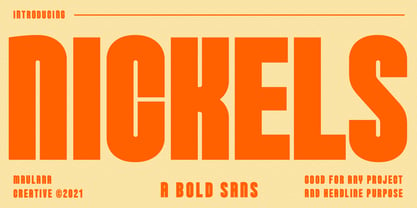 Nickels is a Fancy Bold Sans Serif font. fun character with a bit of ligatures. To give you an extra creative work. Nickels font support multilingual more than 100+ language. This font is good for Headline, logo design, Social media, Movie Titles, Books Titles, a short text even a long text letter and good for your secondary text font with sans or serif. Make a stunning work with Nickels font. Cheers, MaulanaCreative
 - Visuela by Maulana Creative,
$14.00 Visuela is a modern clean soft round sans serif font. With bold stroke, fun character. To give you an extra creative work. Visuela font support multilingual more than 100+ language. This font is good for logo design, Social media, Movie Titles, Books Titles, a short text even a long text letter and good for your secondary text font with sans or serif. Make a stunning work with Visuela font. Cheers, Maulana Creative
 - Sorren by Reserves,
$49.00 Sorren is a definitive bold condensed sans influenced by neo-grotesque designs. A relatively low stroke contrast complimented with sharp, horizontal stroke ends lend an unyielding appearance, while it’s rounded forms and refined curves juxtapose its inherent strength with grace. Stylistically, Sorren has a classic, timeless feel with a contemporary finish and attention to detail. It is characteristically more elegant and considerably sturdier than the typical condensed sans, lending to its singular disposition.
 - Spoodbrush by Dhan Studio,
$20.00 Spoodbrush is a new lowercase brushed textured font family designed to perfectly combine the different styles with one another and allow you to create beautiful designs with a personal touch. It also contains some ligatures and swashes and additionally a Spoodbrush Sans style. Perfect for branding, logos, product packaging, posters, invitations, greeting cards, news, blogs, and everything requesting personal charm. Fonts Included : Spoodbrush One Spoodbrush Two Spoodbrush Bold Spoodbrush Slant Spoodbrush Sans Spoodbrush Extra
 - Choegs by Maulana Creative,
$16.00 Choegs is a distressed sans font. With bold stroke, fun character with a bit of ligatures and alternates. To give you an extra creative work. Choegs font support multilingual more than 100+ language. This font is good for logo design, Social media, Movie Titles, Books Titles, a short text even a long text letter and good for your secondary text font with sans or serif. Make a stunning work with Choegs font. Cheers, Maulana Creative
 - Cogney by Maulana Creative,
$13.00 Cogney is an all caps modern sans serif font. With sharp bold stroke, fun character. To give you an extra creative work. Cogney font support multilingual more than 100+ language. This font is good for logo design, Social media, Movie Titles, Books Titles, a short text even a long text letter and good for your secondary text font with sans or serif. Make a stunning work with Cogney font. Cheers, Maulana Creative
 - Generisch Mono by Akufadhl,
$29.00 Generisch Mono is a monospaced version of Generisch Sans. Generisch - a german equivalent of generic - sans serif typeface has gain its own place among designers and earn such popularity due to its "simple" design. Generisch is influenced by early grotesk typefaces from early 1900's when sans was starting to get popular and used as a body type. Some old ligatures such as ch ck and ng are present in generisch (not the ct and st tho), old style numeral for better typesetting experience and more.
 - Vetrena MF by Masterfont,
$59.00 A square san serif font family for short texts and headlines. Inspired by old hand-painted signs in Tel Aviv.
 - Labours by Akufadhl,
$15.00 Labours is a bold strong handcrafted typeface, inspired by an old and rustic signs on the street. Designed for any vintage purpose. suitable for Posters, Logotype, T-Shirt design, and many other vintageous design!
 - Cannon by W Type Foundry,
$20.00 The Cannon family is the result of combining the clean aesthetics from a classic sans neo-grotesque with a touch of a geometric design. The result is a simple but dynamic typeface with retro and technological airs. Cannon is ideal for robust advertising, bold brand identities and packaging, also suitable for high impact headlines and short texts. This type family consists of 36 variants and 9 weights (thin, extra light, light, regular, book, medium, bold, extra bold, black), matching italics for all weights and widths, matching small caps for all weights and widths, alternate characters and extended language support. We are proud to introduce: Cannon.
 - Peroba Rosa by Yahya Type,
$16.00 Peroba rosa is a modern sans serif type family featuring a blend of modern, classical, and playful characteristics. The simple, clean forms and classically inspired proportions give it a timeless quality and interesting visual rhythm. Peroba rosa is perfect for logo design, magazine headers, product packaging, branding projects, clothing or simply as a stylish text overlay to any images or websites. WHAT’S INCLUDED? • Comes with regular, thin, light, italic, bold, thin italic, light italic, bold italic and bold italic font styles. Uppercase & lowercase letters. numbers. punctuation Ligature & Huge Stylistic alternate. Multilingual support. Still got a question? Send me a message and I’ll be happy to answer! qura.yahya@gmail.com
 - Sangre BB by Blambot,
$20.00A handwriting font with a decidedly sexy, Mediterranean flair. Perfect for restaurant signage, menus, party invitations and more. Sangre includes a plethora of European characters. - Omnidirectional Arrows JNL by Jeff Levine,
$29.00Omnidirectional Arrows JNL is a series of arrow dingbats in different shapes and directions in both solid and outlined drop shadow versions from Jeff Levine. - Girls Girls Girls by Comicraft,
$19.00Yeah, Baby! You wanted the World’s Greatest Comic Book Fonts and we gave them to you! They're Sexy DropCaps! They're Saucy Dingbats! GIRLS!GIRLS!GIRLS! - ITC Officina Display by ITC,
$29.99When ITC Officina was first released in 1990, as a paired family of serif and sans serif faces in two weights with italics, it was intended as a workhorse typeface for business correspondence. But the typeface proved popular in many more areas than correspondence. Erik Spiekermann, ITC Officina's designer: Once ITC Officina got picked up by the trendsetters to denote 'coolness,' it had lost its innocence. No pretending anymore that it only needed two weights for office correspondence. As a face used in magazines and advertising, it needed proper headline weights and one more weight in between the original Book and Bold."" To add the new weights and small caps, Spiekermann collaborated with Ole Schaefer, director of typography and type design at MetaDesign. The extended ITC Officina family now includes Medium, Extra Bold, and Black weights with matching italics-all in both Sans and Serif -- as well as new small caps fonts for the original Book and Bold weights. - ITC Officina Serif by ITC,
$40.99 When ITC Officina was first released in 1990, as a paired family of serif and sans serif faces in two weights with italics, it was intended as a workhorse typeface for business correspondence. But the typeface proved popular in many more areas than correspondence. Erik Spiekermann, ITC Officina's designer: Once ITC Officina got picked up by the trendsetters to denote 'coolness,' it had lost its innocence. No pretending anymore that it only needed two weights for office correspondence. As a face used in magazines and advertising, it needed proper headline weights and one more weight in between the original Book and Bold." To add the new weights and small caps, Spiekermann collaborated with Ole Schaefer, director of typography and type design at MetaDesign. The extended ITC Officina family now includes Medium, Extra Bold, and Black weights with matching italics-all in both Sans and Serif -- as well as new small caps fonts for the original Book and Bold weights."
 - Scala Pro by Martin Majoor,
$49.00 The award-winning Scala family (1990-1993) is a worldwide bestseller and has established itself as a ‘classic’ among digital fonts. It was one of the first serious digital text fonts to support small caps, ligatures and different set of numbers. In fact Scala and Scala Sans (1990-1993) are two different typefaces sharing a common form principle: the skeletons of both Scala and Scala Sans are identical. Scala’s dark colour and low contrast works to prevent the thin parts from breaking up. The generous length of Scala italic’s serifs gives it a strong rhythm. The bold weight has the same character widths as the normal weight, so changing a text from normal into bold does not affect the set width. Another part of Scala is very popular among its users: Scala Hands, containing more than one hundred decorative hands and pointers, is a free bonus. Scala Jewels is a set of four highly decorative typefaces, based on the bold capitals of Scala.
 - TOMO Ernest by TOMO Fonts,
$10.00 Ernest is a handmade typeface with an unique yet strong personality. Say it bold with this font. Punk & Wave styles. Ideal for type based designs.
 - Futura Black by Bitstream,
$39.99Josef Albers drew a stencil sanserif form at the Bauhaus in 1923 (published in 1926); Paul Renner and the Bauer design office made a similar design into a typeface in 1929, and rather confusingly included it in the Futura series. Many websites erroneously attribute the stencil design to Josef Albers, but there is no evidence that the two met or collaborated on Futura Black. In 1929 Josef Albers and Jan Tschichold corresponded on the “Transito” typeface (another very similar stencil typeface, while Paul Renner was working with Jan Tschichold. - Nicolas Jenson SG by Spiece Graphics,
$39.00 It was the original work of fifteenth century designer Nicolas Jenson that formed the basis for this roman serif style developed by Ernst Detterer in 1923. Similar in spirit to other early twentieth century revivals such as Centaur, Cloister Old Style, and Italian Old Style, Nicolas Jenson is distinguished by its pristine and delicate nature. A gifted young apprentice to Detterer, Robert Hunter Middleton, greatly expanded the family. And by 1929, bold, italic, and open were part of the Ludlow Foundry’s beautiful Nicolas Jenson Series. It was reintroduced under a new name, Eusebius, in 1941. This digital version includes a new medium and extrabold weight with intermediate small caps and swash alternates throughout the family. There is also a regular expert version with a variety of currency symbols plus a regular petite caps (regular x-height small caps) and old style figures version. Nicolas Jenson is now available in the OpenType Std format. Small caps, old style figures, and swash alternates have all been combined into one style for ease of use. You will also find an additional regular petite caps version included with the regular style. Some new characters have been added as stylistic alternates and historical forms. These advanced features work in current versions of Adobe Creative Suite InDesign, Creative Suite Illustrator, and Quark XPress. Check for OpenType advanced feature support in other applications as it gradually becomes available with upgrades.
 - Cnossus by Haksen,
$14.00 Say Hello to "Cnossus" Bold Funny Fonts! Cnossus was built with OpenType features, numbers, punctuation, ligatures and it also supports other languages. Cnossus is very suited to build your brand such as : T-shirt, Logo, Poster, Packaging, Advertising and anything. Installing Your New Font: This font can be installed in all software that can read standard fonts. Accessing the swashes / opentype features / glyphs: In order to access the alternate characters in this font, you need a program that supports OpenType features such as Adobe Indesign, Adobe Illustrator CS, or Adobe Photoshop CC.