10,000 search results
(0.028 seconds)
- Cordillera by Latinotype,
$39.00 Clear, simple and multipurpose. We present Cordillera, a new sans serif designed for corporate use, which mixes classic proportions, geometric and neo-grotesque characters. Its alternative characters will allow you to go from expressive titles to neutral texts easily while maintaining the harmony of the system.
 - Nouveau Titling JNL by Jeff Levine,
$29.00 Sheet music for 1907's "Just A Little Fond Affection" had the song title hand lettered in a simple sans serif design with influences from the then-current Art Nouveau movement. This is now available as Nouveau Titling JNL; available in both regular and oblique versions.
 - Reveler JNL by Jeff Levine,
$29.00 The sheet music for "Good Night Angel" from the 1937 motion picture "Radio City Revels", had the movie's title hand lettered in a free form Art Deco sans serif design. This has been recreated digitally as Reveler JNL, which is available in both regular and oblique versions.
 - Tannhaeuser by ITC,
$29.99 Tannhaeuser is the work of British designer Alan Meeks, a sans serif typeface with conventional capitals letter complemented by an unusual lowercase alphabet. It looks best when close letter spaced, especially the lowercase, whose lower right extensions are designed to overlap or join in a script fashion.
 - Atophuzomekosou by Meyerfonts,
$15.00 Atophuzomekosou is a sans serif typeface that can be used for a lot of purposes, including: signage, posters, campaigns, videos, artworks, billboards, games, and many more. The 7-segment and Arbitrary fraction characters are located in the Private Use Area at U+E000 and U+E100 respectively.
 - Sunmore by Viaction Type.Co,
$17.00 Sunmore is a sans serif font with elegant characters. Sunmore is perfect for your elegant-themed work, suitable also for elegant vintage. This font is available in six font style variants, making it easy to do work on various design themes. Sunmore is equipped with multilingual accents.
 - Huai Thai by Positype,
$49.00 หวยและหวยไทย ฟอนต์ที่ออกแบบโดยพชร์ เอื้อเชิดกุล ผลงานการออกแบบที่แสดงให้เห็นถึงการค้นคว้าใน 2 พื้นที่ที่ส่งผลซึ่งกันและกัน ระหว่างลายมือแบบตัวไทยที่เขียนกันทั่วไปและตัวละติน ผลที่ได้คือแบบตัวอักษร ‘หวย’ ที่ให้ความรู้สึกเป็นกันเองแต่มีความโดดเด่นชัดเจน มีลักษณะที่ไม่ขัดกับวิธีการเขียนที่คุ้นเคยและภาษาไทยที่เป็นต้นทางของแบบ สำหรับตัวอักษรไทย ลักษณะของหัวสามารถแบ่งได้เป็น 2 ประเภท คือแบบมีหัวและแบบไม่มีหัว แบบมีหัวนั้นมีที่มาจากลักษณะการเขียนดั้งเดิมของตัวอักษรไทย ส่วนแบบไม่มีหัวนั้นเป็นการพัฒนาขึ้นมาใหม่เพื่อให้สอดคล้องกับแบบตัวละตินไม่มีเชิงฐาน (Latin sans serif typefaces) โดยในช่วงหลายปีที่ผ่านมา แบบตัวไทยไม่มีหัวนั้นได้รับอิทธิพลและค่อยๆ ปรับให้มีสไตล์สอดคล้องกับลักษณะของตัวละตินมากขึ้น มากจนถึงจุดที่เราสามารถนิยามแบบตัวไทยที่ได้รับอิทธิพลมานี้ว่า Thai Latinized ได้ ซึ่งความสงสัยต่ออิทธิพลที่เปลี่ยนแปลงไปนี้ เป็นเหตุของไอเดียในการพลิกมุมมองว่าอะไรจะเกิดขึ้นถ้าหากลายมือตัวไทยนั้นเป็นฝ่ายไปมีอิทธิพลกับแบบตัวละตินแทน ผลลัพธ์ที่ได้ก็คือ โลกด้านกลับของแบบตัวไทยที่ถูกทำให้เป็นละติน ไม่ว่าจะเป็นป้ายหน้าร้านต่างๆ หรือริมถนนในกรุงเทพฯ การเขียนทั่วไปในชีวิตประจำวันที่เขียนอย่างเร็วๆ เป็นเส้นลายมือที่ลื่นไหล ทัังหมดนี้ส่งอิทธิพลให้เกิดรูปทรงของแบบที่เป็น DNA ของฟอนต์หวยชุดนี้ พัฒนาแบบด้วยการเก็บรายละเอียดและปรับธรรมชาติที่เป็นอยู่ของลายมือให้มีระบบมากขึ้น และต่อยอดขึ้นมาเป็นสัดส่วนต้นแบบของการพัฒนาฟอนต์ละตินที่เข้าคู่กับชุดฟอนต์หวยไทย ฟอนต์หวยนี้ได้นำส่วนสำคัญของตัวอักษรภาษาไทยถ่ายทอดไปสู่ตัวละติน พร้อมกับนำวิธีการ (ตลอดจนจิตวิญญาณ) ของการเขียนในช่วงเวลาปัจจุบันของคนไทยให้เข้ามาอยู่ในรูปทรงของตัวอักษรด้วย
 - Basic Nouveau JNL by Jeff Levine,
$29.00 The 1913 sheet music for "You’ll Be Welcome When You Get Back Home" had its title hand lettered in a simple, yet attractive Art Nouveau sans serif design which has been preserved as digital type. Basic Nouveau JNL is available in both regular and oblique versions.
 - Mister Giacco Pro by Sudtipos,
$39.00 Mister Giacco Pro, designed by Diego Giaccone, is a simple stroke sans serif font designed with a solid structure that is ideal for corporate use, branding and any design where legibility and personality are required. It is available in 3 weights including small caps and italics.
 - MBF Neurotic by Moonbandit,
$18.00 Neurotic is a geometric modern minimalist square sans serif display font. An experimental combination between angled and straight lines makes this a unique typeface design. Easily access the styles with uppercase and lowercase. Perfect usage includes logo, poster, display, headline, t-shirt design and many more.
 - Fruitella by Zamjump,
$17.00 Fruitella is a geometric sans serif look. Designed with powerful opentype features in mind. equipped with ligature standards that are different from ligatures in general. Perfect for graphic design and any display use. It can easily work for web, signage, corporate, and also for editorial design.
 - Volante by Hindia Studio,
$12.00 Volante is a gorgeous condensed sans serif typeface that comes with various stylistic alternates and discretionary ligatures. It comes with multiple weights, from thin to heavy, with 3 extra outline styles. This is perfect to sweeten up your headlines, branding visual identity, editorial, poster, and etc.
 - Neue George Pro by Kaligra.co,
$29.00 Neue George Pro is an Elegant contemporary sans serif font family of 8 fonts. Designed with clean and stylized modern European geometry with harmonious appearance for both texts and headlines. Neue George is perfect companion for branding, editorial and signage, also works great for bigger applications.
 - The Main by NicolassFonts,
$25.00 The Main is a modern sans-serif font family. It comes in 16 weights, 8 uprights, and matching italics. The Main has separate softly beveled corners, which gives it a unique look. Each weight includes OpenType features. Completely suited for graphic design and any display use.
 - Houschka Rounded by G-Type,
$72.00 Houschka Rounded is the companion family to Houschka Pro, featuring CE, Baltic, Turkish & Cyrillic language support plus small caps, stylistic sets, contextual alternates, ligatures and 4 sets of numerals. Houschka Rounded may be a softer & cuter sans serif than her big sister but she's equally versatile.
 - ITC Golden Type by ITC,
$29.99 Canadian designer Anthony De Meester created the font in 1989. Vienna Extended is a light, elegant sans serif. Simplicity is the hallmark of Vienna and it can be used most effectively where a look of regal elegance is desired. Vienna is a trademark of International Typeface Corporation.
 - Autoprom Pro by Stefan Stoychev,
$29.88 AutopromPro is a modern sans serif display font with a geometric touch contains 24 styles. It comes in 6 weights and its matching rounded and italics. The Thin weight and Black Rounded Italic is a free of charge, so you can use them to your projects.
 - Marbellya by Namara Creative Studio,
$5.00 Marbellya an Condensed Sans Serif Font with luxurious style. Available in 6 styles : Regular, Italic, Outline, Bold, Bold Italic and Bold Outline. Included alternates, ligatures and multilingual support. It's perfect for headlines, logos, quotes, packaging, magazine covers, editorial design, and many more project with suitable purpose!
 - Deltarbo by Aah Yes,
$16.00Deltarbo is a medium-heavy sans-serif typeface that is designed primarily for great legibilty in graphics and display situations, with clean lines and a modern "rounded-rectangle" feel. Please note that this font is not intended to be formal, the characters are ever so slightly casual. - Zimric by Ingrimayne Type,
$5.00 Zimric is a family with 28 styles. It has the look of neat hand printing. It is monoline and sans-serif, friendly and legible. The Zimric family has three widths, each width has four or five weights, and each weight comes in both upright and italic styles.
 - Destrod by Tanya Savchenko,
$11.00 Destrod is a modern techno sans serif font. Its futuristic and minimalist style makes it incredibly suitable for all your projects that need a sci-fi touch. Uppercase letters with alternate characters in lower case. Included: Latin base and extended. Cyrillic base and extended. Multilingual support.
 - Show Card Elite JNL by Jeff Levine,
$29.00 One example in the 1919 instructional book “One Hundred Alphabets for the Show Card Writer” was for an elegant sans serif with a subtle Art Nouveau style to the letter forms. This is now available digitally as Show Card Elite JNL in both regular and oblique versions.
 - Gacor by Din Studio,
$29.00 Gacor is urban sans serif font. Made for any professional project branding. It is the best for branding, printing, and quotes. Every letter has a unique and beautiful touch. Features: PUA Encoded Multilingual Support Numerals and Punctuation Thank you for downloading premium fonts from Din Studio
 - RBNo2.1 by René Bieder,
$25.00 RBNo2.1 is a condensed sans serif typeface with a technical and geometric appearance. The family includes 2 versions (RBNo2.1a and RBNo2.1b) and has 7 weights with matching italics. RBNo2.1 feels comfortable in technical surroundings with short text passages, in brochures, catalogs, magazines, posters, websites headlines and logos.
 - FS Silas Slab by Fontsmith,
$80.00 Slab-like sibling Why stop at sans? Rather than leave FS Silas Sans as an only child, the team wanted to extend the family, and create a complete system for brands and editorial. Unsure what the result would be, the team started experimenting with a slab serif version. ‘We didn’t know how it would turn out, but we really liked it and wanted to take it further. A fresh angle ‘We stuck with the angular theme of the sans by drawing angled slab serifs,’ says Phil Garnham, ‘as opposed to the square serifs that slab fonts usually have. That created an inner dynamism in words and sentences on the page, and a very distinctive, crafted character, like a Victorian soul in a contemporary body.’ These crafted touches include details such as the angled ascenders on the ‘i’ and ‘l’, while characters such as the ‘y’, with its abruptly-ending descender, add a mark of distinction. A perfect pair Silas Slab, like its sibling, offers a clear-cut range of five weights, from the elegant Thin to the monumental ExtraBold. Put it together with Silas Sans and you have the full complement, capable of performing the full range of tasks, above the line and below, in headlines, body copy and logotypes, B2B and B2C. Keep them together; they don’t like it when they’re apart.
 - Merry Bright by Romie Creative,
$12.00 Hello everyone, I would like to introduce my newest font Merry Bright Script is a beautiful modern calligraphy typeface, I hope you will be interested in this font, if you want to use it for your work. This font can be used easily and simply because there are many features in it. contains a full set of lowercase and uppercase letters, a wide variety of punctuation marks, numbers, and multilingual support. font also contains a lot ligatures and contains many alternative Style Sets such as the stroke alternative of the heart to combine with two words, for example: Ashley-Haston. You can see an example in the image above. Merry Bright is perfect for today's emerging market design, this font has a stylish, trendy, natural and soft font, with this font you can take advantage of any opportunity is a great way to highlight the celebration the best of parties, because this font will be an advocate for the cause such as wedding invitations, branding, parties, graduations, birthdays, gatherings, etc. Thank You, Romie Creative
 - Soleil by TypeTogether,
$49.00 Soleil, designed by Wolfgang Homola, is a geometric sans serif typeface. Unlike most existing geometric sans serif typefaces, it has asymmetrical counters, making it look fresher, more dynamic and more contemporary. Simple geometric forms – such as the circle or the square – played a certain role in the design of the letterforms, but in order to introduce more fluidity into the rather stiff and rigid concept of geometric sans serif typefaces, a lot of optical corrections were necessary. Soleil is based on the modernist ideas of simplicity, clarity and reduction to essential forms. Yet its letter shapes are not the result of geometric construction, but of a design process that brings together simplicity and fluidity, clarity and rhythm. Soleil has a rather large x-height, making it legible also in small sizes or from a bigger distance. The typeface family consists of six weights. The Opentype version also allows for the implementation of typographic features such as Small Caps, lining and old-style figures, both tabular and proportional, ligatures, alternate characters, case-sensitive variants and fractions. Soleil offers a wide range of potential applications: signage and wayfinding systems, book and magazine design, branding and corporate publications.
 - Fer by ParaType,
$30.00 Fer is a sans-serif font for body text, not lacking in its own distinctive voice. The aftertaste of reading the text set in Fer is like reading the letters on old rusty plates somewhere in Southern Europe, hence the name (Fer means iron in French). Being a modern system that includes a variable font with weight and optical size axes, Fer combines the features of geometriс sans serifs and old sans serifs with closed apertures. The typeface contains three sets of styles: for captions, text and headings, — with the weight ranging from regular to black. Fer was created with the idea to unite nations. The Latin character set supports all European languages, most African languages and Vietnamese. Cyrillic has support for all living Cyrillic languages and some obsolete characters too. The font also supports the Greek language. Additionally, the character set includes currency signs of all supported languages’ countries, old style, lining, tabular and proportional figures as well as numbers in squares and circles. Lastly, the font has lots of localized letterforms and stylistic sets. Fer was designed by Dmitry Goloub for Paratype in 2020–2023.
 - Nestine by Craft Supply Co,
$20.00 Introducing Nestine – Elegant Sans Serif High Contrast Elegance Nestine – Elegant Sans Serif is more than just a font; it’s a visual masterpiece with high contrast that effortlessly exudes an air of elegance and luxury. The Epitome of Elegance Moreover, Nestine epitomizes elegance. Its striking contrast between thick and thin lines creates a visual appeal that is both refined and sophisticated, making it the perfect choice for luxury designs that demand attention. A Minimalist Marvel Nestine’s high contrast design is a minimalist marvel. It relies on the purity of its design to convey sophistication and elegance, proving that simplicity can be the essence of opulence. Ideal for Luxury Design Additionally, Nestine is tailor-made for luxury design projects. From high-end branding to upscale packaging, it adds a touch of opulence and refinement that leaves a lasting impression of sophistication. In Conclusion In summary, Nestine – Elegant Sans Serif is the epitome of high-contrast elegance. It’s the font that effortlessly combines the art of sophistication and luxury. With Nestine, your designs achieve a minimalist yet opulent quality that captivates the viewer, leaving an indelible mark of refined taste and aesthetic beauty.
 - Raina by Nathatype,
$29.00 Want to have a more unique design? Raina is a new way to show uniqueness and freedom in your design. Raina is one of the sans serif font combinations with the display font. Unlike the other solid, firm displays of sans serif font, Raina expresses more artistic, unique displays as a result of the display font’s character combinations. Its differing letter shapes from ordinary alphabets create uniqueness for this font because each letter has no straight lines, but indentations or cavities instead, and no tiny lines or hooks as a sans serif font character. With the unique shape of this font, use this font on bigger screens for a legibility reason. This font has included outstanding features to take your creativity and ideas to the next level. Features: Ligatures Multilingual Supports PUA Encoded Numerals and Punctuations Raina fits for various design projects, such as posters, banners, logos, book covers, quotes. , headings, printed products, merchandise, social media, etc. Find out more ways to use this font by taking a look at the font preview. Feel free to contact us if you require more information when you are experiencing a problem. Thank you. Happy designing.
 - Renois by Craft Supply Co,
$20.00 Introducing Renois – Display Sans Serif Powerful Impact, Bold and Condensed Renois – Display Sans Serif is more than just a font; it’s a meticulously designed tool for achieving a commanding presence in a variety of display applications. Command Attention Instantly Furthermore, Renois is purpose-built to command attention instantly. Its bold and condensed design ensures that your message takes center stage and captures the viewer’s gaze right away, making it perfect for headlines and displays that demand immediate attention. Clarity in Boldness Remarkably, despite its boldness, Renois prioritizes clarity. Each character is thoughtfully crafted for optimal readability, guaranteeing that your message is not only impactful but also effectively communicated, even at larger sizes. Versatile for Diverse Displays Moreover, Renois’s versatility shines in various display applications, whether it’s for posters, banners, or promotional materials. This typeface seamlessly adapts to your design needs, making a bold and impactful statement in any context. In Conclusion In summary, Renois – Display Sans Serif is the font of choice when you need to make a powerful and clear statement in your displays. Elevate your designs with Renois, ensuring your message rises above the noise, leaving an indelible and memorable impact on your audience.
 - Spheris - Personal use only

- Peter by Vibrant Types,
$33.00 Peter started as a sketch in the static sans-serif tradition of Helvetica®. Then slight references to the calligraphic origin of type were added, giving it a more distinct character. This neo-grotesque sans has rational and clear basic letterforms, while in its details it unfolds attributes of humanist type. As a neo-grotesque sans it claims a very modest design, yet being a bit wider than its relatives and offering the warmth of humanist drafts. The early sketch grew to a type family of 18 fonts and now supports 700+ glyphs with pro opentype features.
 - Apotheosis by Pixel Colours,
$26.00 Apotheosis is a chic, clean handwritten font with modern flows. Includes automatic ligatures, stylistic alternates and a beautiful big ending "s" that gives statement to the words. It also includes a small uppercase sans to make the perfect combination. A beautiful font great for branding, labeling, packaging, etc. Opentype Features This font contains opentype features and must be used in a program that supports opentype like Adobe to access the alternates in the Glyphs panel. Includes: Apotheosis: A clean modern script font. Apotheosis Sans: A modern uppercase sans serif perfect for pairing and great for descriptions, taglines, etc. Language support
 - Hops And Barley by Fenotype,
$25.00 Hops And Barley - a Vintage Font Collection. Hops And Barley includes following: • 6 fonts - a textured and clean version of each • Catchwords, textured and clean version • Ornaments, textured and clean version Hops And Barleys’ core is four font styles. Fonts are designed in the same proportions and they have the same soft edges so that they work great together. Here’s a short introduction to the fonts • Hops And Barley 1 -A Connected Script with Contextual, Swash, Stylistic and Titling Alternates • Hops And Barley 1b -A Bold version of Script • Hops And Barley 2 -A Serif vernacular Swash, Stylistic and Titling Alternates • Hops And Barley 3 -A sturdy Sans Serif with a wide character. • Hops And Barley 3b -A Bold version of Sans Serif • Hops And Barley 4 -A Condensed Sans Serif • Hops And Barley 5 -A set of 61 Catchwords • Hops And Barley 6 -A set of 71 Pictograms Hops and Barley fonts have rugged outline and eroded texture inside the letters. Hops And Barley C stands for Clean - they are an identical set of the styles but they come with straight and clean outlines and softened edges. Hops and Barley fonts work great together or on their own. They’re a fantastic choice for any display use and when paired they can cover the whole display part in any project from website to packaging and from poster to logo.
 - Scholar by Great Studio,
$22.00 Scholar is a new editorial serif with clean and smooth lines, tight curves, and subtle yet sharply contrasting serifs. It is a typeface series that exudes elegance and confidence. Scholar comes in two font versions: Regular and Italic. It is designed perfectly to meet all your needs, whether you're creating nostalgic designs that remain clean and elegant, or working on projects like headlines, magazines, logos, packaging, editorials, and more
 - Fregan by Seniors Studio,
$15.00 Fregan Typeface is sharp serif font with an elegant feel. Unique character by combining geometric shapes with organic curvy details. It is a unique typeface for your individual personality. Inspired by old-style serif and contemporary fonts. And additional Fregan Sans, working in harmony with Fregan Serif to create typography awesome creations. Perfectly for elegant branding, magazine design, logo design, headlines, posters, packaging, cards or your wedding invitation and more. 4 styles: Regular and Bold Latin based languages. OpenType features, including ligatures. OTF files. If you need help or advice, please contact me by e-mail "seniorsstudio@gmail.com" Thank you!
 - Remixa by Narrow Type,
$35.00 Introducing Remixa, a cutting-edge modern sans-serif typeface that seamlessly incorporates elements from serif typefaces, resulting in a truly unique and captivating design. Remixa boasts a carefully crafted set of six weights, ranging from light to bold, allowing for versatile usage across a wide range of design projects. Each weight has been meticulously balanced to ensure optimal legibility and visual impact, empowering designers to create captivating and expressive compositions. Its clean lines and subtle serif-inspired details create a harmonious blend that stands out in both digital and print media. Experience the essence of modernity and timeless elegance with Remixa.
 - Vigofam by Keristyper Studio,
$14.00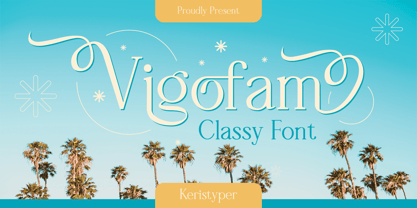 Vigofam serif typeface is an elegantly themed font that has a dynamic serif style. This font is good for logo design, Social media, Movie Titles, Books Titles, short text even long text letters, and good for your secondary text font with sans or serif. **Featured:** * Standard Uppercase & Lowercase * Numeral & Punctuation * Multilingual : ä ö ü Ä Ö Ü ß ¿ ¡ * Alternate & Ligature * PUA encoded We recommend programs that support the OpenType feature and the Glyphs panel such as Adobe applications or Corel Draw. so you can use all the variations of the glyphs. Hope you enjoy our fonts!
 - Beluga LT by Linotype,
$29.99 Linotype Beluga is a part of the Take Type Library, winners of Linotype’s International Digital Type Design Contest. The font was designed by Hans-Jürgen Ellenberger to suggest the writing of the Middle Ages but without any specific models from that time. A distinguishing characteristic of the font is its pointed, effusive serifs, which give Beluga its feel of the Middle Ages or of mysticism. In spite of its dynamic character, Beluga is legible even in smaller point sizes, which makes it equally good for headlines as for shorter texts. Beluga combines well with sans serif, slab serif and constructed fonts.
