5,064 search results
(0.012 seconds)
- Swankie by Midtype,
$29.00 Introducing Swankie Regular typeface, it looks natural like a handmade which has a fast dry brush style. That is ideally suited for advertising and packaging, logo, branding and creative industries. The Swankie Regular typeface is designed to make your next great project look more natural and stand out.
 - Stratus by Marc Foley,
$15.00 Stratus is a neutral sans-serif family, consisting of six weights. The design is heavily influenced by '90s screen fonts. It has been tested and developed using a range of different operating systems and web browsers. You'll find it works incredibly well at small sizes and user interfaces.
 - Dusky Slab by Gleb Guralnyk,
$13.00 Hello, introducing a vintage style all caps typeface "Dusky Slab". It's a seventies style font with bold serifs and reverse contrast inspired by western hippie culture. Dusky Slab supports a lot of languages, including west european and cyrillic characters (check out all available symbols on the last screenshot).
 - Chamber Of Commerce JNL by Jeff Levine,
$29.00Chamber of Commerce JNL is loosely based on a type style used for some rubber stamp letters and numbers from a vintage child's printing set. Originally a cast shadow design, Jeff Levine felt the lettering merited a direct treatment in both regular and oblique styles without the shadow effect. - Yalla by Borutta Group,
$39.00 Yalla was inspired during a trip Mateusz Machalski took to Cairo (Egypt). The vast array of strong Arabic headline type, geometric forms working in interesting ways and contrasting with smooth, calligraphic details fed the design. Due to the same proportions and heights, Yalla works great together with Afronaut.
 - Slazer by João Henrique Lopes,
$20.00 Slazer is a futurist font designed for a dynamic and powerful effect when it comes to science, technology, games, web, cellphones and electronics. All glyphs are open, straight and smooth, enhancing their connection with images. Slazer’s lines never touch or split: they always go somewhere… and go fast!
 - Scratch Up by Hanoded,
$15.00 Scratch up started out by testing a brush pen I bought. I penned down two alphabets: one by pressing hard on the pen and one without pressure. The result is Scratch Up: a pair of roughish tall & thin fonts. Scratch up comes with all the diacritics you need.
 - Travel Poster JNL by Jeff Levine,
$29.00 A 1927 travel poster for visiting what was then Palestine and Near East was hand lettered in an early Art Deco thick-and-thin type face. The lettering was redrawn digitally, and is now available as the aptly-named Travel Poster JNL, in both regular and oblique versions.
 - P22 Avocet by IHOF,
$29.95 A light chancery script font influenced by both the hand-held pen and the typefounder’s machinery. The curves are reminiscent of the beak of the avocet, a wading bird. This font was originally engraved in metal and copper matrices made for casting into hot metal type for letterpress printing.
 - Ponte Vecchio NF by Nick's Fonts,
$10.00An elegant typeface from the turn of the last century named "Venezia", issued by Karl Brendler and Son of Vienna, provided the inspiration for this little gem, with hints of the exotic. Both versions of this font include the complete Unicode Latin 1252 and Central European 1250 character sets. - Goudy Initialen - Personal use only

- Ogenblik by Hanoded,
$15.00 The other day, I was thinking how time flies and how my kids grow up so fast. In the blink of an eye, they had turned from babies into almost-teenagers. They're not teenagers yet, but given their tantrums, it does feel like I have three teenagers in the house... ;-) Ogenblik, in Dutch, means: ‘in the blink of an eye’, ‘lightning fast’, or ‘for a brief moment’. It’s similar to the German ‘Augenblick’, which means exactly the same. Ogenblik was made with the same dried out marker pen that helped me create my font Castlerigg. I guess it had more than one extra font in it! Ogenblik is a bit of a grungy, yet quite legible and neat font. Comes with multilingual support.
 - Dopelton by Variatype,
$22.00 Introducing Dopelton, a signature font that transcends the ordinary, embodying the essence of personal style and sophistication. Crafted with meticulous attention to detail, Dopelton is more than a font; it’s a stroke of individuality, a visual symphony that transforms signatures into works of art. Each letter in Dopelton carries a distinctive flair, reminiscent of a signature penned by a hand writer. The fluid strokes seamlessly merge, creating a harmonious rhythm that captures the art of the handwritten with a contemporary twist. The balance between elegance and readability is finely tuned, making Dopelton versatile for various design purposes. Dopelton is not confined to the limits of static characters; it adapts to the natural flow of the hand, ensuring a unique signature experience every time. The font’s dynamic nature brings authenticity to digital signatures, providing a touch of human warmth in the digital realm. The details of Dopelton are a testament to its craftsmanship. Subtle curves, refined loops, and a tasteful interplay of thick and thin lines give each letter a signature-worthy personality. Whether used for branding, invitations, or personalized stationery, Dopelton adds a touch of refined charm to any project. This signature font is designed to make a statement—bold yet graceful, modern yet timeless. Dopelton is more than a font; it’s an extension of your identity, a signature that leaves a lasting impression. Elevate your designs with Dopelton and let your words carry the unmistakable touch of personalized elegance. FONT FEATURES Additional Accents 68 Languages Kerning Alternates Ligatures Swashes
 - TOMO Claire by TOMO Fonts,
$10.00 TOMO Claire is a handmade typeface with a relaxed style and committed to the environment. It comes in two styles, Regular and Waste with a distressed look. This typeface is ideal for all types of projects related to the care of the environment and everything else. Be green! Act now!
 - Cupcake Mystery by Bogstav,
$17.00 Who took the last cupcake? It's a mystery! This lovely cookie Is made out of crunchy handmade lines, and comes with 7 different versions of each letter - these automatically cycles as you type. Pretty lovely, if you ask me! On top of all this, Cupcake Mystery has multilingual support! Enjoy!
 - Hasty Hand by Gerald Gallo,
$20.00 Hasty Hand is a hand-lettered sans serif font whose appearance suggests that it is the work of someone who writes in haste. The font has an uppercase and lowercase alphabet, numbers, punctuation, symbols, and miscellaneous characters. Hasty Hand is ideal for use where a very casual feel is desired.
 - Naroid Initials JNL by Jeff Levine,
$29.00Naroid Initials JNL is one of the most ultra-compressed sets of initials available in digital type. These twenty-six initials are so narrow that a test print with all of the letters at 2-1/2 inches in height took up no more than about 5 inches in width! - Pink Lemonade by Typadelic,
$19.95 Pink Lemonade (formerly called Fresh Paint) is just like cool, tart lemonade on a hot summer’s day...refreshing! With varying widths and irregular sizes of the lowercase letters, Pink Lemonade lends a bouncy rhythm to text. Works very well for scrapbooking, invitations, children’s books, recipe books, titling, display purposes, etc.
 - Bake Sans by S6 Foundry,
$15.00 Bake Sans is a captivating contemporary typeface that exudes style and personality. Crafted with modern and distinctive shapes and curves, this font offers the perfect visual consistency for your branding and communication projects. Elevate your designs with Bake Sans and make a lasting impression. Ideal for logos, websites, and marketing materials.
 - Legasov by AlfaBravo,
$25.00 Legasov is an original font family designed for logos, titles, book covers, and branding identity. You can also use it for small text fragments. Legasov is a modern geometric grotesque inspired by the Ukrainian modernism of the last century. It has a dynamic shape of characters and an avant-garde nature.
 - Ghiberti LP by LetterPerfect,
$39.00 Ghiberti is a contemporary interpretation of the bold Florentine lettering style used with marble inlaid and bronze cast inscriptions of the fourteenth and fifteenth centuries. The font, consisting of caps and small caps, was designed by Paul Shaw and Garrett Boge in 1997. Ghiberti is part of the LetterPerfect Florentine Set.
 - Roaring 20s by Thomas Käding,
$5.00 This is a decorative font containing the letters A-Z, numbers 0-9, and enough punctuation to make invitations, playbills, posters, and the like. It is meant to have the feel of the theatre district early last century. "Roaring 20s" comes in three styles: regular/engraved, hollow/white, and black. Enjoy!
 - Docklands by Hemphill Type,
$22.00 An authentic collection of engineered fonts, constructed in East London. Docklands is a handmade font family inspired by the creation of the London docks in the early 18th century. The rough edged sign written style is evocative of the era when iron works and boatbuilding wharfs lined the River Thames.
 - Black Rider by Hanzel Space,
$25.00 Black Rider is a supercharged street brush font full of energy. With extra attention to quick strokes and sharp detail, Black Rider is guaranteed to deliver a very loud & fast message; ideal for logos, clothing, quotes, product packaging, movie titles, book covers or anything else that needs a typography turbo-boost.
 - Moline Quotes Sans by Ayska,
$20.00 Introducing Moline Quotes Sans Typeface. it looks natural like a handmade which has a fast dry brush style. That is ideally suited for advertising and packaging, logo, branding and creative industries. The Moline Quotes Sans Typeface is designed to make your next great project look more natural and stand out.
 - Kopius by Kontour Type,
$50.00 The Kopius™ family is a contemporary serif type that features friendly characteristics with round, open counters conveying a relaxed ambiance. The robustness of the characters supports a wide variety of applications including editorial and display use. The uniquely defined novel glyph construction and serif shapes convey an allusion to a brush stroke that bestows a contemporary, texture-rich appearance entirely in tune with functionality. The top and bottom slightly curved stems imply flow and reading direction. Kopius is an exuberant family with a genuinely multifaceted repertoire. This upbeat type comes with a multitude of weights to satisfy any fanciful appetite for a colorful typographic palette. With packaging solutions in mind the family includes sets of expandable and combinable box heading material for a boundless range of adjusted composites. In addition, pertinent labels, weight-adjusted arrows, and word logos complete the Kopius family. OpenType provides advanced layout features including figure sets, small caps, fractions, and more. Herbert Thannhaeuser’s Liberta, an Antiqua type family designed for the East German type foundry VEB Typoart between the middle to end 1950s, has stirred the initial inspiring force for Kopius. Baskerville-like open and modern typeface proportions further characterize Kopius’ letter dimensions. With its affable yet serious demeanor, Kopius is confidently assuming numerous tasks.
 - Aeroko Variable by Monotype,
$279.99 Meet Aeroko, a slick variable typeface that evokes grit and speed, a dynamic play, a future–present competitive edge that evokes motorsport and all progressive brand design. This is a robust type system that creates memorable brand headlines. Powered by four display weights and three widths. Turbo-charged by a two-axes variable font. High performance brands can expect Aeroko to out-pace in every graphic condition. Aeroko is bold and assertive, it moves fast in headlines, it flexes when and where you need it. The forms are boxed and solid from Condensed to Wide, and they provide a distinct contrast when paired with rounder text fonts. Aeroko’s secondary power unit is harnessed from the ever adaptable variable font format. Variable font technology enables vast levels of typographic scale and expression, furthermore it allows Aeroko to react instantly in any digital space to maximize results. Aeroko evokes confidence, this is a typeface that actively encourages you to be courageous and daring with type in your own way. Brands demand distinct and robust typography, much in the same way that drivers demand pace. Aeroko meets these demands with ease, delivering assurance and weight across a valiant aesthetic. Aeroko is designed by Krista Radoeva and the Monotype Studio.
 - Skolar PE by Rosetta,
$70.00 Originally developed for academic publishing, Skolar asserts credibility and sustains comfortable reading. It has established itself as a go-to choice for all kinds of scholarly texts, no matter the field or school of thought: it handles the minutiae of linguistic, scientific, and editorial typography with ease. A classic with a twist, Skolar brings a trace of human touch to serious typography. Thanks to this knack for subtlety, it is also successfully used in other genres from branding to children’s literature. Skolar PE has a vast character set that caters to nearly four hundred languages and transliteration systems (Pinyin, IAST/Sanskrit) using Latin, Cyrillic, and Greek (including polytonic). Its larger x-height, robust serifs, low contrast, and its deft italic make it a pleasure to read even at small sizes. With Skolar, footnotes and bibliography become readers’ best friends. The OpenType feature set is engineered for the most rigorous editorial settings. Tabular, proportional, old-style, and lining figures as well as a full set of fractions, ordinals, and scientific superiors and inferiors will stand up to any conjectural challenge. Language-sensitive forms and compound diacritics will handle the demands of many linguistic texts. The companion families Skolar Gujarati, Skolar Devanagari, Skolar Sans PE, and Skolar Sans Arabic expand its typographic and semantic potential even further.
 - Leo by Canada Type,
$29.95 Leo is an economic magazine and book face meant for use in sizes suitable for immersive reading, with different cuts optimized for different body copy size ranges, like footnotes and legal text. Designed with the explicit intent of relaying information without calling attention to itself, this typeface places itself squarely on the "function" side of the eternal debate about form versus content. The roman Leo fonts were built with as little ornamentation as possible, with wedge serifs, a high x-height and a skeleton somehwat rooted in the designers' reflections on the modern, post-war Dutch archetype. Rather than follow traditional models with entirely different forms, contracted widths and steep slants, the Leo italics deliver naturally subtle emphasis in reading by closely relating to the forms, stance and rhythm of their roman counterparts. The 12 Leo fonts contain over 700 glyphs each, and include support for the vast majority of Latin languages. Included OpenType features are built-in small caps, lining and oldstyle figures in both proportional and tabular sets, superiors, numerators, denominators inferiors, ordinals, automatic fractions, ligatures, and optional long descenders for optimal counterspace management in book and magazine text layout. For more information on Leo's character set, features and some print tests, please consult the PDF in the gallery section of this page.
 - Aeroko by Monotype,
$49.99 Meet Aeroko, a slick variable typeface that evokes grit and speed, a dynamic play, a future–present competitive edge that evokes motorsport and all progressive brand design. This is a robust type system that creates memorable brand headlines. Powered by four display weights and three widths. Turbo-charged by a two-axes variable font. High performance brands can expect Aeroko to out-pace in every graphic condition. Aeroko is bold and assertive, it moves fast in headlines, it flexes when and where you need it. The forms are boxed and solid from Condensed to Wide, and they provide a distinct contrast when paired with rounder text fonts. Aeroko’s secondary power unit is harnessed from the ever adaptable variable font format. Variable font technology enables vast levels of typographic scale and expression, furthermore it allows Aeroko to react instantly in any digital space to maximize results. Aeroko evokes confidence, this is a typeface that actively encourages you to be courageous and daring with type in your own way. Brands demand distinct and robust typography, much in the same way that drivers demand pace. Aeroko meets these demands with ease, delivering assurance and weight across a valiant aesthetic. Aeroko is designed by Krista Radoeva and the Monotype Studio.
 - Kaat by ChrisNuijen.com,
$29.00 Kaat is a new type (2013). It was designed by Chris Nuijen and named after his daughter Kaat. It represents the period in which everyone has their face behind the latest mobile phone screen or interactive games console. "Kaat"is slick, modern and progressive, to reflect our busy immediate life style, whilst providing the essentials in a period where people can be judged on television. Kaat is here to stay and to evolve. Everyone wants to try to be that little bit different, but essentially we are all the same, with the same inherent needs, just like babies or children. We need to be fed, watered, nurtured and loved, the only difference is in today's world you can do all that from behind a screen. "Kaat" bridges that gap, transcending the basic needs of type, with the sophistication and fast paced sharpness of today, everyone wants to be different but we all stay the same, this is a reflection in the thickness and shape of each glyph. The font represents how we are molded and cast differently in yet we still stay the same, because we need the repetition! Everything needs to be done quicker, simpler and cheaper. We eat we sleep we communicate.
 - Wayfinding Sans Pro by FDI,
$49.00 Ralf Herrmann, the designer of Wayfinding Sans, started this project with extensive field studies, driving tens of thousands of miles to explore the legibility of road signage typefaces in dozens of countries around the world. After building his own theoretical framework of relevant legibility parameters, the design process used a unique custom real-time simulation software, which could simulate difficult reading conditions (distance, fog, halation, positive/negative contrast) while the letters were actually being designed. This process made it possible to optimize even the tiniest details of each letter for maximum legibility. Being made specifically for wayfinding purposes, this type family does not compromise on any aspect of legibility — and yet, the typeface is a beautiful, clean and modern sans serif. With its broad language support and the large number of available styles it is perfectly suitable for any possible signage project anywhere in the world. In an independent empirical study at the University of Applied Sciences “htw” in Berlin different typefaces were recently tested when used on signs and Wayfinding Sans Pro was the winner in all conducted tests, being significantly more legible and therefore superior to all other styles of the tested typefaces. Check out the PDF specimen for more information: wayfinding-sans-pro.pdf
 - Mesquin by MuSan,
$15.00 Mesquin is an all uppercase sans serif font with geometric shapes of characters. It is inspired by lettering from the industrial and good old past, but it still has a strong modern appearance. Its allows versatile design options and works perfectly for headlines, logos, posters, packaging, T-shirts, postcards and much more.
 - Pacifista by Suitcase Type Foundry,
$39.00 Pacifista takes advantage of the well-tested structure of our constructed typefaces, the directness and simplicity of which are by far the best suited to stencils. Straight lines, regular arcs and purity of drawing facilitate maintaining the maximum possible legibility even in a typeface that is practically devoid of any joining of strokes.
 - Nuff Said by Comicraft,
$19.00Comicraft's President and Tiger Rank-and-File (recently demoted from First Tiger for kissing a girl) stayed up all night with a big box of crayons and created a unique series of illustrations which, we confidently predict, will be widely known as the last word in comic book lettering fonts... 'NUFF SAID! - Palm Honey by PeachCreme,
$19.00 We were quite often asked to create heart font with modern letters, stepping back a little from a calligraphic look (Hi, Sophia Ronald!) Palm Honey beautifully works for modern wedding stationery projects. Palm Honey has beginning lowercase, ending lowercase, connecting heart lowercase alternates. You can test your custom text in the box above!
 - Stencil Cutter JNL by Jeff Levine,
$29.00 Modeled after some antique stencil cutting tools spotted in an online auction, Stencil Cutter JNL portrays the look of hand tooled lettering. The rounded-end characters have their own personality and this eccentricity provides a warmth and charm from times past. Stencil Cutter JNL is available in both regular and oblique versions.
 - Herojuana by Allouse Studio,
$16.00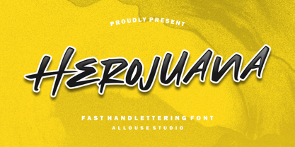 Herojuana a Fast Handlettering Font. Herojuana is perfect for any tittles, logo, product packaging, branding project, megazine, social media, wedding, or just used to express words above the background. Herojuana also come with Multi-Lingual Support. Enjoy the font, feel free to comment or feedback, send me PM or email. Thank you!
 - Looky Cookie NF by Nick's Fonts,
$10.00Hey, take a look at this! This typeface is just for fun, whenever you want to invite folks to take a gander, cast their eyes your way or otherwise check you out. Both versions include complete Latin 1252, Central European 1250 and Turkish 1524 character sets, with localization for Moldovan, Romanian and Turkish. - Herringbone by Elemeno,
$25.00Part of the Zoot Suite of offbeat handwriting fonts, Herringbone is based on a fast and sloppy formal script the designer has been using since he was a child. For use when handwriting fonts are too informal and script fonts too formal. Herringbone is a happy medium. For a bolder look, try Houndstooth.
