10,000 search results
(0.029 seconds)
- HoneyBee by Laura Worthington,
$27.00 HoneyBee is an all-caps display face in a delightfully hand-lettered style for irresistibly sweet layouts on food packaging, fantasy games, or children’s products. This versatile font includes three sets of full-size capitals, two sets of smaller capitals. Mix and match swash forms with titling forms to create headlines, titles, and wordmarks. 20 charming ornaments are included to complement your designs. See what’s included! http://bit.ly/2bGYin7 *NOTE* Basic versions DO NOT include swashes, alternates or ornaments This font has been specially coded for access of all the swashes, alternates and ornaments without the need for professional design software! Info and instructions here: http://lauraworthingtontype.com/faqs/
 - Bickley Script by ITC,
$29.00Bickley Script was designed by Alan Meeks in 1986 and is based on the handwriting forms popular at the end of the 19th century. The flowery capitals contrast beautifully with the delicate and reserved lower case letters, fit perfectly together and enhance the handwritten character of the font. Bickley Script looks as though it were written with a fine tipped pen and has an elegant, nostalgic charm. The font is best for headlines as well as short to middle length texts and should be set in point sizes of 14 or larger, and Bickley Script's capitals can also be used as initials with other alphabets. - Ribbon Cursive by Okaycat,
$29.50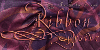 Ribbon Cursive was developed largely from Mercator's Italic Hand, which originated from Italy, during the Renaissance. Ribbon Cursive is fancy, legible, and luxurious text. Works great if you are designing a logo, or use it to create some beautiful titling. Use it for advertisement copy, or even for short to medium-length bodies of text. It should be noted that, due to the heavy embellishment of all the capital letters, this font will not work well if your text is set in all capitals! Ribbon Cursive is contains the full West European diacritics and a full set of ligatures, making it suitable for multilingual environments and publications.
 - Fantasy by Typesenses,
$49.00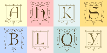 Fantasy draws on a series of historical calligraphic traditions: Roman capitals, Lombardic initials, enlightenment era ornamentation and refinement. The user is invited to deploy their imagination playing with the alternates, ornaments and frames in different universes like publications and stationery. Fantasy Pro is the fully-featured OpenType version with two styles of capitals and plenty of swash alternates and ornaments. Each of these varieties is available as a separate font in addition to Fantasy Std, a set of unadorned standard characters for smaller settings. Use professional software that widely support Open Type features. Otherwise, you may not have access to some glyphs. Give a touch of magic to your work!
 - Dynamique by PizzaDude.dk,
$15.00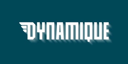 I wouldn't recommend that you use this font for massive text, or text written in CAPS ... but then again, go ahead and try - I even kerned all the capital letters ... just in case that you would do something so crazy! :) Dynamique is a kind of a "straight out of the highway" grid-font. But then again, not ... if you use the lowercase alone, you have this almost monospaced font - try starting every word with a capital letter, and let it end with the alternate ligature, your words suddenly got even more power! If you want to go lightspeed - then use the same technique, but only with the italic version!
 - PGF Trajanite by PeGGO Fonts,
$29.00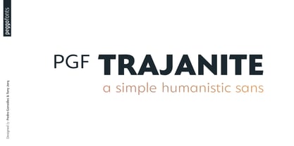 “PGF-Trajanite” is a simple Roman typeface, with capital letters inspired on classical Trajan schemmas such regular square and circle, simple and double root five, early ideas based on the golden ratio, while lowercase have more organic but yet balanced proportions with short ascenders/descenders stems allowing more air to flow between textlines, both (capitals and lowercases) optically adjusted to deliver a better reading experience. Due to simple and universal look it result in versatile typeface perfectly suitable for branding, packaging, label design, UI Interface design. Include standard and discretionary ligatures, alternate glyphs, oldstyle numers, various numerical arrangements. Altogether you will find this a very clean, fashionable, and elegant typeface.
 - Durazno de Chile by Ocha Puyaber,
$10.00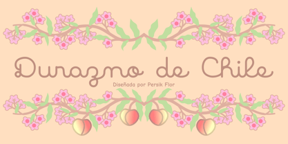 Durazno de Chile are cursive fonts based on Chilean school script. It can be written in Aymara, Mapuche and Rapa Nui from Chile. It can also be written in Dutch, Maltese, and other languages. This font family is cute. The style is wide and rounded. It has wide and open loops. The strokes are drawn with a round cap tool, with no contrast. It is cursive and connected. The form is upright because upright is the Chilean script standard. It is easy to read in Chile. Parts A have capitals with high starts. Parts B have capitals with low starts. Parts F are Final forms.
 - Young Baroque by ITC,
$29.99Young Baroque was designed by Doyald Young, and the font first appeared in the ITC library in 1984. It is a delicate and elegant typeface, whose basic forms are those of baroque script. The generous spirals adorning the capital letters give the font its temperament and contrast beautifully with the small, heavily slanted lower case letters. The flowing, graceful characters create an overall image of aristocratic elegance and dignity. This font can be used advantageously for labels, invitations and certificates and its capitals as initials to contrast harmoniously with both serif and sans serif fonts. Young Baroque is best used for headlines or short texts. Featured in: Best Fonts for Tattoos - Morocco by Linotype,
$29.99Morocco is a round, curvaceous font from Swiss designer Michael Parson. Many of the letterforms in Morocco are inspired by the Modern Greek alphabet. Five of the lowercase letters have additional ascenders/descenders that are not typical in the Roman alphabet (h, n, s, u, x). This experimentation continues into the uppercase as well; many capital letters in this font have been bequeathed with ascender or descender-like elements, and some capital letters, like the Q", only come up to the x-height of the lowercase letters. This experiment in type design is one of ten from Parson that has been included in the Take Type 5 collection from Linotype GmbH." - Wellingborough by Greater Albion Typefounders,
$11.50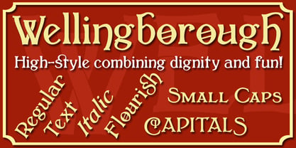 Wellingborough is a family of six late-Victorian inspired faces, principally for display work and headings but also including a text form suitable for use in ‘feature’ paragraphs and short documents. The regular, small capitals and italic forms provides good clear headings, with a modicum of individualism and flair about them, while the Flourish and capital faces carry the family to rather more elaborate-yet still readily legible- heights. The italic form also works well alone to suggest a sense of flow and movement. The whole family is ideally suited for poster and advertising work, as well as book and record covers and period themed signage.
 - MFC Hills Medieval by Monogram Fonts Co.,
$24.95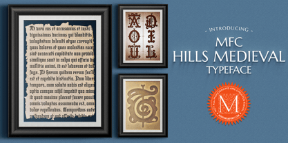 MFC Hills Medieval was developed from a unique historical Blackletter type specimen in the 1882 Hills Manual of Social and Business Forms. While you could use its ornate capitals to construct a monogram, this is not a monogram font, but a fully functional typeface for invitations and period lettering. From stylish and ornate capitals to a soft lowercase resembling bled ink, this period lettering style is a true eye-catcher. Because of some of the unique medieval letterforms, standardized letterforms were created as the default typeable letters while the true historical forms were setup as Stylistic Alternates. A sophisticated Blackletter for manuscripts and invitations alike.
 - Kropotkin Std by sugargliderz,
$30.00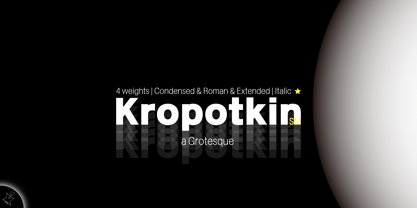 This typeface design was influenced by the British Rail corporate type introduced in an old lettering instruction book published in Japan. Of course, the only clue to this typeface is the lettering instruction book at hand. Therefore, this typeface is based on the British Rail corporate type introduced in an old lettering instruction book published in Japan, and I have expanded the design variations. I started with the Bold design first. Then I designed Light, Regular, and Black in that order. Light and Regular are intended to be used as the text type, while Bold and Black are intended to be used as the base for logotypes, headlines, and other eye-catchers.
 - Aeroport by Brownfox,
$45.00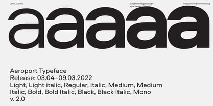 Aeroport is a new typeface in the spirit of both German geometric sans serifs and Swiss neogrotesques. Its deliberately wide proportions and relatively short capitals account for the excellent way the type carries the line. Its short ascenders and descenders allow for very tight leading. When used in large point sizes, Aeroport reveals its industrial ancestry and its unconventional design: the somewhat unbalanced top of the lowercase a, the capital B that has deliberately not been compensated optically, the overly wide capital M. In smaller sizes the type creates a starkly different effect: its measured widths and low contrast make a text setting appear neutral and homogenous. This versatility is what makes Aeroport a multipurpose sans serif suitable for a wide variety of typographic applications. The family includes four weights with their italics and a monospased style. Character set includes an alternate lowercase a, two sets of figures and currency symbols, uppercase punctuation, and a set of arrows. Includes Latin and Cyrillic sets supporting over forty languages. Designed by Gayaneh Bagdasaryan & Vyacheslav Kirilenko, 2017.
 - Pesaro by Hoftype,
$49.00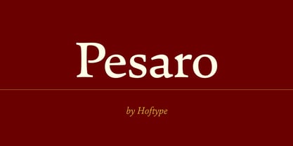 Pesaro is a new text typeface with a strikingly robust but charming appearance. Inspired by early prints from Venice like Jensen and Manutius, it follows its own formal concept of a contemporary design – a stable typeface with strong text qualities and graphic appeal. The Pesaro family comprised 12 styles and is well suited for ambitious typography. It comes in OpenType format with extended language support. All weights contain ligatures, proportional lining figures, tabular lining figures, proportional old style figures, lining old style figures, matching currency symbols, fraction- and scientific numerals and elegant swash captitals for all italic styles.
 - FF Hertz by FontFont,
$68.99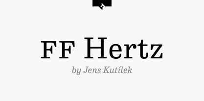 Low stroke contrast, generous spacing, and fine-grained weights from Light to Extra Bold make FF Hertz a workhorse text typeface which holds up well under today’s widely varying output conditions from print to screen. The quite dark Book style works well on e-ink displays which usually tend to thin out letters, as well as in print when you want to evoke the solid letter image of the hot-metal type era. Two sizes of Small Caps are included: A larger size for abbreviations and acronyms, and a smaller size matching the height of the lowercase letters. FF Hertz is a uniwidth design, that means each letter occupies the same space in all weights. This feature allows the user to switch between weights (but not between Roman and Italic styles) without text reflow. Jens Kutilek began work on FF Hertz in 2012. From a drawing exercise on a low-resolution grid (a technique proposed by Tim Ahrens to avoid fiddling with details too early), it soon evolved into a bigger project combining a multitude of influences which up until that point had only been floating around in his head, including his mother’s 1970s typewriter with its wonderful numbers, Hermann Zapf’s Melior as well as his forgotten Mergenthaler Antiqua (an interpretation of the Modern genre), and old German cartographic lettering styles. Jens likes to imagine FF Hertz used in scientific books or for an edition of Lovecraftian horror stories.
 - Decrypt H1 by Type Innovations,
$39.00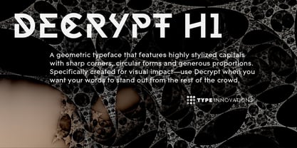 Say hello to Decrypt H1—a geometric typeface that features highly stylized capitals with sharp corners, circular forms and generous proportions. Specifically created for visual impact—use Decrypt H1 when you want your words to stand out from the rest of the crowd. The concept is modern, futuristic and non-traditional. Perfect for display text, logos and headings. The development of Decrypt H1 started in 1997, inspired by Alex Kaczun’s best selling grotesque font family called Contax Pro. Decrypt H1 is specifically introduced here as a bold weight, but Alex plans to expand the design to include many weights, styles and alternative design treatments. Stay tuned! If you like Decrypt H1—check out it’s alternate twins Decrypt 01, Decrypt 02 and all of Type Innovations fonts at: http://www.myfonts.com/person/Alex_Kaczun/
 - Flamante Serif by deFharo,
$8.00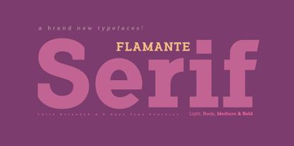 Flamante Serif is a family of 8 typographies with thick square serifs of the slab type, also known by the Egyptians, which are released with four weights: Light, Book, Medium and Bold and their corresponding italic versions. They are heiress fonts of the Egyptian types arisen at the beginning of the S. XIX and descendants of the fonts "Flamante Sans" Special corporate typographies to design resounding titles on any advertising medium, also for any type of publication like magazines or newspapers. They include the Bitcoin symbol. ================================== OpenType Features: Standard Ligatures, Additional languages, All Alternates, Alternate Annotation Forms, Superscript, Kerning, Superiors, Capital Spacing, Localized Forms, Superior letters, Discretionary Ligatures, Subscript, Fractions, Slashed Zero, Inferiors, Extended Fractions, Scientific Inferiors, Ordinals, Denominators, Oldstyle Figures, Numerators, Historical Forms, Historical Ligatures. - 500 glyphs. Latin Extended-A • OTF & TTF.
 - Clip by Setup,
$19.95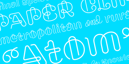 Clip is a display typeface inspired by the shape of a paperclip, but it’s not designed with the usual minimalistic modular approach. Instead, Clip mimics the construction, proportions and contrast of classic bold text typefaces and has one unique characteristic: each of its characters is drawn with only one single line. Clip family consists of 3 fonts, Hair, Light and Regular, each with 745 glyphs (supporting more than 70 latin based languages), 4 stylistic sets and advanced OpenType features. When Stylistic set 1 is activated, the overlapping loops contract, giving the text a whole new character. Moreover, every uppercase character is also available in an ornamental swash variant, which means most of the capitals have four different versions. Learn more about the OpenType features in Clip fonts at http://www.urtd.net/clip.
 - Paradigm by Shinntype,
$9.00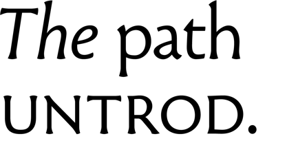 Originally released in 1995 as a three font family, Paradigm forcefully addressed the emaciating effect that digitization was then exerting upon traditional serifed typography. Investigating the new media of a much previous era, Nick Shinn deconstructed the first roman type, designed by Sweynheym and Pannartz in 1467, and gleaned, from its minuscules, the low contrast and discreet serif treatment (portrayed by a novel convex effect), which he subsequently applied to both capitals and lower case of a classically proportioned Venetian invention. Now in 2008, the glyphs, metrics and hinting of the 1995 fonts have been refined, Extra Bold and Light weights added, a full range of OpenType features instituted, and the number of characters per style increased almost threefold. It is a major upgrade to a unique typeface.
 - Bronzetti by Greater Albion Typefounders,
$10.00 A typographic revolution-Bronzetti has been a long term project for Greater Albion Typefounders, aimed at filling a large gap in the range of typefaces available today. The Bronzetti family of 22 text typefaces combines modern requirements for legibility and readability with the charm of traditional Roman faces in the spirit of those carefully constructed by small scale quality foundries such as the Kelmscott and Vale presses. In short, Bronzetti is traditional letterpress meets modern publishing, offering a real opportunity to make your material stand out from today’s ‘run of the mill’ crowd. The range of typefaces on offer includes five widths of type, as well as small capitals and italic forms and regular and bold weights. Try out Bronzetti today, make your work stand out from the crowd and join the revolution!
 - Magari by Sudtipos,
$49.00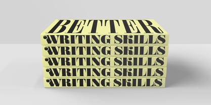 Partially inspired by the mid XIX century german condensed serif typefaces –and a clear connection to Italian classics– Magari extrapolates that idea of fusion to a new level, getting a unique variable font file, or 9 specific weights. With that in hand the user is able to find the perfect match for any design. From an ultra compressed thin to an extended black style, Magari is a perfect font for display use. It’s jazzy vibes and wide range of weights make it incredibly perform in advertising, packaging or editorial design, assuring great impact whether it’s thin and tall, or big and bold. The addition of three kinds of endings for the lowercase –from a serif to two tailed strokes– and two different swash sets for the capitals, Magari lets the user play with infinite results.
 - Decrypt 02 by Type Innovations,
$39.00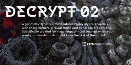 Say hello to Decrypt 02—a geometric typeface that features highly stylized capitals with sharp corners, circular forms and generous proportions. Specifically created for visual impact—use Decrypt 02 when you want your words to stand out from the rest of the crowd. The concept is modern, futuristic and non-traditional. Perfect for display text, logos and headings. The development of Decrypt 02 started in 1997, inspired by Alex Kaczun’s best selling grotesque font family called Contax Pro. Decrypt 02 is specifically introduced here as a bold weight, but Alex plans to expand the design to include many weights, styles and alternative design treatments. Stay tuned! If you like Decrypt 02—check out it’s alternate twin Decrypt 01 and all of Type Innovations fonts at: http://www.myfonts.com/person/Alex_Kaczun/
 - Maecenas by Dada Studio,
$29.00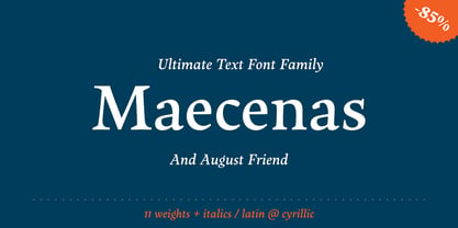 Maecenas is an elegant professional. It stands out from other typefaces due to it’s timeless style and versatility. It will add smartness to all texts, regardless of the user’s expectations. In a quick and flashy way it will make an impression on anyone, who requires from his tool character and reliability. Maecenas won’t be lost in the crowd, and thanks to it neither will you. This font, marked by chivalry, is an AUGUST friend for good and bad. Light and bold weights, due to their strong personality, are perfect for display uses. At the same time, Regulars create a harmonious structure that provides excellent legibility in long texts. Maecenas covers all latin languages and cyrillic. It contains a wide set of numerals, small capitals, fractions, ligatures and other OpenType goodies.
 - Decrypt He2 by Type Innovations,
$39.00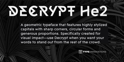 Say hello to Decrypt He2—a geometric typeface that features highly stylized capitals with sharp corners, circular forms and generous proportions. Specifically created for visual impact—use Decrypt He2 when you want your words to stand out from the rest of the crowd. The concept is modern, futuristic and non-traditional. Perfect for display text, logos and headings. The development of Decrypt He2 started in 1997, inspired by Alex Kaczun’s best selling grotesque font family called Contax Pro. Decrypt He2 is specifically introduced here as a bold weight, but Alex plans to expand the design to include many weights, styles and alternative design treatments. Stay tuned! If you like Decrypt He2—check out it’s alternate twins Decrypt H1, Decrypt 01, Decrypt 02 and all of Type Innovations fonts at: http://www.myfonts.com/person/Alex_Kaczun/.
 - Tropical by Sudtipos,
$49.00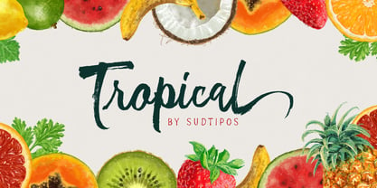 The single-named, multi-talented designer Joluvian now lives in Madrid. But he grew up in the “Caribe” of Venezuela, where thick jungles meet endless beaches, and fecund trees bear juicy fruit – a tropical paradise where music and dance vibrate in the humid air. The Tropical pack, designed by Joluvian and digitized by Ale Paul, echoes the spirit of his birthplace. Its three faces are casually stylish – a bold, wet-looking display script, an inky, textured brush script, and hand-penned capitals with a felt-tip look. Like a fruit cocktail, each ingredient is tasty on its own, but they combine even more deliciously. Sprinkle the included catchwords, shapes, and bursts in your layout to complete the easygoing, Carribbean vibe. Each face includes alternates and support for multiple Latin languages.
 - Kyotce by Soerat Company,
$24.00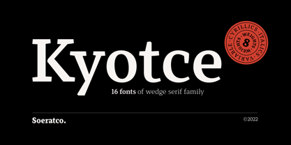 Kyotce is inspired by the Egyptian serif which has a strong and bold typeface. This family of 8 weights from Light to Bold along with italics and is perfect for advertising, packaging, logo, editorial and publishing, branding and other creative industries. Each style includes 700+ glyphs, Kyoto supports around 200 languages in the Latin and Cyrillic. This font provides advanced typographic support with features such as ligatures, alternate characters, old-style figures, fractions, numerator/denominator, superior/inferior, and various symbols.
 - VVDS Benigne Sans by Vintage Voyage Design Supply,
$14.00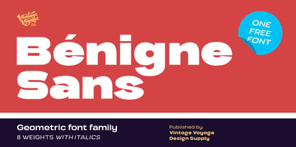 VVDS Benigne Sans is geometric font family consisting of 8 weights ranging from Thin to Ultra Bold with matching italics. Balanced and gently Thin or fat and heavy Ultra Bold, good wide range of widths, which allow use this font not only as a Headers, also as sub-headers or block texts. Also, I love how it looks in infographics. VVDS Benigne Sans is latin-based multilingual and contains all mathematics symbols. OpenTypeFeatures Ligatures, alternates, old style numerals and fractions. Enjoy! VVDS
 - AT Move Billiard by André Toet Design,
$39.95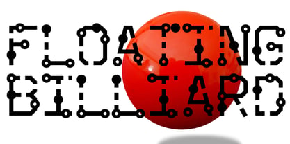 BILLIARD was born from the numerous sketches André Toet did for the design of a series of postage stamps in 2011. It’s a capital monospaced and ‘fun’ alphabet, based on the classic billiard play with two white and one red ball. Actually snooker and pool were derived from this rather old sport! In Europe it used to be a sport played by elderly people, practiced in traditional bars, including the smell of beer and the at that time prevalent smell of cigarettes and cigars. These days billiard, snooker and pool are quite popular once again with young people. Hopefully our new font will get the same attention the ‘old sport’ deserves and who knows it might even be used in a sportive way. Concept/Art Direction/Design: André Toet © 2017
 - Callejera - Unknown license

- Miss Donna by Scholtz Fonts,
$15.00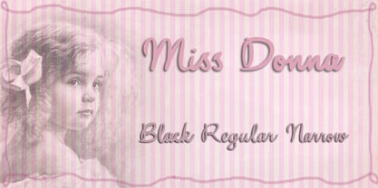 Miss Donna - contemporary, powerful, versatile and casual. Curvy, sassy, fast-talking, and utterly useable, she takes you into the world of movie posters, decor ads, fashion posters and tags, greeting cards and invitations. Her lines are bold, clean and legible. The Miss Donna family comes in four styles: - REGULAR - clean good lines and generous curves - for decor ads, greeting cards, copy - NARROW - slim (more compact), and elegant with contained curves - for greeting cards, invitations, copy - BLACK - bold statement, round, generous curves - for movie posters, fashion posters - BLACK CAPS - especially designed for "all-caps" printed text. Use for headings & subheads. Miss Donna Black Caps contains capitals in two sizes and this gives you the ability to generate text of two types: - a correctly spaced and kerned upper case, OR - a TRUE Small Caps -- as opposed to the false Small Caps produced by a well-known word processing application. In a correctly proportioned Small Caps the stroke width should not be reduced in the same proportion as the letter height is reduced. The stroke width of the small capitals should rather be equal or close to the stroke width of the corresponding upper case characters. Note: When using script fonts it is NOT usually advisable to use text in ALL caps. The best effects for headings and subheads are obtained with an initial upper case letter followed by lower case characters. BUT, Miss Donna will still produce excellent results with all caps if you are using an application that supports kerning. If you are using upper and lower case then it is not necessary to use kerning, although it may make a slight difference on occasion. Miss Donna contains over 235 characters - (upper and lower case characters, punctuation, numerals, symbols and accented characters are present). It has all the accented characters used in the major European languages.
 - Monograf by Milan Pleva,
$10.00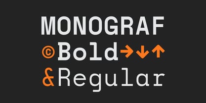 Monograf was originally designed as fixed-width monospaced font which has 2 weights (Regular and Bold). Monograf Text is a derived style of Monograf with proportional spacing and well-balanced kerning to make the text easier to read and look optically balanced. So in the total bundle you get 4 pieces of this font: Monograf Regular, Monograf Bold, Monograf Text Regular and Monograf Text Bold. This versatile font with clean geometry and slightly rounded corner elements works great in digital space, as well in print. It also retains its legibility at smaller sizes. Typographic features include old-style figures, directional arrows and four types of asterisks. The entire font is suitable for purposes such as tabular layout, coding, website, but also for magazines, logos, signs, products, and others. Features: Basic latin alphabet A-Z 116 Accented characters Numbers, Punctuation, Currency, Symbols, Math symbols & Diacritics Old style figures, Directional arrows and 4 asterisks
 - Sheet Music JNL by Jeff Levine,
$29.00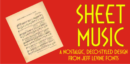 Sheet Music JNL was based on lettering found on an old piece of 1930s-era sheet music being sold at a local rummage sale.
 - P22 Canterbury by IHOF,
$49.95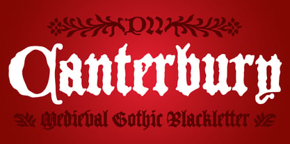 Canterbury is a late Medieval Gothic font with a rough edge. This blackletter face is available with four different types of Capital initial letters or combined into one Opentype Pro font with all variations plus historic ligatures, alternates and even a few ornaments.
 - Alright by K-Type,
$20.00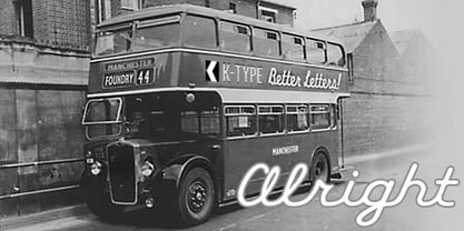 Alright is a cursive font is based on the handwriting alphabets used in education, but with modern short ascenders and descenders. Most of the lowercase letters and half of the capitals join up smartly. A useful teaching alphabet and surprisingly stylish too.
 - Asgaard by Vozzy,
$10.00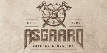 Introducing a vintage label font named Asgaard. This strong typeface is perfect for lettering on vintage style posters, t-shirts, greeting cards, logos, and more. All capital letters (including multilingual) have alternates. You can see all available characters and styles in the previews.
 - Badcab by Dismantle Destroy,
$19.00This is a great poster font. It was created by hand, scanned and digitalized for quality. After, it was distressed with custom made brushes. The font is in all capitals with two versions of each letter. Font includes over 100 characters and glyphs. - Orphiel by Scriptorium,
$18.00Orphiel from a sample of Edwardian period hand lettering, mainly because we wanted to offer an alternative to our Belphebe font for invitations, menus and wedding announcements. It's an elegant font, with nice variations in weight and capital letters which are quite ornate. - Dolmen by ITC,
$29.99Dolmen font from Max Salzmann revives the look of the 1920s and suggests all the glamour and culture of the jazz age. Dolmen can be used in all capital or upper and lower case settings and gives any work an Art Deco look. - Neon by Monotype,
$29.99Neon Extra Condensed was designed by Giulio da Milano and released in 1935. This all-capital typeface is similar to designs released in the early 1990s. The Neon Extra Condensed font is good as a headline face for magazines and book covers. - Hopeful Giraffe by JBFoundry,
$18.00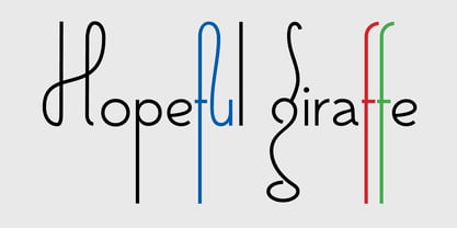 Long legs, long neck, low x-height, it’s Hopeful giraffe. Each of both styles of this family of font contains two stylistic sets. With its ornamental capitals and its varied numerals, you can modulate the aspect of your texts as you want it.
