10,000 search results
(0.036 seconds)
- Linotte by JCFonts,
$30.00 Linotte is a rounded sans in 7 styles designed by Joël Carrouché. Small irregularities give the typeface a warm and naive look, while the simple geometric construction provides good legibility in long texts and small sizes. Linotte is an ideal choice for food or kids related products, or anything that needs to convey a human and friendly feeling. Originally released in 2014, Linotte was updated in 2021 with Greek and Cyrillic support, two new styles, and other small additions. Linotte Semibold is 100% free for personal and commercial use. The fonts, provided in OpenType format, include diacritics for most European languages, a set of arrows & icons, and a variety of advanced features like stylistic alternates, case-sensitive forms, sub and superscript, automatic fractions, etc.
 - Winden by Latinotype,
$26.00 Winden is a geometric slab serif typeface based on the bestselling font Isidora https://www.myfonts.com/fonts/latinotype/isidora/ and inspired by early 20th century famous classic slab-serif typefaces. Characteristic features such as trapezoid shape serifs give Winden a modern, contemporary touch and the rounded edges of the Alt version make it look unique and special. This font consists of two subfamilies: Winden —classic, simple and functional— and Winden Alt (playful and contemporary), ideal for display use. Each version comes in 7 weights, ranging from Thin to Black, and includes matching italics— 28 fonts in all. Winden is the perfect choice for headlines, logos, branding, packaging, publications and websites. The full set contains 615 characters that support over 200 Latin-based languages.
 - Bobby Jones by Tom Chalky,
$19.00 Introducing The Loud & Proud Bobby Jones Font Collection Inside you'll find 16 quirky handcrafted fonts, oozing with personality, ripe and ready to take center stage within a variety of creative and fun design projects. If you're looking to grab eyeballs with an ad campaign, a logo design, apparel, printed stationery, and all that other good stuff, then worry not. Bobby has you covered. We all come with imperfections and Bobby is no exception! His outlines are slightly off, his corners are irregular, his straights aren't straight, but he's cool with it. In fact, he's too busy strutting his stuff. - What's Inside? Each of the fonts listed below boast multilingual glyph ranges and their own individually handcrafted outline style! (16 fonts in total!) - Bobby Jones - The original Bobby.J - Bobby Jones Soft - A rounded version of the above - Bobby Jones Condensed - The thinner and leaner sibling to Bobby Jones - Bobby Jones Condensed Soft - A rounded version of the above - Bobby Rough - A high-res textured version of the original - Bobby Rough Soft - A textured version of Bobby Jones Soft - Bobby Rough Condensed - A textured version of Bobby Jones Condensed - Bobby Rough Condensed Soft - A textured version of Bobby Jones Condensed Soft Designed a little over five years ago, the original Bobby Jones Font was my first ever product. This new and improved version has been entirely redesigned from bottom to top. Holding dearly to the punch that the original had, while adding a whole lot of extra power. I hope you enjoy the Bobby Jones Family as much as I do and have, and as always if you have any questions or comments, please do not hesitate to get in touch. I'd love to hear from you. (tom[at]tomchalky.com)
 - Tatty by Scrowleyfonts,
$- Tatty is a sans serif, monoline font that is distinguished by the gentle, rounded, backward curves on the ascenders. I created it because I had a picture in my mind of a font that I wanted to use when designing images and logos for clients' websites but I could never find one that was just exactly right. Many years ago I worked for a sign-writing company. My job was to copy and enlarge letter sets from printed copy and then cut masks for airbrushing. One morning I arrived at my desk to find that the airbrush artist had written on a rough, rubbed out, scribbled on drawing of the letter ‘a’ - “make a letter happy, make it beautiful”. That was the brief I set myself in the design of Tatty - to make every letter happy and beautiful. The result is a flowing, elegant yet simple type which I believe works particularly well for poetry.
 - Fab by Canada Type,
$24.95 It's 1984 and everything has sideburns. Shoulder-padded "dress for success" is in, with power suits for women, black and white layers for men, neon brights for the youngsters. Maggie's "enemy within" and "no society" speeches preface the arrival of shopping malls and corporate status symbols. The economy is a philosophy and accountants carry ambiguous but very sophisticated-sounding titles. Thousands of words and expressions are reduced to initials or monosyllabic sounds. Synthesizers are very refined and the music is very catchy. The Macintosh and MTV are making waves. Brands are lifestyles. "Yuppy," Yummy," "Bobo," "Dinky" and "Woopie" are standard consumer categories in advertising lingo. The Volkswagen identity, only 5 years old now, is all the rage in design. VAG Rundschrift, by all appearances a rounded and slightly condensed Futura, is everywhere. Tube design is king. Fast forward two dozen years. Replay, but bigger and much louder. Fab. Let's dance. Fab is Canada Type's tribute to the Eighties. It's a five-font unicase family that brings tube design into the 21st century. The main font is an all-in-one treatment of the shiny roundness that the 1980s were. Fab White is a tightly packed thick outline font that conveys luscious contentedness like nothing else. The Fab Trio package is very useful for layered and colorful design, with the Black style serving as a backdrop, the Bold style as the front forms, and the Fill style for inlining. Fab comes in all popular formats and contains support for Western, Central and Eastern European languages, as well as Baltic, Esperanto, Maltese, Turkish and Celtic/Welsh languages.
 - CA No Dr. by Cape Arcona Type Foundry,
$30.00 No Dr. was inspired by an old movieposter lettering for the 1962 movie "James Bond: Dr. No". Just like the original Dr. No, No Dr. has a diabolical charm. It was developed into a font family that combines distinctiveness with versatility. It has a good readibility as a textfont but also looks great as a Headline. The two widths and the two weights give you a big choice. Intended to become an interesting alternative to the much used DIN Schrift, it has now developed into a highly functional family of it's own.
 - Radiant Days by Prestige Artsy Studio,
$19.99 Spice up your designs with Radiant Days an elegant retro bold serif with its lovely rounded curves that will give a modern retro touch to your designs. Radiant Days with its alternates will provide your project. Whether you are a logo designer, or looking for a great bold header to your designs, retro quotes, Radiant Days will definitely make your work stand-out. To access the ligatures and the stylistic alternates make sure they are ON in the OpenType Feature option. Supported languages: Western European Central European South Eastern European South American Oceanian
 - Tangential SemiSerif by ArtyType,
$29.00 This variation in the Tangential series (see also the Standard & Rounded families) continues with the angles that give the typeface its name, however a semi-serif is applied wherever appropriate to create a more open, softer variant. The Tangential style I envisaged for the family is complemented by the prominent use of negative space throughout, most apparent on the drop shaped ‘o’ which is a key feature of the typeface and a letterform I'm particularly pleased with. Available in 2 weights, Regular & Bold, in both OpenType OTF & TrueType TTF formats.
 - Brightly Stories by Graphicxell,
$20.00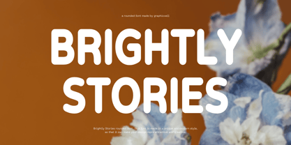 Brightly Stories Rounded Sans Font Typeface inspired by the famous minimalist logo perfect for the purposes of designing templates, brochures, videos, advertising branding, logos, invitation, layout design, elegant crafting, beauty design and other What's Included : + Standard glyphs + International Accent + Works on PC & Mac + Simple installations Accessible in the Adobe Illustrator, Adobe Photoshop, Corel Draw. PUA Encoded Characters - Fully accessible without additional design software. Fonts include multilingual support Image used : All photographs/pictures/vector used in the preview are not included, they are intended for illustration purpose only. Thank You
 - Outbacker by Rook Supply,
$14.00 With Outbacker you're not just getting a typical a-z font. You're getting a font that has over 100 alternate glyphs, so that you can use the font to write phrases a ton of different ways. So, if you're looking for the perfect 'R', you have 6 additional options to choose from in addition to what's programmed for the default uppercase and lowercase characters. Choose more sharp characters if you're going for something more aggressive, or more rounded characters if you want something with more of a laid back flow.
 - Blastvader by Invasi Studio,
$19.00 Introducing a new collection of retro display fonts. Blastvader is a reverse contrast retro display font. The glyphs have a fat rounded shape. It's ideal for headlines, flyers, posters, greeting cards, product packaging, book covers, logotypes, and album covers, among other things. Ensuring carefully crafted styles result from the use of this font. The alternates in this font can add more fun to your projects. Its imperfections keep it casual while still providing legibility. Features: Total 209 Glyph Uppercase Numerals & Punctuation Alternates Multilanguage Supports 60+ Latin based languages
 - Architype Schwitters by The Foundry,
$99.00 Architype Konstrukt is a collection of avant-garde typefaces deriving mainly from the work of artists/designers of the inter-war years, whose ideals have helped to shape the design philosophies of the modernist movement in Europe. Due to their experimental nature character sets may be limited. Architype Schwitters was developed from the phonetic experiments made by Kurt Schwitters with his 1927 universal alphabet, where he attempted to link sound and shape. He ‘played with’ using heavier, wider, rounded forms to convey the vowels, creating a unique visual speech texture.
 - Chancery Lane by K-Type,
$20.00 Chancery Lane is a condensed cursive with a breezy, flowing feel. Many of the lowercase characters join up, some uppercase ones too, and the two fonts are slantier than many other chancery-inspired faces, inclined at almost 20°. Each glyph has slightly rounded corners to bestow softness and warmth. The typeface emerged from a study of pen lettering, italic scripts and chancery hands – down a rabbit hole and along the Chancery Lane. The research ranged from early cancellaresca manuscripts to contemporary fonts, and also calligraphic work, most notably that of Indian artist Mayank Baranwal whose lowercase letters inspired many of the Chancery Lane glyphs. Uppercase characters have been designed to harmonise with the lowercase rather than providing overly ornamental openers, true to origins that were functional rather than fancy. Both the capitals and the uppercase alternates are unfussy and relatively simple, and the lowercase swash characters are similarly understated, only modestly flourished. Stylistic alternates and lowercase swash characters can be accessed using OpenType-aware applications or font management software.
 - Millenium Pro Var by TypoStudio Pro,
$200.00 La famille Millenium est composée de modèles dont le poids varie progressivement. Elle est très étendue. Elle va de "Super Thin" à "Extra Black". Unique au monde, sa finesse permet de concevoir un style très léger même pour l'impression d'affiches et d'autres grands formats. Conçu dès l'origine comme un caractère variable, le Millenium offre une gamme de 900 variations possibles et une infinité de créations...
 - Punch Tape JNL by Jeff Levine,
$29.00 Punch Tape JNL emulates the old-style pin-punched paper tapes that were used in everything from ticker tapes to moving electronic signage to early digital typesetting equipment. Pin punch characters were also used in the early days of banking as a secure way of canceling a check so that it was rendered useless if re-submitted. In this version, the "dots" are square rather than round.
 - Utendo - Personal use only

- Glotona Black - Personal use only

- Odisean Tech - Personal use only

- Display Dots - 100% free

- K5 - Personal use only

- !PaulMaul - Personal use only

- CosmosCaps - Unknown license

- Soft Press by Canada Type,
$24.95 This is the rounded, softer version of Canada Type's popular Press Gothic. Originally done in 2011 for a global publisher, this font has already seen plenty of magazine and book cover action, perhaps even more than the sharp condensed face that spawned it. And like Press Gothic, Soft Press comes with small caps and biform/unicase forms, in addition to the main upper/lowercase set. The extended language support covers a wide range, including Greek and Cyrillic, Turkish, Baltic, Central and Eastern European languages, Celtic/Welsh and Esperanto. The Pro version combines all three TrueType fonts into one OpenType-programmed font, taking advantage of class-based kerning, the small caps feature, and the stylistic alternates feature for the biform shapes.
 - Harjita by Mantra Naga Studio,
$20.00 Harjita is a Retro Groovy Font inspired by the retro pop style of the 80s-90s by combining a thick serif style and rounded corners so it looks friendly and easy to read. This font is perfect for brand identity needs or other graphic media. This font is also PUA encoded, which means you can easily access all glyphs and opentype features easily. 376 Glyphs 4 Opentype features 9 Ligatures set Support Multilingual for 89 languages We highly recommend using a program that supports the OpenType feature and the Glyphs pane like many Adobe and Corel Draw applications, so that you can view and access all variations of Glyphs. Thanks for your support of our product and using it in your project.
 - Bron by Jeremia Adatte,
$49.00 Bron is based on Zelek, designed in the 70s by Polish type designer Bronisław Zelek. This typeface was originally made for dry transfer lettering sheets. It has been drawn following the principles of impossible geometry and is derived from simple geometric forms (perfect circles, triangles and squares). It has been carefully redrawn and updated and is now available for contemporary technology and design. Use Bron’s rounded and smooth optical shapes in your headlines, logos, packagings, posters to instantly attract attention. This style offers two separate layered fonts to make your own awesome two color compositions. These can be used separately to create even more subtle effects. Bron is packed with an extended character set, supporting Central, Western and Eastern European languages. Check its semi-outline version here!
 - Core Sans R by S-Core,
$20.00 The Core Sans R Family is a part of the Core Sans Series, such as N, NR, N SC, M, E, A, D. and G. This font family has closed and square letter shapes, and overall rounded finishes provide a soft and friendly appearance. Simple shapes with a tall x-height make the text legible and the spaces between individual letter forms are precisely adjusted to create the perfect typesetting. The Core Sans R Family consists of 7 weights (Thin, Light, Regular, Medium, Bold, Heavy, Black) and Italics for each format. Core Sans R supports complete Basic Latin, Cyrillic, Central European, Turkish, Baltic character sets. Each font includes proportional figures, tabular figures, oldstyle figures, numerators, denominators, superscript, scientific inferiors, subscript, fractions and case features.
 - Axion by Type Innovations,
$39.00 Axion is an original design by Alex Kaczun. It is a display font not intended for text use. It was designed specifically for display headlines, logotype, branding and similar applications. The entire font has an original look which is strong, dynamic, machine generated and can be widely used in publications and advertising. Axion is a futuristic, techno-looking and dynamic typeface with elements of machined-like parts containing sharp and rounded edges. This attractive display comes in roman with lower case and lining figures. The font is also available with true-drawn slant italics. Other design style variations include small capitals with old style figures. The large Pro font character set supports most Central European and many Eastern European languages.
 - Ekeras V2 by Type Innovations,
$39.00 Ekeras V2 Inline is an original design by Alex Kaczun. It is a display font not intended for text use. It was designed specifically for display headlines, logotype, branding and similar applications. Primarily a display, this extremely versatile font has generous proportions, large counters and loose fitting which also allow the font to work well across a wide range of text sizes. The entire font has an original look which is strong, dynamic, machine generated and can be widely used in publications and advertising. Ekeras is a futuristic, techno-looking and dynamic typeface with an appearance of machined-like parts with sharp and rounded edges. The large Pro font character set supports most Central European and many Eastern European languages.
 - Linotype Sangue by Linotype,
$29.99Linotype Sangue is part of the Take Type Library, selected from the contestants of Linotype’s International Digital Type Design Contests of 1994 and 1997. This prize-winning font was designed by the German artist Gabriele Laubinger. The most distinguishing characteristic of Linotype Sangue is the contrast between the wide, rounded capital letters and the tall, narrow and pointed lower case. Another factor which makes this font so unique is the way Laubinger worked with stroke contrasts, using heavy strokes in the top third of the characters and diminishing to extremely light strokes at the bottom. Linotype Sangue makes a mysterious, secretive impression. It is best used for headlines and displays and shorters texts with point sizes of 12 and larger. - Momain Kidz by IbraCreative,
$37.00 Momain Kidz is a delightful and enchanting children's typeface that captures the imagination and playfulness of young minds. Its rounded and bubbly letterforms exude a sense of innocence and joy, instantly transporting us to a world of imagination and wonder. With its slightly irregular shapes and friendly curves, Momain Kidz evokes the spontaneity and creativity of a child's handwriting, making it perfect for children's books, educational materials, and playful designs. The vibrant and cheerful colors of Momain Kidz bring a sense of fun and excitement to any project, while its legibility ensures that young readers can easily engage with the text. Momain Kidz is a whimsical and inviting typeface that sparks curiosity and invites young hearts to embark on exciting adventures in the world of reading and learning.
 - Ashemore Softened by insigne,
$32.00 Following the success of the Ashemore family, it became clear that a rounded version of Ashemore would be a great addition to the product line that would allow designers even more design choices. Ashemore Softened’s rounder forms compliment the face well as the original font eschewed straight lines. The rounded terminators give the face a sense of friendliness that is unsurpassed. The distinct and flamboyant style of Art Nouveau and the Arts and Crafts style remain, but the blunted terminators give the face a more technological and contemporary look and feel. The Ashemore Softened family has a full range of six weights from thin to black and includes condensed and extended options for a total of 36 fonts. The typeface also includes some unique OpenType alternates that make the superfamily even more versatile. Ashemore Softened is equipped for complex professional typography, including alternates, small caps and many alternate characters. The face also has a number of numeral sets, including tabular figures, fractions, old-style, lining figures and superiors and inferiors. OpenType-capable applications such as Quark or the Adobe Suite can take full advantage of automatic ligatures and alternates. You can find these features demonstrated in the .pdf brochure. Ashemore Softened also includes the glyphs to support a wide range of languages, including Central, Eastern and Western European languages. In all, Ashemore Softened supports over 40 languages that use the extended Latin script, making the new addition a great choice for multi-lingual publications and packaging. The original Ashemore was designed by Jeremy Dooley with production assistance from Lucas Azevedo and Marcelo Magalhaes. Kerning assistance from iKern.
 - Quell by Underscore,
$35.00 Quell is a novel attempt to bridge the gap between geometrically constructed shapes on the one hand, and modulated strokes and subtle calligraphic influence on the other hand. The visual tension in Quell stems from conflict between two tendencies: The perfectly round shapes are geometrically constructed, yet the contrast of stroke widths and oblique line terminations suggest calligraphic roots. How this dualism affects typographic impression is up to designers and typographers using Quell — as variable font the seamless transition between modulated contrast and linear appearance offers unique typographic possibilities. Linear appearance gives the text a solid and compelling voice, whereas the modulated styles convey elegance, vibrance and a delicate tone. Quell is suited to display setting, headlines, way finding and identity. The combination of linear and contrast variants provides typographic range to convey different stance while rooted in the same visual heritage. In short paragraph typesetting the fonts have a modern look and characterful tone, but should not be overused for longer texts. Quell has been in development for over a year, and is the proud third release under the Underscore label. Released in 2018 this design by Johannes Neumeier is available from the Underscore webshop as well as selected retailers.
 - Aukim by AukimVisuel,
$20.00 Aukim is an exceptional, unique and ligature-rich font that gives a new look to your texts. It is a more text-oriented font and thanks to its OpenType features, it becomes versatile. It is available in 3 sub-families (condensed, normal and extended) for a total of 54 fonts. There are 9 weights with their real italics. It has 886 glyphs, 107 uppercase and 65 lowercase ligatures per font. It also offers a wide range of languages, from Latin to Cyrillic, as well as powerful OpenType features such as meticulously and professionally maintained kerning, stylistic variations, swashes, highly distinctive ligatures, old-fashioned tabular figures, fractions, denominators, superscripts, unlimited subscripts, arrows and much more to satisfy the most demanding professionals. On the one hand, it has rounded curves with very open endings that make this font family noble, friendly and contemporary and on the other hand very useful for writing titles on any medium. Perfectly suitable for graphic design and any display use. It could easily work for web, signage, corporate design as well as editorial design. Aukim is a cool, wonderful, elegant, bold and fun display font. It can easily be paired with an incredibly wide range of projects, so add it to your creative ideas and notice how it makes them stand out!
 - ZT Floogn by Khaiuns,
$14.00 The new ZT Floogn font family, designed by Khaiuns and published by Zelowtype, is a modern, dense sans-serif style with a rounded look. This font is characterized by its balanced proportions, uniform stroke width, and subtle variations in type forms, giving it a distinctive look at all weights. Due to the narrow shape of the ZT Floogn typeface, it is best applied to headlines and poster-sized typography, resulting in designs with a fresh, friendly personality. ZT Floogn has 8 weights, one of them is commercial-free, and each style has a unique alternative font. I hope you have fun using ZT Floogn. Thanks for using this font ~ Zelowtype X Khaiuns
 - Balega by Linotype,
$29.99 Balega is stencil-like display font, created by German designer Jürgen Weltin in 2002. Balega's letters are very bold, and have a slight italic slant. While some of the uppercase forms appear somewhat sharp, the lowercase is definitively round and friendly. Text set in Balega has a very forward moving motion, as the slant makes all of the letters seem to be lunging toward the right. This gives the typeface a very dynamic feel. Because the counterforms in and between the letters are very narrow, we recommend using Balega in posters and other larger displays, where its design may be truly appreciated. Balega is part of the Take Type 5 collection, from Linotype GmbH."
 - Figgins Sans by Shinntype,
$79.00 The first sans serif types were made in London in the early 19th century. They were severely modern, all caps and bold. The Figgins foundry, inventor of the term sans serif, showed a ?ne example in its specimen of 1836. The extra bold weight of Figgins Sans is a close revival of the original, with the addition of a lower case which retains its partly geometric, partly grotesque quality. The family is rounded out with other weights and an italic, and extended into Cyrillic and Greek, all executed in what is assumed to be as authentic a manner as possible, given the hypothetical nature of the exercise. Together with Scotch Modern, comprises The Modern Suite of matched fonts.
 - Portiere by Cititype,
$14.00 "Portiere" is a natural handwritten font, we created this font using a marker pen, the natural emphasis of the pen makes the round size random. We write one by one on the paper and then we select each glyph to be the font. This is how we get a natural impression. To sharpen the natural impression we made several ligatures because in natural writing you will not find the same composition. Activate the ligature and feel a natural writing sensation. This font is very suitable for writing quotes and short sentences. Even more so for text animations such as on YouTube and other social media. Its unique shape also allows it to be used for logos.
 - Flicker Lettering by Hanzel Space,
$25.00 Flicker - Vintage Calligraphy Font We're Introducing the "Flicker" Font we created in 2022. To talk more about the character of this font, please see a preview of how each Glyph in the font will look when applied to a design. This font has a vintage touch and a modern look to each letter, slightly rounded and neat shapes in each curve, plus a Stylistic feature at the end of the letters. We design this font in such a way that it is suitable when used for design projects so that it looks very attractive. And you can also use this font for logos, branding, brochures, names on product packaging and so on. Uppercase & Lowercase, Numeral, Punctuation, Miltilingual, Swash
 - Aksen by Tokotype,
$40.00 Aksen is a humanist sans-serif typeface that draws influence from Roger Excoffon’s Antique Olive. Its design is formed by the rounded, curving letters found in ancient Greek and Roman inscriptions but is implemented with a contemporary and pragmatic approach. This typeface comes in 56 styles consisting of four widths and seven weights, each with matching italics. Also available in variable font format, Aksen Variable boasts three variable axes: width, weight and italic. These axes open up a plethora of stylistic choices making this typeface highly adaptable. Aksen is a versatile typeface that seamlessly blends contemporary humanistic aesthetics with a touch of historical sophistication, making it a perfect fit for a wide range of design applications.
 - Via Sans by Latinotype,
$26.00 Via sans is a font inspired by classics like Steile Futura and Din 1451, with neo-humanist characteristics. It was designed as a font for fast reading from a distance, which saves horizontal space in the text composition, making it a very good alternative when composing long phrases in reduced spaces, with high readability in various sizes due to its ample counters. With round corners that reduce the irradiation that reflective materials in signs produce. This family is composed by 8 fonts, 4 weight variations and 4 inclination variations, which include European accents marks, ligatures, fractions, ordinals and tabular numbers, in addition to a pictogram set that complement applications for wayfinding and maps.


