10,000 search results
(0.12 seconds)
- Brendria Signature by Rometheme,
$22.00 Brendria – Signature is a handwritten signature script font, this font looks classy, luxury, elegant, romantic, wedding, lovely, girly and awesome. Highlights: Standard glyphs (Uppercase, Lowercase, Numeral & Punctuation) Work on PC or Mac PUA Encoded Support Fonts include multilingual support for; ä ö ü Ä Ö Ü ß ¿ ¡ No special software is required, The fonts can be opened and used in Adobe Illustrator, Adobe Photoshop, Adobe InDesign, even work on Microsoft Word.
 - Zn Branch by Zeenesia Studio,
$15.00 Introducing BRANCH - Elegant Serif Typeface BRANCH is a beautiful and smooth serif font created by a romantic and lovely look. I created some natural ligatures to make this font very elegant and look so classy. It is perfect for greeting cards, wedding invitations, posters, logotypes, product branding, and much more. This font is PUA encoded, which means you can access all of the glyphs and swashes with ease!
 - Adigen Abigel by Kartiny Type,
$12.00 Adigen Abigel is a beautiful script that's perfect for branding, wedding invitations, and other romantic projects. This love-centered look makes it perfect for use in all your design projects. Adigen Abigel is interesting because the typeface is pleasing to the eye, clean, feminine, sensual, glamorous, simple, and very easy to read. Contains full set: -Uppercase -Lowercase -Alternative -Ligature -Punctuation -Number -Multilingual support. Thank you for your purchase!
 - Swanstone by Zetafonts,
$51.00 Mario De Libero designed Swanstone while investigating XIX Century Old Style typefaces. Designs like Theophile Beaudoire’s Romana (1860) or Miller & Richard’s Modernized Old Style, that re-imagined the classical “Venetian” letterforms adding flared serifs and early Art Nouveau influences. In Italy, one of these fonts was Raffaello Bertieri’s Raffaello, which De Libero used as the starting point of his research in a contemporary retelling of these exuberant and sexily unsettling letterforms.
 - Keukenhof by Ef Studio,
$15.00 Keukenhof is a modern calligraphic font that shows the beauty and luxury. Rich of various alternates curly lowercases that will make your project charming. It's perfect for elegant project. Such as wedding invitation, gift card, romantic quotes, elegant branding, and so on. You can get uppercase and lowercase letters, numeral and punctuation, beginning and ending swashes, lowercase alternates, lowercase initial form, and ligatures. Please look at preview pictures detaily.
 - Scriptys by Atom,
$14.00 Scriptys is a beautiful and light handwritten font with a romantic twist. Use it to add an authentic spark to any design project. It includes 1-10 amazing alternates, which gives you the opportunity to create multiple unique designs with just this one download. It is suitable for logos, web, stationary kits, banners, greeting cards, quotes and every other design which needs an elegant touch. Have a great day! Thanks :)
 - Christmas Worship by Letterara,
$14.00 Christmas Worship is an enchanting natural handwritten font. This versatile script font has a wide spectrum of applications ranging from greeting cards, logos to headlines and is guaranteed to add an elegant or romantic feel to your next project. Add it confidently to your projects, and you will love the results. This font is PUA encoded which means you can access all the beautiful glyphs and swashes with ease!
 - Sydonia Atramentiqua by Wardziukiewicz,
$20.00 Sydonia Atramentiqua is a strange creation. The inspiration was the first releases of "Malleus Maleficarum" (actually the typography used there). I decided I wanted something strange, so Sydonia came into being. Like a blood of all witches who were being hunted down by Malleus Maleficarum's "fans" for their skills and beliefs. Why Sydonia? Sydonia von Borck was a witch from my area. It was probably the last woman executed for witchcraft. The genesis of the name. Sydonia was THE WITCH, and by the name I added "Atramentiqua". It is a combination of the words "Ink" (polish "ATRAMENT") + "Antiqua". The idea of spilling a font is historical. The former Zecer composition was not perfectly sharp. As it was a "wet job", there were always light exits behind the lines. Who supported me? The GENEALOGIA project has been carried out for several years in cooperation with the Academy of Art in Szczecin and the National Museum in Szczecin. The project's supervisors are prof. Waldemar Wojciechowski and MA Patrycja Makarewicz, who runs the Visual Communication Studio. Some information: Sydonia was like that! This is not an everyday font. It is a stylized font, used to imitate old prints made by Zecer. The first version of Sydonia Atramentiqua was created in 2018 for the purposes of the exhibition at the National Museum in Szczecin. Base inspiration: Malleus Maleficarum & Caslon.
 - Delirian by Andrey Sharonov,
$35.00 Delirian Script & Ornaments Delirian is elegant script with contemporary mood and perfect forms, inspired by immortal classic calligraphy. Not too thin and not too thick, good balanced and variable, born for luxury and beauty. In my examples I show how this script can be used. It's great for logotypes, branding, wedding invitations, romantic cards, alcohol labels, packaging, spelling of names and others. Delirian Script comes with beautiful Uppercase and Lowercase letters, numbers and punctuation. In addition to the main character set, there are 158 alternates characters, 36 ligatures and 10 lengths of end-swashes. You also get Ornament set of 26 elements which harmoniously complements original script. Multilingual Support Script support Western European characters and works with following languages: English, Croatian, Danish, Dutch, Estonian, Faroese, Filipino, Finnish, French, German, Hungarian, Icelandic, Irish, Italian, Norwegian, Polish, Portuguese, Slovenian, Spanish, Swedish, Turkish. OpenType Stylistic Alternates works on the principle of simple combinations with activated Standard Ligatures option in OpenType panel (Adobe Photoshop, Adobe Illustrator). To get alternate just add for example number 2 (two) after any letter. Every Uppercase has 1-2 variations and Lowercase about 3-4 alternate characters. For example: A2 A3 - Uppercase; a2 a3 a4 - Lowercase; a.1 a.2 - Lowercase with underline. _1 _2 _3 - End-swashes Ligatures works with activated Discretionary Ligatures option in OpenType panel. This special features don't work in Microsoft Word.
 - Apolline Std by Typofonderie,
$59.00 A Venetian serif in 6 styles The Apolline typeface family was created by Jean François Porchez as a means to study the transition from Renaissance writing into the first printing types. Rather than sticking to the method commonly used these days for the creation of revivals of Jenson or Bembo types, it seemed more interesting to try and get in the same mindset as those exceptional designers during this pivotal period in the history of typography. Thus Apolline is an exploration of the design methods used by people like Nicolas Jenson and his contemporaries for adapting handwriting with its multiple occurrences (a, a, a, b, b, b…) into single, unique signs (a, b…). Initially Jean François made drawings modelled after his own calligraphy. They were done at a very small size on tracing paper (2 cm high for the capitals) to preserve the irregularity of human handwriting. Besides emphasising the horizontal parts of the letter forms, the serifs were designed asymmetrically to reinforce the rhythm of the writing. The final drawings were produced at a large size (10 cm high for the capitals) to allow for subtle optimisation of specific details. The very narrow and fluid Apolline italic Influenced by various concepts for an ideal italic by Van Krimpen, Gill, etc. Apolline italic was designed at 8° degrees. Although the structure of the letterforms were informed by chancery scripts, the italic has full serifs like the roman. Very narrow and fluid, its unique design creates a good contrast when used in combination with its upright counterparts. Thanks to the presence of the serifs similar to roman typefaces it sets very neatly in large sizes. The next step was digitising the drawings with Ikarus (the pre-Bézier-curves era) to create the final roman and italic fonts. Two years later, when the family was expanded to six series the same method was used, this time with Fontographer. This was necessary for correcting a few problems caused by the conversion to Bézier outlines, and to add intermediate weights. Before the advent of feature-rich OpenType, quality type families consisted of several separate fonts for each weight to provide users with various sets of numerals, an extended ligature set and alternates, ornaments, and so on. Introducing Apolline Morisawa Awards 1993
 - Mastadoni by Eclectotype,
$40.00 Mastadoni is a bold headliner/masthead typeface, with high vertical contrast in a Didone style. That's the starting point at least. There's much more to this font than another modern clone. It is a specialized (only one weight) typeface that comes in five optical grades. Use G1 at very large sizes and G5 at smaller sizes. The grades can be combined so that the thins of type set at different point sizes appear the same thickness - a very useful feature for magazine layouts. Optical grades could also be used in circumstances where a logo needs to be size-specific; the text on your bistro sign can afford to be more delicate than that on your coffee cups. This is a typeface with a big x-height, small cap-height and stubby ascenders and descenders, which contribute to an overall appearance somewhat different from must Didones, and make for some interesting layout possibilities in tight spaces. Mastadoni features a number of useful OpenType features. All fonts include standard ligatures and automatic fractions. In the discretionary ligature feature, you'll find the esoteric "percent off" glyph. Just type '%ff' with dlig engaged and there it is! Case-sensitive forms are available in all the fonts. The contextual alternates feature performs a subtle trick that resolves an optical illusion whereby two ascenders next to each other appear to be different heights. The Roman and Italic styles have a different group of stylistic sets as follows: Roman: SS01 substitutes a less decorative 4; SS02 is a different eszett; SS03 substitues the # with an attractive numero glyph; and SS04 gives an alternate K. Italic: SS01 and SS03 are the same as in the Romans; SS02 gives you more bulbous variants of v, w, and y letters; SS04 is a single storey g; SS05 changes C, G and S to non-ball-terminal varieties; and SS06 changes the swash versions of E, L, N and Q (when the swash feature is engaged). Speaking of the swash feature, the italic fonts feature swash capitals from A to Z, and swash variations for lower case h k m n v w and z. Lastly, the discretionary ligature feature in the italic fonts has vi, wi, KA and RA ligatures. Mastadoni is a typeface that would find itself immediately at home in glossy magazines, while offering a different aesthetic palette from the more standard choices of Didones.
 - Blocksta by AVP,
$30.00 Based on the character shapes of Atria Bold, Blocksta is a bullish rough cut sans with extensive language support. Hopefully it won’t start another cold war.
 - Esquina by Green Type,
$37.00 Esquina is a family of octagonal slab serif fonts. Designed for use in outdoor advertising, branding, packaging. Esquina is also ideal for sports related materials such as team logos, flyers, posters and more. Esquina contains Latin, Cyrillic and Greek glyphs.
 - Christmas Peachy by Yoga Letter,
$20.00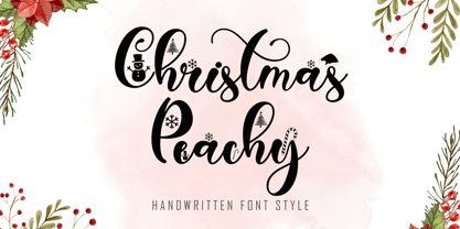 Christmas Peachy is a charming and festive handwritten font adorned with delightful Christmas ornaments. Its elegant strokes and decorative accents bring a touch of holiday magic to your design projects, making it perfect for creating warm and inviting Christmas-themed materials.
 - Lacerika by Iwm Design,
$10.00 Introducing Lacerika font family, a versatile and sleek sans serif font designed to elevate your projects, whether you're creating a stunning website, captivating app, eye-catching brochure, or unforgettable branding materials. Unlock the potential of your creativity with Lacerika today!
 - Abine by Olexstudio,
$16.00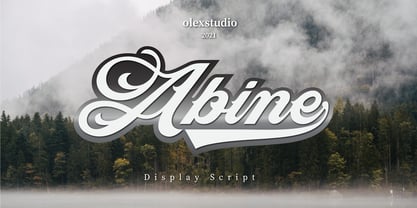 Abine - Display Script will look gorgeous on all your designs, invitation, poster design, book design, branding materials, logo's, t-shirt and all project design other. Abine - Display Script contains standard characters, Uppercase, Lowercase, Swashes, numbers, punctuation, ligatures and international glyphs
 - Rodentia by Olexstudio,
$10.00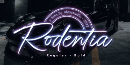 RODENTIA - Handwritten Brush Script Font will look gorgeous on all your designs, invitation, poster design, book design, branding materials, logo's, and all project design other. RODENTIA - Handwritten Font contains standard characters, Lowercase, alternates, Uppercase, numbers, punctuation, ligatures and international glyphs.
 - Stencilvania JNL by Jeff Levine,
$29.00Stencilvania JNL is one of the growing number of stencil fonts based on original source material by Jeff Levine. In this case, a "solid letter" stencil from years ago was modified to give it the classic stencil look of broken lines. - Slimeha by ahweproject,
$9.00 Slimeha is a bold and modern handwritten font capable of taking any creation to the highest levels! Try it on advertisements, posters, branding materials, logos, etc. Slimeha is PUA encoded, which means you can access all glyphs and swashes with ease!
 - Blush And Bloom by Make Media Co,
$12.00 Introducing Blush & Bloom, a smooth, elegant typeface with 80 ligatures and alternates for an authentic hand-written feel. Blush & Bloom looks gorgeous on business cards, envelopes, logos, signage, greeting cards, wedding materials and packaging. And works beautifully with Cricut & Silhouette machines!
 - Black Snake by Zee Studio,
$17.00 Inspired from Maori's neckless of New Zealand, this font is a great way to bring creativity to your project. With some snake forms, elongate and graphic style. You can play with this font to create lot's of creative design. Have fun !
 - Matchings by Fontysia,
$20.00 Matching is a beautiful, casual script adds a custom and organic feel to any design you need! Use this font for: Branding, Invitations, Stationery, Logos, Print Materials, Watermark, Label, Wedding designs, Social media posts, Products, Desktop Programs, Canva , Websites and more.
 - Tiresias by Bitstream,
$29.99Tiresias was designed for subtitling by Dr. John Gill from the Royal National Institute for the Blind (RNIB), in the United Kingdom. The Tiresias font is designed to have characters that are easy to distinguish from each other, especially important for the visually impaired. The following key factors were considered during the design process: character shapes, relative weight of character stokes, intercharacter spacing, and aspect ratios that affect the maximum size at which the type could be used. The benefits of the Tiresias font are greatest on lower resolution displays, such as televisions, train and airline information terminals, and low resolution displays on wireless communication and handheld devices. InfoFont is for printed instructions on public terminals where legibility is the primary consideration; these instructions are often read at a distance of 30 to 70 cm. Infofont is not designed for large quantities of text. The Tiresias LPfont is a large print typeface specifically designed for people with low vision. Large print publications should be designed to specifically help with reading problems, and should not just be an enlarged version of the ordinary print. The Tiresias LPfont family, made up of roman, italic, and bold weights, was designed to address and solve these issues. The RNIB developed PCfont for people with low vision to use on computer screens. It is designed for use at larger sizes only. PCfont includes delta hinting technology in the font to ensure pixel-perfect display at key sizes. Signfont is for fixed (not internally illuminated) signage. The recommended usage is white or yellow characters on a matt dark background. Note that the “Z” versions have slashed zeroes, and are identical in all other respects. These faces were developed together with Dr. John Gill of the National Institute of the Blind, Dr. Janet Silver; optometrist of Moorfields Eye Hospital, Chris Sharville of Laker Sharville Design Associates, and Peter O'Donnell; type consultant. Tiresias himself is a figure from Greek mythology, a blind prophet from Thebes. - Glance Sans by Identity Letters,
$29.00 Geometric, stylish, and not quite a stencil face: Glance Sans is the urban alter ego of Glance Slab—a strong-willed sans-serif with no frills but a few unique character traits. Glance Sans follows the design principle of nonjoining parts that made Glance Slab successful. Some strokes may not connect to their stems, creating visible gaps and thus, a dynamic impression of balance and movement. However, Glance Sans has a calmer appearance due to the lack of detached serifs. If Glance Slab’s home territory are large, crowded stadiums and massive sports events, Glance Sans prefers streetball courts, well-used skate parks, and underground clubs. It also adapts to urban work environments from finance to high-tech. Whenever a more toned-down look is called for while retaining the elegance of an athlete, Glance Sans is ready to roll. In the city environment, versatility is key. That’s why Glance Sans sports 7 weights as well as a complete set of italics. These are not just sloped romans but individually drawn letterforms, subtly referencing classic italic construction for more effective emphasis. Among the 600+ glyphs of Glance Sans, you’ll find goodies such as six sets of figures, circled numbers, circled arrows, and all kinds of currency symbols in two stylistic versions. Glance Sans is a great tool for industrial and high-tech branding, for wayfinding systems in contemporary or modernist architecture, for corporate identities in arts, crafts, medicine, culture, and education, and for all kinds of sports-themed design. Both members of the Glance superfamily are easily and effectively combinable; both are able to stand on their own feet. With its powerful italics, you might opt for Glance Sans as your text typeface and use Glance Slab for headlines. Or you set large, clean, display-sized lines in Glance Sans and spice them up with a bit of sportive Glance Slab. It’s up to you to decide how to bring out the best in both of them.
 - Mayfest by pentagonistudio,
$17.00 Mayfest Is An Elegant Display serif Inspired By Luxury and Elegant Character. FAQ's : Where are the OTF's? They are included in a download link( in a text file) in your main download file. 1 user 2 computers installation (Desktop License) You may NOT use for broadcast or Cinema/Motion Picture. You may NOT resell this font in any platform without further permission from designer. Do NOT embed font files in app/game/e-pub (for desktop license) You may NOT use the fonts in templates for sale/free. ( web/print/app ) For other license use please contact us. SOFTWARE REQUIREMENTS : Fonts and alternate : No special software required they may be used in any basic program /website apps that allows standard fonts That's it folks! You can go ahead and get cracking :) Follow My Shop For Upcoming Updates Including Additional Glyphs And Language Support. And Please Message Me If You Want Your Language Included or If There Are Any Features or Glyph Requests, Feel Free to Send me A Message. Have a Good Day !
 - Lanche by pentagonistudio,
$19.00 Lanche Is An Modern Elegant Serif Font Inspired By Elegant Serif Typeface FAQ's : Where are the OTF's? They are included in a download link( in a text file) in your main download file. 1 user 2 computers installation (Desktop License) You may NOT use for broadcast or Cinema/Motion Picture. You may NOT resell this font in any platform without further permission from designer. Do NOT embed font files in app/game/e-pub (for desktop license) You may NOT use the fonts in templates for sale/free. ( web/print/app ) For other license use please contact us. SOFTWARE REQUIREMENTS : Fonts and alternate : No special software required they may be used in any basic program /website apps that allows standard fonts That's it folks! You can go ahead and get cracking :) Follow My Shop For Upcoming Updates Including Additional Glyphs And Language Support. And Please Message Me If You Want Your Language Included or If There Are Any Features or Glyph Requests, Feel Free to Send me A Message. Have a Good Day !
 - Burpology by Typodermic,
$11.95 Hey, cats and kittens! Dig this groovy font we got for ya—Burpology! It’s the perfect typeface for all your cartoon headline needs. With its heavy weight, small counters, and tight spacing, you’ll be making a visual footprint that’ll knock ’em out! And that’s not all, daddy-o! Burpology comes equipped with automatic shuffling of three letter and numeric variations in OpenType-savvy apps, giving your words that cool, hand-drawn vibe. It’s like having your very own in-house cartoonist! So, if you want to add some serious pow and pizzazz to your headlines, just hit up your application’s contextual alternates or standard ligatures option and watch the magic happen. Don’t be a square, man—get Burpology and let your words do the talkin’! Most Latin-based European writing systems are supported, including the following languages. Afaan Oromo, Afar, Afrikaans, Albanian, Alsatian, Aromanian, Aymara, Bashkir (Latin), Basque, Belarusian (Latin), Bemba, Bikol, Bosnian, Breton, Cape Verdean, Creole, Catalan, Cebuano, Chamorro, Chavacano, Chichewa, Crimean Tatar (Latin), Croatian, Czech, Danish, Dawan, Dholuo, Dutch, English, Estonian, Faroese, Fijian, Filipino, Finnish, French, Frisian, Friulian, Gagauz (Latin), Galician, Ganda, Genoese, German, Greenlandic, Guadeloupean Creole, Haitian Creole, Hawaiian, Hiligaynon, Hungarian, Icelandic, Ilocano, Indonesian, Irish, Italian, Jamaican, Kaqchikel, Karakalpak (Latin), Kashubian, Kikongo, Kinyarwanda, Kirundi, Kurdish (Latin), Latvian, Lithuanian, Lombard, Low Saxon, Luxembourgish, Maasai, Makhuwa, Malay, Maltese, Maori, Moldovan, Montenegrin, Ndebele, Neapolitan, Norwegian, Novial, Occitan, Ossetian (Latin), Papiamento, Piedmontese, Polish, Portuguese, Quechua, Rarotongan, Romanian, Romansh, Sami, Sango, Saramaccan, Sardinian, Scottish Gaelic, Serbian (Latin), Shona, Sicilian, Silesian, Slovak, Slovenian, Somali, Sorbian, Sotho, Spanish, Swahili, Swazi, Swedish, Tagalog, Tahitian, Tetum, Tongan, Tshiluba, Tsonga, Tswana, Tumbuka, Turkish, Turkmen (Latin), Tuvaluan, Uzbek (Latin), Venetian, Vepsian, Võro, Walloon, Waray-Waray, Wayuu, Welsh, Wolof, Xhosa, Yapese, Zapotec Zulu and Zuni.
 - Hellbound - Unknown license

- Historism Border 2D by 2D Typo,
$36.00 Historism Border 2D is a collection of ornaments organized into four font files. The ornaments can be divided into two groups: Friezes (borders) and Rapports (patterns). All the ornaments attribute to the period of Historicism, which prevailed in art in the middle of the 19th century. The ornaments are based on elements of architectural decorations of Lviv buildings in Ukraine. The author personally collected the material and embodied it in the font. This makes the font exclusive and unique among other digital collections of ornaments. These patterns are perfectly suited to be used in the design of invitations, diplomas, certificates or other printed materials in classic-style design.
 - Nylon and Draylon by Barnbrook Fonts,
$30.00 Nylon is an interpretation of pre-16th century letterforms, in particular those found in mediaeval portraits at the National Gallery, London. The source material contains many unusual and manic shapes—it appears as if these classical forms have, over time, become perverted, almost demonic. Draylon is the more restrained counterpart to Nylon; it is based on letterforms found on 18th century ceramics—some 200 years after the source material of Nylon. Nylon and Draylon have been designed so that they can be mixed together with ease. Both typefaces have been drawn with a kind of crude digital awkwardness—acknowledging the tool of the present moment, the computer, in the design process.
 - TT Bricks by TypeType,
$29.00 TT Bricks useful links: Graphic presentation | Customization options Do you love the early Soviet visual culture as much as we do? We’ve tried going back a hundred years and rethinking the constructivist era. We’ve created an extensive font family that consists of the simplest triangle and rectangle forms. TT Bricks font family includes 16 typefaces: Hairline, Thin, Light, Regular, Medium, Bold, ExtraBold, Black and Italics. Regardless of its Soviet past, TT Bricks is a very fresh and visually powerful font family that perfectly fits the contemporary media landscape. TT Bricks is perfect for mobile apps and corporate websites, as well as for printed press layout. Thanks to the exaggeratedly simple forms of all signs, TT Bricks looks great in very small type sizes. FOLLOW US: Instagram | Facebook | Website TT Bricks language support: Acehnese, Afar, Albanian, Alsatian, Aragonese, Arumanian, Asu, Aymara, Banjar, Basque, Belarusian (cyr), Bemba, Bena, Betawi, Bislama, Boholano, Bosnian (cyr), Bosnian (lat), Breton, Bulgarian (cyr), Cebuano, Chamorro, Chiga, Colognian, Cornish, Corsican, Cree, Croatian, Czech, Danish, Embu, English, Erzya, Estonian, Faroese, Fijian, Filipino, Finnish, French, Friulian, Gaelic, Gagauz (lat), Galician, German, Gusii, Haitian Creole, Hawaiian, Hiri Motu, Hungarian, Icelandic, Ilocano, Indonesian, Innu-aimun, Interlingua, Irish, Italian, Javanese, Judaeo-Spanish, Kalenjin, Karachay-Balkar (lat), Karaim (lat), Karakalpak (lat), Kashubian, Khasi, Khvarshi, Kinyarwanda, Kirundi, Kongo, Kumyk, Kurdish (lat), Ladin, Latvian, Laz, Leonese, Lithuanian, Luganda, Luo, Luxembourgish, Luyia, Macedonian, Machame, Makhuwa-Meetto, Makonde, Malay, Manx, Maori, Mauritian Creole, Minangkabau, Moldavian (lat), Montenegrin (lat), Mordvin-moksha, Morisyen, Nahuatl, Nauruan, Ndebele, Nias, Nogai, Norwegian, Nyankole, Occitan, Oromo, Palauan, Polish, Portuguese, Quechua, Rheto-Romance, Rohingya, Romanian, Romansh, Rombo, Rundi, Russian, Rusyn, Rwa, Salar, Samburu, Samoan, Sango, Sangu, Scots, Sena, Serbian (cyr), Serbian (lat), Seychellois Creole, Shambala, Shona, Slovak, Slovenian, Soga, Somali, Sorbian, Sotho, Spanish, Sundanese, Swahili, Swazi, Swedish, Swiss German, Tagalog, Tahitian, Taita, Tatar, Tetum, Tok Pisin, Tongan, Tsonga, Tswana, Turkish, Turkmen (lat), Ukrainian, Uyghur, Vepsian, Volapük, Võro, Vunjo, Xhosa, Zaza, Zulu.
 - Fontazia Floradot by Deniart Systems,
$20.00 Fontazia FloraDot features 62 unique dotted floral patterns. These simple swaying FloraDot blooms will add flair to any font library - they're great for backgrounds, greeting cards, posters, summer themes or any project where florals say just the right thing!
 - Mystyline Decorative by Struvictory.art,
$14.00 Mystyline is a modern thin line condensed font inspired by hipster aesthetics. The letters are decorated with lines and dots. Mystyline is suitable for contemporary typographic posters (event design, movie posters, advertising, music production, photo overlays), hipster design etc.
 - Century 751 by Bitstream,
$29.99The year 1914 marked the appearance of Washington Ludlow's first typograph machine. This remarkable invention permitted typesetters to quickly cast a full line of lead type in one operation using supplied brass matrices, a procedure which was for the time a major technological improvement over the usual hand-set foundry type methods. Casting type the Ludlow way necessitated the creation of an entire range of new Ludlow typefaces, a development which made Ludlow not only a major manufacturer of printing machinery, but also one of the world's leading sources of professional type design. Renowned typographers such as Douglas C. McMurtrie and Ernest F. Detterer created original faces at Ludlow's request. Robert Hunter Middleton was Ludlow's design director for over fifty years, and during his distinguished career produced an entire library of typefaces representing virtually every known typographic style. He is recognized as one of the most prolific type designers of all time. Today, new Ludlow computer fonts are in preparation, including optically-correct versions of many classic Ludlow typefaces, drawn directly from the originals in the Ludlow company library. - Cubio Mono by R9 Type+Design,
$38.00 Cubio™ Mono is a new monospaced geometric sans serif inspired by the hexagonal silhouette of isometric cubes. We applied this angular form through all aspects of Cubio™ type design from the overall look of letters and icons down to the small details such as the end of each letter stem and hexagonal dotted lines. This font family comes in 3 weights/styles: 300 (Regular), 500 (Medium), and 700 (Bold). With over 1,500 glyphs, Cubio™ Mono not only supports most Latin-based languages, but also features an extensive set of UX/UI icons, and patterns. Cubio™ Mono is a versatile typeface for both digital and traditional designs. Perfect for packaging design, logo design, print design, store signages, UX/UI web & apps designs. Cubio™ Mono packed with features such as case-sensitive marks, punctuations and math symbols. It also comes with an extensive set of box/compartment drawing glyphs to help you create a unique modern design without even using the line tools. We designed the Cubio™ Mono font system with your convenience in mind. It comes with two sets of hexagonal dotted line and icon positions (Mid Cap Height and Mid X-Height ), so you don’t have to use the baseline shift command to set them to the perfect spots. To find out more about Cubio™ Mono Opentype features and type specimen, please visit www.r9typedesign.com
 - Aure Wye by Aure Font Design,
$23.00 Aure Wye wraps a carefree dispassion with the dignity of tradition. The precise engraving and organic finials of these decorative serif forms engage the reader with a subtext of elegance. Wye brings an unpretentious grace to titles and drop-caps and provides dignity to astrological expressions and chartwheels. In Regular, Wye presents a formal presence; in Italic, Wye offers a more romantic feel. Its small-caps add a stately variety to Wye's typographic textures. Wye is an original design developed by Aurora Isaac. After more than a decade in development, 2018 marks the first release of the CJ and KB glyphsets, now available in regular and italic. The CJ glyphset is a full text font supporting a variety of European languages. A matching set of small-caps complements the extended lowercase and uppercase glyphsets. Supporting glyphs include standard ligatures, four variations of the ampersand, and check-mark and happy-face with their companions x-mark and grumpy-face. Numbers are available in lining, oldstyle, and small versions, with numerators and denominators for forming fractions. Companion glyphs include Roman numerals, specialized glyphs for indicating ordinals, and a variety of mathematical symbols and operators. The CJ glyphset also includes an extended set of glyphs for typesetting Western Astrology. These glyphs are also available separately in the KB glyphset: a symbol font re-coded to allow easy keyboard access for the most commonly used glyphs. Aure Wye will stand up as a text font, but for extended text, try pairing Wye with its close cousin, Aure Declare. Used in titles and drop-caps, Wye will provide a striking elegance that will blend well with the serifed forms of Declare. Give Aure Wye a trial run! You may discover a permanent place for this font family in your typographic palette. AureFontDesign.com
 - Cuttie Beary by Good Java Studio,
$18.00 Introducing Cuttie Beary - Fun Handwritten Font Cuttie Beary is the perfect font for all your fun designs. The main font file is equipped with ordinary characters. Everything is made with a funny brush so you can be sure all leters will work well together! It is suitable for you to use in making t-shirt design, quote, labels, packaging, logo types, or long writing because we have compiled kerning and matrices that are tailored to your needs.
 - Desphalia Pro by Ingo,
$42.00 A classic “American” sans serif with a kink Desphalia belongs to the kind of sans serif fonts that were created in the 19th century. You could also name it “American Gothic”, a sans serif in the style of fonts like Franklin Gothic, News Gothic and similar. Above all, the high x-height characterizes this typeface style, as do the identical heights of uppercase and ascenders. However, I allowed myself a few peculiarities ;-) On the one hand, there is the gently sloping horizontal middle line on letters such as H, E, F, A and e. The M also got gently slanted sides. Some of the lower-case letters have an up- or down-stroke: a d m n p u. This "kink" on the shaft also serves to better distinguish the small l from the capital I — as can be seen clearly with the term »Illinois«. In keeping with the tradition of American typefaces, Desphalia does not have a true italic. Rather, the letters of the “Italic” have the same character forms as the normal upright variant, but in oblique — and so it is not called “Italic” but “Oblique”. Style Set 01: Another American peculiarity is the capital I with dashes above and below. It is included in the Desphalia as an alternate character form. An alternative small l with the “kink” in the ascender is also included — as is a y with the “kink” in the descender. Style Set 02: The corresponding “straight” forms a d l m n p u without the break are included as alternatives in a separate style set. Small caps are uppercase letters that are optically the same size as lowercase letters. They offer a very classy way of emphasis. Desphalia is available in the widths Condensed, Normal and Expanded, the weights include Thin, Light, Book, Bold, Black. Using the variable font, all intermediate levels can be freely selected. The figures are optionally available as tabular figures, proportional lining figures or old style figures.
 - Mightiest Autograph by Din Studio,
$29.00 Digital designs seldom show personal touches to make them stand out and to give unique displays. Generic fonts are no longer enough to do so. You need something special to make great impacts on your work. Therefore, a handwritten font can be the perfect solution to such a necessity. This is the Mightiest Autograph. Mightiest Autograph is a handwritten font in a signature looking style to add elegant, personal nuances on your designs. The curves and wipes in the swinging ends of the letters are the main characters. Like the other cursive fonts, each letter is connected to one another to make the font legible. The letters’ proportions are made different for a more artistic looking style applicable for such romantic texts. You can apply this font for any text sizes due to its great legibility. Additionally, you can enjoy the available features here. Features: Alternates Ligatures Multilingual Supports PUA Encoded Numerals and Punctuations Mightiest Autograph fits best for various design projects, such as brandings, posters, banners, invitations, greeting cards, magazine covers, quotes, printed products, merchandise, logos, social media, etc. Find out more ways to use this font by taking a look at the font preview. Thanks for purchasing our fonts. Hopefully, you have a great time using our font. Feel free to contact us anytime for further information or when you have trouble with the font. Thanks a lot and happy designing.
 - Storyville by Canada Type,
$29.95 This is the redrawn and expanded version of an alphabet Rebecca Alaccari made back in 2009 as a bespoke font for a tourism agency looking to recapture the appeal of New Orleans after the hurricane Katrina disaster robbed it of its core industries. The brief back then was to "revive the unique spirit of what always made Nola great for new adults, which is the excellent combination of history, romance, food and music." No word of a lie, the brief actually contained "new adults." Storyville contains two interchangeable sets of forms drawn in the doodly, loose and organic way now conspicuously popular with today's young designers, almost every one of whom thinks they will get to design something for a boutique coffee bar somewhere. Well, this whole thing perhaps means freedom, youth, fun, happiness, good stuff like that. But just in case, a little caution doesn't hurt: Use this font only if you know what you're doing. We don't want to go back to the 1990s. Please. We were nearly done for by that exposure the first time around. The ligatures feature in this font does some pseudo-randomization, so the forms in doubled letters don't repeat. Serious fun can be had by also applying the stylistic alternates feature, or picking a letter in the middle of a setting and disabling the ligatures feature. Or various sequences of all that. If you don't like any of that stuff, just forget about it. Uh, wutever.
