10,000 search results
(0.036 seconds)
- Restora Neue by Nasir Udin,
$25.00 Restora Neue is an evolution of its precursor, Restora. While the Restora has an authentic imperfect letterforms, Restora Neue comes with a neater shape and higher contrast. It’s a mix of old-style roman serif styles. Its sharp and longer serif with a bit touch of medieval, makes Restora Neue a versatile type family that can be used in many different themes of design projects, from classic style to modern. It comes in nine weights from thin to black with matching italics. Its mixture of weights provide a wide range of styles that will help you find the best vibe for your projects, for headlines or a short paragraph. The set of special ligatures and stylistic alternates can be perfect mates for your brand. It is well suited for book covers, editorial, branding, advertising and more. To see the complete presentation please visit my Behance profile.
 - Ergonomique by Monotype,
$31.99 Ergonomique is a humanist sans serif typeface that has been designed to be efficient and comfortable to use across all applications. Ergonomique’s personality is defined by its spurless lowercase glyphs – the stems are truncated and blend into their adjoining arcs, as can be seen in the a/b/d/m/n/p/q/r/u characters. Ergonomique is ideal for branding and display purposes, but also performs well as body copy if you’re seeking a unique style for your text. With its nine weights and complementing italics, Ergonomique is highly versatile, especially when you consider that there are small caps and old style figures included, along with a Latin Extended character set. Key Features: • 18 font family – 9 weights in Roman and Italic • Small Caps, Ligatures, with Proportional, Old Style, and Small Cap figures, plus Fractions, Numerators, Denominators, Superiors, and Inferiors • Full European character set (Latin Extended) • 800+ glyphs per font.
 - Slow Tempo by Dharma Type,
$19.99 Slow Tempo is a relaxed, loose-fit font that you can easily enjoy. Slow Tempo has basic, natural and neutral letterforms and skeletons for a wide range of usage. Though, there are some distinctive features. As you can see, Slow Tempo has low curvature of the intersections between stem & shoulder or bowl and also has large and open apertures. This makes this font relaxed. The letterform has low contrast and geometric shape to be neutral design, large x-height and humanistic terminal to be legible and distinguishable. Slow Tempo consists of 8 weights and their matching Italics for a wide range of usages. Further, Slow Tempo is supporting international Latin languages and basic Cyrillic languages including Basic Latin, Western Europe, Central and South-Eastern Europe. Also CSS covers Mac Roman, Windows1252, Adobe1 to 3. This wide range of international characters expands the capability of your works.
 - 1785 GLC Baskerville by GLC,
$42.00 This family was created/inspired from the well-known Baskerville Roman and Italic typefaces created by John Baskerville, the English font designer. We were inspired by the original family sent by Baskerville’s wife after his death. The full Baskerville collection was bought by the French editor and author Pierre-Augustin Caron de Beaumarchais who used it to print - in Switzerland - for the first time the complete works of Voltaire (known as the “Kehl edition” from the "Imprimerie de la société littéraire typographique"). We have used this edition, with copies from 1785, to reconstruct these two genuine historical styles. The font faces, kerning, and spacing are scrupulously identical to the original. This Pro font includes characters for Western, Eastern and Central European languages (including Celtic) and Turkish, with a complete set of small caps, standard and “long s” ligatures in each of the two styles.
 - Garibaldi by Harbor Type,
$50.00 🏆 Selected for Tipos Latinos 6. 🏆 Selected for the 12th Biennial of Brazilian Graphic Design. 🏆 Typographica Favorite Typefaces of 2015. Garibaldi is a text typeface based on humanist calligraphy. It has an organic look and feel, while preserves the traditional construction of roman typography. It all started with a desire to learn more about the origin of the strokes on humanist typefaces. To accomplish that, Garibaldi features a 20° axis, medium contrast based on translation and expansion, asymmetric serifs, and terminals related to the broad nib stroke. Garibaldi Regular was nominated for Tipos Latinos 2014. Since then, the family was expanded with more weights and matching italics, making it a solid choice for setting books, magazines and documents. Among many OpenType features, each font contains small caps, ligatures and contextual alternates, totalling more than 750 glyphs and supporting at least 80 languages.
 - Cavolini by Monotype,
$50.99 The Cavolini™ typeface family, by Carl Crossgrove, is unique to handwriting fonts. It is a family of several designs, and it was developed for imaging on small screens. While drawn for a specific use, the family is also equally at home in many interactive and print applications. Cavolini has all the casual charm and immediacy of handwriting, while maintaining high levels of typographic clarity. Cavolini’s large x-height, open character spacing, clearly defined apertures, and easily differentiated forms enable high levels of legibility and readability at small sizes, while the family’s multiple designs of roman, bold and italic in regular and condensed proportions enable breadth of choice for creating emphasis, hierarchy, and typographic diversity a wide variety of environments. A large character set enables the setting of most Western European and many Eastern European languages, including Cyrillic and Greek – and adds to the family’s broad range of uses.
 - Keiss Condensed by DSType,
$50.00 The Keiss type family is our interpretation of the popular nineteen century Scotch Roman typefaces. We intended to keep a very classic approach while introducing a couple of new elements that differentiate this type family from it’s ancestors. This design, with short descenders and ascenders, along with three very distinct optical sizes makes this type family well suited for contemporary newspapers. The Title and Big versions range from Thin to Heavy, with matching italics, in order to be used in big sizes and stand out in the design. The Text ranges from Thin to ExtraBold and is a standalone type family for text usage, with narrow proportions and wider and open italics for improved text setting. The Condensed versions, ranging from Thin to Bold, don’t have italics, although they can be matched with the italics of the Title and Big versions, due to the fact they are very condensed.
 - Quadrim by Artisticandunique,
$40.00 Quadrim - Serif Font Family - Multilingual -12 Style (2020) On the basis of Quadrim, it is a mix of the old-fashioned Roman serif family. The old style serif combination combines, modern aesthetics with fantasy and Art Nouveau serif fonts, making Quadrim a versatile family that can be used in many different design projects. This font offers a wide variety of styles to help you discover the best mood for your projects, from body text to large titles, from classic styles to modern and bold styles. It is very suitable for book and magazines, magazine covers, editorial, titles, websites, logos, invitations, branding, advertising and more. CHARACTER RANGES : Basic Latin, Latin-1 Supplement, Latin Extended-A, Latin Extended-B, General Punctuation, Currency Symbols, CJK Symbols And Punctuation, Private Use Area (plane 0), With this font you can create your unique designs. If you have a question, please contact me. Have a good time.
 - Keiss Condensed Big by DSType,
$50.00 The Keiss type family is our interpretation of the popular nineteen century Scotch Roman typefaces. We intended to keep a very classic approach while introducing a couple of new elements that differentiate this type family from it’s ancestors. This design, with short descenders and ascenders, along with three very distinct optical sizes makes this type family well suited for contemporary newspapers. The Title and Big versions range from Thin to Heavy, with matching italics, in order to be used in big sizes and stand out in the design. The Text ranges from Thin to ExtraBold and is a standalone type family for text usage, with narrow proportions and wider and open italics for improved text setting. The Condensed versions, ranging from Thin to Bold, don’t have italics, although they can be matched with the italics of the Title and Big versions, due to the fact they are very condensed.
 - Sunshine by Chank,
$49.00 Sunshine is the unlikely alphabet collision of Gobbler and Liquorstore. Chank's napkin scrawl smashed into the letters commonly found on signage at the neighborhood liquor store. Gobbler's blotchy textures fragmented Liquorstore's uniform stroke. It began as a hideous lumpy thing with random vector points everywhere. Chank came to the rescue with his Alphabetician's first aid kit. He smoothed the blunt corners with a few hammer blows. He wrapped the font in extra strokes, in a sans serif Roman style, to increase its contrast. His industrial influence helped stabilize Gobbler's gloppy qualities and his grunge aesthetic softened Liquor store's checkerboard rigidity. The end result is a font with a solid structure and a painterly wiggle that creates a dirty display or a slightly clumsy text face. Because of its many detailed strokes, it tends to look a little better in print than on the web. All organic. Earthy.
 - Keiss Text by DSType,
$50.00 The Keiss type family is our interpretation of the popular nineteen century Scotch Roman typefaces. We intended to keep a very classic approach while introducing a couple of new elements that differentiate this type family from it’s ancestors. This design, with short descenders and ascenders, along with three very distinct optical sizes makes this type family well suited for contemporary newspapers. The Title and Big versions range from Thin to Heavy, with matching italics, in order to be used in big sizes and stand out in the design. The Text ranges from Thin to ExtraBold and is a standalone type family for text usage, with narrow proportions and wider and open italics for improved text setting. The Condensed versions, ranging from Thin to Bold, don’t have italics, although they can be matched with the italics of the Title and Big versions, due to the fact they are very condensed.
 - Medieval Leaves by Kaer,
$19.00 Once I found a pretty H letter initial on an ancient book. The letter was illuminated by beautiful engraved leaves. Based on it, I designed A-Z and 0-9 sets and assembled Medieval Leaves font. Medieval Leaves font family has Regular and Colored styles. It's all you need to precisely imitate medieval style text. Use this font as a decorative element at the beginning of a paragraph or section, other part of the paragraph should be in regular black letter font. You’ll get Drop Caps & Numbers set. --- *You can use color fonts in PS CC 2017+, AI CC 2018+, ID CC 2019+, macOS 10.14 Mojave+ * *Please note that the Canva & Corel doesn't support color fonts!* *Please download this test file with only A letter ( https://www.dropbox.com/s/03e7i78j4bz4mnm/MedievalLeaves-Test.otf?dl=0 ) to check your app & system.* --- Please feel free to request any help you need: kaer.pro@gmail.com Best, Roman.
 - Scripta Pro by John Moore Type Foundry,
$54.00 Scripta is a family of typefaces that leads "Scripta Pro", a commercial script writing similar to those used in ads advertising the decades 40 and 50, with fine lettering combinations of that time, Scripta Pro is ideal for composing headlines and subheads and this is supplied in two weights. This system is complemented by a Roman Sans "Scripta Gothic" an artdeco style typeface to harmonize with the style of that fonts. To add style to set fonts, created "Scripta Icons", one dingbats font based on a series of graphs that help recreate the ornamental fantasies of a postwar generation, a society in transition between the classical world and ornament and promises of a cosmic and atomic world. For those wishing to use words made was created "Scripta Catchwords". "Scripta Pro" is a script typeface inspired by the style works of the american typeface designer LH Copeland.
 - Scribal by Loaded Fonts,
$15.00Designed with help and inspiration from legendary tattoo artist Dustin Horan. This beautiful time saver was designed specifically for skin application. Short words and initials can instantly be turned into seamless tribal style tattoos. Each glyph links with the next allowing letters to flow endlessly around limbs and in circles. Respecting the rhythm and geometry principles laid forth by American pioneering tribal artist Leo Zulueta, Scribal makes flowing text shapes that disguise themselves as design. When mirrored back to back and rotated vertically, Scribal becomes well-crafted tribal pattern. Typeface wise, Scribal breaks the mold. While a script font, Scribal was designed to be written in all capitals. Each capital is a mono-spaced glyph, providing even spacing. The shape influences are also vast, ranging from scripts, to blackletters, to romans. Making Scribal a very "Americanized" font, reflective of this "Americanized" style of Tribal Tattooing. - FTY Varoge Saro Noest by The Fontry,
$25.00 VAROGE SARO NOEST arrives on your computer with OpenType replacement features standard, along with extended language support for Central European, Greek, Cyrillic and Extended Cyrillic. We've even included some nice character options for our German-speaking customers with the uppercase Eszett and a number of alternatives to the standard lowercase eszett. Also included is the new Turkish Lira. VAROGE SARO NOEST is a font with a very funny name. Sometimes it can be a funny font. Or a font that is fun. It looks kinda casual, but also a little bit handwritten--freeform and freehand. Or a form of block lettering with a rough edge. Not too rough. Just enough to break up the visual rigidity. But this is not a face in distress. It's mostly at ease in its surroundings. If it's in text mode, it handles the job comfortably. In headline mode it does well too. It's quite flexible and looking for a home. Give this font a home. See if you can figure out what to use it for. See if you see what we saw when we made it. We saw a font that's cool and elegant with a bit of a tantrum driving the node count. We also found it's impossible to look away from it. Anyone can see that. That's why you're here. That's why you're reading this. And VAROGE will do you a favor if you let it. Revisit your typographic beliefs and head over to the one persistent constant in life: your font list. Is VAROGE SARO NOEST on it? If it were to set up headquarters there, you might discover something ideal. That's the favor I was promising.
 - TD Neuth by Tribox Design,
$9.00 TD Neuth is inspired by Millennial and Gen Z qualities; it is modern, direct, and clear. It has excellent legibility and is ideal for usage in displays, headlines, labels, packaging design, and even long paragraphs on digital collaterals. Each glyph is meant to be balanced: not too light, not too bold, and not too regular. Use TD Neuth if you want your layout and designs to look modern and fresh.
 - Cypher by Typeco,
$29.00Cypher is a techno looking font that attempts to employ the Gestalt principal of closure. It may, at larger sizes look like some sort of code or a bunch of dots and dashes, but when viewed at smaller sizes it falls together into legible words. This font family was first inspired by an experiment to try to make a legible upper and lower alphabet with the smallest grid possible that would still describe the letterforms. The original conclusion was that it could be done in a 3x6 grid. This made a fun design exercise, but it makes a lousy font. The grid was expanded a bit for aesthetic reasons to a 3x8 grid, But not restricted so severely and so occasionally goes wider than 3 for the certain letterforms. From this a whole family of widths and weights was born, and rather than simply obliquing for italics, a true italic of sorts was created. Cypher is a versatile family of 24 fonts – 4 widths, each with 3 weights and their accompanying italics. - Carouge Pro by André Simard,
$14.00 Carouge Pro is a contemporary typeface with a classical twist. This duality gives Carouge an energetic and vivid sensibility. Its subtle shapes are highly suitable for all types of documents, including corporate collateral and publicity literature. The fineness of the types provides a pure and elegant style that is highly valued in the fashion and design industry. While extremely legible in small body sizes, its personality comes into full bloom when used in large type sizes. Carouge comprises a wide range of bold fonts, from Ultra Thin to Ultra. The italic companion of the roman type has a split-line allure with a rounded personality. Carouge Pro is available in eight weights from the UltraThin to an Ultra Black. Each weight is also supported by a strong personality cursive italic. “When I designed Carouge, I wanted to create a typeface with a sober appearance and a dash of audacity. Carouge provides a fine balance between two different worlds.” — André Simard Carouge Pro is a contemporary typeface with a classical twist. This duality gives Carouge an energetic and vivid sensibility. Its subtle shapes are highly suitable for all types of documents, including corporate collateral and publicity literature. The fineness of the types provides a pure and elegant style that is highly valued in the fashion and design industry. While extremely legible in small body sizes, its personality comes into full bloom when used in large type sizes. Carouge comprises a wide range of bold fonts, from Ultra Thin to Ultra. The italic companion of the roman type has a split-line allure with a rounded personality. Carouge Pro is available in eight weights from the UltraThin to an Ultra Black. Each weight is also supported by a strong personality cursive italic. “When I designed Carouge, I wanted to create a typeface with a sober appearance and a dash of audacity. Carouge provides a fine balance between two different worlds.” — André Simard
 - ITC Founder's Caslon by ITC,
$40.99The Englishman William Caslon punchcut many roman, italic, and non-Latin typefaces from 1720 until his death in 1766. At that time most types were being imported to England from Dutch sources, so Caslon was influenced by the characteristics of Dutch types. He did, however, achieve a level of craft that enabled his recognition as the first great English punchcutter. Caslon's roman became so popular that it was known as the script of kings, although on the other side of the political spectrum (and the ocean), the Americans used it for their Declaration of Independence in 1776. The original Caslon specimen sheets and punches have long provided a fertile source for the range of types bearing his name. Identifying characteristics of most Caslons include a cap A with a scooped-out apex; a cap C with two full serifs; and in the italic, a swashed lowercase v and w. Caslon's types have achieved legendary status among printers and typographers, and are considered safe, solid, and dependable. ITC Founder's Caslon® was created in 1998 by Justin Howes, an English designer who used the resources of the St. Bride Printing Library in London to thoroughly research William Caslon and his types. As was common in the eighteenth century, Caslon had punchcut several different sizes of his types, and each size had a slightly different design. Howes digitized every size of type that Caslon cast, keeping their peculiarities and irregularities and reproducing them as they appeared on the printed page. This family has the 12 point, 30 point, 42 point, and Poster styles, as well as a full set of bona fide ornaments. In keeping with the original Caslon types, none of the sizes have bold weights, the numerals are all old style figures, and a full set of ligatures (some with quaint forms) are included. ITC Founder's Caslon® is a remarkable revival in the true sense of the word, and works beautifully in graphic designs or texts that require an authentic English or historical flavor. - Caslon Graphique by ITC,
$29.99 The Englishman William Caslon punchcut many roman, italic, and non-Latin typefaces from 1720 until his death in 1766. At that time most types were being imported to England from Dutch sources, so Caslon was influenced by the characteristics of Dutch types. He did, however, achieve a level of craft that enabled his recognition as the first great English punchcutter. Caslon's roman became so popular that it was known as the script of kings, although on the other side of the political spectrum (and the ocean), the Americans used it for their Declaration of Independence in 1776. The original Caslon specimen sheets and punches have long provided a fertile source for the range of types bearing his name. Identifying characteristics of most Caslons include a cap A with a scooped-out apex; a cap C with two full serifs; and in the italic, a swashed lowercase v and w. Caslon's types have achieved legendary status among printers and typographers, and are considered safe, solid, and dependable. Caslon Antique was designed by Berne Nadall and brought out by the American type foundry Barnhart Bros & Spindler in 1896 to 1898. It doesn't bear any resemblance to Caslon, but has the quaint crudeness of what people imagine type looked like in the eighteenth century. Use Caslon Antique for that old-timey" effect in graphic designs. It looks best in large sizes for titles or initials. Caslon Black was designed by David Farey in the 1990s, and consists of one relatively narrow and very black weight. It is intended exclusively for titles or headlines. Caslon Black has a hint of the original Caslon lurking in the shadows of its shapes, but has taken on its own robust expression. Caslon Graphique was designed by Leslie Usherwood in the 1980s. The basic forms are close to the original Caslon, but this version has wide heavy forms with very high contrast between the hairline thin strokes and the fat main strokes. This precisely drawn and stylized Caslon has verve; it's ideal for headlines or initials in large sizes."
 - Plinc Beaux Arts Didot by House Industries,
$33.00 Firmin Didot is credited with establishing the Modern genre of serif typefaces, of which Beaux Arts Didots stands as an exemplary model. Like the French neoclassical architecture of its namesake, Beaux Arts has all the hallmarks of the early nineteenth-century style: a clear and confident construction consisting of simple yet strong lines. Use it for elegant and formal settings, or when a direct typographic tone is desired. Mix it with styles of similar sensibilities such as Plinc Hanover and Davison Spencerian. Digitized from the original Photo-Lettering film matrix in 2014 by Jean-Baptiste Levée. BEAUX ARTS DIDOT CREDITS: Typeface Design: Photo-Lettering Staff Typeface Digitization: Jean-Baptiste Levée Typeface Production: Ben Kiel Typeface Direction: Ken Barber Like all good subversives, House Industries hides in plain sight while amplifying the look, feel and style of the world’s most interesting brands, products and people. Based in Delaware, visually influencing the world.
 - Black Metal Logos - Unknown license

- Arkitech - Personal use only

- Arkitech - Personal use only

- Schramberg by Runsell Type,
$19.00 Schramberg is a new typeface inspired by vintage labels and combining with modern design. This font come with sans serif. Schramberg features with stylistic alternate, contextual alternate and stylistic set. This font come with script and match your vintage design, t-shirt, logo, labels, badges, posters and etc. To access the alternate glyphs, you need a program that supports OpenType features such as Adobe Illustrator CS, Adobe Photoshop CC, Adobe Indesign and Corel Draw. If you have any question please do not hesitate to contact me. Happy creating! Runsell Studio - Magelang - Indonesia
 - Fast by Gatra Std,
$10.00 Introducing a cute handwriting "FAST" Display Sans-Serif Font! If you are needing a touch of casual modern San-Serif for your designs, this font was created for you! What's Included: Uppercase and Lowercase Number and Punctuation Support Language This font works best in a program that supports OpenType features such as Adobe Indesign, Adobe Illustrator CC and CS, or Adobe Photoshop CC and CS also CorelDraw More Questions? Here are some (potential) answers! Do not to resell this font in any way. Multilingual Support is included for Western European Languages
 - Elmore by Haksen,
$10.00 Introducing the warm handwriting "Elmore" Script Font! If you are needing a touch of casual modern calligraphy for your designs, this font was created for you! What's Included: Uppercase and Lowercase Ligatures Number and Punctuation Support Language This font works best in a program that supports OpenType features such as Adobe Indesign, Adobe Illustrator CC and CS, or Adobe Photoshop CC and CS also CorelDraw More Questions? Here are some (potential) answers! Do not to resell this font in any way. Multilingual Support is included for Western European Languages Cheers!
 - Paragraph Stretch by Paragraph,
$15.00 When merely “extended” just would not do, here is Paragraph Stretch™: a super extended or elongated geometric display typeface. It is a typeface with an unicase effect: the capitals and lower case fit the same height and a similar width, so they are interchangeable: fancy a round “W” in all caps? Use the lower case. Want a straight “x” in lower case? Use the cap. And so on. Designed for use at larger sizes for logotypes, short titles or headings. It supports Western plus Nordic, Eastern European and Turkish languages.
 - Dioksiany by sizimon,
$20.00 Introducing our new font the Dioksiany! Inspired by Sophisticated Fashion Style. Classy, contemporary paired font. It is free-flowing, fashionable, feminine, and friendly. Use the fonts for: logos, branding, wedding invitations, farmhouse decor, farmhouse signs, mugs, shirts, pantry labels, stickers, business cards, greeting cards, posters, social media, planner prints and websites. Dioksiany Includes: Uppercase, lowercase, numeral, punctuation & Symbol Multilingual support Stylistic alternates 55 Discretionary ligatures 10 swash (numeral keys) PUA Encoded Characters Fully accessible without additional design software. If you have any question please do not hesitate to contact me: sizimon.id@gmail.com
 - WILK by Edyta Demurat,
$20.00 Do you need a hand-drawn, heavy, creative typeface? If so, WILK is perfect for you! This font was created specially for fairy tale "Little Red Riding Hood" and it was inspired by the fairy-tale's character of wolf . The typography is tight- knit and fat but also free and funny. It consists only of uppercases, but it has two up to five alternative gifs for each letter. This great choice of gifs makes WILK perfect for long texts but not only! It's also great in a large magnification.
 - Strata by Just My Type,
$25.00 Big, expansive and flat on top; that’s a land formation called a mesa. “Mesa” was the first name for Strata Bold Rounded Serif, but it turns out it’s someone else’s registered trademark; in any case, if you need a bold, extended mono-height font that’s great for logotype, you could, as we used to say in the Mid-West, do a whole lot worse. SBRS is the final generation of an evolution that started with Mesa begating Mesa Bold which begat Mesa Bold Rounded which culminated in this evolutionary superior product. Use it!
 - Fox Kitty by Fox7,
$14.00 Fox Kitty is a cute and fun color font. This font is your go-to for crafting cute greeting cards that express affection and warmth. Whether you’re a designer, a social media influencer, or someone with a penchant for creative expression. Fall in love with its authentic feel and use it to create gorgeous invitations, beautiful stationary art, eye-catching social media posts, and cute greeting cards. Learn more about color font support on third-party apps here: https://www.colorfonts.wtf/ 🌺🌺 Please note that the Canva do not support color fonts! 🌺🌺
 - Lachrymose by Hanoded,
$15.00 Lachrymose is a word that stems from ‘lacrima’, the Latin word for tear. It means ‘tearful’, or ‘given to weeping’. Now, before y’all think I am depressed or so - I am not. I just like the sound of this word and the way it is written. All I needed to do was to build a font for it! Lachrymose is a handmade brush font. I used my fantastic Chinese ink and a cheap brush to create the glyphs. Lachrymose is a display font, so use it for anything display-ish.
 - Malikon by Alcode,
$20.00 Malikon is a classic script, with each letter having been carefully made to make your text look beautiful. This font is perfect for logos, badges, shirts, labels, clothing designs, etc. Try Malikon and enjoy the richness of OpenType features and let the fun and elegant fun make you happy and increase your creativity! You can use this font very easily. If you do not have programs that support OpenType features like Adobe Illustrator and CorelDraw X Versions, you can access all alternative flying machines using Font Book (Mac) or Character Map (Windows).
 - Fontazia AquaFlorium by Deniart Systems,
$15.00 Fontazia AquaFlorium is a new addition to our Fontazia series , featuring an assortment of flowers and aquatic accents inspired by the idea that not only sponges can live at the bottom of the sea, flowers can too. When in need of aquatic accents or modern floral decorations, this combination of dingbats are sure to do the trick. Like other type, you can easily add them to any text document or if splicing and dicing artwork is your game, these will add a little pizzazz to all your designs.
 - Soreng by Gatra Std,
$10.00 Cute handwriting "soreng" Handwritten Display Font! If you are needing a touch of casual modern display for your designs, this font was created for you! What's Included: Uppercase and Lowercase Number and Punctuation Support Language This font works best in a program that supports OpenType features such as Adobe Indesign, Adobe Illustrator CC and CS, or Adobe Photoshop CC and CS also CorelDraw More Questions? Here are some (potential) answers! Do not to resell this font in any way. Multilingual Support is included for Western European Languages Have a Wonderful Day, Gatra Std
 - Rosarian by Laura Worthington,
$29.00 Rosarian celebrates the grace of the pointed brush, flowing expressively from thick, rounded downward strokes to thin, delicate hairlines to create graceful and unique letterforms. Contextual alternates help Rosarian look convincingly hand-lettered, while stylistic alternates allow you to customize Rosarian into a less formal, unconnected script. See what’s included! http://bit.ly/2bIG4Pc *NOTE* Basic versions DO NOT include swashes, alternates or ornaments These fonts have been specially coded for access of all the swashes, alternates and ornaments without the need for professional design software! Info and instructions here: http://lauraworthingtontype.com/faqs/
 - Badjigoer by Gatra Std,
$10.00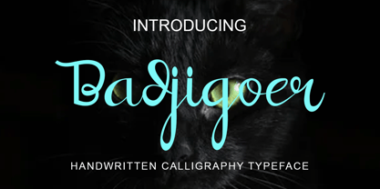 Introducing a cute handwriting "Badjigoer" Handwritten Calligraphy Typeface! If you are needing a touch of casual modern display for your designs, this font was created for you! What's Included: Uppercase and Lowercase Number and Punctuation Support Language This font works best in a program that supports OpenType features such as Adobe Indesign, Adobe Illustrator CC and CS, or Adobe Photoshop CC and CS also CorelDraw More Questions? Here are some (potential) answers! Do not to resell this font in any way. Multilingual Support is included for Western European Languages Have a Wonderful Day, Gatra Std
 - Rafting by Gatra Std,
$10.00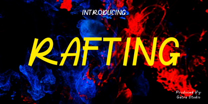 Introducing a cute handwriting "RAFTING" Handwritten Display Font! If you are needing a touch of casual modern display for your designs, this font was created for you! What's Included: Uppercase and Lowercase Number and Punctuation Support Language This font works best in a program that supports OpenType features such as Adobe Indesign, Adobe Illustrator CC and CS, or Adobe Photoshop CC and CS also CorelDraw More Questions? Here are some (potential) answers! Do not to resell this font in any way. Multilingual Support is included for Western European Languages Have a Wonderful Day, Gatra Std
 - Paenchong by Gatra Std,
$10.00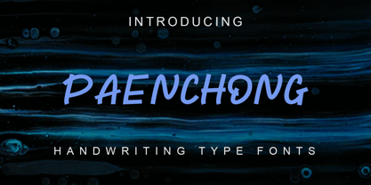 Introducing a cute handwriting "PAENCHONG" Handwritten Display Font! If you are needing a touch of casual modern display for your designs, this font was created for you! What's Included: Uppercase and Lowercase Number and Punctuation Support Language This font works best in a program that supports OpenType features such as Adobe Indesign, Adobe Illustrator CC and CS, or Adobe Photoshop CC and CS also CorelDraw More Questions? Here are some (potential) answers! Do not to resell this font in any way. Multilingual Support is included for Western European Languages Have a Wonderful Day, Gatra Std


