10,000 search results
(0.032 seconds)
- Bella Donna by Canada Type,
$24.95The famous Italian type designer and Nebiolo director Alessandro Butti designed Rondine in 1948. Not so surprisingly - given its beauty - it quickly became quite a commonly copied metal type. But for some reason Rondine was spared during the massive “phototyping” that happened with the introduction of film type. Perhaps this is why no digital version of it ever existed until now. Bella Donna is an upright round script that can be used both formally and informally, in almost any design where an elegant script completes the equation. The almost dramatic grandeur of the majuscules is very nicely complemented by pouty low-x-height minuscules that sprout graceful and very visible ascender and descender loops. Titles, sentences and paragraphs set in Bella Donna are meant to delightfully tease the reader and make hearts skip a beat. Bella Donna can deliver a subtle promise of joyful playfulness, inviting elegance, memorable romance, sensuality, or sincere understanding. Bella Donna was redrawn and digitized from original specimen by Rebecca Alaccari, who also extended the character set with plenty of alternates and some add-on swashes built within the font. - Morris by HiH,
$10.00 Morris is a four-font family produced by HiH Retrofonts and based on the work of the very English William Morris. William Morris wanted a gothic type drawn from the 14th century blackletter tradition that he admired both stylistically and philosophically. He drew from several sources. His principal inspiration for his lower case was the 1462 Bible by Peter Schoeffer of Mainz; particularly notable for the first appearance of the ‘ear’ on the g. The upper case was Morris’s amalgam of the Italian cursive closed caps popular throughout the 12th through 15th centuries, a modern example of which is Goudy’s Lombardic Capitals. The gothic that Morris designed was first used by his Kelmscott Press for the publication of the Historyes Of Troye in 1892. It was called “Troy Type” and was cut at 18 points by Edward Prince. It was also used for The Tale of Beowulf. The typeface was re-cut in at 12 points and called “Chaucer Type” for use in The Order of Chivalry and The Works of Geoffrey Chaucer. Morris' objective is designing his gothic was not only to preserve the color and presence of his sources, but to create letters that were more readable to the English eye. ATF copied Troy and called it Satanick. Not only was the ATF version popular in the United States; but, interestingly, sold very well in Germany. There was great interest in that country in finding a middle ground between blackletter and roman styles -- one that was comfortable for a wider readership. The Morris design was considered one of the more successful solutions. Our interpretation, which we call Morris Gothic, substantially follows the Petzendorfer model used by other versions we have seen, with the following exceptions: 1) a larger fillet radius on the upper arm of the H, 2) a more typically broadpen stroke in place of the foxtail on the Q, which I do not like, 3) inclusion of the aforementioned ear on the g and 4) a slightly shorter descender on the y. We have included five ornaments, at positions 0135, 0137, 0167, 0172 and 0177. The German ligatures ‘ch’ & ‘ck’ can be accessed using the left and right brace keys (0123 & 0125). Morris Initials One and Morris Initials Two are two of several different styles of decorative initial letters that Morris designed for use with his type. He drew from a variety of 15th century sources, among which were Peter Schoeffer’s 1462 Mainz Bible and the lily-of-the-valley alphabet by Gunther Zainer of Augsburg. Each of the two initial fonts is paired with the Morris Gothic lower case. Morris Ornaments is a collection of both text ornaments and forms from the surrounding page-border decorations.
 - Komet Pro by Jan Fromm,
$65.00 Komet is a sturdy typeface with a calm and upright feel. Although it derives inspiration from classical English sans-serifs, it’s not too closely related to that model. Komet, instead, feels rather more lively and contemporary. Its compact spacing, low stroke contrast and heavy dots and accents give it an almost monolinear quality. The diagonals are slightly curved and the counters of the round letters such as b, o and q are generously wide. The muted, understated middle weights are built for extended body copy, while Komet’s thin and dark weights look brisk and assertive and make for subtly expressive headlines. Komet is an ideal choice for editorial design, branding and corporate design. The Komet Pro family comes in eight weights with matching italics, from Thin to Black. Each font contains around 850 glyphs, including a rich repertoire of OpenType features. Small caps, ligatures, ten different figure sets with matching currency symbols, stylistic alternates and arrows make Komet Pro a comprehensive toolkit for ambitious typography.
 - Komet by Jan Fromm,
$45.00 Komet is a sturdy typeface with a calm and upright feel. Although it derives inspiration from classical English sans-serifs, it’s not too closely related to that model. Komet, instead, feels rather more lively and contemporary. Its compact spacing, low stroke contrast and heavy dots and accents give it an almost monolinear quality. The diagonals are slightly curved and the counters of the round letters such as b, o and q are generously wide. The muted, understated middle weights are built for extended body copy, while Komet’s thin and dark weights look brisk and assertive and make for subtly expressive headlines. Komet is an ideal choice for editorial design, branding and corporate design. The Komet family comes in eight weights with matching italics, from Thin to Black. The glyph set of each font contains around 520 glyphs and provides good everyday support for most Latin-based languages. For a wider range of advanced OpenType features, Komet Pro is also available.
 - Eezyl by Partu Haodis,
$25.00 A title font that looks better as larger the font size. First of all, it is designed for use in the upper-case format. Feature style: futurism, space, modernism, glyph variety (uniqueness (minimum automatic generation)). A kind of „s‟ in the lower-case format sets the tone and emphasizes the character, formed in the Prime Numbers Nebula — they determined its appearance, and influenced the style as a whole. Particular attention is paid to the kern: the kern table is formed manually, taking into account absolutely all the glyphs included in the font-family. Two types of stress (grave, acute) for all letter glyphs. The font contains basic Latin and several additional tables, as well as three types of quotation marks, a non-breaking space and a hyphen, a short, medium, and long dash. For a set of mathematical expressions there are centrifugal signs: equal, minus (not a hyphen or minus-hyphen), plus, multiplication (X-shaped and dot), plus-minus, division. The font was made for 3 years.
 - Wonderful Day by Almarkha Type,
$35.00 Wonderful Day – is a Romantic Script font with a natural handwritten feel. It has sweety swash that are perfect for any creative design. This handmade font will make your design has a beautiful natural touch for each details. It is perfect for any design project as Invitation,logo, book cover, craft or any design purposes. This font is PUA encoded which means you can access all of the magical glyphs and swashes with ease! It also features a wealth of special features including alternate glyphs and ligatures.
 - Dulce Pro by Latinotype,
$45.00 Dulce pro (improved and changed version of Dulce), is a swash typeface, monoline elongated teardrop terminals. This romantic and thin font has certain characteristics of a script, without turning it, which gives a sophisticated and elegant. Dulce pro, has initial capital letters with swashes and final in lowercase. To make it a more complete typeface we have added italics and ornaments also make any design, a very welcome time to design, among its ornaments can find hearts, a flower, banners, various frameworks to mix, among others.
 - Cressida NF by Nick's Fonts,
$10.00Here's a flashback to the sixties, which originally went by the rather unimaginative name of Triline. It's available in two versions: regular and swash caps. In the swash version, the uppercase Q is a "Qu" ligature; a plain Q is located in the ASCII circumflex position (SHIFT+6 on PC or Mac). Named for the heroine of a medieval romance. The Postscript and Truetype versions contain a complete Latin language character set (Unicode 1252); in addition, the Opentype version supports Unicode 1250 (Central European) languages as well. - Chorles Elegant by HansCo,
$15.00 Chorles Serif Font is a classy display serif font with unique look that is perfect for multipurpose projects. I made Chorles Serif Font inspired by the concept of romantic vibes and made it into a modern yet luxury style. This font is also looks elegant and will fit well in any design and very recommended for logo, crafts, posters, books, branding, quotes, print templates, packaging, invitations, product labels, advertising, wedding project and more. This typeface comes in uppercase, lowercase, with punctuation, symbols, numerals, ligature and stylistic alternates.
 - Aku Cinta by MC Creative,
$10.00 Aku Cinta is monoline script font which natural movement and romance style. is perfect for branding projects, logo, wedding designs, social media posts, advertisements, product packaging, product designs, label, photography, watermark, invitation, stationery and any projects that need handwriting taste. What’s Included : Standard glyphs Ligature Works on PC & Mac Simple installations Accessible in the Adobe Illustrator, Adobe Photoshop, Adobe InDesign, even work on Microsoft Word. PUA Encoded Characters – Fully accessible without additional design software. Fonts include multilingual support for; ä ö ü Ä Ö Ü ß ¿ ¡
 - Horse Drawn Carriage JNL by Jeff Levine,
$29.00 Picture if you will, a balmy autumn evening in Manhattan during the 1930s and a well-dressed couple out on the town. They hail one of the hansom cabs located near Central Park and climb in for an old-fashioned romantic ride around the green. Such are the type of images the stylized Art Deco hand-lettering comprising Horse Drawn Carriage JNL evokes. The inspiration for this font was the title card for a 1935 Bette Davis feature entitled "The Girl from 10th Avenue".
 - Subroyal by Subtitude,
$15.00 Subroyal was inspired by the official logo of the City of Montreal. The idea came to us while reading an article about a revised version of this logo that didn't have any original typography. We realized it was our civic duty to bring the City logo to life, and the result is a fairly romantic font that reminds us of the many parks around the island, its fragile snowflakes, and its electronic music scene. Voilà! Montreal has its first custom-made (non-official) font package.
 - Black Love Pink by Stefani Letter,
$14.00 Carefully designed, black love pink is a stunning and beautiful handwritten font with a light feel. Fall in love with its delicate and sophisticated characters, and use it for any design project that requires a romantic twist. This font is easy to use. it remains only to add symbols (--,++,--) in front, middle, and back to reveal the features. This font is PUA encoded which means you can access all of the glyphs and swashes with ease! It features a varying baseline, gorgeous glyphs, and stunning alternates.
 - Codelia by Tabular Type Foundry,
$- No matter if you're professional or beginner, your work should be fun. And if you are a coder/programmer, your coding font should be something you enjoy looking for very long time. Square and crisp coding fonts might be easy on the pixels, but are they easy on your eyes? Do they keep you entertained at work? Codelia is a monospaced humanistic typeface designed for coding with focus on comfort and fun without sacrificing legibility or coding functionality. It's fun but not a joke. Its round shapes are easier on the eyes and make the code look less intimidating. It is not designed to make maximum use of every pixel on screen, but to make you forget about pixels. The italic is full of personality but sober enough to not draw unnecessary attention. Codelia works great for coding, but also in presentation, education as well as packaging and branding. Codelia is available in two families, one with coding ligatures and one without; ligatures in the latter are still present in Diescretionary Ligatures feature (dlig).
 - New Lincoln Gothic BT by Bitstream,
$50.99New Lincoln Gothic is an elegant sanserif, generous in width and x-height. There are twelve weights ranging from Hairline to UltraBold and an italic for each weight. At the stroke ends are gentle flares, and some of the round characters possess an interesting and distinctive asymmetry. The character set supports Central Europe, and there are three figure sets, extended fractions, superior and inferior numbers, and a few alternates, all accessible via OpenType features. Back in 1965, Thomas Lincoln had an idea for a new sanserif typeface, a homage of sorts, to ancient Roman artisans. The Trajan Column in Rome, erected in 113 AD, has an inscription that is considered to be the basis for western European lettering. Lincoln admired these beautiful letterforms and so, being inspired, he set out to design a new sanserif typeface based on the proportions and subtleties of the letters found in the Trajan Inscription. Lincoln accomplished what he set out to do by creating Lincoln Gothic. The typeface consisted only of capital letters. Lincoln intentionally omitted a lowercase to keep true his reference to the Trajan Inscription, which contains only magiscule specimens. The design won him the first Visual Graphics Corporation (VGC) National Typeface Competition in 1965. The legendary Herb Lubalin even used it to design a promotional poster! All this was back in the day when typositor film strips and photo type were all the rage in setting headlines. Fast forward now to the next millennium. Thomas Lincoln has had a long, illustrious career as a graphic designer. Still, he has one project that feels incomplete; Lincoln Gothic does not have a lowercase. It is the need to finish the design that drives Lincoln to resurrect his prize winning design and create its digital incarnation. Thus, New Lincoln Gothic was born. Lacking the original drawings, Lincoln had to locate some old typositor strips in order to get started. He had them scanned and imported the data into Freehand where he refined the shapes and sketched out a lowercase. He then imported that data into Fontographer, where he worked the glyphs again and refined the spacing, and started generating additional weights and italics. His enthusiasm went unchecked and he created 14 weights! It was about that time that Lincoln contacted Bitstream about publishing the family. Lincoln worked with Bitstream to narrow down the family (only to twelve weights), interpolate the various weights using three masters, and extend the character set to support CE and some alternate figure sets. Bitstream handled the hinting and all production details and built the final CFF OpenType fonts using FontLab Studio 5. - Movie Matinee JNL by Jeff Levine,
$29.00 A 1926 trade ad for the silent comedy “The Nut-Cracker” starring Edward Everett Horton has the film’s title hand lettered in a decorative bold sans serif design complete with highlight lines and accent dots. This festive type face is now available digitally as Movie Matinee JNL in both regular and oblique versions.
 - ITC New Esprit by ITC,
$29.99Originally drawn in 1985, Jovica Veljović had intended to add a few kerning pairs and make some minor refinements to the letterforms. However, his work lead him to take a fresh look at the family. Veljović recalls, … I soon realized that some characters could benefit by more refined shapes and proportions. By the time I was done, I had worked on just about every character in the original design." In fact the end result is two systems: one optimized for extended texts; the other for display settings. The original elegance of the design is not lost, but the new design brings with it letterforms that are altogether more harmonious and balanced. The roman is dynamic and spirited, just oozing character. The italic by contrast is a little more restrained, but nonetheless an elegant and fitting accompaniment. The text-optimized fonts come with a generous x-height, and slightly less contrast; though its marginally wider proportions let in the light, making it very legible even at small sizes. ITC New Esprit ® is a versatile family, brought to you in four weights from regular to black. OpenType features like small caps, alternates, and a broad character set make this a welcome addition to everyone's font library. Whether you want elegant and legible text, or dynamic and personable headlines, then you'll want to click through to see more of ITC New Esprit. " - PG Gothique Variable by Paulo Goode,
$300.00 IMPORTANT: This is the VARIABLE VERSION of PG Gothique This is my addition to a long line of traditional gothic typefaces. As you can probably tell, PG Gothique Variable is inspired by classics such as Trade Gothic, News Gothic, Franklin Gothic, Alternate Gothic, and Gothic Gothic. Well, maybe not the last one... But Paulo, we have all those already, why would we want to add PG Gothique Variable to our collection? This typeface has many subtle design nuances that differentiates itself from its historical influences. Also, this is possibly the most comprehensive Latin gothic font family released to date. It has 99 default styles that cover pretty much every width and weight you could ever need, while this variable version unlocks options to match your exact style preference – including the angle of italic. PG Gothique Variable is designed to handle a multitude of applications, from branding projects, to titles, body text, user interfaces, and film poster credits. This typeface has a style that will suit the purpose. There are 99 default instances in this family, ranging from Thin to Ultra weights across six widths in both roman and italic. Activate Stylistic Set 1 and you will get the alternate slab-serif-style capital “I” that offers improved legibility when placed adjacent to a lowercase “l”. PG Gothique Variable has an extensive character set that covers every Latin European language. See full details and hi-res examples at https://paulogoode.com/pg-gothique
 - Parfait Script by Lián Types,
$37.00Parfait Script Pro takes its inspiration from Spencerian script and pointed brush lettering. Technical Parfait Script has more than 850 glyphs. It’s up to you to choose, it’s up to you to have fun. Parfait would love to play. The font has lots of alternates. They'll certainly either embellish your words or provide more legibility. The alternates are: Standard Ligatures; Contextual Alternates; Discretionary Ligatures; Swashes; Stylistic Alternates; Titling Alternates; Terminal Forms; Historical Alternates * ; Stylistic Ligatures; Stylistic Set 1 and 2 * ; Ornaments. (* These Alternates are only included in Parfait Script Pro). Parfait Script Pro contains everything. Advice: Use designing programs that support the OpenType features named above, so you can easily alternate glyphs. However, for those who don't have this kind of program, or for those who don't want the entire font, we offer Parfait Script Pro as several separate fonts: Parfait Script Standard (the best for text); Parfait Script Contextual (decorative); Parfait Script Stylistic (decorative); Parfait Script Swashes (for giving the last letter a nice touch); Parfait Script Titling (both decorative and more Roman); Parfait Script Endings (for giving the word the look of a signature); and Parfait Script Ornaments (a set of swirls). These versions of Parfait Script Pro are Open-Type programmed too, in order to include the Standard, Discretional and Stylistic Ligatures. Pssst!... Take a look at Parfait Script Pro’s Guide in the gallery section in order to discover this beauty! - Dr Slab by Dharma Type,
$14.99 Extraordinary impact and visual conspicuousness. Dr Slab is a super 3D serif family for posters, logos and all display. The basic idea is not a brand new. Stacking type system have been used since before wood type age. As you imagined, colored wood type(woodcut), many other engravings and contemporary printer machine print many colors separately with different printing plates for each colors. Dr Slab uses the same system for 3d effect. Please use Photoshop or Illustrator, or your favorite graphic design apps that can handle layers. Layers are the printing plates of wood type. You should be able to change text color for each layers. Dr Slab "Base" style is the core of this font family. You can add effects by using the other styles(Rim, Shadow, Ext). Instruction 1. Type your text as you like. 2. Set font-name "Dr Slab" and font-style "Base" 3. Set color for "Base". 4. Duplicate the layer which includes "Base" text. 5. Set font-style and color for new layers. 6. Stacked layers in different font-style and color make the text in 3D. For further detail, https://www.dropbox.com/s/9p9083zv2855bcq/DrSlab.pdf Dr Slab "Base" style can be used solely. Rounded slabs add soft, cute and casual impressions to your design. Spec: OpenType Format (.otf) with over 500 glyphs! Basic Latin ✓ Western Europe ✓ Central Europe ✓ South Eastern Europe ✓ Mac Roman ✓ Windows 1252 ✓ Adobe Latin 1 ✓ Adobe Latin 2 ✓ Adobe Latin 3 ✓ Almost all Latins are covered.
 - VTCTattooScriptTwo - Personal use only

- Eskapade by TypeTogether,
$53.50 The Eskapade font family is the result of Alisa Nowak’s research into Roman and German blackletter forms, mainly Fraktur letters. The idea was to adapt these broken forms into a contemporary family instead of creating a faithful revival of a historical typeface. On one hand, the ten normal Eskapade styles are conceived for continuous text in books and magazines with good legibility in smaller sizes. On the other hand, the six angled Eskapade Fraktur styles capture the reader’s attention in headlines with its mixture of round and straight forms as seen in ‘e’, ‘g’, and ‘o’. Eskapade works exceptionally well for branding, logotypes, and visual identities, for editorials like magazines, fanzines, or posters, and for packaging. Eskapade roman adopts a humanist structure, but is more condensed than other oldstyle serifs. The reason behind this stems from the goal of closely resembling the Fraktur style to create harmony in mixed text settings. Legibility is enhanced by its low contrast between thick and thin strokes and its tall x-height. Eskapade offers an airy and light typographic colour with its smooth design. Eskapade italic is based on the Cancellaresca script and shows some particularities in its condensed and round forms. This structure also provided the base for Eskapade Fraktur italic. Eskapade Fraktur is more contrasted and slightly bolder than the usual darkness of a regular weight. The innovative Eskapade Fraktur italic, equally based on the Cancellaresca script previously mentioned, is secondarily influenced by the Sütterlin forms — an unique script practiced in Germany in the vanishingly short period between 1915 and 1941. The new ornaments are also hybrid Sütterlin forms to fit with the smooth roman styles. Although there are many Fraktur-style typefaces available today, they usually lack italics, and their italics are usually slanted uprights rather than proper italics. This motivated extensive experimentation with the italic Fraktur shapes and resulted in Eskapade Fraktur’s unusual and interesting solutions. In addition to standard capitals, it offers a second set of more decorative capitals with double-stroke lines to intensify creative application and encourage experimental use. The Thin and Black Fraktur styles are meant for display sizes (headlines, posters, branding, and signage). A typeface with this much tension needs to keep a good harmony between strokes and counters, so Eskapade Black has amplified inktraps and a more dynamic structure seen in the contrast between straight and round forms. These qualities make the family bolder and more enticing, especially with the included uppercase alternates. The Fraktur’s black weights are strident, refusing to let the white of the paper win the tug-of-war. It also won’t give away its secrets: Is it modern or historic, edgy or amicable, beguiling ornamentation or brutish presentation? That all depends on how the radically expanded Eskapade family is used, but its 16 fonts certainly aren’t tame.
 - Supernouveau by Intellecta Design,
$39.90 Supernouveau is a handfull and easy to use font with 244 pieces of art nouveau elements of decoration : frames, cuts, tailipieces, headpieces among others... Ready to use to make patterns, book coovers, públishing design, package material and all you need in your design with a XIX to XX centuru first decades feeling of beauty.
 - Breaking Road by Namara Creative Studio,
$20.00 Breaking Road is a Modern handwritten script font with casual and organic look, thick uneven strokes that vary in width. Perfect for wedding invitations, greeting cards, and posters to add a sense of informality and warmth. Also can be used in branding and marketing materials to give a brand a more approachable, friendly feel.
 - Hello baby by Letterfreshstudio,
$13.00 Hello baby! A new fresh an modern hand lettered font with decorative characters and a dancing baseline. So beautiful on invitation like handicraft, greeting cards, branding materials, business cards, quotes, posters, and more design concepts. Features : Ligatures Stylistic sets Basic Latin A-Z and a-z Numbers International Symbols included Punctuation Ligature Thank You.
 - Malven by Craft Supply Co,
$15.00 Malven is a modern serif features thin stroke, low-contrast modulation, with small serif that make it elegant and classy. It can be used to create almost all types of design projects like print materials. Just use your imagination and your project will become more alive and look great than ever with this typeface.
 - Oh Lady Script by Letterfreshstudio,
$12.00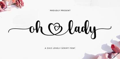 Oh Lady ! A new fresh an modern hand lettered font with decorative characters and a dancing baseline. So beautiful on invitation like handicraft, greeting cards, branding materials, business cards, quotes, posters, and more design concepts. Features : Ligatures Stylistic sets Basic Latin A-Z and a-z Numbers International Symbols included Punctuation Ligature Thank You.
 - Granny Tales by OKSHUtypeCO,
$12.00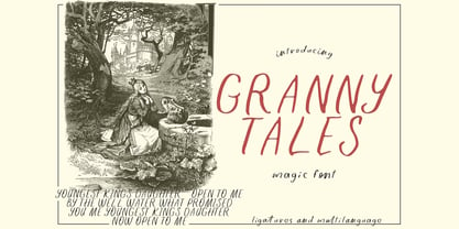 Granny Tales - a new fresh handmade calligraphy font. Very suitable for greeting cards, branding materials, business cards, quotes, posters, and more!This font are perfect for wedding postcard. Or you can create perfect and unique design of your logo, blog, stationery, marketing, magazines and more :) Features : Ligatures UpperCase & Lowercase Numerals & Punctuations Multilingualcharacters(AÀÁÂÃÄÅCÇDÐEÈÉÊËIÌÍÎÏNÑOØÒÓÔÕÖUÙÜÚÛWYÝŸŸ ÆŒßÞàáâãäåæçèéêëìíîïðñòóôõöøùúûüýÿ)
 - Trembling Hands by Olivetype,
$18.00 With its flowing strokes and natural-looking letterforms, Trembling Hands captures the essence of hand-drawn beauty. Each character has a slightly wobbly touch, giving it a charming imperfection that sets it apart from other fonts. Whether you're creating headlines, logos, or branding materials, Trembling Hands adds an artistic flair that will grab attention.
 - ALS Agrus by Art. Lebedev Studio,
$63.00 Agrus in Ukrainian means "gooseberry". The letters are rounded like the berries and the sharp end elements remind of the barbs. In fact, the font is an intricate italic type. Optical compensations are purely decorative and rhyme with thin connecting lines. Design of this font is one hundred percent due to “strength of material”
 - Bestina Signature by Typebae,
$15.00 Bestina Signature Font is a delicated signature-style script handwriting font. With delicate and graceful lines, this font adds a personal and sophisticated touch to your designs. Use Bestina Signature Font to add an exclusive and elegant touch to logos, invitations, marketing materials, and various other design projects that require a special handwritten style.
 - Pendry Script by ITC,
$29.00Pendry Script is the work of British designer Martin Wait, a typeface that emulates all the spontaneous hand-crafted qualities of a highly skilled lettering artist. It should be set closely whether capitals are used alone or with the lowercase alphabet. The fresh, informal style of Pendry Script is ideal for powerful, eye-catching headlines. - Handy Dandies JNL by Jeff Levine,
$29.00 Handy Dandies JNL is a third collection from Jeff Levine Fonts of pointing hands along with a few card holders thrown in for good measure. The images were re-drawn from vintage source material and these embellishments (also known as "Printer's Fists" or "Bishop's Fists") will enhance wood type projects as well as contemporary designs.
 - Hisav by Flawlessandco,
$9.00 Hisav is a modern elegant serif, with some connected letters that are perfect for branding materials, t-shirt, logo, poster, photography, quotes, and many more. Modern serif font type to complete your display creation such as wedding invitation card, etc. If you need help, just write me! Thanks so much for checking out my shop!
 - Blueberry Powder by OKSHUtypeCO,
$9.00 About the Product Blueberry Powder FONT DUO - a new fresh handmade calligraphy font. Very suitable for greeting cards, branding materials, business cards, quotes, posters, and more!This font are perfect for wedding postcard. Or you can create perfect and unique design of your logo, blog, stationery, marketing, magazines and more :) Multilanguage sans and script Ligatures
 - Buttoneer by DonkeyWorx,
$20.00Buttoneer is a specialist symbol font for representing media controls such as play, stop, fast forward, and so on as well as other icons useful in developing multimedia or interactive applications. Also useful in printed materials for representing these items - for example software or hardware manuals. Layout optimised for use with codepage utilities e.g: CharMap. - Southeast by Haksen,
$13.00 Southeast The new fresh handmade brush script font. Very suitable for greeting cards, branding materials, business cards, quotes, posters, and more! This font are perfect for all brand :) Features : UpperCase & Lowercase Numerals & Punctuations Ligatures Multilingual characters (AÀÁÂÃÄÅCÇDÐEÈÉÊËIÌÍÎÏNÑOØÒÓÔÕÖUÙÜÚÛWYÝŸŸÆŒßÞàáâãäåæçèéêëìíîïðñòóôõöøùúûüýÿ) PUA ENCODEDZIP INCLUDED: - Southeast OTF - Southeast Swashes OTF Thanks for visited and reviewed. Happy Design, Haksen Letters
 - Daft Brush by PintassilgoPrints,
$29.00 Daft Brush is the stylish contemporary brush font you've been looking for. It’s not just a rad face. The original cut brings not only 2 or 3, but 4 alternates for each letter! There’s also 2 alternates for numbers and variations for punctuation marks. Its OpenType Contextual Alternates feature is programmed to instantly cycle all these folks to get an amazing organic feel. Yes, OpenType savvy software is needed, but these days even the pretty basic Windows Notepad will do! Designed initially as an all-caps font, the family now counts with a text font. Daft Brush Text is loaded with a complete set of lowercase letters (and yes, a set of uppercase letters too). Amazing designs guaranteed! It’s only rock and roll and we like it. Play it loud!
 - und4 by URW Type Foundry,
$39.99 The rasterized square (clear, therefore 4 as part of the font name) was the constructive basis. The intention was to put all characters within this grid and produce a highly structured, yet lively, resting in itself, display font. Relaxed but exciting, just. An absolutely noteworthy detail are the classical construction principles (based on a typography book from the 50's for poster designers), the so-called optical weighting, derived and slightly exaggerated character elements: The characters are not purely symmetrical and the curve shapes do not close justified with the surrounding square. Loops and tongues slightly hang over; the upper bows are slightly less protruding than lower ones, etc. The kerning is tuned to fit these design details: the white space between the characters match the same filling space.
 - Hello January Cyrillic by Ira Dvilyuk,
$19.00 The slope and clear rhythm of the Hello January Cyrillic cursive script font will harmoniously blend in with the laconic design of your projects. Also, elements from the Hello January symbols font will be a good addition to it when creating logos. The font pair Hello January script font will look gorgeous on wedding stationery, love stories, branding materials, monoline logos, business cards, Insta quotes, elegant fashion sketches, and much more. Hello January script font contains the Cyrillic glyphs too. Hello January script is pretty monoline cursive font, plus a Symbols font with 36 lovely hand-drawn swashes and illustrations. Hello January script font contains a full set of uppercase and lowercase letters. Hello January Symbols is a font with over 36 hand-drawn elements, illustrations, and swashes that can help you to make your design unique and matchless. Combine and merge swashes and illustrations to create your own designs and make borders, frames, dividers, logos, and more (just use A-Z or a-z and 0-9 keys in the included Hello January Symbols font). A different symbol is assigned to each uppercase or lowercase standard character, so you do not need graphics software, just type the letter you need. Multilingual Support for 31 languages: Latin glyphs for Afrikaans, Albanian, Basque, Bosnian, Catalan, Danish, Dutch, English, Estonian, Faroese, Filipino, Finnish, French, Galician, Indonesian, Irish, Italian, Malay, Norwegian Bokmål, Portuguese, Slovenian, Spanish, Swahili, Swedish, Turkish, Welsh, Zulu. Cyrillic glyphs support Russian, Belorussian, Bulgarian, and Ukrainian languages.
