10,000 search results
(0.097 seconds)
- Citation by ITC,
$29.99Citation was designed by British lettering artist Trevor Loane. It is a solemn, all caps roman alphabet whose coolly elegant letters look as though they were etched in stone. Citation is perfect for any work which should have a stately and expensive appearance. - Triplett by Monotype,
$40.99The capitals of the Triplett font bare a strong resemblance to Roman inscriptions, while the lowercase alphabet has been drawn with a rounded hand, inspired by the cursive uncial handwriting. Serifs are very small, giving a clean modern look to texts and headings. - FDI Triumph by FDI,
$29.00 FDI Triumph revives Albert Auspurg’s “Triumph” typeface originally released in 1929 by the type foundry Ludwig Wagner in Leipzig. The forgotten design was carefully digitized from the original wood type font and extended to cover the Western codepages Win 1252 and Mac Roman.
 - HV Constantine by Harmonais Visual,
$10.00 Constantine - an exquisite display modern serif, inspired by classic roman arts and vintage cars aesthetics. Specially designed for luxury, clean, high-end projects, perfectly suitable for creating elegant, classy design such as magazine, social media, and more. The font features standard ligatures.
 - Aubgane by Pista Mova,
$15.00 Aubgane is a classy display script inspired by the romantic era. It's unique and pairs perfectly with most of our typography. A sweet compliment to a serif or sans serif, whether bold or more subtle. It also supports multilingual. Multilingual SupportFuture updates for free — Our typography works best in design software. Please note that while our fonts work well in Canva, Canva itself does not support advanced open type features such as special characters. For support please email me at pistamova02@gmail.com.
 - Rebel mind by Artisticandunique,
$25.00 Rebel mind - Sans Serif Condensed Font Family - Multilingual supports Rebel mind is a modern Sans serif condensed font family. With 6 styles and multilingual supports, you can easily use the sans serif font feature in many areas. You can enhance your projects from body text to big headlines, from classic to modern and bold styles, you can develop your projects. If you are looking for a condensed sans serif font, this font many meet your needs. Ideal for posters, newspaper, movie title and magazines, magazine covers, editorials, headlines, websites, logos, branding, advertising and more. You can create your unique designs with this font. If you have a question, please contact me. Have a good time.
 - Slowmotion Girl by PizzaDude.dk,
$20.00A crunchy, yet romantic font. Another word that could describe the font is “delicate”. - Alurea by Storictype,
$19.00 Alurea is a feminine and girly font with delicate serifs that add a touch of elegance . Unique ligatures the graceful lines and curves evoke a sense of beauty and romance. This is a font for love letters, cover novel, magazine, coffee shop, wedding invitations, and feminine branding. It whispers sweet nothings in your ear with its delicate and intimate forms. The sensual contours beckon with a coy wink and a bashful smile. Like a graceful ballerina effortlessly dancing across the page, this font brings a soft, romantic air to any design. Use it to make a statement with its delicate femininity and inner poise. This is a font that celebrates the beauty, charm, and tenderness Features : Character Set A-Z Numerals & Punctuations (OpenType Standard) Disrectionary Ligatures Accents (Multilingual characters) Thank You
 - Belarisha by Bosstypestudio,
$12.00 Belarisha is a beautiful script font with perfectly perfect alternates. This font will exude a romantic and elegant feeling of your design. Belarisha can be used for various applications, such as wedding designs, logos, invitations, posters, social media posts, and others. Feature: - Lots of Flying Machines - Additional characters encoded by PUA with a love accent - Can be used in any software, such as Adobe Photoshop, Illustrator, even Microsoft Word, PowerPoint, and others. - multilingual glyphs. Thank you
 - Dream Grandys by Jehansyah,
$10.00 Dream grandys is an elegant, perfect and charming serif font, looks very natural and luxurious, this font will also display a natural and romantic professional impression, there are several alternates that you can use, and it is supported by PUA encode, which means you can easily access all glyphs to display alternates, perfect for magazines, books, print media, brands, logos, advertising properties, movie thumbnails, and much more, include : Punctuation Numeric Latin Alternate Thank you very much
 - ITC Motter Corpus by ITC,
$40.99ITC Motter Corpus was designed by the Austrian type designer Othmar Motter in 1993 to combine the display advantages of a sans serif extra bold design with the legibility of a roman weight. The Motter Corpus is available in the weights regular and condensed regular. The capitals with their strong strokes display slight irregularities and natural looking outlines. When used in very large point sizes the tiny serifs become noticeable. Distinguishing characteristics of this typeface are the unusual design of the g with its upward reaching ear and that of the capital C, whose curve ends in an angular stroke in its upper third. Almost, but not quite, a sans serif, the typeface has diminutive serifs which, along with its modulated weight contrasts, make ITC Motter Corpus remarkable legible in display applications and will give text a nostalgic feel. A similar typeface is Linotype Bariton. - Rahere Esoteric by ULGA Type,
$25.00 Rahere Esoteric is a gothic-flavoured, quasi-Roman display font with an eccentric persona and more quirks than a Tim Burton film. A member of the extended Rahere typeface family, it’s the enigmatic cousin of Rahere Roman Display & Rahere Sans. This is a niche display font that doesn’t try to please everyone. Rahere Esoteric revels in its mystical aura, using a bewildering array of ligatures to magically transmute itself as characters loop, curl, jerk and strut, randomly connecting and disconnecting into words like a retro-futuristic steam train clattering along a disused railway track, challenging and delighting the reader at the same time. To add more sparkle, there are alternatives, inferior and superior caps plus a [Wicca] basketful of symbols, ornaments, weird faces and even a snake-infused ampersand. Whilst Rahere Esoteric has been designed primarily as an all-caps font, the lowercase slots contain small caps with corresponding numerals. However, because this is an arcane, unpredictable font, order and regularity are frowned upon, which means there are no tabular numerals – so company reports or accounts are a solid no! Unless they’re for the Golden Circle of Alchemists PLC or Gothic Blackstar Corporation. It is ideal for all things pagan, esoteric, alchemy, other-worldly or magic-related projects and particularly useful for music genres across the Gothic / Darkwave / Ethereal spectrum. What about legibility? Hey, look into my eyes: Esoteric is all about the mystique. If a secondary font is needed for the important stuff, I recommend its cousin, Rahere Sans, which pairs beautifully with this display font and is perfect for long passages or small text. The initial idea for Rahere Esoteric came about during a visit to Whitby, a small coastal town in Yorkshire, UK and famous for its inclusion in Bram Stoker’s novel, Dracula. A Steampunk festival was in full swing and the narrow streets of the town centre were teeming with people adorned in a glorious fusion of clothing and accessories influenced by a love of 19th-century life, science fiction, horror, fashion and art. I was fascinated by the juxtapositions of colour, patterns, material and style – archaic mechanical Sci-fi, gothic, the American Wild West and romantic Victorian. But what intrigued me the most, somehow, all the disparate elements worked as a whole. Thus, like Frankenstein, this font jolted into existence. Supported languages include Western Europe, Vietnamese, Central/Eastern Europe, Baltic, Turkish and Romanian.
 - FF Meta Variable by FontFont,
$344.99The FF Meta® design is a sans serif, humanist-style typeface that was designed by Erik Spiekermann for the West German Post Office (Deutsche Bundespost). It was subsequently released in 1991 by Spiekermann's company FontFont The FF Meta family, initially released as a commercial font in 1991, now comprises over sixty fonts. The FF Meta 2 family was released in 1992, the FF Meta Plus family in 1993, and in 1998 a facelift of the complete font family reclassified the FF Meta series and combined them into family-sets named FF Meta Normal, FF Meta Book, FF Meta Medium, FF Meta Bold and FF Meta Black. These are all available in Roman, italic, small caps and italic small caps. Between 1998 and 2005, further light stroke weights and a condensed family were introduced by Tagir Safayev and Olga Chayeva and were named: FF Meta Light and FF Meta Hairline. The last addition to the growing FF Meta font family is FF Meta Serif released by FSI in 2007. FF Meta Variable Roman is a single font file that features two axes: Weight and Width. For your convenience, the Weight and Width axes have preset instances. The Weight axis has a range from Hairline to Black. The Width axis provides a range of condensed values. This Roman (upright) font is provided as an option to customers who do not need Italics, and want to keep file sizes to a minimum. FF Meta Variable Italic is a single font file that features an italic design with two axes: Weight and Width. For your convenience, the Weight and Width axes have preset instances. The Weight axis has a range from Hairline to Black. The Width axis provides a range of condensed values. This Italic font is provided as an option to customers who do not need Roman (uprights), and want to keep file sizes to a minimum. FF Meta Variable Set is a single font file that features three axes: Weight, Width and Italic. For your convenience, the Weight and Width axes have preset instances. The Weight axis has a range from Hairline to Black. The Width axis provides a range of condensed values. The Italic axis is a switch between upright and italic - Streetcar JNL by Jeff Levine,
$29.00 An ebay purchase of a vintage Speedball lettering pen set yielded an extra bonus… numerous alphabets on paper rendered in both pen and ink and via pencil sketches. One such design in rough pencil layout is a classic serif typeface often found on many passenger and freight trains, trolley cars and busses. This “Railroad Roman” was scanned from the original sketches and then re-drawn digitally, all along retaining the charm and attractiveness often found in hand lettering. The end result is Streetcar JNL, which is available in both regular and oblique versions.
 - Zosimo Pro by Delicious Type,
$49.00 Zosimo is a neo-grotesque typeface created by designer Ron Gilad (Delicious Type) in cooperation with renowned typographer Oded Ezer based on his ubiquitous Alchemist typeface. Carefully drawn curves, robust shapes and a range of OpenType features make Zosimo a great choice for designing logotypes, signage, titling, texts and more. Zosimo now comes in three families: Standard (full Latin support), Cyrillic (basic Latin and Cyrillic) and Pro (all included). Totalling in 9 weights, roman and italic, Zosimo can accommodate all your type-related design needs in one big happy family.
 - EB Base Mono by Fenotype,
$19.95 Not your average monospaced typeface, Base Mono flourishes with several handsome OT features mostly found exclusively in text fonts. Despite the geometric and techno feel of the initial roman version, the cursive version is heavily influenced by traditional Finnish weaving and folk art! The contradiction is taken further by inclusion of such classical features as small capitals and lower case figures, usually found in slightly more traditional fonts. Base Mono family suits many editorial, corporate identity and logotype tasks. It can even be used for setting text such as captions and headlines.
 - Three Neon Lines by Kaer,
$19.00 Hello! Do you need colorful neon-style lettering? Please use the ready-colored font I've made. What you will get: * Colored and regular B&W styles * Uppercase (lowercase glyphs are same) * Multilingual support * Numbers and symbols If you have any questions or issues, please contact me: kaer.pro@gmail.com Best, Roman. --- *You can use color fonts in PS since CC 2017, AI since CC 2018, ID since CC 2019, QuarkXPress since 2018, Pixelmator, Sketch, Affinity Designer Since macOS 10.14 Mojave, Paint.NET Windows only.* *Please note that the Canva does not support color fonts!*
 - Manuscript Felice by Kaer,
$24.00 Manuscript Felice blackletter font family with 2 styles. This font family based on vintage Italian Processional manuscript. The book block has disintegrated, and I don’t know who is the author. Luckily I found the last owner, Felice Osio and the last date 1634. That's all) I manually redesign original and regular style fonts from this folio. Also, I’ve added some modern symbols. With this set, you can precisely imitate medieval style text. You’ll get: * Initials & Regular styles * Uppercase and lowercase * Multilingual support * Numbers * Symbols * Punctuation * Ligatures Best, Roman. Thank you!
 - PR-Uncial by PR Fonts,
$10.00 This is our first font, based on Peter's own personal way of writing uncials, The rounded letters of the fourth to eighth centuries. The characters in the caps position are more closely related to the classical Roman forms, and the lowercase position has letters that are the more rounded, medieval forms, at the same size, so they can be freely mixed, for a hand lettered appearance. This typeface is currently used for the titles in the TNT Television show "the Librarians". It was originally designed in 1998, and is now available in Open Type Format.
 - Zosimo Cyrillic by Delicious Type,
$39.00 Zosimo is a neo-grotesque typeface created by designer Ron Gilad (Delicious Type) in cooperation with renowned typographer Oded Ezer based on his ubiquitous Alchemist typeface. Carefully drawn curves, robust shapes and a range of OpenType features make Zosimo a great choice for designing logotypes, signage, titling, texts and more. Zosimo now comes in three families: Standard (full Latin support), Cyrillic (basic Latin and Cyrillic) and Pro (all included). Totalling in 9 weights, roman and italic, Zosimo can accommodate all your type-related design needs in one big happy family.
 - Heavy Rain by Mans Greback,
$59.00 Heavy Rain is a decorative roman typeface. Drawn and created by Mans Greback during 2020 and 2021, this medieval serif font has a distinct classic style and a historical character. It gives antiquity to any graphic project, and with its ornamental capitals it accentuates your message. In addition to the decorated uppercase, it is provided in a regular, simplified text style. Heavy Rain is built with guaranteed top-notch quality. It has extensive lingual support, covering all Latin-based languages. It contains all characters and symbols you'll ever need, including all punctuation and numbers.
 - Bold Loop by Kaer,
$19.00 Here is my new font family Bold Loop. The symbols are made of overlapping lines in a childish style. Ideal for colorful applications, children's design, bright advertising, mosaic packaging, multimedia identity. --- *You can use color fonts in PS CC 2017+, AI CC 2018+, ID CC 2019+, macOS 10.14 Mojave+ * *Please note that the Canva & Corel doesn't support color fonts!* *Please download this test file with only ABC letters ( https://www.dropbox.com/s/vvxws9jffocet5t/BoldLoop-Test.otf?dl=0 ) to check your app & system.* --- If you have any questions or issues, please contact me: kaer.pro@gmail.com Best, Roman.
 - Gutenberg Gotisch by RMU,
$30.00 Gutenberg Gotisch is a redesign of an inhouse font released by Bauer in 1885, and it is a predecessor of Princess Engraved. So both fonts make a perfect match. The long s can be reached by typing the integral sign or turning the round s into the long s by using the historical OT feature. In this font, you have the possibility to turn I, V, X, L, C, D, and M into Roman numerals by activating the salt feature. Finally I recommend to use both ligature features.
 - Zosimo Std by Delicious Type,
$39.00 Zosimo is a neo-grotesque typeface created by designer Ron Gilad (Delicious Type) in cooperation with renowned typographer Oded Ezer based on his ubiquitous Alchemist typeface. Carefully drawn curves, robust shapes and a range of OpenType features make Zosimo a great choice for designing logotypes, signage, titling, texts and more. Zosimo now comes in three families: Standard (full Latin support), Cyrillic (basic Latin and Cyrillic) and Pro (all included). Totalling in 9 weights, roman and italic, Zosimo can accommodate all your type-related design needs in one big happy family.
 - Elfort by Intellecta Design,
$22.90A lovely script face remastered from found drawings, great for antique, vintage and romantic designs. - Lehavot MF by Masterfont,
$59.00 Here is you next choice of the desired romantic greeting font you were looking for.
 - Frau Doctor MF by Masterfont,
$59.00 Simple yet romantic handwriting, curly, rounded and legible - perfect for love letters or children books.
 - Vendetta by Emigre,
$69.00 The famous roman type cut in Venice by Nicolas Jenson, and used in 1470 for his printing of the tract, De Evangelica Praeparatione, Eusebius, has usually been declared the seminal and definitive representative of a class of types known as Venetian Old Style. The Jenson type is thought to have been the primary model for types that immediately followed. Subsequent 15th-century Venetian Old Style types, cut by other punchcutters in Venice and elsewhere in Italy, are also worthy of study, but have been largely neglected by 20th-century type designers. There were many versions of Venetian Old Style types produced in the final quarter of the quattrocento. The exact number is unknown, but numerous printed examples survive, though the actual types, matrices, and punches are long gone. All these types are not, however, conspicuously Jensonian in character. Each shows a liberal amount of individuality, inconsistency, and eccentricity. My fascination with these historical types began in the 1970s and eventually led to the production of my first text typeface, Iowan Old Style (Bitstream, 1991). Sometime in the early 1990s, I started doodling letters for another Venetian typeface. The letters were pieced together from sections of circles and squares. The n, a standard lowercase control character in a text typeface, came first. Its most unusual feature was its head serif, a bisected quadrant of a circle. My aim was to see if its sharp beak would work with blunt, rectangular, foot serifs. Next, I wanted to see if I could construct a set of capital letters by following a similar design system. Rectangular serifs, or what we today call "slab serifs," were common in early roman printing types, particularly text types cut in Italy before 1500. Slab serifs are evident on both lowercase and uppercase characters in roman types of the Incunabula period, but they are seen mainly at the feet of the lowercase letters. The head serifs on lowercase letters of early roman types were usually angled. They were not arched, like mine. Oddly, there seems to be no actual historical precedent for my approach. Another characteristic of my arched serif is that the side opposite the arch is flat, not concave. Arched, concave serifs were used extensively in early italic types, a genre which first appeared more than a quarter century after roman types. Their forms followed humanistic cursive writing, common in Italy since before movable type was used there. Initially, italic characters were all lowercase, set with upright capitals (a practice I much admire and would like to see revived). Sloped italic capitals were not introduced until the middle of the sixteenth century, and they have very little to do with the evolution of humanist scripts. In contrast to the cursive writing on which italic types were based, formal book hands used by humanist scholars to transcribe classical texts served as a source of inspiration for the lowercase letters of the first roman types cut in Italy. While book hands were not as informal as cursive scripts, they still had features which could be said to be more calligraphic than geometric in detail. Over time, though, the copied vestiges of calligraphy virtually disappeared from roman fonts, and type became more rational. This profound change in the way type developed was also due in part to popular interest in the classical inscriptions of Roman antiquity. Imperial Roman letters, or majuscules, became models for the capital letters in nearly all early roman printing types. So it was, that the first letters in my typeface arose from pondering how shapes of lowercase letters and capital letters relate to one another in terms of classical ideals and geometric proportions, two pinnacles in a range of artistic notions which emerged during the Italian Renaissance. Indeed, such ideas are interesting to explore, but in the field of type design they often lead to dead ends. It is generally acknowledged, for instance, that pure geometry, as a strict approach to type design, has limitations. No roman alphabet, based solely on the circle and square, has ever been ideal for continuous reading. This much, I knew from the start. In the course of developing my typeface for text, innumerable compromises were made. Even though the finished letterforms retain a measure of geometric structure, they were modified again and again to improve their performance en masse. Each modification caused further deviation from my original scheme, and gave every font a slightly different direction. In the lower case letters especially, I made countless variations, and diverged significantly from my original plan. For example, not all the arcs remained radial, and they were designed to vary from font to font. Such variety added to the individuality of each style. The counters of many letters are described by intersecting arcs or angled facets, and the bowls are not round. In the capitals, angular bracketing was used practically everywhere stems and serifs meet, accentuating the terseness of the characters. As a result of all my tinkering, the entire family took on a kind of rich, familiar, coarseness - akin to roman types of the late 1400s. In his book, Printing Types D. B. Updike wrote: "Almost all Italian roman fonts in the last half of the fifteenth century had an air of "security" and generous ease extremely agreeable to the eye. Indeed, there is nothing better than fine Italian roman type in the whole history of typography." It does seem a shame that only in the 20th century have revivals of these beautiful types found acceptance in the English language. For four centuries (circa 1500 - circa 1900) Venetian Old Style faces were definitely not in favor in any living language. Recently, though, reinterpretations of early Italian printing types have been returning with a vengeance. The name Vendetta, which as an Italian sound I like, struck me as being a word that could be taken to signifiy a comeback of types designed in the Venetian style. In closing, I should add that a large measure of Vendetta's overall character comes from a synthesis of ideas, old and new. Hallmarks of roman type design from the Incunabula period are blended with contemporary concerns for the optimal display of letterforms on computer screens. Vendetta is thus not a historical revival. It is instead an indirect but personal digital homage to the roman types of punchcutters whose work was influenced by the example Jenson set in 1470. John Downer.
 - P22 Monumental Titling by IHOF,
$24.95 Based on Transitional Roman forms, this tasteful and well crafted Humanist display face exudes an air of authority along with a subtle playfulness. Narrow proportions allow for space conservation. Alternate letterforms & ligatures give this caps-only font expanded possibilities for any given text setting.
 - Sweetpea by Andrew Harper Fonts,
$4.00 Sweetpea is a new OpenType font by Andrew Harper that includes a ton of features: contextual alternates, stylistic variations, regular/discretionary ligatures, fractions, ordinals, and swashes. Over 600 glyphs to choose from, including fractions, Greek symbols, music accidentals, Roman numerals, arrows, and mathematical notation.
 - Grimm by The Type Fetish,
$25.00 The origin of Grimm was to create a typeface in the spirit of Elliott Peter Earls' Subluxation, but somewhere in the process things shifted to a blackletter influenced uppercase while the lowercase became more roman. The end result is a quirky little blackletter display typeface.
 - Storage JNL by Jeff Levine,
$29.00The range of subtle differences in the many different sized lettering stencils of the 1940s and 1950s allows for a wonderful library of authentic-looking stencil fonts. Storage JNL is another Roman (serif) type design by Jeff Levine and modeled from a 1950s stencil set. - Elegant Showcard JNL by Jeff Levine,
$29.00 "Baker’s Showcard Book" (1916) was an early 20th Century instructional book on sign lettering. One of the sample alphabets entitled “Decorative Roman” was a spurred serif, Art Nouveau design that has been recreated digitally as Elegant Showcard JNL in both regular and oblique versions.
 - CA Play by Cape Arcona Type Foundry,
$29.00 This font invites you to play with it. The Real version has longer tails, while the Roman version cuts them up to make the font more suitable for text. The Script version connects the letters, while the Dynamic version is just an italic style.
 - Featherly Handlettered by Joanne Marie,
$10.00 I had to do it :-) - A hand lettered version of featherly is here! As always with featherly, it's perfect for anything to do with romance, weddings and love but this hand lettered version can give you an even more authentic, handmade look to your designs. There are 26 left and right swashes. No alternates with this one though. Hence the lower price.
 - Punch of Love by Sipanji21,
$15.00 Punch Of Love is a lovely display font that radiates charm. It features gorgeous hearts in each letter which give it an incredibly romantic feel. this font suitable for valentine day poster, logo, t shirt, event banner and etc. you can use this font for any design, apparel, kids logo, logo type, with many swash for make your design awesome.
 - Hello Bucin by Sealoung,
$15.00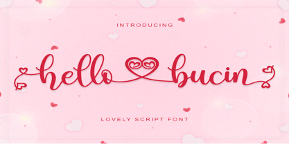 Hello Bucin feels equally romantic and whimsical. It looks lovely on wedding invitations, thank you cards, quotes, greeting cards, logos, business cards and every other design which needs a handwritten touch. This font is PUA encoded which means you can access all of the glyphs and swashes with ease! It features a varying baseline, smooth lines, gorgeous glyphs and stunning alternates.
 - Sweet Butterfly by AEN Creative Studio,
$14.00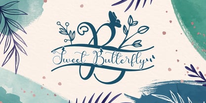 Sweet Butterfly is a beautiful script font with a romantic monogram theme, featuring lovely, butterfly ornaments. Fall in love with its authentic feel and use it to create gorgeous wedding invitations, thank you cards, logos, business, branding, and every other design which needs a handwritten touch. This font is PUA encoded which means you can access the available glyphs and swashes with ease!
 - Montlake Road by The Styled Script,
$25.00 Say hello to the Montlake Road Script Font. This is a carefree and elegant font with a romantic and feminine flare. Montlake Road has Opentype ligatures that give help give a natural handwritten look while the lowercase swashes add a beautiful touch to any project. This font is perfect for logos, notes, labels, wedding invitations, or branding for any project.
 - Queen Bee by Stefani Letter,
$12.00 Queen Bee is a sweet and cute font with special heart characters. Get inspired by its gorgeous swashes and create beautiful designs with a romantic touch to any crafting project! This font is PUA encoded which means you can access all of the amazing glyphs and swashes with ease! It also features a wealth of special features including alternate glyphs and ligatures.