10,000 search results
(0.04 seconds)
- Cowboy Junk by PizzaDude.dk,
$15.00 Cowboy Junk is my loose handmade impression of what would happen if the wild west crashed into grafitti! The letters are loose and jumpy and the terminals are kind of exaggerated to give that firce impression of handcraft! So, better get up early and leave this town, 'cos there’s only room for one sheriff in this here town, and that is Cowboy Junk! Comes with contextual alternates, which means that the font will automatically cycle through the 5 different versions AS YOU TYPE! Yieeehaaar!
 - Silky Smoke - Personal use only

- Shade Blue - Personal use only

- Atrament by Suitcase Type Foundry,
$75.00The Atrament font family was originally conceived in 2003 as the corporate display type family for Suitcase Type Foundry. Its original source of inspiration is the front cover of the Devetsil - Revolucni slovn’k almanac (1922), designed by Karel Teige. The lettering on this cover is a condensed sans serif with rounded stroke terminals. Atrament is significantly broader than the model and its characters are better balanced, reflecting the evolution of semi-condensed sans serifs throughout the 1960s. The horizontal strokes of both lower and upper case are less stressed than the vertical stems. Noteworthy are the unusual tiny gaps in the apex and vertex of letters with diagonal strokes, designed to prevent ink from spreading and smudging the letter shapes. This detail is one of the main features of the font's character. The general feel of the italics closely matches the strictly vertical, parallel character of the regular cut. When converting the family to OpenType the alternate character shapes from the Alternator weights were incorporated in the regular cut, which allows the user to switch selected characters from one shape to another within the same font. A number of glyphs and accents were corrected, and all the glyphs missing in the Suitcase Standard character set were added, along with the relevant kerning pairs. The individual weights of Atrament Std thus contain accented upper and lower case, small caps, alternate glyphs for most European languages, nine types of numerals, superscript characters, caps glyph versions, and much more. Its narrow proportions make Atrament the perfect choice whenever economy of space is a must. It is however not very well suited for setting long texts. Ideal for headlines and display use, it is perfect for situations where the text needs to make a great impact in a little space. - Semilla by Sudtipos,
$79.00 I spend a lot of time following two obsessions: packaging and hand lettering. Alongside a few other minor obsessions, those two have been my major ones for so many years now, I've finally reached the point where I can actually claim them as “obsessions” without getting a dramatic reaction from the little voice in the back of my head. When you spend so much time researching and studying a subject, you become very focused, directionally and objectively. But of course some of the research material you run into turns out to be tangential to whatever your focus happens to be at the time, so you absorb what you can from it, then shelf it — like the celebrity bobblehead that amused you for a while, but is now an almost invisible ornament eating dust and feathers somewhere in your environment. And just like the bobblehead may fall off the shelf one day to remind you of its existence, some of my lettering research material unveiled itself in my head one day for no particular reason. Hand lettering is now mostly perceived as an American art. Someone with my historical knowledge about lettering may be snooty enough to go as far as pointing out the British origins of almost everything American, including lettering — but for the most part, the contemporary perspective associates great lettering with America. The same perspective also associates blackletter, gothics and sans serifs with Germany. So you can imagine my simultaneous surprise and impatience when, in my research for one of my American lettering-based fonts, I ran into a German lettering book from 1953, by an artist called Bentele. It was no use for me because it didn't propel my focus at that particular time, but a few months ago I was marveling at what we take for granted — the sky is blue, blackletter is German, lettering is American — and found myself flipping through the pages of that book again. The lettering in that book is upbeat and casual sign making stuff, but it has a slightly strange and youthful experimentation at its heart. I suppose I find it strange because it deviates a lot from the American stuff I'm used to working with for so long now. To make a long story short, what’s inside that German book served as the semilla, which is Spanish for seed, for the typeface you see all over these pages. With Semilla, my normal routine went out the window. My life for a while was all Bezier all the time. No special analog or digital brushes or pens were used in drawing these forms. They're the product of a true Bezier process, all starting with a point creating a curve to another point, which draws a curve to another point, and so on. It’s a very time-consuming process, but at the end I am satisfied that it can get to pretty much the same results easier and more traditional methods accomplish. And as usual with my fonts, the OpenType is plenty and a lot of fun. Experimenting with substitution and automation is still a great pleasure for me. It is the OpenType that always saves me from the seemingly endless work hours every type designer must inevitably have to face at one point in his career. The artful photos used in this booklet are by French photographer and designer Stéphane Giner. He is very deserving of your patronage, so please keep an eye out for his marvelous work. I hope you like Semilla and enjoy using it. I have a feeling that it marks a transition to a more curious and flexible period in my career, but only time will tell.
 - Anglecia Pro by Mint Type,
$- Anglecia Pro is an exquisite and versatile system of three transitional serif typefaces designed to work together in editorial design. Sharing the same skeleton, vertical axis, and trapezoidal uncurved serifs, each of these faces bears different key dimensions and different contrast typical for three different type epochs. Anglecia Pro Text is a typeface designed for general typesetting in average reading sizes. Although it features a vertical axis, its soft skeleton, relatively small x-height and prominent ascenders and descenders give the typesetting a traditional warm texture with a slight contemporary touch. Anglecia Pro Title incorporates proportions of familiar transitional serif typefaces but exposes higher-than-average vertical contrast which makes it useful for setting captions, pull quotes or general purpose text in sizes of 12 pt and above. Anglecia Pro Display, still having non-rectangular serifs and the same soft skeleton as the rest of Anglecia Pro system, features extreme contrast, much thinner serifs and exaggerated ball terminals typical for Didone modern serif families. Its large x-height and tighter letter spacing suggests larger text sizes e.g. in decorative headlines, extra large pull quotes or logos. Altogether these three typefaces form 36 styles – each supporting numerous Latin-based languages as well as major Cyrillic languages. In roman styles the Cyrillic script comes in two flavours accessible via OpenType alternates – to choose either more traditional and curvy (default) or more formal and rigid type texture. In italics this feature affects uppercase and small caps. Also, each style is packed with OpenType features: ligatures, small caps, six sets of digits, superiors and inferiors, fractions, ordinals, and respective punctuation varieties including all-cap punctuation. There are also language-specific alternates for Polish kreska, Romanian Ș/ș, Catalan punt volat, and correct small-cap versions for Turkish/Azerbaijani i/ı. Some of the styles of Anglecia Pro can be found in Mint Type Editorial Bundle together with other fonts which make some great pairs. Check it out!
 - Junkwerk by PizzaDude.dk,
$20.00 Junkwerk is my heavy metal grunge font! It has got that feel like something that was stamped on, jumped on, shaken and headbanged for hours...just like how you would feel after hours of heavy metal! Comes with different upper- and lowercase letters, alternate letters and ligatures for both double letters and double numbers - and ofcourse it has got unique accented letters! You will need to use OpenType supporting applications to use the ligatures.
 - Bright Bridge by Putracetol,
$28.00 Bright Bride - Beautiful Script Font Introducing Bright Bride, a stunning and elegant script font that exudes sophistication and beauty. This font was carefully crafted with the intention of adding a touch of glamour to any design project. Its clean lines and flowing curves create a sense of grace and charm, making it perfect for wedding invitations, branding projects, social media posts, and much more. For those seeking a romantic and feminine touch, Bright Bride is the perfect font choice. Its delicate strokes and intricate details add a level of elegance that is sure to catch the eye of any viewer. Pair it with soft pastels or classic black and white to create a stunning contrast that will make your designs stand out. One of the standout features of Bright Bride is its OpenType alternates and ligatures. These unique letter combinations add an extra level of creativity and customization to your designs. Plus, with full multilingual support, this font can be used for projects in a variety of languages. The Bright Bride font package includes three different file formats: OTF, TTF, and WOFF. This makes it easy to use the font across a variety of design software and platforms. Whether you're a professional graphic designer or a casual hobbyist, this font is sure to be a valuable addition to your design arsenal. If you're looking for a font that is both stunning and versatile, look no further than Bright Bride. Its unique combination of elegance and creativity make it a perfect fit for a wide range of projects. So why wait? Add Bright Bride to your font collection today and start creating designs that are truly unforgettable. In summary, Bright Bride is a beautiful and sophisticated script font with delicate strokes and intricate details. It comes with OpenType alternates and ligatures, multilingual support, and three different file formats: OTF, TTF, and WOFF. This font is perfect for wedding invitations, branding projects, social media posts, and more.
 - Fangs ALot by Ingrimayne Type,
$9.00 FangsALot is a bizarre typeface family that was designed to alternate two character sets. These sets are alternated automatically in applications that support the OpenType feature Contextual Alternatives (calt). The template used to design characters is a distorted triangle that resembles a curved tooth or a fang. This shape can be flipped horizontally, vertically, and both horizontally and vertically to give four orientations. Two of these orientations are used in the regular style and two in what is called the italic style. I thought the fang motif did not come through clearly in the regular and italic styles. Rather the impression they give is more like graffiti lettering. To emphasize the fang motif I added two more members to the family by filling fang outlines with unadorned sans-serif characters. Then to allow more color in lettering, I added two more styles with letters on black. I then had six styles based on triangles skewed left and right. Why not fill the family out with three more styles based on an isosceles triangle? The end result is a family of nine. All members of the family are monospaced and are hard to read. The three graffiti-like styles have some alternative letters that can be accessed with the OpenType feature Stylistic Sets. Also, for each style it is possible to use only one set of characters by adding a space after each letter and then adjusting the character spacing. The graffiti-like styles can be useful in situations where the hard-to-read property is not important but where a menacing and vicious touch is needed, such as topics of sharks, teeth, biting, and vampires.
 - 99 Names of ALLAH Spiral by Islamic Calligraphy75,
$12.00 We have transformed the “99 names of ALLAH” into a font. That means each key on your keyboard represents 1 of the 99 names of ALLAH Aaza Wajal. The fonts work with both the English and Arabic Keyboards. We call this Calligraphy "Spiral" because of the spiral like design. The first "Alef" has a "hamzit wasel", this indicates that you can pronounce the names both ways, "AR-RAHMAAN" or "R-RAHMAN". (in the zip file you will find a pdf file explaining the differences in the "harakat", pronunciation and spelling according to the Holy Quran). The "Ye" doesn't have 2 dots at the end of a name, instead we chose to include a small "ye" on the letter "ye". Also, we used the traditional "soukoun" instead of the Quranic "soukoun". Decorative letters used in this calligraphy: "Mim, Aain, Sin, HHe, He, Kaf, Alef & Ye". Purpose & use: - Writers: Highlight the names in your texts in beautiful Islamic calligraphy. - Editors: Use with kinetic typography templates (AE) & editing software. - Designers: The very small details in the names does not affect the quality. Rest assured it is flawless. The MOST IMPORTANT THING about this list is that all the names are 100% ERROR FREE, and you can USE THEM WITH YOUR EYES CLOSED. All the “Tachkilat” are 100% ERROR FREE, all the "Spelling" is 100% ERROR FREE, and they all have been written in accordance with the Holy Quran. No names are missing and no names are duplicated. The list is complete "99 names +1". The +1 is the name “ALLAH” 'Aza wajal. Another important thing is how we use the decorative letters. In every font you will see small decorative letters, these letters are used only in accordance with their respective letters to indicate pronunciation & we don't include them randomly. That means "mim" on top or below the letter "mim", "sin" on top or below the letter "sin", and so on and so forth. Included: Pdf file telling you which key is associated with which name. In that same file we have included the transliteration and explication of all 99 names. Pdf file explaining the differences in the harakat and pronunciation according to the Holy Quran. --------------------------------------------------------------------------------------------------------------------------- Here is a link to all the extra files you will need: https://drive.google.com/drive/folders/1Xj2Q8hhmfKD7stY6RILhKPiPfePpI9U4?usp=sharing ---------------------------------------------------------------------------------------------------------------------------
 - Hiatus by Stephen Rapp,
$59.00 Hiatus bridges the gap between formal scripts used for invitations and more classic settings and casual scripts that exude a warmer tone. Like many formal scripts, Hiatus is fully connecting. Its low body height combined with generous letterspacing adds an elegant profile to lines of text. Like casual scripts, Hiatus has a warm, hand-lettered appearance with great rhythm. Solid in structure; Hiatus also sets well at smaller sizes. Type enthusiasts will enjoy the variety of options. For optimal text flow, both letters and ligatures have alternate versions programmed to come in at the appropriate place for both beginnings and endings as well as in various contextual settings. In addition, there are variations and flourished versions of almost every letter and ligature. Some ligatures have as many as 12 variations. Also included are fractions, a set of old-style numbers, and a set of ornamental flourishes. Hiatus is a unique contemporary script with the strength of a time-tested classic. Please note that this version supports a wider range of languages compared with the lower-priced version available through other channels.
 - Odisseia by Plau,
$20.00 Odisseia: Monospaced Typeface Made on Earth by Plau. Plau presents Odisseia, a monospace type family in 8 styles designed with simplicity of shapes and a humanist touch. We’ve ventured into monospace territory, where all letters must occupy the same amount of space. This style is usually associated with typewriters and computer terminal fonts. Like all monospaced fonts, every letter align vertically in a multi-line setting. The rhythm created is peculiar, since large letters such as m and w occupy the same space as narrow ones like i. Because we have 4 different weights: light, regular, bold and black the design of some characters have to be adapted to fit the same width and achieve a constant light/dark value throughout. These features make Odisseia suitable for a specific yet considerable range of uses, from computer coding to systemized communication such as brand identities. This style has been used from high-end brand identity to cutting edge digital applications. Odisseia sets a little shorter in comparison with other monospaced fonts, and bears a large x-height.
 - VLNL Kouseband by VetteLetters,
$30.00 The starting point for VLNL Kouseband was spotted by Donald DBXL Beekman on the Christian Reformed Church in the Dutch town of Naarden. The iron wire lettering contained a number of unusual characters and details, which eventually led to this five weight family. The Kouseband fonts mix elements of geometric sans serifs and upright unconnected scripts, with a hint of Dutch school writing. VLNL Kouseband is monolinear and has an very large cap height compared to the (lowercase) x-height, giving the capital letters an elongated condensed appearance. Kouseband is the Dutch word for ‘garter (belt)’ and also gave the name to a long tropical bean known as Yardlong bean. Kouseband beans are a common ingredient in Roti and other Surinamese dishes. As the Dutch Christian church is sometimes referred to as ‘Zwarte kousenkerk’ (Black stocking church), and stockings are held up by garter belts, we have come full circle and VLNL Kouseband has a name. VLNL Kouseband contains a set of oldstyle numbers matching the lowercase letters, and a couple of wider alternate capitals (HMNOQ) to enhance the liveliness of your designs.
 - Pedestrian by Ingrimayne Type,
$12.95 The letters in this font are made by chopping bits from footprints. Individual letters are sometimes very hard to decipher, but when put together as words they are usually readable. In Pedestrisan-Regular, the original version of this font, the upper-case letters have toes on the top the lower case letters have toes on the bottom. All the feet with letters are right feet. The upper case and lower case do not mix. In 2020 two alternate versions were created. In Pedestrian-Alt all toes are on the top but the lower-case letters are left feet. In Pedestrian-AltTwo all toes are on the bottom with the upper-case letters being cut from left feet and the lower case from right feet. Both the alternate styles also have an alternate set of numbers on the unicode circled numbers that can also be accessed with an OpenType feature.
 - Gaela by Letterena Studios,
$17.00 Gaela is a modern and classic serif typeface with a unique style and modern look. This typeface is perfect for an elegant & luxury logo, book or movie title design, fashion brand, magazine, clothes, lettering, quotes, and so much more.
 - Wargika by Letterena Studios,
$17.00 Wargika is a modern and classic serif font with a unique style and modern look. This typeface is perfect for an elegant & luxury logo, book or movie title design, fashion brand, magazine, clothes, lettering, quotes, and so much more.
 - Pullman by Scriptorium,
$18.00Pullman is based on turn-of-the-century lettering reminiscent of the signage on some luxury Pullman-style train cars of that period. It is a heavy script font with a lot of character and an authoritative, elegant look. - Lordranga by Letterena Studios,
$10.00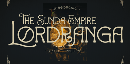 Lordranga is a distinct and vintage styled serif font, with a unique style & modern look. This typeface is perfect for an elegant & luxury logo, book or movie title design, fashion brand, magazine, clothes, lettering, quotes, and so much more.
 - Marslow by JprintStudio,
$20.00 Marslow is a modern look font with a futuristic vibe, bold and clean. Get inspired by its incredible youthful vibe. Add this lettering font to your designs and watch how it comes to life and your creations stand out!
 - Krisis Sans by ABSTRKT,
$25.00This font was originally designed for one lettering job with only one simple purpose—to be as much condensed as a font can be. Then it was developed as a font family of 4 weights with regulars and italics. - Jacaranda JNL by Jeff Levine,
$29.00Jacaranda JNL is a casual and fun font—resembling lettering made with the broad side of a chisel-tipped marker. Perfect for anything that is relaxed and not-too-serious, it is flexible and versatile for many ad projects. - Rousset Bilast by Zamjump,
$19.00 Rousset Bilast is a handwritten signature font with a calligraphy flair, ideal for creating handwritten-style logos, wedding stationery, photographer watermarks logos, modern websites, and more. Rousset Bilas features heart connectors, handwritten ligatures, and end swashes for lowercase letters.
 - Mackenzin by Letterena Studios,
$17.00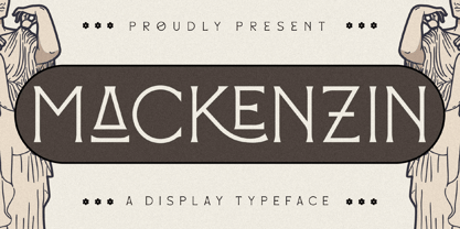 Mackenzin is a modern and classic serif font with a unique style and fancy look! This typeface is perfect for an elegant & luxury logo, book or movie title design, fashion brand, magazine, clothes, lettering, quotes, and so much more.
 - Salminah by Letterafandi Studio,
$14.00 Salminah is a fashionable and thin lettered script font. Suitable to a wide variety of designs due to its neat and simple style, this font has the potential to become your favorite go-to font, no matter the occasion!
 - MPI No. 508 by mpressInteractive,
$5.00 No. 508 is a chunky, friendly, modulated gothic font. Strokes have a gentle inward curve at the median, with the tops and bottoms of the letters slightly wider. The face was introduced by William H. Page & Company in 1890.
 - Poca by Type-Ø-Tones,
$40.00 Poca is made up of right angles and regular strokes. It is a De Stijl typeface provided by Peret. We devised the lower case letters and added some Peret dingbats. Fifteen years later we added a fun bitmap version.
 - Military Agent by Yoga Letter,
$17.00 "Military Agent" is a patriot-themed display font. This font is decorated with a star shape on each letter. Equipped with uppercase, lowercase, numerals, punctuation, and multilingual support. Suitable for 4th of July moments, posters, banners, branding, and more.
 - Teom by Fontimonim,
$59.00 A Hebrew sans font inspired by the Latin letters of font Tahoma. Teom serves as a more polished and harmonious substitute for Tahoma's default Hebrew, and also as an independent and elegant Hebrew font for titles and short texts.
 - Megila by Letterena Studios,
$17.00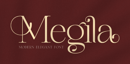 Megila is a modern and classy serif font with a unique style and modern look. This typeface is perfect for an elegant & luxury logo, book or movie title design, fashion brand, magazine, clothes, lettering, quotes, and so much more.
 - Busy Scratch by PizzaDude.dk,
$15.00 Busy Scratch is very useful for something that needs a simple, yet eye-catching handmade look. The letters are carefully hand-kerned and spaced for a natural and legible look. For extra energy, try switching between Regular and Italic!
 - Kiks by David Engelby Foundry,
$25.00 Kiks is the Danish name for biscuit. Just like a biscuit this font throws its crums in every direction with curvy, bold letters. A display font made for headlines and everything else that needs to be visually loud. Enjoy!
 - Mariana by Letterena Studios,
$9.00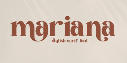 Mariana is a modern and classic serif font with a unique style and beautiful characters. This typeface is perfect for an elegant & luxury logo, book or movie title design, fashion brand, magazine, clothes, lettering, quotes, and so much more.
 - Second Impression JNL by Jeff Levine,
$29.00Second Impression JNL is the solid version of Lasting Impression JNL by Jeff Levine. It emulates the look of ink-stamped letters and numerals. Based on a 1930s-era set of rubber stamps, there is a limited character set. - Occidental Tourist JNL by Jeff Levine,
$29.00Occidental Tourist JNL is based on a set of die-cut cardboard letters used by teachers. They were primarily found on classroom bulletin boards or felt boards. The font's name is a pun on the movie The Accidental Tourist. - Witchfinder by Die Typonauten,
$19.00 This font family is the first collection of almost all pictograms, signs and letters that refers to the topic of White Magic, witches and witch hunt. There are plenty of witch symbols, astrology signs, woodcuts and witch letters. The cryptic symbols are explained in an extra style. In addition to the symbols the scripts contain both: a digitized original manuscript from the ending 18th century and a modified newer script version. Bringing the light of the Enlightenment to the dark ages of suspicion, chasing and unjustness!
 - Dizzy Edge by PizzaDude.dk,
$15.00 My Dizzy Edge font is really not that dizzy! Actually it's quite steady and legible - super good for packaging, greeting cards and perhaps even commercials for toys, candy, t-shirts, movieposters...yep, that list is long! What's more interesting is that the font as got 6 different versions of each letter - at first glance, the letters don't vary that much, but a closer look reveals the sometimes grungy outline of a pen! But theres more!!! Dizzy Edges comes with multi-language accents!!! What's not to like!!!
 - Lilypaly by Sronstudio,
$15.00 Lilypaly is a modern and elegant font with a lot of stylistic alternates for your beautiful project. I made this font carefully so that each letter could be connected well and elegantly either using alternate or not. Lilypaly includes start and ending swash, and middle swash for some letters, this is very easy to use. Lilypaly is perfect for many different project such as logos & branding, invitation, stationery, wedding designs, social media posts, advertisements, product packaging, product designs, label, photography, watermark, special events or anything.
 - Circolino by Aspro Type,
$19.99 Circolino is calligraphic script typeface set that is inspired by the letterforms taught in Italian schools. Each letter combination is designed to tie in perfectly within the word. In this regard, many contextual alternatives and letter variants have been designed, especially to make a more calligraphic feel. The Circolino character set consists of two families: Circolino Classic and Circolino Sport. The Classic Family has an almost vertical tilt axis, while Sport Family has a much more pronounced tilt axis that gives it more dynamism and movement.
 - Clichy by Eurotypo,
$32.00 Clichy is a delightfully handwritten font with strong character. Clichy is a font inspired by the successful Nuit font, looking for the same harmony and casual character, Nuit's rounded strokes are now straight. Clichy has even more stylistic alternatives, decorative characters, ligatures, initial and terminal forms in upper and lower case, that allow you to mix and match pairs of letters. Also, with Clichy it is possible to write in capital letters. Clichy will help your creativity and make your typographic work expressive and elegant.
 - Smyrna by Ahmet Altun,
$19.00 Smyrna is a hand-drawn font family comes in two weights; light and regular. Thanks to its randomize effect, you can write 4 options for each letter. When the Smyrna Font used in OpenType-savvy applications, its Stylistic Alternates feature produce a random-like effect on the terminal points of the letters. So, typing is no longer monotony; it's returning full of fun. The name "Smyrna" comes from the city I live, Izmir. Smyrna is the name of the ancient city located at modern Izmir.

