10,000 search results
(0.015 seconds)
- Linea by Page Studio Graphics,
$25.00 - Live by Lián Types,
$30.00 After Bird Script's ballet, Sproviero comes with these fast strokes, resulting in a font full of life and a youthful spirit. The aim of Live was again to see how far calligraphy & lettering could dive into the world of type-design. The font is perfect for logos, posters, magazines, perfumes and all pieces of design related to music, and the feminine world. You can also have a lot of fun with Live More, which contains a set of pre-designed catch words and lovely ornaments.
 - Lince by Typomancer,
$26.00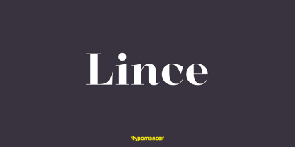
- Likely by Adam Ladd,
$25.00 Likely is a joyful, brush script type family with complementary sans and extras styles. Hand drawn freely but carefully, each font is designed to work together to present a vibrant and natural package. Layer and colorize the free Counter styles to easily enhance the color palette or use the over 170 matching catchwords and shapes to make your designs even more fun!
 - Cline by Typomancer,
$20.00 Cline, a family of slab and sans typefaces that seamlessly harmonize with each other. All styles have the same width, so changing font weight will not affect your typesetting. Suitable for both text and headlines.
 - Limes by Piñata,
$9.90 The idea of Limes emerged at the seashore last year in late summer. Getting ready in advance for a dark winter, we've decided to design a special fontfamily which would bring a bit of vitamins and summer sun into the rough everyday routine and help us survive the cold winter. Limes is both a dream of the sun while it’s gone and a refreshing breeze for the time when it finally gets warm! Limes is a completely handwritten fontfamily and consists of 23 typefaces. To create Limes Sans and Limes Slab families, we've used regular watercolor brushes, and to create monolinear Limes Script, as well as for Catchwords and Dingbats, we've used a felt-tip pen with circular section. Limes Sans and Limes Slabs fonts work perfectly together with Limes Script due to the general handwritten idea, as well as due to the widths contrast – despite its width, Limes Script mixes well with narrower opponents and adds a bit of human spontaneity into the general handwritten concept. The Limes collection includes: Limes Sans (Thin, Light, Regular, Bold, Black & italics), Limes Slab (Thin, Light, Regular, Bold, Black & italics), Limes Script, Catchwords and Dingbats. Limes Sans and Limes Slab widely support OT features: tnum, ordn, frac, case, numr, dnom, subs, sups, and Limes Script uses a large number of context alternatives.
 - Hines by Craft Supply Co,
$20.00 Unveiling Hines – The Vintage Font Masculine Nuance Firstly, Hines bursts forth with a strong, masculine nuance. Explicitly crafted, it resonates with the robust vibes of custom motor cultures and similar realms. Vintage Charm Additionally, the font carries a vintage charm. Its classic serif details are infused with a tough, rugged aesthetic, making each letter captivating and rich with character. Tailored for Customization Moreover, Hines is meticulously tailored. Suitable for custom motor artworks and more, it harmonizes perfectly with themes of strength, adventure, and craftsmanship, enhancing the project’s vibe.
 - Links by HouseOfBurvo,
$36.00 Links was built adhering to a strict grid of 'linked' squares; and comes with special "Grid Glyphs" that line up perfectly with all characters. These Grid Glyphs can be used to create an invisible grid for your layout or as a background to enhance your design. Perfect for posters, logos and headlines, this font is available in four styles; Round and Square with accompanying obliques. This font was inspired by much of the lettering from the Dutch movement, or Functionalism which in turn was a descendant of the International Style pioneered by the Swiss. In keeping with these traditions, Links was build adhering to a strict grid of linked squares, taking a clear scientific approach to construct each character. One of the main features of International Style is the implementation of a Grid. This font has built in special characters that I call 'Grid Glyphs'; these Grid Glyphs line up perfectly with every character, enabling you to construct your own grid that echoes the form of the characters. These glyphs can also be used to create a background for your layout, as can be seen in the gallery pictures.
 - Roma by Canada Type,
$29.95 Tom Lincoln's award-winning type design work since the 1960s has been one way or another of expressing his fascination for the Roman majuscules inscribed at the base of the Trajan Column in Rome. This time he has really outdone himself by bringing us Roma, a definitive, contemporary, mature sans serif expression of those majuscules. With Roma, Lincoln is not satisfied with simply creating a proper "Trajan Sans". He goes on to make it a family of four weights, with built-in small caps and oldstyle figures, then he really goes to town with the options he makes available for shading and multi-color settings. Precise renderings of the Roma capitals are provided in different fonts that can function individually or be layered atop each other for two- or three-color treatments. The Roma family comes with extended language support that spans the majority of Latin-based languages. For more information on the design, complete character sets, technological features, and print tests, consult the accompanying PDF.
 - Oman by Par Défaut,
$35.00 With five weights and four contrasts, all grouped in three version : sans-serif, slab, serif and all this doubled by a true italic, Oman regroup 120 different styles declined in four variables. Perfect from headlines to text, Oman will meet your needs with a many languages to support (Latin pro, Cyrillic), 14 OpenType features (Fraction, Numerator, Denominator, Tabular figure, Oldstyle figure, Small capital, Small capital from capital, Ordinal, Stylistic set, Case sensitive, Discretionary ligature, Contextual alternate and All access alternate). • Numerator and Denominator includes numerals and currency • Tabular Figure includes : numerals, currency, OldStyle numerals, small capital numerals, small capital currency. • Small Capital features includes the Latin & Cyrillic alphabet with the accents. • Ordinal feature includes the Latin & Cyrillic alphabet. • Two Stylistic set for “a” & “g” includes accents. • Discretionary Ligature includes “AE”, “AÉ”, “IJ”,“OE”, available in lowercase, small capital and ordinal. • Contextual Alternate includes ligatures for arrows : <-->^|v|<->v^|. Add n, d or +, for numerator, denominator or case arrows. All Case sensitive characters become after the uppercase and number.
 - Life is life - Unknown license

- Tallula SelbyWillis aged 4 - Personal use only

- 4 Star Face Font - Unknown license

- Eight Track program 4 - Personal use only

- Joshua Dawson aged 4 - Personal use only

- KR Irish Kat 4 - Unknown license

- 4 Point Greek Fret by Deniart Systems,
$20.00 A whimsical array of pointers designed with semi-traditional Greek fret pattern (up/down/left/right) - great for adding directions or pointers to documents, maps, posters, greetings, or simply used as decorative elements. See also 4Point Deco and 4Point Florals.
 - LHF Saratoga Panels 4 by Letterhead Fonts,
$53.00The final collection in the series of 4 fonts. Each font contains 37 expertly drawn panels. All you have to do is add your own text and color for a quick and easy design. All 37 of these panels are exclusive to Letterhead Fonts. Typing each letter generates a different panel. Special Note: Due to the large file size of these fonts, they will not convert for use in Gerber Omega. Instead, Omega users may wish to use an alternate program to type the characters and import them into Omega as .eps files. CorelDraw users should use the "Weld" command rather than "Convert to Curves" command to convert these fonts to vector outlines. Otherwise, the program may crash due to the sheer number of points in each panel. - Calligraphia Latina Soft 4 by Intellecta Design,
$25.90 One of the most successful ornament fonts is CalligraphiaLatina . It is part of a trend that's been quite popular lately: messed-up calligraphy. CalligraphiaLatina is a worldwide best-seller from IntellectaDesign.. Besides the original CalligraphiaLatina, its family of fonts (13 different sets) represents a complete solution of intrincated fleurons and ornaments to use with several styles of artworks.
 - Wood Heinz No. 4 by astype,
$50.00 Just Wood Heinz No.4 - the cool display font. Wood Heinz No.4 offering up to four "printed look" variations of all the Latin base letters and figures. An OpenType letter rotator is programmed into the fonts to emulate the randomness of wood type printing. You can switch manually to the alternate letters by using the Stylistic Sets 1 – 4. Stylistic Set 5 will activate the more common look of the capital letter R with a straight leg. PDF Specimen
 - Stand By 4 Action by Comicraft,
$19.00 Anything could happen in the next Half Hour! Inspired by the work of Gerry Anderson, this font graces the pages of Marvel's AVENGERS and THUNDERBOLTS Each and Every Month!
 - Espesor Olas Lines - Personal use only

- a Morris line - Unknown license

- Last N Line - 100% free

- Line Dings BRK - 100% free

- Pecot Lined Jewel - Unknown license

- BN-Outer Line - Unknown license

- White Line Rolled - Unknown license

- Rail Line JNL by Jeff Levine,
$29.00 Rail Line JNL is a font for the railroad enthusiast for making their own model train car emblems. The logos contained in this font are or may be the property of the various rail companies, their assigns and/or successors. Outside of non-profit hobby use or for historical/educational purpose under the Fair Use rules, any commercial application of these logos must be obtained by written permission by the respective logo owner or owners. Jeff Levine fonts provided Rail Line JNL strictly as a hobby font. We assume no liability for the use, misuse or misrepresentation of any of the logos contained within the font file.
 - Naive Line Sans by S&C Type,
$8.00 Naïve Line Sans is an unusual handwritten sans serif font designed by Fanny Coulez and Julien Saurin in Paris. Our goal was to draw a font with finely irregular lines that give a human and whimsical feeling. We designed five weights, finely balanced, to assure a good readability whatever the size. This font is part of our Naïve superfamily that contains lot of variations: Line, Inline, Serif, Sans Serif, and a special Art Deco one. Just click on our foundry name to see them all! We hope you will enjoy our work. Merci beaucoup!
 - Noble Line Caps by URW Type Foundry,
$28.00 The basic idea for this headline typeface is to create strictly geometric letters, similar to a script typeface, as far as possible in a single sweep, without setting them down. And similar to a typeface written with a quill, there is a thin and a thicker stroke. The uppercase letters can also be used with the lowercase keys. The varied and unusual variety of forms in this typeface gives headlines, keywords and even short texts the attention they are looking for.
 - MEGA SLANT LINE by TypoGraphicDesign,
$19.00 CONCEPT/CHARACTERISTICS This strikingly bold, black and extended 3D font reminiscent of sci-fi films and experimental typeface design. The font acts as a chain of ligatures and thus receives a unique aesthetic. The unique letter forms are in sharp contrast to other fonts and thus stand out as a unique selling point. APPLICATION AREA Posters, music cover, book cover, logos, as a headline font for magazines or websites … TECHNICAL SPECIFICATIONS Headline Font | Display Font | Sci-Fi Font »Mega Slant Line« OpenType Font with 303 glyphs – alternative letters and ligatures (with accents & €) & 2 styles (regular & 3d) KONZEPT/BESONDERHEITEN Diese auffällig plakative, fette und breitlaufende 3D Schrift erinnert an Sci-Fi Filme und ist experimentelle Schriftgestaltung. Die Schrift wirkt wie eine Kette aus Ligaturen (Buchstabenverbindungen) und erhält somit eine ganz eigene Ästhetik. Die sehr eigenen Buchstabenformen werden sich deutlich von anderen Schriften abheben und somit als Alleinstellungsmerkmal herausstechen. Der Fluss ergiebt sich aus den EINSATZGEBIETE Plakate aller Art, Musik Cover, Buchcover, für Logos und Wortmarken, als Displayschrift für Zeitschriften oder Websites… TECHNISCHE INFORMATIONEN Headline Font | Display Font | Sci-Fi Font »Mega Slant Line« OpenType Font with 303 glyphs – alternative letters and ligatures (with accents & €) & 2 styles (regular & 3d)
 - Wood Line JNL by Jeff Levine,
$29.00 Wood Line JNL is based on a printed example of a vintage handmade wood type. This sans serif digital font is available in both regular and oblique versions.
 - New York Line by Kustomtype,
$30.00 When you go traveling you always fall in love with something… At this time, it is the inscription of Holland America Line which is sparkling on ‘New York Hotel’, Rotterdam-Holland. Based on the letters I had at my disposal from the Holland America Line inscription at ‘Hotel New York,’ I started to complete the alphabet in the same style as the original text. Eventually, I digitized everything in order to acquire a usable and modern font to be able to use it for all graphic purposes. The font is ideal for head text, posters, logos, editorial, branding, signage, web applications, modern design, etc... Don't hesitate to use this unique historical font! It will give your work that glamour that you will find in this extraordinary font. Enjoy the New York Line. The Holland America Line was founded in 1873 as the Dutch-America Steamship, a shipping, and passenger line. Because it was headquartered in Rotterdam and provided service to the Americas, it became known as Holland America Line (HAL). From 1901 the iconic building on the Kop van Zuid shines. It previously housed the Holland America Line; now it houses the hotel-restaurant, Hotel New York. A building with a great history. Hotel New York has a beautiful history. Built in 1901, many ships sailing away and opened in 1993 as a hotel and restaurant. The New York Line Font comes with uppercase, lowercase, numerals, punctuations so you can use it to customize all your designs. Perfect for Logos, Letterhead, Poster, Apparel Design, Package design, Label design etc. The New York Line Font is designed by Coert De Decker in 2018 and published by Kustomtype Font Foundry. Enjoy your journey with the New york Line!
 - Fun Line Arabic by FunFont,
$29.00 FunLine is a modern script font, crafted with monoline strokes characterized by curved lines and seamless connections, presenting a classic font with a modern touch. The font family comprises three weights; Light, Regular, and Bold. Suitable for your design needs. The Arabic version will be released, accompanied by the addition of Arabic, Urdu, Pegon, Persian, and Kurdish languages.
 - Three Neon Lines by Kaer,
$19.00 Hello! Do you need colorful neon-style lettering? Please use the ready-colored font I've made. What you will get: * Colored and regular B&W styles * Uppercase (lowercase glyphs are same) * Multilingual support * Numbers and symbols If you have any questions or issues, please contact me: kaer.pro@gmail.com Best, Roman. --- *You can use color fonts in PS since CC 2017, AI since CC 2018, ID since CC 2019, QuarkXPress since 2018, Pixelmator, Sketch, Affinity Designer Since macOS 10.14 Mojave, Paint.NET Windows only.* *Please note that the Canva does not support color fonts!*
 - Uptown Line JNL by Jeff Levine,
$29.00 Ask any typical New Yorker about subway directions and they'll tell you to take the "uptown line", "downtown line" or "cross-town line". Uptown Line JNL is yet another variation of the Art Deco monoline style of lettering prevalent during the 1930s and 1940s, and is based on titling from vintage sheet music for a Johann Strauss classical piece.
 - Holiday Thin Line by alphArt,
$25.00 “Holiday Thin Line” is a mesmerizing typeface with elegant and minimalist thin lines. It is specifically designed to add a touch of beauty and lightness to your designs. With its gentle and simplistic nature, this font is perfect for projects that require a modern touch, such as wedding invitations, logo designs, greeting cards, and more. Available in various character variations and symbols, it allows you to express limitless creativity. Get “Holiday Thin Line” now and enjoy the enchanting beauty of typography. Unlock a world of creative possibilities with an extensive collection of 369 meticulously crafted glyphs, offering limitless expression for your designs. Our font proudly supports an impressive range of 92 languages, ensuring seamless communication across cultures and borders. May it inspire you to create remarkable designs that leave a lasting impression. Thank you for joining us on this typographic journey!
 - Courier Line Draw by Monotype,
$29.99Designed as a typewriter face for IBM, Courier was redrawn by Adrian Frutiger for the IBM Selectric series. Courier is a typical fixed pitch design, monotone in weight and slab serif in concept. The Courier font is used to emulate typewriter output for reports, tabular work and technical documentation. - Two Lines Loop by Kaer,
$21.00 Alphabet set made of two white parallel lines. They are looked like infinite looped icons. Ideal for dynamic app, minimalism design, sports identity, technology adv. What's included? Uppercase (lowercase are the same) Numbers Symbols Punctuation Multilingual support Please feel free to request any help you need: kaer.pro@gmail.com Best, Roman.


