10,000 search results
(0.031 seconds)
- Frankfurter SH by Scangraphic Digital Type Collection,
$26.00Since the release of these fonts most typefaces in the Scangraphic Type Collection appear in two versions. One is designed specifically for headline typesetting (SH: Scangraphic Headline Types) and one specifically for text typesetting (SB Scangraphic Bodytypes). The most obvious differentiation can be found in the spacing. That of the Bodytypes is adjusted for readability. That of the Headline Types is decidedly more narrow in order to do justice to the requirements of headline typesetting. The kerning tables, as well, have been individualized for each of these type varieties. In addition to the adjustment of spacing, there are also adjustments in the design. For the Bodytypes, fine spaces were created which prevented the smear effect on acute angles in small typesizes. For a number of Bodytypes, hairlines and serifs were thickened or the whole typeface was adjusted to meet the optical requirements for setting type in small sizes. For the German lower-case diacritical marks, all Headline Types complements contain alternative integrated accents which allow the compact setting of lower-case headlines. - Stilla SH by Scangraphic Digital Type Collection,
$26.00Since the release of these fonts most typefaces in the Scangraphic Type Collection appear in two versions. One is designed specifically for headline typesetting (SH: Scangraphic Headline Types) and one specifically for text typesetting (SB Scangraphic Bodytypes). The most obvious differentiation can be found in the spacing. That of the Bodytypes is adjusted for readability. That of the Headline Types is decidedly more narrow in order to do justice to the requirements of headline typesetting. The kerning tables, as well, have been individualized for each of these type varieties. In addition to the adjustment of spacing, there are also adjustments in the design. For the Bodytypes, fine spaces were created which prevented the smear effect on acute angles in small typesizes. For a number of Bodytypes, hairlines and serifs were thickened or the whole typeface was adjusted to meet the optical requirements for setting type in small sizes. For the German lower-case diacritical marks, all Headline Types complements contain alternative integrated accents which allow the compact setting of lower-case headlines. - Aachen SH by Scangraphic Digital Type Collection,
$26.00Since the release of these fonts most typefaces in the Scangraphic Type Collection appear in two versions. One is designed specifically for headline typesetting (SH: Scangraphic Headline Types) and one specifically for text typesetting (SB Scangraphic Bodytypes). The most obvious differentiation can be found in the spacing. That of the Bodytypes is adjusted for readability. That of the Headline Types is decidedly more narrow in order to do justice to the requirements of headline typesetting. The kerning tables, as well, have been individualized for each of these type varieties. In addition to the adjustment of spacing, there are also adjustments in the design. For the Bodytypes, fine spaces were created which prevented the smear effect on acute angles in small typesizes. For a number of Bodytypes, hairlines and serifs were thickened or the whole typeface was adjusted to meet the optical requirements for setting type in small sizes. For the German lower-case diacritical marks, all Headline Types complements contain alternative integrated accents which allow the compact setting of lower-case headlines. - Garamond No. 1 SB by Scangraphic Digital Type Collection,
$26.00 Since the release of these fonts most typefaces in the Scangraphic Type Collection appear in two versions. One is designed specifically for headline typesetting (SH: Scangraphic Headline Types) and one specifically for text typesetting (SB Scangraphic Bodytypes). The most obvious differentiation can be found in the spacing. That of the Bodytypes is adjusted for readability. That of the Headline Types is decidedly more narrow in order to do justice to the requirements of headline typesetting. The kerning tables, as well, have been individualized for each of these type varieties. In addition to the adjustment of spacing, there are also adjustments in the design. For the Bodytypes, fine spaces were created which prevented the smear effect on acute angles in small typesizes. For a number of Bodytypes, hairlines and serifs were thickened or the whole typeface was adjusted to meet the optical requirements for setting type in small sizes. For the German lower-case diacritical marks, all Headline Types complements contain alternative integrated accents which allow the compact setting of lower-case headlines.
 - LCD SH by Scangraphic Digital Type Collection,
$26.00 Since the release of these fonts most typefaces in the Scangraphic Type Collection appear in two versions. One is designed specifically for headline typesetting (SH: Scangraphic Headline Types) and one specifically for text typesetting (SB Scangraphic Bodytypes). The most obvious differentiation can be found in the spacing. That of the Bodytypes is adjusted for readability. That of the Headline Types is decidedly more narrow in order to do justice to the requirements of headline typesetting. The kerning tables, as well, have been individualized for each of these type varieties. In addition to the adjustment of spacing, there are also adjustments in the design. For the Bodytypes, fine spaces were created which prevented the smear effect on acute angles in small typesizes. For a number of Bodytypes, hairlines and serifs were thickened or the whole typeface was adjusted to meet the optical requirements for setting type in small sizes. For the German lower-case diacritical marks, all Headline Types complements contain alternative integrated accents which allow the compact setting of lower-case headlines.
 - Friz Quadrata SB by Scangraphic Digital Type Collection,
$26.00Since the release of these fonts most typefaces in the Scangraphic Type Collection appear in two versions. One is designed specifically for headline typesetting (SH: Scangraphic Headline Types) and one specifically for text typesetting (SB Scangraphic Bodytypes). The most obvious differentiation can be found in the spacing. That of the Bodytypes is adjusted for readability. That of the Headline Types is decidedly more narrow in order to do justice to the requirements of headline typesetting. The kerning tables, as well, have been individualized for each of these type varieties. In addition to the adjustment of spacing, there are also adjustments in the design. For the Bodytypes, fine spaces were created which prevented the smear effect on acute angles in small typesizes. For a number of Bodytypes, hairlines and serifs were thickened or the whole typeface was adjusted to meet the optical requirements for setting type in small sizes. For the German lower-case diacritical marks, all Headline Types complements contain alternative integrated accents which allow the compact setting of lower-case headlines. - Modist by Fikryal,
$25.00 Introducing Modist, a modern serif is a font that combines classic elegance with a fresh modern touch. Created with meticulous detail and precision, this font exudes an elegant and professional impression in every design that utilizes it. With smooth lines and balanced proportions, Modist brings high clarity and readability. Each letter is carefully designed, blending subtle and contemporary serif elements, creating a harmony between traditional and modern aesthetics. The standout feature of Modist is its versatility in various design contexts. Whether used for headlines, body text, or a combination of both, this font provides a sophisticated and professional look. Whether you’re designing a logo, book layout, marketing materials, or a website, Modist will infuse the elegant touch you need. Features: Modist Multilingual Support If you have any questions please don’t hesitate to contact me follow my Instagram: fkryall Thank you
 - Graphique Next by profonts,
$41.99 The original Graphique Pro was designed by the famous Swiss designer Hermann Eidenbenz in 1945 and included one outline shadow style. His idea of a very narrow, very economic headline font became increasingly more popular over the last decades and since the recent trend of layered fonts his idea is more up-to-date than ever. profonts studio now took the idea of the Graphique Pro to its next level: Graphique Pro Next. This layered type family consists of 8 styles which can be combined in plenty of ways to create unique designs. The fonts thereby preserve the outstanding and timeless drawings of the original Graphique Pro font and will add an aesthetic and fresh look to every project. Please have a look at the Graphique Pro Next Type Specimen for more details about the language support and font layer combinations.
 - Zebron by Fontron,
$35.00A bold, decorative, striped font for display and headlines. - Televisio by Suomi,
$25.00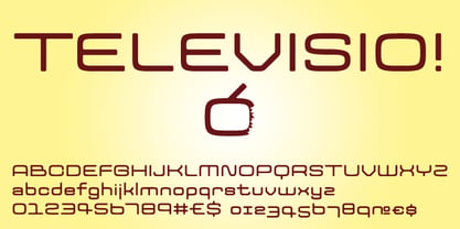 Televisio is a headline font witha technical retro feel.
 - Title Gothic Light by BA Graphics,
$45.00A very thin light line gothic, great headline face. - Triron by Fontron,
$35.00A bold, decorative, striped font for display and headlines. - Maslul MF by Masterfont,
$59.00 Super clear and bright font for headlines and logos.
 - FF DIN Paneuropean Variable by FontFont,
$629.99 FF DIN: the famous, faithful and first revival of DIN 1451. FF DIN originates in the lettering models from the German standard DIN 1451, and is considered the perfect standard typeface due to methodical and engineered design. FF DIN Variable offers you more FF DIN than ever before. Pushing font technology to its limits, Variable fonts provide creatives a tool to dial in hyper specific variations which thrive in any design space. FF DIN Variable take bold steps in engineering, which the typefaces behaviour which brings in FF DIN’s technical look-and-feel into the smooth and almost organic world of Variable Fonts. Available in both upright and italic styles, there is a lot more FF DIN to discover with new era of type technology. FF DIN Italic is a sloped roman style, however it is optically corrected – slightly thinner, slightly narrower. As a result, FF DIN Italic stands out subtly. FF DIN Variable stays faithful to its parent’s DNA, the utmost care was taken to ensure that the new instances of FF DIN Variable remained consistent with all the well-known weights. Precision is the mantra of FF DIN, the FF DIN Variable is no exception to this design philosophy. Produce exquisitely fine-tuned typography and expressive animated headlines for any design. Infinite styles, intelligent, and powerful.
 - FF DIN Paneuropean by FontFont,
$92.99FF DIN: the famous, faithful and first revival of DIN 1451. FF DIN originates in the lettering models from the German standard DIN 1451, and is considered the perfect standard typeface due to methodical and engineered design. FF DIN Variable offers you more FF DIN than ever before. Pushing font technology to its limits, Variable fonts provide creatives a tool to dial in hyper specific variations which thrive in any design space. FF DIN Variable take bold steps in engineering, which the typefaces behaviour which brings in FF DIN’s technical look-and-feel into the smooth and almost organic world of Variable Fonts. Available in both upright and italic styles, there is a lot more FF DIN to discover with new era of type technology. FF DIN Italic is a sloped roman style, however it is optically corrected – slightly thinner, slightly narrower. As a result, FF DIN Italic stands out subtly. FF DIN Variable stays faithful to its parent’s DNA, the utmost care was taken to ensure that the new instances of FF DIN Variable remained consistent with all the well-known weights. Precision is the mantra of FF DIN, the FF DIN Variable is no exception to this design philosophy. Produce exquisitely fine-tuned typography and expressive animated headlines for any design. Infinite styles, intelligent, and powerful. - Technica by Monotype,
$25.00 Do you remember a typeface called Meccanica? I didn’t think so. Well, it was pretty unique – too unique for most people’s tastes it seems. Anyway, this is Technica, Meccanica’s more conservative little brother. Essentially, this typeface is a geometric sans that retains the structure of Meccanica, but tones down most of the hexagonal elements. The chamfered terminals are retained, but sharpened, and a more technical approach is instilled with each glyph being fine-tuned for optimal performance and aesthetics. The result is a refined sans serif that has enough personality to differentiate itself from the myriad of others available – undoubtedly, Technica will deliver a distinctive tone to your own typographic designs. Key features: • 9 weights in Roman and Italic • Western European character set (Adobe Latin 1) • 250+ glyphs per font.
 - Pompeijana by Linotype,
$29.99Pompeijana is a part of the 1990 collection Type before Gutenberg 2’, which includes twelve contemporary typefaces each representative of a particular era. Pompeijana is Adrian Frutiger’s contribution to the project Type before Gutenberg’. He based the forms of this capital typeface on the writing of the Romans in Pompei. The decorative look of the alphabet is achieved by purely graphic means, placing the emphasis of the top and foot of the letters with heavy horizontals and diamond-shaped serifs. Frutiger completed his typeface with the weight Borders, a font consisting of numerous ornaments true to the style of the alphabet. The ornaments can be combined to form different borders and offer an optimal addition to the elegant Pompeijana. Pompeijana is best combined with modern sans serif typefaces. - Neuliner by CozyFonts,
$20.00 The Neuliner Family is sleek, condensed, extremely legible & flexible available in 7 styles. The inspiration stems from the classic, slender Art Deco era. Designed with a repeated vertical theme Neuliner is consistent from style to style with variations in weight and character. With over 350 glyphs and applying in over 80 languages with Numerals, Dingbats & Euro accents this family is complete. At the time of its first release Neuliner is available in Medium, Bold, Italic, Outline, Drop, Rough, & Rounded. Other styles are in the works. As displayed in the posters, Neuliner works well, in any style, for headlines, by-lines, logos, titles, posters, signage, billboards, ads, main & end titles, monograms, numbering systems, wedding invites and stationary, etc. The Bold style works congruously with the Outline & Drop styles, for either 'trapped' or 'offset' effects. This family also has its roots and influence in Mid Century influenced architecture and design yet lends its style to contemporary and modern design in the 2020s. The Drop & Rough versions are unique styles that render well in Adobe Illustrator & Adobe Photoshop for use in a myriad of colors and effects. The rough-edged style resembles a stitched and weathered effect, while the drop version plays prominently as headlines in either bright or muted color combinations. The versatile, ever-classic outline style gives any image or photographs an impression of elegance and transparency without sacrificing legibility. Neuliner Rounded embosses and engraves either blindly or foil added with a lasting impression. Neuliner Family from Cozyfonts Foundry.
 - KT Quantum by Kotivoro Lab,
$11.00 KT Quantum is a Display Serif Typeface with 8 weight from Thin to Extrablack. Quantum adapted from 1911 old style serif typeface, Our mindset is to bring this historical typeface to this era, which is we have to redrawing that from the scratch and refining the shape to build the strong characteristic and make it ours. KT Quantum have total 434 glyphs and 203 language support. Quantum support latin basic, latin-1 supplement, latin extended A-B, Spacing modifier letters, and combining diacritical marks. This typeface have a bold characteristic with masculine and feminine effect in the same time, that's make this typeface suitable for your Headline and sub-headline, we don't recommended to use it as body text in small size, because it has a very large contrast and reduce the legibility and readability Whats Include: Webfont is available if you purchase the webfont option and we will send the file direct to download it. Enjoy & Happy Creating We're Here Tapinkco@gmail.com
 - Velo Serif Display by House Industries,
$33.00 Velo leads layouts with a grand tour champion’s panache but is also a hard-working design domestique for text-heavy applications. Superelliptical shapes and sturdy serifs will keep pace with contemporary culture with an aesthetic agility that will never go out of style. Velo Serif includes sixteen fonts: Twelve display styles ranging from thin to black with complementary italics and four text styles designed for longer settings. Velo Serif Display features an increased x-height for more illustrative headlines while Velo Serif Text maintains a readable cadence in high word count environments. Typeface design by House Industries, Christian Schwartz, Mitja Miklavčič and Ben Kiel. FEATURES Text vs Display: Velo Text maintains the distinctive style of its Display siblings, but is enhanced for optimum legibility in running text settings. Key ligature combinations keep headlines and running text flowing smoothly. Velo Serif Text includes a complete small cap alphabet to add another typographic dimension to your layouts. Select Velo Serif figures include illustrative alternates to display numerical superiority.
 - Jubel by Sine,
$15.00 Jubel font is named after the German word for "celebration". Crafted with a natural, blocky style, Jubel is designed for various creative uses, including magazine titles, captivating headlines, book titles, distinctive logos, vibrant shop banners, attention-grabbing flyers, and impactful advertising headlines.
 - Guaruja Grotesk by Tipogra Fio,
$- Guaruja Grotesk is the first Tipogra Fio family for headlines & body copy. The grotesque form factor is much inspired in the Modernism movement from the mid of 20th Century but the Italic weight is a great cursive contrast aside the Roman ones so you can make very brutalist layouts or craft humanist projects, without losing the communication between all the family. Do not be afraid to type words with uppercase I and lowercase L because this last one has its own personality so do others glyphs like Italic lowercase G, Y and K and the straight corners in the Roman uppercase A, K, V, W, X, Y and Z. The same curves and corners are transferred to the numbers, symbols and so on. If your text is in a latin alphabet even though has lots of diacritcs, Guaruja may get it done! If you’re making a mathematical equation, it also can make it. If there’s a signaling project with lots of destinations, trust the arrows to help with together with the whole family.
 - Eurotypo BKL by Eurotypo,
$28.00 Eurotypo BKL is a family of fonts inspired in on one of the most beautiful British Typography ever done. This version of Baskerville tries to reflect the taste of his fine style, compatible with the bluntness of the digital present. As many other designers and foundries, our intention has been to represent the atmosphere of Baskerville's style, than simply relive the shapes of its letters. Actually, capitals fits almost to a square proportions, lowercases are more open, ascenders and descenders are shorter, offering more space for enlarge the "x" high. The beauty of his letterforms can enrich headlines; this font can also be used as body text for its good legibility and accurate kerning. John Baskerville (1706-1775) was born 1706 in Wolverley, England. He was a great typographer and printer who published a remarkable edition of Virgil in 1757. His typefaces were greatly admired by Benjamin Franklin; He also has improved and developed many innovations in printing, paper and ink production. Baskerville’s typefaces are regarded as transitional types that represents the link between Old Roman Style and Modern Roman typography.
 - Mayonez by Sardiez,
$29.00 Mayonez is a typeface with rational structure and axis but softened with rounded contours and cupped serifs, getting as result a balance between seriousness and friendliness. The shapes have a soft appearance but without lacking definition. A more fluid structure influenced by calligraphy is proposed for the italic variants, in this case the uppercase letters adopted a simplified semiserif structure that works better with the lowercase letters. Also the figures are very different from the roman version and follow more faithfully the italic style. In an attempt to give Cyrillic lowercase romans a fresh look, symmetrical serifs inherited from the versal tendency are mostly avoided thus getting simpler structures closer to the latin forms. This type is good for commercial and editorial uses like advertising, packaging and pages with showy headlines where a warm touch wants to be given. The character set includes a group of figures and currency symbols with standard height and another suited to match better with lowercase letters. Mayonez was selected to be part of the Communication Arts Typography annual in 2015.
 - Axion SSF by Type Innovations,
$39.00 Axion SSF is an original design by Alex Kaczun. Axion SSF is a style variation based on his original Axion typeface family of fonts. It is a display font not intended for text use. It was designed specifically for display headlines, logotype, branding and similar applications. The entire font has an original look which is strong, dynamic, machine generated and can be widely used in publications and advertising. Axion SSF is a futuristic, techno-looking and expressive typeface with an appearance of machined parts with sharp and rounded edges. This attractive display comes in roman with lower case and lining figures. The large Pro font character set supports most Central European and many Eastern European languages.
 - Ostad Pro by Naghi Naghachian,
$65.00 Ostad Pro is designed by Naghi Naghashian. It is a headline font, as a modern interpretation of classic Sans Serif Roman characters in 2 weights: Regular and Bold. The character set of this Font family supports most western languages including: Afrikaans, Basque, Breton, Catalan, Danish, Dutch, English, Finnish, French, Gaelic, German, Icelandic, Indonesian, Irish, Italian, Norwegian, Portuguese, Sami, Spanish, Swahili and Swedish. There are 17 additional symbol characters: euro, litre, estimated, omega, pi, partialdiff, delta, product, summation, radical, infinity, integral, approxequal, notequal, lessequal, greaterequal, and lozenge. It also includes the characters necessary to support the following central European languages: Croatian, Czech, Estonian, Hungarian, Latvian, Lithuanian, Polish, Romanian, Serbian (Latin), Slovak, Slovenian and Turkish.
 - Bork by Harbor Type,
$50.00 🏆 Selected for Tipos Latinos 9. Bork is a display typeface that was inspired by an exercise in blackletter calligraphy. The style’s characteristic dark texture is seen mainly in the lowercase, with uniform spacing (where counterspace equals letterspace), shapes that recall the straight, interrupted strokes used in that style of writing, and the peculiar construction of certain letters. On the other hand, the uppercase aims for a more conventional roman construction, making it more legible for modern-day readers. It features an extensive character set that includes contextual and stylistic alternates, superior/inferior figures, arbitrary fractions, as well as several unusual ornaments, symbols and punctuation. Bork is especially suited for use in book covers, headlines, packaging and logotypes.
 - Mecanica by Type Innovations,
$39.00 Mecanica is an original design by Alex Kaczun. It is a display font not intended for text use. It was designed specifically for display headlines, logotype, branding and similar applications. The entire font has an original look which is strong, dynamic, machine generated and can be widely used in publications and advertising. Mecanica is a futuristic, techno-looking and expressive typeface with an appearance of metal-like parts with some very sharp edges. This attractive display comes in roman with lower case and lining figures. The font also is available with true-drawn slant italics. Other design style variations include Swash as well as Ornamental Italic Capitals along with a few Ornamental Symbols to embellish and enhance the possibilities.
 - Axion RND by Type Innovations,
$39.00 Axion RND is an original design by Alex Kaczun. Axion RND is a style variation based on his original Axion typeface family of fonts. It is a display font not intended for text use. It was designed specifically for display headlines, logotype, branding and similar applications. The entire font has an original look which has rounded corners throughout and is strong, dynamic, machine generated and can be widely used in publications and advertising. Axion RND is a futuristic, techno-looking and expressive typeface with an appearance of machined parts and rounded edges. This attractive display comes in roman with lower case and lining figures. The large Pro font character set supports most Central European and many Eastern European languages.
 - Minimal Nahidha by Attype Studio,
$19.00 Minimal Nahidha is a minimalist sans serif typeface with a casual and trendy outlook. Minimal Nahidha was built to balance the geometric qualities of a san-serif typeface with all the benefits of traditional serif fonts, like readability and personality. Minimal Nahidha comes in Regular and Slant version, each with its own unique set of characters & it has ligatures and stylistic alternates that make it easy to customize your designs. The fonts works best as display typefaces or as beautiful headline fonts, but can also be used in other ways to create stunning designs. Features : - Minimal Nahidha Family Font - Ligatures - Stylistic Alternates - Multilingual, US Roman, Latin 1 Support Hope you enjoy with our font! Attype Studio
 - Super Chango 94 by Nomaszebras,
$10.00 GREAT FOR: Logos, Headlines, Titles, Branding, Magazine, Architecture and Packaging.
 - KG Sorry Not Sorry by Kimberly Geswein,
$5.00 A neat blocky solid font for headlines. In two weights.
 - Octane MF by Masterfont,
$59.00 Perfect for high contrast, slanted stylistic headlines, signage and logos.
 - Beeranit MF by Masterfont,
$59.00 Such a beauty calligraphic headline, so funny yet so cute.
 - Imagine Font by Jens Isensee,
$15.00 8 nice and simple futuristic fonts for headlines and styles!
 - Meruba MF by Masterfont,
$59.00 Square and serif font - perfect for heavy headlines and signage.
 - Raw Street Wall by Volcano Type,
$25.00 The typeface Raw Street Wall is designed for the Typo Graphic Design font foundry from 2011–2017 by Manuel Viergutz. A playful display type for headlines with a street-art graffiti-style by hand. Rough-look plus state-of-the-art automatic generated OpenType-features (like contextual alternates (calt)). 567 glyphs with extras like emoticons/icons, arrows, dingbats, symbols, geomatric shapes, catchwords and many alternative letters. Multilingual support with 27 languages. Have fun with this font & try the DEMO-FONT (with reduced glyph-set) FOR FREE! Example of use It’s your turn … for example everywhere where it makes sense. Maybe for use in magazines, posters, headlines and advertisement, plus as webfont for decorative headlines. Technical Specifications ■ Font Name: Raw Street Wall ■ Font Weights: Regular + DEMO (with reduced glyph-set) ■ Font Category: Display for headline size ■ Font Format: .otf (OpenType Font for Mac + Win) + .ttf (TrueType Font) ■ Glyph Set: 567 glyphs ■ Language Support: 27: Afrikaans, Albanian, Catalan, Croatian, Czech, Danish, Dutch, English, Estonian, Finnish, French, German, Hungarian, Italian, Latvian, Lithuanian, Maltese, Norwegian, Polish, Portugese, Romanian, Slovak, Slovenian, Spanisch, Swedish, Turkish, Zulu ■ Specials: Extras like emoticons/icons, arrows, dingbats, symbols, geomatric shapes, catchwords and many alternative letters plus OpenType-Features. ■ Design Date: 2011–2017 ■ Type Designer: Manuel Viergutz ■ License: Desktop license, Web license, App license, eBook license, Server license
 - Streetcar JNL by Jeff Levine,
$29.00 An ebay purchase of a vintage Speedball lettering pen set yielded an extra bonus… numerous alphabets on paper rendered in both pen and ink and via pencil sketches. One such design in rough pencil layout is a classic serif typeface often found on many passenger and freight trains, trolley cars and busses. This “Railroad Roman” was scanned from the original sketches and then re-drawn digitally, all along retaining the charm and attractiveness often found in hand lettering. The end result is Streetcar JNL, which is available in both regular and oblique versions.
 - ITC Mudville by ITC,
$29.99ITC Mudville was Christopher Wolff's entry in the 1998 U&lc Type Design Competition, for which he won an Honorable Mention (Display). Mudville evolved from variations on hand-lettering that Wolff had done on a variety of projects over the years. The underlying shapes of the letters are formal roman letterforms, but the actual strokes retain the look of letters sketched casually on a layout. Mudville straddles the line between inline and outline type designs. It recalls some of the styles of popular lettering used in display advertising in the '20s. - Ring Netlike by Fridaytype,
$17.00 Ring Netlike - Classic Serif Font Ring Netlike is a classic serif typeface called weiss roman. A unique modern font that is a mix of old and new. The Elegant curves also make for a unique logo or masthead. Ring Netlike comes with multilingual support also. The combination with the width of each letter forms a modern feel and is suitable for various magazines, logos, branding, photography, invitations, wedding invitations, quotes, blog headers, posters, advertisements, postcards, books, websites, etc. Files Includes: - Uppercase & Lowercase - Numerals & Punctuation - Multilingual - Ligature - Alternative Fridaytype