6,627 search results
(0.013 seconds)
- Patient by Garisman Studio,
$22.00 Patient was born in the modern era which was inspired by the letters found in various print and digital media. Comes with a modern and futuristic style that will rock your great design! It is suitable for you to use in logotype designs, posters, typography, t-shirts, tickets, and other modern designs.
 - Boom Amorita by Beary,
$15.00 Embrace the power of 'Boom Amorita' to transform your designs into captivating visual stories. Whether you're crafting logos, posters, invitations, or digital content, this font effortlessly blends modern aesthetics with timeless elegance. With 'Boom Amorita' at your fingertips, every project becomes an opportunity to create something extraordinary, reflecting the essence of your creativity.
 - Moonlit Walk JNL by Jeff Levine,
$29.00 Another variant to the ever-popular Art Deco sans lettering with solid centers (no counters) was found in the hand-lettered title on the cover of the 1933 song "There's A Ring around the Moon". This became the basis for the digital typeface Moonlit Walk JNL, available in both regular and oblique versions.
 - Superstar Grotesk by Not Bad Typeface,
$30.00 Superstar Grotesk is a free interpretation of the first Cyrillic versions of Royal Grotesk and Akzidenz Grotesk, later the "Roublennaya" typeface is the same irremovable pop artist who lingered in the top of the typographic charts until the digital era, and formed the image of the Cyrillic alphabet in the 20th century.
 - Millinery JNL by Jeff Levine,
$29.00 One of the type samples showcased in the 1907 Barnhart Brothers & Spindler specimen book was named “Sterling”; a spurred serif Art Nouveau design. This is now available digitally as Millinery JNL in both regular and oblique versions. An old fashioned term for a once plentiful business, ‘millinery’ is a women’s hat shop.
 - Newspaper Publisher JNL by Jeff Levine,
$29.00 The Logansport, Indiana Pharos-Observer dated June 12, 1917 had the following headline running across its front page: “American Steamer Sunk by German U Boat”. The condensed slab serif typeface used to set that headline has been recreated digitally as Newspaper Publisher JNL, and is available in both regular and oblique versions.
 - P22 Zebra by IHOF,
$24.95Zebra was originally designed by Karlgeorg Hoefer in 1965 for the Stempel foundry in Germany. This unique font was designed as a two-color script face and is now available digitally for the first time. The P22/IHOF release presents six separate fonts based on the original painted drawings and Stempel proofs. - Art Materials JNL by Jeff Levine,
$29.00 The cover of the 1930s-era “Catalog of Artists’ Materials” from Ernst H. Friedrichs, Inc. (New York) has the words “Artists’ Materials” hand lettered in a stylized Art Deco sans serif type style. This unique design is now the digital font Art Materials JNL, which is available in both regular and oblique versions.
 - Electrical Tape by PBinns,
$20.00 Electrical Tape is a mono-case display type. The idea came from generating custom letters using pieces of electrical tape. The over all design was then influenced by the graffiti subgenre as well as a hint of constructivist influence. Recommended applications of the font are for display purposes as well as digital media.
 - Artwork Stencil JNL by Jeff Levine,
$29.00 Many great lettering examples were found in the 1939 French publication by Georges Léculier, "Modèles de Lettres Moderns" ("Models of Modern Letters"). One design in particular is a stencil alphabet so typical of the Art Deco movement of the 1930s. Artwork Stencil JNL is now available digitally in both regular and oblique versions.
 - Pragma ND by Neufville Digital,
$45.25 Pragma ND is a sans serif typeface with calligraphic features. Its vital rhythm facilitates the reading of long texts. It also has an “authentic” italic imitating the movement of handwriting. Its high legibility makes it an ideal typeface for long texts in analog and digital contexts. Pragma is a Trademark of BauerTypes SL
 - Ranchstyle by Ampersand Type Foundry,
$29.00 Based off of research into Nevada cattle branding irons of the 19th century, Ranchstyle takes the vernacular from rancher’s brands of the old west, digitizes it, and brings it into the contemporary world as a vivacious spunky typeface. The letterforms mimic bent metal and have the fluidity that follows such a material.
 - Pixelfy by Crumphand,
$19.00 Introducing new fonts! its called Pixelfy. Pixelfy is hand made pixel font. perfect contour, shape and square. this font its very perfect match for your project. 8bit games, chiptunes music, vaporwave design, digital ads and quotes. What's inside the fonts ? Uppercase Lowercase Numerals & Punctuation Multilinguals Support Opentype Features Stylistic Alternates Thank you!
 - Gadems by limitype,
$20.00 Gadems is a display typeface with futuristic characteristics with a modern and cool appearance with a unique shape. Gadems are inspired by modern digital typography which is getting more varied and experimental every day which of course influences the design style itself. Gadems are equipped with : Uppercase Lowercase Numbers Symbols And several Multilingual
 - Bustellina by Krafted,
$10.00 Seeking to redefine your brand's image or add an extra essence to your projects? We've got you covered. Introducing Bustellina - An Elegant Sans Serif Font. Whether it's logos, digital assets, or print media, Bustellina leaves an enduring impression. Amplify your brand's visual identity with the captivating allure of this font. Have fun!
 - Screwby by Pink Broccoli,
$14.00 A slightly offbeat latin typestyle, Screwby started as a digitization of a film typeface called Surf by Lettergraphics. From there, this wonderful typeface was expanded into a giant family of fun widths and weights to play with: from spindly thin and light weights, to chunky bold and blacks. An all-around fantastic treat!
 - Zapf Renaissance Antiqua by Linotype,
$29.99The Zapf Renaissance Antiqua type family was designed by Hermann Zapf for the German Scangraphic Dr. Böger GmbH in Hamburg, from 1984–1986. The typefaces were engineered for use in digital CRT phototypesetting. This version was based on Scangraphic SH version (For Display use) and not on the SB version (for text use). - Dosty by Dhan Studio,
$18.00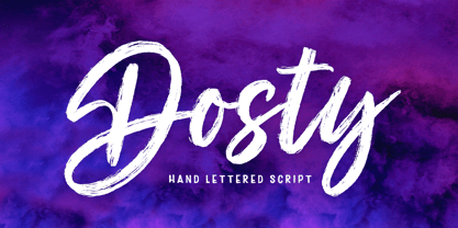 Dosty is a unique textured brush font because this brush font is made digitally. It's a contemporary approach to design, and has underlines and also several ligatures. Suitable for use in title designs such as book tittles, stationery designs, quotes, branding, logos, clothing, invitations, greeting cards, t-shirts, packaging designs, posters and more.
 - Awesome Brush by Gatype,
$10.00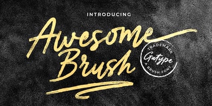 Awesome Brush is a unique textured brush font, because this brush font is made digitally. contemporary approach to design, and has underlines and also has several ligatures. Suitable for use in title designs such as tittle books, stationery designs, quotes, branding, logos, clothing, invitations, greeting cards, t-shirts, packaging designs, posters and more.
 - Kasih Putih by Tigade Std,
$15.00 Kasih Putih is a modern calligraphy font. It supports common international characters and comes with a set of alternates and ligatures. It is suitable for multiple projects from printed to digital products. It is nice to be printed on billboards, bottles or cups as well as for logos or design for apparel.
 - Allabbad by Abjad,
$5.00 Allabbad typeface was inspired by one of the hand letterings that belong to the godfather of Arab graphic design, Mohieddine Allabbad. The typeface is part of the Arsheef Alkhatt Project, a platform that revives and tributes classical Arabic lettering from different resources and presents them as affordable, digital fonts for independent designers.
 - Film Critic JNL by Jeff Levine,
$29.00 An ongoing movie review column known as the "Critic's Forum" (such as was found in the May 23, 1936 issue of The Film Daily) had a simple Art Deco monoline hand lettering of the column's name. Redrawn digitally as Film Critic JNL, this typeface is now available in both regular and oblique versions.
 - Tabloid Edition JNL by Jeff Levine,
$29.00 The headline across the October 7, 1918 edition of the UK’s Daily Mail stated: "Germany Asks the Allies for Peace". Set in extrabold sans serif lettering, it’s now available digitally as Tabloid Edition JNL in both regular and oblique versions. This is another “redrawn from the headlines” typeface from Jeff Levine Fonts.
 - ITC Tempus Sans by ITC,
$29.99ITC Tempus is the work of British designer Phill Grimshaw. He claims that every calligrapher's aspiration is to draw perfect roman capitals with a pen, but admits that this is extremely difficult. For this typeface, Grimshaw used a fountain pen on cheap, porous paper and, of course, the ink bled. The resulting forms are classic but their rugged edges deviate from the perfection of roman type. And Tempus Sans is just Tempus with the serif surgically removed, yet the proportions of the characters work nicely," says Grimshaw. Because of its rough quality, the typeface works best in larger point sizes, yet maintains its characters even in smaller sizes." - English Grotesque by Device,
$39.00 English Grotesque is based on the proportions of an early 20th century signwriter’s sans, emphasising the characteristic idiosyncrasies of type of the period. Sharing a similar Roman circle-and-square construction as Gill Sans or Johnston Railway, it has a wide T and W, a narrow S, and a long-tailed R. The Roman alphabet did not include a lower-case, and therefore early sans-serifs tended to base theirs on handwritten or cursive models, resulting in more even character widths. English Grotesque, by contrast, carries the more characterful proportions of the capitals through to the lower case. Available in six weights, with optional alternative versions for the Q, &, £ and J.
 - Castellar MT by Monotype,
$29.99 Castellar is a capital letter typeface from John Peters, named after a location in the Alps. It first appeared in 1957 with Monotype. Peters modelled the design on the Roman script Scriptura Quadrata as it was used in the first two centuries of the Roman Empire. One distinguishing characteristic is the quadratic proportions of many letters, which are however mixed with circular and narrow forms. The original script was called Scriptura Quadrata because the ancient engravers used rectangular stone plates for their work. Castellar is a typical title typeface and is best used in large and very large point sizes to highlight its classic elegance.
 - ITC Tempus Serif by ITC,
$29.99ITC Tempus is the work of British designer Phill Grimshaw. He claims that every calligrapher's aspiration is to draw perfect roman capitals with a pen, but admits that this is extremely difficult. For this typeface, Grimshaw used a fountain pen on cheap, porous paper and, of course, the ink bled. The resulting forms are classic but their rugged edges deviate from the perfection of roman type. And Tempus Sans is just Tempus with the serif surgically removed, yet the proportions of the characters work nicely," says Grimshaw. Because of its rough quality, the typeface works best in larger point sizes, yet maintains its characters even in smaller sizes. - Accelerator by Characters Font Foundry,
$25.00 FONT UPDATE → CFF Accelerator Roman is the ultimate logo typeface. It’s an efficient font family, consisting of 8 fonts with 4 weights and 2 widths. The masculine wide shoulders and sharp diagonal serifs are instantly recognizable and leave a lasting impression. CFF Accelerator is a space-age font made for heavy lifting. The original Accelerator Italic font was designed in 2005, making it our very first commercial font. It was created as an all-caps typeface. Now, the new Accelerator Roman font family has lowercases, an extended glyph set, a gazillion discretional ligatures, and loads of OpenType features. CFF Accelerator is currently our all-time bestseller!
 - Revival 565 by ParaType,
$30.00 Revival 565 is the Bitstream version of type Berling. The face was created by Karl-Erik Forsberg for the Swedish Berling foundry in 1951, with other weights added in 1958. The design is an old style roman, particularly useful for books, journals, and other text applications. Despite the fact that it has higher contrast than most old style typefaces, Berling has the classic features of old style romans with its small x-height, and ascenders that exceed the height of the capital letters. Berling is good for text settings as well as display work. Cyrillic version was developed for ParaType by Manvel Shmavonyan in 2008.
 - Herculanum by Linotype,
$36.99Herculanum is a part of the 1990 program “Type before Gutenberg”, which included the work of twelve contemporary font designers and represented styles from across the ages. Herculanum is a work of Swiss typeface designer Adrian Frutiger. It takes its name from the city of Herculaneum, an ancient Roman resort town destroyed by volcanic pyroclastic flows from Mt Vesuvius in 79 AD (the same eruption that destroyed the nearby city of Pompeii). Herculaneum's ruins are located today in the commune of Ercolano, Campania, Italy. Ancient Roman writings of the 1st century influenced the font's design. Herculanum is distinguished by its broad characters with narrow strokes and its willful character. - EuroSans by profonts,
$41.99 Euro Sans Pro ? created by German type designer Ralph M. Unger - is a classical and modern Roman Sans Serif at the same time. The family comprises of 12 styles, each with more than 500 glpyhs covering standard Latin, Central European, and Cyrillic. It is an all purpose typeface, a strong and expressive roman sans serif with a French touch to it. Euro Sans Pro provides excellent readability in all sizes, for small copy as well as for very large letters on posters and signs. The character complement also includes small caps and old style figures, and the corresponding OTF features are built into the fonts as well.
 - LP Saturnia by URW Type Foundry,
$39.99 After designing two script fonts (lp Pinselschrift, lp Bambus), Peter Langpeter has now drawn an elegant Antiqua font, namely lp Saturnia, derived and conceived from his work in developing headlines and logos. The aim was to create a modern interpretation of the classical Roman letters (Capitalis Monumentalis or Trajan by Carol Twombly), avoiding the archaic look of these letter forms. Also, the difficulty of spacing characters with excessive forms, such as the long tails of 'K' and 'R', are avoided. Additionally, lp Saturnia also comes with lower case characters. The result is a contemporary and elegant typeface that is more suitable for practical use, without renouncing the classical Roman character.
 - Dingdangits JNL by Jeff Levine,
$29.00Stars, faces, ornaments... a little of this-and-that comprises Dingdangits JNL, the companion dingbat font to Dingits JNL and Dangits JNL. - Halloween Notes by PhoenixXWay,
$12.00 Every character in this font is meticulously crafted from eerie, yet beautifully haunting music notes. Here are some ways you can use this font to your benefit: Party Invitations: Create spine-chilling invitations for your Halloween party that resonates with the theme, setting the mood for a night of hauntingly good fun. Posters and Flyers: Craft attention-grabbing posters and flyers for haunted houses, Halloween events, or horror movie screenings that evoke the perfect blend of fear and fascination. Merchandise: Design eerie merchandise like t-shirts, mugs, or stickers that cater to Halloween enthusiasts and music lovers alike. Digital Media: Elevate your digital content, including social media graphics, banners, and web elements, to capture the essence of Halloween in a truly unique way. (This font only includes the 26 characters based on the English alphabet)
 - Terry Junior by Monotype,
$40.99 Terrance Weinzierl's Terry Junior typeface is a perfectly imperfect design – one that retains the marks of the brush used to create it and harks back to the craft required to hand make letterforms. Originally drawn during a Monotype Font Marathon, Weinzierl later refined the typeface digitally – adding an Inline version and designing alternates that replicate the irregularity of real-life brush scripts. “It has a natural, cheery and bold appearance,” says designer Terrance Weinzierl. “It's young, but not wild. Painted, but not sloppy. A sign painter's apprentice, perhaps.” Terry Junior is an obvious choice for designers and brands communicating with younger audiences, but would also work well on book covers, packaging, and in digital environments that need a little bit of extra playfulness. The family includes five fonts, including an Inline version.
 - Kloetzchen by TypoGraphicDesign,
$9.00 The typeface Klötzchen (german word for blocks) is designed from 2020 for the font foundry Typo Graphic Design by Manuel Viergutz | Typo Graphic Design × Peter Eckartz | kleinholzTYPO as a political statement #climatejustice The display font based on the original wood letter from Peter Eckartz (kleinholzTYPO). The technic is called Reifendreherei from the Erzgebirge. Craft Tools like Hobel and Fräsmaschine. The idea based from Gert Schaaf (Spielzeugproduzent in Wittlich, 1970s). The font started from 41 wood letters (analog) and was finally digitalize and extended to 374 glyphs (digital). Thanks to Alex Branczyk for the Klötzchen. 3 font-styles (Wood, Clean, Impact) + 1 icon-style with 374 glyphs (Adobe Latin 1) incl. 100+ decorative extras like icons, arrows, dingbats, emojis, symbols, geometric shapes (type the word #LOVE for ❤️or #SMILE for
 - Cougar by Canada Type,
$24.95It is still a mystery to us why Martin Wilke's 1968 Konzept design was ignored by the digital age. It certainly has the elements of attractive yet realistic handwriting, as well as a few very distinctive letters that make it very unique in its class. So here it comes digitally under another feline name from Canada Type. We named it Cougar because the top of the C gives off just that impression. Ditto the G's casual descender, and the gorgeous a and g. With casual letters like these, a handwriting font cannot get any more realistic. Cougar is ideal for handwritten notes, both long letters and friendly short sentences. It's also great for use in scrawl design, titling, or any environment where friendly and casual appearance is of importance. - HWT Star Ornaments by Hamilton Wood Type Collection,
$24.95 Star Ornaments are seen as a long standing companion to many wood type poster layouts. Various manufacturers managed to derive many variations of the five pointed star motif and offered them as a ubiquitous ornament option in almost all of their catalogs. Manufacturers such as Wm. H Page, Morgans & Wilcox, Tubbs Mfg. Co. and of course, Hamilton Wood Type each had their own slight variations. This digital font features almost 100 glyphs of mostly stars, but it also features a unique star border that can create boxes just like the modular offerings of the 19th century. The twist on this digital version is the inclusion of additional connection options that become a unique lettering 'kit' that can create typography or maze-like connections using a limited set of component parts.
 - Meuga by Ferry Ardana Putra,
$19.00 Introducing our sleek and modern condensed sans-serif font - Meuga. Meuga is condensed sans-serif font offers a minimalist design with its narrow width and clean lines, perfect for any branding or design project. This condensed sans-serif font is perfect for anyone looking for a clean and modern look, with its narrow width and elegant lines. Add a contemporary touch to your designs with our condensed sans-serif font, perfect for headlines and titles in digital and print design. This font is perfect for Headlines and titles, digital advertisements, brochures and flyers, infographics and data visualizations, navigation menus and labels, web designs, logotypes, t-shirts, and many more. Meuga features: A full set of uppercase Numbers and punctuation Multilingual language support PUA Encoded Characters OpenType Features Condensed Style +235 Total Glyphs
 - Harri by Blancoletters,
$39.00 Harri –“stone” in Basque language– is a display font based on the peculiar letter forms used in signs and fascias all over the Basque Country. This idiosyncratic lettering style, very often used as an identity signifier, evolved from ancient inscriptions carved on gravestones which can still be found in the French part of the Basque Country (Behe Nafarroa, Lapurdi and Zuberoa).Harri takes some of its more significant features from those engraved letter forms, but also from the current overemphasized shapes derived from them, while keeping in sight their antecessors: the Romanesque inscriptions and ultimately the Roman Capitals. Gerard Unger once said “the black version of a font is a caricature of the regular”. This may explain how the odd heavy shapes in use in the Basque Country today might have evolved from their engraved roots, which are already an interpretation of Romanesque and Roman letter forms. This evolution is echoed in Harri through its weights, from the clean formal Roman-inspired light to the extreme expressive Basque-style extra bold.