8,671 search results (0.012 seconds)
  1. Byte 205 by Talbot Type, $15.00
    Byte 205 is a modular font, resulting from experiments in creating a practical, legible font from a minimum set of geometric components on a uniform grid. It has full upper and lower case character sets and includes all accented characters for Western and Central European languages. It's available in three styles – 105, 205 and 305. Each style has different corners, 105 is square, 205 is bevelled and 305 is round. Each style is available in three weights, Light, Medium and Bold.
  2. Karben 205 by Talbot Type, $19.50
    Karben 205 is inspired by the classic, no nonsense DIN, and has a form that follows its highly legible function. Based on a lozenge, it has a clean and pure geometry with even stroke weights. Karben 205 is available in a family of five weights, and is also available with character variations as Karben 105. There are also monospaced variants of both Karben 105 and Karben 205 and a stencil version. All of the Karben fonts feature an extended character set, including accented characters for Central European languages.
  3. Kamerik 205 by Talbot Type, $19.50
    Kamerik 205 is inspired by the classic, geometric sans-serifs such as Futura and Avant Garde, but has shallower ascenders and descenders for a more compact look, and features a traditional double-storey lower case a and g. It's a versatile, modern sans, highly legible as a text font and with a clean, elegant look as a display font at larger sizes. It includes old style non-aligning (lower case) numbers, both proportional and tabular as well as accented characters for Central European languages. The Kamerik 205 family comprises of six weights, and is closely related to Kamerik 105. The most notable differences between the two variations, are the two-storey lower case a and g in Kamerik 205, where they are single-storey in Kamerik 105.
  4. Kursk 205 by Talbot Type, $19.50
    A text and display font with square proportions, inspired by the type styles of soviet-era Russia. Very shallow ascenders and descenders and a large relative x-height, exaggerate the compact and geometric look. Related to Kursk 105 , its squarer-edged cousin.
  5. Kessel 205 by Talbot Type, $19.50
    Kessel 205 is inspired by the classic, geometric sans-serifs such as Futura, but has shallower ascenders and descenders for a more compact look, and features an art deco influence with sharp points at the apex of many characters, lowered crossbars and an oblique crossbar on the lower case e. It's a versatile, modern sans, highly legible as a text font and with a distinctive, elegant look as a display font at larger sizes. It includes old style non-aligning (lower case) numbers, both proportional and tabular as well as accented characters for Central European languages. The Kessel 205 family comprises of six weights and is closely related to Kessel 105.
  6. Kinghorn 205 by Talbot Type, $19.50
    Kinghorn 205 is an Egyptian style slab-serif. The strokes are all of a roughly equal weight for an even, geometric look. Although original Egyptian slabs date from the early 19th century, the even look gives the font a balanced, contemporary look. It's intended mainly as a display font, but it's even strokes mean it remains legible even at smaller sizes. It's also available with some character variations as Kinghorn 105.
  7. Klamp 205 by Talbot Type, $19.50
    Talbot Type Klamp 205 is an elegant and streamlined, geometric sans-serif. A legible text font, its narrow proportions mean it’s economical with space; while at larger sizes it makes a confident, modern display face. Klamp 205 is available in a comprehensive family of seven weights, featuring an extended character set to include old style numerals, as well as accented characters for Central European languages. It is also available with some character variations as Klamp 105, most notably featuring a more modern, single-storey lower case a and g.
  8. KR Celebrate 2002 - Unknown license
  9. Doctor Who 2006 - Unknown license
  10. KR Grads 2002 - Unknown license
  11. Metal Spagetti 2000 - Unknown license
  12. Year 2000 Replicant - Personal use only
  13. Nostra 2003 J - Unknown license
  14. SPARKS Scrapbook 2001 - Unknown license
  15. Torcing Away 2000 - Unknown license
  16. KR Christmas 2001 - Unknown license
  17. KR Easter 2002 - Unknown license
  18. BN Year 2000 - Unknown license
  19. Sci Fied 2002 - Unknown license
  20. Sci Fied 2002 - Unknown license
  21. England squad 2006 - Unknown license
  22. 2008 Script 2 by GLC, $38.00
    This font was created for the birth of a baby in June 2008. It's a melting font, including various types : blackletter script, bastarde, humanistic... a joyful interpretation for a joyful event. It is intended for use as web-site titles, posters and flyers design, but primarily for greeting cards, invitations, party, menus... as a very fancy and joyful font... This font remains clear and easy to read from 8 or 9 points to 72 and much more...
  23. 2009 GLC Plantin by GLC, $38.00
    We created this family in an attempt to submit a Plantin's font pattern overview. So it is not a real historical font, but a "looking like". We have added the special East European diacritics (Czech, Hungarian, Romanian, Croatian, Slovak, Slovenian, Sorbian ) and some other features. Our Italic style is resulting from a choice through the numerous possibilities.
  24. !CRASS ROOTS OFL - Unknown license
  25. SF Square Root - Unknown license
  26. SF Square Root - Unknown license
  27. SF Square Root - Unknown license
  28. SF Square Root - Unknown license
  29. Roots N Branches by Crumphand, $16.00
    Hello, Introduce the new font : Roots N Branches Roots N Branches inspired by hipster life. Handmade fonts & Sharpie marker What's Included Inside The Fonts ? Uppercase Lowercase Symbols Numerals European Multilingual Thank You, Regards!
  30. MC Robo City by Maulana Creative, $17.00
    Robo City mecha display font. Heavy stroke, fun character with a bit of ligatures. To give you an extra creative work. Robo City mecha display font support multilingual more than 100+ language. This font is good for logo design, Social media, Movie Titles, Books Titles, a short text even a long text letter and good for your secondary text font with script or serif. Make a stunning work with Robo City mecha display font. Cheers, Maulana Creative
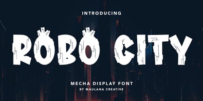
  31. KG Attack of the Robots - Personal use only
  32. I am not a robot by PizzaDude.dk, $15.00
    The other day I had to login to a page several times, and as security I had to check the "I am not a robot" box. Actually, I think I did a login at that particular page like 30 times that day...and in the end I was thinking "Come on, you should know by now that I am not a robot" And even though I thought it was a repetitious hassle I figured that I needed to name a font "I am not a robot" - and not a robotic-like one, but a sweet and funny cartoonish one! :)
  33. KG Attack Of The Robots by Kimberly Geswein, $5.00
    This squared font is designed to look robotic in style.
  34. Kaleko 205 Text by Talbot Type, $19.50
    Kaleko 205 Text is the text specific variation of stablemate, Kaleko 205 . With a shallower x-height and longer ascenders and descenders, its more traditional proportions make it more economical with space and better suited to continuous text. It's a well-balanced, versatile, modern sans, highly legible as a text font and with a clean, elegant look as a display font at larger sizes. The Kaleko 205 Text family comprises of four weights and includes old style non-aligning (lower case) numbers, both proportional and tabular as well as accented characters for Central European languages. It is closely related to Kaleko 105 Text , which offers variations in some characters, most notably a single storey lower case a and g.
  35. YD Myungjo 200 by Yoon Design, $400.00
  36. Kaleko 205 Round by Talbot Type, $19.50
    Kaleko 205 Round is a rounded variation of Talbot Type font Kaleko 205. It's a well-balanced, versatile, modern sans, highly legible as a text font and with a clean, elegant look as a display font at larger sizes. The rounded terminals give it a friendly, approachable look. The Kaleko 205 Round family comprises of six weights and is closely related to Kaleko 105 Round. The most notable differences between the two variations are the two-storey lower case a and g in Kaleko 205 Round, where they are single-storey in Kaleko 105 Round.
  37. Engravers' Oldstyle 205 by Bitstream, $29.99
  38. K haus 205 by Talbot Type, $19.50
    K-haus 205 is inspired by the work of graphic designer and typographer, Herbert Bayer, during his time at the Bauhaus around 100 years ago — work that kick-started graphic design as we know it, to this day. It owes something to the simple geometry of Bayer’s hand-drawn, ‘universal typeface’, updated and expanded to deliver a clean, balanced, geometric sans for today. Also available as K-haus 105 , featuring a few different characters here and there, chiefly in the lower case set. Both variations include an extended character set, featuring accented characters for Central European languages.
  39. Kamerik 205 Text by Talbot Type, $19.50
    Kamerik 205 Text is the text specific variation of stablemate, Kamerik 205. With a shallower x-height and longer ascenders and descenders, its more traditional proportions make it more economical with space and better suited to continuous text. It's a well-balanced, versatile, modern sans, highly legible as a text font and with a clean, elegant look as a display font at larger sizes. The Kamerik 205 Text family comprises of four weights and includes old style non-aligning (lower case) numbers, both proportional and tabular as well as accented characters for Central European languages. It is closely related to Kamerik 105 Text, which offers variations in some characters, most notably a single storey lower case a and g.
Looking for more fonts? Check out our New, Sans, Script, Handwriting fonts or Categories
abstract fontscontact usprivacy policyweb font generator
Processing