10,000 search results
(0.019 seconds)
- Cheshire Initials - Unknown license
- Just Animals by Outside the Line,
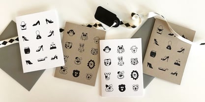
$19.00Just Animals… is just really cute. 34 animals – monkey, frog, bear, sheep, tiger, leopard, lion, cat, dog, horse, cow, penguin, birds, ducks, snake, bunny, ladybug, dragonfly, fish, shark, turtle, pig, mouse, hippo, elephant, giraffe and a deer. Think scrapbooking or kid’s party invitations. Lots of cuteness, lots of uses. - Deco Power JNL by Jeff Levine,
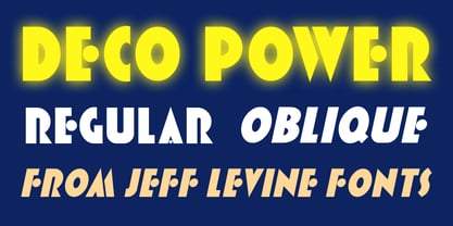
$29.00A June 18, 1929 issue of the Hollywood trade paper “The Film Daily” ran an ad for a film called “The Power House”. The film’s title was hand lettered in an extra bold sans serif design with strong Art Deco influences. This is now available digitally as Deco Power JNL in both regular and oblique versions. - LTC Village by Lanston Type Co.,
$24.95Village was originally designed by Frederic Goudy in 1903 for Kuppenheimer & Company for advertising use, but it was decided it would be too expensive to cast. It was later adopted as the house face for Goudy's Village Press. The design was very much influenced by William Morris's 'Golden' type. Paul Hunt began working on a digital version of Frederic Goudy's Village type prior coming to P22 in 2006 for an internship (which evolved into a staff designer position at P22.) Around this time, The Tampa Book Arts Studio was looking for a digital version of Village to complement with a letterpress edition of a book called "The Rich Mouse" by JJ Lankes. Many years later the Rich Mouse project has been completed, so we decided to release the Village type on the same day as the release of the Rich Mouse Book! - Home Sweet Home by Gerald Gallo,
$20.00 - An Unfortunate Event - Unknown license
- An Accidental Kiss - Unknown license
- SA Woodland Hills by Artcoast,
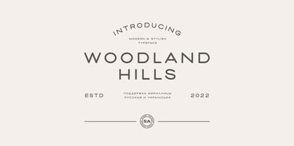
$14.00Introducing SA Woodland Hills - a clean, elegant, modern typeface that you can use in packaging or branding, creating beautiful logos, headlines, quotes and any other printed matter. The font supports Russian and Ukrainian Cyrillic, as well as extended Latin. We hope that the font will become your excellent assistant in the design of products. - Untitted - Unknown license
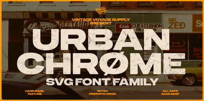
- Urbanchrome by Vintage Voyage Design Supply,
$15.00• Introduce you the first SVG font in Vintage Voyage collection. • Trendy all-caps cinematic sans in four styles. Inspired by 80s multimedia era typographic like your old VHS cassette package design in your mama's house attic. Perfect choice for your movie titles, party flyers, exhibition identity or action style advertisement. • Four styles: Clean, Roughen, Outline and SVG textured. SVG was made with Hand Made grunge texture. • Multilingual. • If you don't know how to use SVG fonts Jeremy from The Hustle Supply has a useful video about it here: https://youtu.be/Qed4f2UAChU Please, Pay Attention: Myfonts.com doesn’t support the heavy svg files. After purchase this family just send me your order number to contact@vintagevoyagedesign.com and i’ll send you the link to download the OTF SVG file within 24 hours. - KG Ways to Say Goodbye - Unknown license
- WHEN THE GOES SUN . SCENE - Unknown license
- KR Careful What You Say! - Unknown license
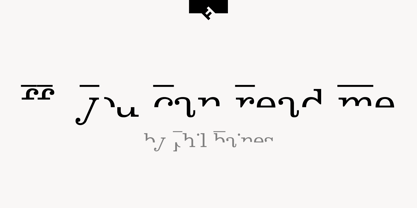
- FF You Can Read Me by FontFont,
$41.99British type designer Phil Baines created this display FontFont in 1995. The font is ideally suited for festive occasions, editorial and publishing, logo, branding and creative industries as well as poster and billboards. FF You Can Read Me provides advanced typographical support with features such as ligatures and alternate characters. It comes with tabular oldstyle figures. - Van Den Velde Script Pro by Intellecta Design,
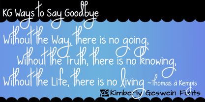
$59.95Van den Velde Script Pro is the definitive edition of the original Van den Velde Script, by Intellecta Design, a free interpretation of the work of the famous master penman Jan van den Velde, to be found in the “Spieghel der schrijfkonste, in den welcken ghesien worden veelderhande gheschrifften met hare fondementen ende onderrichtinghe. ” (Haarlen, 1605). This font has evocative ancient ligature forms from the XVII Century Dutch master penman Jan van den Velde. Your indescritible writing-book was important not only with regard to the specific period it represents, but also in relationship to the entire history of calligraphy as an art: Van den Velde is rightly credited with having introduced and perfected a new trend in Dutch calligraphy. Our font, Van den Velde Script, merges modern necessities or better legibility without loosing the taste of his archaic origins. This enhanced OpenType version is a complete solution for producing documents and artworks whith an evocative and voluptuous style of calligraphic script: Van den Velde Script PRO has - more glyphs than the original Van den Velde Script. We created hundred of new glyphs, deactivated old non-representative glyphs and redesign the remaining library of original glyphs. Van den Velde Pro is more functional, soft and beauty than the original. - to keep the powerful of this unusual kind of script we make a tour-de-force kerning work: 771 glyphs in this font was adjusted in 5400 kerning pairs handly. - hundreds of contextual alternates combinations, some of them with three or more letters, - historical ornaments and fleurons in the typical style (and motifs) from the XVII century at the Lower Countryes accessed with the glyph palette using the Ornaments feature); - an extensive set of ligatures (100s of contextual alternates plus discretionary ligatures) providing letterform variations that make your designs really special, resembling real handwriting on the page; .... and, much better, Van den Velde Scriopt PRO is plus cheap than the original font !!! In non-OpenType-savvy applications it works well as an unusual and beautiful script style font. Because of its high number of alternate letters and combinations (over 700 glyphs), we suggest the use of the glyph palette to find ideal solutions to specific designs. The sample illustrations will give you an idea of the possibilities. You have full access to this amazing stuff using InDesign, Illustrator, QuarkXpress and similar software. However, we still recommend exploring what this font has to offer using the glyphs palette: principally to get all the power of the Contextual Alternates feature. Van den Velde Script PRO has original letters designed by Iza W and overall creative direction plus core programming by Paulo W. - KG Ways To Say Goodbye by Kimberly Geswein,
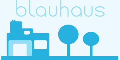
$5.00 - Blauhaus by Hanoded,
$15.00Yes, you're right. Blauhaus should have been 'Blaues Haus', as that is the proper way of saying Blue House in German. But hey, Blauhaus sounds much better and in writing, it is quite similar to Bauhaus. Blauhaus is a stylish, rounded sans serif font, modeled after some early 20th century German typefaces. It is easy on the eye and it will certainly give your work a sophisticated punch. Comes with a classy collection of diacritics. - Alphabet Soup Pro by Red Rooster Collection,
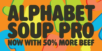
$60.00Steve Jackaman. In the early 1980's, Steve worked at Typographic House in Boston, Massachusetts. At the time, 'Typo' House, as it was affectionately known, was the largest type house in New England. This font was designed and produced during his tenure. The design was so popular that it became available commercially through VGC, and was known as TH Alphabet Soup. Completely redrawn and remastered, Alphabet Soup Pro contains all the high-end features expected in a quality OpenType Pro font. - Depicto by Michael Rafailyk,
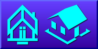
$12.00A pixelated typeface with asymmetrical serifs intended to depict emojis in coarse mosaic shapes and represented in two styles that perfectly complement each other – Mono (casual font) and Mosaic (color font). The main font feature is a large set of pictograms, which are activated using the Stylistic Set and typed right in a text with a keywords like :smile: :happy: :sad: :pear: :rose: :horse: :bike: :house: and so on. Read more about Depicto font family concept, features, pictograms, color font, emoji skin tone, how to use it, and the applications support: https://michaelrafailyk.com/depicto See the complete list of 600+ pictograms: https://michaelrafailyk.com/typeface/specimen/Depicto.pdf Scripts: Latin, Greek, Cyrillic, Hebrew Languages: 480+ The promo image “Serpant Mosaics” used a photo of Nick Verlice from Pexels - Bughouse - Unknown license
- Ryp childC - Unknown license
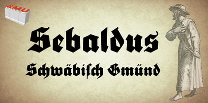
- Sebaldus by RMU,
$25.00 - Sign Painter by House Industries,
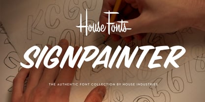
$33.00For decades, the handletterer’s craft has been indispensable to the advertising and design trades. As prevailing tastes changed and new technologies emerged, commercial art saw the fateful demise of this lost skill. Now, House Industries is proud to offer the Sign Painter font kit, a collection of six timeless display typefaces along with an assortment of eye-catching advertising type treatments in font format. Like all good subversives, House Industries hides in plain sight while amplifying the look, feel and style of the world’s most interesting brands, products and people. Based in Delaware, visually influencing the world. - Sunflowers - Unknown license
- Funkhouse - Unknown license
- Coffeehouse - Unknown license
- Oriental View - Unknown license
- Rassum Frassum by Comicraft,
$19.00In the immortal words of Homer Simpson, "It's easy to complain... and so much FUN, too! Woo-HOO!" Now your characters can grumble, mumble and mutter in barely audible tones as they dredge up some bit of misery from their lives, unleash a rambling river of criticism and complaints about the state of their health, or the government, garbling as much graphic detail as time and your imagination will allow! Or perhaps your creations are issuing drunken slurs as they wake up outside their own fricka-frackin' houses cuddling wheelie bins, covered in glitter, wearing a shiny hat and budgie smugglers over their jeans while holding the reins to a miniature horse. So moan, groan, gossip incoherently or swear under your whiskey-soaked breath like a trooper... courtesy of those Rassum Frassum font lovers at Comicraft. >Hic! - Morning Edition JNL by Jeff Levine,
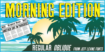
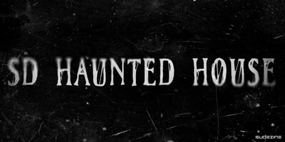
$29.00The front page headline of the April 6, 1917 edition of the Bemidji Pioneer [from Bemidji, Minnesota] says in extrabold letters: “State of War is Declared”. The subtext underneath reads: “President Signs Resolution 1:13 P.M., Passed by House 3 O’Clock this Morning”. Thus, the United States formally entered into World War I. However… that subtext was set in a sans serif type face which was a perfect addition to the numerous newspaper-inspired type revivals offered by Jeff Levine Fonts. Morning Edition JNL is available in both regular and oblique versions. - SDHauntedHouse by Sudezine,
$10.00SDhauntedhouse is a whimsical hand-drawn typeface. This font has a slightly eerie vibe, and I created it inspired by haunted house movies. You can use this font for logos, quotes, invitations, greeting cards, journals, posters, clothing, and more. This font will infuse your designs with playfulness and fun! - ryp_fiesta2 - Unknown license
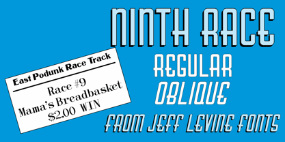
- Ninth Race JNL by Jeff Levine,
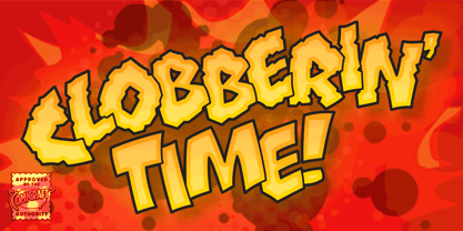
$29.00 - Clobberin Time by Comicraft,
$19.00 - Rennie Mackintosh Hillhouse by CRMFontCo,
$20.00Derived from the world famous Rennie Mackintosh Font, the Hillhouse version gives a 3D look to the genius of Charles Rennie Mackintosh. The "Hillhouse" name comes from one of Mackintosh's most famous architectural works - the Hill House in Helensburgh, Scotland. This stunning conceptual design can be visited from April to October. - Brinca by In-House International,
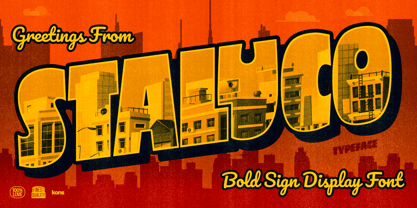
$7.50Brinca is an intrepid ‘full spectrum’ typeface with emotional range and a dynamic heart. Morphing sharp tight pleats that relax into office ready neutral sans, then plump into joyful bouncy letters with mesmerizing fluency, Brinca is ready to adapt to a wide variety of expressive needs. Named after its jumping extremes of the type’s styles; from coiled spring to stuffed and bouncy, Brinca is also a leap into new possibilities for display type design. Because of its chameleon-like range of styles, Brinca is a versatile workhorse. It’s a great choice for brand identities ready to embrace expressive range, and it’s perfect for fine-tuned packaging, events promotions, merch, product lines, and much more. WIth its very wide spectrum of options, It’s a single typeface that can be used to design a library’s worth of book covers. (We put it to the test!) About Brinca was designed by Alexander Wright and Rodrigo Fuenzalida with Michu Benaim Steiner for In-House Int’l foundry, the type foundry of brand consultancy In-House International. It was developed by Rodrigo Fuenzalida at FragType, and available through YouWorkForThem. In-House foundry offers bold, fearless, and expressive, display typefaces that tell a story. Its previous releases have been featured on Design Milk, DesignBoom, Slanted, PAGE. They’ve also been used to create standout work by designers around the world, and even won some awards. - Staluco by Konstantine Studio,
$17.00Jump back to the classics with Staluco - A bold sans-serif font inspired by vintage greeting cards and town signs in the 70s 80s era. This font captures the vibes and sense of going-home and childhood-like spirits from your grandparent's house. Perfectly fit for logo, a town sign, branding, poster, clothing, merchandise, music project, books, greeting cards, street, and urban culture concepts, you name it. - Third Time Lucky by Hanoded,
$15.00We’re in the process of buying a house. Our first bid was rejected, our second bid as well. Our third (and final) bid was accepted (yay!), so, for us, the old ‘third time lucky’ quote rings true! Third Time Lucky is a set of three distinct handmade fonts, each with its own italic. Use this wonderful set for your books, your packaging or even your ‘house for sale’ signs. - White Rose by The Good Type,
$10.00White Rose is an original hand-drawn typeface that was made for the White Rose Catholic Worker house in Chicago. White Rose (the Catholic Worker house) follows a long tradition of providing hospitality, being active and involved in the community and living a sustainable lifestyle. In the same way, White Rose (the typeface) follows a long tradition of typefaces, mimicking Old Style and Transitional forms while retaining an element of style. - You Can Make Your Own Font - 100% free
- KG What Does The Fox Say by Kimberly Geswein,
$5.00

