10,000 search results
(0.055 seconds)
- Gancio by Funk King,
$39.00 Gancio is my first fully realized hand-drawn font and has a robust character set. Its simple lines and sophisticated curves are contemporary, but recall vintage and retro cool. The font is very adaptable and flexible and can be used effectively in a number of themes. Also included are the dingbats used in the poster art.
 - Chopsee Softee by TypeUnion,
$35.00 Chopsee Softee is the marshmallowy version of our 2017 release Chopsee. It's fun and curvaceous and comes in 8 weights with matching italics. Just like Chopsee the soft version maintains the fluidity and movement with the accentuated curves and terminals, but with added fun and freedom. Chopsee Softee is perfect font for packaging to branding and everything in between.
 - Brumers by Trustha,
$17.00 Brumers is a fun sans serif font. Inspired by the curves of a bear. The basic concept is actually hand-drawn. Then, I developed and improved it in the next process. It comes in six styles, which makes it easy to choose according to the project you are working on. Brumers is perfect for headlines, branding, and many more.
 - HU Specialmovie by Heummdesign,
$15.00 HU Specialmovie is a retro, wide square typeface, characterized by streamlined, narrow stroke ends. The first consonants are designed to be large with full modules to improve readability. The grapheme 'O', which is the face of the font, is in the form of a square in harmony with straight lines and curves, expressing a solid and simple feeling overall.
 - Auster Variable by Resistenza,
$89.00 Auster Variable for Adobe's softwares. Auster packs sensational personality in its fine-tuned forms. Confident and quirky, yet comfortable to read, this distinctive san serif family stands out from the crowd. The curves cinch and strokes flair in unconventional places making Auster an unashamed rebel sure to turn heads. More About Opentype Features: https://bit.ly/opentype-rsz
 - Divenire by CAST,
$45.00 Divenire is derived from a custom typeface designed for the Partito Democratico (Italian Democratic Party), it is used in their political communication. It has variation of tension in its design, alternating curved and almost straight elements. The glyphlist includes many alternatives like a set of odd punctuation marks: the famous "interrobang" and others, starting from Hervé Bazin's work.
 - Plantin Infant by Monotype,
$29.99Plantin is a family of text typefaces created by Monotype in 1913. Their namesake, Christophe Plantin (Christoffel Plantijn in Dutch), was born in France during the year 1520. In 1549, he moved to Antwerp, located in present-day Belgium. There he began printing in 1555. For a brief time, he also worked at the University of Leiden, in the Netherlands. Typefaces used in Christophe Plantin's books inspired future typographic developments. In 1913, the English Monotype Corporation's manager Frank Hinman Pierpont directed the Plantin revival. Based on 16th century specimens from the Plantin-Moretus Museum in Antwerp, specifically a type cut by Robert Granjon and a separate cursive Italic, the Plantin" typeface was conceived. Plantin was drawn for use in mechanical typesetting on the international publishing markets. Plantin, and the historical models that inspired it, are old-style typefaces in the French manner, but with x-height that are larger than those found in Claude Garamond's work. Plantin would go on to influence another Monotype design, Times New Roman. Stanley Morison and Victor Larent used Plantin as a reference during that typeface's cutting. Like Garamond, Plantin is exceptionally legible and makes a classic, elegant impression. Plantin is indeed a remarkably accommodating type face. The firm modelling of the strokes and the serifs in the letters make the mass appearance stronger than usual; the absence of thin elements ensures a good result on coated papers; and the compact structure of the letters, without loss of size makes Plantin one of the economical faces in use. In short, it is essentially an all-purpose face, excellent for periodical or jobbing work, and very effective in many sorts of book and magazine publishing. Plantin's Bold weight was especially optimized to provide ample contrast: bulkiness was avoided by introducing a slight sharpening to the serifs' forms." - Plantin Headline by Monotype,
$29.00Plantin is a family of text typefaces created by Monotype in 1913. Their namesake, Christophe Plantin (Christoffel Plantijn in Dutch), was born in France during the year 1520. In 1549, he moved to Antwerp, located in present-day Belgium. There he began printing in 1555. For a brief time, he also worked at the University of Leiden, in the Netherlands. Typefaces used in Christophe Plantin's books inspired future typographic developments. In 1913, the English Monotype Corporation's manager Frank Hinman Pierpont directed the Plantin revival. Based on 16th century specimens from the Plantin-Moretus Museum in Antwerp, specifically a type cut by Robert Granjon and a separate cursive Italic, the Plantin" typeface was conceived. Plantin was drawn for use in mechanical typesetting on the international publishing markets. Plantin, and the historical models that inspired it, are old-style typefaces in the French manner, but with x-height that are larger than those found in Claude Garamond's work. Plantin would go on to influence another Monotype design, Times New Roman. Stanley Morison and Victor Larent used Plantin as a reference during that typeface's cutting. Like Garamond, Plantin is exceptionally legible and makes a classic, elegant impression. Plantin is indeed a remarkably accommodating type face. The firm modelling of the strokes and the serifs in the letters make the mass appearance stronger than usual; the absence of thin elements ensures a good result on coated papers; and the compact structure of the letters, without loss of size makes Plantin one of the economical faces in use. In short, it is essentially an all-purpose face, excellent for periodical or jobbing work, and very effective in many sorts of book and magazine publishing. Plantin's Bold weight was especially optimized to provide ample contrast: bulkiness was avoided by introducing a slight sharpening to the serifs' forms." - Panforte Serif by Zetafonts,
$39.00 Panforte Serif is the basic ingredient for any tasty visual feast: a prime-cut font family, deliciously readable online and offline, space-saving and organic, appealing to hipster consumers and seasoned gluttons. Hand drawn in easy big strokes, its a very condensed typeface that allows you to typeset easily long texts. Lovers of world cuisine will be delighted to discover that it supports over 190 languages using the latin alphabet.
 - Galangal by Hanoded,
$15.00 Galangal, or Laos, is a root belonging to the ginger family, which is used in Indonesian cuisine. Since this font has the same design characteristics as Kurkuma, I thought naming it after a root was quite appropriate. Galangal is pretty unique, with thin and fat areas, bizarre glyphs and rough edges. Upper and lower case are fully interchangeable and the typeface comes with a full range of diacritics.
 - Bergen Sans by Mindburger Studio,
$40.00 Bergen Sans is a contemporary sans serif font family of 6 fonts. Carrying clean and stylized Scandinavian geometry, partnered with explosive post Bauhaus type aesthetics, Bergen Sans is perfect companion in any designer's 'survival' kit. While being a small font family it has unlimited capabilities and plenty of Open Type features for highly professional use. Bergen Sans also includes Extended Latin, Cyrillic (including Bulgarian alternates) and Greek language support.
 - Dans Le Toilette by Latinotype,
$25.00 Dans le toilette is a fun dingbat inspired by things that happen fast in the bathroom every morning. You can use them on posters, covers, patterns, brands and all kind of image with a vintage touch. Dans le toilette is part of the dingbats series designed by Coto Mendoza including Dans le cuisine, Dans le jardin and Dans le Noël. Make your day with a fun morning Dans le toilette!
 - Oddee by Informal Type,
$25.00 Construction period of Anafor deeply inspired by the pioneer of geometric abstract art and the creator of the avant-garde suprematist movement Kazimir Severinovic, Malevich’s suprematist compositions. Anafor typeface is separated from the basic Latin letters in terms of character and letter structure. Furthermore, The forms and main structure are designed together with alternatives by taking into account the relationships between the defined angles.Anafor contains certain aspects of a display typeface, due to the structure of the letter forms that are open to abstract connotations. Typeface family includes 2 styles; Anafor Basic and Anafor Crash. Each individual style has 235 glyphs and it has OpenType encoding. Due to the diversity of three styles, Anafor is providing a wide range of possibilities for the user.
 - Skyward by Carmel Type Co.,
$19.00 Robust, towering, and geometrically refined, Skyward is a surefire classic cocktail of equal parts utility and elegance. This typeface carries a set of over 300 glyphs across 8 distinct faces. With Deco-era sensibilities and a touch of modern refinement + an all new alternative set of characters, Skyward is exceedingly effective in a diverse spectrum of situations. Skyward is the perfect selection for modern, chic, luxury products and packaging as well as bold ad campaigns, window signage, magazine headlines or the classic branding project. Skyward works best as display text. 12 styles Sans-Serif, Serif, and Rounded styles Select Stylistic alternates Upper & lowercase Numerals & punctuation 330+ glyphs per style Supports 75+ Latin based languages OTF files Designed by Jason Carne
 - Anafor by Informal Type,
$25.00 Construction period of Anafor deeply inspired by the pioneer of geometric abstract art and the creator of the avant-garde suprematist movement Kazimir Severinovic, Malevich’s suprematist compositions. Anafor typeface is separated from the basic Latin letters in terms of character and letter structure. Furthermore, The forms and main structure are designed together with alternatives by taking into account the relationships between the defined angles.Anafor contains certain aspects of a display typeface, due to the structure of the letter forms that are open to abstract connotations. Typeface family includes 2 styles; Anafor Basic and Anafor Crash. Each individual style has 235 glyphs and it has OpenType encoding. Due to the diversity of three styles, Anafor is providing a wide range of possibilities for the user.
 - Ezekiel by MYSTERIAN,
$9.00 Ezekiel Script is the font become flesh—mythic gesture imposed upon forms of mechanical medium. Typography has changed the internet; our phasing mimetic desires tend toward posture rather than rationale, and the face is a concept that explores that concept. Obviously some reading of McLuhan has infliunced this concept of analysis. The script has ample diacritic extensions, as well as an alternative for the ampersand (characteristic of MYSTERIAN type) and the eszette: an upper and lower case. The upper and lower case alphabets are diverse in that the majuscules do not have linking strokes while the miniscules do. This was the first script that I've made, and great attentiveness was taken to ensure that links were set accurately, and spacing harmonious throughout.
 - YR Qaf by Alrefaiy,
$20.00 YR Qaf is a clean, modern, and highly legible font. Featuring clear, easy-to-read letterforms with a focus on legibility. The font is carefully crafted with balanced proportions and an emphasis on vertical lines, resulting in a harmonious and streamlined appearance. YR Qaf offers a sleek and modern aesthetic, with exceptional legibility and versatility. Its clean lines and balanced proportions make it a perfect choice for a variety of design projects where clarity and readability are essential. YR Qaf is ideal for a wide range of applications, including branding, web design, editorial design, and more. With a comprehensive set of glyphs, including both upper and lowercase letters, numerals, and symbols, this font can adapt to diverse design needs with ease.
 - Mervale Script Pro by Stiggy & Sands,
$39.00 An Unusual Hero Script Mervale Script Pro is based on inspiration from the 1940's Fawcett Publications “Mary Marvel” comic. This unusual brush lettered script blends script and serif capitals with a mix of unusual brush strokes to create a lively font that draws attention. Clean letterforms with an eclectic offbeat flavor in letter stances lends Mervale Script Pro to a unique variety of uses from casual to lightly sophisticated. The stylistic alternates feature adds swash capitals to the mix to offer even more diversity. See the 5th graphic for a comprehensive character map preview. OpenType features include: A collection of ligatures. Full set of Inferiors and Superiors for limitless fractions. Tabular, Proportional, and Oldstyle figure sets. Stylistic Alternates for Caps to Swash Caps conversion.
 - La Taqueria by Sudtipos,
$39.00 Mexico’s storied culture is one of the most recognizable today. Its amazing vibrant art and delicious foods have made the leap to influence many parts of the world in recent years. This proud, intense and diverse identity was the inspiration behind La Taqueria, a set of four fonts that express different characteristics of Mexican pop culture. The heavy and spicy, the light and gentle, the constant dynamism, all come together with one rhythm to produce an explosion of personality. Just like its predecessors Distillery and Scrapbooker, the La Taqueria set contains down-to-earth alphabets perfect for chalkboard art and handmade design. All the fonts include alternates and ligatures, providing plenty of variation for that spontaneous appearance everyone is looking for these days.
 - Mondial Plus by Wiescher Design,
$49.50 MondialPlus is, as the name implies, a font meant for the whole world. MondialPlus is the newer and better version of Mondial. MondialPlus is designed to work in small sizes for bodytext. Only in bigger sizes does the font show its hidden character, it has a curved design to it, that makes it very special. Mondial is a very elegant and versatile font in the tradition of french sans typefaces.
 - Papyrus by ITC,
$40.99Papyrus is a roman calligraphic typeface with distinctive human touches like rough edges, irregular curves, and high horizontal strokes in the caps. It imparts a warm and friendly ambience to everything from restaurant menus to book covers. American Chris Costello created the popular font Papyrus in 1983 and counts it as one of his proudest accomplishments. In addition to designing type, Costello is a prolific graphic designer, illustrator, and web designer. - Uchrony by deFharo,
$14.00 Uchrony is a condensed proportion slab serif typeface. The font family is made up of 3 styles, Roman, Small Caps & Italics, with 6 weights each. The lowercase letter "o" has guided the basic proportions and curves, in an exercise in minimalist construction, providing morphological coherence and maximum legibility, for this multi-purpose typeface family. The typography includes alternative letters, several sets of numbers, and advanced OpenType features. • View specimen in PDF
 - ITC Vinyl by ITC,
$29.99 ITC Vinyl was designed by J. Keith Moore, who was born in Germany but raised in Colorado. The typeface is a hybrid of Art Nouveau, street attitude, and 1950s design and was created with pen, ink, and French curves before being converted into digital fonts with Adobe Illustrator. ITC Vinyl is a family of four display faces in outline and solid designs with corresponding sawtooth" variants for each."
 - Retrotype by Luxfont,
$18.00 Introducing retro font Retrotype. Family's vintage style will suit both 50s-80s cartoon illustrations and wild west designs. Retro family has 2 types of styles, complete with different curves. Carefully constructed glyph shapes look great in both large amounts of text and single words in headings. Ideal for vintage and retro designs. Features: - Vintage style. - Uppercase and lowercase the same size. - Numbers & basic Punctuation. - 4 fonts in family. - Kerning. ld.luxfont@gmail.com
 - Dekros by FontHaus,
$14.00 Dekros has the look and feel of an Art Nouveau font when a key feature in much of the design of the 1890s was characterized by intricate linear and flowing curves that were based on natural and organic forms.
 - MB GEOMETRIXA by Ben Burford Fonts,
$25.00 Inspired from geometric curves and circles, an audacious lower case display face with some alternate characters in Upper and Lower case glyphs. Great for Logos and Logotypes, headlines and larger text. Works well with smaller strap lines as well.
 - MPI No. 508 by mpressInteractive,
$5.00 No. 508 is a chunky, friendly, modulated gothic font. Strokes have a gentle inward curve at the median, with the tops and bottoms of the letters slightly wider. The face was introduced by William H. Page & Company in 1890.
 - ITC Motter Sparta by ITC,
$29.99ITC Motter Sparta is the work of Austrian designer Othmar Motter and for its inspiration, he turned to car design. As we all know, trends in car design affect many other fields of design in a way that shapes tastes." At the end of the 1990s, Motter saw the trend moving away from soft lines and toward a tighter, tenser look: "In this latest trend, sharp clearly-defined edges meet broadly-drawn, dynamic curves and cut them off sharply." And so too is ITC Motter Sparta, with each character form distinct, which also creates a typeface instantly recognizable from a single character. "The sharp straight strokes, cut off almost at right angles, and the strong cross-stroke curves, ending in points, form a charged contrast to the vertical and horizontal straight strokes that give Motter sparta its taut framework."" - Lafemme Vibe by Jolicia Type,
$27.00 LaFemme Vibe is a conceptual serif font that exudes a modern and elegant aesthetic, tailored specifically for women. Featuring uppercase characters with distinctive curly signatures, LaFemme Vibe combines the following elements to create a unique visual experience: Classy Serifs: LaFemme Vibe boasts serif characters with soft, graceful serifs that add an element of sophistication to each letterform. Asymmetrical Charm: This font is intentionally imperfect in its symmetry, as if crafted by a gentle, artistic hand. It radiates an inviting and charming quality. Curly Signature Flourish: The curly, signature-like embellishments that adorn the letterforms in LaFemme Vibe infuse a personal and artistic touch. This imparts the sense that each word written with this font is a unique work of art. Modern Harmony: Despite its classical elements, LaFemme Vibe maintains a modern sense of harmony. The letters appear assertive yet gentle, making it perfectly suited for contemporary women seeking timeless elegance. Elegance and Chic: LaFemme Vibe embraces an elegant and chic aesthetic that is particularly fitting for products or designs targeted towards women who aspire to exude luxury and style. LaFemme Vibe is a typographic masterpiece created to bring a modern and elegant sensibility to women who appreciate beauty in every detail. It’s a font that effortlessly blends classic charm with contemporary allure, making it an ideal choice for a wide range of design projects aimed at celebrating the essence of femininity.
 - Medieval Borders by Aah Yes,
$5.00 This is a large group of typefaces inspired by those borders and patterns you see going across documents from the Middle Ages and Medieval times, eventually becoming this collection of fonts where you can scroll various repeating patterns across a page, for example. You can get a repeating pattern that scrolls seamlessly by repeating the same letter. The default text displaying on the web-page is bbbbbbbb, for example. There's over 2 dozen basic styles, and each style has 52 designs within it, using the characters Upper Case A - Z and lower case a - z, with the lower case being the negative/reverse colour of the Upper Case version, it will be the corresponding design just reverse coloured and with an edging strip. There's also a space - but nothing else. The styles in these fonts usually have groups of six characters (A to F, G to L, M to R, S to X), and where the second group is a variation on the first - usually thicker lines - and the third grouping is another variation on that, usually thicker lines again, making the first 24 letters. (Sometimes there's three groups of eight characters). The pattern within a group normally starts off plain then gets busier as it progresses - such as there'd be a more complex pattern of circles and diamonds as you go through the letters. Then the letters Y & Z are somewhat different to the rest. There's four versions starting with Z, and they're a little bit different, and they're grouped in fives - getting bolder as you progress through the letters, but with similar patterns within each group of 5, and that makes the first 25 characters. The letter Z character is extra busy. Again, lower case is the reverse colour of the Upper Case. Mostly you can get patterns and borders that combine seamlessly by using letters within the same group of 6 or 8 (like maybe abdcedcb). There are a few occasions when that doesn't work out, because there may be circles or diamonds at the sides of the letters that don't match up with another letter that has a different pattern at the side. But you can create a pattern with the exact level of complexity you want perfectly easily. You can see examples of this in the poster images. Neighbouring letters without embellishments at the sides of the letters will usually fit together. Have fun with it, that's what it's there for. aah yes fonts
 - Tolyer by Typesketchbook,
$25.00 Tolyer font is an extra large super family of 50 fonts! In many cases quantity doesn’t mean quality but here we have such a big abundance of contrast, styles, weights and special effects in one place that it actually doesn’t pay attention to the fact this is an all caps family. When it comes to strong headlines, titles, posters, masculine brand names Tolyer type family is probably one of the best choices in sans serif typography. You could easily pick from low to high contrast outlines, uprights and obliques, 3D effects or different artistic textured styles to make your work diverse, expressive and attractive. Tolyer font offers you maximum readability even in poor display conditions like low quality printing or low resolution monitors. In some cases poor print quality could even add more value to the final result, because Tolyer has a lot of potential to be used in difficult conditions. Letterpress and high embossing are one of those print effects that really suit Tolyer best. Use it in high contrast with background environment, higher ink flow, don’t think about the dot gain and you should definitely use a textured paper – this is what Tolyer really likes and deserves. It will thank you for this with authentic look, classic vintage style and strong but attractive presence.
 - Thicker by Zetafonts,
$39.00 Thicker is a type-family designed for Zetafonts by Francesco Canovaro with Andrea Tartarelli. A geometric sans typeface on steroids, it was first designed in the muscular Extrablack weight with the aesthetics of high-power dynamic typefaces used in sports communication, and then developed in the lighter weights where the shapes show some vintage-inspired proportions and the slightly squared look that nods to Novarese famous Eurostile, eponymous with retro-futurism. With these diverse influences the typeface allows for both impressive display use and effective logo design as well as more fine-tuned editorial use in body text - with a natural inclination for effective and powerful advertising. Sports typography usually uses italics to add dynamism and impact, and Thicker complies with this by offering a choice of three alternate italic forms with different slant, made even more customizable by the inclusion of variable font technology that allows fine tuning of the weight range as well as precise choice of typeface slant. In each of the 44 weights of the typeface family (as well as in the all-in-one variable type solution) Thicker offers a extended charset of over 900 latin, Cyrillic and Greek glyphs, covering over two hundred languages and including useful Open Type features (Alternate forms, Positional Numerals, Small Caps and Case Sensitive Forms) for flawless typesetting.
 - Mina Chic by Resistenza,
$49.00 Mina Chic is fresh, elegant and sexy. She was raised by the french riviera sun, loves watching Nouvelle Vague films and adores french pop divas from the 60´s. She wants to be a star! Mina Chicis a new version of one of our most popular scripts,Mina. We added some expansion on the strokes reminding of a pointed nib pen writing and kept the long connections and smooth swashes to preserve the elegance and simplicity of that classic style. This typeface contains 515 glyphs, swashes, ligatures, alternates, final forms and initial forms and offers a wide range of flexibility with its many Opentype features! Mina Chic Extra has an extra thicker strokes who gives more weight to Mina.
 - Blackness by Letterara,
$12.00 Blackness is a strong original handwritten font with a unique feel. Natural and elegant, cursive, legible script font which can be used on a wide variety of designs such as headlines, titles, headings, logos, branding, posters, books, and any other creative design. It will add a unique spark to any design project that you wish to create! This font is PUA encoded which means you can access all of the amazing glyphs and ligatures with ease!
 - Chuglet by Maulana Creative,
$14.00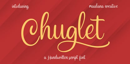 Chuglet is a cursive script font. With bold contrast stroke, fun character with a bit of ligatures and alternates. To give you an extra creative work. Chuglet font support multilingual more than 100+ language. This font is good for logo design, Social media, Movie Titles, Books Titles, a short text even a long text letter and good for your secondary text font with sans or serif. Make a stunning work with Chuglet font. Cheers, Maulana Creative
 - Dancing Brush by Letterara,
$16.00 Dancing Brush is a strong original handwritten font with a unique feel. Natural and elegant, cursive, legible script font which can be used on a wide variety of designs such as headlines, titles, headings, logos, branding, posters, books, and any other creative design. It will add a unique spark to any design project that you wish to create! This font is PUA encoded which means you can access all of the amazing glyphs and ligatures with ease!
 - Hollyfur by Maulana Creative,
$11.00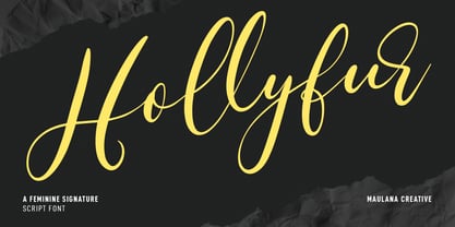 Hollyfur is a cursive beauty and feminine script font. With high contrast stroke, fun character with a bit of ligatures and alternates. To give you an extra creative work. Hollyfur font support multilingual more than 100+ language. This font is good for logo design, Social media, Movie Titles, Books Titles, a short text even a long text letter and good for your secondary text font with sans or serif. Make a stunning work with Hollyfur font. Cheers, MaulanaCreative
 - Hindyloft by Maulana Creative,
$12.00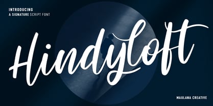 Hindyloft is a modern cursive script font. With high contrast stroke, fun character with a bit of ligatures and alternates. To give you an extra creative work. Hindyloft font support multilingual more than 100+ language. This font is good for logo design, Social media, Movie Titles, Books Titles, a short text even a long text letter and good for your secondary text font with sans or serif. Make a stunning work with Hindyloft font. Cheers, MaulanaCreative
 - Asutenan by Letterara,
$12.00 Asutenan is a strong original handwritten font with a unique feel. Natural and elegant, cursive, legible script font which can be used on a wide variety of designs such as headlines, titles, headings, logos, branding, posters, invitations, books, and any other creative design. It will add a unique spark to any design project that you wish to create! This font is PUA encoded which means you can access all of the amazing glyphs and ligatures with ease!
 - Australia Handwritten by Letterara,
$14.00 Australia Handwritten is a strong original handwritten font with a unique feel. Natural and elegant, cursive, legible script font which can be used on a wide variety of designs such as headlines, titles, headings, logos, branding, posters, invitations, books, and any other creative design. It will add a unique spark to any design project that you wish to create! This font is PUA encoded which means you can access all of the amazing glyphs and ligatures with ease!