1,492 search results
(0.02 seconds)
- Caslon No337 by URW Type Foundry,
$35.00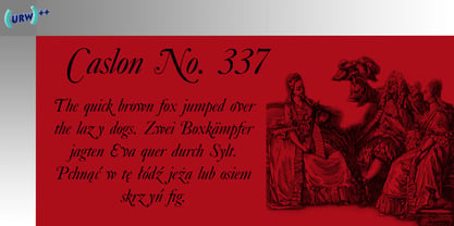
- Adobe Caslon by Adobe,
$35.00The Englishman William Caslon punchcut many roman, italic, and non-Latin typefaces from 1720 until his death in 1766. At that time most types were being imported to England from Dutch sources, so Caslon was influenced by the characteristics of Dutch types. He did, however, achieve a level of craft that enabled his recognition as the first great English punchcutter. Caslon's roman became so popular that it was known as the script of kings, although on the other side of the political spectrum (and the ocean), the Americans used it for their Declaration of Independence in 1776. The original Caslon specimen sheets and punches have long provided a fertile source for the range of types bearing his name. Identifying characteristics of most Caslons include a cap A with a scooped-out apex; a cap C with two full serifs; and in the italic, a swashed lowercase v and w. Caslon's types have achieved legendary status among printers and typographers, and are considered safe, solid, and dependable. Carol Twombly designed this Caslon revival for Adobe in 1990, after studying Caslon's own specimen sheets from the mid-eighteenth century. This elegant version is quite true to the source, and has been optimized for the demands of digital design and printing. Adobe Caslon? makes an excellent text font and includes just about everything needed by the discriminating typographer: small caps, Old style Figures, swash letters, alternates, ligatures, expert characters, central European characters, and a plethora of period ornaments. - Caxton SH by Scangraphic Digital Type Collection,
$26.00Since the release of these fonts most typefaces in the Scangraphic Type Collection appear in two versions. One is designed specifically for headline typesetting (SH: Scangraphic Headline Types) and one specifically for text typesetting (SB Scangraphic Bodytypes). The most obvious differentiation can be found in the spacing. That of the Bodytypes is adjusted for readability. That of the Headline Types is decidedly more narrow in order to do justice to the requirements of headline typesetting. The kerning tables, as well, have been individualized for each of these type varieties. In addition to the adjustment of spacing, there are also adjustments in the design. For the Bodytypes, fine spaces were created which prevented the smear effect on acute angles in small typesizes. For a number of Bodytypes, hairlines and serifs were thickened or the whole typeface was adjusted to meet the optical requirements for setting type in small sizes. For the German lower-case diacritical marks, all Headline Types complements contain alternative integrated accents which allow the compact setting of lower-case headlines. - Caslon Manuscript by BA Graphics,
$45.00An antiqued looking Caslon type letter, very retro but works well for many of today's applications. This font also works very well for text settings. - Caslon 2000 by Intellecta Design,
$19.95 - Caslon 540 by ParaType,
$30.00 The Bitstream version of Caslon 540 of the American Type Founders, 1902. Based on William Caslon I's first English Old Style typefaces of 1725. Caslon modeled his designs based on late 17th century Dutch types, but his artistic skills enabled him to improve those models, bringing a variety of forms and subtlety of details. Strokes in Caslon fonts are somewhat heavier than in earlier Old Style fonts, serifs are thicker and a bit stubby. Italic letters have uneven slope. A text set in Caslon looks legible and aesthetically appealing. Caslon is a favorite font of English printers for setting of classical literature. Cyrillic version was developed for ParaType in 2002 by Isay Slutsker and Manvel Shmavonyan.
 - Caslon Classico by Linotype,
$29.99The Englishman William Caslon (1672-1766) first cut his typeface Caslon in 1725. His major influences were the Dutch designers Christoffel van Dijcks and Dirck Voskens. The Caslon font was long known as the script of kings, although on the other side of the political spectrum, the Americans used it as well for their Declaration of Independence. The characteristics of the earlier Renaissance typefaces are only barely detectable. The serifs are finer and the axis of the curvature is almost or completely vertical. The overall impression which Caslon makes is serious, elegant and linear. Next to Baskerville, Caslon is known as the embodiment of the English Baroque-Antiqua and has gone through numerous new interpretations, meaning that every Caslon is slightly different. Caslon Classico appeared in 1993 and was designed by Franco Luin, the designer of various interpretations of classic typefaces. Luin kept his design true to the original and Caslon Classico consists of two cuts with corresponding italic and small caps characters. - Caslon #540 by Linotype,
$29.99The Englishman William Caslon punchcut many roman, italic, and non-Latin typefaces from 1720 until his death in 1766. At that time most types were being imported to England from Dutch sources, so Caslon was influenced by the characteristics of Dutch types. He did, however, achieve a level of craft that enabled his recognition as the first great English punchcutter. The original Caslon specimen sheets and punches have long provided a fertile source for the range of types bearing his name. Identifying characteristics of most Caslons include a cap A with a scooped-out apex; a cap C with two full serifs; and in the italic, a swashed lowercase v and w. A few of the many interpretations from the early twentieth century were true to the source, as well as strong enough to last into the digital era. These include two from the American Type Founders company, Caslon 540 and the slightly heavier Caslon #3. Both fonts are relatively wide, and come complete with small caps, old style figures, and italics. - HD Colton by HyperDeluxe,
$35.00 HD Colton is a 90-style super-sans from London Design Studio HyperDeluxe®. Using a combination of horizontal & vertical terminals along with squarish ovals, it is built with a confident structure that feels so much more than a neutral sans, it feels iconic. Engineered in 5 widths, compressed to extra wide, and in nine weights, HD Colton features a huge 90 styles that will offer your brand ultimate flexibility and variation in one font family. The black weights will help bring prominence to your brand while the light to mid weights will help you tell your story at a smaller size. HD Colton includes 1200+ glyphs per style, providing you with a workhorse sans that supports 200+ languages including extended Latin, extended Cyrillic and basic Greek. Also included are 5 stylistic sets, 2 arrow sets & numerous OpenType features (see last poster for complete list). The HD Colton complete family package comes with a single, 3-axis variable font so you'll have an infinite amount of combinations and uses for you to experiment with and add that touch of finesse to your visuals. Variable fonts are tech friendly providing smaller sizes for developers to work with, while also being responsive and used for motion design on the web. HD Colton key features: 3-Axis Variable Font. 90 Styles. 1200+ Glyphs Per Style. 5 Widths (Compressed, Condensed, Regular, Wide, Extra Wide). 200+ Languages Supported. Extended Latin, Extended Cyrillic, Greek Support. Stylistic Alternates for some key glyphs (J, Q, G, l, &, Arrows). Extensive OpenType features.
 - Caslon 540 by URW Type Foundry,
$89.99 William Caslon (1692-1766) laid the foundation for English typefounding, when he cut his first roman face in London in 1722. He modeled his designs on late seventeenth-century Dutch types; thus his typefaces are classified as Old Styles. The original Caslon punches have been preserved, enabling a perfect recutting of his faces. Notice the hollow in the apex of A and the two full serifs or beaks in the C. The italic capitals are irregular in their inclination. The Caslon font family is distinctive for use in subheadings or continuous text.
 - Caslon Gotisch by RMU,
$25.00 A blackletter font by William Caslon (1692-1766), with Dutch influences, which appeared for the first time in a font sample book of William Caslon & Son, London, 1763. To access all ligatures in this font, it is recommended to activate both OT features Standard and Discretionary Ligatures. The round s occupies the number sign key, and typing N - o - period and activating this combination with the OT feature Ordinals gives you the numero sign.
 - Caslon Antique by URW Type Foundry,
$35.00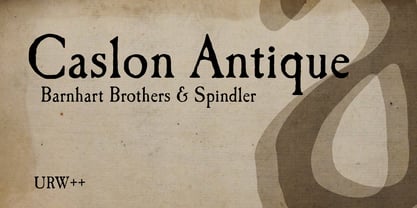
- Caslon Black by ITC,
$29.99The Englishman William Caslon punchcut many roman, italic, and non-Latin typefaces from 1720 until his death in 1766. At that time most types were being imported to England from Dutch sources, so Caslon was influenced by the characteristics of Dutch types. He did, however, achieve a level of craft that enabled his recognition as the first great English punchcutter. Caslon's roman became so popular that it was known as the script of kings, although on the other side of the political spectrum (and the ocean), the Americans used it for their Declaration of Independence in 1776. The original Caslon specimen sheets and punches have long provided a fertile source for the range of types bearing his name. Identifying characteristics of most Caslons include a cap A with a scooped-out apex; a cap C with two full serifs; and in the italic, a swashed lowercase v and w. Caslon's types have achieved legendary status among printers and typographers, and are considered safe, solid, and dependable. A few of the many interpretations from the early twentieth century were true to the source, as well as strong enough to last into the digital era. Caslon Black was designed by Dave Farey in the ITC library. - Caslon 540 by Bitstream,
$29.99William Caslon’s design as made regular by ATF at the beginning of this century. - Marlon Pro by Mostardesign,
$25.00 Marlon Pro is a soft sans serif font family characterized by its contemporary aspect and its warm touch. It provides advanced typographical support with features such as case sensitive forms, small caps, ligatures, alternate characters, fractions, slashed zero, circled gures, pro kerning...It comes with a complete range of gure set options – oldstyle and lining gures, each in tabular and proportional widths. It comes in 9 weights with corresponding italics and it's suited for multiple purposes including editorial use, web font, apps, digital ads, ebook, and also for advertising, long text, packaging and branding. As a modern sans serif font family, Marlon Pro Sans has true italics to give more style in long texts. It has also an extended character set to support Central and Eastern European as well as Western European languages.
 - Caslon Bold by Bitstream,
$29.99The Bitstream version of Caslon 3 of the American Type Founders, 1905. - NOh Carbone by OhType!,
$32.00 NOh CARBONE is a serif typeface with more than 250 glyphs, including Capitals, Small Letters, Numbers & Special glyphs and Punctuation. Appropriate for medium and large formats, its high contrast, strong features & aggressive and unconventional diagonal endow it with great elegance and give it distinction over other types of the same style. This typeface is adapted to different topics and applications, is easily modifiable and capable of generating a clear and direct message.
 - Caslon Antique by Mecanorma Collection,
$45.00 - Dalton Marine by Sign Studio,
$15.00 Dalton Marine is an absolutely elegant serif font and designed for display. This typeface includes stylistic alternates set that allow you to change multiple characters in one click. It will elevate a wide range of crafting ideas, from cards to branding, labels, and more. This font is PUA encoded, which means you can access all of the glyphs and swashes with ease.
 - Caslon Antique by GroupType,
$19.00 Caslon Antique is a decorative American typeface that was designed in 1894 by Berne Nadall. It was originally called "Fifteenth Century", but was renamed "Caslon Antique" by Nadall's foundry, Barnhart Bros. & Spindler, in the mid-1920s. The design of the typeface is meant to evoke the Colonial era. Early printers would reuse metal type over and over again, and the faces would become chipped and damaged from use. Caslon Antique emulates this look. Despite the name, it is not a member of the Caslon family of typefaces. The renaming is believed to have been a marketing maneuver to boost the popularity of a previously unpopular typeface by associating it with the highly popular Caslon types. Caslon Antique is popular today when a "old-fashioned" or "gothic" look is desired. It is used by the musical group The Sisters of Mercy on their albums, for the logo of the musical Les Misérables, and for the covers of the books in A Series of Unfortunate Events. It is also frequently used on historical displays. It was used for the previous edition of the Warhammer Fantasy Role-Play. Most recently, it has been used on promotional material for the smash musical Monty Python's Spamalot on Broadway, the West End, and its tour of the United States. British 80's band The The also used the font in several of their music videos, usually displaying several lyrics from the song in the opening scenes. It used on the cover of Regina Spektor's album, Begin to Hope. This description was sourced (in part) from Wikipedia, the free encyclopedia.
 - Caslon Graphique by ITC,
$29.99 The Englishman William Caslon punchcut many roman, italic, and non-Latin typefaces from 1720 until his death in 1766. At that time most types were being imported to England from Dutch sources, so Caslon was influenced by the characteristics of Dutch types. He did, however, achieve a level of craft that enabled his recognition as the first great English punchcutter. Caslon's roman became so popular that it was known as the script of kings, although on the other side of the political spectrum (and the ocean), the Americans used it for their Declaration of Independence in 1776. The original Caslon specimen sheets and punches have long provided a fertile source for the range of types bearing his name. Identifying characteristics of most Caslons include a cap A with a scooped-out apex; a cap C with two full serifs; and in the italic, a swashed lowercase v and w. Caslon's types have achieved legendary status among printers and typographers, and are considered safe, solid, and dependable. Caslon Antique was designed by Berne Nadall and brought out by the American type foundry Barnhart Bros & Spindler in 1896 to 1898. It doesn't bear any resemblance to Caslon, but has the quaint crudeness of what people imagine type looked like in the eighteenth century. Use Caslon Antique for that old-timey" effect in graphic designs. It looks best in large sizes for titles or initials. Caslon Black was designed by David Farey in the 1990s, and consists of one relatively narrow and very black weight. It is intended exclusively for titles or headlines. Caslon Black has a hint of the original Caslon lurking in the shadows of its shapes, but has taken on its own robust expression. Caslon Graphique was designed by Leslie Usherwood in the 1980s. The basic forms are close to the original Caslon, but this version has wide heavy forms with very high contrast between the hairline thin strokes and the fat main strokes. This precisely drawn and stylized Caslon has verve; it's ideal for headlines or initials in large sizes."
 - Display Carlos by Gerald Gallo,
$20.00 Display Carlos is a display font not intended for text use. It was designed specifically for display, headline, logotype, branding, and similar applications. There are numbers and punctuation located under their respective keys.
 - Carlo Handwriting by SoftMaker,
$15.99 Digitized handwriting fonts are a perfect way to give documents the “very special touch”. Invitations look simply better when handwritten than when printed in bland Arial or Times New Roman. Short handwritten notes look authentic and appealing. There are numerous occasions where handwritten text makes a better impression. Carlo Handwriting is a beautiful typeface that mimics true handwriting closely. Use Carlo Handwriting to create stunningly beautiful designs easily.
 - Juan Carlos by Homelessfonts,
$49.00 Homelessfonts is an initiative by the Arrels foundation to support, raise awareness and bring some dignity to the life of homeless people in Barcelona Spain. Each of the fonts was carefully digitized from the handwriting of different homeless people who agreed to participate in this initiative. A biography/story of each homeless person captures their story, to help raise awareness and bring some dignity to the life of homeless people. Monotype is pleased to donate all revenue from the sales of Homelessfonts to the Arrels foundation in support of their mission to provide the homeless people in Barcelona with a path to independence with accommodations, food, social and health care. Juan Carlos was born in Barcelona, Spain 46 years ago. Since the age of 17 – and during eleven years – he worked double shifts of eight hours every day in a factory. Excessive work and family problems debilitated his health and he lost his job. He then faced a dilemma: to spend unemployment benefits to pay for rent or for food. For a few years, he worked helping in the kitchens of different restaurants while he lived on a pension, until he was definitively left without work and ended up living in the street for 10 years. “In the street I tried to find rest in the ATMs of banks. I preferred to be alone, and if I ran into conflictive people, I looked for somewhere else” he explains. Living in the street he was the victim of an aggression. Since then, with the help of Arrels he moved into a pension. Today, Juan Carlos is a volunteer in the shower service of Arrels, the same showers he used during years. He also collaborates with the maintenance team, helps prepare hygienic and cleaning material, and participates in activities such as the theatre group and the football team.
 - Alton JNL by Jeff Levine,
$29.00Alton JNL is an ultra-bold sanserif design that's perfect for any headline application. - Cartoon Party Time - Unknown license

- Nouveau Cartoon JNL by Jeff Levine,
$29.00 Samuel Welo’s “Studio Handbook – Letter and Design for Artists and Advertisers” was a go-to source of inspiration for generations of layout artists, graphic designers and sign painters. An interesting example of free-form pen lettering was found amongst the pages of one edition and it has now been recreated as a digital typeface called Nouveau Cartoon JNL; available in both regular and oblique versions.
 - Cartoon Cavalcade JNL by Jeff Levine,
$29.00 There are times when a customer might look over a dingbat font and like a few of the images because they suit a particular need, but hesitates on purchasing the font because enough of those images isn't available. For all of the lovers of vintage letterpress cartoon cuts, Cartoon Cavalcade JNL collects sixty two assorted images from many of the Jeff Levine Fonts dingbat collections and places them within one singular file.
 - Cartoon Panel JNL by Jeff Levine,
$29.00 Charles W. "Plot" Plotner was a cartoonist who had developed a template-based cartooning set for kids circa 1952 called "Plot-O". A companion set was called "Plot-O the Clown". "Plot-O" consisted of two plastic templates with pre-cut and numbered cartoon shapes. By following the simple directions and tracing the corresponding parts, any youngster could create basic cartoons of people and finish them off with their own details. The hand-lettered instruction booklet provided the design inspiration for Cartoon Panel JNL.
 - Linotype Bariton Paneuropean by Linotype,
$92.99Linotype Bariton is part of the Take Type Library, chosen from contestants of Linotype's International Digital Type Design Contests of 1994 and 1997. Designer Alexei Chekulayev designed his font in one weight to mirror the Zeitgeist of the early 1930s. The characters of this extremely bold font are based on the form of a rectangle though its rounded edges soften its look a bit. Linotype Bariton should be used only in larger point sizes in headlines which should really catch the eye. - Cartoon Nouveau JNL by Jeff Levine,
$29.00 Most of the lettering on a piece of sheet music for a song from the 1921 George M. Cohan musical comedy entitled “The O’Brien Girl” was hand lettered in a playful, casual Art Nouveau design with rounded ends. The characters on that page took on a look reminiscent of cartoon or comic strip wording, and the result is a digital typeface named Cartoon Nouveau JNL, which is available in both regular and oblique versions.
 - Caslon Calligraphic Initials - Unknown license

- Caslon Open Face by Monotype,
$29.00Open, outline or inline faces became very popular in the 1940's. By removing the usual weight, a clear-cut letterform is achieved. In Caslon Open Face, the right-hand strokes are accentuated, providing a slightly three-dimensional effect. The ascenders of Caslon Open Face are large and the overall design of this version does not relate to Caslon 3 Roman. This Caslon Open Face font is good for personal stationery, or sentences where a decorative but distinguished result is sought. - Caslon Old Face by Bitstream,
$29.99William Caslon established the first major English typefoundry, re-creating earlier Dutch designs with excellent craftsmanship, color and rhythm. Caslon Old Face is one of many faithful revivals; the original matrices (from many hands; the lowercase of the 48 point is Moxon’s 1669 Great Canon) survive at Stephenson Blake. George Ostrochulski adapted this design for photocomposition at Mergenthaler with skill and understanding. - Caslon Black EF by Elsner+Flake,
$35.00 - Walton Stencil EF by Elsner+Flake,
$35.00 - 1913 Typewriter Carbon by GLC,
$38.00 1913 Typewriter Carbon is the bold version of GLC foundry's 1913 Typewriter. It is available in two styles: Normal, and Underlined (Bold). It is a complete alphabetic font. It is used as variously as web-site titles, posters design or books editing. It may be preferable, if possible, when printing, to choose a pale color - dark grey instead of heavy black, for exemple - to give a good appearance, just like the real one, and still benefit from the full details. With inkjet printers, it may be used the economic or draft option with a good result too. The old typewriter characters size is 11 or 12 points, but this font supports easily enlargement.
 - Arston Stencil EF by Elsner+Flake,
$32.00 - Caslon Open Face by Image Club,
$29.99Open, outline or inline faces became very popular in the 1940's. By removing the usual weight, a clear-cut letterform is achieved. In Caslon Open Face, the right-hand strokes are accentuated, providing a slightly three-dimensional effect. The ascenders of Caslon Open Face are large and the overall design of this version does not relate to Caslon 3 Roman. This Caslon Open Face font is good for personal stationery, or sentences where a decorative but distinguished result is sought. - New Caslon SB by Scangraphic Digital Type Collection,
$26.00 Since the release of these fonts most typefaces in the Scangraphic Type Collection appear in two versions. One is designed specifically for headline typesetting (SH: Scangraphic Headline Types) and one specifically for text typesetting (SB Scangraphic Bodytypes). The most obvious differentiation can be found in the spacing. That of the Bodytypes is adjusted for readability. That of the Headline Types is decidedly more narrow in order to do justice to the requirements of headline typesetting. The kerning tables, as well, have been individualized for each of these type varieties. In addition to the adjustment of spacing, there are also adjustments in the design. For the Bodytypes, fine spaces were created which prevented the smear effect on acute angles in small typesizes. For a number of Bodytypes, hairlines and serifs were thickened or the whole typeface was adjusted to meet the optical requirements for setting type in small sizes. For the German lower-case diacritical marks, all Headline Types complements contain alternative integrated accents which allow the compact setting of lower-case headlines.

