10,000 search results
(0.019 seconds)
- MC Minosh by Maulana Creative,
$14.00
- Lemon Milk Pro by Marsnev,
$16.99
- MC Dark Dragon by Maulana Creative,
$15.00
- Galber by Craft Supply Co,
$20.00
- Balloon - Unknown license

- Stop - Unknown license

- HKI Nightlife - Unknown license

- Marriage - Unknown license

- Merrimac by Aboutype,
$24.99 - Elante by Monotype,
$29.99 - H74 Dishonor by Hydro74,
$9.99
- Razor Bill by Red Rooster Collection,
$45.00
- Caslon Extra Condensed by Red Rooster Collection,
$45.00 - Dractura by Aerotype,
$29.00 - Autograf by Mans Greback,
$59.00
- Century PS Pro by SoftMaker,
$14.99
- Charles by Aboutype,
$24.99 - Nabuco by Omine Type,
$24.00 - Float by Aboutype,
$24.99 - Willem by Aboutype,
$24.99 - Sylvia by Alias Collection,
$60.00
- Venezuela by Red Rooster Collection,
$45.00 - Pergamon by SoftMaker,
$9.99
- Salonika by Aboutype,
$24.99 - Kner Antikva by Font HU,
$39.00
- Century Schoolbook Pro by SoftMaker,
$14.99
- Singela by PintassilgoPrints,
$20.00
- Organ Grinder by SoftMaker,
$9.99
- Dracena by Aerotype,
$29.00
- Quest by Red Rooster Collection,
$45.00 - UltraGotica by Omine Type,
$24.00 - Openface No2 by SoftMaker,
$9.99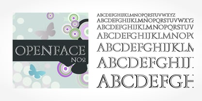
- Technik Mono by CarnokyType,
$20.00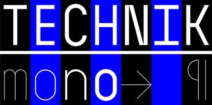
- Safe Font by Galapagos,
$39.00 - Indigo Antiqua 2 by Fontanova,
$36.00
- Humanex by Sébastien Truchet,
$40.00
- Plinc Beaux Arts Didot by House Industries,
$33.00
- Grrr by ParaType,
$30.00
- PerfectPixel - Unknown license

- Donthank by Letterhend,
$19.00


