10,000 search results
(0.026 seconds)
- Born Strong by Rook Supply,
$16.00 Born Strong is built with athletics in mind. The goal was to make the perfect typeface for sports teams, college football, athletic wear and everything in between. The font family supports a wide range of languages and is available in many different weights.
 - Big Tent Players NF by Nick's Fonts,
$10.00A WPA poster announcing the latest production by—guess who?—the Big Tent Players inspired this eye-catching, if somewhat unconventional, typeface. Both versions of the font include the 1252 Latin and 1250 CE character sets (with localization for Romanian and Moldovan). - Foppish Birdie by Natalie Thomson,
$15.00 Foppish Birdie is a font family with character of birds that was inspired by the font Guakala by RodrigoTypo. Foppish Birdie - dynamic, cheerful, a special typeface for children's short titles and brands, containing the Cyrillic set. Take each letter and make game!
 - Angler NF by Nick's Fonts,
$10.00 The 1895 specimen book from Barnhart Brothers and Spindler featured this whimsical typeface, originally called Anglo. An unusual combination of elegance and quirky charm. Both versions of this font support the Latin 1252, Central European 1250, Turkish 1254 and Baltic 1257 codepages.
 - Osnova Navigation by AndrijType,
$18.75 The common Slavic word Основа (Osnova) means basis in English and βάση in Greek. This universal but still distinctive typeface can make a good ground for any design project. Special Navigation version separated by Western Latin, Greek and Cyrillic families is here.
 - After Death by Fauzistudio,
$20.00 After Death is a script typeface. It is inspired by brush lettering and has a soft and welcoming look. After Death can be used for branding, packaging, and anywhere else you need a script font that is easy to read and smooth.
 - Cartager by Ditatype,
$29.00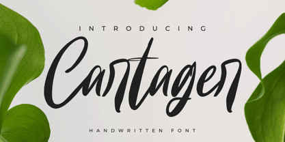 Cartager is a modern handwritten font. With a classy and natural handwritten style, it brings a classy and chic typeface. Cartager is best used for weddings, branding, logotype, and quotes. Includes: - Cartager (OTF) Features: - Beautiful Ligatures - PUA Encoded - Multilingual Support - Numerals and Punctuation
 - Tall Order JNL by Jeff Levine,
$29.00 The condensed style and square character shapes of a vintage typeface originally known as Raleigh has been re-interpreted by Jeff Levine Fonts as Tall Order JNL. There is an alternate A, K, M, N and S on the respective lower case keys.
 - Better Saturday by Din Studio,
$29.00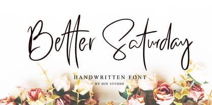 Introducing Better Saturday for your better work. With a classy and natural handwritten style, it brings a classy and chic typeface. Better Saturday is best used for weddings, branding, logotype, and quotes. Features: Beautiful Ligatures PUA Encoded Multilingual Support Numerals and Punctuation
 - Meal Ticket JNL by Jeff Levine,
$29.00Meal Ticket JNL follows the same basic letter shapes as Jeff Levine's Flatbush Beanery JNL, but with a much lighter look and feel. This is another perfect typeface for recreating the sign lettering and menus of old-time diners, drive-ins and restaurants. - Scribe by Wiescher Design,
$49.50 Scribe is an elaborate typeface somewhere in between Bodoni and an English script. It has interwoven capitals and joining lowercase letters. I have tried to make something new that has this old, settled touch. I think I like it. Yours sincerely, Gert Wiescher
 - So Nouveau JNL by Jeff Levine,
$29.00 Three of the four letters of the name “Jane” on the cover of a vintage piece of sheet music inspired So Nouveau JNL. The free-form swoops emulating the pen lettering of the early 1900s adds a nostalgic charm to this typeface.
 - FP Head by Fontpartners,
$29.00 FP Head is a redesign of a corporate typeface for the Danish trade union FOA. Head is a extended display font, with a blurred look and a touch of FF Max: Hard and soft at the same time. Available in two versions.
 - Rugak by Nemelk aka Clément Petit,
$15.00 Rugak is a serif typeface created by Clément Petit. This font contains 186 characters (letters/numbers/punctuation). The particularity of Rugak font is to use a circle which the recurrent size on all the characters. More information (video + animation) on www.petitclement.net/rugak
 - Dopamine by Luke Thompson,
$30.00 Dopamine is a friendly, flowing sans serif typeface. It works best for large headlines, particularly in packaging or editorial projects. Its most interesting feature is the flowing line across the top of many of the characters, creating smooth waves from one to another.
 - Dash Grid by Gleb Guralnyk,
$13.00 Hi there, introducing an abstract font named Dash Grid. At's a geometric display typeface made of square dashed blocks. Dash Grid font supports most of the european latin languages and includes ukrainian cyrillic alphabet (check out all available characters on the last screenshot).
 - Alissian by Ditatype,
$29.00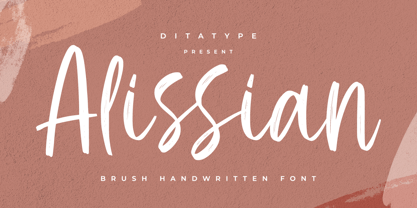 Alissian is a modern handwritten font. With a classy and natural handwritten style, it brings a classy and chic typeface. Alissian is best used for weddings, branding, logotype, and quotes. Includes: - Alissian (OTF) Features: - Beautiful Ligatures - PUA Encoded - Multilingual Support - Numerals and Punctuation
 - Sur by Horacio Lorente,
$20.00 Sur is a modern minimalist sans-serif typeface available in two weights (normal and bold), with a good shape for big editorial headlines and fashion publications. It was developed during 2009, trying to find a new way to express ideas in editorial projects.
 - Sanger phet by Zaki Creative,
$10.00 Sanger Phet is a soft and sweet calligraphic typeface, with characters dancing along the baseline. It has a casual and elegant touch. Can be used for various purposes such as logos, wedding invitations, headings, t-shirts, letterheads, signage, labels, news, posters, badges etc.
 - Carot Sans by Storm Type Foundry,
$39.00 Carot Sans is designed on the basis of three elements - square, circle and triangle. Simple and fresh typeface for visual identities, book covers, magazines and advertisement. The whole Carot system of 64 members offers a modern alternative for all types of design work.
 - Foda Naskh by Fo Da,
$50.00 Foda Naskh is a modern naskh typeface that Combines the originality and modernity, which shows the letters beauty and the ease of reading. Foda Naskh is typical for books, the writing of newspapers, headlines, magazines, poetry, long and short text paragraphs and more..
 - Crypto Scam by Gassstype,
$29.00 Here comes a New Font,Introducing Crypto Scam is Modern Typeface with a Textured inspired by the famous minimalist logo and Blocking has 2 Regular and Stencil styles is perfect for the purposes of designing templates, brochures, videos, advertising branding, logos and more.
 - Fleischer Display by Lewis McGuffie Type,
$30.00 Fleischer is a rough and playful display typeface good for headlines and posters. The face is based on historical letterforms combined with energetic 20th century pulp-style lettering. Fleischer comes with caps and small caps plus West, Central and East European language support.
 - Merchanto by Type Juice,
$19.00 Merchanto is a condensed sans serif display typeface made up of 8 fonts in a variety of styles and weights. Included are over 500 stylized alternate glyphs for creative control and customization. 8 fonts total Over 500 Alternates Multilingual Over 2300+ glyphs
 - Perisland by Ditatype,
$29.00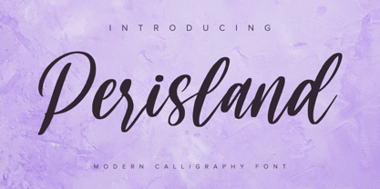 Perisland is a modern handwritten font. With a classy and natural handwritten style, it brings a classy and chic typeface. Perisland is best used for weddings, branding, logotype, and quotes. Includes: Perisland (OTF) Features: Beautiful Ligatures PUA Encoded Multilingual Support Numerals and Punctuation
 - Slutsker Script by ParaType,
$30.00Designed in 2003 by Isay Slutsker and Irina Smirnova. Based on the calligraphic typeface of mid-1980 by Moscow type designer Isay Slutsker (1924-2002). There is a free variation of flat nib pen calligraphy. For use in advertising and display typography. - Wavy Rounded BT by Bitstream,
$50.99Wavy Rounded is a stylized sans serif display typeface by Japanese designer Hajime Kawakami. Some of the characters possess quirky features that randomly create fun visual “waves”. There is a handful of alternate characters including an old style figure set. Catch the Wave. - Digitek by ITC,
$29.00Digitek is the work of David Quay, a futuristic typeface inspired by output of a coarse resolution computer bitmap. This condensed font is best in large headlines with large letter and word spacing. Digitek is perfect for anything needing a computer-age look. - Carltine by Muksal Creatives,
$10.00 Carltine is a unique and modern family of Sans serif fonts. Simply Conception has 18 families Regular and italic font, starting from the small thin to the largest black. This typeface is versatile and can be used successfully in magazines, posters, branding, websites.
 - Julius by Wiescher Design,
$49.50 Julius comes in very handy if you want to jump back in time to the middle of the last century. Julius is also one of my first typefaces, recently I added the light version. Enjoy your trip back into the past, Gert Wiescher
 - Radio Show JNL by Jeff Levine,
$29.00 The 1933 sheet music compilation entitled "Kate Smith Memories Song Book" had the singer's name hand lettered in a bold, spurred serif typeface. This lettering design became the basis for Radio Show JNL, which is available in both regular and oblique versions.
 - Fokers by Letterhend,
$14.00 Fokers, a new display typeface with classy and luxury look! Fokers' different styles works perfectly for headline, logotype, apparel, invitation, branding, packaging, advertising, and more. Fokers comes in uppercase, lowercase, with punctuation, symbols, numerals, stylistic set alternate, ligatures and also multi-lingual support.
 - Vermilion by Hanoded,
$15.00 Vermilion is one of those colors that are neither/nor. It's an ancient hue, in between red and orange and I kind of like the name. Vermilion font is a hand written, narrow and tall typeface which comes with extensive language support.
 - FS Brabo Paneuropean by Fontsmith,
$90.00Worldly Even though it’s a new arrival, FS Brabo has seen the world. Designed by a Brazilian working in London and studying in Belgium under a Dutchman, it’s certainly well-travelled. And it was inspired by the extraordinary archive of early book typefaces at the world-renowned Plantin-Moretus Museum in Antwerp, while Fernando Mello was attending Frank Blokland’s Expert class Type Design course at the Plantin Institute of Typography. It was there that Fernando became engrossed in the collection of early metal type, matrices, punches and type samples by figures such as Garamond and Granjon. So much so that he took on the mighty task of developing ‘a beautiful, functional, serifed text font’ of his own. Heroic FS Brabo’s journey from sketch to font family took an epic three years, starting in Antwerp, continuing at Fontsmith in London, and reaching its conclusion back in Fernando’s home city of São Paulo. No wonder Fernando was reminded of another titanic face-off: that of Antwerp’s Roman hero of legend, Silvius Brabo, and the evil ogre, Antigoon. Brabo came to the town’s rescue after the tyrannical giant had been charging ships’ captains extortionate taxes and chopping off the hands of those who refused to pay up. Having finally downed Antigoon after a long and terrible duel, Brabo cut off the giant’s own hand and threw it into the river Scheldt, unwittingly giving the town its name: the Dutch for ‘hand-throw’ is hand werpen. What better way for Fernando to name his literary typeface than after the hero of Antwerp’s oldest tale? The garalde factor FS Brabo is not a revival, but a very much a contemporary, personal interpretation of a garalde – a class of typeface originating in the 16th century that includes Bembo, Garamond and Plantin, with characteristically rounded serifs and moderate contrast between strokes. Brabo’s ‘ct’ and ‘st’ ligatures, upper-case italic swashes and contextual ending ligatures – ‘as’, ‘is’, ‘us’ – all preserve the beauty and character of traditional typefaces, but its serifs are chunkier than a garalde. Their sharp cuts and squared edges give them a crispness at text sizes, helping to bring a beautifully bookish personality to hardworking modern applications. A workhorse with pedigree It may give the appearance of a simple, four-weight typeface, but FS Brabo has hidden depths beneath its simplicity and beauty. OpenType features such as cap italic swashes, contextual ending swashes – programmed only to appear at the end of words – and stylistic alternatives make this a complete and well-equipped typeface. Comprehensive testing was carried out at text and display sizes, too, to prevent counters from filling in. All of which makes FS Brabo a very modern take on a traditional workhorse serif typeface: colourful and versatile enough to adorn not just editorial projects but also signage, advertising and logotypes. - Brewery No 2 Paneuropean by Linotype,
$103.99An entry in the Second Linotype Design Contest, Linotype Brewery, designed by Gustavs Andrejs Grinbergs, became part of the TakeType Collection in 1997. Brewery No 2 represents a significantly improved version of its precursor, and the typeface has been both extended and enhanced. When asked about prototypes, Grinbergs cites German typefaces of the early 20th century. It is thus not surprising that the characters of Brewery™ No 2 are based on geometrical forms. However, this is no mere synthetic Grotesque-derived typeface. It has significant contrasts in line thickness and triangular line terminals that are not unlike serifs, placing it in the middle ground somewhere between a Grotesque and serif font. The contrast between the features of a synthetic Grotesque and an Antiqua gives the characters of Brewery No 2 their distinctive charm and is the distinguishing attribute of this contemporary typeface. Additional vibrancy is provided by bevelled line endings (as in the case of the 'E' and the 'F'), the circular punctuation marks and the slight curve of the descending bar of the 'k'. Thanks to a generous x-height and its open counters, Brewery No 2 is also highly legible in small point sizes. Only in its bolder versions is another aspect of Brewery No 2 apparent; Grinbergs has here made the linking elements more rectangular and has emphasized the counters, so that the Bold variants of Brewery No 2 exhibit elements typical of a broken typeface. Brewery No 2 is available in seven finely graduated weights, ranging from Light to Black. Every variant has a corresponding, slightly narrower Italic version. In addition, the lowercase 'a' is given a closed form, the 'e' is more rounded and the 'f' has a descender. The character sets of Brewery No 2 leave nothing to be desired. In addition to small caps and ligatures, there are various numeral sets with old style and lining figures for setting proportional text and table columns. In its most extensive form (the Pan-European variant), Brewery No 2 can be used to set texts in many languages that employ the Latin alphabet and also texts in international languages that use Cyrillic or monotonic Greek orthography. Although some of the features of Brewery No 2, such as the tiny serifs, are only evident in the larger point sizes, this typeface is not just at home when used to set headlines. Brewery No 2 also cuts a good figure in short or medium length texts. This contemporary typeface with its formally elegant quality looks good, for example, on posters, in newspapers and promotional material. It can also be used for websites as it is also available as a web font. - FS Brabo by Fontsmith,
$80.00 Worldly Even though it’s a new arrival, FS Brabo has seen the world. Designed by a Brazilian working in London and studying in Belgium under a Dutchman, it’s certainly well-travelled. And it was inspired by the extraordinary archive of early book typefaces at the world-renowned Plantin-Moretus Museum in Antwerp, while Fernando Mello was attending Frank Blokland’s Expert class Type Design course at the Plantin Institute of Typography. It was there that Fernando became engrossed in the collection of early metal type, matrices, punches and type samples by figures such as Garamond and Granjon. So much so that he took on the mighty task of developing ‘a beautiful, functional, serifed text font’ of his own. Heroic FS Brabo’s journey from sketch to font family took an epic three years, starting in Antwerp, continuing at Fontsmith in London, and reaching its conclusion back in Fernando’s home city of São Paulo. No wonder Fernando was reminded of another titanic face-off: that of Antwerp’s Roman hero of legend, Silvius Brabo, and the evil ogre, Antigoon. Brabo came to the town’s rescue after the tyrannical giant had been charging ships’ captains extortionate taxes and chopping off the hands of those who refused to pay up. Having finally downed Antigoon after a long and terrible duel, Brabo cut off the giant’s own hand and threw it into the river Scheldt, unwittingly giving the town its name: the Dutch for ‘hand-throw’ is hand werpen. What better way for Fernando to name his literary typeface than after the hero of Antwerp’s oldest tale? The garalde factor FS Brabo is not a revival, but a very much a contemporary, personal interpretation of a garalde – a class of typeface originating in the 16th century that includes Bembo, Garamond and Plantin, with characteristically rounded serifs and moderate contrast between strokes. Brabo’s ‘ct’ and ‘st’ ligatures, upper-case italic swashes and contextual ending ligatures – ‘as’, ‘is’, ‘us’ – all preserve the beauty and character of traditional typefaces, but its serifs are chunkier than a garalde. Their sharp cuts and squared edges give them a crispness at text sizes, helping to bring a beautifully bookish personality to hardworking modern applications. A workhorse with pedigree It may give the appearance of a simple, four-weight typeface, but FS Brabo has hidden depths beneath its simplicity and beauty. OpenType features such as cap italic swashes, contextual ending swashes – programmed only to appear at the end of words – and stylistic alternatives make this a complete and well-equipped typeface. Comprehensive testing was carried out at text and display sizes, too, to prevent counters from filling in. All of which makes FS Brabo a very modern take on a traditional workhorse serif typeface: colourful and versatile enough to adorn not just editorial projects but also signage, advertising and logotypes.
 - Brewery No 2 by Linotype,
$40.99 An entry in the Second Linotype Design Contest, Linotype Brewery, designed by Gustavs Andrejs Grinbergs, became part of the TakeType Collection in 1997. Brewery No 2 represents a significantly improved version of its precursor, and the typeface has been both extended and enhanced. When asked about prototypes, Grinbergs cites German typefaces of the early 20th century. It is thus not surprising that the characters of Brewery™ No 2 are based on geometrical forms. However, this is no mere synthetic Grotesque-derived typeface. It has significant contrasts in line thickness and triangular line terminals that are not unlike serifs, placing it in the middle ground somewhere between a Grotesque and serif font. The contrast between the features of a synthetic Grotesque and an Antiqua gives the characters of Brewery No 2 their distinctive charm and is the distinguishing attribute of this contemporary typeface. Additional vibrancy is provided by bevelled line endings (as in the case of the 'E' and the 'F'), the circular punctuation marks and the slight curve of the descending bar of the 'k'. Thanks to a generous x-height and its open counters, Brewery No 2 is also highly legible in small point sizes. Only in its bolder versions is another aspect of Brewery No 2 apparent; Grinbergs has here made the linking elements more rectangular and has emphasized the counters, so that the Bold variants of Brewery No 2 exhibit elements typical of a broken typeface. Brewery No 2 is available in seven finely graduated weights, ranging from Light to Black. Every variant has a corresponding, slightly narrower Italic version. In addition, the lowercase 'a' is given a closed form, the 'e' is more rounded and the 'f' has a descender. The character sets of Brewery No 2 leave nothing to be desired. In addition to small caps and ligatures, there are various numeral sets with old style and lining figures for setting proportional text and table columns. In its most extensive form (the Pan-European variant), Brewery No 2 can be used to set texts in many languages that employ the Latin alphabet and also texts in international languages that use Cyrillic or monotonic Greek orthography. Although some of the features of Brewery No 2, such as the tiny serifs, are only evident in the larger point sizes, this typeface is not just at home when used to set headlines. Brewery No 2 also cuts a good figure in short or medium length texts. This contemporary typeface with its formally elegant quality looks good, for example, on posters, in newspapers and promotional material. It can also be used for websites as it is also available as a web font.
 - Butter - Unknown license

- Valve by Typodermic,
$11.95 Introducing Valve—the ultimate industrial typeface for the modern age. With its superelliptical letterforms and pragmatic stroke logic, Valve is the perfect choice for anyone looking to evoke the cold, hard world of plastics, pharmaceuticals, electronics, and alternative energy. But don’t be fooled by Valve’s emotionless, android-like forms. This is a typeface that packs a punch, with soft stroke ends that lend it a touch of elegance and sophistication. Whether you’re designing a cutting-edge tech brochure or a sleek new website, Valve is the perfect choice for anyone who wants to convey a sense of modernity and precision. And unlike other ultramodern typefaces that rely on tongue-in-cheek references to retro futurism, Valve is purely synthetic. Built solely from artificial elements with no specific structural source, this is a typeface that’s as forward-thinking as they come. So why settle for a typeface that’s stuck in the past when you can choose Valve and embrace the future? And with OpenType fractions, numeric ordinals, and a wide range of currency symbols included, Valve is more versatile than ever. Available in five weights—Extra-Light, Light, Regular, Bold, and Heavy—as well as a set of sleek obliques, Valve is the perfect choice for anyone looking to take their design game to the next level. So what are you waiting for? Choose Valve today and see the difference that a truly ultramodern typeface can make. Most Latin-based European writing systems are supported, including the following languages. Afaan Oromo, Afar, Afrikaans, Albanian, Alsatian, Aromanian, Aymara, Bashkir (Latin), Basque, Belarusian (Latin), Bemba, Bikol, Bosnian, Breton, Cape Verdean, Creole, Catalan, Cebuano, Chamorro, Chavacano, Chichewa, Crimean Tatar (Latin), Croatian, Czech, Danish, Dawan, Dholuo, Dutch, English, Estonian, Faroese, Fijian, Filipino, Finnish, French, Frisian, Friulian, Gagauz (Latin), Galician, Ganda, Genoese, German, Greenlandic, Guadeloupean Creole, Haitian Creole, Hawaiian, Hiligaynon, Hungarian, Icelandic, Ilocano, Indonesian, Irish, Italian, Jamaican, Kaqchikel, Karakalpak (Latin), Kashubian, Kikongo, Kinyarwanda, Kirundi, Kurdish (Latin), Latvian, Lithuanian, Lombard, Low Saxon, Luxembourgish, Maasai, Makhuwa, Malay, Maltese, Māori, Moldovan, Montenegrin, Ndebele, Neapolitan, Norwegian, Novial, Occitan, Ossetian (Latin), Papiamento, Piedmontese, Polish, Portuguese, Quechua, Rarotongan, Romanian, Romansh, Sami, Sango, Saramaccan, Sardinian, Scottish Gaelic, Serbian (Latin), Shona, Sicilian, Silesian, Slovak, Slovenian, Somali, Sorbian, Sotho, Spanish, Swahili, Swazi, Swedish, Tagalog, Tahitian, Tetum, Tongan, Tshiluba, Tsonga, Tswana, Tumbuka, Turkish, Turkmen (Latin), Tuvaluan, Uzbek (Latin), Venetian, Vepsian, Võro, Walloon, Waray-Waray, Wayuu, Welsh, Wolof, Xhosa, Yapese, Zapotec Zulu and Zuni.
 - Meposa by Typodermic,
$11.95 Meposa is more than just a typeface; it is a bold statement of individuality and creativity. It’s a unique, tough, and quirky design that defies convention. Meposa’s mixed-case letters with open apertures deviate from the traditional roots of wood-block typography, bringing a fresh and modern twist to an old-school classic. This hybrid typeface is an amalgamation of various design elements from different eras and cultures. The result is a unique and mesmerizing typeface that defies categorization. Meposa also draws inspiration from the 1970s custom van culture, where artists and designers would showcase their creativity by customizing their vehicles with bold and colorful graphics. This typeface channels that same spirit of creativity and individuality, inviting you to break the mold and think outside the box. With historical wood type influences, Meposa pays homage to the timeless and authentic craft of typography. Yet, it also features retro-tech and modern design elements, resulting in a truly one-of-a-kind typeface that bridges the past and the present. In summary, Meposa is a unique and tough display typeface that is both historical and modern, quirky and bold. Its mix of design influences makes it an ideal choice for anyone looking to break the mold and stand out from the crowd. Whether you’re a graphic designer or a creative professional, Meposa is sure to leave a lasting impression. Most Latin-based European writing systems are supported, including the following languages. Afaan Oromo, Afar, Afrikaans, Albanian, Alsatian, Aromanian, Aymara, Bashkir (Latin), Basque, Belarusian (Latin), Bemba, Bikol, Bosnian, Breton, Cape Verdean, Creole, Catalan, Cebuano, Chamorro, Chavacano, Chichewa, Crimean Tatar (Latin), Croatian, Czech, Danish, Dawan, Dholuo, Dutch, English, Estonian, Faroese, Fijian, Filipino, Finnish, French, Frisian, Friulian, Gagauz (Latin), Galician, Ganda, Genoese, German, Greenlandic, Guadeloupean Creole, Haitian Creole, Hawaiian, Hiligaynon, Hungarian, Icelandic, Ilocano, Indonesian, Irish, Italian, Jamaican, Kaqchikel, Karakalpak (Latin), Kashubian, Kikongo, Kinyarwanda, Kirundi, Kurdish (Latin), Latvian, Lithuanian, Lombard, Low Saxon, Luxembourgish, Maasai, Makhuwa, Malay, Maltese, Māori, Moldovan, Montenegrin, Ndebele, Neapolitan, Norwegian, Novial, Occitan, Ossetian (Latin), Papiamento, Piedmontese, Polish, Portuguese, Quechua, Rarotongan, Romanian, Romansh, Sami, Sango, Saramaccan, Sardinian, Scottish Gaelic, Serbian (Latin), Shona, Sicilian, Silesian, Slovak, Slovenian, Somali, Sorbian, Sotho, Spanish, Swahili, Swazi, Swedish, Tagalog, Tahitian, Tetum, Tongan, Tshiluba, Tsonga, Tswana, Tumbuka, Turkish, Turkmen (Latin), Tuvaluan, Uzbek (Latin), Venetian, Vepsian, Võro, Walloon, Waray-Waray, Wayuu, Welsh, Wolof, Xhosa, Yapese, Zapotec Zulu and Zuni.
