10,000 search results
(0.018 seconds)
- Alumni by TypeSETit,
$29.00 At first glance, there is something familiar about this font, but one may not be sure... “Where have I seen this font before?” Known for his diverse portfolio of script style display fonts, typographic designer and lettering artist Rob Leuschke has taken a step back in time with Alumni™. A true departure from present trends, this font resurrects the clean and simple forms made popular in the 1950s. Originally inspired by the black face Impact™, it soon evolved to include numerous weights from the Black flavor of its progenitor to a super thin Pinstripe. The extreme weights (Pinstripe, Hairline and Black) are designed for display situations while the remaining weights may be used for more traditional textual design applications. The Inline and Collegiate flavors offer added display options. Alumni™ is available in Roman and Italic versions of each weight. Extensive kerning and OpenType programming have been applied to give it optimal functionality.
 - Bix Bats by Linotype,
$29.99The Bix Bats symbol family was developed in 2003 by Argentinean designer Victor Garcia to complement his display text font Bix Plain. Bix Bats contains four different symbol fonts. Most of the characters in these fonts have their lower halves reversed out. Typing a line of text in these symbol fonts, or mixing these symbol fonts with Bix Plain, will create a very interesting text effect: the bottom half of your lines of text will be reversed out, on top of a colored bar. Bix Bats Arrows contains numerous possible arrow combinations, from archery references to the American recycling symbol. Bix Bats Funny includes all of the symbols needed for a party, from beer steins to bunny rabbits! Bix Bats Shiny has enough starbursts to light up a night sky, and in Bix Bats Wired you will find all of the technological accessories needed to be in the now. All four fonts are included in the Take Type 5 collection from Linotype GmbH." - Mandelia by Type Innovations,
$39.00 Mandelia was created by Alex Kaczun, an American type designer, in 2010. The typeface was named in honor of Nelson Mandela, former president of South Africa, for his “shining example of the incredible strength of the human spirit to persevere in the face of adversity for the pursuit of freedom”. Mandelia is a strong, bold and wide-bodied serif typeface design, reminiscent of the great African landscape with its diverse animal life. It’s easy to see the influence of the 'Rhino' sharp serifs and ‘Elephant’ size stems and proportions. The font commands attention and respect. Great for headlines that pack a punch, logos, posters, and signage. And because it was well designed, it can even be used in body copy at various point sizes. Mandelia is available in Opentype format for both Mac and PC, and comes complete with true drawn small caps, old style figures and Unicode Latin 1252 and Central European 1250 character sets. It has everything you need to get the job done.
 - Kairos Sans Variable by Monotype,
$314.99 The Kairos™ Sans family melds 19th century wood type design traits from fonts called Grecians with current-as-today sans serif letterforms. The distinctive octagonal corners of the original design are still there, but Kairos Sans has been streamlined through the sensitive shaving of its serifs. Drawn by Terrance Weinzierl to complement his Kairos family, Kairos Sans provides a natural counterpoint sans serif design and stands on its own as a powerful communication tool for everything from two-foot high display copy to the smallest sizes of text content. Kairos Sans is available in 48 styles; 8 weights in three widths, all with matching italics. In addition to a full Latin character set that support most Eastern and Western European languages, it also has the necessary characters to support Greek and Cyrillic scripts. Kairos Variables are font files which are featuring two axis and have a preset instance from Thin to Black and Condensed to Extended.
 - Mundbind NL by Hanoded,
$15.00 I just visited my good friend Jakob Fischer from Pizzadude.dk in Denmark. As always we talked fonts, drank coffee and walked endlessly through Copenhagen, the city where he lives. We thought it would be a fun idea to each create a font from a handmade sign we saw in the city. We only had like 7 glyphs to work with, so the rest was up to our imagination. We also thought it would be nice to give the fonts a similar name. Mundbind means mask in Danish. When you Google translate it, it will give you the wrong translation (it will say 'mouth piece'), so trust me on this one! My font is called Mundbind NL - where the NL stands for Netherlands. Jakob will hopefully call his finished font Mundbind DK - where the DK stands for Denmark. Mundbind NL comes with a monster load of diacritics (including Vietnamese) and two alternate glyphs for the lower case letters that will cycle as you type.
 - Serath by Letterara,
$24.00 Step into a world of bold sophistication with Serath, a remarkable blackletter font that exudes power and elegance. Its distinct and imposing design showcases uniquely shaped letters, making it the perfect choice for creations that demand a touch of distinction. Whether you're working on product packaging, branding, or any project that requires bold and daring typography, Serath will effortlessly make a statement. Unlock its full potential with its PUA encoding, granting you easy access to a wide array of glyphs and swashes. Embrace the confidence that comes with incorporating Serath into your projects, and prepare to be amazed by the remarkable results it delivers.
 - Speech Bubbles by Harald Geisler,
$68.00 The font Speech Bubbles offers a convenient way to integrate text and image. While the font can be used to design comics, it also gives the typographer a tool to make text speak – to give words conversational dynamics and to emphasize visually the sound of the message. The font includes a total of seventy outlines and seventy bubble backgrounds selected from a survey of historic forms. What follows is a discussion of my process researching and developing the font, as well as a few user suggestions. My work on the Speech Bubbles font began with historic research. My first resource was a close friend who is a successful German comic artist. I had previously worked with him to transform his lettering art into an OpenType font. This allowed his publishing house to easily translate cartoons from German to other languages without the need to use another font, like Helvetica rounded. My friend showed me the most exciting, outstanding and graphically appealing speech bubbles from his library. I looked at early strips from Schulz (Peanuts), Bill Waterson (Calvin & Hobes), Hergé (TinTin), Franquin, as well as Walt Disney. The most inspiring was the early Krazy Kat and Ignatz (around 1915) from George Herriman. I also studied 1980’s classics Dave Gibbon’s Watchmen, Frank Miller’s Ronin and Alan Moore and David Lloyd’s V for Vandetta. Contemporary work was also a part of my research—like Liniers from Macanudo and work of Ralf König. With this overview in mind I began to work from scratch. I tried to distill the typical essence of each author’s or era’s speech bubbles style into my font. In the end I limited my work down to the seventy strongest images. An important aspect of the design process was examining each artist’s speech bubble outlines. In some cases they are carefully inked, as in most of the 80’s work. In others, such as with Herriman, they are fast drawn with a rough impetus. The form can be dynamic and round (Schultz) with a variable stroke width, or straight inked with no form contrast (Hergé). Since most outlines also carry the character of the tool that they are made with, I chose to separate the outline from the speech bubble fill-in or background. This technical decision offers interesting creative possibilities. For example, the font user can apply a slight offset from fill-in to outline, as it is typical to early comic strips, in which there are often print misalignments. Also, rather than work in the classic white background with black outline, one can work with colors. Many tonal outcomes are possible by contrasting the fill-in and outline color. The Speech Bubbles font offers a dynamic and quick way to flavor information while conveying a message. How is something said? Loudly? With a tint of shyness? Does a rather small message take up a lot of space? The font’s extensive survey of historic comic designs in an assembly that is useful for both pure comic purposes or more complex typographic projects. Use Speech Bubbles to give your message the right impact in your poster, ad or composition.
 - Scripps College Old Style by Monotype,
$49.00The story of Scripps College Old Style is a heart-warming and inspiring chronicle about a young librarian, a handful of students, a wealthy grandmother, a dedicated educator -- and two eminent American type designers. The story begins in 1938, when Dorothy Drake, the newly hired librarian at Scripps College, a small women's college in southern California, became an impromptu dinner companion of the American type designer Fred Goudy. By the 1990s, the original fonts that Goudy had created for Scripps College in the 1940s had become prized -- but they were seldom-used antiques. Scripps needed digital versions of the metal fonts. This goal posed two immediate challenges: finding a designer familiar with letterpress printing who was skilled at creating digital fonts, and locating the money to commission the designer's services. The first challenge was the easiest to conquer. Sumner Stone was my first and only choice," recalls Kitty Maryatt, the current curator of the Scripps College Press. "I knew he had letterpress experience, was an accomplished calligrapher, and that his typeface designs were simply exquisite. The choice was easy."The second challenge was more difficult. It took the dedication, hard work and tenacity of Maryatt to bring the beautiful Goudy designs into the twenty-first century. While Stone was eager to begin work on the project, the college had no more money for new typeface designs in the 1990s than it did in the1930s. Years of lobbying, cajoling and letter writing were necessary to obtain the college's approval for the design project. Once she had the necessary funding, the design brief posed yet a third challenge. Goudy had provided two sizes of type to the Press: 14 point and 16 point. Which would serve as the foundation for Stone's work? In addition, the Goudy fonts were quite worn. Should Stone use printed samples as his design master, or base his work on the original Goudy renderings? The 14-point master drawings were the ultimate choice, with the stipulation that the finished fonts would provide both a seamless transition from the worn metal versions and a faithful representation of the original Goudy designs. Once the budget and design brief were established, the process of converting the original Goudy drawings into digital fonts took just a little over two months. Stone delivered finished products to Scripps in the fall of 1997. The first official use of the fonts was to set an announcement for a lecture by Stone at Scripps in February of 1998. But the story is not quite finished. Maryatt was so pleased with the new digital fonts, she wanted to share them with the graphic design community. At Stone's suggestion, she contacted Monotype Imaging with the hope that the company would add the new designs to its library. An easy decision! Now Monotype Imaging is part of the story. We are proud to announce the release of Scripps College Old Style as a Monotype Classic font. The once exclusive font of metal type is now available in digital form for designers around the world. " - Noki by ActiveSphere,
$30.00 The new release is called Noki. A font family Ideal for flyers, label, logos, magazine, product branding, corporate branding, signage, posters and certainly in advertising. Check it out !
 - Pendekar by Goodigital13,
$20.00 This font is perfect for fashion brand, apparel, shoes company, business card, logo brand, clothing, and also business brand name like Coffeshop or Bakery. elegant and classic handwritten font. Whether you’re looking for fonts for Instagram or calligraphy scripts for DIY projects, Deventer will turn any creative idea into a true piece of art!
 - Reusco Display by Tebaltipis Studio,
$15.00 Reusco Display comes with some alternates, so you can combine it to make a perfect typography design. It is perfect for your up coming projects. Such as luxury logo and branding, classy editorial design, woman magazine, cosmetic brand, fashion promotional, art gallery branding, museum, historical of architectural, boutique branding, stationery design, blog design, modern advertising design, card invitation, art quote, home decor, book/cover title, special events and any more. That's it! Have fun with Reusco Display font. Thank you! Tebaltipis Studio
 - Murray Slab by Tkachev,
$25.00 Murray Slab is a techno-style typeface with four styles. This font family will be the best solution for posters, signage, magazine, product branding, corporate branding, logos and titles.
 - Molly Lips by Raditya Type,
$15.00 Molly Lips, a monoline handwritten font. Molly Lips can be used for brand identity, wedding invitations and wedding calligraphy, feminine or organic logos, small business branding, packaging, and more!
 - Iturritxu by Salamandra,
$12.00 Iturritxu (a small spring or fountain in the Basque language) is the basic style, one letterform per character, using highly readable glyphs suited to text applications. It includes Latin characters for Western European, Central European and Baltic Languages, plus Romanian and Turkish. Iturritxu 2020 is the feature-rich style for OpenType friendly applications. Designed to work especially well with the concave consonants and nesting vowels (KO, RO, TXO, ZO etc.) common in Basque (Euskara), the font also has many ligatures and contextual features for other languages such as English and Welsh. Much of the inspiration for the contextual forms comes from the compound consonants and vowel signs of North Indian scripts. Small capitals, old-style numerals (with optional swashes), sub and superscript numerals are all present. A PDF guide to the features is included in the 2020 package together with the basic Iturritxu font. The Features Guide is also posted in the Gallery.
 - Headlight Blue by Kitchen Table Type Foundry,
$16.00 Several roads have been closed around my village, so I need to drive alongside narrow country roads ro get my groceries done. The roads are so narrow that two cars cannot pass, so you need to use the (muddy) kerbs. A lot of cars these days have Xenon lights and they shine really bright and blue. I am non xenon-phobic, but I can tell you that the ‘old’ yellowish headlight were softer on the eyes, especially when you’re trying to navigate narrow country roads! Yes, I know, a long story leading nowhere, but a little personal story (in my opinion) is better than a boring text full of technical bla bla. A font is a font after all and I don’t need to explain what it looks like, because you can see that for yourself! Headlight Blue is a handmade, all caps display font. It comes with all the trimmings, including two sets of alternates that cycle as you type.
 - Pritude Radiance by Sohel Studio,
$16.00 Pritude Radiance is a Modern elegant branding serif typeface with Unique alternative , multilingual support with perfect kerning. This typeface is perfect for an elegant & luxury logo , classy editorial design, women's magazine, fashion brand , cosmetic brand, fashion promotion , modern advertising design, invitation card, art quote, home decoration , book/cover titles, special events, Tote bag, T-shirt, Advertising and much more.
 - Liliming by Cubo Fonts,
$25.00 That font was designed for Liliming, a famous Shanghainese feminine fashion brand. As the brand itself, it shows a solid background - a former typewriter machine feeling - and a fresh creative touch.
 - Bandoeng by HRDR,
$19.00 Bandoeng was inspired by the cover of the 1920 Nebiolo book. It is perfect for product logo, signage, branding projects, headlines, posters, packaging, clothing brand logos, Vintage design and much more.
 - GoodBadUgly by Tkachev,
$35.00 GoodBadUgly is a new sans serif type with a Wild West flair. This font family will be the best solution for posters, signage, magazine, product branding, corporate branding, logos and titles.
 - Minormayor by Maulana Creative,
$11.00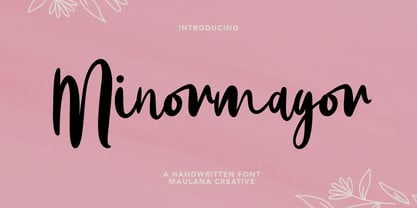 Give your designs an authentic handcrafted feel. Minormayor is perfectly suited to logo, stationery, branding, typography quotes, magazine or book cover, website header, clothing, branding, packaging design, restaurant and more. Cheers, MaulanaCreative
 - Humaira by SimpleType Studios,
$18.00 Humaira is a modern Sans serif font that embodies elegance and charm in every character. It is perfect for luxury logos, branding, classy editorial designs, women magazines, cosmetic brand, promotional designs, the fashion industry, and more. Humaira is perfect for branding projects, logo, wedding designs, social media posts, advertisements, product packaging, product designs, label, photography, watermark, invitation, stationery and any projects
 - Freedam Theory by Stringlabs Creative Studio,
$25.00 Fredam Theory is a Retro bold script with Groovy style, unique design taste and combine with classic retro style of the 80s, trendy, vintage, and sporty. The Fredam Theory is perfect for retro lovers, besides this font is also perfect if used for brands such as: barbershop, motorcycle club, clothing, logo brand, coffee shop, shoe brands, hipster and many more.
 - Roxale Story by Reyrey Blue Std,
$16.00 Introducing - Roxale Story. a new fresh & modern serif with smooth curves. It comes with elegant style, classy, and contrasts, with features and consist of regular, italic and calligraphy italic. Roxale Story is perfect for luxury logo and branding, classy editorial design, woman magazine, cosmetic brand, fashion promotional, art gallery branding, museum, historical of architectural, boutique branding, stationery design, blog design, modern advertising design, card invitation, art quote, home decor, book/cover title, special events and any more. Features : · All Uppercase and Lowercase · Number & Symbol · Supported Languages · Alternates and Ligatures · PUA Encoded
 - Andara by BonjourType,
$15.00 'Andara' is a handwritten font. We created this font for any modern branding brand. Unique and natural hand touch gives a different impression, this can make attention to take a closer look at your brand. Some agencies like this font for branding modern products, you can also make a large number of logos with one font as this font is suitable for use on web logos, signatures, portfolios, prints, headers, magazines, book covers, printed t-shirts, crafts, and cosmetic packaging. Hope this is a font worthy of your collection. Thank you,
 - Armeston Display by Tebaltipis Studio,
$15.00 Armeston Display - MultiPurpose Serif Typeface - Classic Expressive Fancy Display Font Armeston Display comes with some alternates, so you can combine it to make a perfect typography design. It is perfect for your up coming projects. Such as luxury logo and branding, classy editorial design, woman magazine, cosmetic brand, fashion promotional, art gallery branding, museum, historical of architectural, boutique branding, stationery design, blog design, modern advertising design, card invitation, art quote, home decor, book/cover title, special events and any more. That's it! Have fun with Armeston Multi Purpose font. Thank you! Tebaltipis Studio
 - IMAN RG by LGF Fonts,
$10.00 This type of Richard Gans, has always seemed very striking, despite having the complexity of the sources extrusion, has its own personality, and readability unusual for this type of letters. Use it for composing posters, programs or logos was very common at the time. My father, Antonio Lage Parapar, typographer by profession, who composed the texts, which not only had it for profession, but he liked to do, always he spoke of sources and decorative elements of the type foundry Richard Gans, as well as other foundries, especially those that required the mender of them, exercised creator, many of these types they have already been recovered by professionals and companies with excellent results. I've been surrounded by these movable type, and the occasional catalog unfortunately lost. One of those guys that has always struck me visually speaking was the type IMAN Richard Gans, the typographer and more of German origin arrived in Spain, back in 1874, also a pioneer. This work to revive the type mentioned, as well as create non existing glyphs between documents and parts I've been finding, is and has been a personal pleasure all I want serve as a tribute to my father (of aopodo curiously "Richard"), the only sadness it has not been completed. Richard Gans, arrived in Spain in 1874 as a representative of several European factories. then liaised with journalistic and publishing companies, which led him knowledge required of the first sector art. In 1878 he created a center importer gadgets graphic arts and three years later he created his own type foundry. The first rotary newspaper ABC, very famous and the most advanced of the time, the brand manufactured Richard Gans.
 - PMN Caecilia Sans by Monotype,
$50.99 Few projects are outside the range of PMN Caecilia® Sans. Drawn specifically for on-screen imaging, the family benefits from a large suite of weights, each with several stylistic variations. This is a design ideally suited to building digital interfaces, complex websites, apps, games, kiosks, HTML ads and large-scale brand identities. “My goal was to create a, friendly, versatile, ageless, yet discerning typeface family that will serve the needs of many users,” says Peter Matthias Noordzij. the typeface’s designer. “It is not intended to be eye-catching, but generous: enabling numerous visual and typographical expressions.” The use of Noordzij’s earlier design, PMN Caecilia, in Amazon’s Kindle® wireless reading devices, gave him the opportunity to study the behavior of the slab serif typeface in an on-screen environment. Although based on his earlier design, Noordzij incorporated fundamental changes to optimize PMN Caecilia® Sans’ digital performance. While PMN Caecilia has proven to be a steadfast serif typeface in print and on screen, the addition of a sans serif counterpart gives designers more flexibility when creating complex hierarchies. The combination of serif and sans serif makes the PMN Caecilia family a good choice for everything from print editorial projects to complicated web sites. A broad range of typefaces pair well with PMN Caecilia Sans. Humanist serif typefaces, such as Agmena™, Dante®, and Frutiger® Serif, set up dynamic typographic harmony, while designs like ITC New Veljovic™ Masqualero™ and Perpetua®, will create a striking counterpoint. And, of course, PMN Caecilia is a natural design partner – as are other slab serif typefaces, like the Aptifer™ Slab, Joanna® Nova and Soho® families.
 - Cohen by TripleHely,
$16.00 Hello! Let me introduce Cohen – a handwritten font named in memory of the great poet and singer Leonard Cohen. On the day he passed away I did my routine calligraphy practice and wrote a part of his song 'Night Comes On'. You may see this work in presentation pictures, and after time I designed a font based on this calligraphy. Cohen signature font is perfect for logos, branding, web, blog headlines, invitations, magazine and book design, product packaging – or for any text on postcards and on your favorite photos. Cohen includes: a standard set of characters with wide multilingual support: Western-, Central- and Eastern-European, Baltic, Turkish, Latin-type Africans, and Asian (94 languages in total) two additional character sets: lowercase letters with alternates shapes and lowercase letters with a little end-swash - for the position at the end of a word 39 ligatures for double letters and frequent combinations Cohen has a large number of embedded context-dependent auto-replacement features that give the text a natural, handwritten look and correct inharmonious combinations of letters. These features work well in many apps (even simple ones like Notepad/TextEdit), and if you need to customize their application – you could use programs that support OpenType features (for example, Adobe apps or CorelDraw). All these additional glyphs are PUA-encoded, so if your software does not support OpenType — you could access them through Character Map (Windows) or Font Book (Mac). I hope you will like Cohen and create great designs with it! And if you have any questions, feel free to contact me via e-mail: triple.hely@gmail.com
 - Mestre by Tipotecture,
$19.99 Mestre is a German & Dutch inspired geometric sans-serif designed. Its solid and formal shapes are embedded with a discreet humanist flair resulting in a very versatile contemporary hybrid and a highly functional and flexible font for many of today’s branding & UX requirements. With its rational forms and its large x-height, Mestre is perfect for long texts in small sizes allowing a comfortable reading. Its open forms, moderate & balanced proportions, neutral appearance and solid structure grant a high legibility on paper and on screens. With its extensive 8 weights and corresponding true italics, more than 900 glyphs per font, extended character set to support Central and Eastern European as well as Western European languages and a wide OpenType features set (small caps, case-sensitive forms, lining, tabular & old-style figures, scientific superior/inferior figures, fractions, a set of arrows, etcetera) it is meant to build visual hierarchies of any detail and complexity in editorial design or deliver the best performance for branding purposes. Mestre is a great choice for modern, contemporary and professional typography.
 - Satinwoods by Maulana Creative,
$13.00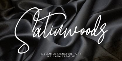 Satinwoods Slanted Signature Font Give your designs an authentic handcrafted feel. Satinwoods is perfectly suited to logo, stationery, branding, typography quotes, magazine or book cover, website header, clothing, branding, packaging design, restaurant and more.
 - Wood Island by WAP Type,
$20.00 Inspired by traditional ethnic feel and visuals. Great for fun and casual thematic visuals, games, logos, branding, products, campaigns, events, seasonal promotions, traditional concepts, explore different sides of your brand using wood island font.
 - Skullbats by Canada Type,
$24.95Patrick Griffin's sister is a really annoying individual sometimes. Not only is she into theater, but she thinks everyone else in the universe is into it as well. So once in a while tickets to local or provincial Shakespearean plays get delivered to the mailbox or dropped off on the living room's table. And once in a while the tickets just cannot be "lost" or ignored. Three or four times a year, Patrick must be subjected to Olde Englishe Speake, umbrella dresses and squeezetops, featherhats and men in leggings, rhyme and treason, mortality and immorality, drama inflicted by some mama, and it never ends. Last June it was Hamlet. Again. Someone's (wink wink) idea of a good time. There he goes, the Prince of Denmark, holding that skull with the tips of his fingers like it's an alien egg. Alas, poor Yorick! Yadda yadda boop-bop-a-loo-bop. And so the idea of a font made of skulls was born. And what can we possibly be but conduits for such abhorring ideas? Where be our gibes, our songs, our flashes of merriment? Skullbats has more skulls than you'll ever see in your lifetime. At least we hope so. Scary skulls, funny skulls, evil skulls, strange skulls, pixel skulls, fiery skulls, surprised skulls, happy skulls, sad skulls, cow skulls, sketched skulls, profiled skulls, light bulb skulls, cartoon skulls, techno skulls, alien skulls, expressionist skulls, pirate skulls, horned skulls, and skulls with whacky headgear. You name it, it's there. There's even a disco skull there for you. We lost count at 90 skulls, but there's a few more in there. For a complete showing of the skulls in the font, consult the image in the MyFonts gallery. Patrick's sister didn't turn out to be so bad after all. After making this font, he couldn't help but notice that her skull was a bit small compared to his. So now he takes every opportunity to remind her that the size of the cranium is relative to what it houses. Her upcoming halloween present will be a shirt with guess-what on it. Shirts, now there's putting Skullbats to good use! - FS Irwin by Fontsmith,
$80.00 New York vibes FS Irwin was born in New York while Senior Designer, Fernando Mello, was studying an intensive 5 week typeface design course at the Cooper Union. His brief was to design a perfectly clear typeface that could communicate well, without loud or overtly mannered design features. Fernando was influenced by the subway font in New York: ‘It is very in your face and clear, always in bold. It doesn’t shout much but at the same time is very present and unique. The design is completely different but it was this spirit I wanted to capture for FS Irwin.’ And the vibe of the city: ‘In a similar way to London, New York is so mixed and so cosmopolitan. I was amazed by the different styles and identities I saw there, and tried to encapsulate this essence to create something new, relevant and very now.’ Incisive quality Rather than focusing on quirks or distinctive characteristics, the key to FS Irwin is the quality of its design and spirit of simplicity. The design, proportions and details are usable and authentic and it is suitable for countless situations, without running the risk of being instantaneously noticeable. Families like this can be used on nearly anything, from more playful designs to serious corporate IDs. ‘Extensively tested and precisely drawn text-oriented typefaces are what I enjoy designing the most. There is a beauty and a different approach, a different way of making them interesting, sellable and usable rather than adding flicks or unexpected details.’ Inscriptions and calligraphy FS Irwin’s origin lies in Fernando’s studies in inscriptional lettering and writing-calligraphic exercises at the Cooper Union. Mello started the process by digitising his explorations and adapting them into a more workable sans serif structure. The traditional forms of writing which gave the basis to Latin type as we know it today were the perfect place to start. This influence can be seen in the proportion of the capitals and in slight writing-calligraphic details in the lowercase, such as the slightly angled, chiselled spurs and their open terminals.
 - ITC Stepp by ITC,
$29.99When Hal Taylor saw the 1930 logo for the Stetson Shoe Company of Weymouth, Massachusetts, he didn't run out and buy a pair of loafers. Instead, he seized on this striking example of an Art Deco logotype as the basis for a new typeface design. “I was impressed with the delicate and sophisticated letter forms,” Taylor recalls, “particularly the enlarged cap S -- in any other case it would have seemed unbalanced, but in the context of this logo, it worked perfectly.” All the letters in the original all-caps Stetson Shoe logo were rendered with condensed proportions except the O, which was a perfect circle. While the prominent O added visual interest to the logo, Taylor knew that such a character would limit his typeface to display applications. For versatility's sake, he drew his O for ITC Stepp with the same proportions as the rest of the alphabet. Taylor also gave the logotype's inverted S a more traditional design, but kept the original as an alternate character in the OpenType font. Taylor's toughest challenge during the design process was creating a lowercase. “A good type design tells you what it wants to be,” he says, “and after a little while the Stepp caps began to tell me what the lowercase should look like.” Taylor's lowercase is slightly more conventional than the caps. The jaunty g" and almost upside-down "s" add subtle charm, while the capital letters provide the broader gestures of Stepp's personality. Together, they create a versatile and distinctive typeface design. One of Hal Taylor's first jobs was as a photo-lettering typographer in Philadelphia, setting headlines and creating custom lettering. This was followed by a stint doing finished lettering for John Langdon, whose ambigrams appear in Dan Brown's best-selling novel, Angels & Demons. Today, Taylor works as a graphic designer in the publishing industry, but he still finds time to create an occasional hand-lettered book jacket, and draw handsome typeface designs. ITC Stepp is available in four weights, ranging from Light to Ultra Bold. All four weights have companion italics, and the lightest three weights also offer a suite of small caps." - Fairplex by Emigre,
$49.00 Zuzana Licko's goal for Fairplex was to create a text face which would achieve legibility by avoiding contrast, especially in the Book weight. As a result of its low contrast, the Fairplex Book weight is somewhat reminiscent of a sans serif, yet the slight serifs preserve the recognition of serif letterforms. When creating the accompanying weights, the challenge was to balance the contrast and stem weight with the serifs. To provide a comprehensive family, Licko wanted the boldest weight to be quite heavy. This meant that the "Black" weight would need more contrast than the Book weight in order to avoid clogging up. But harmonizing the serifs proved difficult. The initial serif treatments she tried didn't stand up to the robust character of the Black weight. Several months passed without much progress, and then one evening she attended a talk by Alastair Johnston on his book "Alphabets to Order," a survey of nineteenth century type specimens. Johnston pointed out that slab serifs (also known as "Egyptians") are really more of a variation on sans serifs than on serif designs. In other words, slab serif type is more akin to sans-serif type with serifs added on than it is to a version of serif type. This sparked the idea that the solution to her serif problem for Fairplex Black might be a slab serif treatment. After all, the Book weight already shared features of sans-serif types. Shortly after this came the idea to angle the serifs. This was suggested by her husband, and was probably conjured up from his years of subconscious assimilation of the S. F. Giants logo while watching baseball, and reinforced by a similar serif treatment in John Downer's recent Council typeface design. The angled serifs added visual interest to the otherwise austere slab serifs. The intermediate weights were then derived by interpolating the Book and Black, with the exception of several characters, such as the "n," which required specially designed features to avoid collisions of serifs, and to yield a pleasing weight balance. A range of weights was interpolated before deciding on the Medium and Bold weights.
 - Univers by Linotype,
$42.99 The font family Univers? is one of the greatest typographic achievements of the second half of the 20th century. The family has the advantage of having a variety of weights and styles, which, even when combined, give an impression of steadiness and homogeneity. The clear, objective forms of Univers make this a legible font suitable for almost any typographic need. In 1954 the French type foundry Deberny & Peignot wanted to add a linear sans serif type in several weights to the range of the Lumitype fonts. Adrian Frutiger, the foundry's art director, suggested refraining from adapting an existing alphabet. He wanted to instead make a new font that would, above all, be suitable for the typesetting of longer texts - quite an exciting challenge for a sans-serif font at that time. Starting with his old sketches from his student days at the School for the Applied Arts in Zurich, he created the Univers type family. In 1957, the family was released by Deberny & Piegnot, and afterwards, it was produced by Linotype. The Deberny & Peignot type library was acquired in 1972 by Haas, and the Haas'sche Schriftgiesserei (Haas Type Foundry) was folded into the D. Stempel AG/Linotype collection in 1985/1989. Adrian Frutiger continues to do design work with Linotype right up to the present day. In 1997, Frutiger and the design staff at Linotype completed a large joint project of completely re-designing and updating the Univers family. The result: Univers Next - available with 59 weights and 4 Linotype Univers Typewriter weights. With its sturdy, clean forms Univers can facilitate an expression of cool elegance and rational competence. Univers has the uncanny ability to combine well with fonts of many different styles and origins: Old style fonts such as: Janson Text, Meridien, Sabon, Wilke. Modern-stressed fonts such as: Linotype Centennial, Walbaum. Slab serif fonts such as Egyptienne F, Serifa. Script and brush fonts such as: Brush Script, Mistral, Ruling Script. Blackletter fonts such as: Duc De Berry, Grace, San Marco. Even fun fonts such as F2F OCRAlexczyk, Linotype Red Babe, Linotype Seven."
 - Rusted Sabbath by Ferry Ardana Putra,
$99.00 Introducing our brand new black metal font! It is Rusted Sabbath, baby! This savage death metal font can be used for logos or branding and your metal band name without having to pay for expensive logo-making services. You can immediately make your band or brand logo name by buying this font. Combine it with the death metal ornaments and make your death metal design with ease! This black metal typeface is perfect for logotypes, t-shirts, vintage badges, branding, packaging, posters, clothing brands, horror movies, album covers, and many more! ——— Rusted Sabbath features: A full set of uppercase and lowercase Numbers and punctuation Multilingual language support PUA Encoded Characters OpenType Features +295 Total Glyphs +Death Metal Ornaments included! ——— Rusted Sabbath Includes: Rusted Sabbath Regular
 - Hojlund by Mevstory Studio,
$30.00 Hojlund Brush Font, a modern and stylish font style influenced by urban style and branded goods that can be used in a wide variety of ways by Lettercorner Studio Hojlund font is ideal for branding, photo overlays, watermark, typography, greeting cards, posters, business card, branding projects, social media posts, magazines, book covers, invitations, weddings, photography, fashion, apparel, letter, stationery, or any tasks that need a signature taste.
 - Mango Style by Creativemedialab,
$20.00 Mango Style is a modern branding font with a stylish script alternates. This font is ideal for crafting logos for fashion, apparel brand, luxury projects. Tips: Insert stylish alternates between words for more fashionable look
 - Alonnafeast by Maulana Creative,
$15.00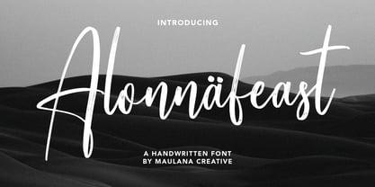 Give your designs an authentic handcrafted feel. Alonnafeast Brush Script Font is perfectly suited to logo, stationery, branding, typography quotes, magazine or book cover, website header, clothing, branding, packaging design, restaurant and more. Cheers, MaulanaCreative