Mate by Ferry Ardana Putra, $29.00 
Introducing "Mate" - a modern mecha font that pushes the boundaries of typographic design. Inspired by the sleek aesthetics of mecha machinery, this font combines hexagonal formations with a futuristic and cyberpunk visual language, giving your projects a bold and captivating edge. The "Mate" font captures the essence of the future with its hexagonal shapes meticulously integrated into each character. The geometric precision and interconnectedness of these forms create a visually striking and dynamic appearance. The carefully crafted letterforms evoke a sense of advanced technology and mechanical elegance, making them perfect for projects seeking a contemporary and cutting-edge look. With its cyberpunk-inspired design, "Mate" transports your audience into a world where technology and imagination intertwine. The font's sleek lines, sharp angles, and futuristic elements capture the essence of a dystopian future, adding an air of intrigue and sophistication to your designs. The unique hexagonal feels of "Mate" create a sense of interconnectedness and harmony within the letterforms. Each character seamlessly integrates into the next, forming a unified and visually captivating composition. Whether used in titles, logos, or headlines, this font demands attention and conveys a sense of progress and innovation. Unleash the power of "Mate" in your design projects to evoke the spirit of mecha aesthetics. Whether you're working on sci-fi book covers, gaming interfaces, futuristic posters, or branding for technology-driven companies, this font will effortlessly infuse your creations with a modern, cyberpunk-inspired charm. With "Mate," you have the perfect tool to unleash your creativity and redefine the boundaries of typographic expression. Let this modern mecha font propel your designs into a realm where imagination meets technology, and the future is brought to life in stunning visual form. This font is perfect for Logo designs, Gaming branding, Technology magazines, Sci-fi book covers, Cyberpunk posters, Futuristic product packaging, Robotics company branding, Virtual reality interfaces, Futuristic event invitations, Mecha-inspired apparel branding, Tech-themed websites, Dystopian novel covers, Futuristic movie titles, Cybernetic-themed party invitations, Gaming convention banners and many more! Mate features: A full set of uppercase Numbers and punctuation Multilingual language support PUA Encoded Characters OpenType Features Cyber Mecha Style +298 Total Glyphs
Laima by TypeTogether, $39.00 
Laima is the brush-formed stencil from Bogidar Mascareñas that will create an ovation for branding, album art, upscale venues, and packaging. If wide appeal, attention to detail, or international reach is necessary for your brand, consider Laima’s high-calibre design as your personal ambassador. The general font user is accustomed to stencil typefaces that have a brute look to them — industrial, mechanical, restrictive, or even militarised. Stencils are commonly used because they serve a function, like spray-painting over template letters, giving the reader a warning that must be heeded for safety, or a command to follow immediately. Wooden crates and grunge art are the medium and black or red paint are the norm. Laima, instead, creates a stencil from the world of calligraphy to turn all this on its head. Laima’s 12 stencil styles (six roman and six italic) use the junctures of calligraphic strokes as an opportunity to achieve an uncommon stencil effect, shifting to create unexpected shapes and the illusion of twisted, disconnected overlaps. Inspired by “Arte Nueva de Escribir”, an engravings book published by Francisco Palomares in 1776, Laima progressed well beyond its beginning as a Type and Media Master’s project at KABK, The Hague (NL). It sometimes required completely new character shapes to accommodate the space needed for clear diacritic marks, and was further enhanced with flourishes and alternates for liveliness and variety in individual or branded work. Laima’s italic begins with swashes and uses OpenType features to automatically turn them off with more than two successive capital letters. Use one swashed character for a drop cap, two for ligatured fun, turn them on or off at your discretion, or change the ascender length and swash shape to suit your creative need. With two styles of numerals and stylistic sets for final forms, Laima’s 12 styles and hundreds of Latin-based languages can turn simple words into an occasion that would immediately benefit high-class brands and special uses. Set that article title, release that new product, code your best-looking UI yet, letterpress that business card, and print that gourmet label. Whatever is next, Laima is the unexpected stencil partner to introduce it to an expectant world.

Overview of BD Megatoya Consists of 41 fonts, including nine upright, nine italics, nine extended, nine extended italics, all in nine weights from thin to black. 4 outline version in black weight. 1 variable with three axes (weight, width, slant). 1,470 glyphs in each font. Opentype features include small caps, stylistic alternates, ligatures, complete numeral figures, ordinal, case-sensitive forms. language support: Western European, Central European, and Southeastern European. About BD Megatoya Taking a geometric sans serif approach, we designed the letterform with details on round characters to pursue harmony and leave a slightly boxy feel to the extended style. The stylistic alternate is one of our concentrations to make them versatile yet still preserve consistency in stem and metrics to provide good readability in small text. Overall, the various treatments for each character will encourage each other to dynamic colours, flexible, and functional impressions in their application. Slicing edges The edge of the letter slice in 45 degrees will give the impression of a sparkle of light when you look at them for the first 2 seconds (our experience). This is what we did a few years ago when working on automotive branding. The word-mark logotype with slicing form gives an exclusive and different impression from its crowds. If you agree with us, does BD Megatoya deserve to be called a problem solver in branding projects? Jump over to .ss07, .ss08, .ss09, and .ss10 to find them! The Features BD Megatoya font family includes 41 great fonts in nine weights, an extended character set of over 1400 glyphs, multilingual support such as Southeastern Europe, Central Europe, Western Europe. Also advanced & useful open-type features: case-sensitive forms, small caps, standard and discretionary ligatures, stylistic alternates, ordinals, fractions, numerator, denominator, superscript, subscript, circled number, slashed zero, old-style figure, tabular and lining figure. Use BD Megatoya BD Megatoya is very suitable for branding projects and many designs purpose like advertising, posters, invitations, branding, logos, magazines, merchandise, presentations, etc. It's a FREE Get one weight from the BD Megayoya family for Free! Apply to your amazing projects and enlarge your creative tools by adding the complete BD Megatoya family to your font library.

Tropicane - Stylish Typeface refers to a font that possesses a distinct and attractive aesthetic, often characterized by unique design elements, creative flair, and an overall fashionable or contemporary look. Stylish typefaces are crafted to make a visual impact and are frequently chosen for design projects where the typography plays a crucial role in conveying a specific mood, personality, or brand identity. Here's an in-depth explanation of the characteristics and significance of a stylish typeface: - Distinctive Design Elements: Stylish typefaces stand out due to their distinctive design features. This may include unique letterforms, creative ligatures, elegant serifs, or modern sans-serif shapes. The goal is to create a visually appealing and memorable set of characters. - Contemporary Aesthetic: The term "stylish" implies a modern and fashionable design. Stylish typefaces often incorporate contemporary design trends, keeping up with current aesthetics to ensure that they remain visually relevant and appealing. - Versatility: Stylish typefaces are often versatile, suitable for a variety of design applications. Whether used for branding, editorial design, websites, or marketing materials, these typefaces maintain their stylish appeal across different contexts. - Attention to Detail: A stylish typeface is characterized by meticulous attention to detail. Designers pay close attention to the shapes, proportions, and spacing of individual characters to create a harmonious and visually pleasing overall appearance. - Expressive Characters: Stylish typefaces can convey a sense of expressiveness and personality. This expressiveness can be achieved through unique letter shapes, playful elements, or the incorporation of design features that evoke a particular mood or emotion. Applicability to Branding: Brands often use stylish typefaces to create a distinctive visual identity. A stylish font can contribute to the overall brand image, helping to communicate the brand's values, tone, and style to the target audience. - Innovative Typography: Stylish typefaces are often at the forefront of typographic innovation. They may push the boundaries of traditional letterforms, experimenting with new shapes, styles, and arrangements to create a sense of novelty and creativity. - Readability and Functionality: Despite their emphasis on style, these typefaces generally maintain a balance between visual appeal and readability. Clear and legible letterforms are crucial, ensuring that the text remains accessible while still making a stylish statement. - Adaptability to Trends: Stylish typefaces are often designed with an awareness of design trends. This adaptability allows them to stay relevant over time, making them a popular choice for designers who want their projects to reflect a contemporary and stylish aesthetic. - Customization Options: Some stylish typefaces come with additional features, such as alternative characters, ligatures, or stylistic sets, offering designers the flexibility to customize the appearance of the text for specific design needs. In summary, a stylish typeface is a carefully crafted font that goes beyond mere functionality, aiming to enhance the visual appeal and expressiveness of the text.
The grandeur of what was Miami Beach had its golden years peak in the 1940s. One of the grande dame hotels that stood at Collins Avenue and 23rd Street was the Roney Plaza; built in the 1920s and demolished around 1969. An online auction offered a pair of gummed labels provided by the hotel to be used by their guests for shipping souvenir packages back home, thus also giving the hotel a promotional plug. Jeff Levine not only created two typefaces from this hand-lettered label - Old Miami Beach JNL and Old Miami Beach Nights JNL (a solid black version), but painstakingly recreated the look of the label for the promotional flag and banner for the fonts.
As of my last update in 2023, the "Copyright Violations Nudged" font by GemFonts | Graham Meade isn't a widely recognized or popularly discussed font in mainstream typography circles, which suggests ...
The Lohengrin font is a compelling display font that captures the essence of historical artistry and craftsmanship within its letterforms. Created by Dieter Steffmann, a renowned German typographer a...
Project Z is a unique and captivating font that immediately grabs attention with its distinctive characteristics and design choices. Crafted by the talented David Kerkhoff, Project Z transcends the c...
CorpusCare, designed by the prolific Canadian type designer Ray Larabie, stands out as a distinct and innovative font that marries accessibility with aesthetic appeal. Larabie, known for his vast and...
You're Gone is an evocative typeface designed by the prolific Canadian type designer Ray Larabie, famous for his wide-ranging and impactful contributions to the typography world. This particular font...
Victorian Initials One is a captivating font that immediately transports you back to the elegance and intricacy of the Victorian era. Created by Dieter Steffmann, a typeface designer known for his pa...
The Básica font, created by the talented typographer Juan Casco, stands as a remarkable example of modern font design that harmoniously blends elegance with functionality. It is a typeface that immed...
The font "Catchland PERSONAL USE ONLY PERSONAL USE ONLY" by Måns Grebäck is a distinctive typeface that embodies creativity and flair. This particular font comes from the prolific body of work produc...
Colchester by Dieter Steffmann is a font that seems to capture the essence of historical depth and artistic elegance, marrying them into a cohesive typeface that's both visually intriguing and laden ...
The font "SmallTypeWriting" by Manfred Klein is a distinctive and meticulously designed typeface that exudes a vintage charm and simplicity, reminiscent of the classic typewriter text. Created by the...
BlaxSlabXXL is an intriguing and bold font created by the talented typographer Manfred Klein. As its name suggests, it is a slab serif font, distinguished by its robust and blocky serifs that project...
"Walk Da Walk One," a font crafted by the renowned Måns Grebäck, is a striking typeface that seamlessly blends artistry and vivacity. Grebäck, known for his intricate letterforms and keen eye for typ...
Ubahn is a distinctive font that echoes the spirit and aesthetics of urbanity with a nod to the historical context of metropolitan transportation systems, particularly inspired by the signage and typ...
FancyPants by Nick Curtis is an exquisite font that embodies a unique blend of whimsical grace and artistic flair, making it a perfect choice for projects that require a touch of elegance fused with ...
As of my last update in April 2023, the font named "Linear Curve Fatty" by Matt Perkins represents a distinctive blend of design principles that make it stand out in the realm of typography. The name...
"Shipped Goods 1 (Personal Use)" is a captivating typeface from the creative mind of Måns Grebäck, a renowned designer known for his prolific output of visually striking and character-rich fonts. Thi...
The Hill House font, designed by the talented Jon Hicks, stands as a testament to the intricate and unique possibilities that typeface design can offer. This particular font draws inspiration from th...
Oh, Tipbrush Script! Imagine taking a whimsical wander through a calligrapher's dream, where each stroke dances to the tune of elegance and charm—that's Tipbrush Script for you. Created by the wizard...
WinterthurCondensed is a captivating typeface designed by the accomplished German type designer, Manfred Klein. This particular font is named after the Swiss city of Winterthur, suggesting a connecti...
SelznickNormal is an intriguing font that manages to capture the essence of a bygone era while still being versatile enough for contemporary design projects. Designed by Nick Curtis, a designer known...

Zigfrida Typeface was born from a process of re-designing a logo where, through a grid created, I was developing all its main characters. As the project grew, it was noted that it was necessary not only to limit itself to the Latin alphabet, but also to develop Cyrillic characters. Its possibilities of use are endless, can be used in projects for your favorite sport, signs, posters, large formats, advertising projects, architectural, packaging, titles, among others. The result of all this was the development of a font that has up to 747 glyphs that can understand 100% of Latin languages and the vast majority of countries that use the Cyrillic alphabet. It has unique personality and characteristics that bring a differential to any project it is part of. ----- A Zigfrida Typeface nasceu a partir de um processo de re-design de um logotipo onde, através de um grid criado, fui desenvolvendo todos os seus principais caracteres. A medida que o projeto foi crescendo, observou-se que era preciso não apenas se limitar ao alfabeto latino, mas também desenvolver os caracteres cirílicos. Suas possibilidades de uso são infinitas, pode ser utilizada em projetos para seu esporte favorito, sinalizações, cartazes, grandes formatos, projetos publicitários, arquitetônicos, embalagens, títulos, entre outros. O resultado de tudo isso foi o desenvolvimento de uma fonte que possui até 747 glifos capaz de compreender 100% dos idiomas latinos e a grande maioria dos países que utilizam o alfabeto cirílico. Tem personalidade e característica únicas que trazem um diferencial para qualquer projeto que ela fizer parte.
Robur by Canada Type, $24.95 
It shouldn't be a surprise to anyone that these letter shapes are familiar. They have the unmistakable color and weight of Cooper Black, Oswald Cooper's most famous typeface from 1921. What should be a surprise is that these letters are actually from George Auriol's Robur Noir (or Robur Black), published in France circa 1909 by the Peignot foundry as a bolder, solid counterpart to its popular Auriol typeface (1901). This face precedes Cooper Black by a dozen of years and a whole Great War. Cooper Black has always been a bit of a strange typographical apparition to anyone who tried to explain its original purpose, instant popularity in the 1920s, and major revival in the late 1960s. BB&S and Oswald Cooper PR aside, it is quite evident that the majority of Cooper Black's forms did not evolve from Cooper Old Style, as its originators claimed. And the claim that it collected various Art Nouveau elements is of course too ambiguous to be questioned. But when compared with Robur Noir, the "elements" in question can hardly be debated. The chronology of this "machine age" ad face in metal is amusing and stands as somewhat of a general index of post-Great War global industrial competition: - 1901: Peignot releases Auriol, based on the handwriting of George Auriol (the "quintessential Art Nouveau designer," according to Steven Heller and Louise Fili), and it becomes very popular. - 1909-1912: Peignot releases the Robur family of faces. The eight styles released are Robur Noir and its italic, a condensed version called Robur Noir Allongée (Elongated) and its italic, an outline version called Clair De Lune and its condensed/elongated, a lined/striped version called Robur Tigre, and its condensed/elongated counterpart. - 1914 to 1918: World War One uses up economies on both sides of the Atlantic, claims Georges Peignot with a bullet to the forehead, and non-war industry stalls for 4 years. - 1921: BB&S releases Cooper Black with a lot of hype to hungry publishing, manufacturing and advertising industries. - 1924: Robert Middleton releases Ludlow Black. - 1924: The Stevens Shanks foundry, the British successor to the Figgins legacy, releases its own exact copies of Robur Noir and Robur Noir Allongée, alongside a lined version called Royal Lining. - 1925: Oswald Cooper releases his Cooper Black Condensed, with similar math to Robur Noir Allongée (20% reduction in width and vectical stroke). - 1925: Monotype releases Frederick Goudy's Goudy Heavy, an "answer to Cooper Black". Type historians gravely note it as the "teacher steals from his student" scandal. Goudy Heavy Condensed follows a few years later. - 1928: Linotype releases Chauncey Griffith's Pabst Extra Bold. The condensed counterpart is released in 1931. When type production technologies changed and it was time to retool the old faces for the Typositor age, Cooper Black was a frontrunning candidate, while Robur Noir was all but erased from history. This was mostly due to its commercial revival by flourishing and media-driven music and advertising industries. By the late 1960s variations and spinoffs of Cooper Black were in every typesetting catalog. In the early- to mid-1970s, VGC, wanting to capitalize on the Art Nouveau onslaught, published an uncredited exact copy of Robur Black under the name Skylark. But that also went with the dust of history and PR when digital tech came around, and Cooper Black was once again a prime retooling candidate. The "old fellows stole all of our best ideas" indeed. So almost a hundred years after its initial fizz, Robur is here in digital form, to reclaim its rightful position as the inspiration for, and the best alternative to, Cooper Black. Given that its forms date back to the turn of the century, a time when foundry output had a closer relationship to calligraphic and humanist craft, its shapes are truer to brush strokes and much more idiosyncratic than Cooper Black in their totality's construct. Robur and Robur Italic come in all popular font formats. Language support includes Western, Central and Eastern European character sets, as well as Baltic, Esperanto, Maltese, Turkish, and Celtic/Welsh languages. A range of complementary f-ligatures and a few alternates letters are included within the fonts.
ImperiumSerif is an intriguing font crafted by the accomplished type designer Manfred Klein. Klein, known for his prolific work in the field of typography, has developed a diverse array of fonts, and...
Blockography, conceived by the skilled hand of Måns Grebäck, is a visually striking font that captures the essence of creativity and bold expression. Grebäck, a renowned typeface designer known for h...
Interplanetary Crap, crafted by the renowned typeface designer Ray Larabie, stands as a notable entry in the modern archive of unique and thematic fonts. Known for his ability to infuse personality a...
As of my last update in early 2023, there doesn't appear to be a widely recognized font named "Juan Miro" directly linked with the famous Spanish painter Joan Miró, a misunderstanding likely rooted i...
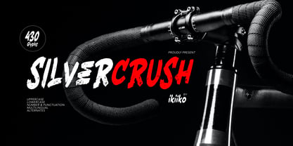
Introducing SILVERCRUSH Typeface, created by ikiiko. A rough letters with expressive strokes and have a strong character for street art typeface. Silvercrush typeface is perfect for an poster event, urban brand, hipster magazine, fashion stuff, quotes, and all the design elements that require a street vibes. What's included? Uppercase & Lowercase Number & Punctuation Bonus Alternates Multilingual Support Enjoy our font and if you have any questions, you can contact us by email : ikiikowrk@gmail.com
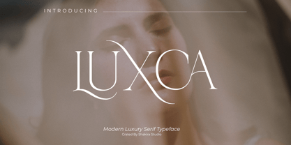
Luxca by Shakira Studio, $17.00 Introducing Luxca, a font that epitomizes modern luxury within the serif category. This typeface seamlessly blends contemporary sophistication with timeless elegance, making it the perfect choice for designers seeking to infuse their projects with an air of opulence and refinement. With Luxca as your font of choice, you have at your fingertips a versatile tool that can elevate a wide range of design applications. Whether it's high-end branding, editorial layouts, invitations, or packaging.
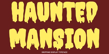
Introducing "Haunted Mansion" Haunted Mansion - A Halloween Font You Can Mix And Match for Your Awesome Project This fonts is ideal for crafting, branding and decorate your any project. This fonts are perfect for wedding invitation or your blog. Also with their help, you can create a logo or beautiful frame for your home. Or just use for your business, book covers, stationery, marketing, magazines and more. FEATURES : Uppercase & Lowercase Number & Punctuation Multilingual Language Outline
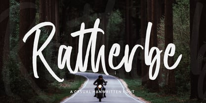
Ratherbe is a new modern brush font with an irregular baseline. A contemporary approach to design, natural handmade, suitable for use in designs for clothing, invitations, book titles, stationery designs, quotes, branding, logos, greeting cards, T-shirts, packaging designs, posters, and more. Complete with upper and lower case letters, and multi-language support, numbers, punctuation and several ligature. Thank you very much for searching and letting me know if you have questions.
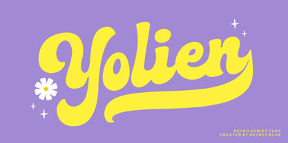
Yolien by Reyrey Blue Std, $16.00 Introducing, Yolien Font. A retro, cute, and modern inspired by the flowy freeform lettering of the '60s and '70s. This font has a unique shape where every corner is smoother and more rounded. Every curve is designed based on an authentic and natural style. Yolien is perfectly suitable for a layout design for quotes or body copy, best used as a display for headings, logos, branding, magazines, product packaging, invitations: logotypes, and much more.
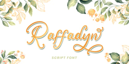
Raffadyn is a wedding font perfect for your wedding dream. Combine Raffadyn with stylistic set to create amazing script font for wedding! Fall in love with its incredibly versatile style and use it to create spectacular designs! Raffadyn is perfect for branding, logo, invitation, quotes, apparel design, product packaging, merchandise, game titles, cute style design, Book/Cover Title and more. What's Included : - Stylistic Set character - Multilingual Support --- Hope you enjoy with our font! Attype Studio
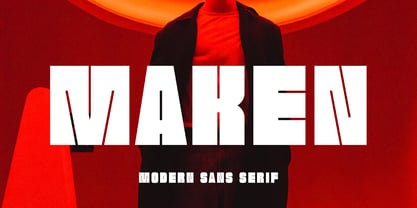
Maken by Graphicxell, $19.00 This typeface encapsulates a rhythm that is symmetrical and balanced due to a unique mix of different sources of inspiration. Proportions are precisely adjusted with subtle contours and subtle contrasts. These shapes give the font an attractive look without compromising on elegance and minimalism, ensuring that any glyph will work well in any graphic design purpose such as brochures, videos, advertising branding, logos, magazines, layout designs, posters, post templates, games and others
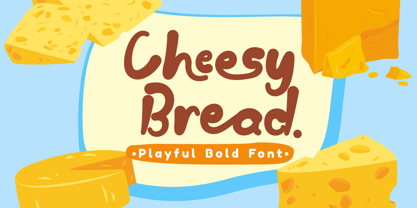
Introducing Cheesy Bread, a super playful bold font. This font is perfect for your projects related to kids, which is playful and fun. This font also has 2 versions, clean and rough. Cheesy Bread also perfect for branding design, posters, apparel, logotype, header, quote, invitation, greeting card, cover, poster, fashion design and any more. Come with lot of ligatures character, its help you to make great lettering. This font is also support multi language.


