10,000 search results
(0.177 seconds)
- Bernhard Signature by Jonahfonts,
$40.00I started to work at the Bernhard Studio in 1952 to 1959 in New York. I helped with some type designs and many other projects, this two tiered signature was added on all of Bernhard’s art that was produced in the past and in his later years. In the 50’s I thought Bernhard’s Gothic face was quite a bit outdated but as you may know it has become one of todays most used faces. His signature is based on his Bernhard Gothic Font. With todays computer technology I have digitized the caps and added lower case glyphs with lower ascenders and other slight changes. - Cloister Open Face LT by Linotype,
$29.99Cloister Open Face was designed in 1929 by Morris Fuller Benton as one weight of the Cloister Old Style family. Cloister itself appeared from 1897 with American Type Founders, and later for the typesetting machines of the Linotype, Intertype and Monotype companies. At that time, it was the truest modern industrial revival of the Jensonian Roman. Benton stayed close to the style of his model in both design and spacing. Cloister Open Face has an old-world elegance, and it works well for titling in books and magazines. In 1458, Charles VII sent the Frenchman Nicolas Jenson to learn the craft of movable type in Mainz, the city where Gutenberg was working. Jenson was supposed to return to France with his newly learned skills, but instead he traveled to Italy, as did other itinerant printers of the time. From 1468 on, he was in Venice, where he flourished as a punchcutter, printer and publisher. He was probably the first non-German printer of movable type, and he produced about 150 editions. Though his punches have vanished, his books have not, and those produced from about 1470 until his death in 1480 have served as a source of inspiration for type designers over centuries. His Roman type is often called the first true Roman." Notable in almost all Jensonian Romans is the angled crossbar on the lowercase e, which is known as the "Venetian Oldstyle e."" - Andine by Letterena Studios,
$10.00 Hi, Everyone! Want a font to make your branding bold? Are you trying to make a stylish statement with your projects? We’ve got what you want. Introducing Andine - A Serif Font A fabulous, elegant, and modern serif font that’ll engage your audience and make your branding stand out. This stylish font can be used for a host of different content needs and projects. Perfect for social media branding projects, fashion designs, printed quotes, or even as a stylish text overlay to any background image and many more! Andine includes Multilingual option to make your branding reach a global audience. Includes: Andine (OTF) Features: Standard Ligatures Stylistic Sets Multilingual Support PUA Encoded Numerals and Punctuation
 - Belle Story by Creativemedialab,
$19.00 Belle Story is a beauty serif family. This hi-contrast display font Consists of 2 styles Display & Regular and each style has 10 weights from thin to black with fine lines and smooth curves to make this font perfect for luxury, classy, high-end branding, logo, and many more. Belle Story also includes a Variable style as well as multilingual support, numbers, and currency symbols, and dozens of alternates.
 - Scary Ghost by Sealoung,
$15.00 Scary Ghost is a cute and fun quirky font with a messy style. T his font is perfect for your playful designs, such as for halloween designs, school projects, kids designs, and more. Or just use it for your business, book covers, stationery, marketing, magazines and more. This font is ideal for creating, branding and decorating your projects. FEATURE : All capital Numbers & Punctuation Multilingual Language ligatures Happy designing. Thank you!
 - Kexman by Gleb Guralnyk,
$15.00 Hi! Introducing a calligraphic handmade script named "Kexman". It's a one line font with many OpenType features: ligatures, alternates, swashes.
 - Fairfield by Linotype,
$41.99 Rudolph Ruzicka designed his font Fairfield as a legible text font. His philosophy: The reader expects optical assistance with reading. He does not want to be distracted while interpreting and understanding the ideas of a text." Fairfield font is based on the forms of Venecian Old Face fonts as well as on the designs and details of Art Deco, giving the font a distinctive appearance"
 - Peter Schlemihl by profonts,
$41.99 Adalbert von Chamisso wrote that wondrous story about the man who sold his shadow to the devil. Walter Thiemann recovered that shadow when he put a thin line and a shadow line around his Tiemann Fraktur. It is an embellished and delightful typeface, this Peter Schlemihl. It is probably one of the most beautiful typefaces among the outline, shadow and striped black letter fonts. (Albert Kapr)
 - Goldbugs by Nathatype,
$29.00 Hi, Everyone! Want font to make your branding bold? Looking for a fabulous, stylish, modern, and adventure font? We've got what you want. Goldbugs-A Serif Font Goldbugs a timeless serif font. Designed with elegance and modern style. Every letter has a unique and beautiful touch, which will make your design come alive. This font is perfect for quotes, shirt designs, websites, branding, children's designs, svg designs, blogs, logos, invitations and more! Our font always includes Multilingual Support to make your branding reach a global audience. Features: Ligatures Stylistic Set Swashes PUA Encoded Numerals and Punctuation Thank you for downloading premium fonts from Natha Studio
 - Bomberboy by Din Studio,
$25.00 Hi, Everyone! Want a font to make your branding bold? Looking for a statement font that exudes prominence, style, and adventure? Then we’ve got the font for you! Introducing Bomberboy - A Grafiti Font Bomberboy is offered in two versions: solid and shadow. Use this cool, colourful graffiti font to breathe a street life vibe into your projects. This font is perfect for logos, printed quotes, cards, packaging, website or social media branding, and many more! Our font always includes Multilingual Support to make your branding reach a global audience. Features: Alternates Standart Ligatures Multilingual Support PUA Encoded Numerals and Punctuation Thank you for downloading premium fonts from Din Studio
 - Streetbomber by Din Studio,
$29.00 Hi, Everyone! Want to make your branding bold with graffiti font? Then we’ve got the font for you! Introducing Streetbomber- A Grafiti Font Streetbomber is an urban font that echoes the classic tag lettering style. Use this cool and artistic graffiti font to breathe a street life vibe into your projects. This font is perfect for logos, printed quotes, cards, packaging, website or social media branding, and many more! Streetbomber includes multilingual options to make your branding reach a global audience. Includes: Streetbomber (OTF) Features: Alternates Standart Ligatures Stylistic Set Multilingual Support PUA Encoded Numerals and Punctuation Thank you for downloading premium fonts from Din Studio
 - Vuk by LetterPalette,
$48.00 Vuk Stefanovic Karadzic was a Serbian philologist and linguist who was the major reformer of the Serbian language. In addition to his linguistic reforms, Karadzic also contributed to folk literature, using peasant culture as the foundation. Because of his peasant upbringing, he was closely associated with the oral literature of the peasants, compiling it to use in his collection of folk songs, tales, and proverbs. He was well known abroad and familiar to Jacob Grimm, Johann Wolfgang von Goethe and historian Leopold von Ranke. This typeface, based on his manuscripts, presents the perfect balance between casual handwriting and careful calligraphy. Thoroughly created by Vedran Erakovic and Marija Rnjak, it contains a comprehensive set of upper and lower case letter alternates. Thanks to some OpenType features, such as contextual alternates, this typeface approaches handwritten text as closely as possible. It is ideal for designing greeting cards, quotes, packaging, invitations, fashion layouts and much more.
 - P22 Flora Mambo by P22 Type Foundry,
$24.95 P22 Flora Mambo is based on the distinctive style of 20th century illustrator Jim Flora. Most widely known for his Jazz album covers of the 1940s & 50s, Flora's style shows his fantastic imagination and bold graphic style. The P22 Flora Mambo Set contains 3 fonts- Flora Mambo, a 2-part font that can be used to achieve 2-color text in the style of Flora's iconic 1955 album design, Mambo for Cats and Flornaments, a set of 72 ornaments that features a variety of Flora's illustrative styles from his Jazz album covers to children's books to his fine art prints. Please note that P22 Flora Mambo B is not intended to be used on its own but rather is included with P22 Flora Mambo to create 2-color text. For best results, use with page layout applications. The fonts contained in the P22 Flora Mambo Set are licensed through the Estate of James Flora and JimFlora.com .
 - Bite Hard by Gleb Guralnyk,
$15.00 Hi! Introducing handcrafted high detailed font BITE HARD. It has four variations to help you easy recolor and combine lettering compositions
 - Equestrienne by Red Rooster Collection,
$45.00Designed by Les Usherwood. Digitally engineered by Paul Hickson. Les never released this completed typeface before his untimely death in 1983. - Goodwine by Gleb Guralnyk,
$15.00 Hi. Presenting a simple and elegant font named "Goodwine" includes lots of characters with many languages support (West European, Cyrillic, etc...).
 - Lesmore by Red Rooster Collection,
$45.00Designed by Les Usherwood. Digitally engineered by Paul Hickson. Another typeface from Les Usherwood that was released after his 1983 death. - Speedball No1 NF by Nick's Fonts,
$10.00Another charming handlettered gem based on the work of lettering artist Samuel Welo, from the 1927 edition of his Studio Handbook. - One Thin Line by Gleb Guralnyk,
$13.00 Hi! Introducing a simple minimalistic font named "One Thin Line". Because almost all letters and characters are made of one line.
 - Paddington - Unknown license

- Black Hymned Script by Letterhend,
$17.00 Black Hymned - Font Trio is a font package containing three style with same vibes!. Each font contains lowercase, uppercase, numbers, symbols and also supports multi languages. You will get TTF and OTF. This font can use in any software without problem! A simple font. Features: uppercase & lowercase numbers and punctuation multilingual PUA encoded Please like and follow as appreciation, Thank You,
 - Growing Garden by Wyarecreatype,
$7.00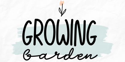 Growing Garden is an elegant and natural trio handwritten font. This original look will appeal to a wide range of crafty ideas. It looks stunning on wedding invitations, thank you cards, quotes, greeting cards, logos, business cards and every other design which needs a handwritten touch. Includes: Uppercase and lowercase For every questions or help, Please contact me. Happy Creating! Thanks!
 - Comixed RP by BluHead Studio,
$20.00Comixed RP Bold and Comixed RP Bold Outline are two new fonts designed by British designer Roy Preston and released by BluHead Studio, LLC. Comixed is a bold, condensed cap-only typeface, with a lively, animated charm. The Outline version turns up the fun factor by adding a drop shadow. Used alone or together, both are great for snappy, eye-catching headlines! - Baskerville by Linotype,
$40.99John Baskerville (1706-1775) was an accomplished writing master and printer from Birmingham, England. He was the designer of several types, punchcut by John Handy, which are the basis for the fonts that bear the name Baskerville today. The excellent quality of his printing influenced such famous printers as Didot in France and Bodoni in Italy. Though he was known internationally as an innovator of technique and style, his high standards for paper and ink quality made it difficult for him to compete with local commercial printers. However, his fellow Englishmen imitated his types, and in 1768, Isaac Moore punchcut a version of Baskerville's letterforms for the Fry Foundry. Baskerville produced a masterpiece folio Bible for Cambridge University, and today, his types are considered to be fine representations of eighteenth century rationalism and neoclassicism. Legible and eminently dignified, Baskerville makes an excellent text typeface; and its sharp, high-contrast forms make it suitable for elegant advertising pieces as well. The Linotype portfolio offers many versions of this design: ITC New Baskerville® was designed by John Quaranda in 1978. Baskerville Cyrillic was designed by the Linotype Design Studio. Baskerville Greek was designed by Matthew Carter in 1978. Baskerville™ Classico was designed by Franko Luin in 1995." - Baskerville Classico by Linotype,
$29.99John Baskerville (1706-1775) was an accomplished writing master and printer from Birmingham, England. He was the designer of several types, punchcut by John Handy, which are the basis for the fonts that bear the name Baskerville today. The excellent quality of his printing influenced such famous printers as Didot in France and Bodoni in Italy. Though he was known internationally as an innovator of technique and style, his high standards for paper and ink quality made it difficult for him to compete with local commercial printers. However, his fellow Englishmen imitated his types, and in 1768, Isaac Moore punchcut a version of Baskerville's letterforms for the Fry Foundry. Baskerville produced a masterpiece folio Bible for Cambridge University, and today, his types are considered to be fine representations of eighteenth century rationalism and neoclassicism. Legible and eminently dignified, Baskerville makes an excellent text typeface; and its sharp, high-contrast forms make it suitable for elegant advertising pieces as well. The Linotype portfolio offers many versions of this design: ITC New Baskerville® was designed by John Quaranda in 1978. Baskerville Cyrillic was designed by the Linotype Design Studio. Baskerville Greek was designed by Matthew Carter in 1978. Baskerville™ Classico was designed by Franko Luin in 1995." - Baskerville LT by Linotype,
$40.99 John Baskerville (1706-1775) was an accomplished writing master and printer from Birmingham, England. He was the designer of several types, punchcut by John Handy, which are the basis for the fonts that bear the name Baskerville today. The excellent quality of his printing influenced such famous printers as Didot in France and Bodoni in Italy. Though he was known internationally as an innovator of technique and style, his high standards for paper and ink quality made it difficult for him to compete with local commercial printers. However, his fellow Englishmen imitated his types, and in 1768, Isaac Moore punchcut a version of Baskerville's letterforms for the Fry Foundry. Baskerville produced a masterpiece folio Bible for Cambridge University, and today, his types are considered to be fine representations of eighteenth century rationalism and neoclassicism. Legible and eminently dignified, Baskerville makes an excellent text typeface; and its sharp, high-contrast forms make it suitable for elegant advertising pieces as well. The Linotype portfolio offers many versions of this design: ITC New Baskerville® was designed by John Quaranda in 1978. Baskerville Cyrillic was designed by the Linotype Design Studio. Baskerville Greek was designed by Matthew Carter in 1978. Baskerville™ Classico was designed by Franko Luin in 1995."
 - Monotype Baskerville by Monotype,
$29.99 John Baskerville (1706-1775) was an accomplished writing master and printer from Birmingham, England. He was the designer of several types, punchcut by John Handy, which are the basis for the fonts that bear the name Baskerville today. The excellent quality of his printing influenced such famous printers as Didot in France and Bodoni in Italy. Though he was known internationally as an innovator of technique and style, his high standards for paper and ink quality made it difficult for him to compete with local commercial printers. However, his fellow Englishmen imitated his types, and in 1768, Isaac Moore punchcut a version of Baskerville's letterforms for the Fry Foundry. Baskerville produced a masterpiece folio Bible for Cambridge University, and today, his types are considered to be fine representations of eighteenth century rationalism and neoclassicism. Legible and eminently dignified, Baskerville makes an excellent text typeface; and its sharp, high-contrast forms make it suitable for elegant advertising pieces as well. The Linotype portfolio offers many versions of this design: ITC New Baskerville® was designed by John Quaranda in 1978. Baskerville Cyrillic was designed by the Linotype Design Studio. Baskerville Greek was designed by Matthew Carter in 1978. Baskerville™ Classico was designed by Franko Luin in 1995."
 - Bestiario by Intellecta Design,
$27.50 John Seddon (1644-1700), was a famous english writing master, the leading calligrapher of his time, and master of Sir John Johnson’s Free Writing School in Priest’s Court, Foster Lane. His portrait was drawn by William Faithorne and was engraved by John Sturt as the frontispiece for his copy-books, such as ‘The Ingenious youth’s companion’ of c.1690 and 'The pen-man’s paradise' of c.1695. These were engraved after his work by others. Your extra-rare book - "The Pen-mans Paradise Both pleasent & Profitable OR Examples of all ye usuall hands of this Kingdome. Adorn'd with variety of ffigures an Flourishes done by Command of hand. Each ffigure being one continued & entire Track of the pen most where of may be struck as well Reverse (or to answer bothwayes) as Forward", London (1965). - YES (that is the title of the book) was the starting point to these new extra accurated works of Iza W, a series of revivals of the penmanship Seddon’s artworks, animal and human kingdon inspired penmanship forms in the Bestiario font. On the other hand, his highly ornamented animal kingdon inspired capitals and alphabets in the Seddon Penmans Paradise Capitals typeface. The “SeddonsFleurons” completes the collection. Fantastic choice to elaborated barocque/renaissance inspired and historical accurated layouts.
 - Baskerville LT Cyrilic by Linotype,
$29.99John Baskerville (1706-1775) was an accomplished writing master and printer from Birmingham, England. He was the designer of several types, punchcut by John Handy, which are the basis for the fonts that bear the name Baskerville today. The excellent quality of his printing influenced such famous printers as Didot in France and Bodoni in Italy. Though he was known internationally as an innovator of technique and style, his high standards for paper and ink quality made it difficult for him to compete with local commercial printers. However, his fellow Englishmen imitated his types, and in 1768, Isaac Moore punchcut a version of Baskerville's letterforms for the Fry Foundry. Baskerville produced a masterpiece folio Bible for Cambridge University, and today, his types are considered to be fine representations of eighteenth century rationalism and neoclassicism. Legible and eminently dignified, Baskerville makes an excellent text typeface; and its sharp, high-contrast forms make it suitable for elegant advertising pieces as well. The Linotype portfolio offers many versions of this design: ITC New Baskerville® was designed by John Quaranda in 1978. Baskerville Cyrillic was designed by the Linotype Design Studio. Baskerville Greek was designed by Matthew Carter in 1978. Baskerville™ Classico was designed by Franko Luin in 1995." - Rotola TH Pro by Elsner+Flake,
$40.00 Karl-Heinz Lange presented his first drafts of Rotola during a Typoart® type design competition in 1985 under the name "Boutique". A year later, Norbert du Vinage, former manager of the type design department, integrated "Boutique" in his production plan. Due the Fall of the Wall, it took about 18 years until Lange finished this font family in cooperation with Elsner+Flake. Karl-Heinz Lange was born on July 29, 1929 in Wiesenkirch in West Prussia. He was enrolled in the Humanistic Gymnasium at Elbing from 1939 to 1945 and changed to the Wernigerode High School after his family had to flee to central Germany. From 1949 to 1951, Karl-Heinz Lange studied at the Werkkunstschule Halle, where one of his teachers was Professor Post. After 1951, he continued his studies at the Hochschule for Grafik und Buchkunst in Leipzig with an emphasis on book design. He received his diploma in 1955 with distinction based on his design of a hot metal typeface. From 1956 to 1961, Karl-Heinz Lange worked as a lecturer for Type and Commercial Graphics at the Hochschule für Angewandte Kunst in Magdeburg. From 1961 to 1963, he taught at the Hochschule für Grafik und Buchkunst in Leipzig, and finally as a freelance commercial designer in Magdeburg. He worked on a variety of assignments, one of which was the design of trick films. From 1969 to 1976 he took the position of Artistic Director of the Henschelverlag, Berlin; from 1976 to 1994 he was Professor of Type and Typography at the Fachschule für Werbung und Gestaltung in Berlin; and, until 2004, he taught at various institutes for advanced professional education. From 2005 to 2007 he taught at the Fachhochschule Magdeburg/Stendal. Karl-Heinz Lange was awarded the second prize at the "International Type Design Contest 1971" for a headline typeface, and, in 1984, at the XI. Biannual of Graphic Design in Brno, he won a Silver Medal for the design of his typeface family Publica. He created the telephone book typeface Minima and re-designed the Typoart Super Grotesk® (Arno Drescher, 1930) as well as the Newspaper typeface Magna® by Herbert Thannhaeuser for the use on digital typesetting systems. To the day of his death on June 29, 2010, Karl-Heinz Lange lived and worked as a type designer. Among others, he closely followed the designs of the typefaces which were developed under his guidance for Typoart®: "Publica®", "Typoart Super Grotesk®" and "Minima®" which he launched as "Publicala", "Minimala" and "Superla" in 2009. In cooperation with Elsner+Flake, he developed the Typeface family "Rotola" between 2006 and 2009 as well as the script families of the "Viabella®" series. To the end, he followed the development of his first typeface, the "Diplom Antiqua", which he also wanted to bring to market together with Elsner+Flake.
 - Coriander by Adobe,
$29.00Coriander is the work of British designer Timothy Donaldson. It started out as a doodle one afternoon Donaldson was bored and uninspired. He wrote the word Coriander" and was then distracted by the sun beating through an adjacent window. He taped the writing paper up on the window as a shade. He took it down a few months later, folded it up, and stuck it in his pocket. When the piece of paper fell out of his pocket a week later, he was inspied to draw the rest of the characters, two alphabets in his sketchbook. The final digitized characters were created by Donaldson using a Wacom tablet and later refined on the screen." - P22 Posada by P22 Type Foundry,
$24.95 Mexican printmaker Jose Guadalupe Posada (1851-1913) created a massive variety of material—broadsheets, cards, advertisements, posters, etc.—which largely represented a defense of the common man and a manifestation of the horrible and gruesome events of the day. Posada often cut his own lettering that looked like more decorative versions of Gothic wood types. His most notable imagery comes from his Calaveras celebrating the Day of the Dead. Calaveras often represent effigies of living people depicted as skeletons going about their daily activities. These are often humorous and playful in a way that helps bridge this world with the beyond. This font family contains two small caps style fonts and one Extras font containing 60 images.
 - Zaleski - Unknown license

- Cheval by Solotype,
$19.95Formalized from some hand lettering by the multifaceted Jugendstil designer Bruno Mauder, perhaps better known for his work in glass and ceramics. - Guillermo by Homelessfonts,
$49.00 Homelessfonts is an initiative by the Arrels foundation to support, raise awareness and bring some dignity to the life of homeless people in Barcelona Spain. Each of the fonts was carefully digitized from the handwriting of different homeless people who agreed to participate in this initiative. Please Note: these fonts include only the latin alphabet; no accented characters, no numbers or punctuation. MyFonts is pleased to donate all revenue from the sales of Homelessfonts to the Arrels foundation in support of their mission to provide the homeless people in Barcelona with a path to independence with accommodations, food, social and health care. Guillermo was born in Argentina. And after crossing four continents and travelling in more than twenty countries, he still has his accent. His luck ran out on the streets of Barcelona. But despite his circumstances, he hasn’t lost a bit of his wit or articulacy. “The worst thing about the street is something that touches your heart, your brain. Not being able to have sex, not having any privacy until it leaves you empty.” On the street he follows his passion for art and writing as best he can, using old cardboard when he can’t find paper and listening to the music that comes to him. His way of thinking and expressing himself leaves people wide-eyed and open-mouthed, but even so he admits he’s a solitary man. “Solitude is an individual word. A solitary type like me can’t bring the word solitude to the whole world.”
 - Bodoni Classic Swing by Wiescher Design,
$55.00 Bodoni Classic Swing is another of my decorative additions to Bodoni’s family of typefaces. Bodoni did not design decorative versions. His quest was for purity in book design. He was purely as a printer who had to cut his own fonts because there simply weren't any foundries in those days. I think if Giambattista were alive today he would design many decorative typefaces. Yours molto classico, Gert Wiescher
 - Mezz by Adobe,
$29.00Clarinetist Milton ?Mezz? Mezzrow (1899-1972) was a remarkable jazz musician, as becomes evident upon reading his autobiography Really the Blues. His sharp tone and serpentine lines inspired English lettering artist and jazz lover Michael Harvey to create a condensed, oblique display typeface with the look of a chiseled alphabet in the musician's honor. Vertical formats such as book jackets and posters will be invigorated by Mezz as the display face. - Black Bamboo by Hanoded,
$15.00 Black Bamboo is a beautiful plant. My father in law, who recently passed away, loved it and had a prized specimen growing in his garden. This font was named in his honour. Black Bamboo font is a bold typeface, created using a good brush and quality paint. It is all caps, but upper and lower case differ and can be freely interchanged. Of course, Black Bamboo comes with all diacritics.
 - P22 Vincent by P22 Type Foundry,
$24.95 This set is inspired by the work of Vincent van Gogh. The alphabet captures the essence of van Gogh's handwriting style, using his extensive correspondence with his brother Theo as the primary reference. This lettering style presents a bold brush-stroke appearance which bears striking similarities to the painting style of Van Gogh. A full international charcter set is featured. The extras feature selected imagery from van Gogh's drawing and paintings.
 - Bambus by URW Type Foundry,
$49.99 LP Bambus is another new handwriting script written with bamboo from German designer Peter Langpeter (lp-design.de). LP has been running his own design studio since 1995, working as a typeface and logo designer, as a calligrapher, cartographer and illustrator. During this time LP created a large number of excellent new typeface designs. Now, we are extremely happy that LP has chosen to let URW digitally produce and market his designs.

